


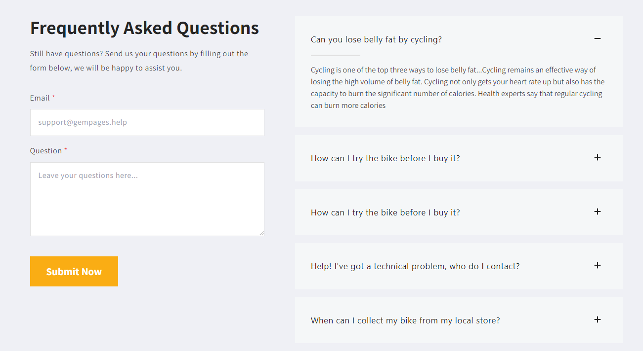
What Is an Accordion Element?
An accordion is a vertically stacked list of headers that visitors can click to expand or collapse. This allows customers to control what information they see, keeping your page organized and easy to navigate.
A commonly use case for accordion design is the FAQs page, where multiple questions are listed, and viewers can simply click on a question to reveal the answer they seek:
How to add the Accordion Element in GemPages
To add the Accordion element to your page, please follow the steps below:
Step 1: In the GemPages Dashboard, select your page to enter the Editor.
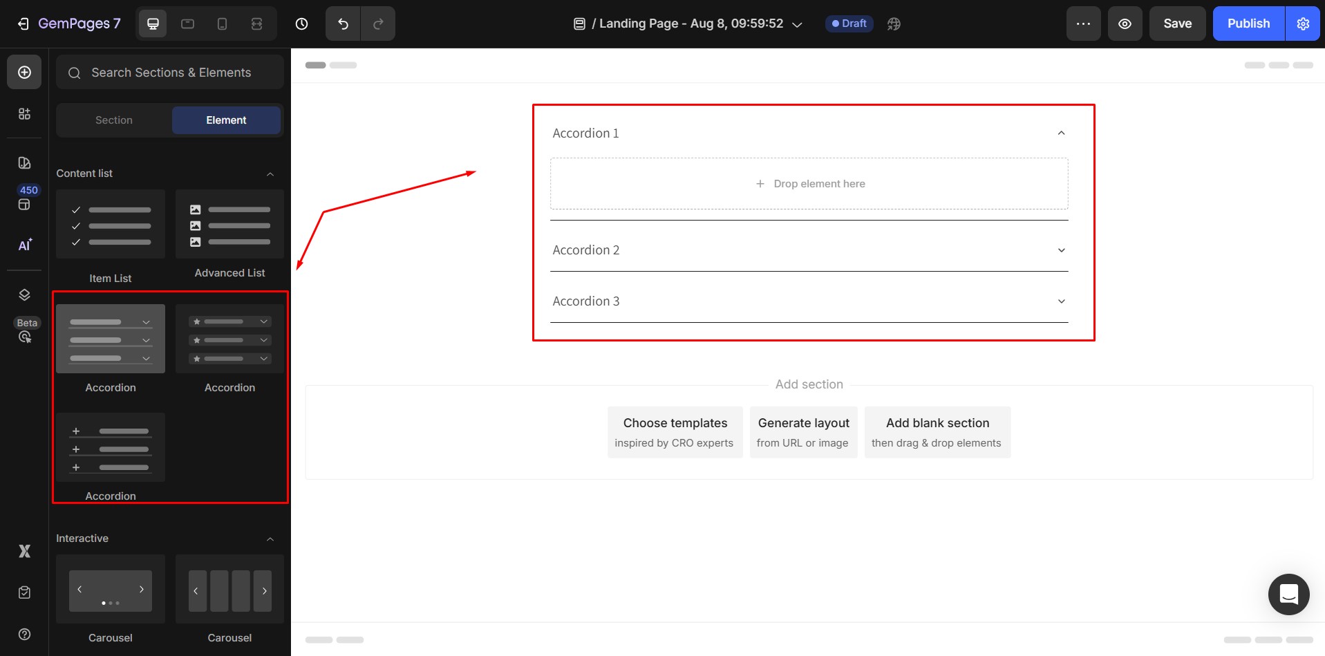
Once finished, the Accordion element’s configurations will be presented on the left sidebar:
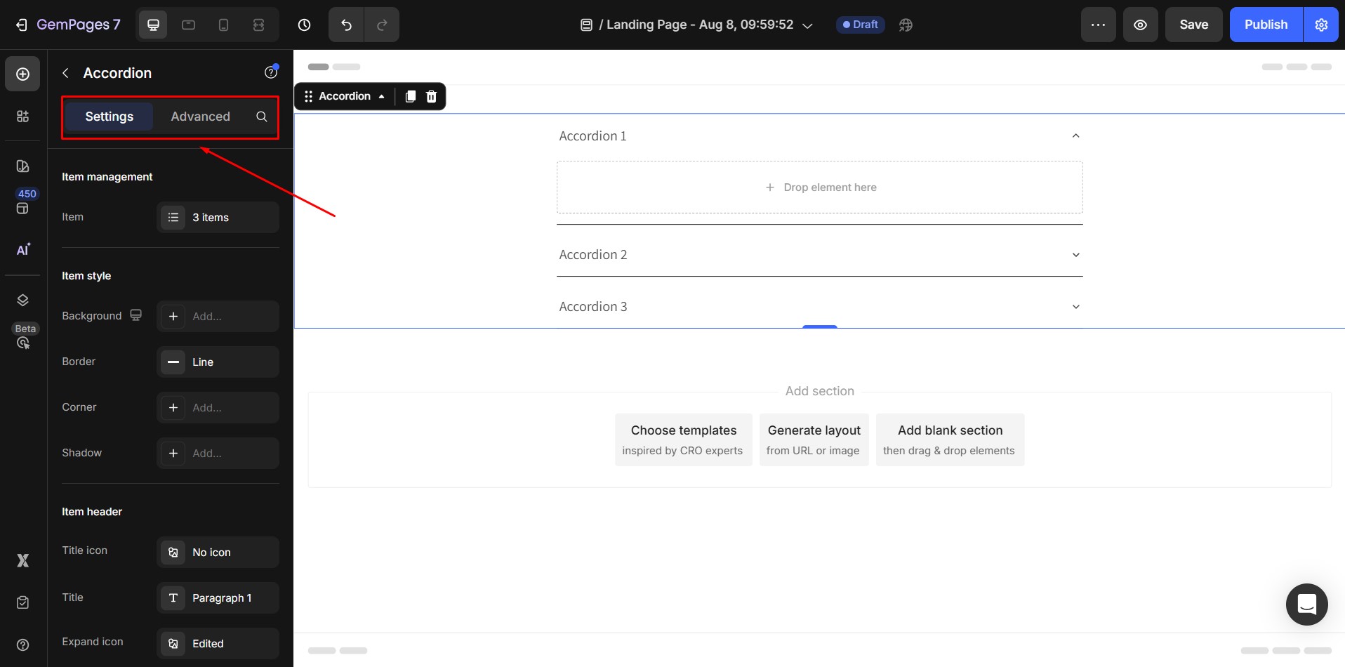
Configuring the Accordion Element
The Accordion element in GemPages is fully customizable. Settings are divided into two main tabs: Settings and Advanced.
1. The Setting Tab
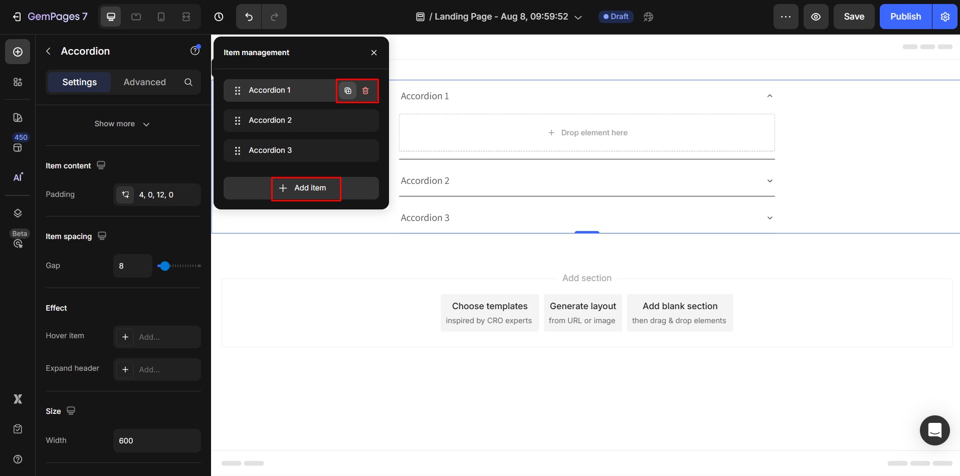
Item Management
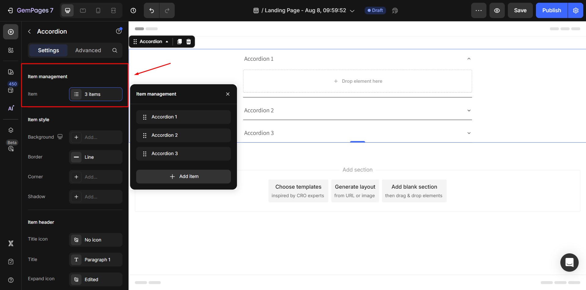
- To add an item: Simply click on the Add more option.
- To duplicate an item: Hover over the desired slide and click on the duplicate icon.
- To remove an item: Hover over the specific slide and click on the trash icon.
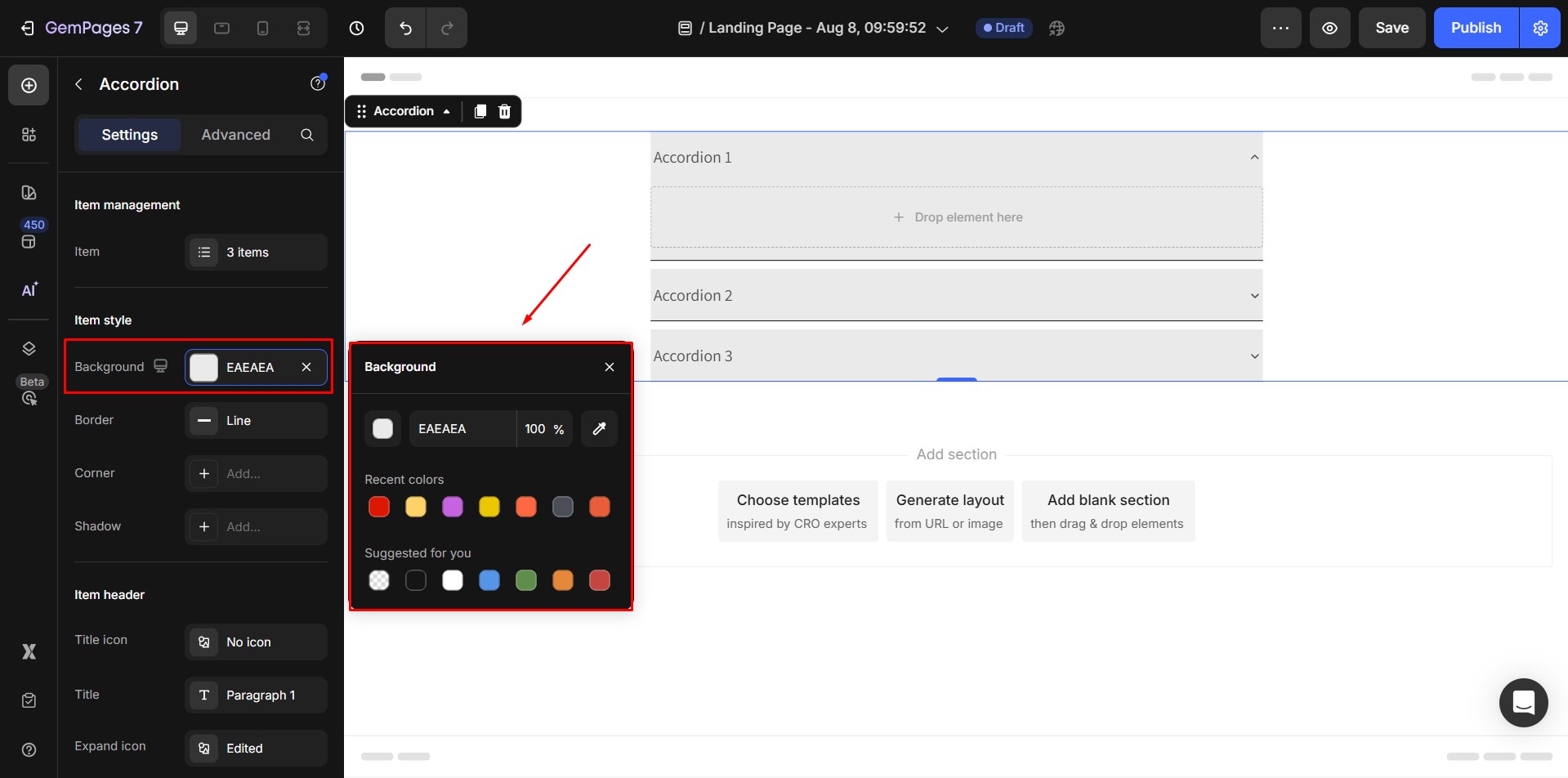
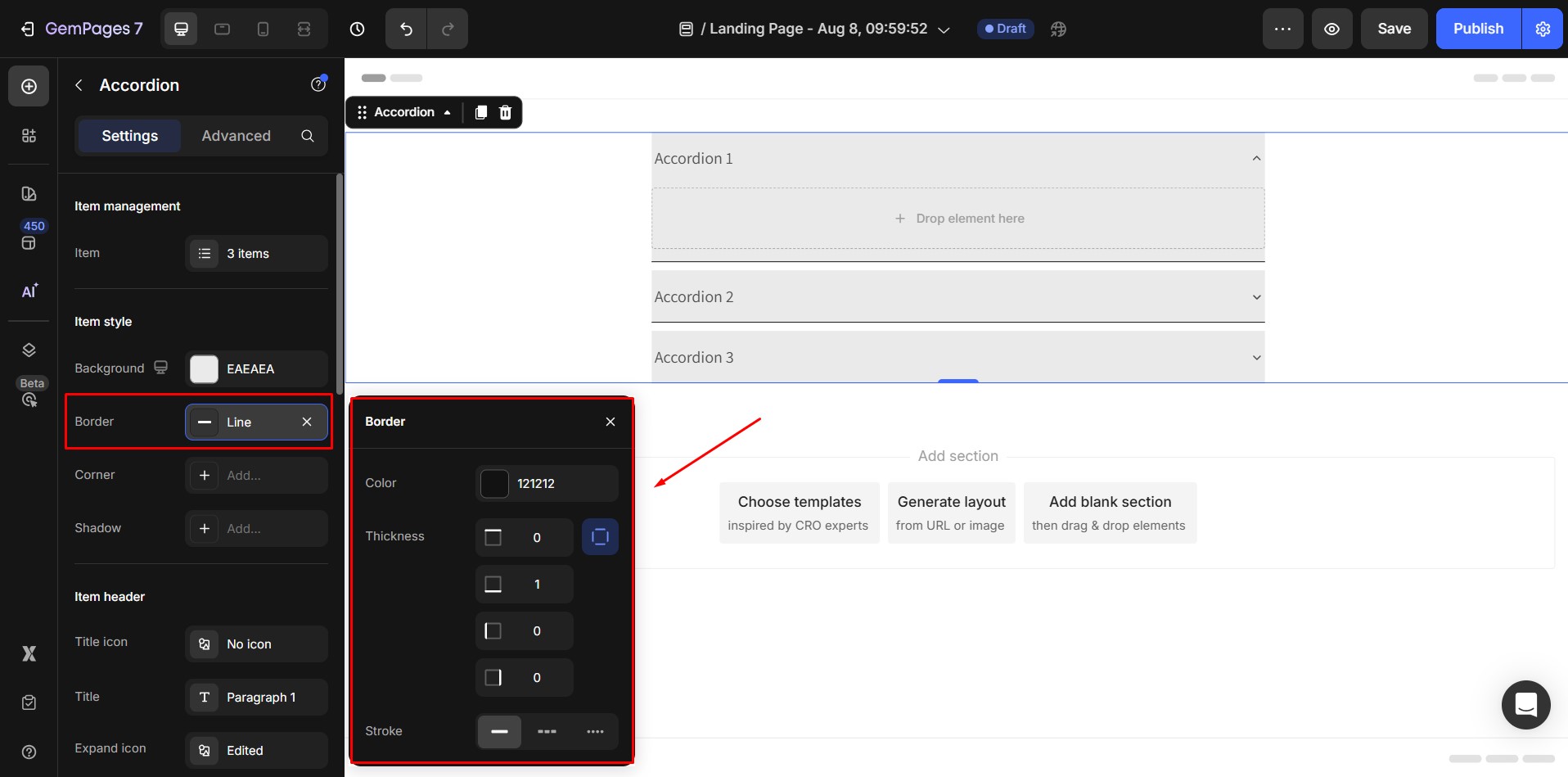
Item Style
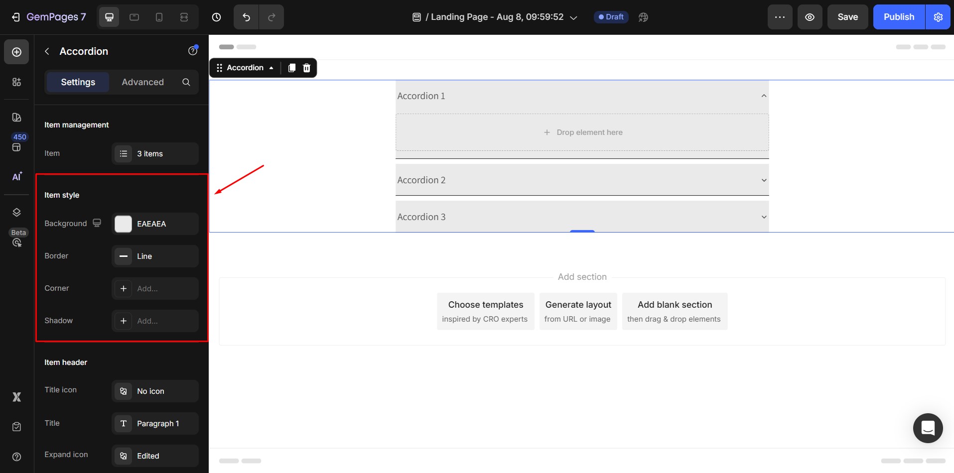
- Background: Background color for each item (including the collapsed and expanded state of item) in the Accordion.
- Border: Customize border color, thickness, and stroke.
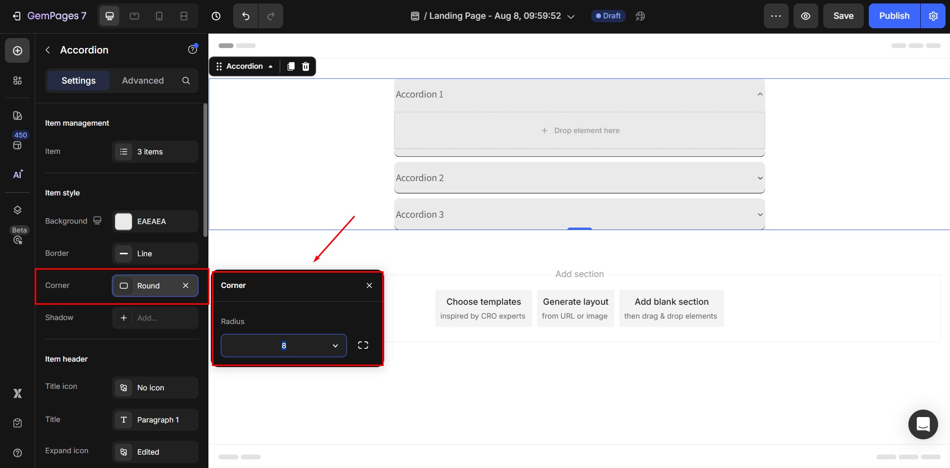
- Corner: Adjust the corner radius for rounded edges.
- Shadow: Add shadow effects for depth.

Item Header
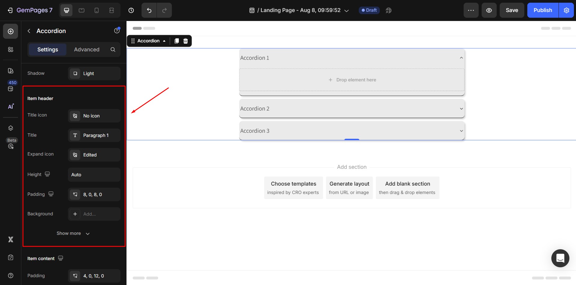
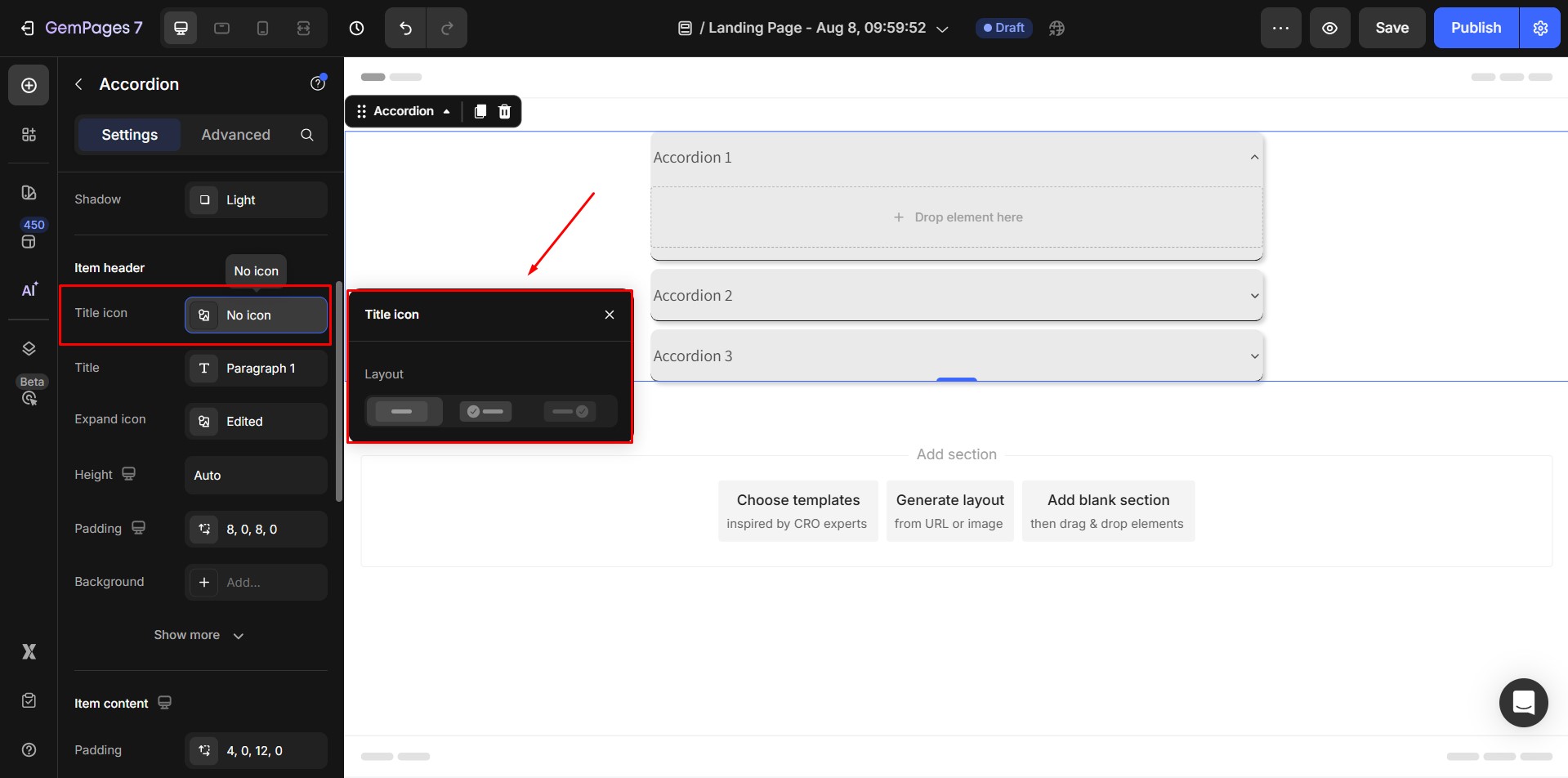
- Title icon: The settings of the Icon of Accordion header.
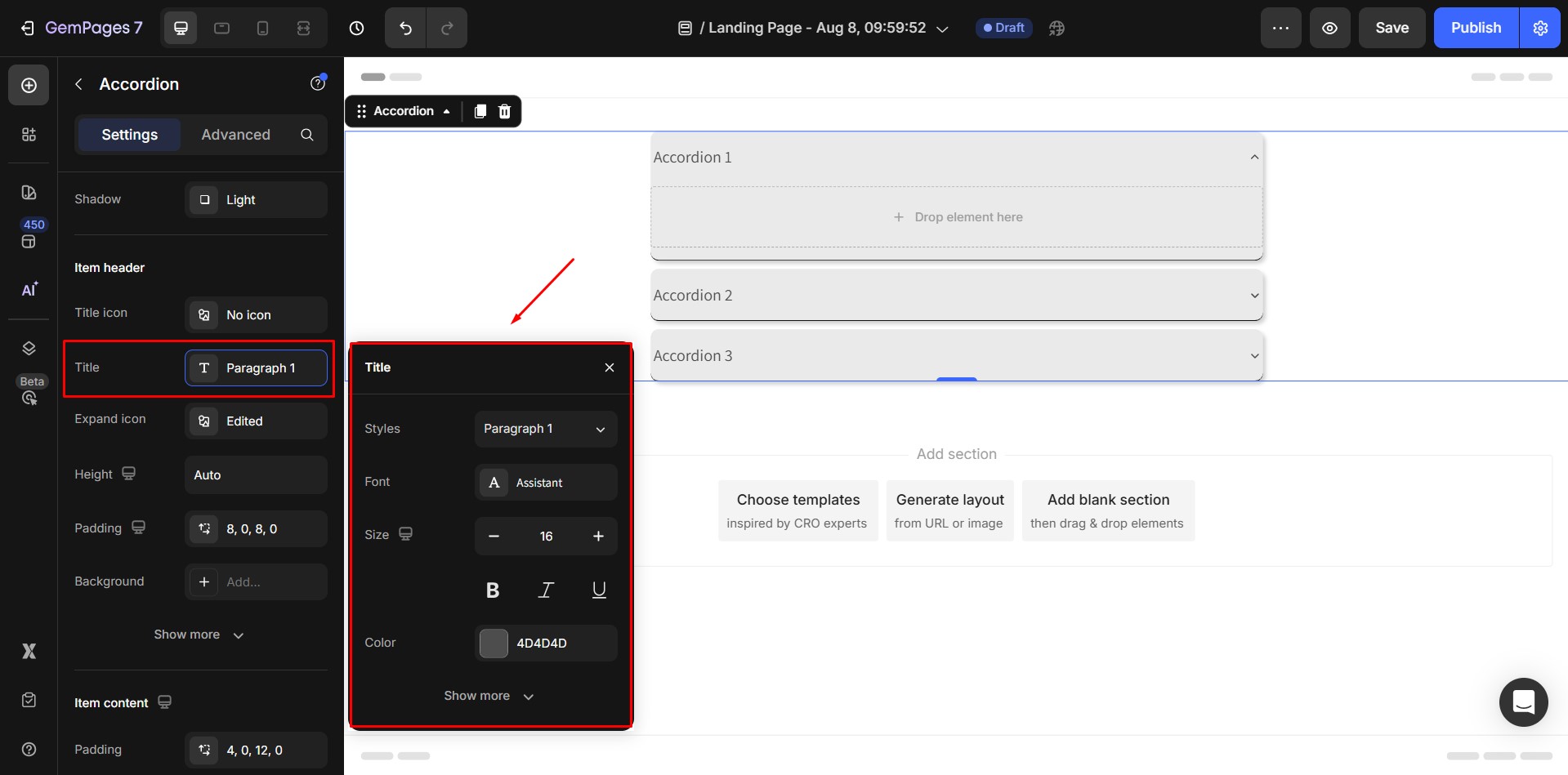
- Title: The text style of the header title.
- Expand icon: The settings for the expanded icon of each item in the Accordion.
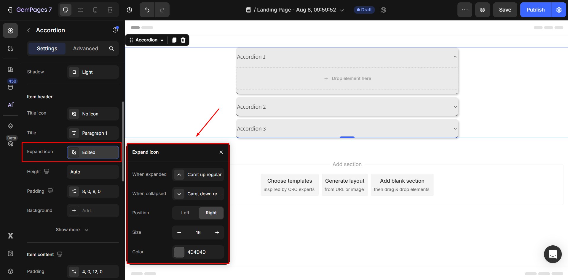
- Height: The height of the Accordion header. By default, its height is Auto, which means the height will automatically resize to fit the content inside the header.

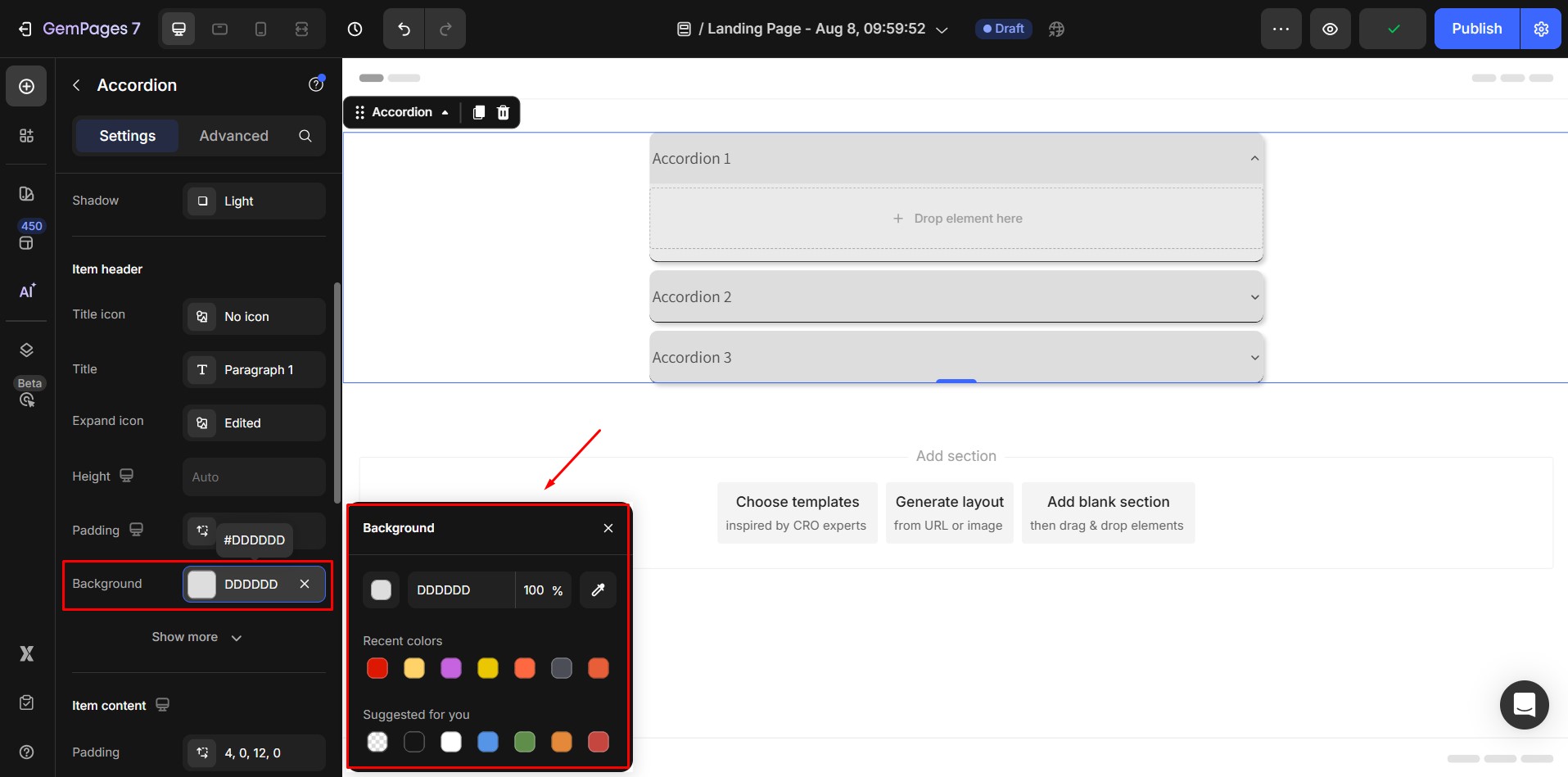
- Background: Change the header’s background color.
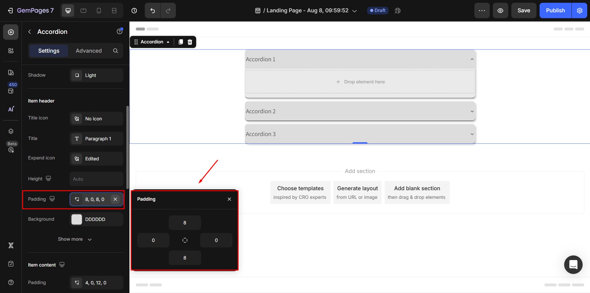
- Padding: The padding of the Accordion header, create the inner spacing from edge to content inside it.
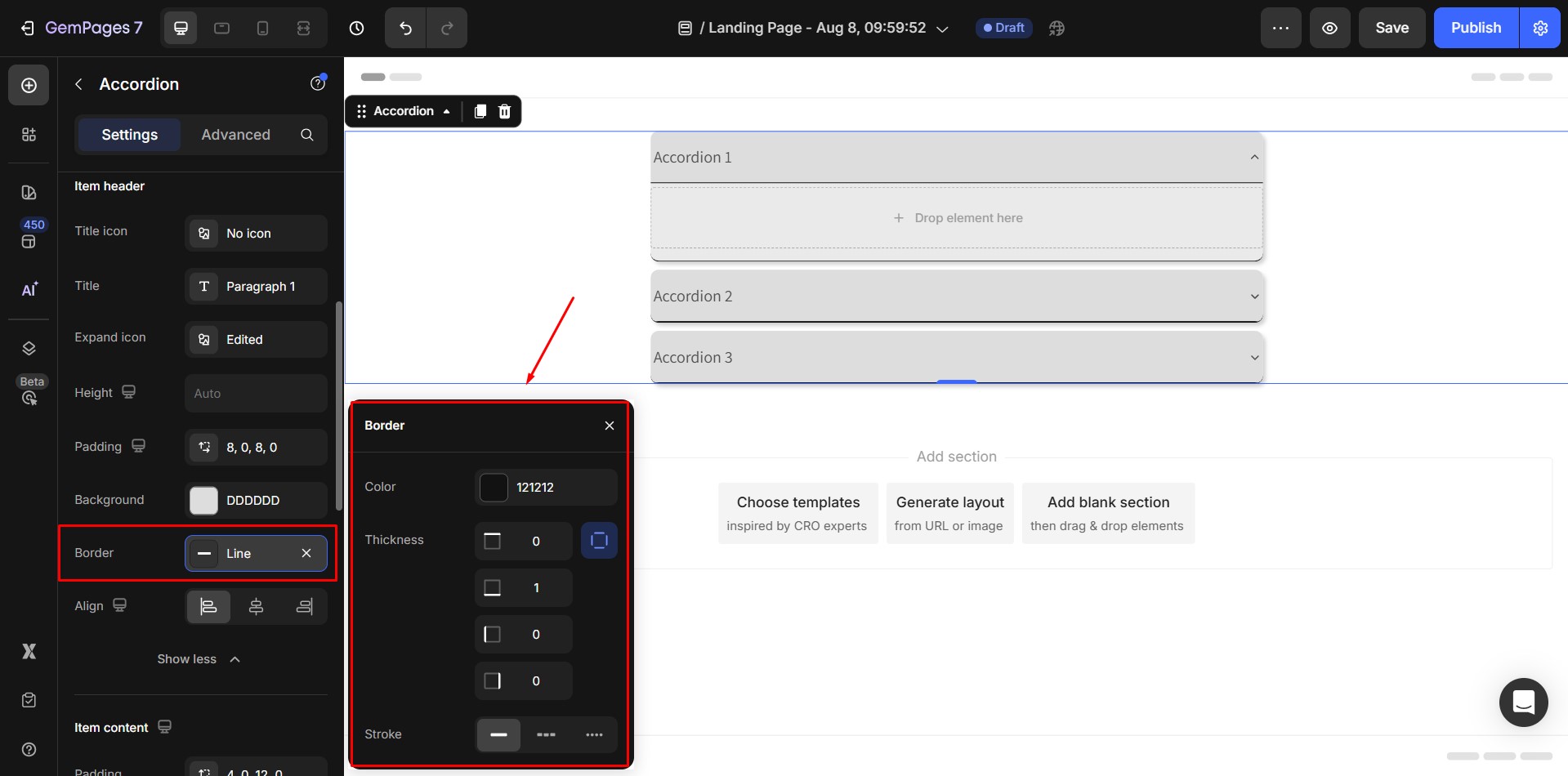
- Border: Customize header borders.
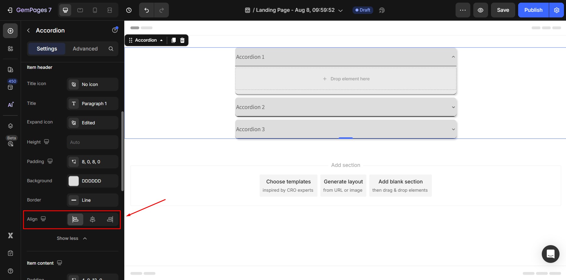
- Align: Alignment of the Header content (including the Header icon and title).
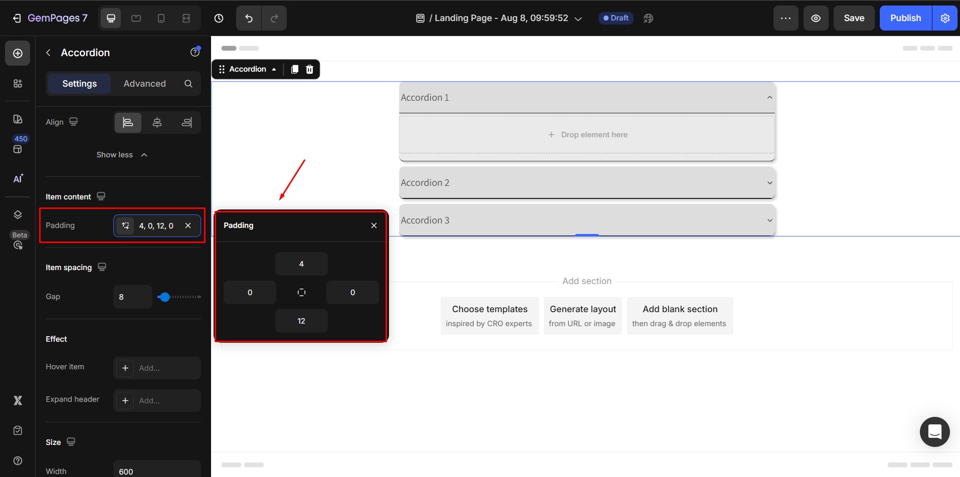
Item content
- Padding: The padding of the content area for each Accordion item
Item Spacing
- Gap: The spacing between each Accordion item. Default spacing = 16px

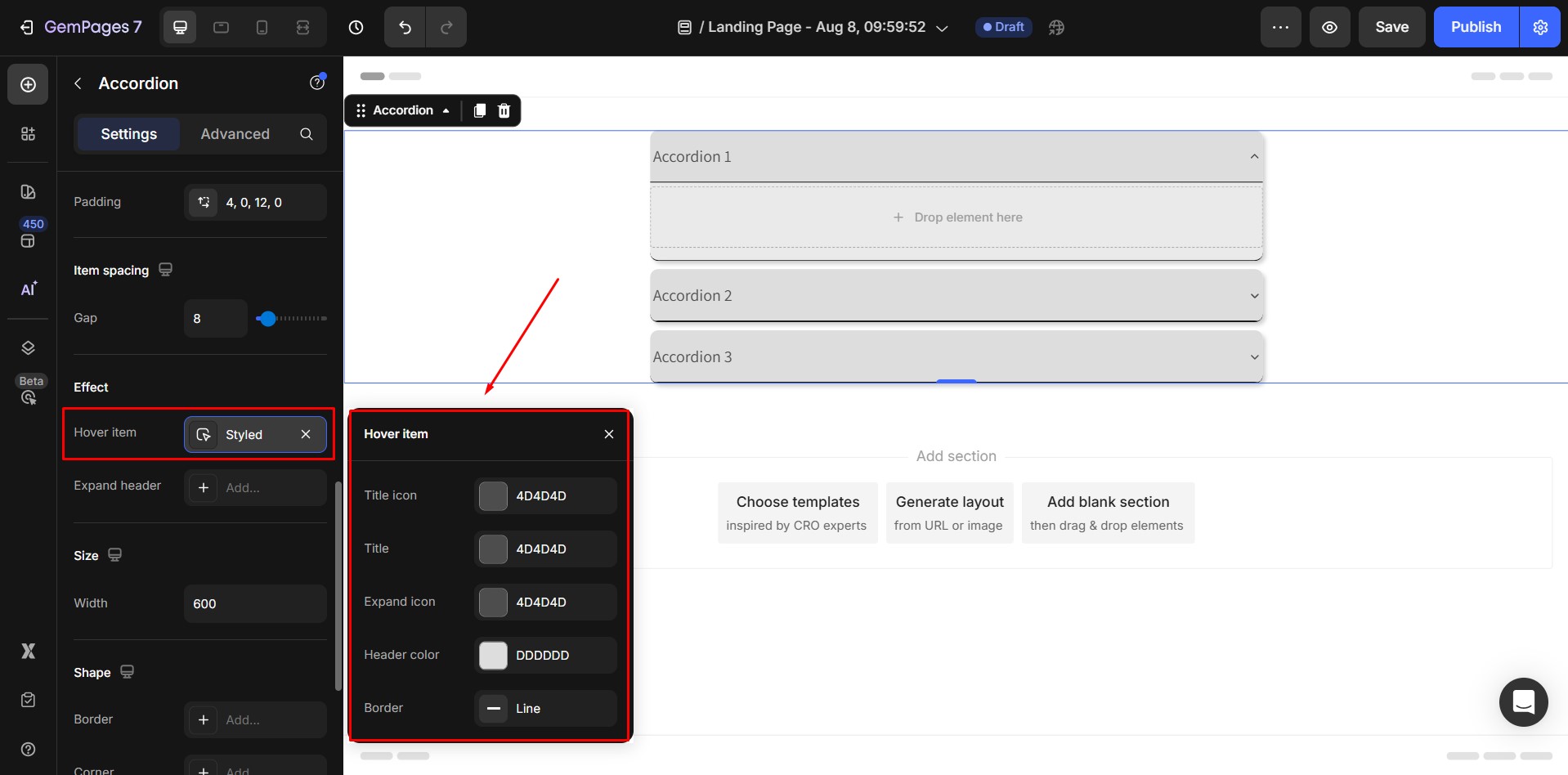
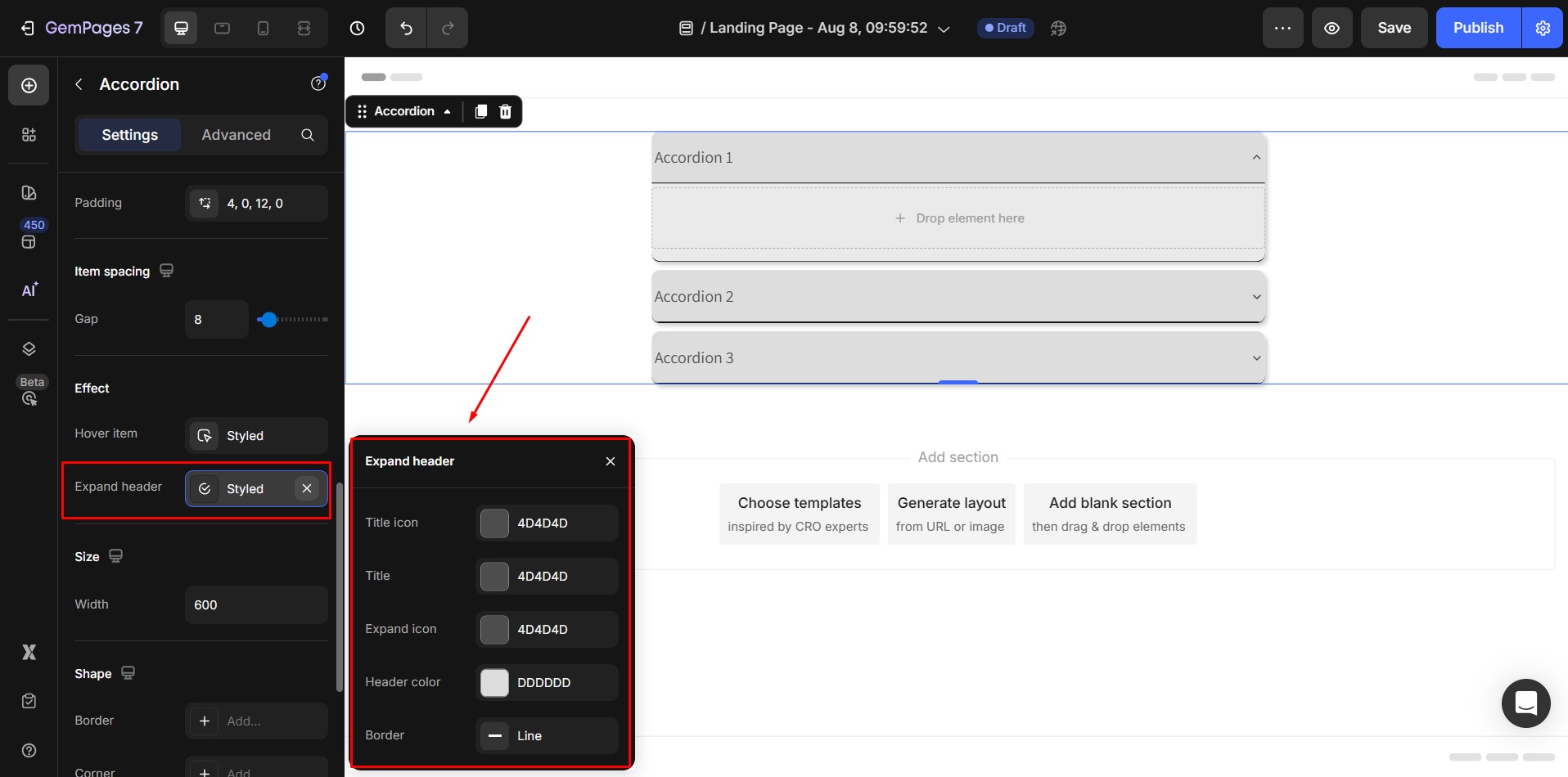
Effect
- Hover item: The settings for the Accordion header style when hovering on.
- Expand header: The settings for the Accordion header style when expanded. Clicking on the setting Expand will open its Popover which contains the Expand state’s settings.
Size
- Width: Size of actual content inside the Accordion element.

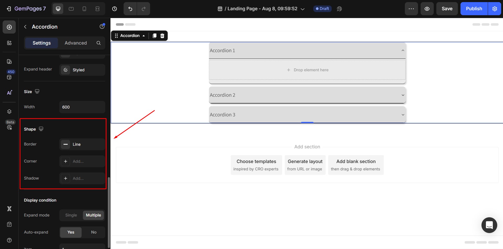
Shape
These Shape settings are for the wrapper of the Accordion.
- Border
- Corner
- Shadow
Display Condition

- Expand mode: Select the number of items a customer can simultaneously open.
- Single mode allows them to open only one item.
- Multiple option permits them to open more than one item at the same time.
- Auto expand: Set one of the accordion items to be initially open by default.
When this option is Yes, the setting of choosing default expanded item will appear. Select the item is expanded by default. If there are multiple items open by default, separate them with a comma.
Align
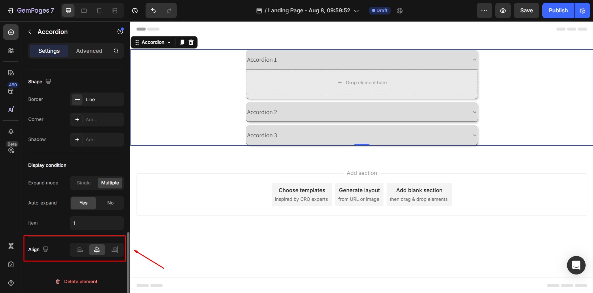
- Alignment will be disabled when Width of the element is 100%.
- If not, default alignment options is align Center.
2. The Advanced Tab
For more advanced customization, please navigate to the Advanced tab and follow the instructions in this article.


Thank you for your comments