


What is Responsive Design in GemPages?
In GemPages V7, the Responsive Design feature allows you to create and optimize pages for various screen sizes, which means you can customize designs for each device, including desktop, tablet, and mobile views.
Some design settings like Font Size, Line Height, and Padding are responsive by default. But if you want full control (for example, a larger heading on desktop and a smaller one on mobile), you’ll need a manual workaround.
How to Set Different Text Size for Different Device
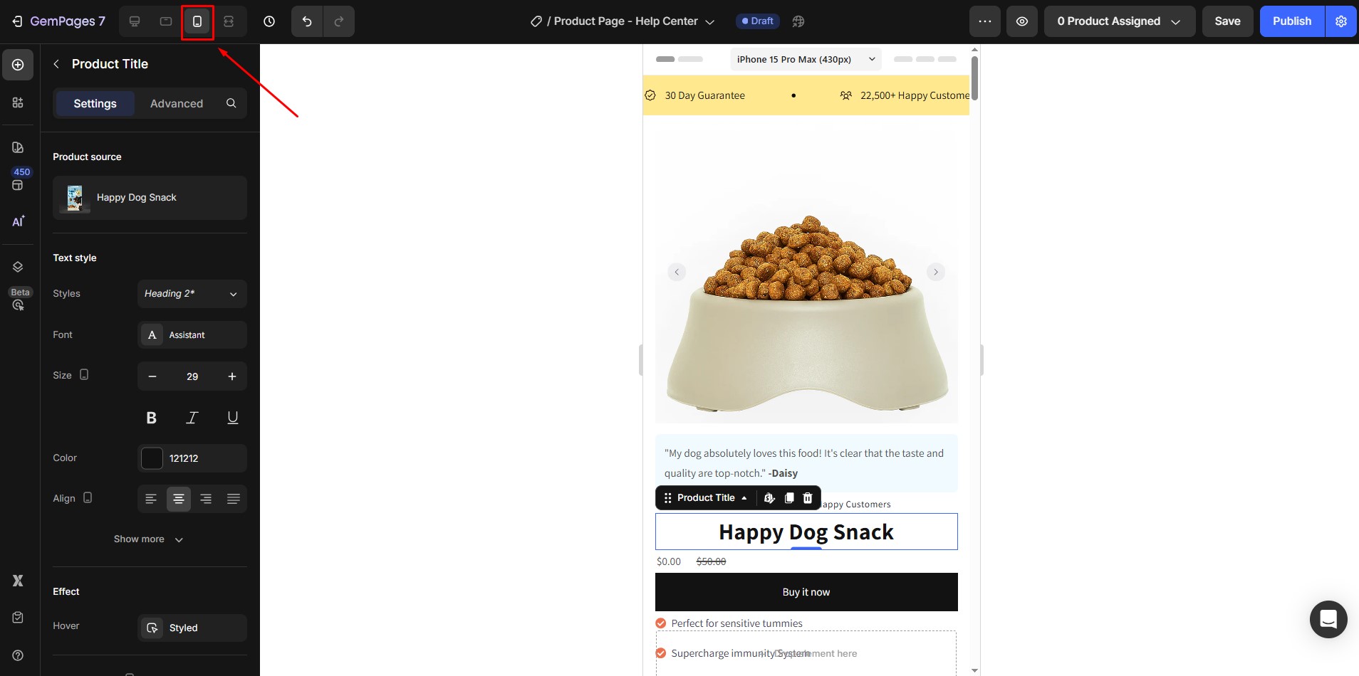
Step 1: In the top toolbar of the GemPages editor, click the mobile icon. This lets you preview and design your page specifically for mobile.
Step 2: Right-click the section or text element you want to customize. Choose “Duplicate.”
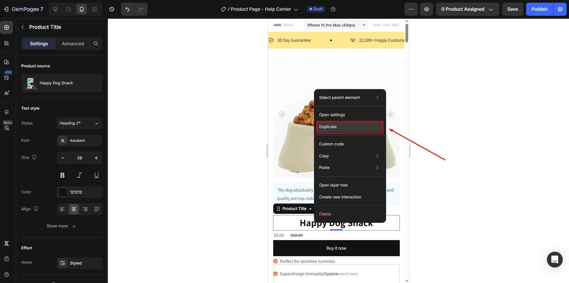
- The original text element will be used for mobile (let’s call it Section A).
- The duplicated text element will be used for desktop (Section B).
You can now set different font sizes, spacing, and even text content for each text element. For example, 24px for mobile, 36px for desktop:

Step 3: Set Visibility for Each Device
- Select Section A, open the Visibility settings, and hide it on desktop.

- Select Section B, and hide it on mobile.
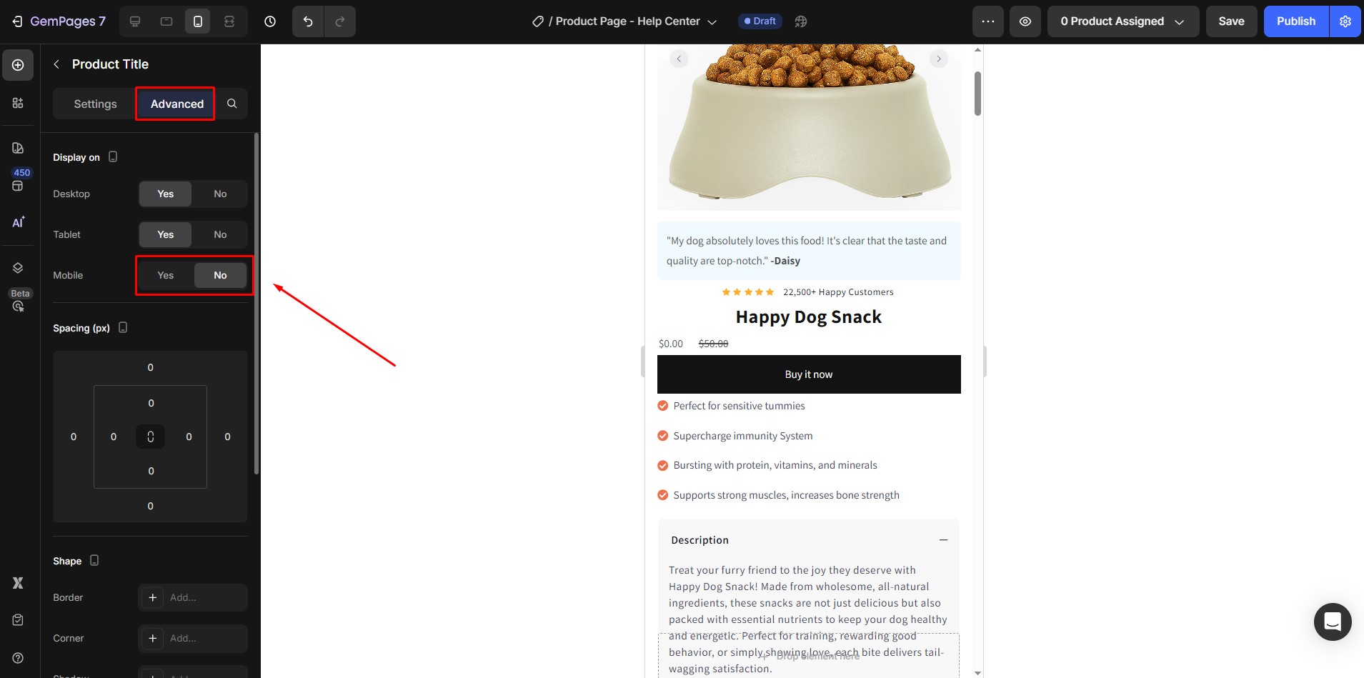
Now each section will only be shown on its respective device.


Thank you for your comments