


In this guide, you’ll learn what a tab element is, how it works in GemPages Editor v7, and how to customize it to match your store’s design.
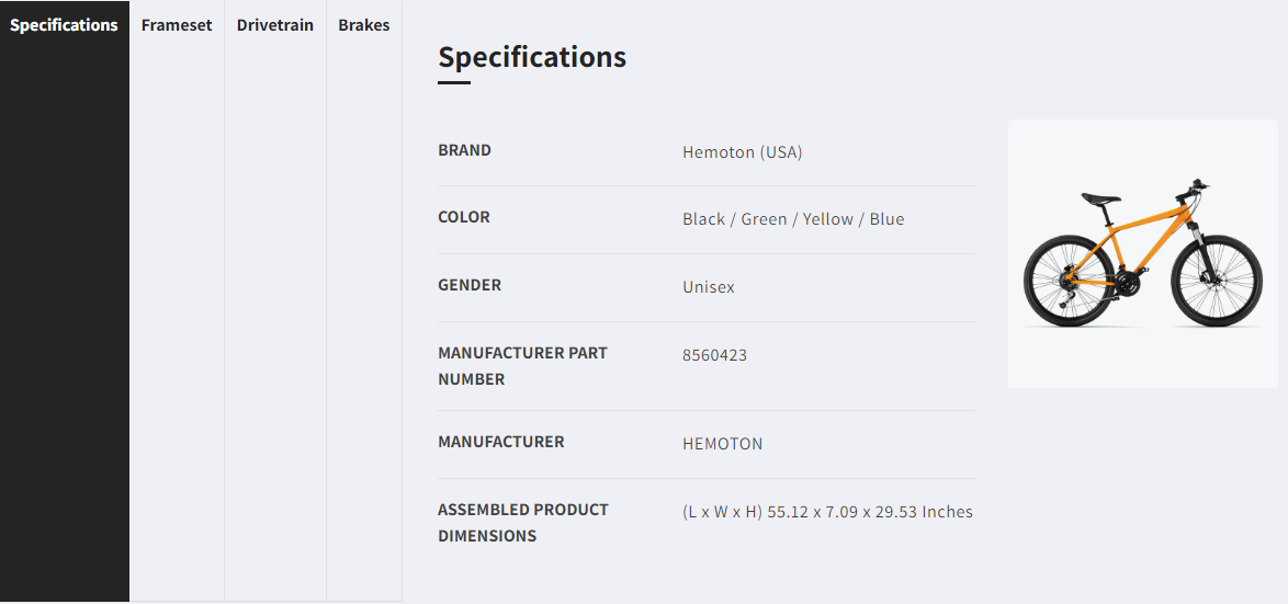
What Is the Tab Element?
Tabs on websites were inspired by the physical tabs of paper file folders. They let you display different sections of content in a compact, easy-to-navigate format.
With the GemPages Tab element, you can:
- Present content in an organized, space-saving layout.
- Allow users to switch between content without leaving the section.
- Keep your page clean and visually appealing.
How to Add the Tab Element in GemPages
Follow these steps to insert the Tab element into your page:
Step 1: From the GemPages Dashboard, open a template to edit. You can quickly find the Tab element on the left sidebar of the Editor, under the Interactive section. Drag & drop the element to any position you prefer.
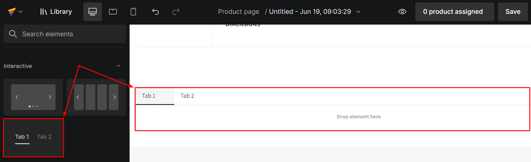
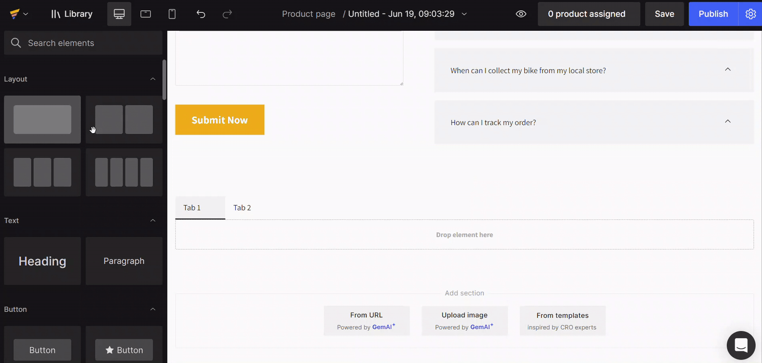
Step 2: Drop the other elements such as Heading, Text block, Image, etc. inside the tab to create the content layout you wish.
Clicking on the Tab element, the configuration will be available on the left sidebar, which will be covered in the following sections.
Configure the Tab Element Setting
Once the Tab element is on your page, its configuration options will appear in the left sidebar.
1. The Setting Tab
Layout
- Controls the position of tabs relative to the content.
- Default: Tabs on the left of the content.
Layout options:
- Tabs above the content
- Tabs to the left of the content
- Tabs to the right of the content
Selecting a layout opens the Layout popover for easy changes.
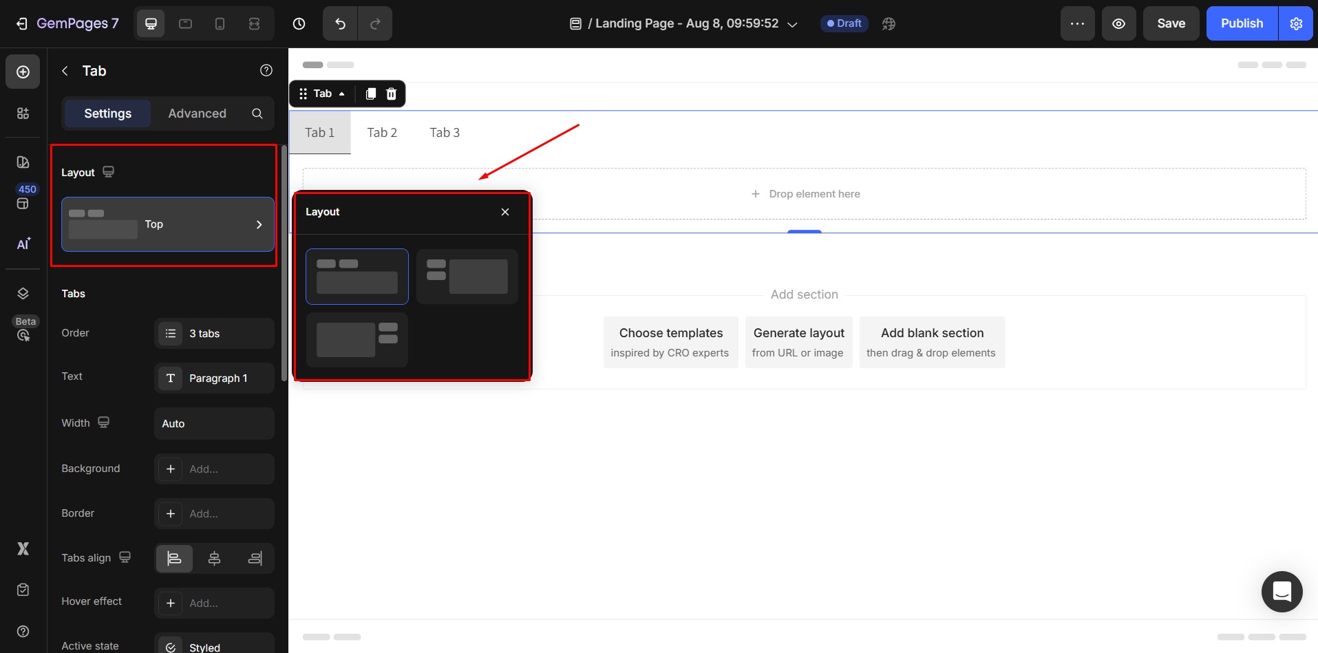
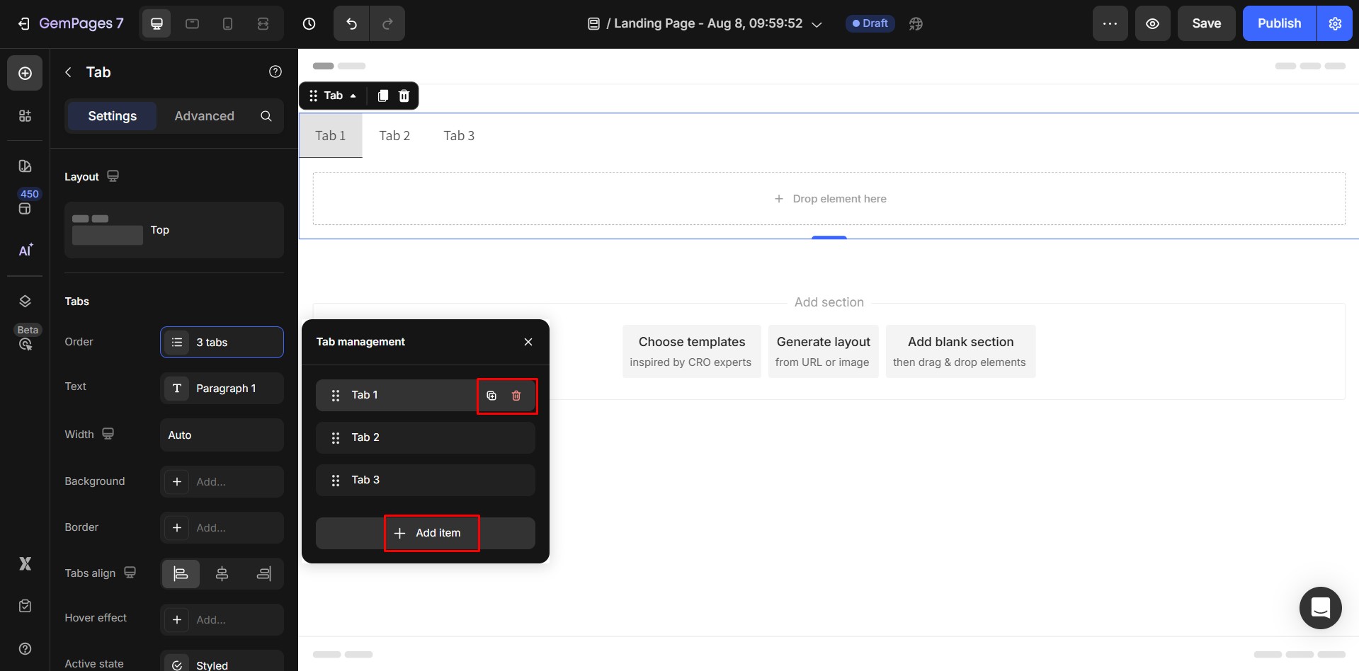
Tabs
1. Order: Default the element has 3 tab items. The tab title in the popover reflects the tab’s content in the Design area.

- To add an additional tab: Simply click on the “Add more” option.
- To duplicate a tab: Hover over the desired slide and click on the duplicate icon.
- To remove a tab: Hover over the specific slide and click on the trash icon.
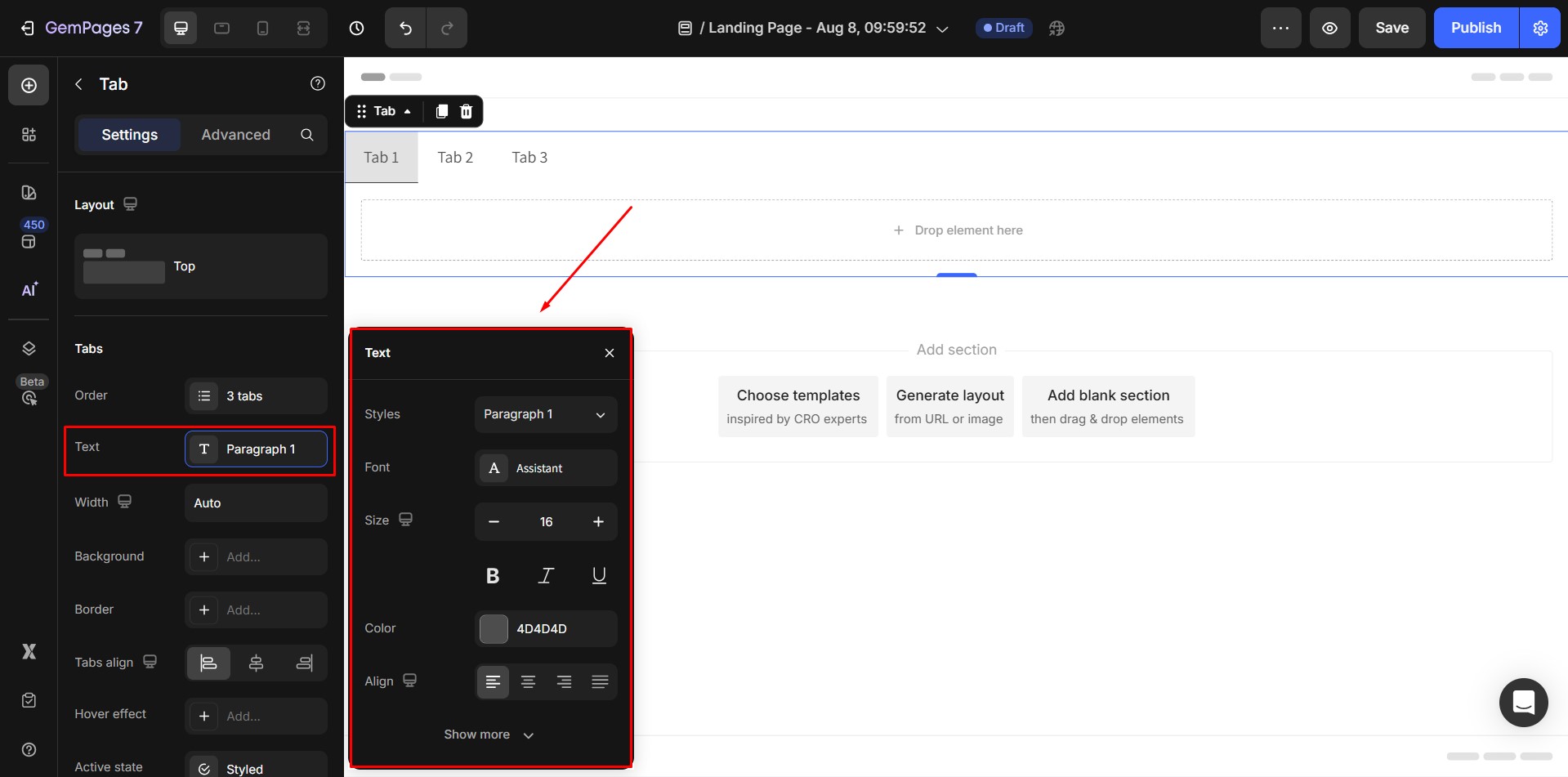
2. Text: The text style of each tab content.
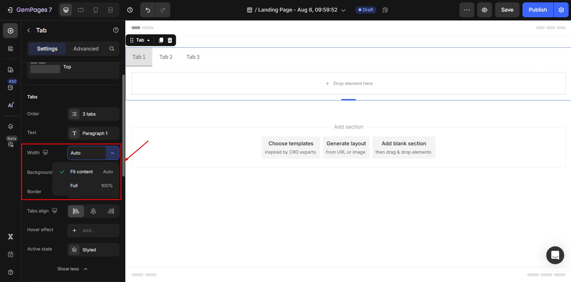
3. Width: The width of each tab item. The default width value is Auto, which means the tab width will automatically resize itself to match size of the content inside.
Width options: when click on dropdown button of Width input field, a dropdown menu including width options will appear:
- Auto means Width will fit to content
- Full means Width = 100% (full width) -> The width of each tab will be fill with the element
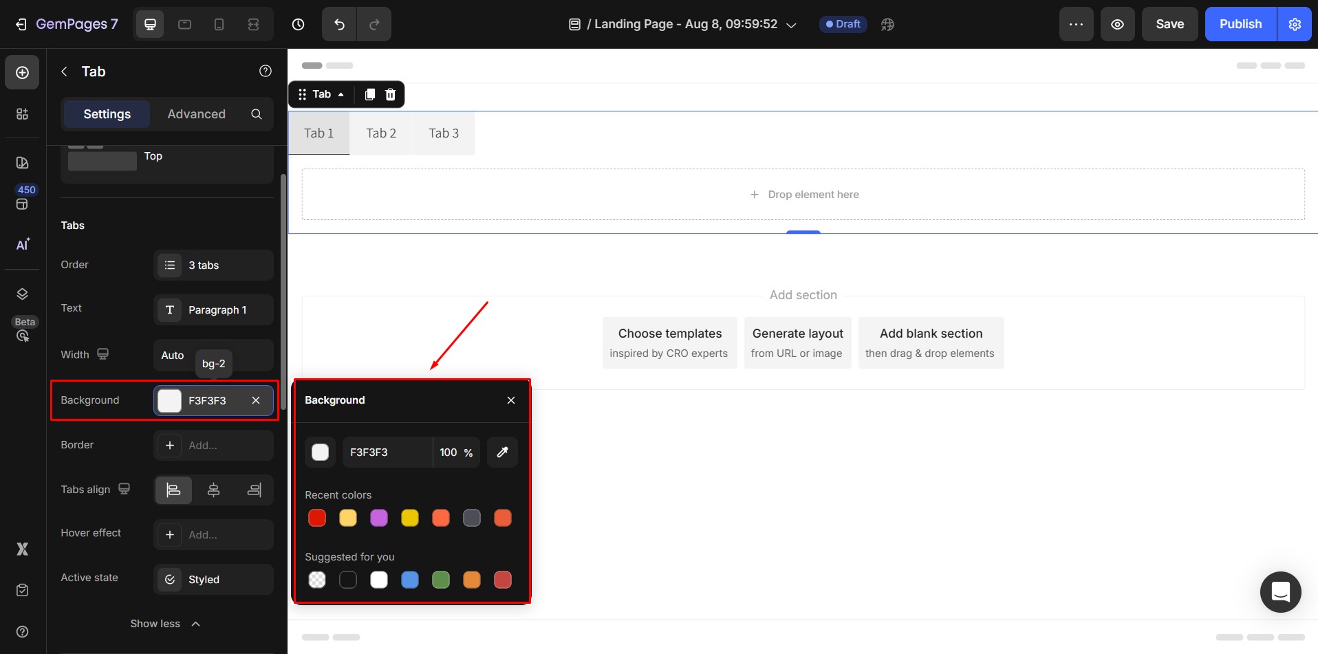
4. Background: Set background color for each tab.
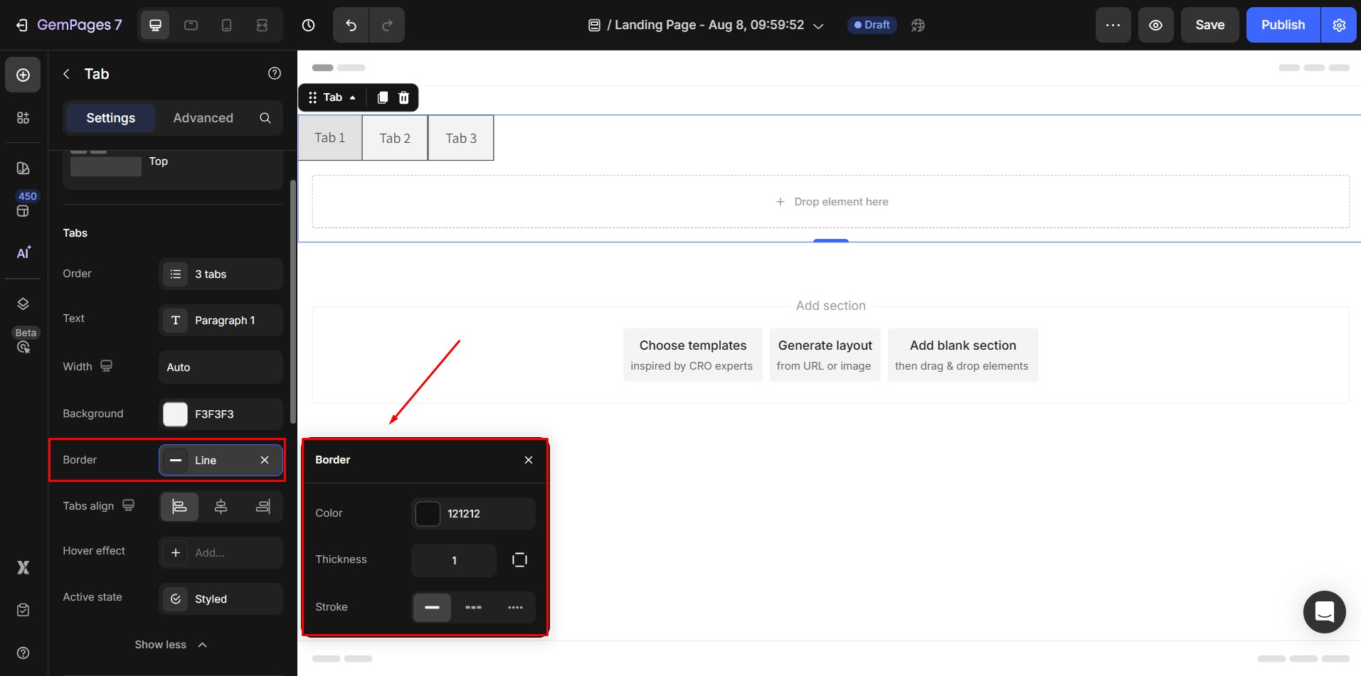
5. Border: Customize border style.
6. Tabs align: The alignment of all tab items inside the Tab element.
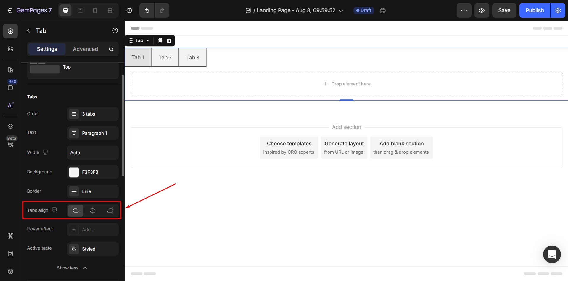
- Layout Top → Horizontal alignment.
- Layout Left/Right → Vertical alignment.
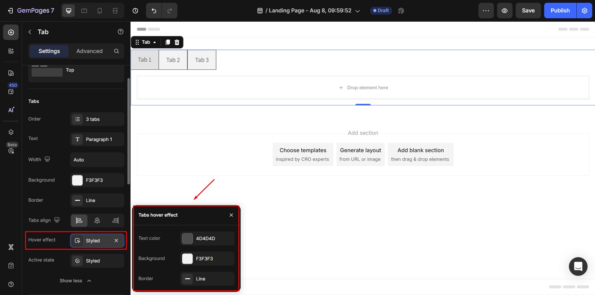
7. Hover effects: The settings for each tab when hovering on.
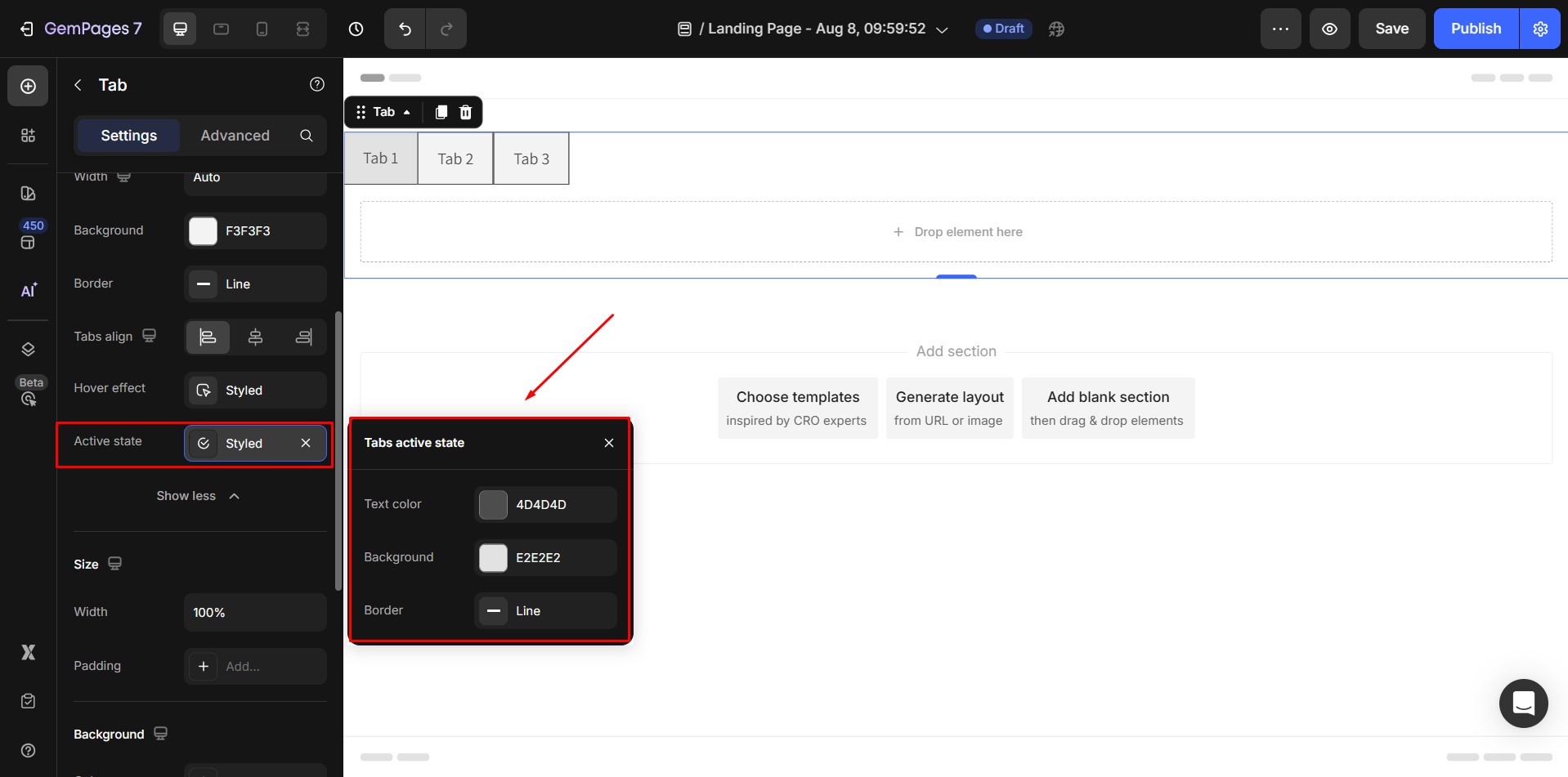
8. Active state: The settings for each tab when active.
Size
1. Width
Width = 1200px: when a Tab is placed to create a new Section or inside a Section 1 column
Width = 100% (full width) :when a Tab is placed inside other elements
Width options: when click on dropdown button of Width input field, a dropdown menu including width options will appear below:
- Default means Width = 1200px
- Full means Width = 100% (full width)

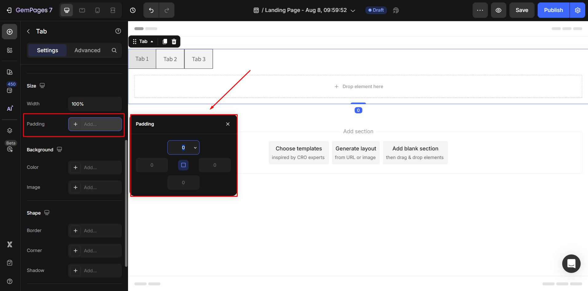
2. Padding
- Padding of the element.
- Adding the padding will increase the spacing between the element edge with the actual size of element.
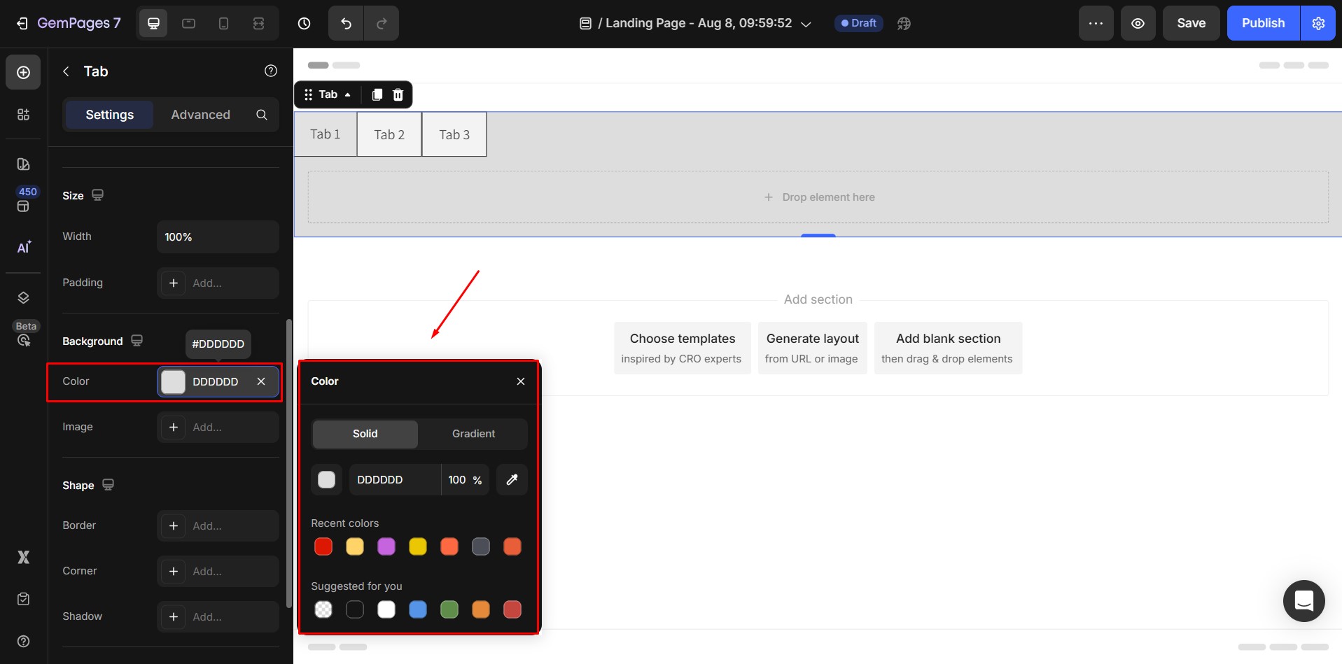
Background
1. Color
Clicking on the Input combo will open Color picker and add a default color #DDDDDD.
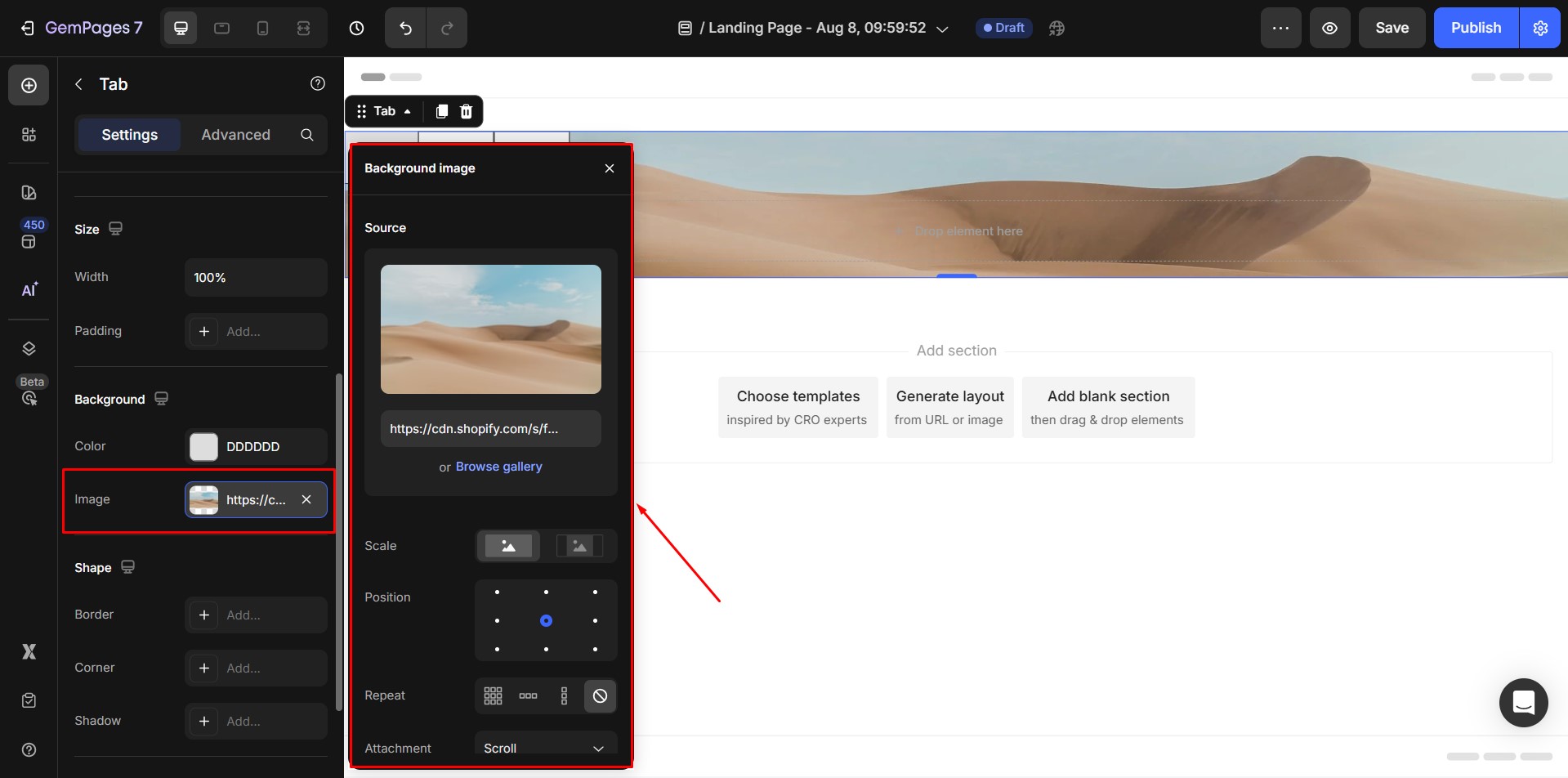
2. Image
Clicking on the Input combo will open Image picker and add a default image.
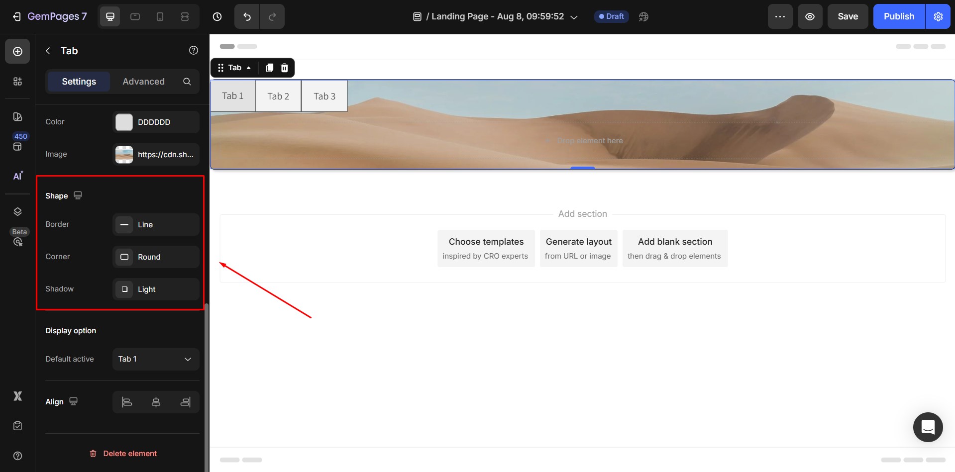
Shape
These Shape settings are for the wrapper of the Accordion.
- Border
- Corner
- Shadow
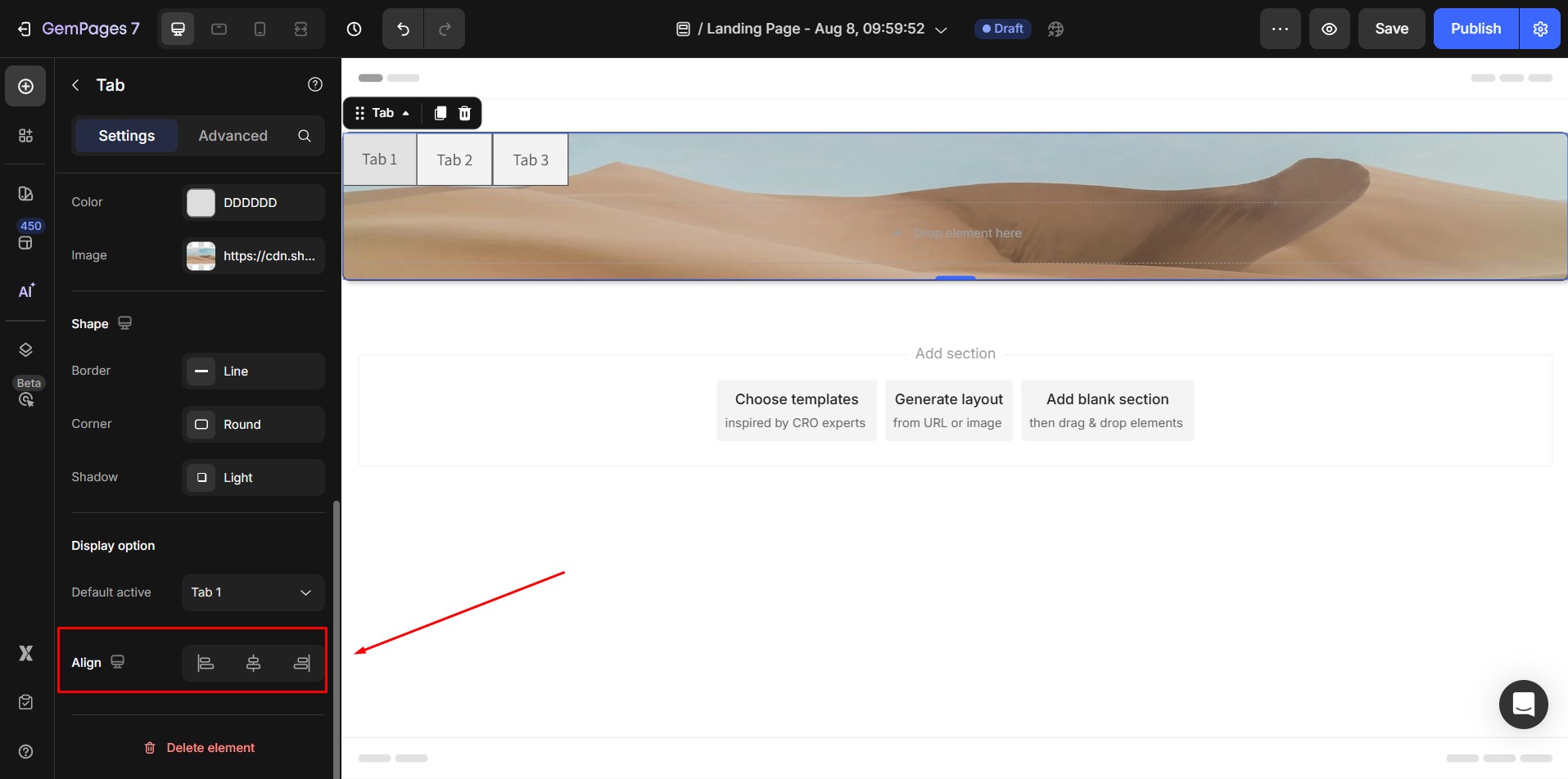
Display option
- Defaut active: Set one of the tab items to be initially selected by default.

Align
- Alignment will be disabled when Width of the element is 100%.
- If not, default alignment options is aligned Center.
2. The Advanced Tab
For more advanced customization, please navigate to the Advanced tab and follow the instructions in this article.


Thank you for your comments