


About the Submit Button Element
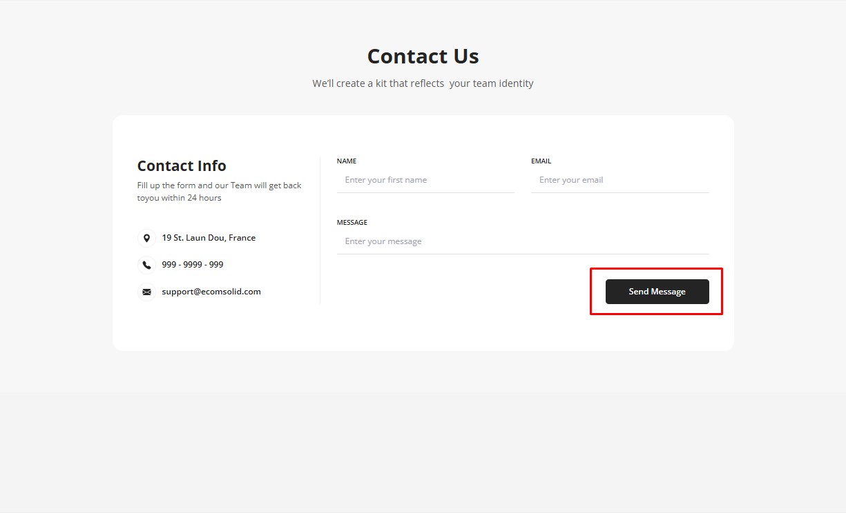
The Submit Button is a key element used exclusively within contact forms to allow visitors to submit their information or responses.
The submit button is specifically designed to send and submit form data. It cannot function as a button for redirecting to another link or as an Add to Cart Button.
How to Add a Submit Button Element to Your Page?
To add the Submit Button to your page, follow these steps:
Step 1: Access the GemPages Dashboard > Pages, then click on the target page to locate the editor.
Step 2: From the left sidebar, search for “submit button”, then drag & drop it into a Newsletter or a Contact Form element.
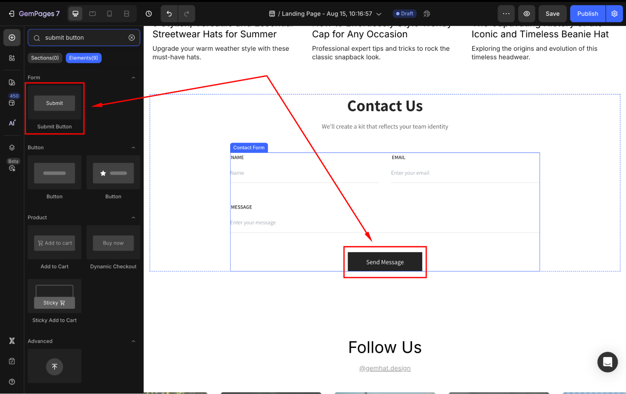
If you do not have any of them yet, add one on your page first, then nest the Submit Button inside.
Step 3: Click on the element to open its settings for further customization.
Configure the Settings tab
Under the Settings tab, you can adjust the following sections:
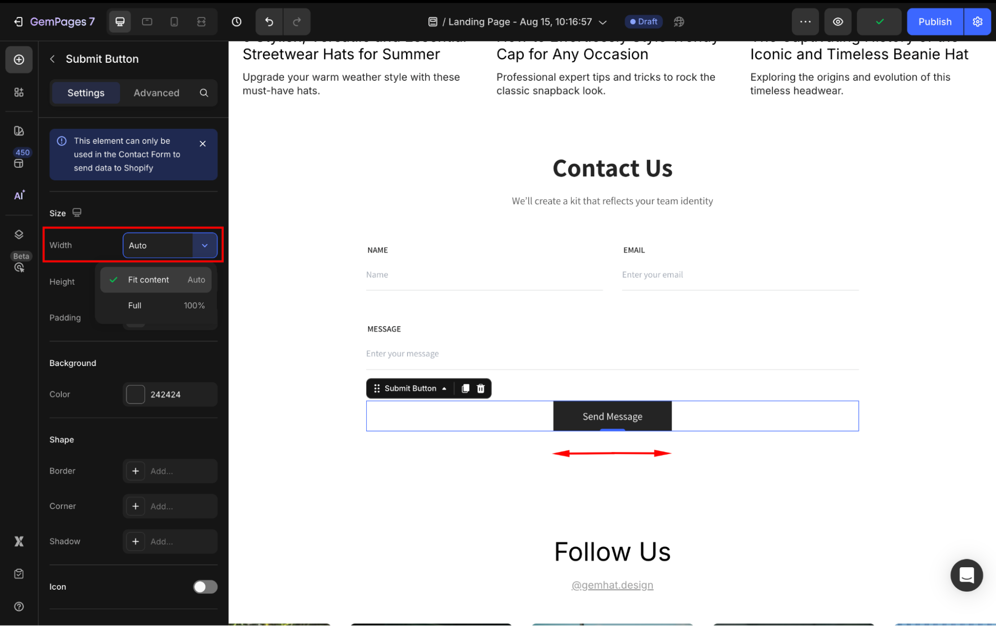
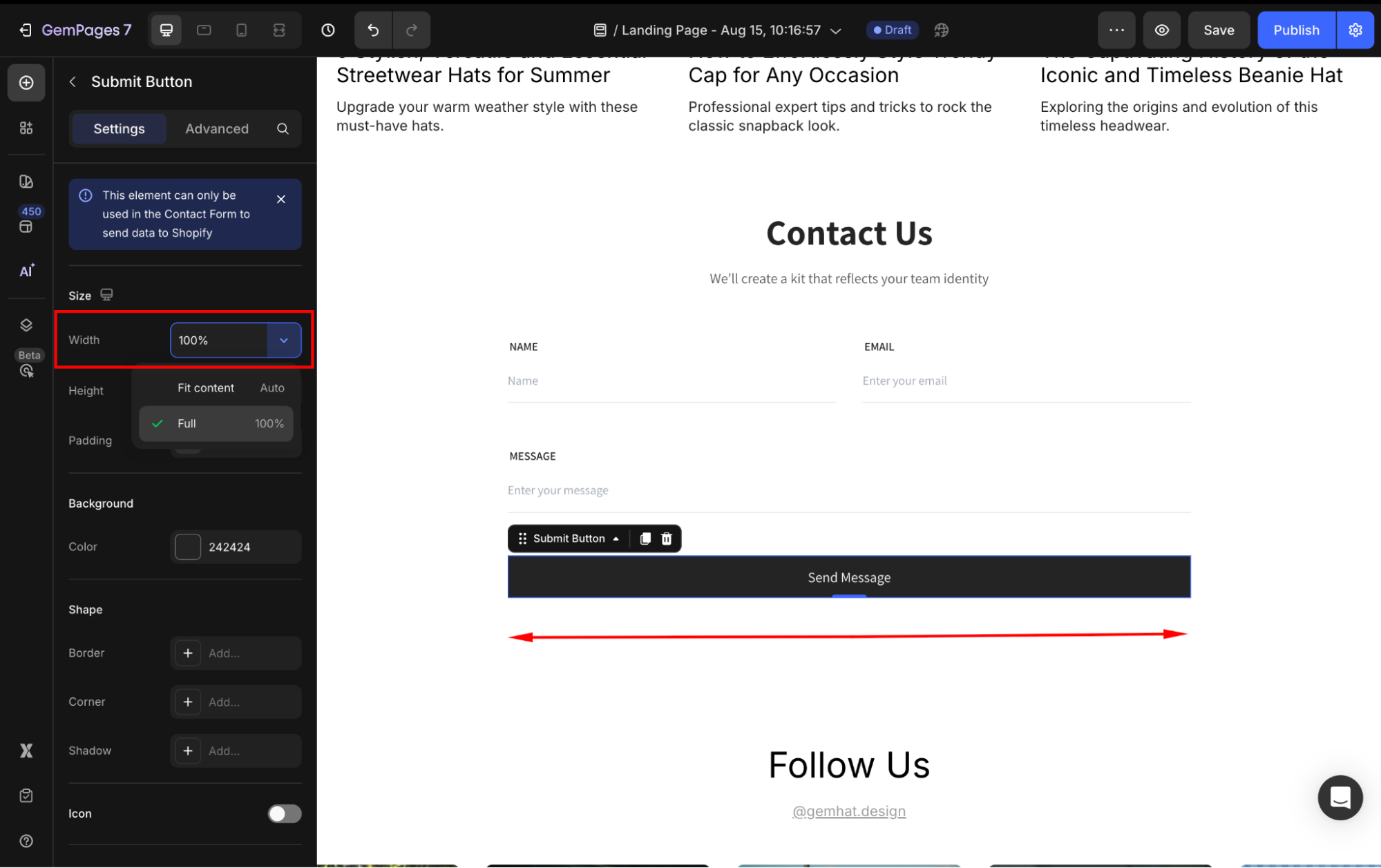
Size
Width: Choose how the button scales horizontally:
- Fit content (Auto): The button will adjust to the size of its content (text and icon).
- Full (100px): The button will expand to fill the full width of its container.
- Custom width: If you prefer other values, enter a specific number in the box (in %) to adjust the button’s width your way.
Height: Set the height to Fit Content (Auto) or a fixed pixel value.
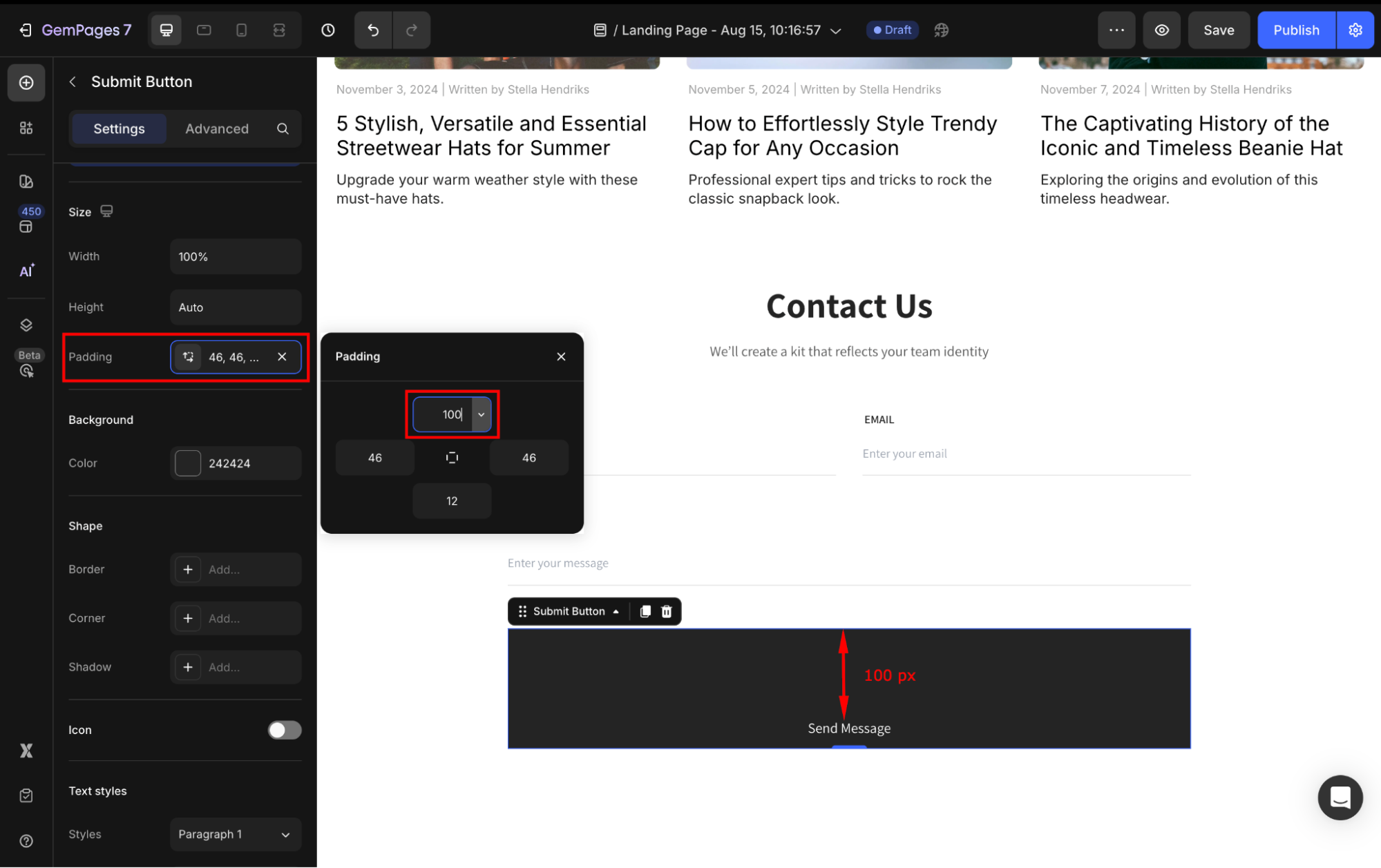
Padding: Define internal spacing inside the button.
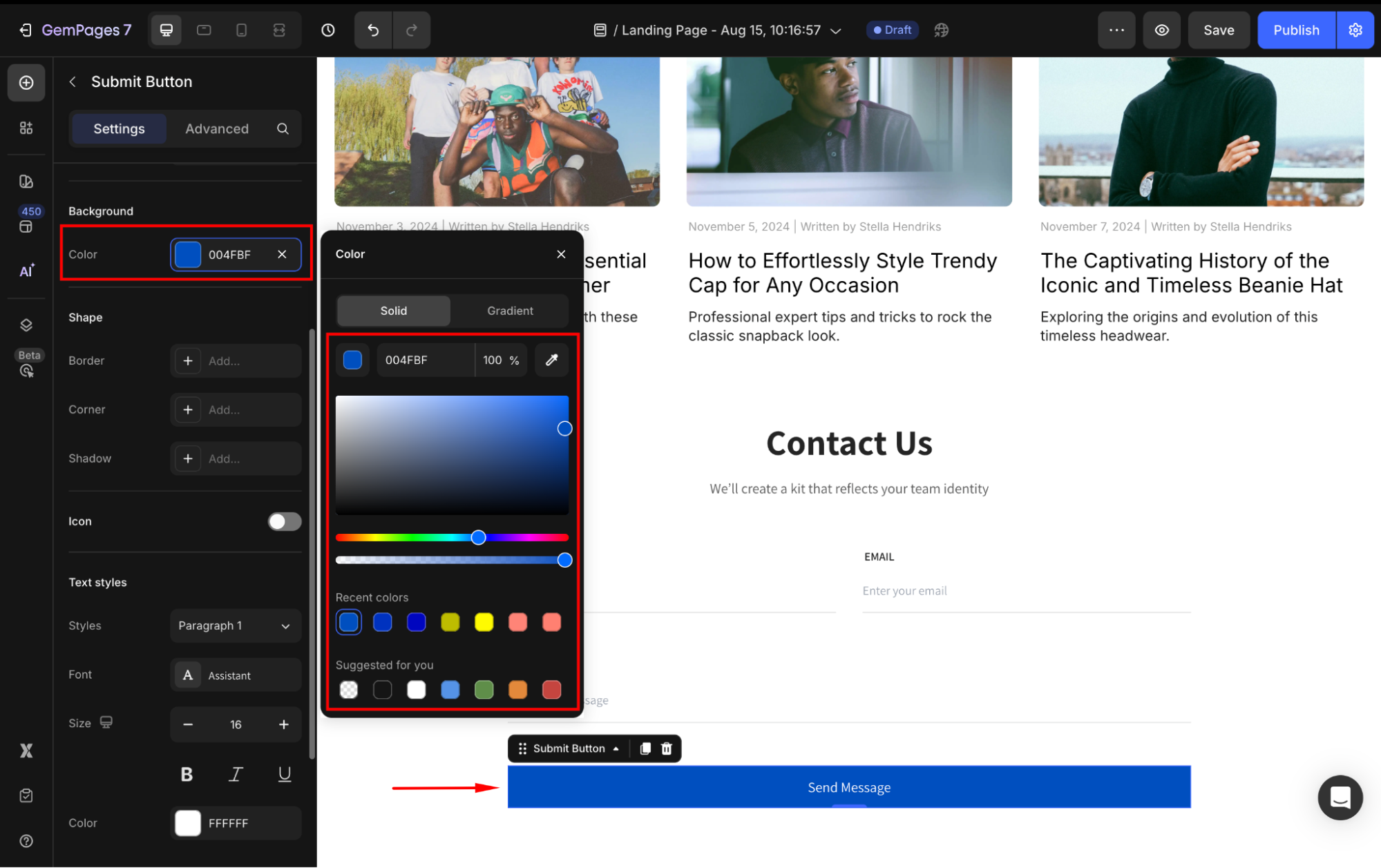
Background
Set a solid or gradient color background for your Submit button. You can adjust the color by:
- Enter the color code
- Drag or select from the color swatches
- Use the color picker to select any color on your current page
- Choose one from the Recent colors or Suggested for you lists
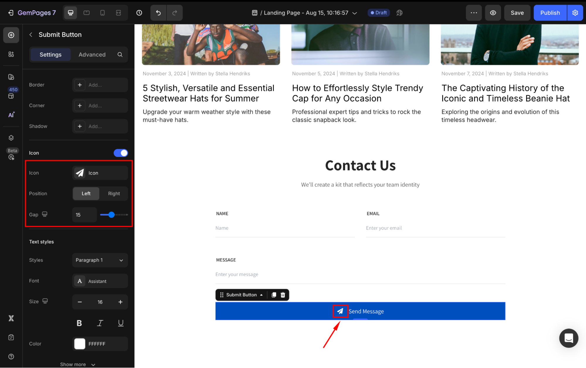
Icon
To add an icon in the Submit Button element, toggle on the Icon section and customize the icon your way in the settings.
- Icon: Choose an icon from GemPages’ available options, or you can upload your own (.SVG file only).
- Position: Select the position of the icon to be on the left or the right with the button text.
- Gap: Adjust the spacing between the icon and the button text
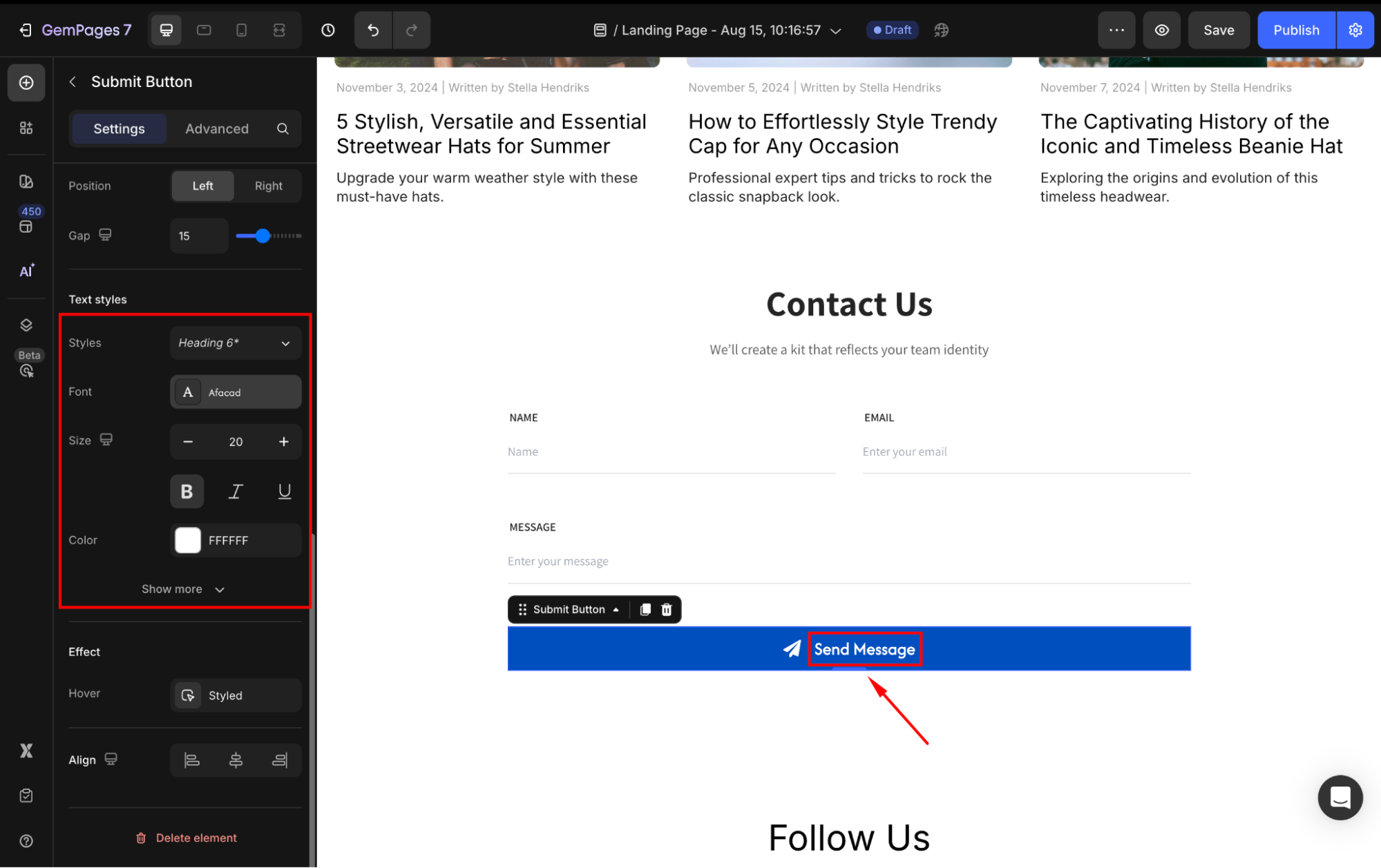
Text styles
Under the Text styles section, modify the button text as you prefer:
- Content: Change the button text as your way to trigger customers to take action.
- Style: Choose the text style from Heading 1-6 or Paragraph 1-3 as the global style.
- Font: Select a font style that matches your brand identity.
- Size: Adjust the font size to make the text prominent.
- Color: Pick a color that complements your design.
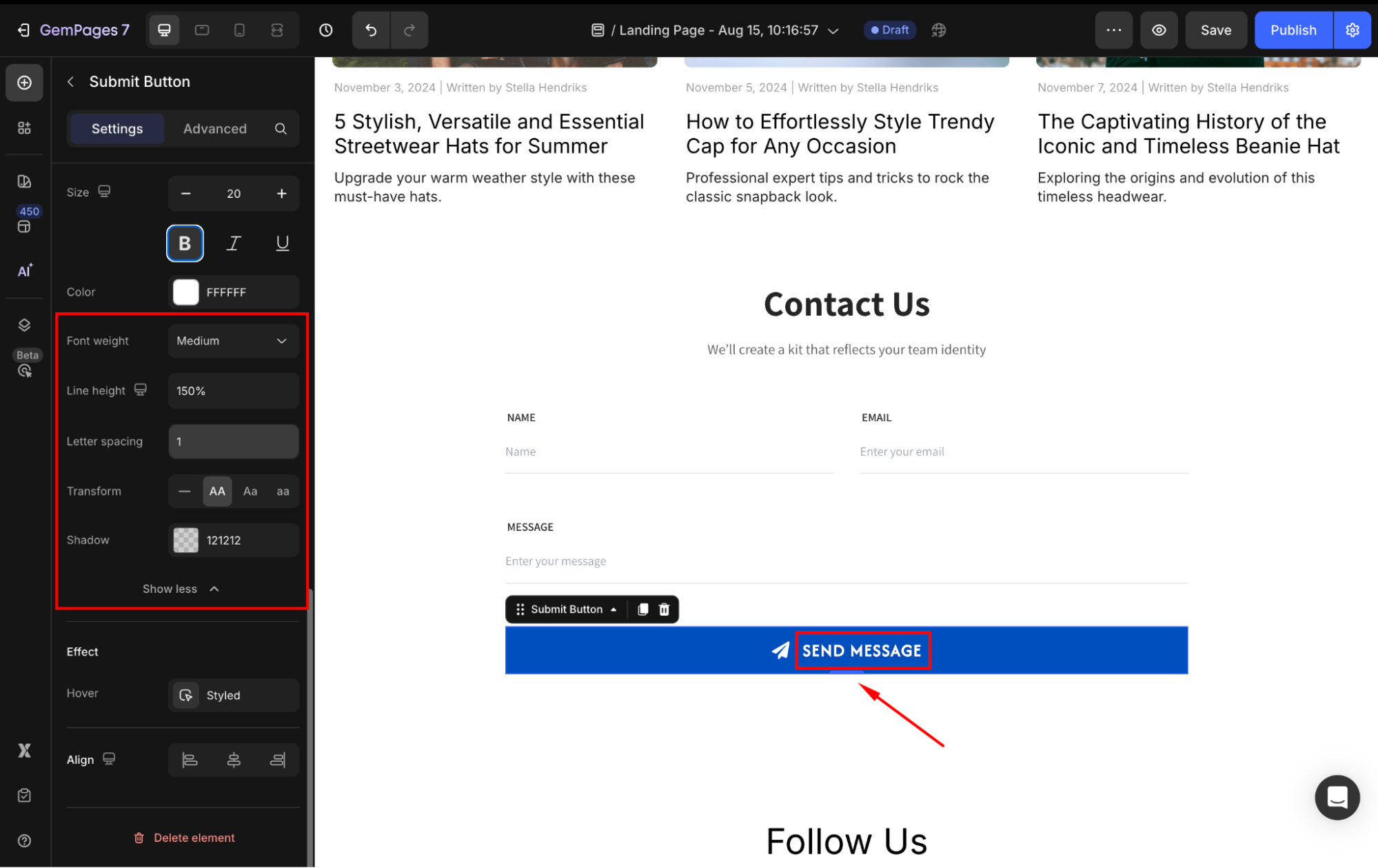
Click Show more to expand the full settings of the Text styles section:
- Font Weight: Control how thick or thin the text appears.
- Line Height: Adjust the space between lines for better readability.
- Letter Spacing: Create a more modern or compact look by changing the space between letters.
- Transform: Convert the text to uppercase, lowercase, or capitalize the first letter of each word.
- Shadow: Apply drop shadow effects to enhance visual depth.
Effect
Customize how your Submit button reacts when hovered:
Background: Select the color background that your button will change to when hovered over.
Text Color: Change the text color on hover.
Shape: Customize the button’s shape when hovered over:
- Border: Add or customize the border style when hovered (color, thickness, stroke).
- Corner: Adjust the corner radius on hover to make edges more rounded or squared.
- Shadow: Apply a shadow effect to give the button more depth when hovered.
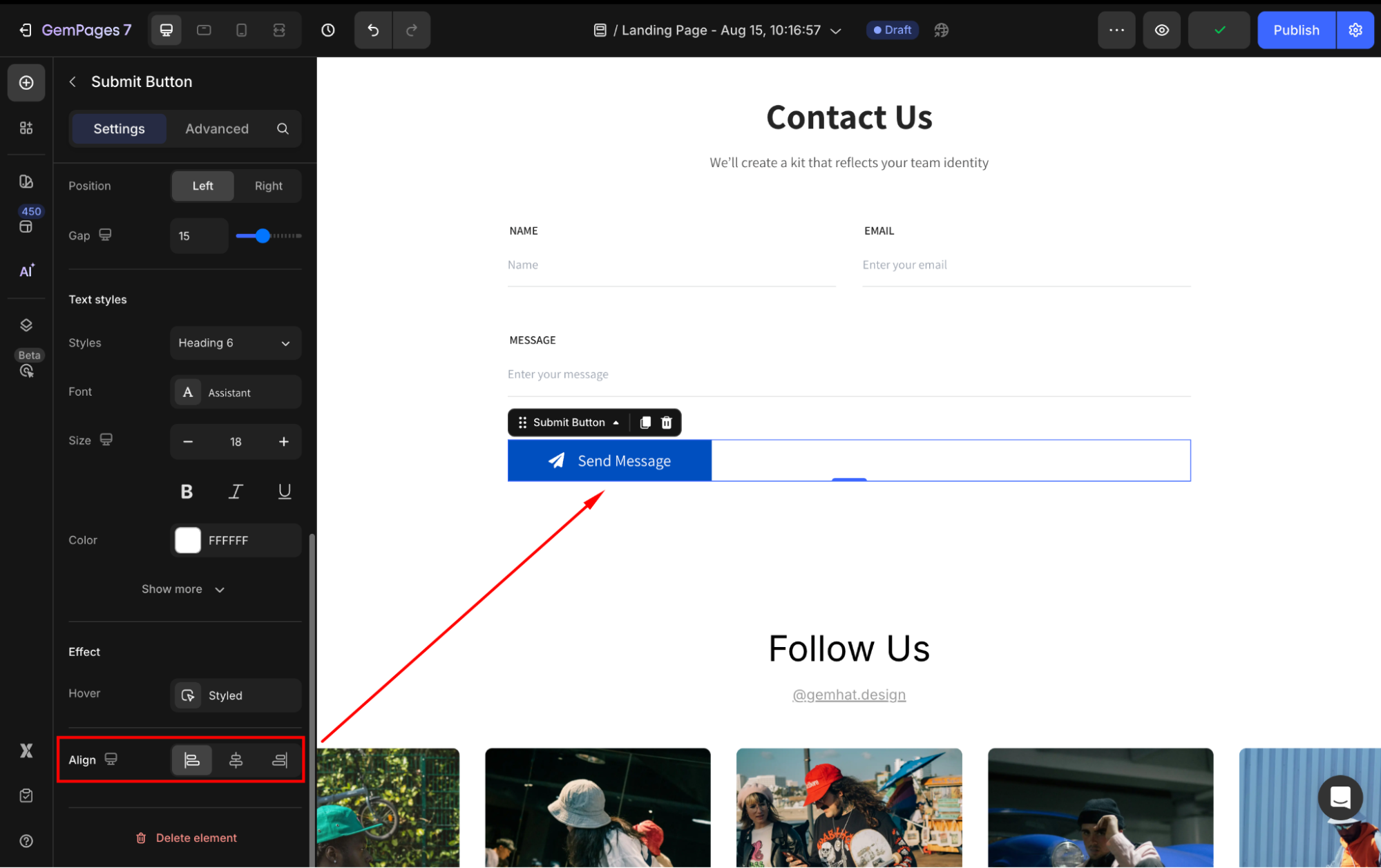
Align
When the button’s width is set to 100% or greater, the horizontal alignment will be disabled. Otherwise, you can align the button to the left, center, or right.
Configure the Advanced tab
For more advanced customization, please navigate to the Advanced tab and follow the instructions in this article.


