


Why does the image show differently on mobile and desktop?
GemPages automatically adapts your page layout for different screen sizes based on a responsive design principle. Here are the most common reasons your image may appear differently:
- Responsive resizing: Images scale to fit each device. This can change the size, aspect ratio, or cropping of an image.
- Device visibility settings: You may have set the image to show on desktop only, mobile only, or both.
- Custom layout for each view: You might have customized sections separately for mobile or desktop, leading to variations.
How to fix this issue?
Here’s how to ensure your image looks consistent across devices. Open the GemPages Editor dashboard and follow the quick steps below:
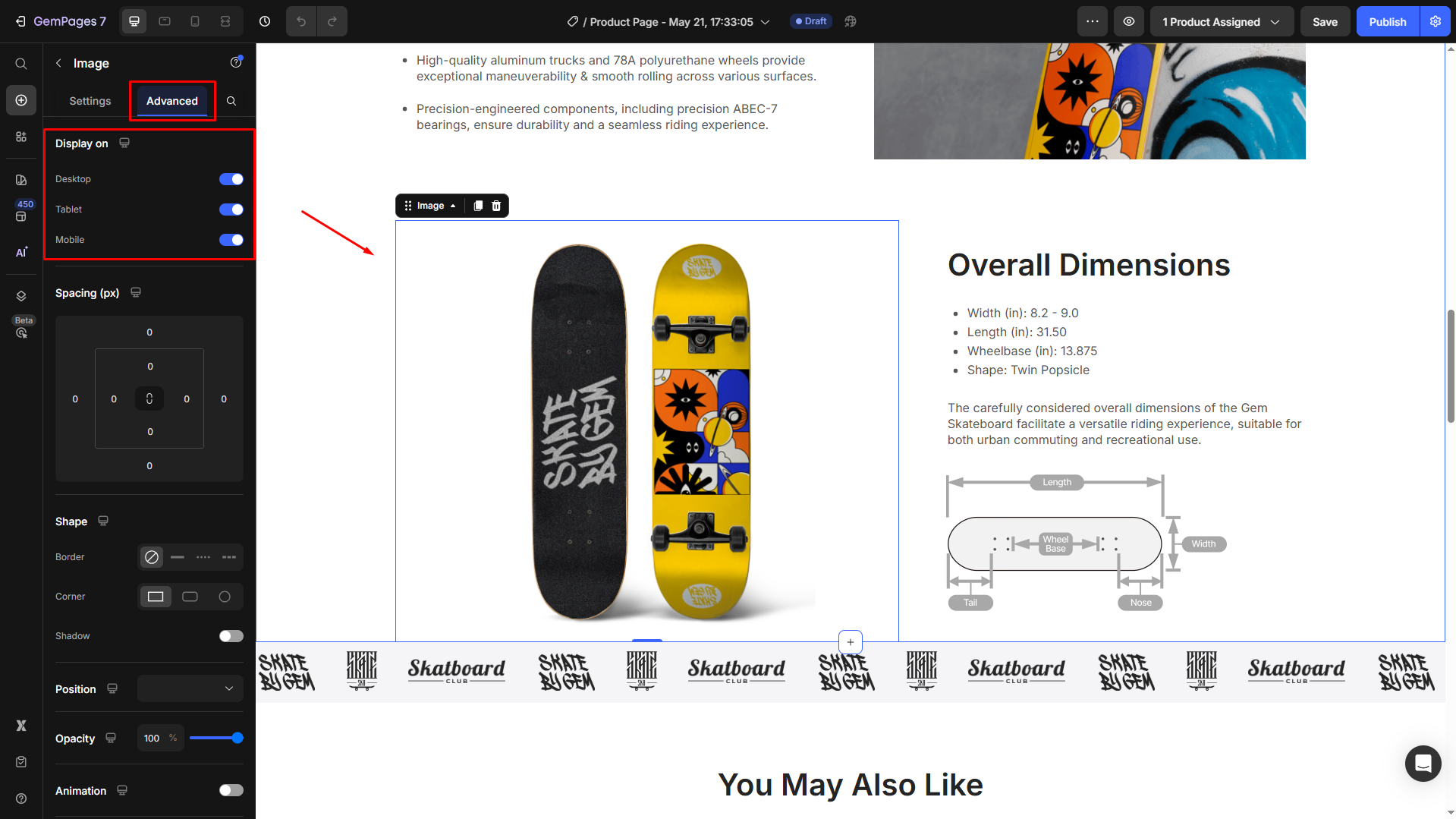
Check visibility settings
1. Click on the image element.
2. In the left sidebar, go to the Advanced tab.
3. Scroll to Display on.
4. Select the correct devices (Desktop, Tablet, Mobile).
 Adjust image size manually
 Adjust image size manually
1. Switch to Mobile View using the Device Switcher.
2. Select the image element.
3. Use the sizing and spacing controls to adjust how the image appears on mobile.
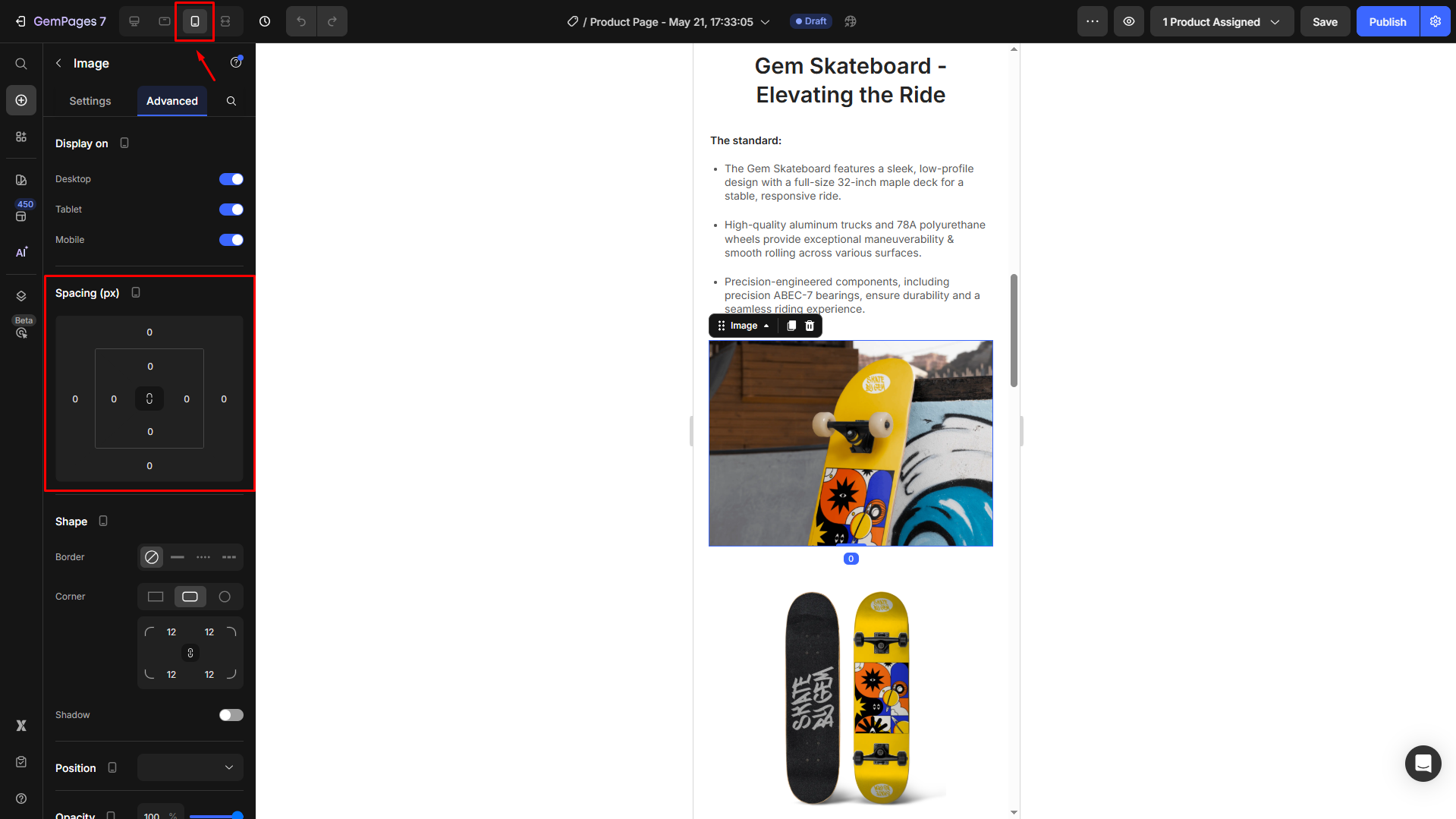
4. Repeat for Tablet View if needed.
Use the same image element across devices
If you’re using the same image element for all devices (Desktop, Tablet, Mobile), keep in mind that:
- The image may be resized or cropped differently depending on screen size.
- Margins, padding, or section layout may cause the image to shift or stretch.
- On smaller screens, the same image might look too large or lose focus.
To keep it looking consistent:
1. Select the image element.
2. Use the Device Switcher to preview how it appears on each device
3. Adjust settings such as Max Width/Height, Padding/Margin, and Object Fit
4. Apply different values for each device by toggling the Device Icon next to each setting.
Upload different image versions for each device (Optional)
If one image doesn’t work well on all devices, try this approach:
1. Prepare multiple versions of the same image (e.g., optimized for desktop and mobile).
2. Upload each version as a separate image element in your layout.
3. Use the Visibility setting to show/hide each image based on the device.


Thank you for your comments