Why Changes on Mobile Can Affect Desktop?
GemPages operates on a responsive design principle. This means the elements on your page automatically adjust to different screen sizes.
When you move or resize an element for mobile, it may change the desktop layout as well because it’s the same element in the code.
You need to apply specific techniques to isolate the designs for each device.
Key Techniques for Mobile-Only Customization
To design mobile-only layouts without breaking desktop, consider using one of the following techniques in GemPages, including:
- Visibility settings
- Responsive layout options
- (Advanced) Custom CSS
1. Visibility settings
This feature allows you to show or hide different elements/sections of your store on specific devices (desktop or mobile).
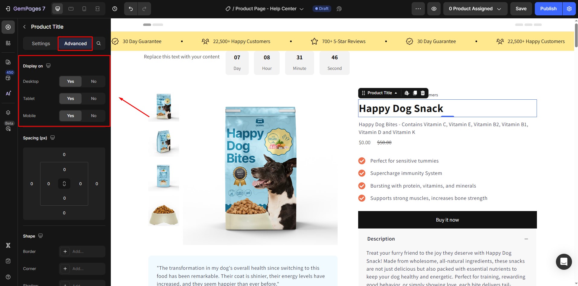
Example:
You create two sections, A and B. Section A is designed specifically for desktop users, while Section B is optimized for mobile. You can set Section A to only display on desktop and Section B to only display on mobile, ensuring that each section is tailored to the respective device without interfering with the other.
Benefits:
- It allows you to create unique layouts optimized for each screen size.
- It’s easy to customize without the risk of affecting other sections.
Limitations:
Your page content is technically duplicated. Although this doesn’t significantly impact loading speed, it’s something to be aware of.
Note: It’s best to limit the use of this technique to 1-2 important sections (such as the above-the-fold section) that require the most customization for each device.
For more details on showing/hiding elements and sections on each device, refer to this article.
2. Element-specific adjustments
GemPages lets you adjust how elements appear based on the screen size.
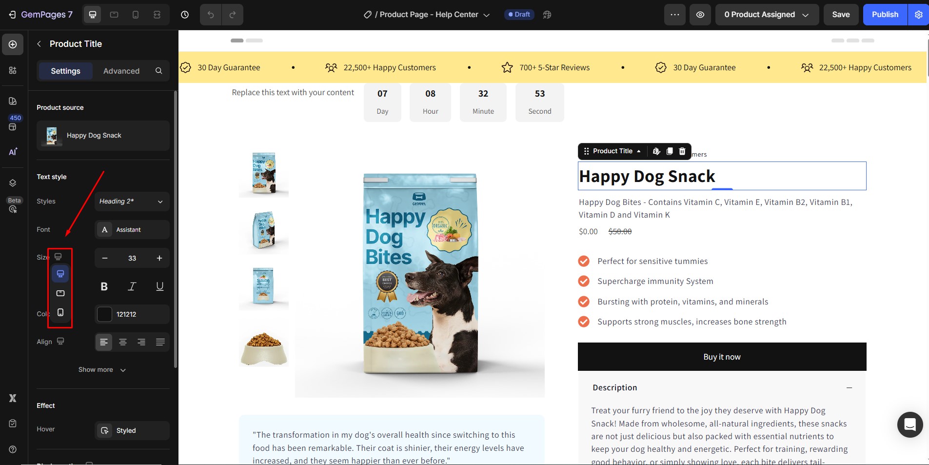
These settings include options to adjust the font size, alignment, colors, margins, padding, backgrounds, etc.
Example:
You increase the font size of a headline on mobile devices for better readability, while keeping the desktop version intact.
Limitations:
You can only adjust the visual appearance of elements, not their position.
If you move an element on mobile, it will also move on the desktop version since the element is still in the same position in the overall layout.
3. Responsive Layouts
By using GemPages’ column and row settings, you can switch between horizontal layouts for desktop and vertical layouts for mobile devices.
This helps ensure a clean and organized design that works well on any screen size.
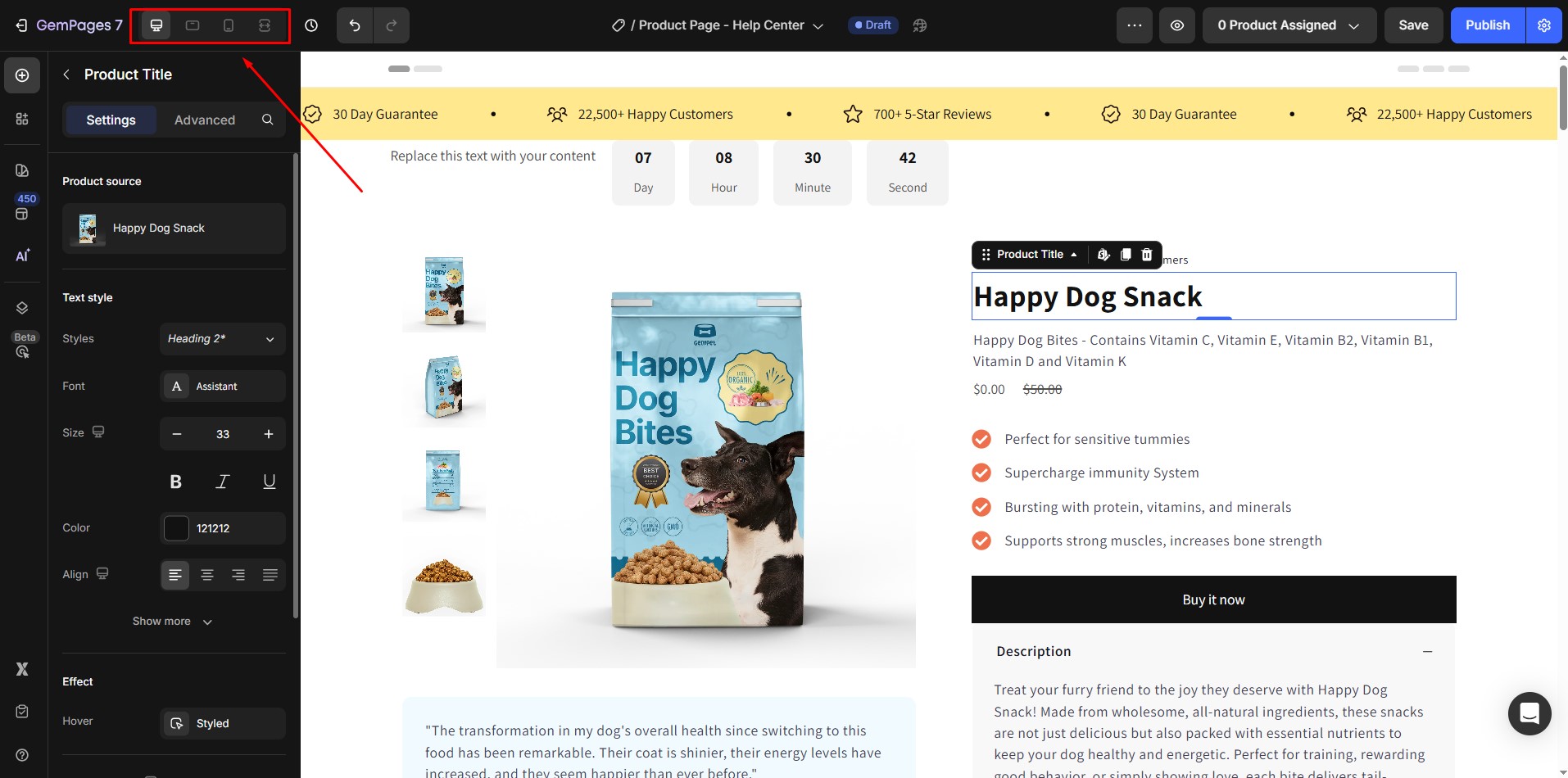
Example:
You set up columns to display side by side on desktop, but stack them vertically on mobile for easier navigation.
Benefits:
- This approach makes it easy to create layouts that look great on both desktop and mobile devices.
- You can rearrange columns within rows, giving you more flexibility in the design.
Limitations:
You can only change the position of entire columns, not individual elements inside the columns.
4. Advanced customization: Use Custom CSS for mobile
If you have a solid understanding of CSS, you can take your mobile optimization to the next level by adding custom CSS code. This allows you to fine-tune the style and appearance of specific elements for mobile devices only.
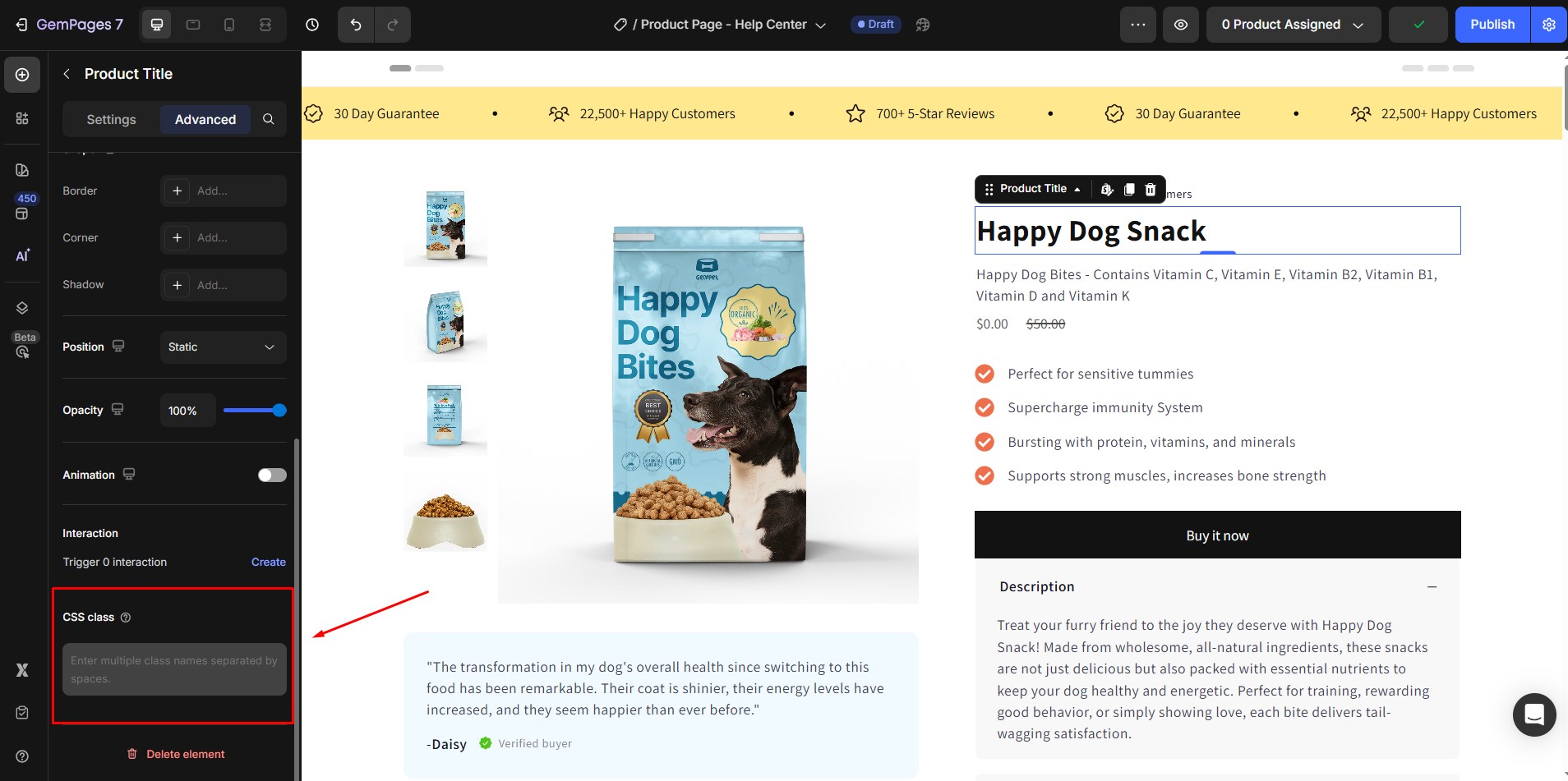
Example:
You can write custom CSS to change the style of a button or adjust the spacing of elements exclusively for mobile.
Benefits:
Complete control over the style of any element, enabling you to make highly specific adjustments.
Limitations:
Requires knowledge of CSS. Without this, it may be challenging to implement customizations effectively.
How to Optimize the Design for Mobile Only?
To optimize your design effectively, we recommend the following approach:
- Start with the desktop
First, design your layout for desktop. The mobile layout will inherit the desktop content structure, so starting here provides a strong foundation.
- Adjust key settings
Use element-specific adjustments and responsive layout techniques to modify font size, color, margins, padding, and alignment for mobile.
- Apply visibility settings if needed
If you need a mobile layout entirely distinct from desktop, consider using Visibility Settings to create mobile-only sections.
Note: When using Visibility Settings for separate mobile and desktop designs, limit this feature to one or two key sections (like the header or hero). Overusing it can slow down page load and affect performance.
For most mobile adjustments, it’s best to use tools like font size, padding, and margin settings, which avoid duplicating content and keep performance high.
However, if a section truly needs a unique mobile design that can’t be achieved with minor adjustments, Visibility Settings is ideal.
For example, here’s a step-by-step example using Visibility Settings in the Advanced tab:
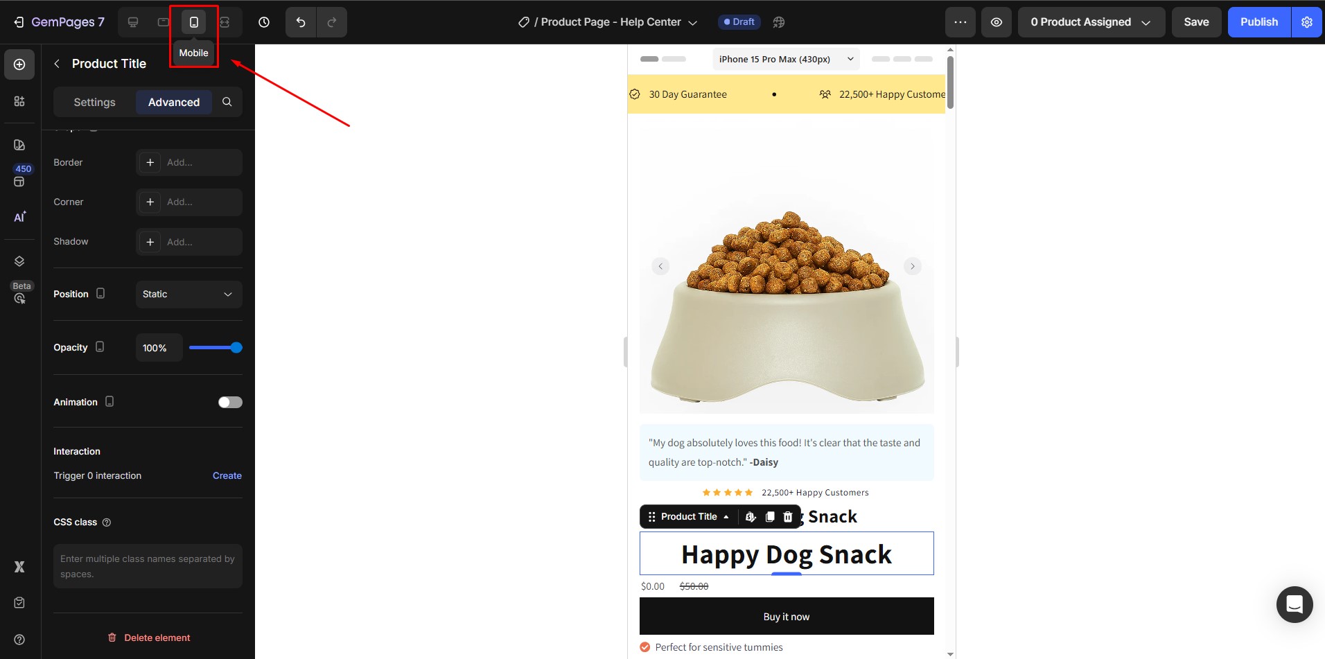
Step 1: Switch to Mobile View
After finishing the desktop design, click the mobile icon in the top toolbar of GemPages to preview how your page looks on mobile.
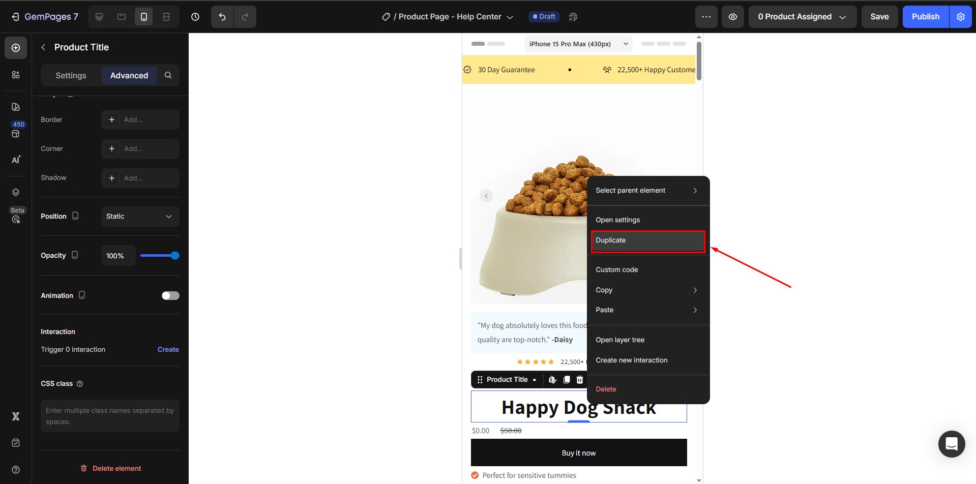
Step 2: Duplicate the Section
Right-click the section you want to customize for mobile and select “Duplicate.”
- The original section will be used for mobile optimization (Section A).
- The duplicated section will be for desktop only (Section B).
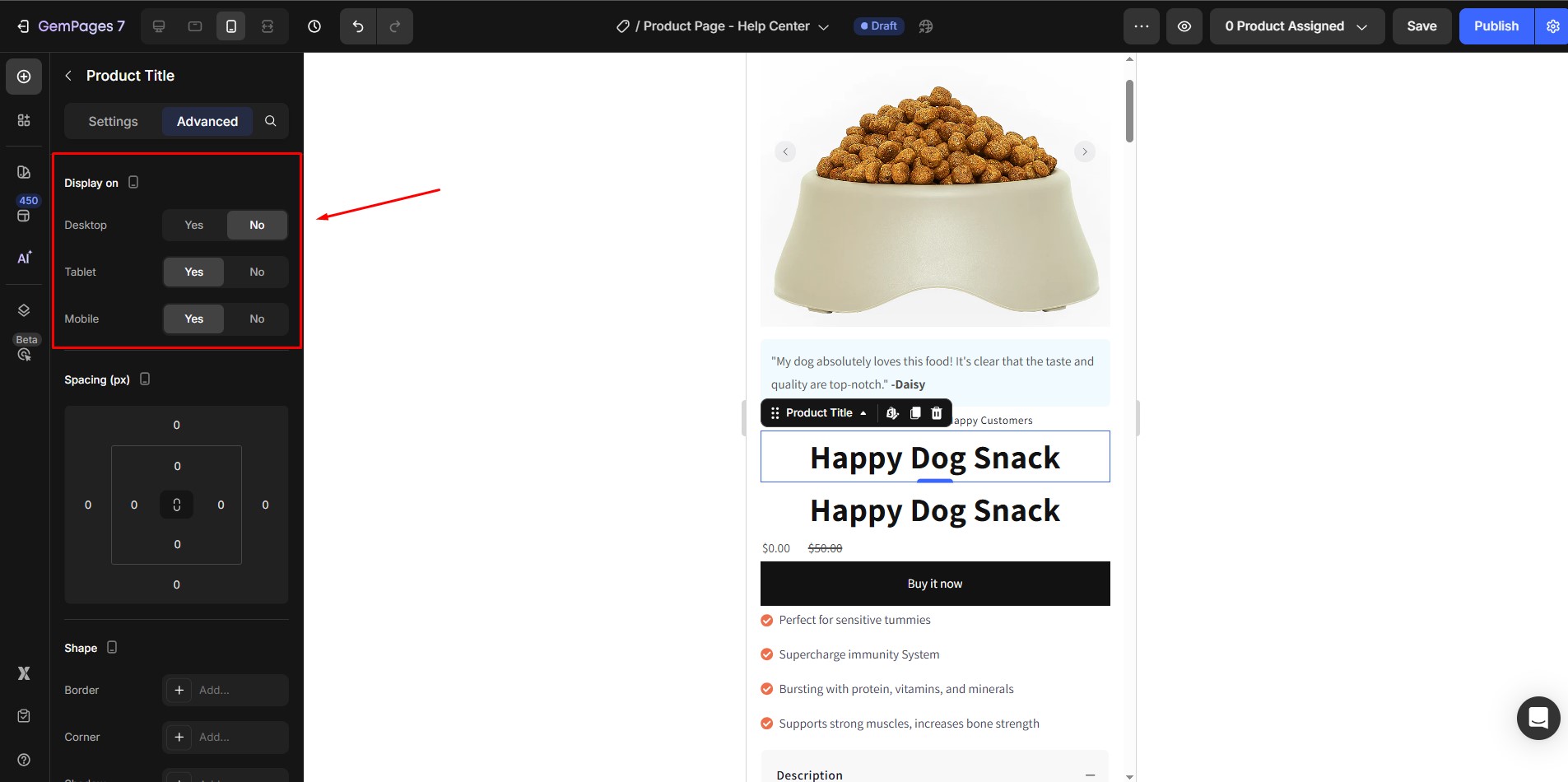
Step 3: Set one element to be visible on mobile and the other on desktop. This lets you apply unique styles to each.
Step 4: In the settings panel on the left, adjust font size, spacing, and other attributes for the mobile version.
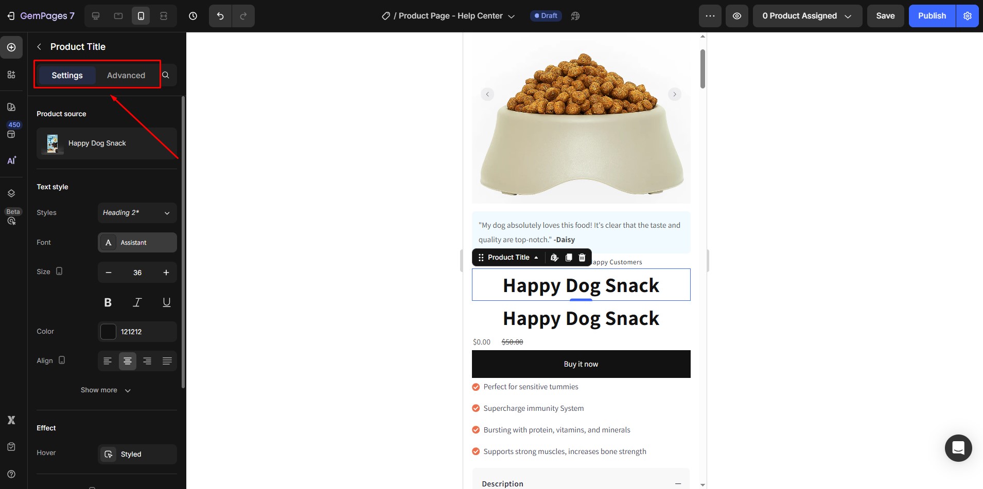
This ensures the element is optimized for smaller screens without affecting the desktop design.
FAQs
1. How do I edit a page for mobile only in GemPages?
Use the mobile view toggle in the top toolbar to switch to mobile preview. Then:
- Adjust font size, padding, margin, etc., for mobile using element-specific settings.
- Use Visibility Settings to show/hide sections on mobile vs. desktop if you need separate designs.
2. Why do changes I make on mobile affect the desktop layout too?
GemPages follows a responsive design structure, meaning elements share the same position across devices. To isolate mobile changes, use Visibility Settings to duplicate the section and tailor each version separately.
3. What’s the best way to make a section look different on mobile?
There are two recommended options:
- Adjust style settings (font size, padding, margin, alignment) directly in mobile view
- Use Visibility Settings to create mobile-only versions of key sections like Hero or CTA
4. Can I apply different background images for mobile and desktop?
Yes. Duplicate the section and use Visibility Settings to show one version for mobile and another for desktop. Then you can set different background images in each.


Thank you for your comments