


What is the Collection Banner Element?
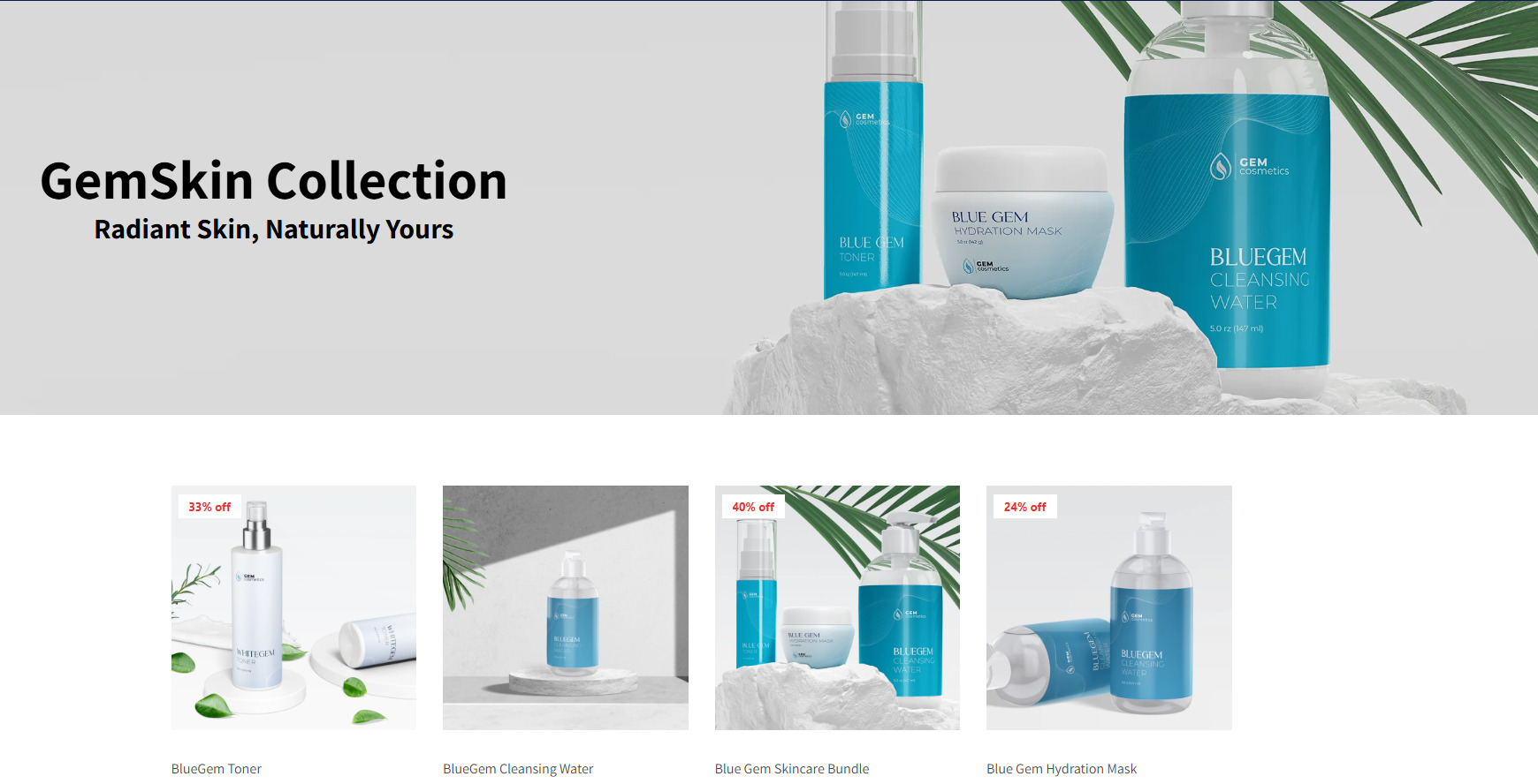
The Collection Banner Element in GemPages is an element that allows you to display a custom banner at the top of your collection pages.
How to Add the Collection Banner to Your Page?
Important: The Collection Banner Element can only be used on collection pages.
To add the Newsletter element to your page, you can follow the steps below:
Step 1: Access the GemPages Dashboard > Pages > Collection, then click on your target collection page to locate the editor.
Step 2: From the left sidebar, search for the “collection banner” and drag & drop it to the preferred position on your page.
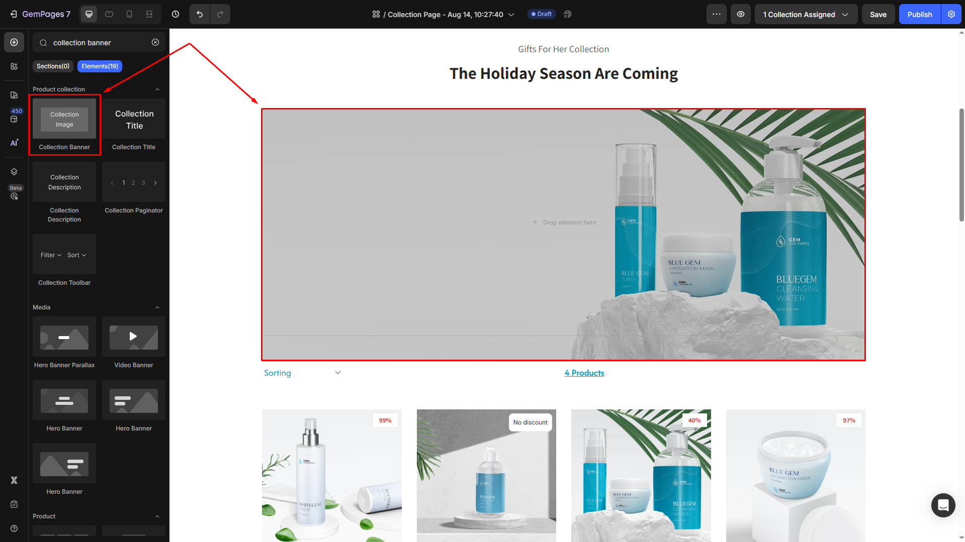
The image will automatically appear based on the settings in Shopify.
Step 3: Click on the element to open its settings for further customization.
Configure the Settings tab
The Collection Banner Element offers several customization options to help you design the perfect banner for your collection pages:
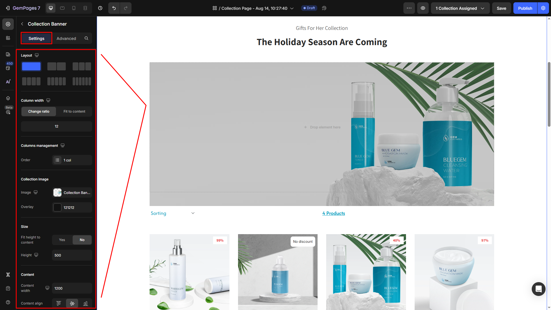
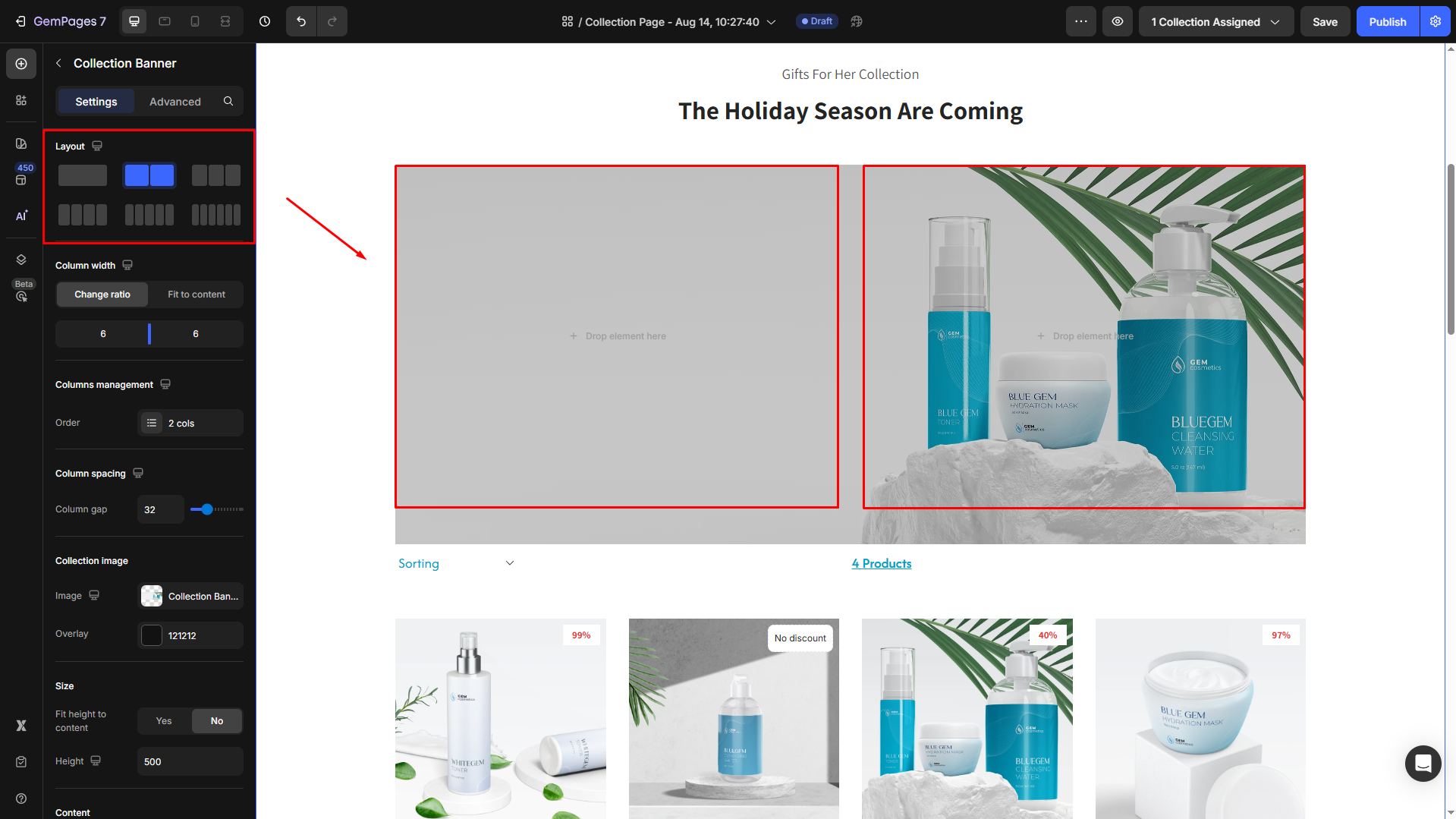
Layout
Select a layout style for the content on the banner.
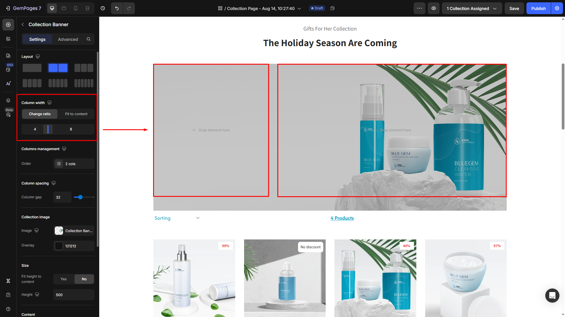
Column width
Control the content arrangement on the Collection Banner within the Column Width section:
- Change Ratio: Set a specific column ratio for consistency.
- Fit to content: Automatically adjusts column width based on content.
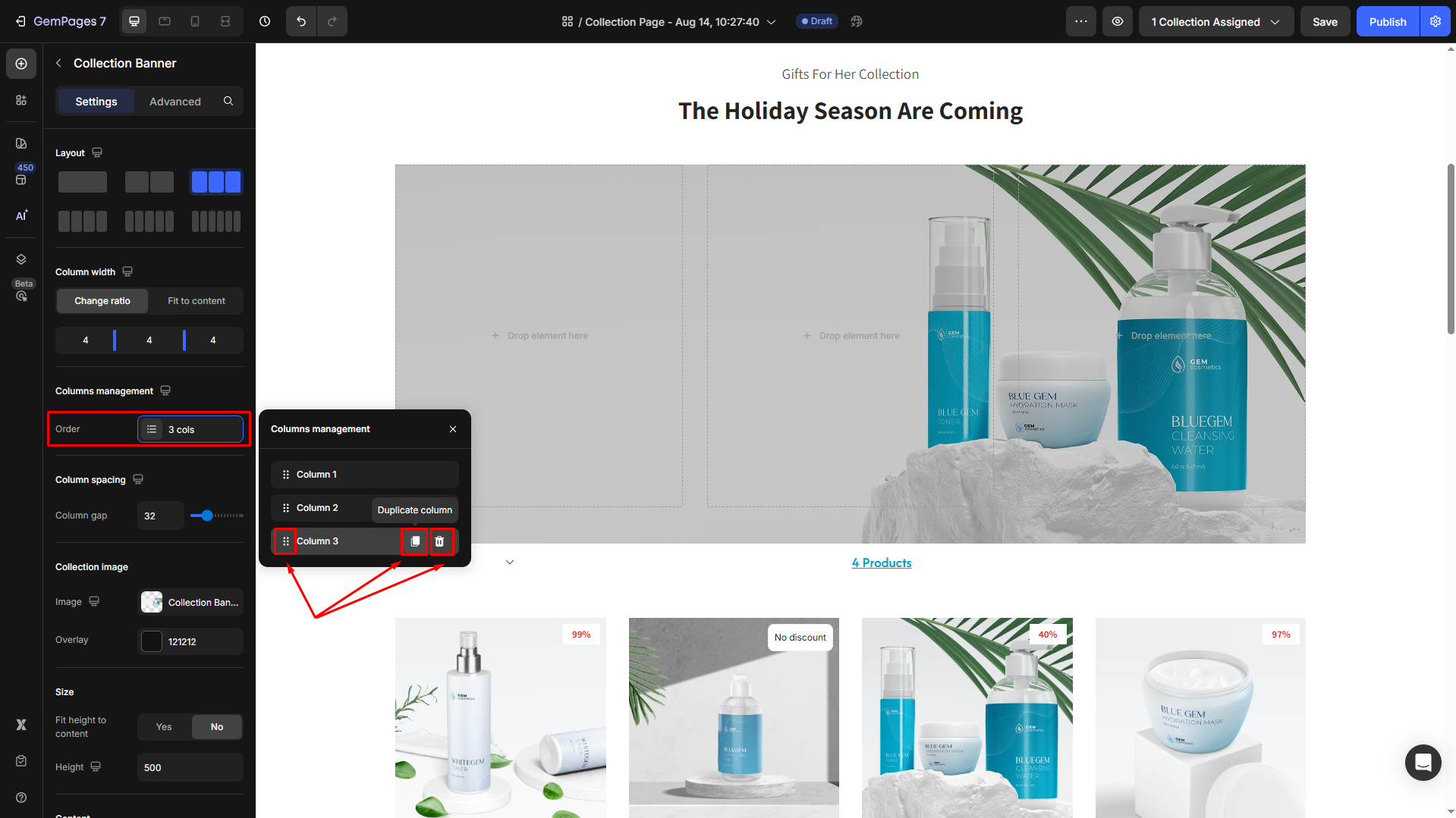
Columns management
Manage the quantity of your columns under this section. From here, you can duplicate the current column, delete one, or rearrange the columns’ position.
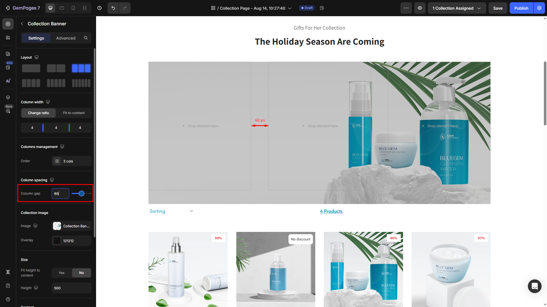
Column spacing
Adjust the gap between columns by entering a specific number or dragging the slider.
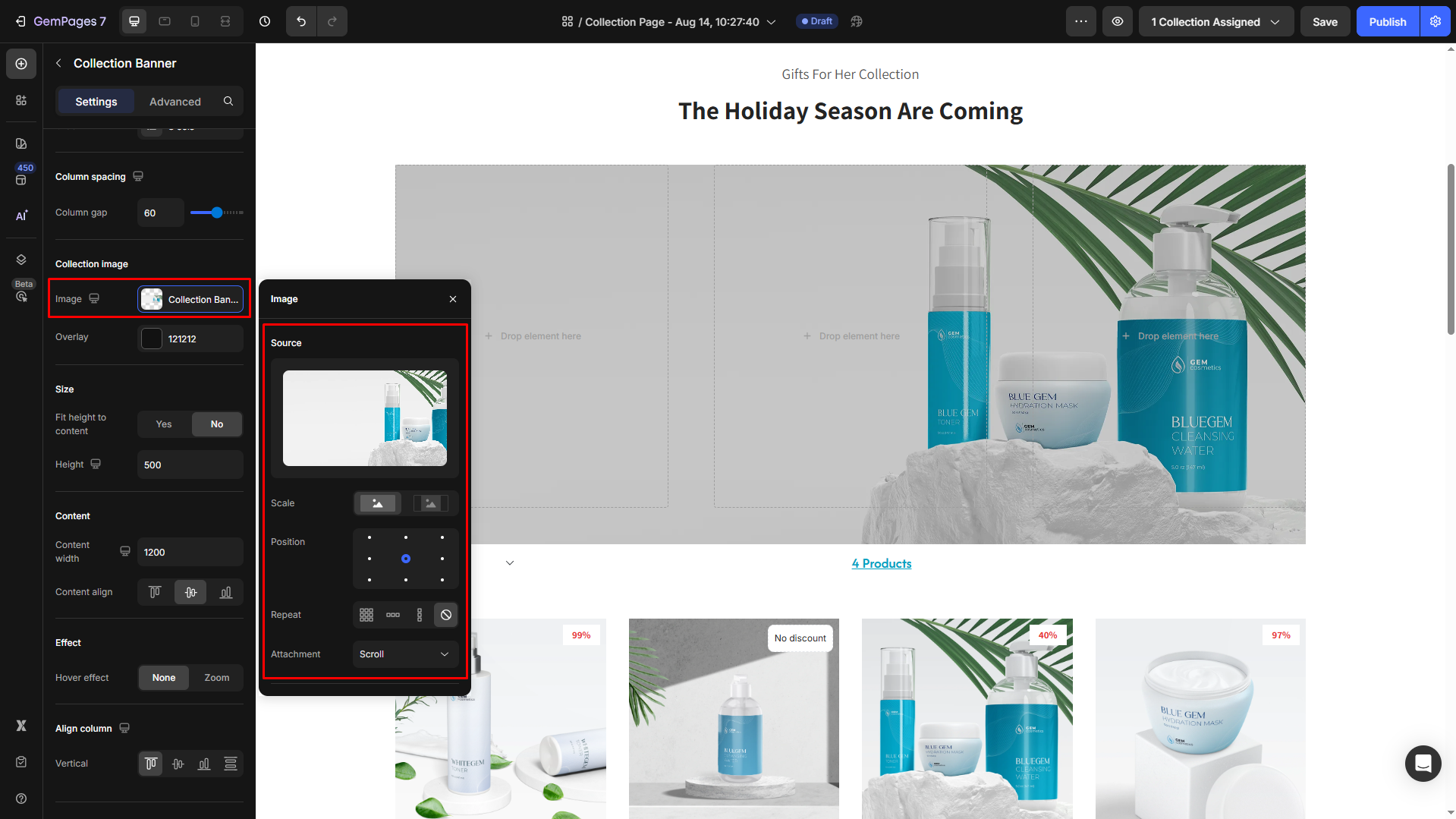
Collection image
Image:
The banner image is pulled directly from your Shopify collection settings. If you want to change the banner image, you need to update it within Shopify.
However, you can modify the collection image’s settings within the GemPages editor, including:
- Scale: You can choose either Cover (for the image to cover the entire banner area) or Contain (to ensure the full image is visible without stretching).
- Position: You can adjust the image’s position within the banner.
- Repeat: Determine if the image should repeat across the background.
- Attachment: Controls image behavior: Scroll moves with the page, Fixed stays stationary, and Local scrolls within its container.
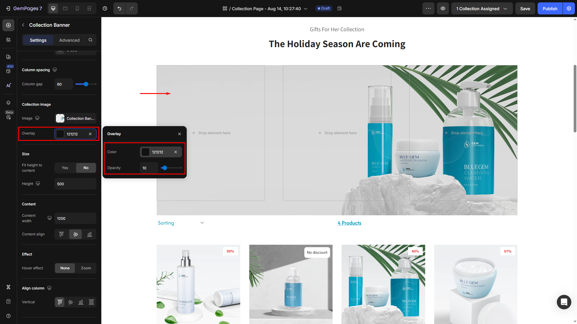
Overlay:
Add a semi-transparent layer over the collection banner image to improve text readability or create a specific visual mood. This is especially useful when your banner contains both light and dark areas that could make overlaying text less visible.
- Color: Choose a color for the overlay, which can add a visual effect to the banner.
- Opacity: Adjust the opacity of the overlay to make it more subtle or bold, depending on your design preferences.
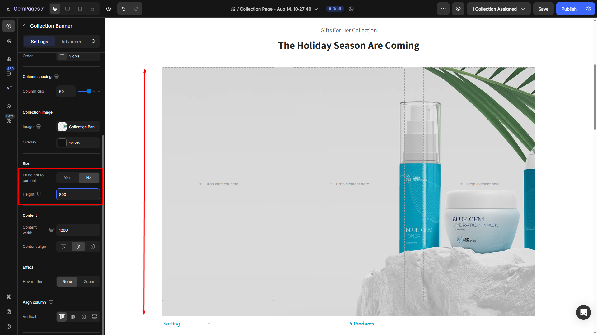
Size
- Fit height to content = Yes: The height of the banner automatically adjusts based on the content inside it.
- Fit height to content = No: You can set a fixed banner height manually (in pixels) regardless of the content inside.
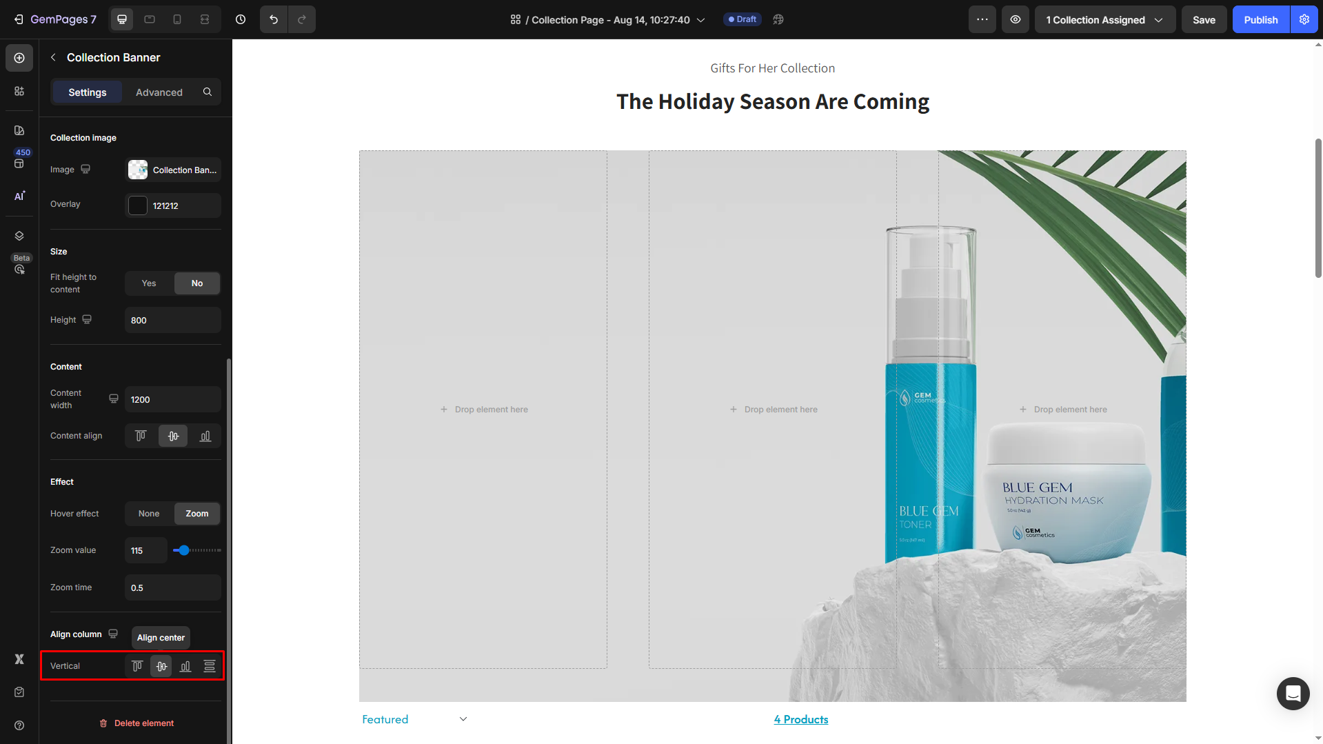
Effect
Hover effect: You can apply a hover effect to the collection banner. The options include None or Zoom.
If you select the zoom effect, you can further customize:
- Zoom value: Control the level of zoom on hover.
- Zoom time: Set the duration of the zoom effect.
Align column
Set the vertical alignment for the element, including:
- Align top
- Align center
- Align button
- Distribute vertical spacing
Configure the Advanced Tab
For more advanced customization, please navigate to the Advanced tab and follow the instructions in this article.
How to Change the Collection Banner?
To change the Collection Banner, you’ll need to update it within Shopify.
Here’s a quick guide:
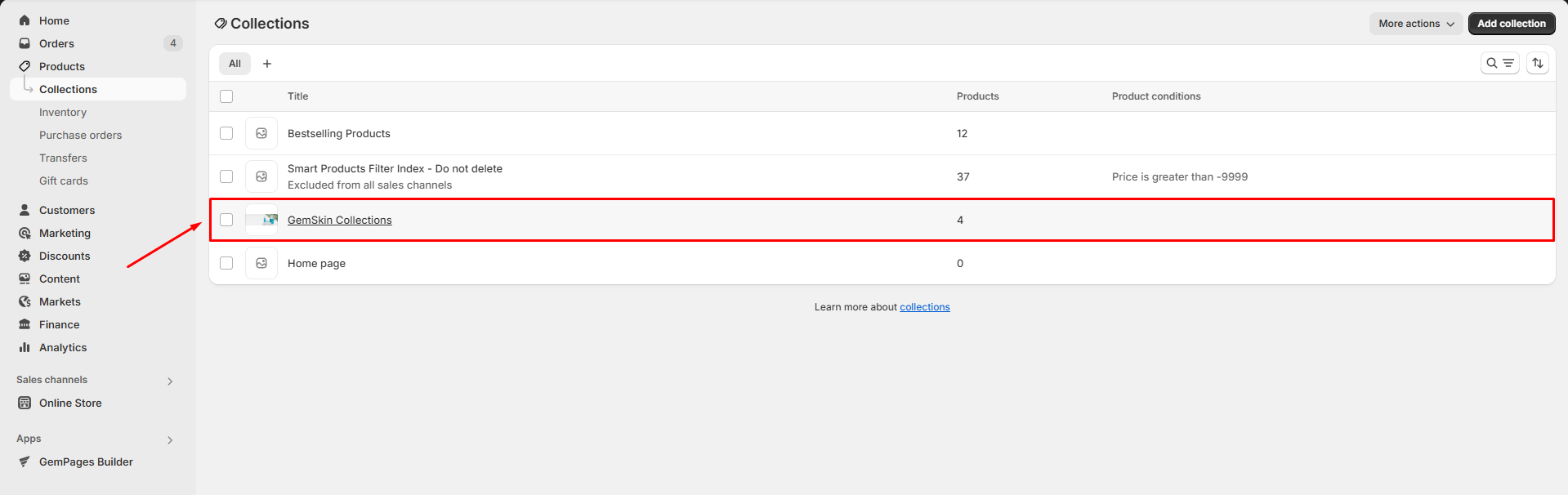
Step 1: In your Shopify admin, go to Products > Collections.
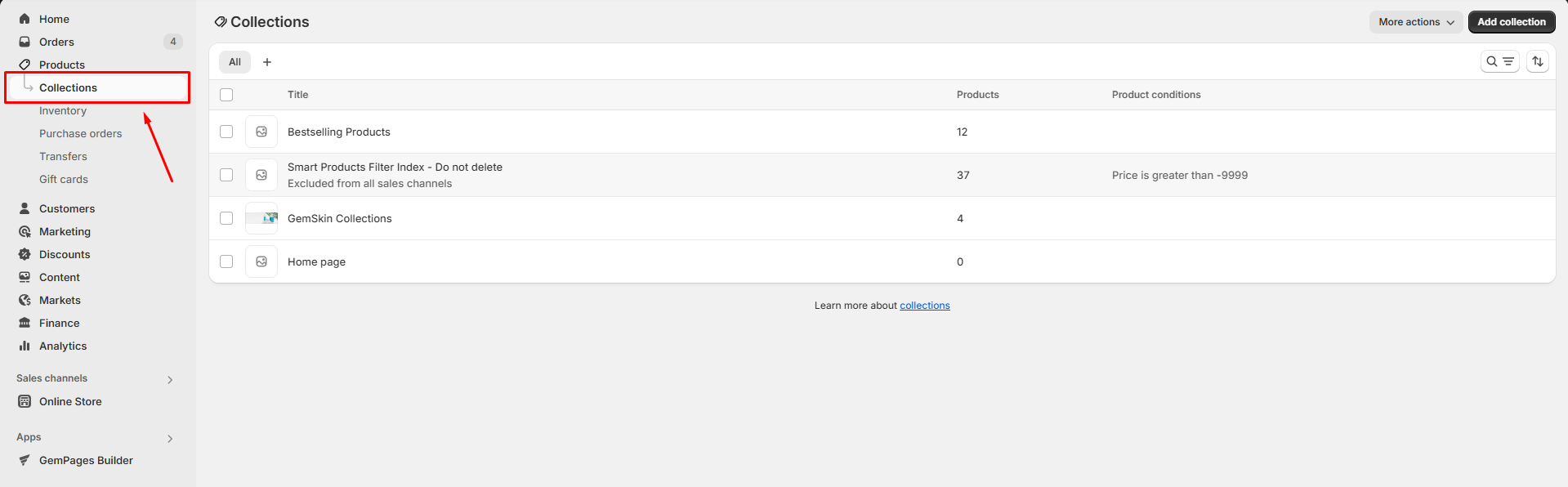
Step 2: Select the collection for which you want to update the banner.
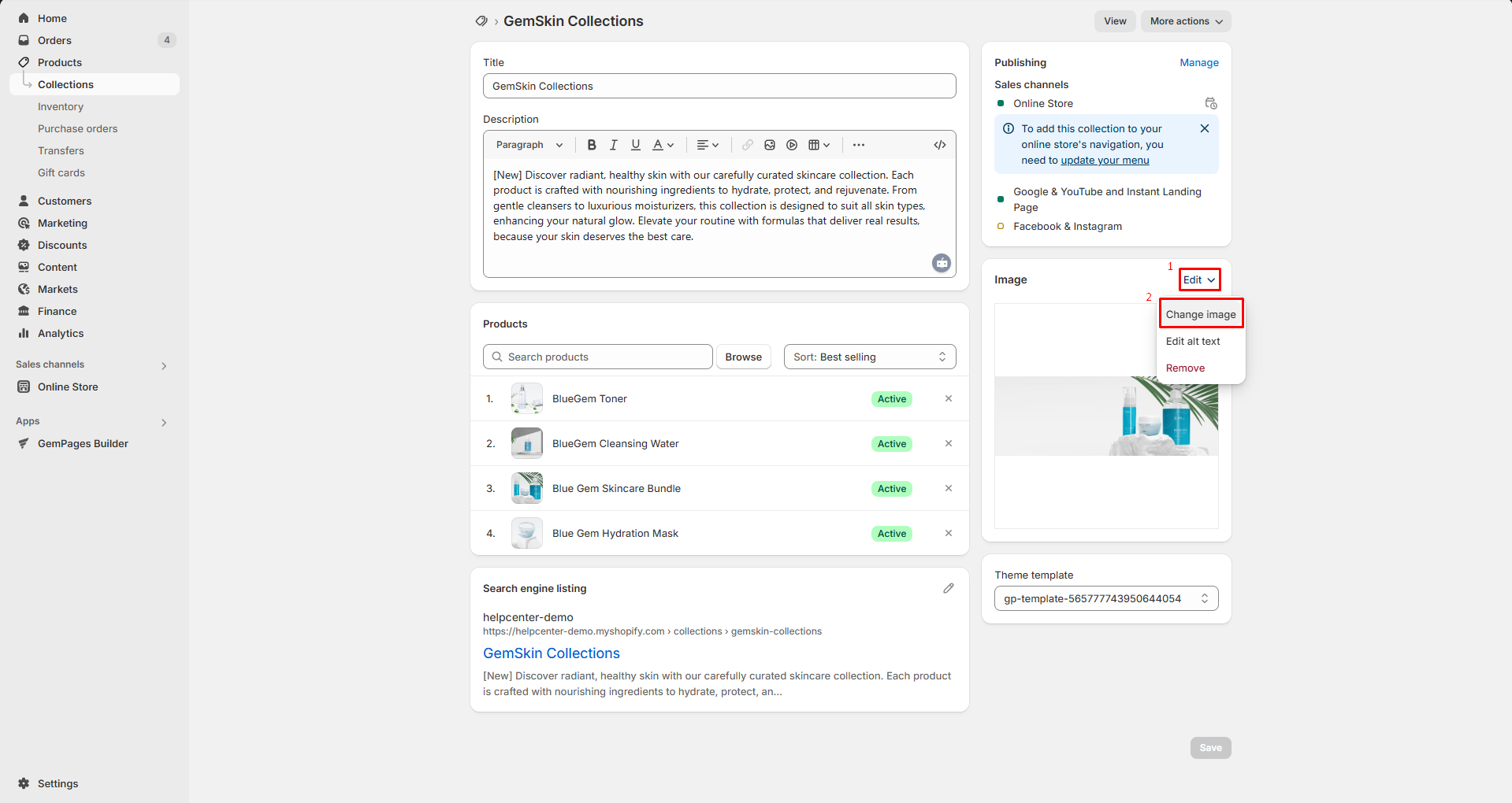
Step 3: Go to Image, click Edit > Change image to change the banner image, then click Save.
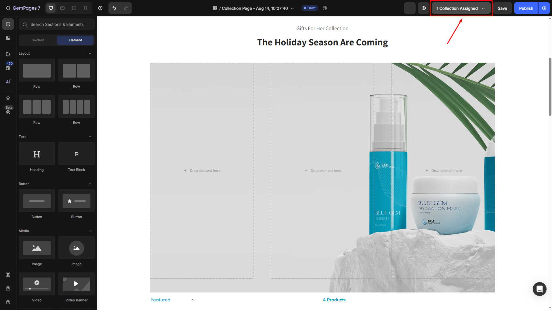
Step 4: Go back to the GemPages editor. In the top bar, click on the Collection Assigned button to open the dialog.
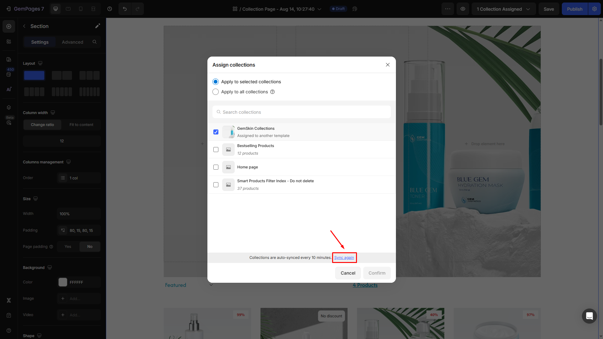
Click Sync again, and the collection banner will be updated.


Thank you for your comments