


This article explains how to use the Marquee Element in GemPages v7 to create engaging horizontal scrolling text and images that highlight promotions, testimonials, and calls-to-action.
What is the Marquee Element?
Marquee element is used to create the horizontal scrolling-like effect for a row that contains other elements.
Here are some key features of the Marquee element that might have been utilized to:
- Highlight Promotions and Special Offers: E-commerce websites might have used the Marquee element to highlight special promotions, discounts, or limited-time offers. The scrolling effect could draw attention to these offers, making them more visible to users visiting the site.
- Display Brand Partnerships: E-commerce sites might have used the Marquee element to display a scrolling list of partner logos. This can showcase relevant brands and increase the credibility of the site, building trust with users through recognizable logos.
- Scrolling Customer Testimonials: The Marquee element could also have been used to feature scrolling customer reviews. This dynamic display can highlight positive feedback, enhancing the site’s trustworthiness by showcasing satisfied customer experiences.
- Display Call to Action: In some cases, e-commerce sites might have used the Marquee element to display scrolling CTAs. This can draw user attention to important actions like ‘Sign Up Now’ or ‘Learn More,’ prompting engagement and improving conversion rates through clear, visible prompts.
How to Add the Marquee Element in GemPages v7
Step 1: Go to the GemPages Editor V7 and find the Marquee element in the search bar.
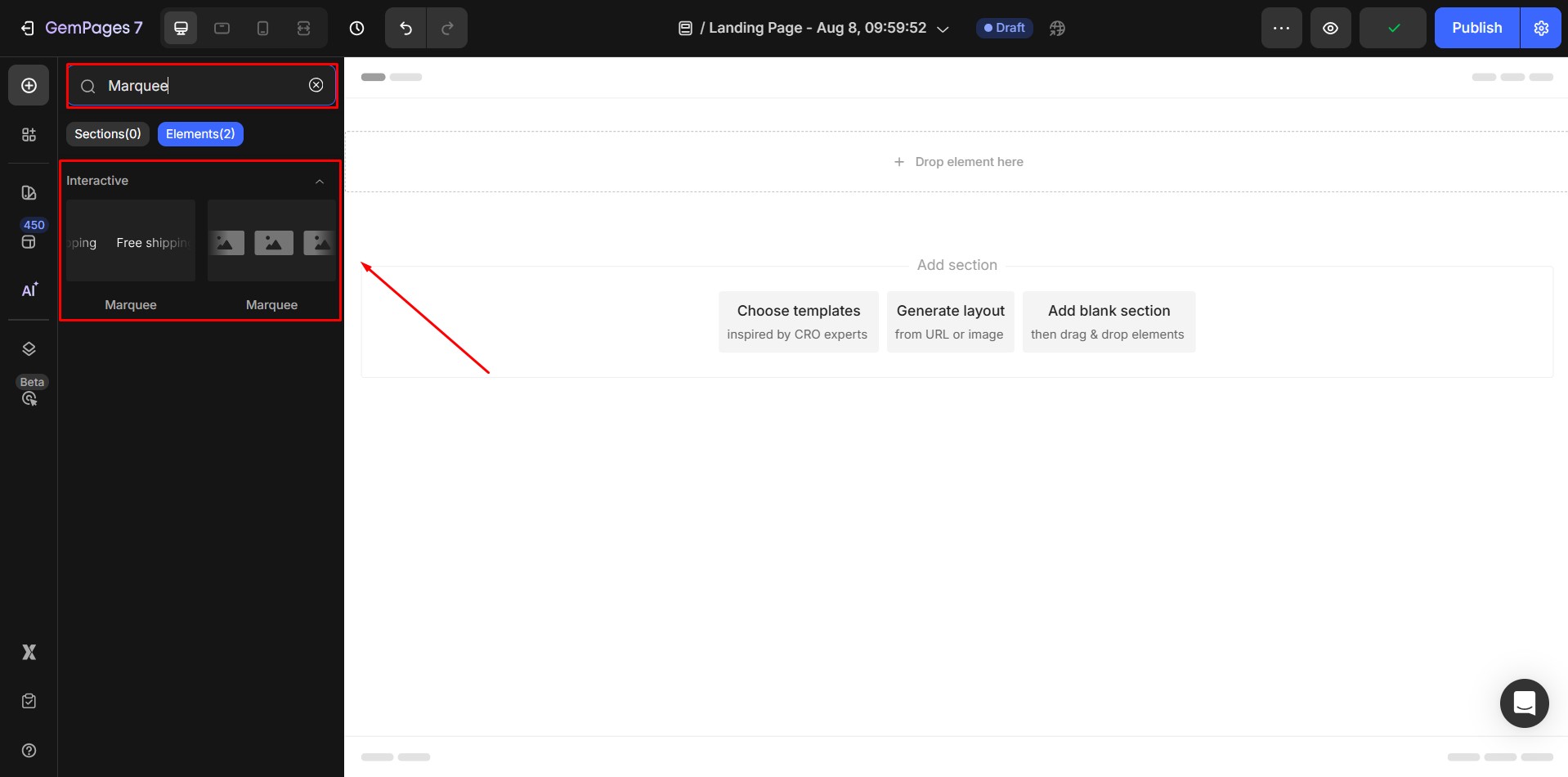 Step 2: Drag and drop the element to the desired area.
Kindly note that:
- You can add any element inside a marquee except: Tabs, Accordion, Contact Form, Product, Hero Banner, Product List, Article List, and Carousel.
- Avoid placing more than 20 marquees per page to prevent performance issues.
- On slower connections, the marquee size may adjust after large images finish loading.
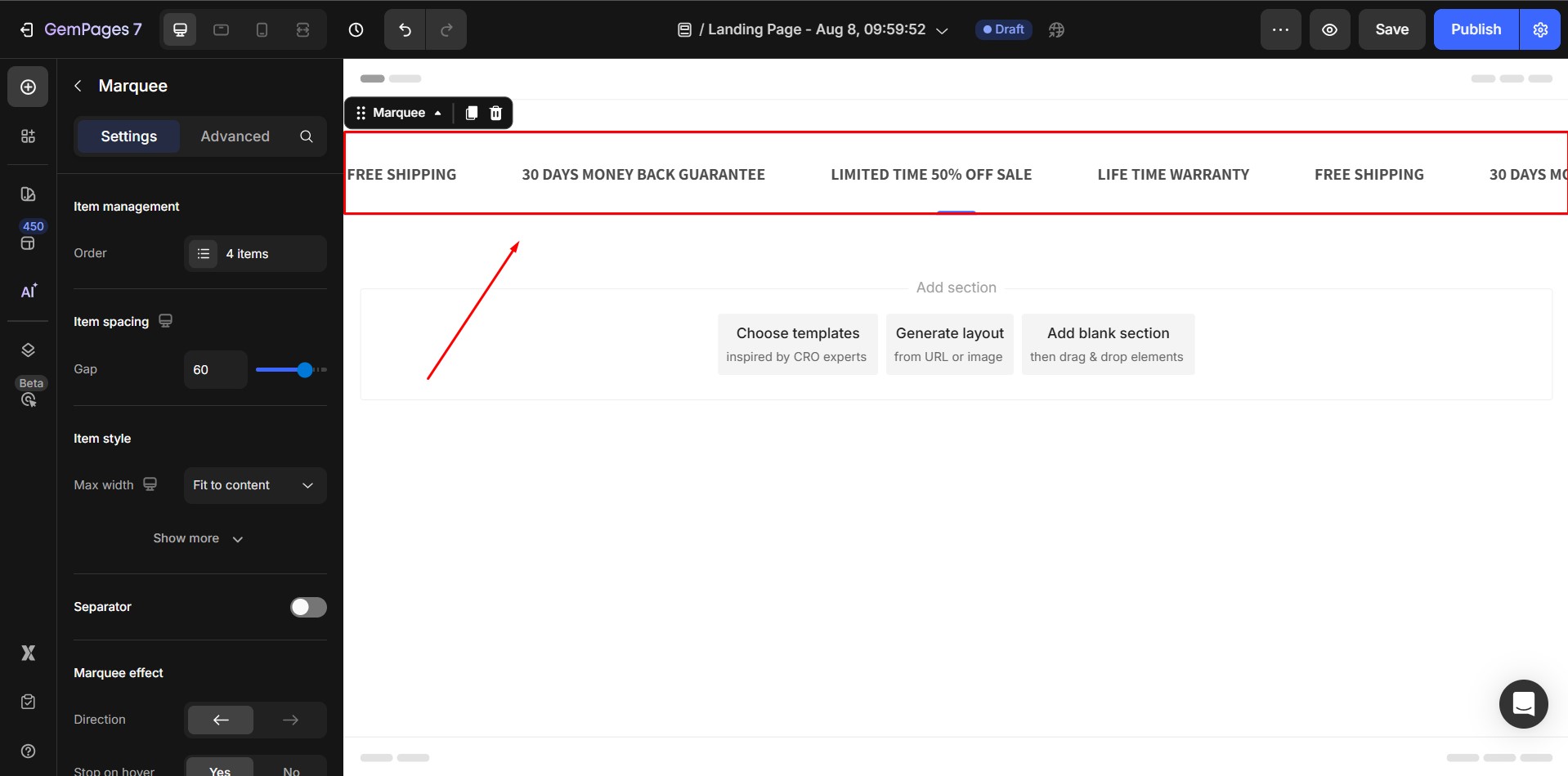
Configure the Settings tab
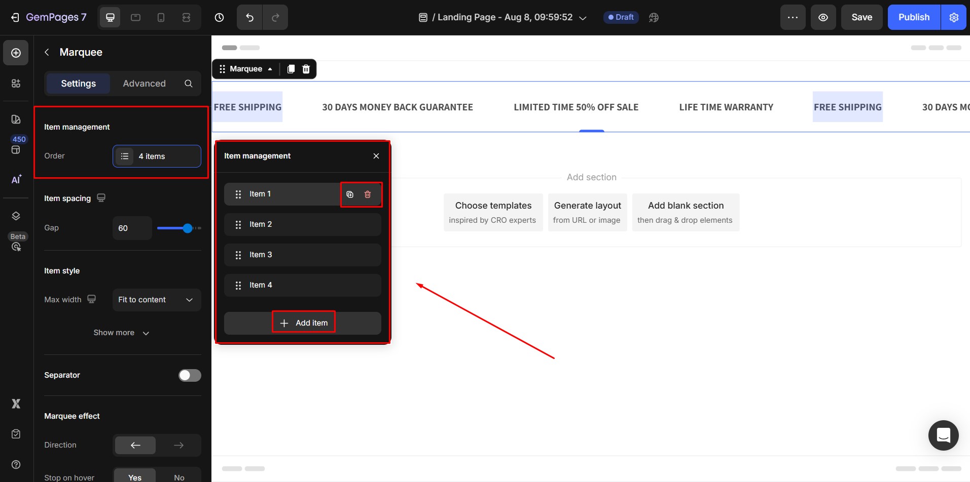
Item management
In the Item Management section, you can:
- Reorder Items: Drag to rearrange.
- Duplicate Item: Clone an existing item.
- Remove Item: Delete an unwanted item.
- Add Item: Create a new marquee item.
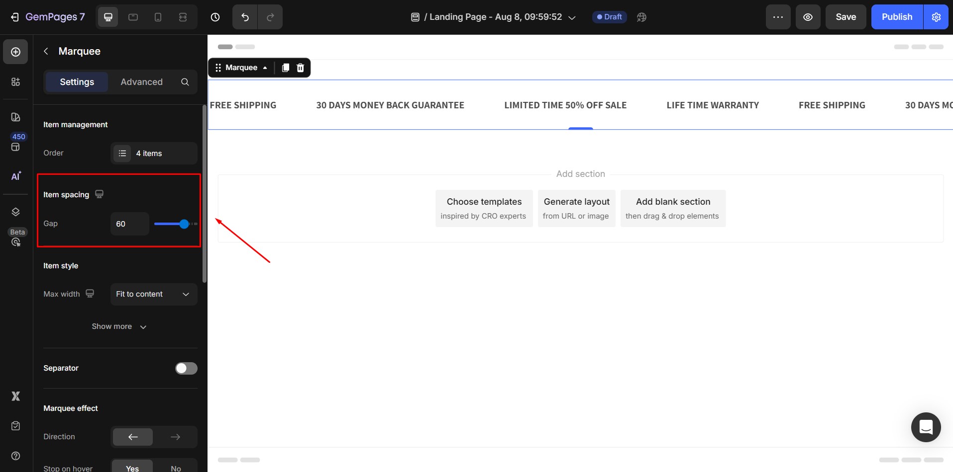
Item spacing
Adjust the gap between items using the slider (default: 60px).
Item style
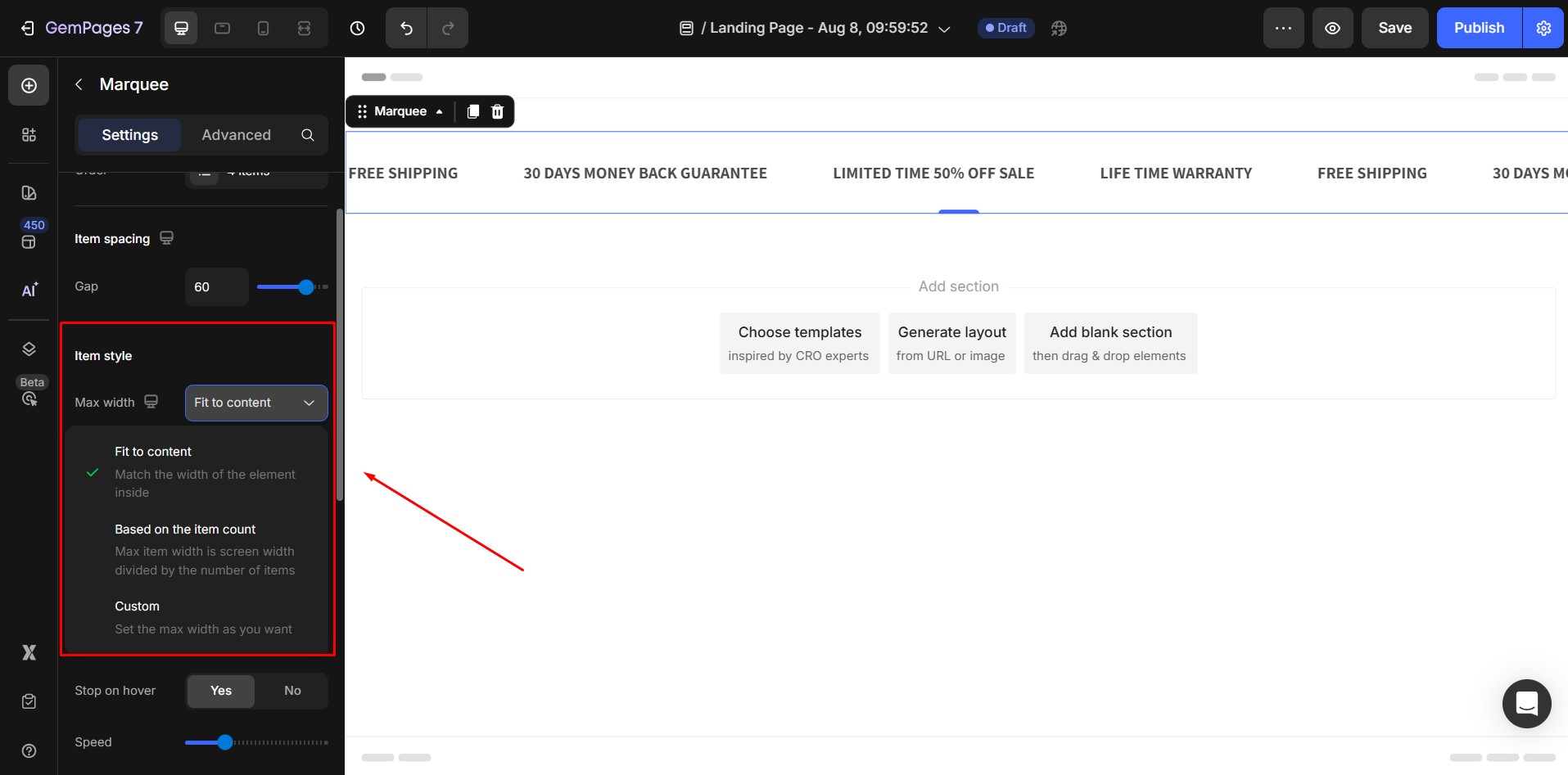
1. Max width: The max width of a single item in the marquee — all items in the marquee will share the same max width.
The default max width value is Fit to content, which means the width of each Marquee item will automatically fit the content inside it.
There are 3 width options:
- Fit to content: width of item = width of content inside.
- Based on the item count: width of item = width of Marquee / number of item.
- Custom: set fixed max width: user can manually input the width value they want in pixel.
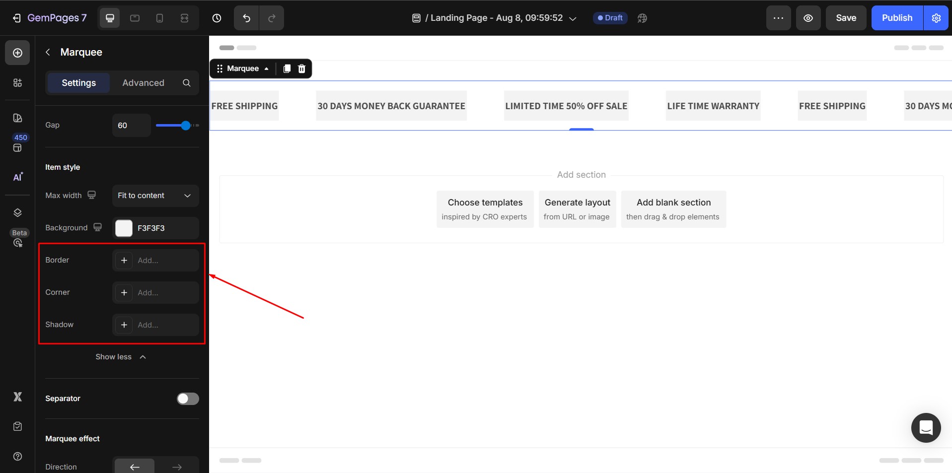
2. Background: Apply a background color or image.

3. Border, Corner, Shadow: Customize each item’s shape and depth.
Separator
Toggle separators on/off between items for better visual distinction.

Marquee effect
- Direction: Set scroll direction (left or right).
- Stop on Hover: Pause animation when the user hovers.
- Speed: Adjust scrolling speed.

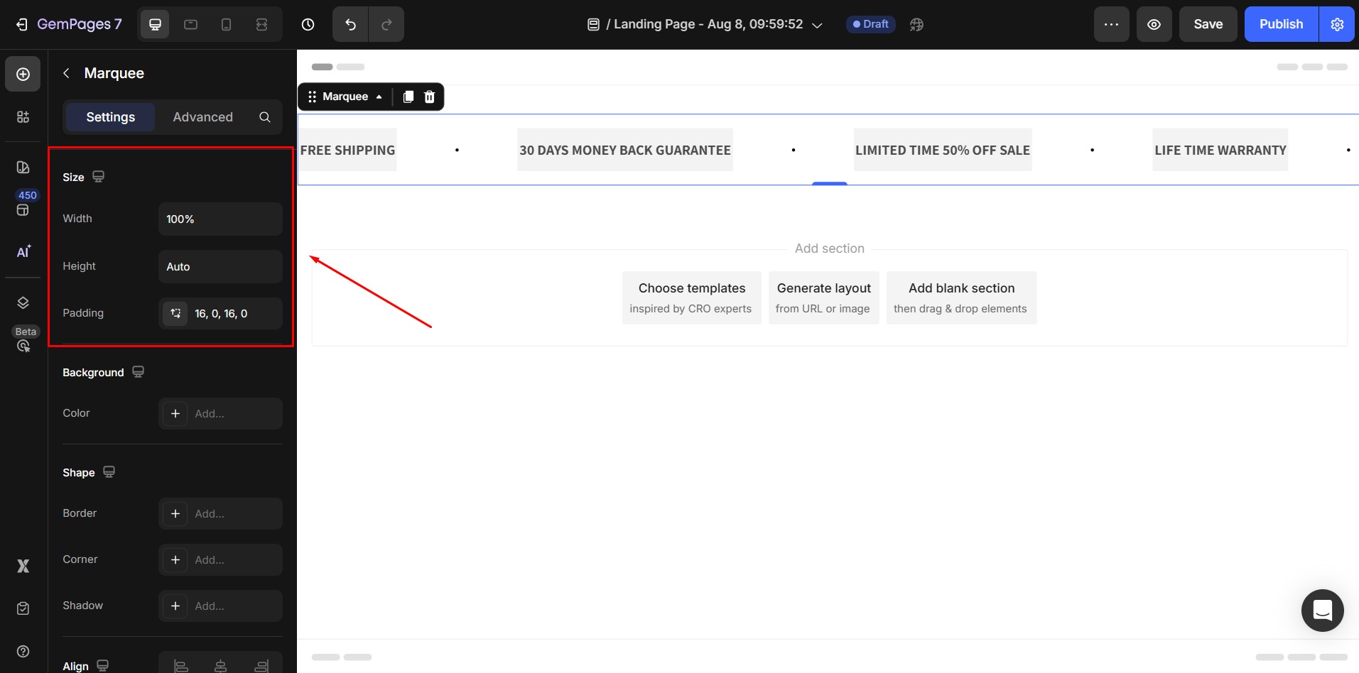
Size
- Width: adjust the width of a Marquee. The default width value is 100%, which means the marquee will automatically resize to match the width of the screen.
- Height: Adjust the height of a Marquee. The Default Height value is Auto, which means the marquee will automatically resize to match the content inside.
- Padding: Adjust the space from the border to the content inside each item.
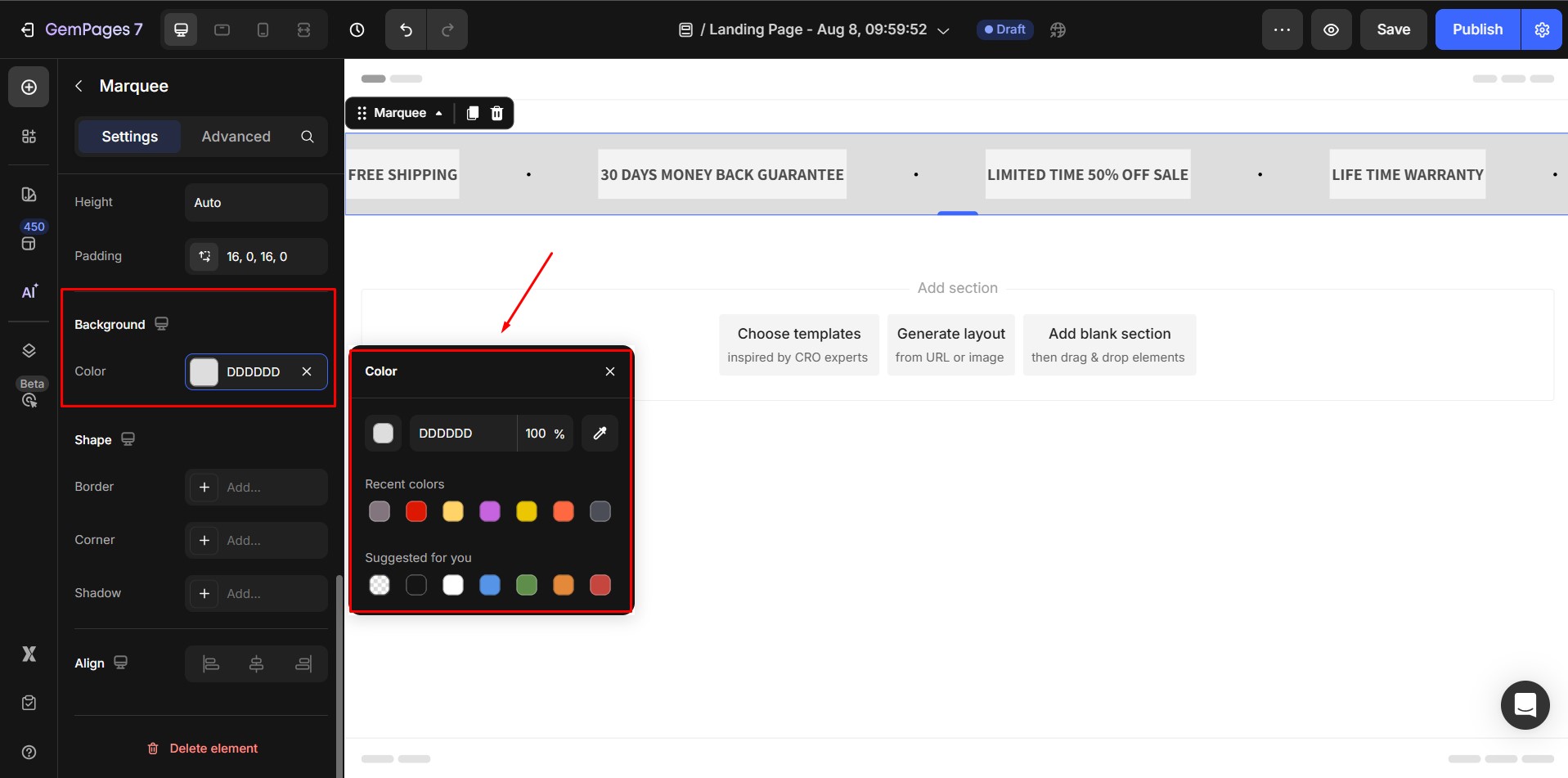
Background
Color: Apply background color to the marquee.
Shape
Configure borders, corners, and shadows.

Align
- Alignment will be disabled when the Width is 100%.
- If not, the default alignment option is align Center.

Configure the Advanced tab
Refer to this article for further instructions on configuring the Marquee Element’s Advanced tab.
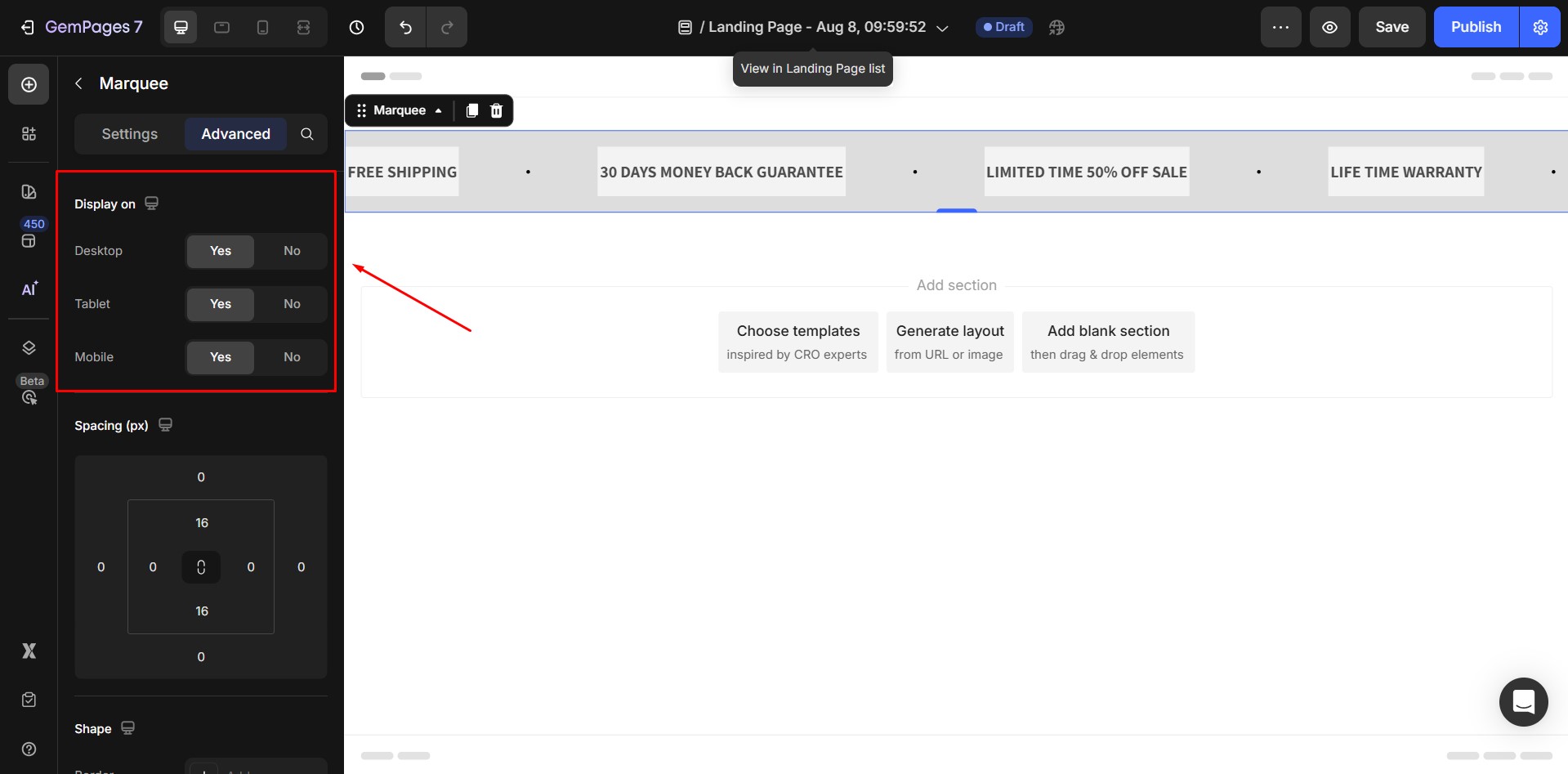
Display on
You can decide which devices the Marquee element will be shown on: Desktop, Tablet, and Mobile. Simply toggle each option to show or hide the element on specific devices.
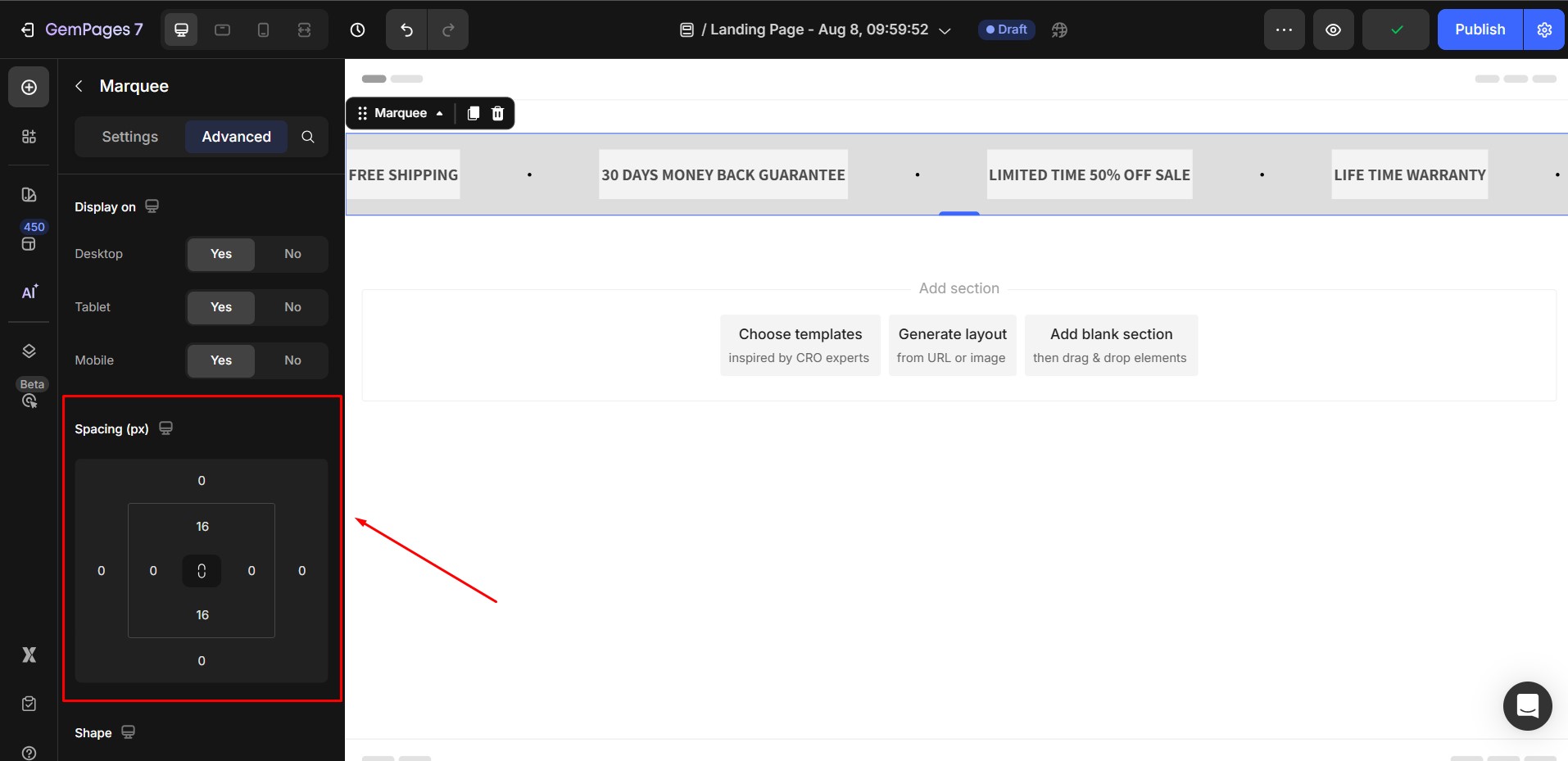
Spacing (px)
Adjust the margin and padding values around the Marquee element using the visual box model:
- Outer values (top, right, bottom, left) control the margin (the space outside the element)
- Inner values control the padding (the space inside the element’s container)
- Click the link icon in the center to sync/unlink values.
Shape
In the Shape section, you’re able to:
- Add a border to the element and select from different styles (solid, dashed, dotted).
- Customize the corner radius: choose between square, rounded, or pill-style corners.
- Enable a shadow to help the element stand out from the background.

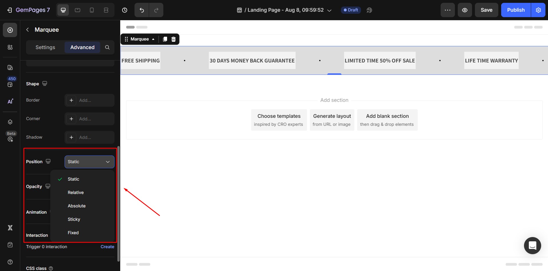
Position
Change how the Marquee is positioned within its section or relative to other elements, including:
- Static
- Relative
- Absolute
- Sticky
- Fixed
Opacity
Adjust the element’s transparency level:
- 100% = fully visible
- 0% = fully transparent
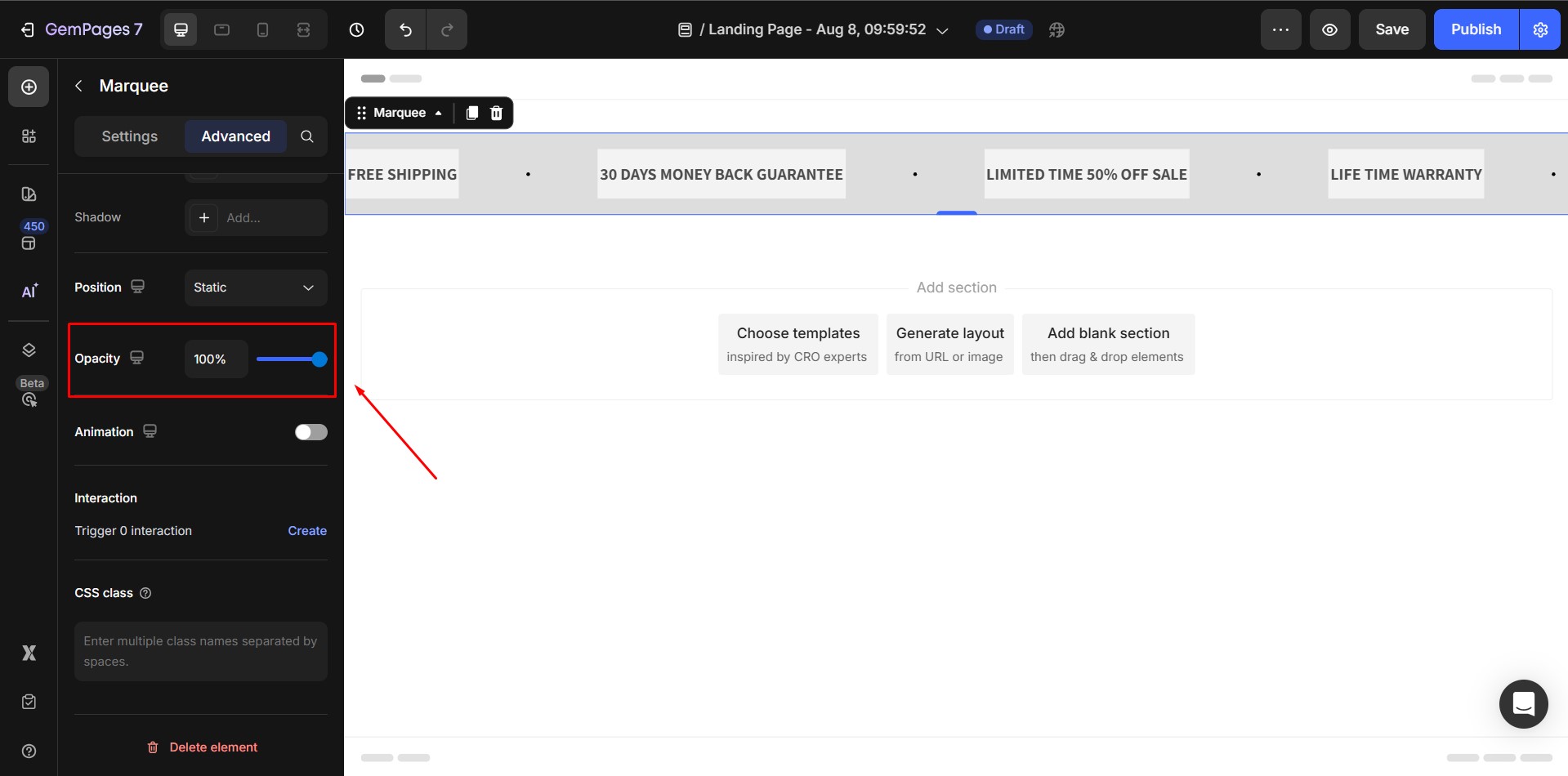
Use the slider or input box to fine-tune the visibility. Helpful when layering elements or creating subtle visual effects.
Animation
Enable this option to add an entrance or hover animation to the Marquee element. Once turned on, you can customize the animation behavior with the following options:
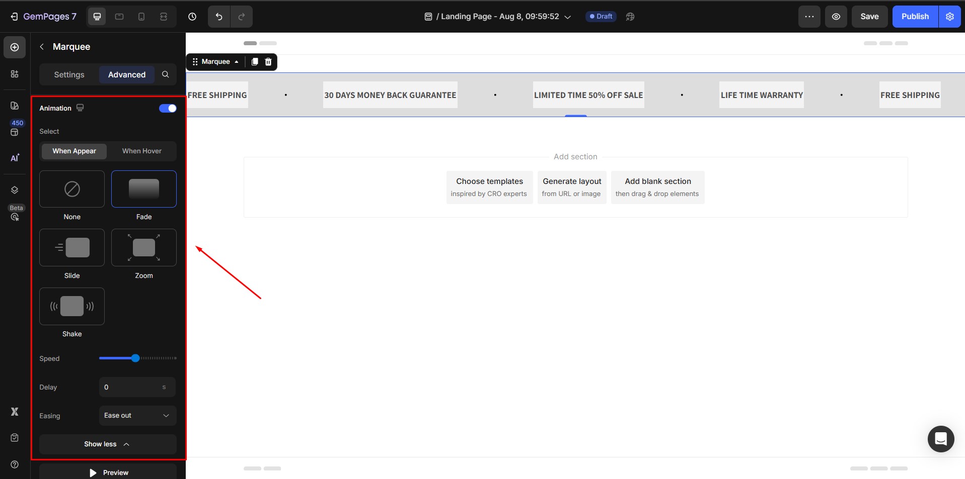
- When Appear/When Hover: Choose whether the animation should be triggered when the element appears on the screen or when a user hovers over it
- Animation types: You can choose from several animation styles: None, Fade, Slide, Zoom, Shake
- Speed: Adjust the animation speed using the slider. Moving it to the right will make the animation play faster
- Show more: Click this button to access additional animation effects (if available).
- Preview: Use the Preview button to test how the animation looks directly in the editor.
- Delay: Set a delay (in seconds) before the animation starts. This is useful if you want to stagger animations across multiple elements.
- Easing: Choose how the animation progresses over time, available options include: Ease in out, Ease in, Ease out, Linear
- Preview: Click the Preview button to instantly test the animation in the editor.
Overusing it can affect performance and distract users.
Interaction
Create custom behaviors for your Marquee element without coding. Click Create to open the Interaction Settings panel.
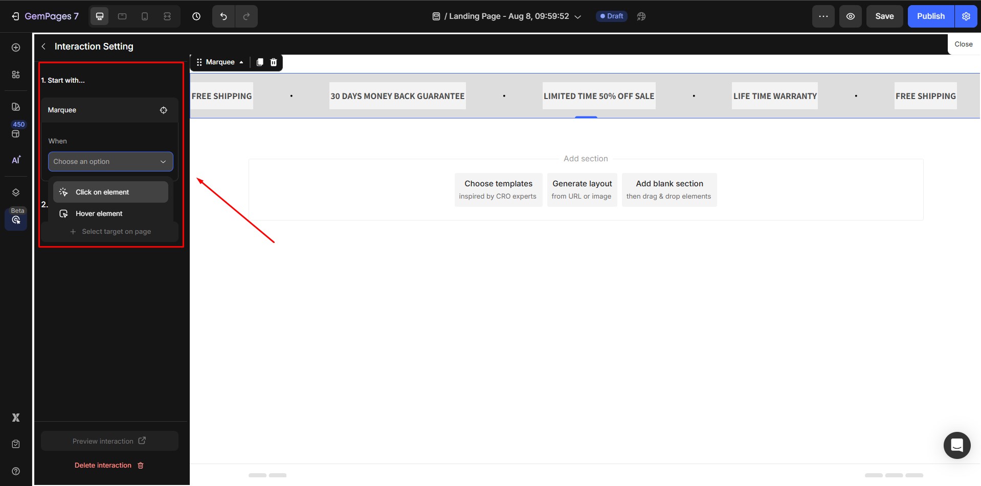
You’ll set up:
- Trigger: Choose when the interaction starts – Click on element or Hover element.
- Action: Select a target element on the page and define what happens, including change text style, change content, show/hide, or scroll to.
CSS class
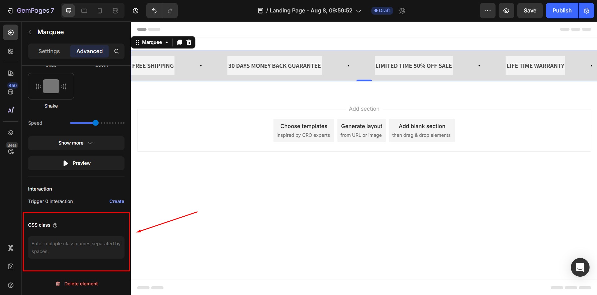
Enter custom CSS class names (separated by spaces) to apply your own styling rules to the element. This is helpful if you want to add advanced styling through custom CSS in your theme or inside the GemPages Global Style.
FAQs about the Marquee Element
1. Why is my marquee scrolling speed inconsistent across devices?
Speed differences can happen when image-heavy items load slowly on certain networks. Once all images finish loading, the scrolling effect stabilizes. To avoid this, optimize or compress large images.
2. Can the Marquee element slow down my page?
Yes, if you add too many items or nest multiple marquees on the same page. We recommend using fewer than 20 Marquee elements per page to maintain performance and smooth animation.
3. Why does my marquee resize after loading?
This happens when items contain large images that finish loading after the animation starts. The element recalculates its size once images are fully loaded. Using compressed images or fixed item widths can minimize shifts.
4. Can I make the marquee pause on click instead of hover?
The built-in “Stop on Hover” option only pauses on hover. If you need pause-on-click behavior, you can simulate it using Interactions by toggling show/hide behavior or switching to a non-animated version.
5. Can I create a Vertical Marquee in GemPages v7?
Currently, the Marquee Element in GemPages v7 supports horizontal scrolling only (left-to-right or right-to-left). A vertical scrolling marquee (top-to-bottom or bottom-to-top) is not supported natively.
If you want to create a similar visual effect, please contact our Support Team for further instructions.
6. How do I add a shadow to the Marquee element?
- Click on the Marquee element in the Editor.
- Go to the Settings tab.
- Open the Shape section.
- Enable Shadow, then adjust the shadow type, color, blur, distance, and size as needed.


Thank you for your comments