


What is the Product View More element?
The Product View More element in GemPages is a dynamic button that redirects visitors to a product detail page.
It is typically used in a Product List or Collection section, where multiple products are displayed with only basic information such as images and titles.
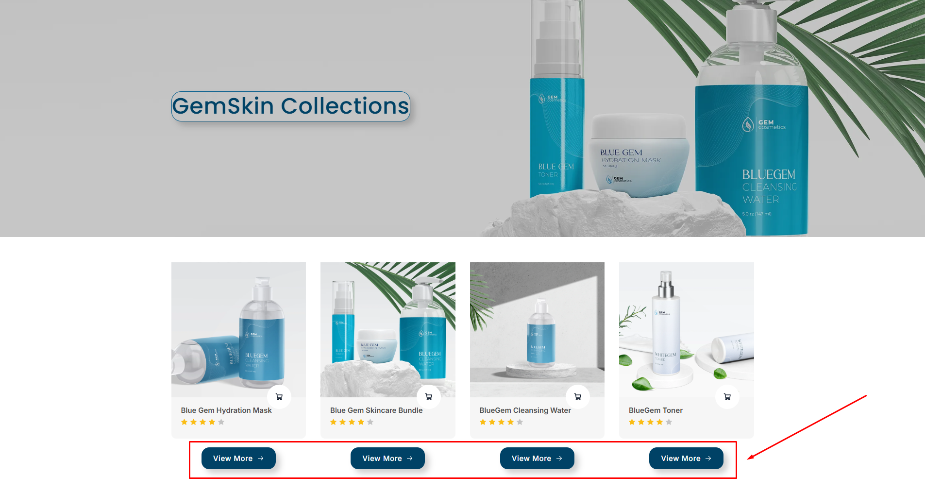
By adding a Product View More button, you give shoppers a clear way to view the full details of a product, encouraging deeper exploration and increasing the likelihood of a purchase.
For example, imagine a product grid showcasing products. Each product card might only show the image, title, and price. By adding the Product View More button, customers can click to access the complete product detail page directly.
How to Add the Product View More Element to Your Page?
Follow the steps below to add it to your page:
Step 1: Use the search bar to find this element, then drag and drop it to your desired position.
For example, if you are building a collection page, you can drop the button under each product card in your Product List.
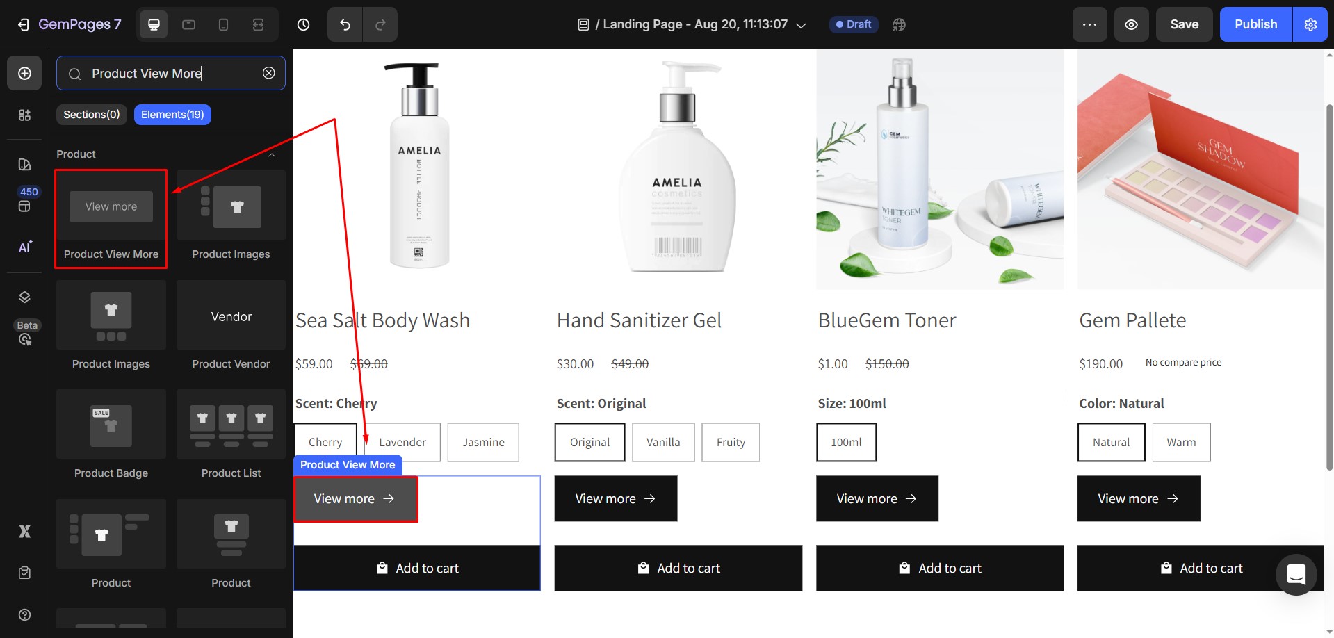
Step 2: Once added, click on the Product View More button to open its Settings panel on the left sidebar. You will see two tabs available: Settings and Advanced.
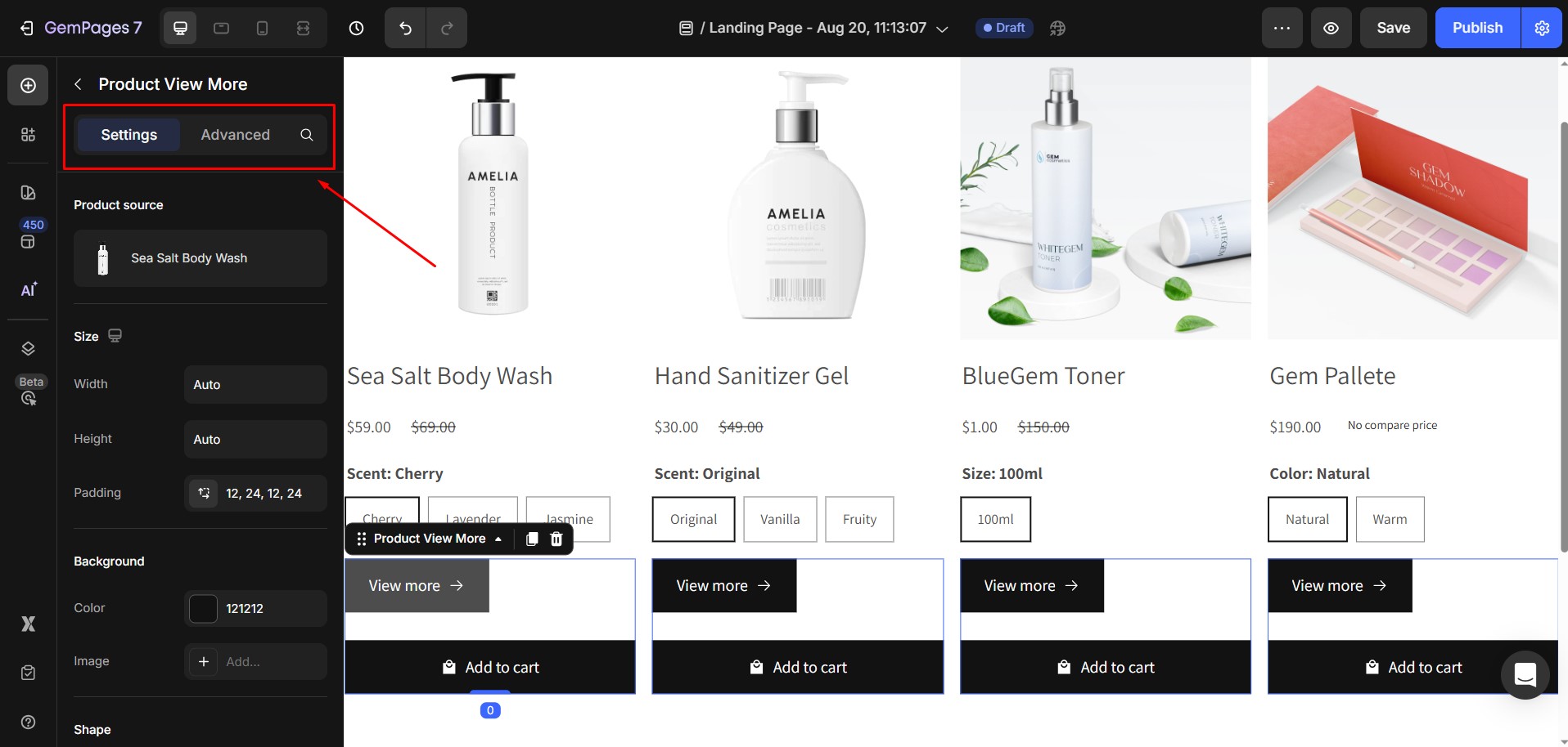
Configure the Settings Tab
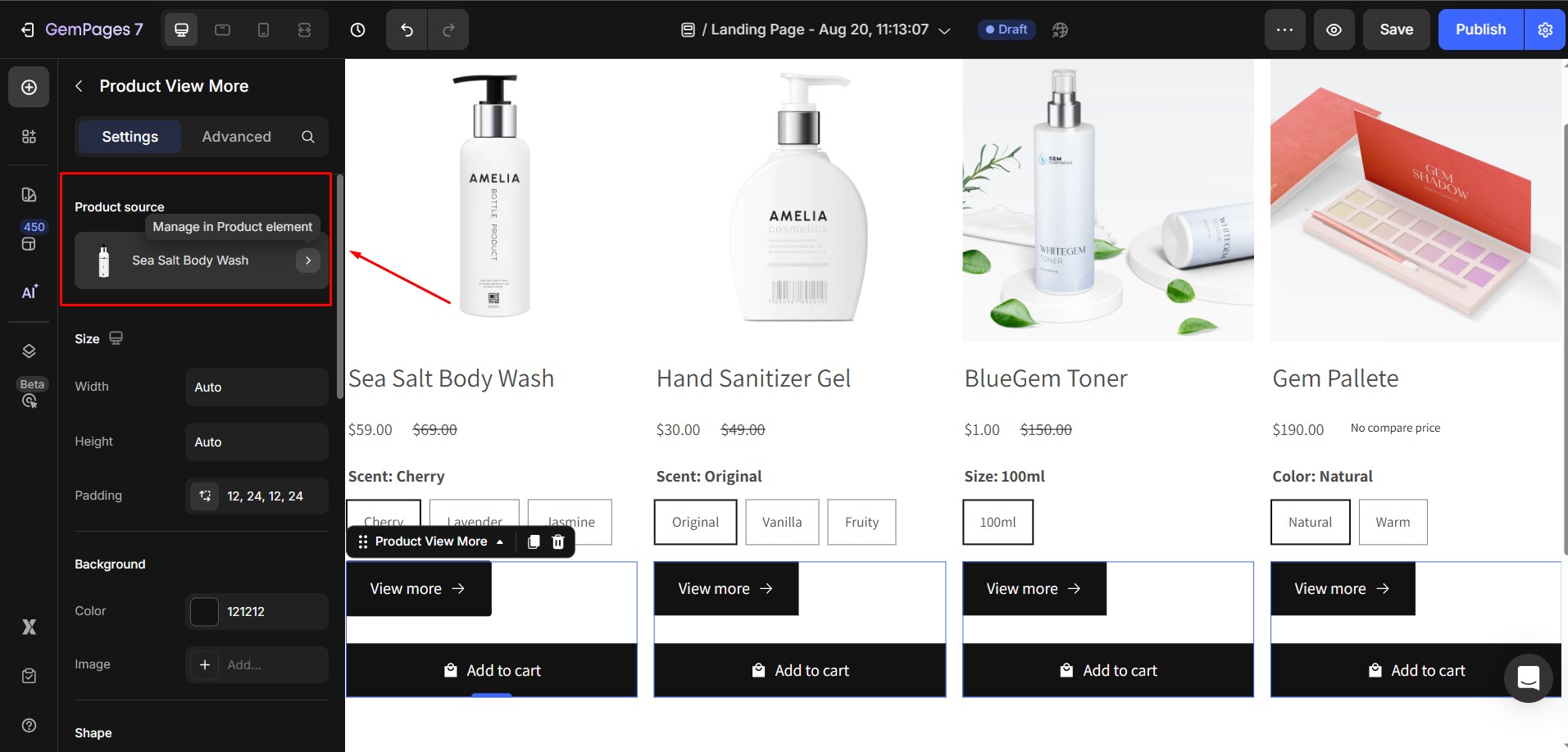
1. Product source
Shows which product the element is displaying information from.
The button will automatically pull product data from your Shopify Admin. Make sure that the necessary product information (title, description, price, etc.) is already set up in your Shopify store.
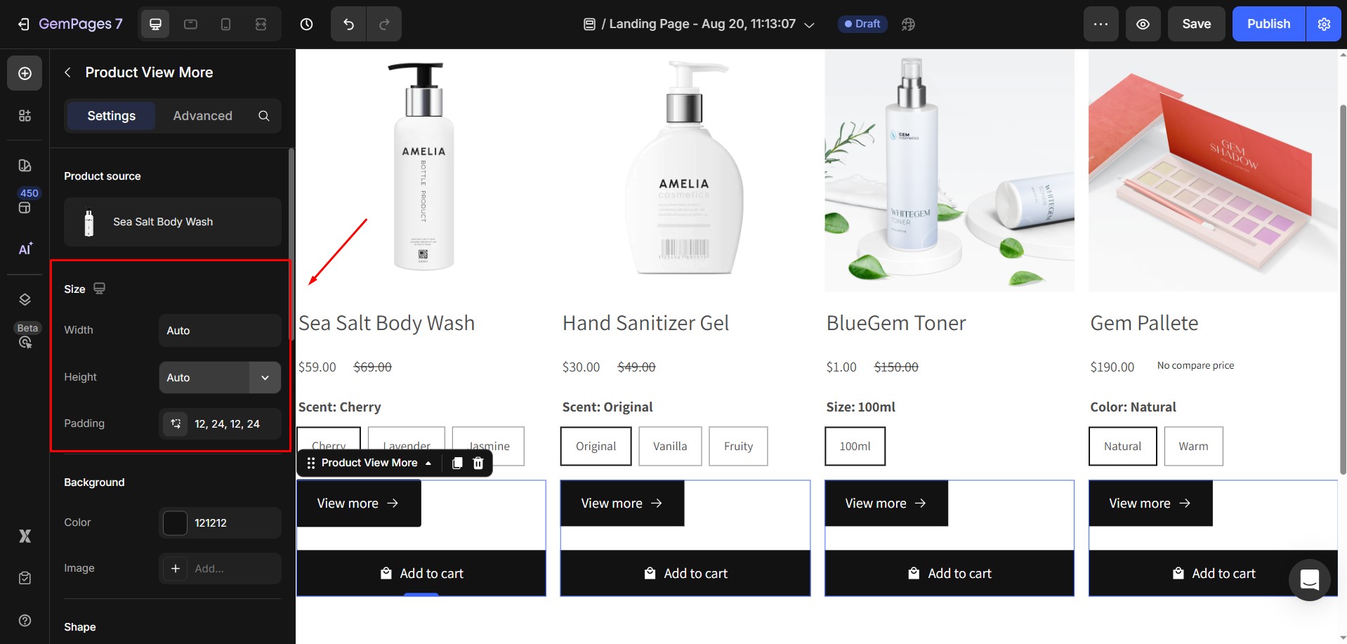
2. Size
You can adjust the width, height, and padding of the button. These values are defined in pixels and let you control how large or compact the button looks.
3. Background
Choose between a color and an image background for the button.

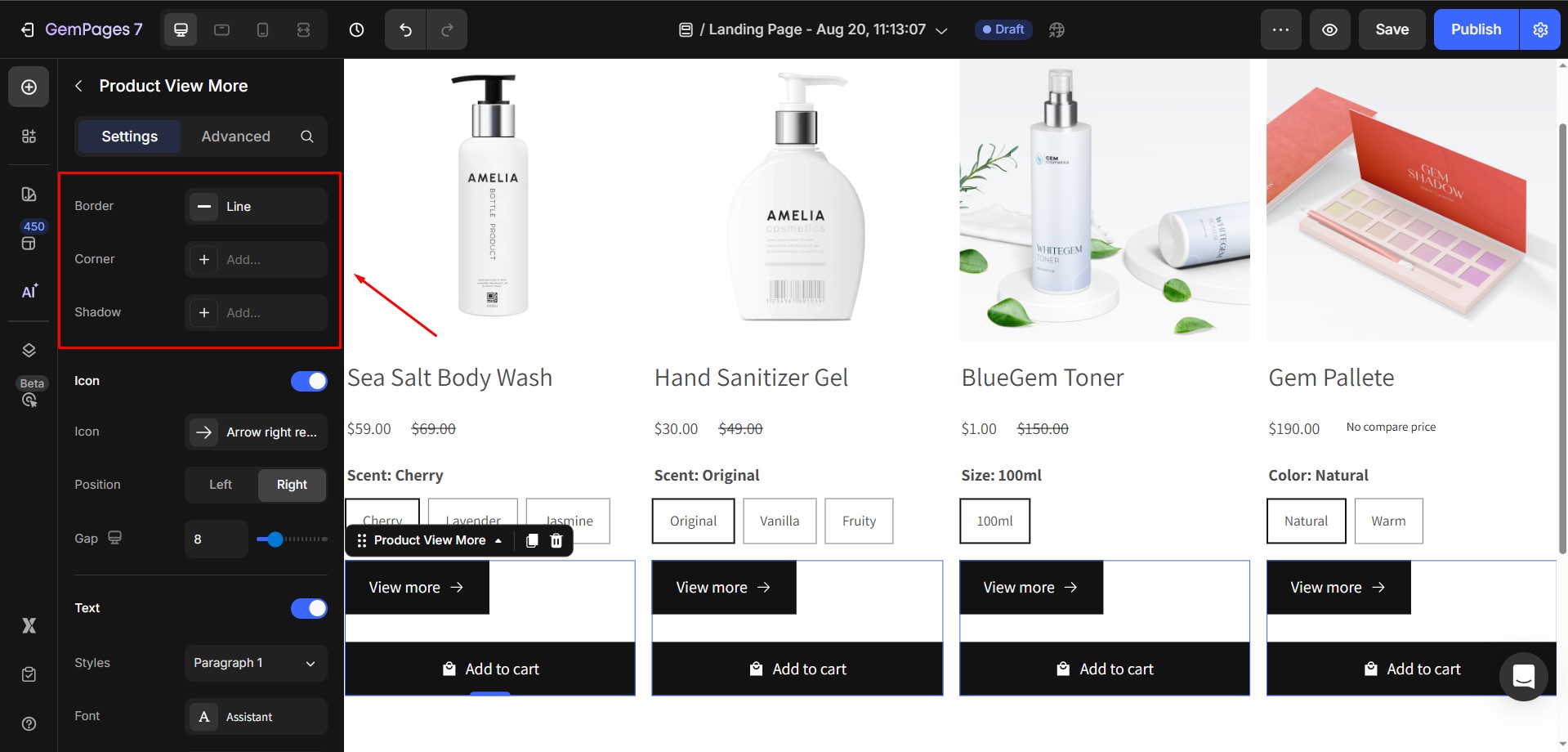
4. Shape
This section controls the button’s overall style:
- Border: Define the border thickness and style.
- Corner: Adjust the corner radius.
- Shadow: Add depth with a button shadow.
5. Icon
You can add an icon to the button or leave it text-only.
If you choose to add one:
- Icon: Select from GemPages’ built-in icons or upload your own custom icon.
- Position: Decide whether the icon appears on the left or right side of the text.
- Gap: Adjust the spacing between the text and the icon. You can set a value manually or use the slider.
6. Text
Under the Text section, toggle it ON to expand the full text’s configurations, including:
- Style: Select from six heading styles or three paragraph styles predefined in the Editor.
- Font: Choose a font from the library or upload your own custom font.
- Size: Set the font size in pixels.
- Color: Select a text color to match your design.
- Font Weight: Adjust how bold the text appears.
- Line Height: Define the vertical spacing between lines of text.
- Letter Spacing: Adjust the spacing between individual letters.
- Transform: Apply text transformations such as uppercase, lowercase, or capitalize.
- Shadow: Add a shadow to the text for emphasis.

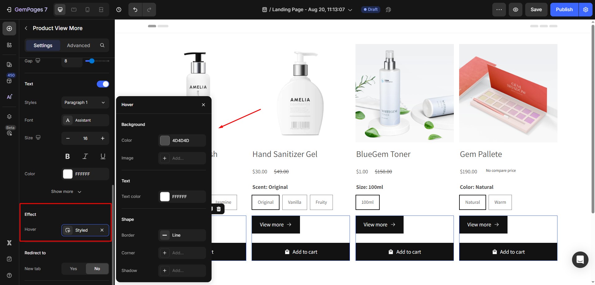
7. Effect
- Hover: Define how the button changes when hovered over. You can adjust the background color, text color, border, corners, and shadow for the hover effect.
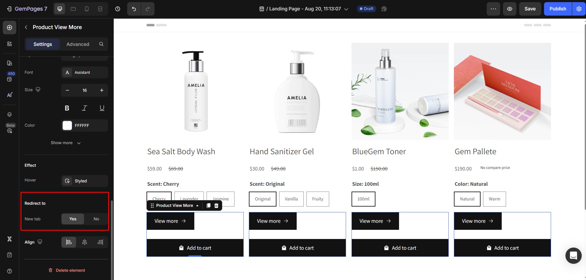
8. Redirect to
- New Tab: Choose whether the product detail page opens in a new browser tab (Yes) or the current tab (No).
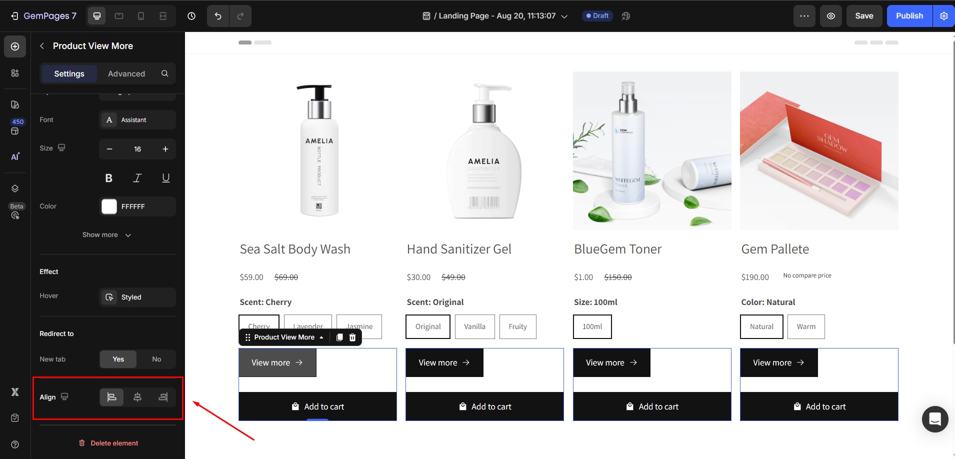
9. Align
Align the button within its container. You can place it to the left, center, or right.
Configure the Advanced Tab
For more advanced customization, please navigate to the Advanced tab and follow the instructions in this article.


Thank you for your comments