


This guide provides a complete introduction to the Item List element in GemPages, along with step-by-step instructions on how to add and customize it to display content effectively on your webpage.
What is Item List Element in GemPages?
The Item List element allows you to present information in a list format, with each item starting with an icon. You can choose icons from the GemPages icon library to maintain visual consistency, or, if you prefer custom icons or images, use the Advanced List element instead.
This element is ideal for:
- Highlighting product features
- Listing benefits or service points
- Presenting step-by-step processes
- Creating compact, scannable content
How to add the Item List element to your page
To add the Item list element to your page, please follow the steps below:
Step 1: From your GemPages Dashboard, select the page you want to edit and open it in the Editor.
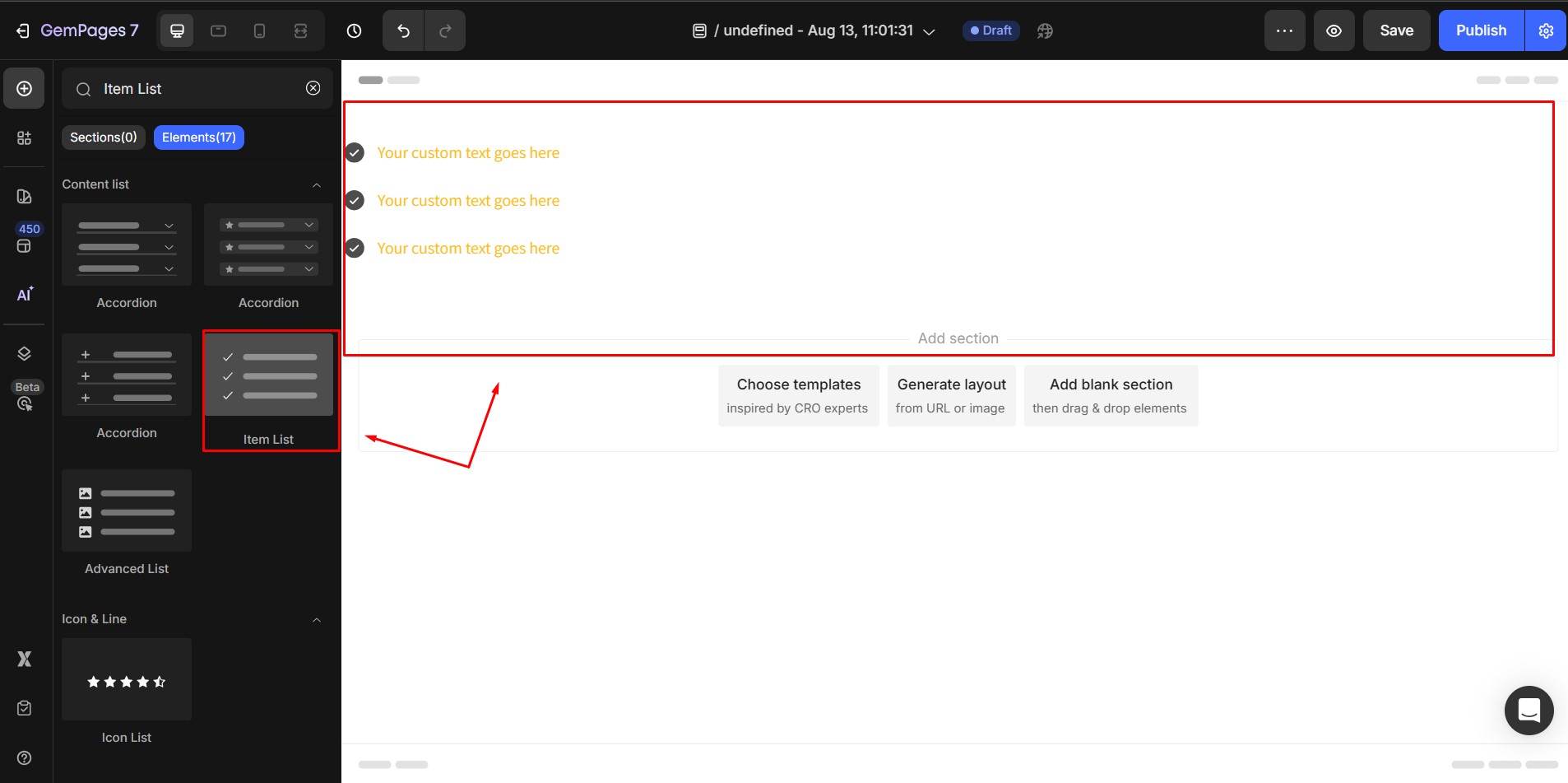
Step 2: Inside the Editor, go to the Content list section in the left sidebar or search for “Item list” in the search bar.
Step 3: Drag and drop the Item List element into your desired location on the page.
Configure Item Element Settings
Once the element is on your page, click on it. The left sidebar will display two main tabs: Settings and Advanced:

The Settings Tab
1. Item management
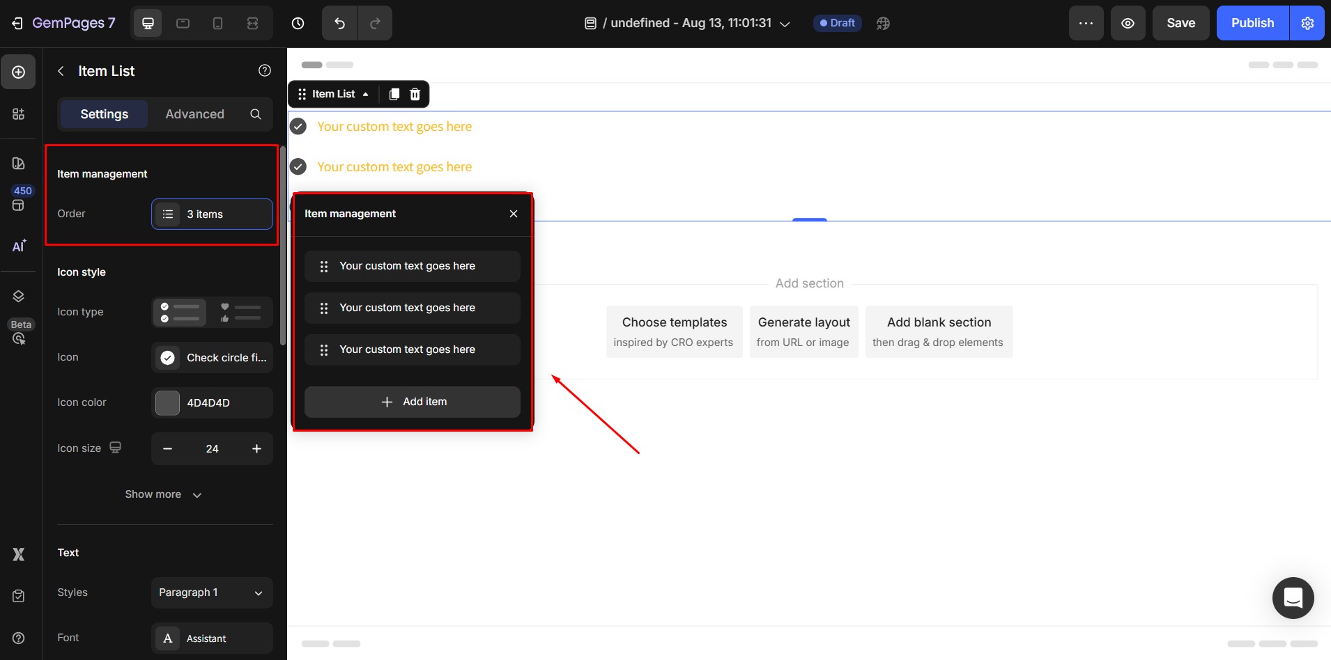
This section allows you to add, remove, or reorder list items:
- Add an item: Hover over an existing item and click the Duplicate icon to create an exact copy.
- Remove an item: Click the Trash icon on the item you wish to delete, then confirm.
- Reorder items: Hover over the item you want to move, click and hold the mouse, then drag it up or down to change its position in the list. Release the mouse when the item is in the desired order.
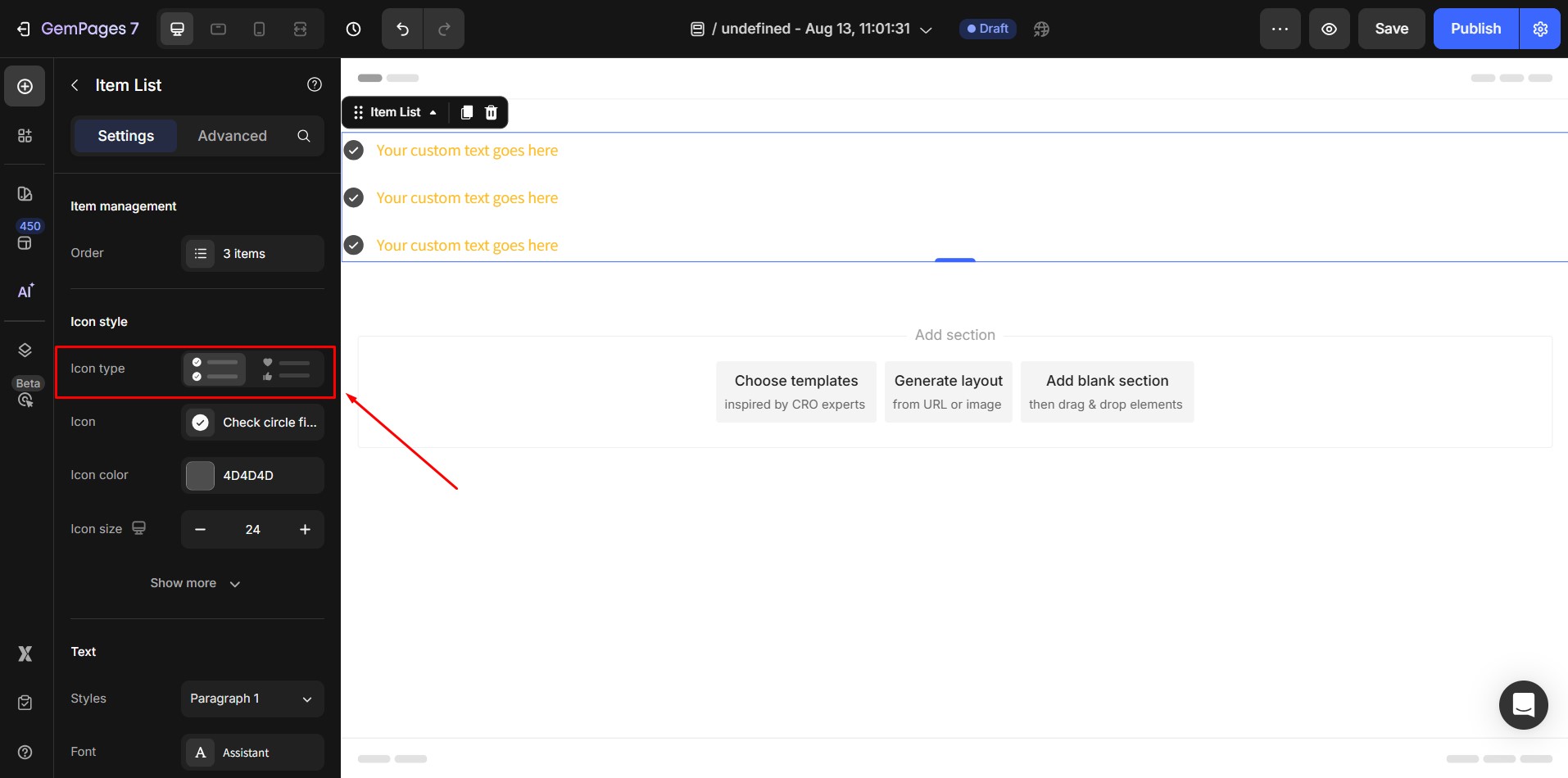
2. Icon
- Icon type: Type of icons of each item in the Item list. There are 2 icon type options:
Matching icons: All icons in the Item list will be the same.
Different icons: Each item in the Item list has an individual icon.
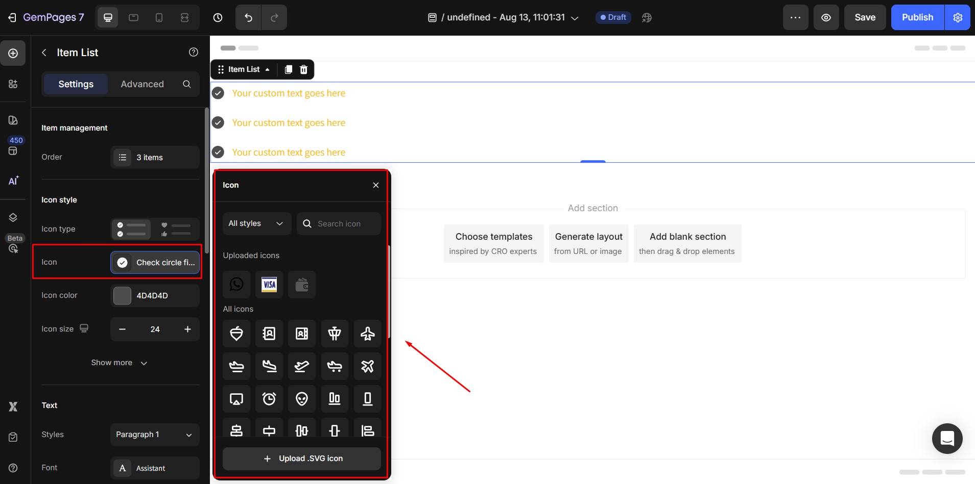
- Icon source: Select the displaying icon
If icon type = Matching icons: All icons in the Item list will be the same.
If icon type = Different icons: Each item in the Item list has an individual icon.
User manually pick each icon for each item.
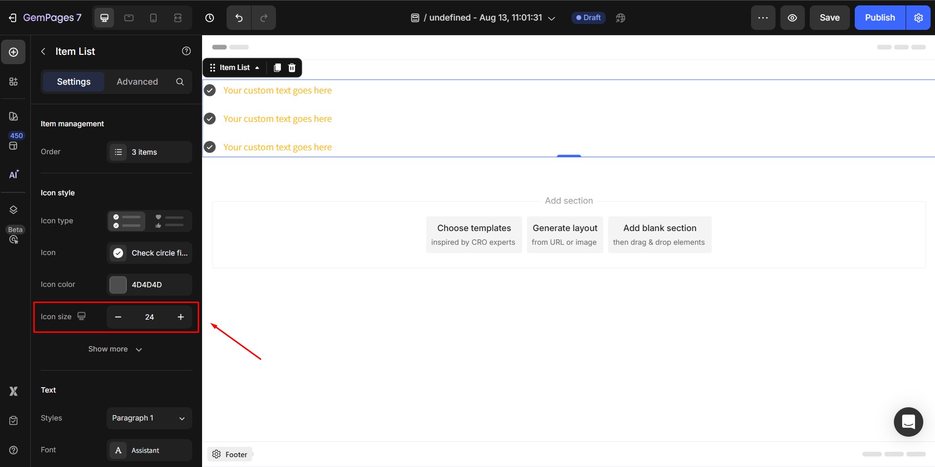
- Icon size: Input your preferred size for the icon. The default icon size is 16px.
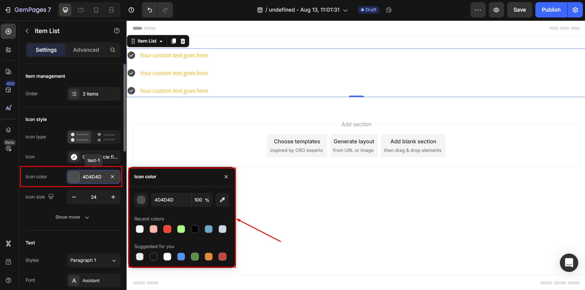
- Icon color: Choose the color for your icon from the palette or input the color hex code into the box.
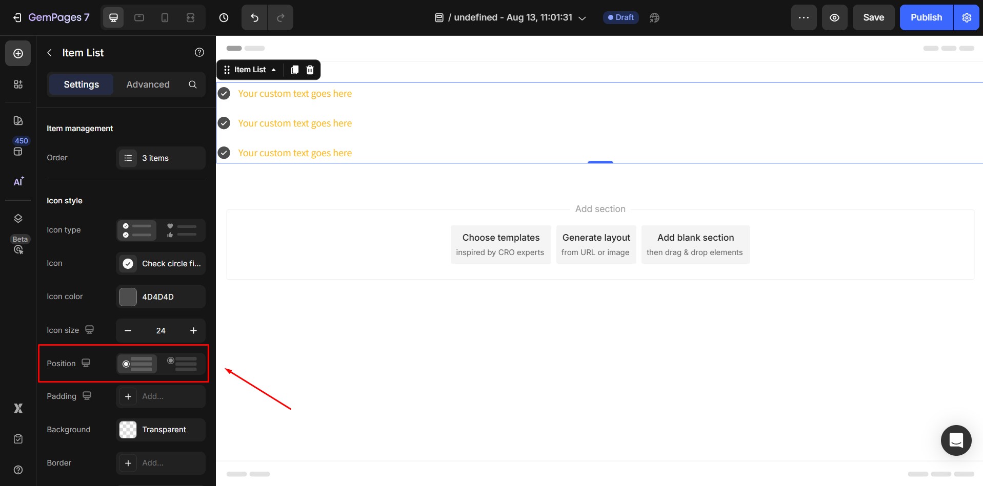
- Position: Position of the icon relative to the text in each item of the list. There are 2 position options: Align top, Align center.
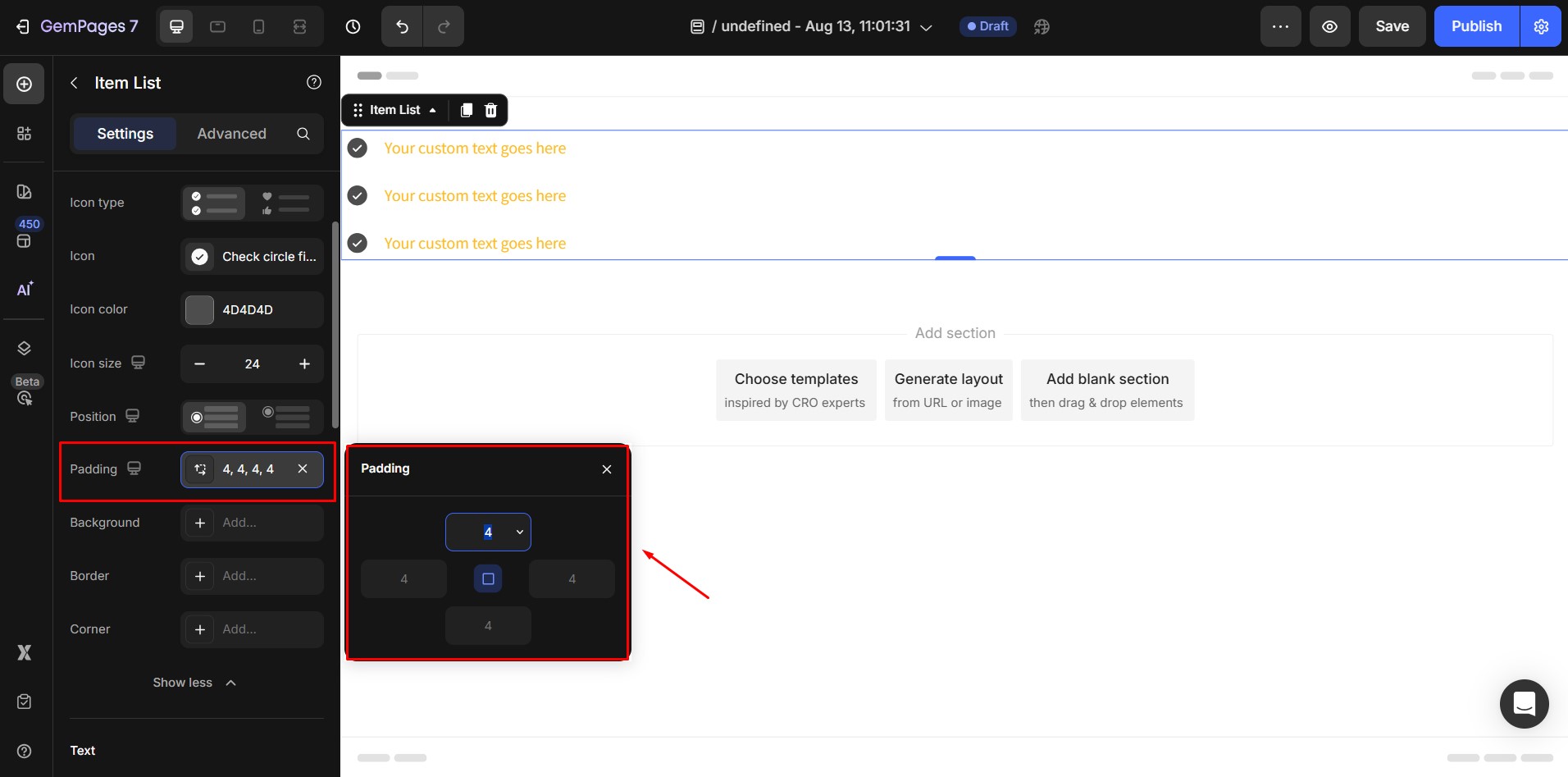
- Padding: Adjust the space inside the icon’s container. This controls how close the icon sits to its container edges. Increase padding for more breathing room around the icon; decrease for a tighter fit.
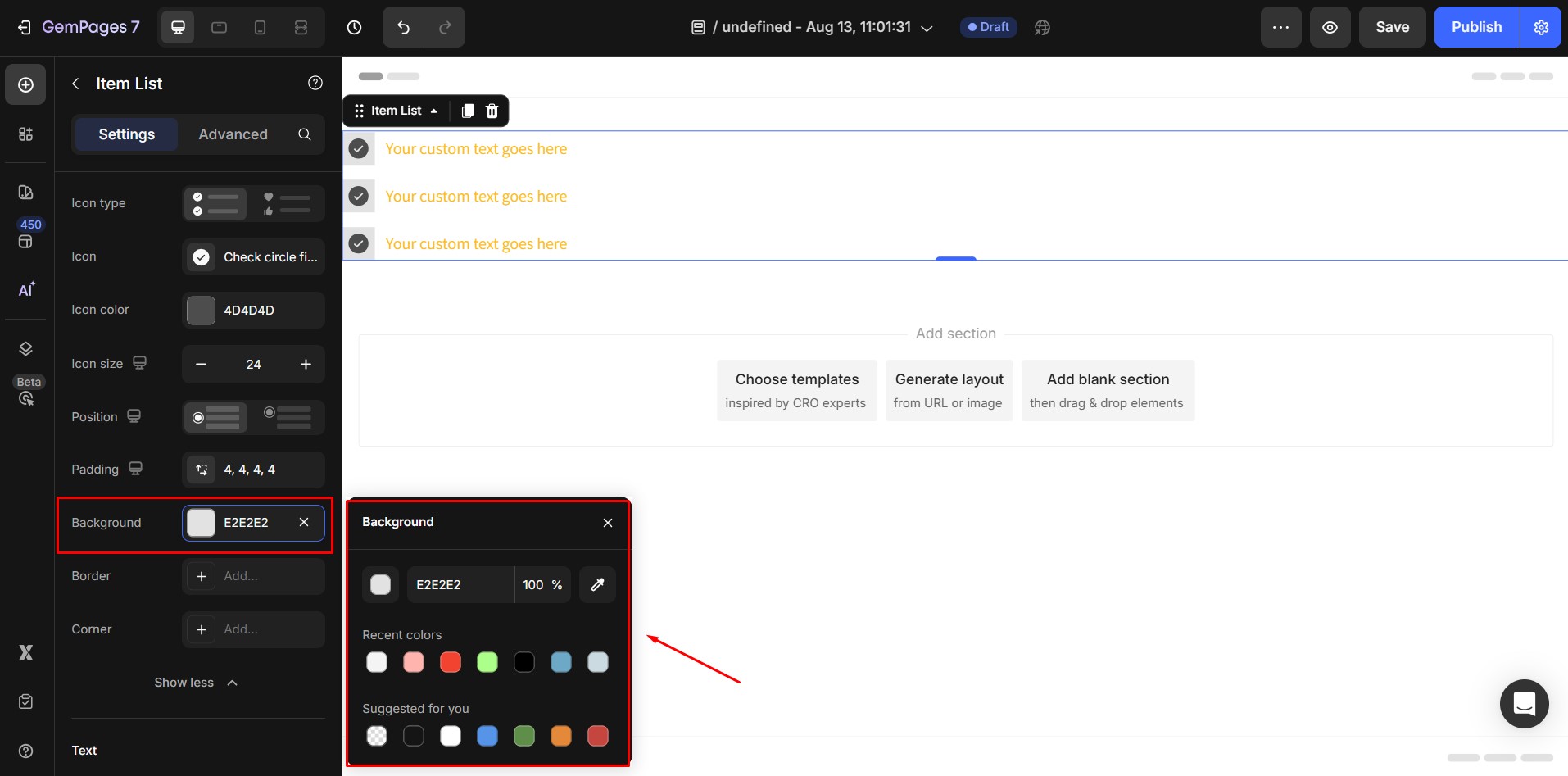
- Background: Add a background behind the icon.
Color: Select a solid or gradient background color.
Image: Upload an image to appear behind the icon.
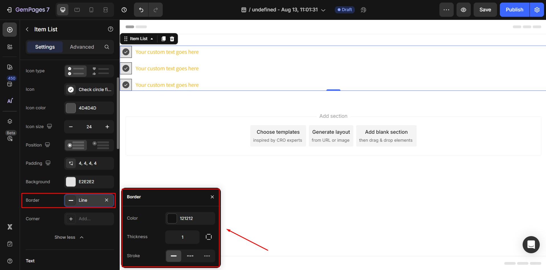
- Border: Add a border around the icon’s container. You can set:
Border style (solid, dashed, dotted)
Border thickness (in pixels)
Border color
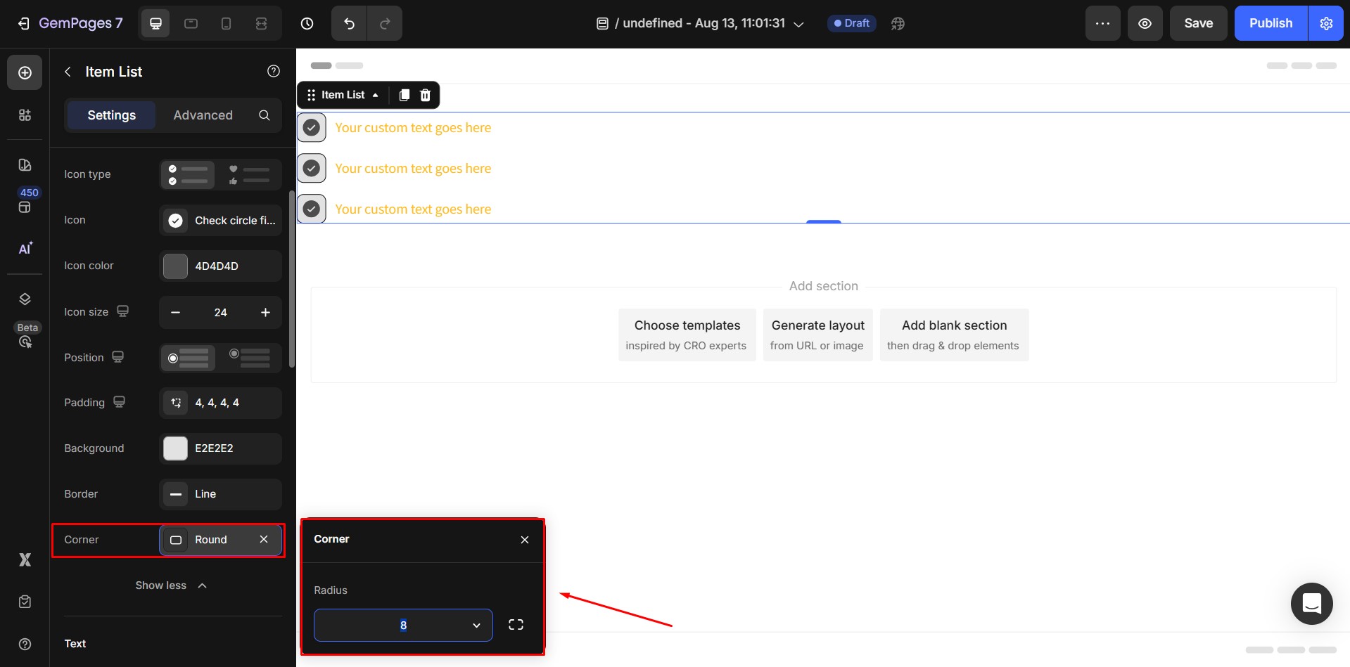
- Corner: Adjust the roundness of the icon’s container corners by setting a border radius.
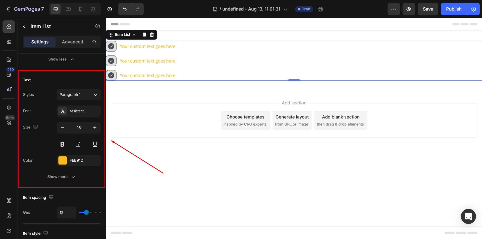
3. Text style
At this point, you have the ability to edit the typography of the text. Here are the available options:
- Styles: Select your desired style from the pre-defined options, which include 6 heading styles and 3 paragraph styles.
- Font: Choose the font you wish to use for the text. If you want to use a font that is not listed, you can refer to the provided guidance on how to add a custom font in Editor ver 7.
- Size: Adjust the font size by specifying a value in pixels.
- Color: Modify the color of the text to your preference.
Click on the “Show more” button to reveal more customization options:

- Font Weight: Choose your desired font weight from the provided drop-down menu.
- Line Height: Adjust the height of the text by specifying a percentage value.
- Letter Spacing: Modify the spacing between letters by inputting a value in pixels.
- Text Transform: Transform the text in one of the following ways: No transformation applied, Uppercase, Lowercase, Capitalize.
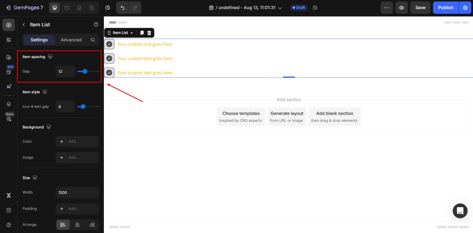
4. Item Spacing
Adjust the vertical spacing between list items using the slider.
Default: 12px.
5. Item Style
Icon & Text Gap – controls the horizontal space between icon and text.
Default: 8px.

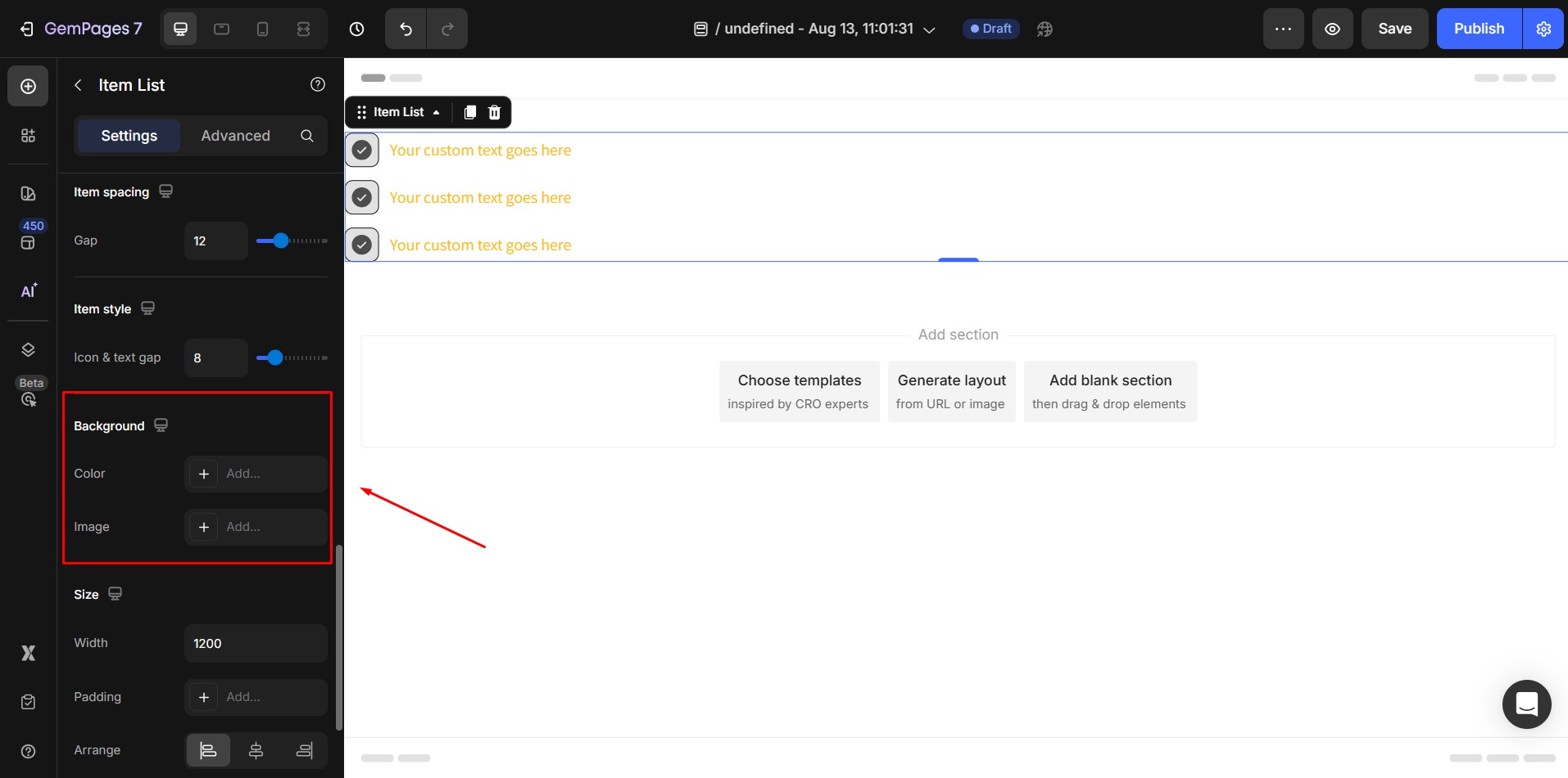
6. Background
- Color: Click the color picker to choose a solid or gradient color background.
- Image: Upload a background image from your device. Recommended size depends on your design layout.
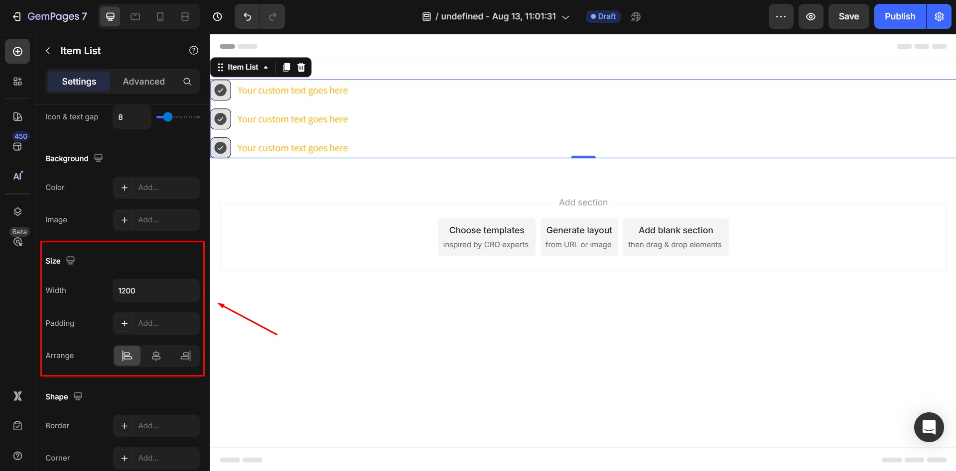
7. Size
- Width: Enter a numeric value (px) or choose:
Fit content: Matches width to content size.
Full: Stretches to full container width.
- Padding: Adjust inner spacing between content and the element’s border.
- Arrange: Align the entire element Left, Center, or Right.
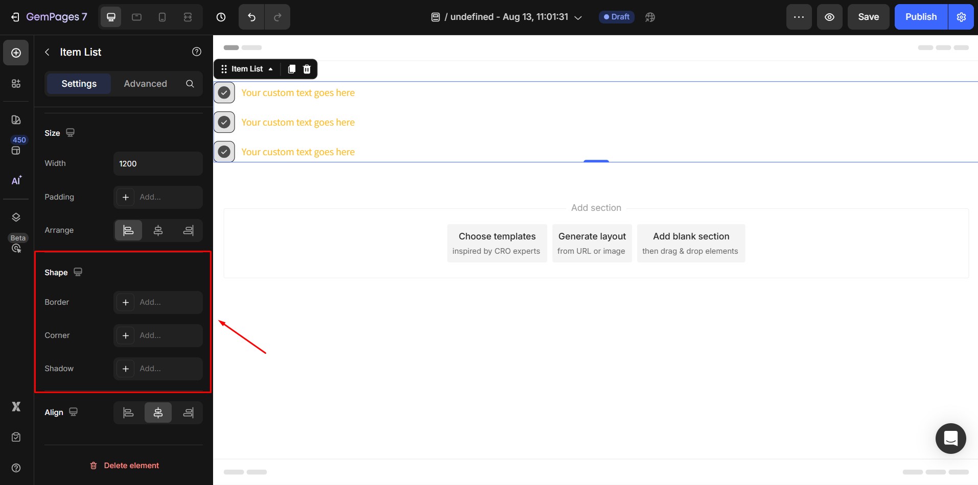
8. Shape
- Border: Add a border, choose style (solid, dashed, dotted), set thickness, and color.
- Corner: Round the corners by setting a radius value (e.g., 5px for slight rounding, 50px for fully rounded).
- Shadow: Add shadow effects for depth; adjust blur, spread, and color.
9. Align
- If width = 100%, alignment is fixed and cannot be changed.
- Otherwise, the default alignment is Left, but you can switch to Center or Right as needed.

The Advanced Tab
For advanced customization, go to the Advanced tab. Here you can:
- Add custom CSS for unique styling.
- Control visibility per device type.
- Apply animations and interaction effects.
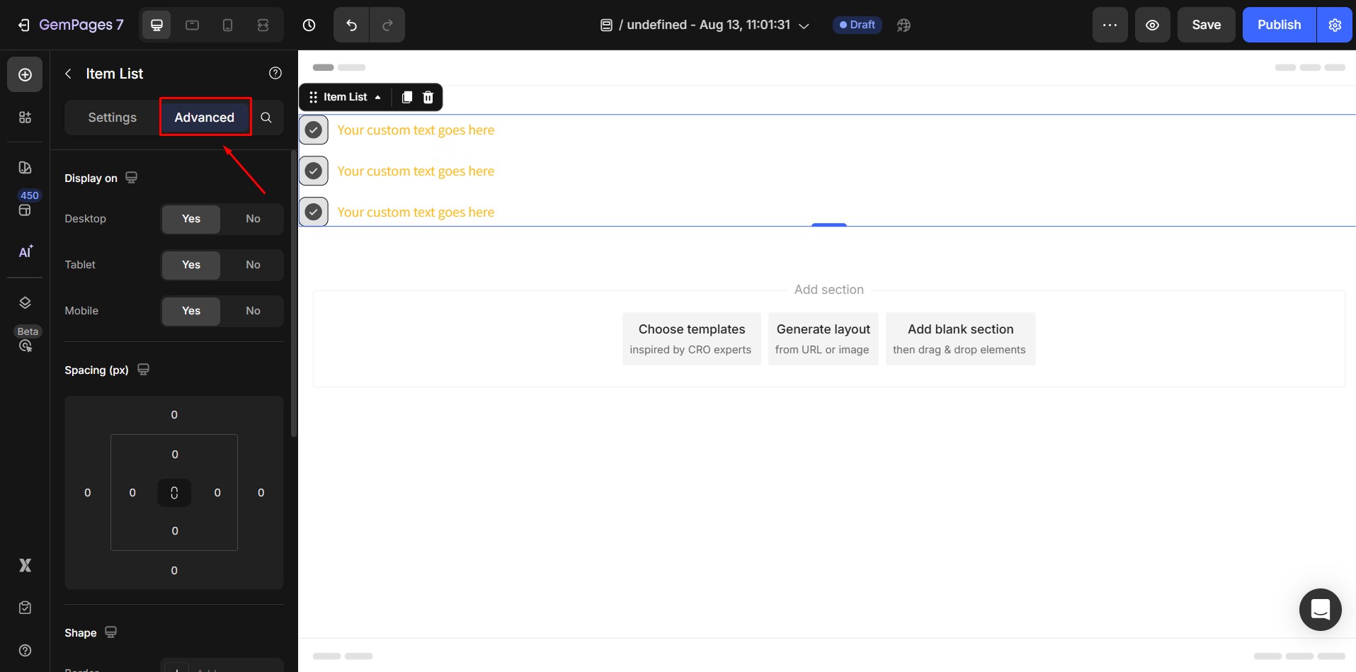
For detailed instructions, see our Advanced Settings article.


Thank you for your comments