


Why Re-ordering Columns on Mobile Matters
By default, columns in a row that are laid out horizontally on the desktop normally will stack vertically on mobile. However, sometimes the automatic column order may not align with your desired layout.
For example:
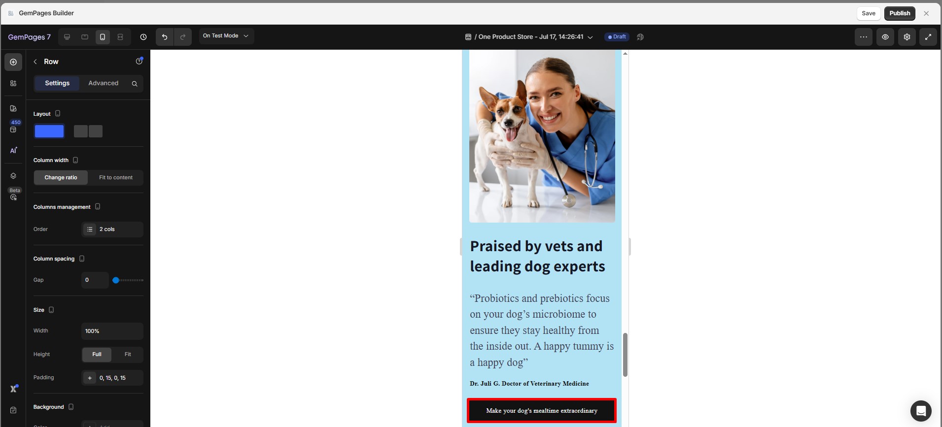
You’re a Shopify store owner. You’ve designed a desktop layout with a 2-column row:
- Column 1 – The image
- Column 2 – Expert thought and CTA button

On desktop, this layout flows well. But on mobile, the content stacks vertically by default. Here’s the issue:
- The image appears first, but the testimonials show up before the CTA button, pushing the CTA further down the page.
- Users may lose interest before reaching the CTA, affecting conversion rates.
As your page transitions from desktop to mobile, ensuring the correct order of columns helps maintain flow and readability.
A well-organized mobile layout enhances user experience, making it easier for visitors to navigate and engage with your content.
Here’s how you can re-order columns on mobile in a few simple steps:
How to Re-order Columns on Mobile (Step-by-Step)
Step 1: Start by opening your page in the GemPages editor. Navigate to the row where the content you want to re-order is located.
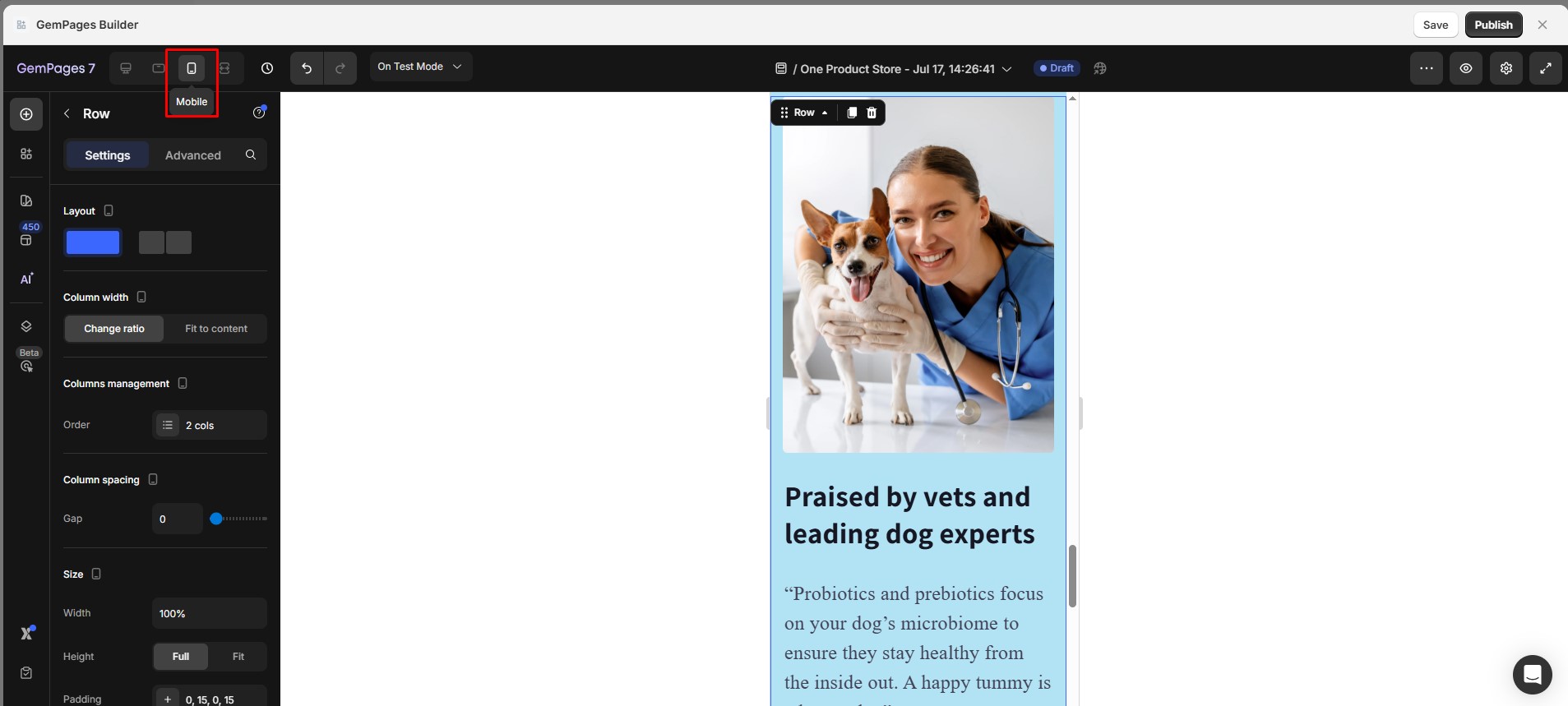
Step 2: Select mobile view.
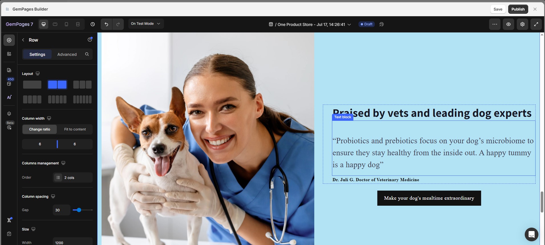
Step 3: Click on the row containing the columns you want to adjust. This will display the row’s settings panel on the left-hand side of the editor.
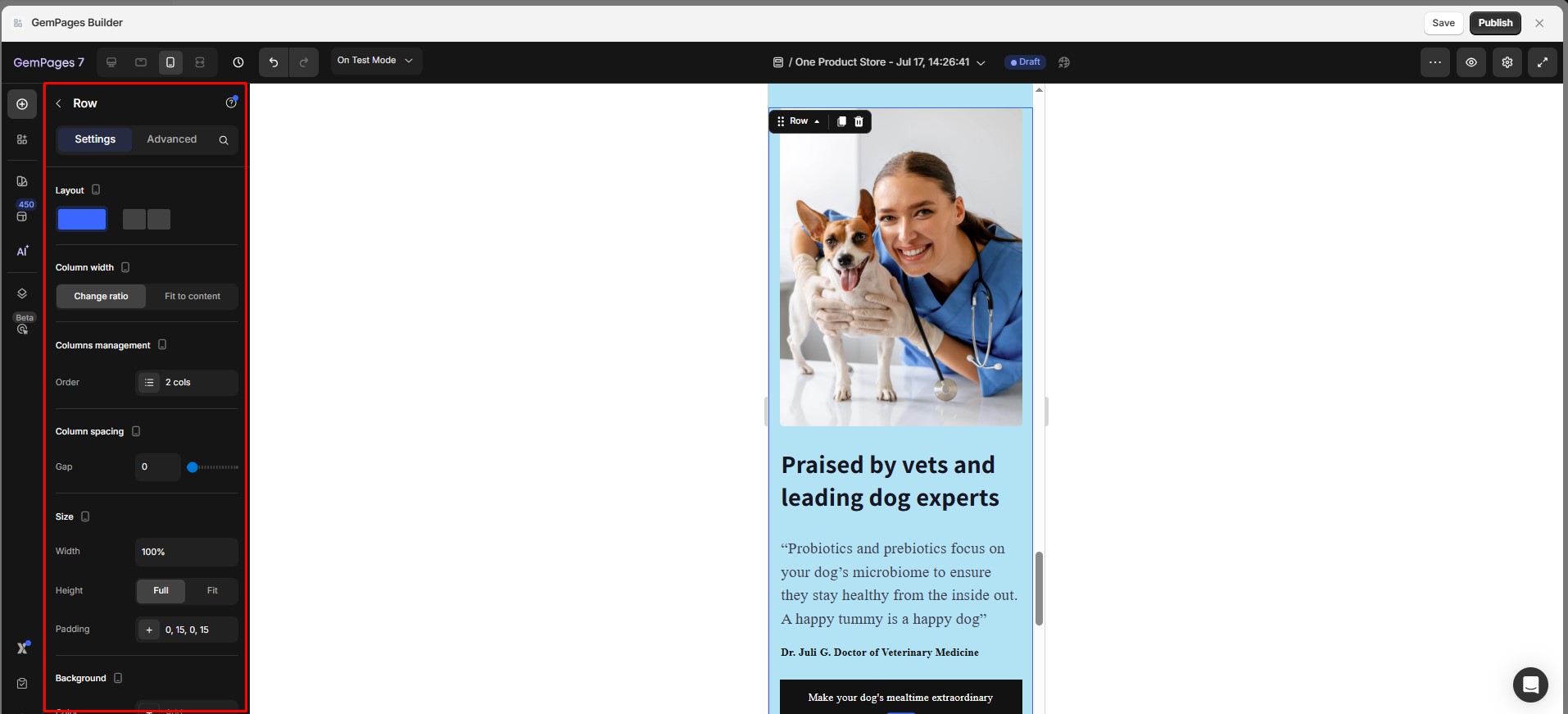
Step 4: Re-order the Columns that suits your mobile layout best.
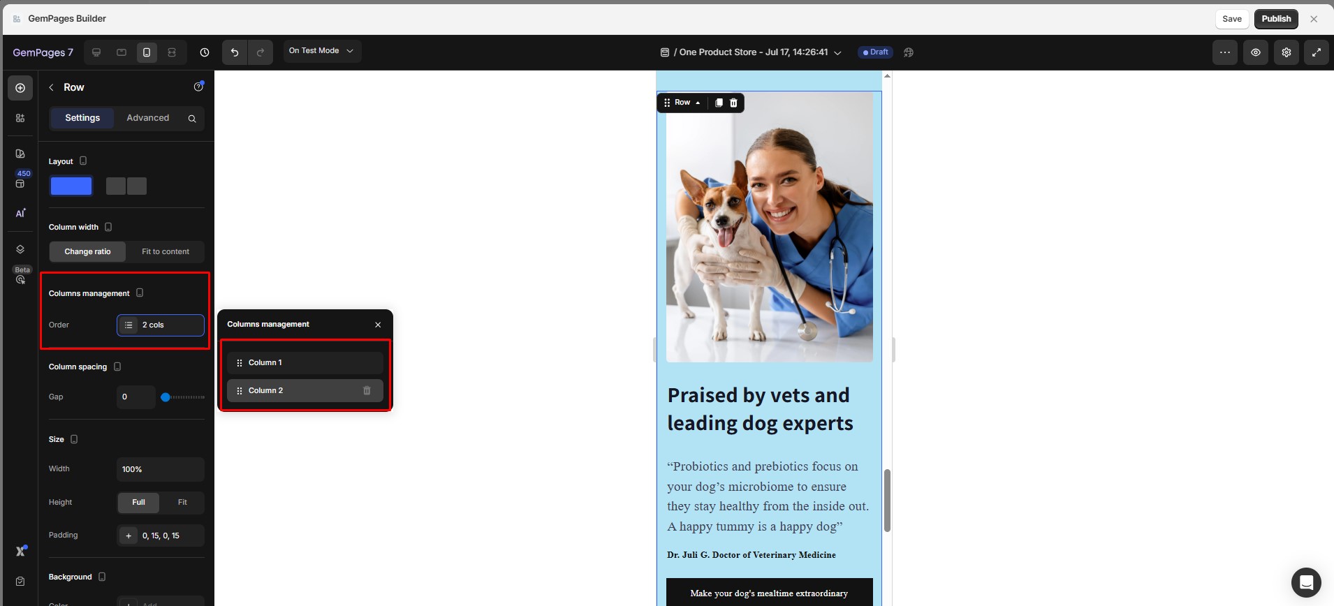
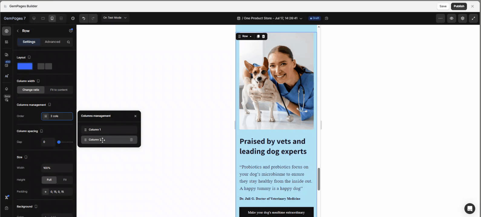
This gives you full control over how the content appears in a vertical stack.
Step 5: After confirming the new order of your columns, hit ‘Save’ and then ‘Publish’ your changes to apply them live to your site.
Final Tips
- Test your layout on multiple mobile screen sizes for best results.
- Keep CTAs and key messages above the fold for higher visibility.
- Consider duplicating rows for desktop vs. mobile if layout logic becomes too complex.


Thank you for your comments