


The Button element is an interactive element that prompts users to take specific actions on your website. However, if your desired action is to add items to the cart, we recommend using the Cart Button element instead.
About the Button Element
The Button element is an interactive element that prompts users to take specific actions on your website, such as navigating to another page, opening a pop-up, or contacting you.
If your desired action is to add items to the cart, we recommend using the Cart button element instead.
Add the Button Element to your page
Step 1: Access GemPages Dashboard > Pages, and locate the target page to open the editor.
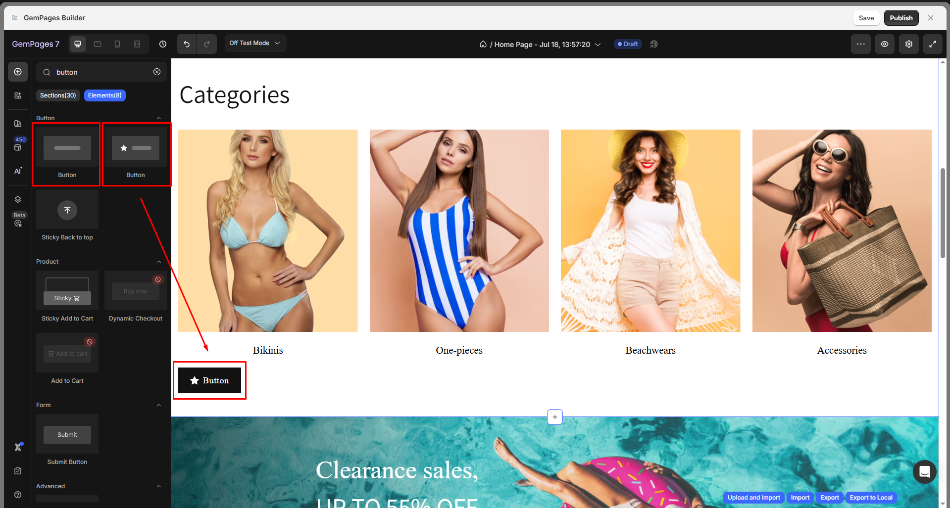
Step 2: In the left sidebar, enter “Button” in the search bar to find the Button element.
You can choose from two button styles, one with a symbol and one without, then drag and drop it to the desired position.
When the element is selected, you’ll find all configuration options in the left sidebar, under the Settings and Advanced tabs.
Configure the Settings Tab
The Settings tab lets you fully control the appearance, layout, and behavior of the Button element, including:
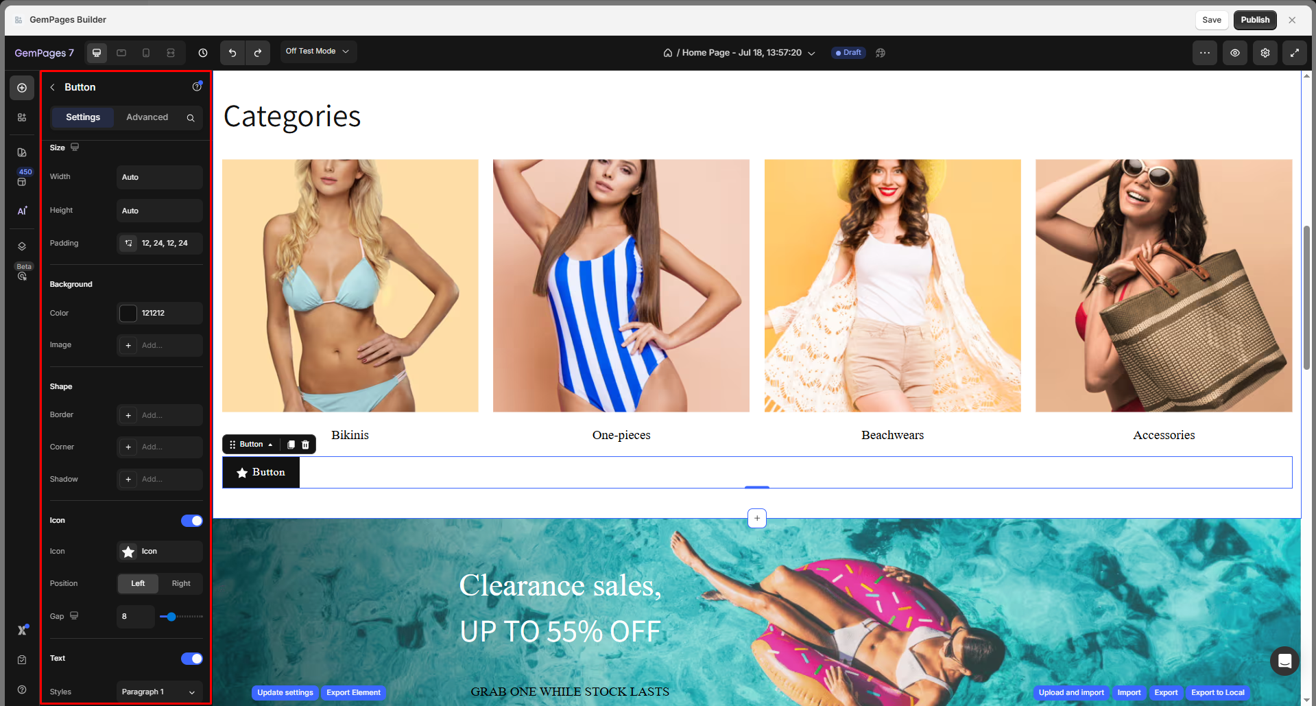
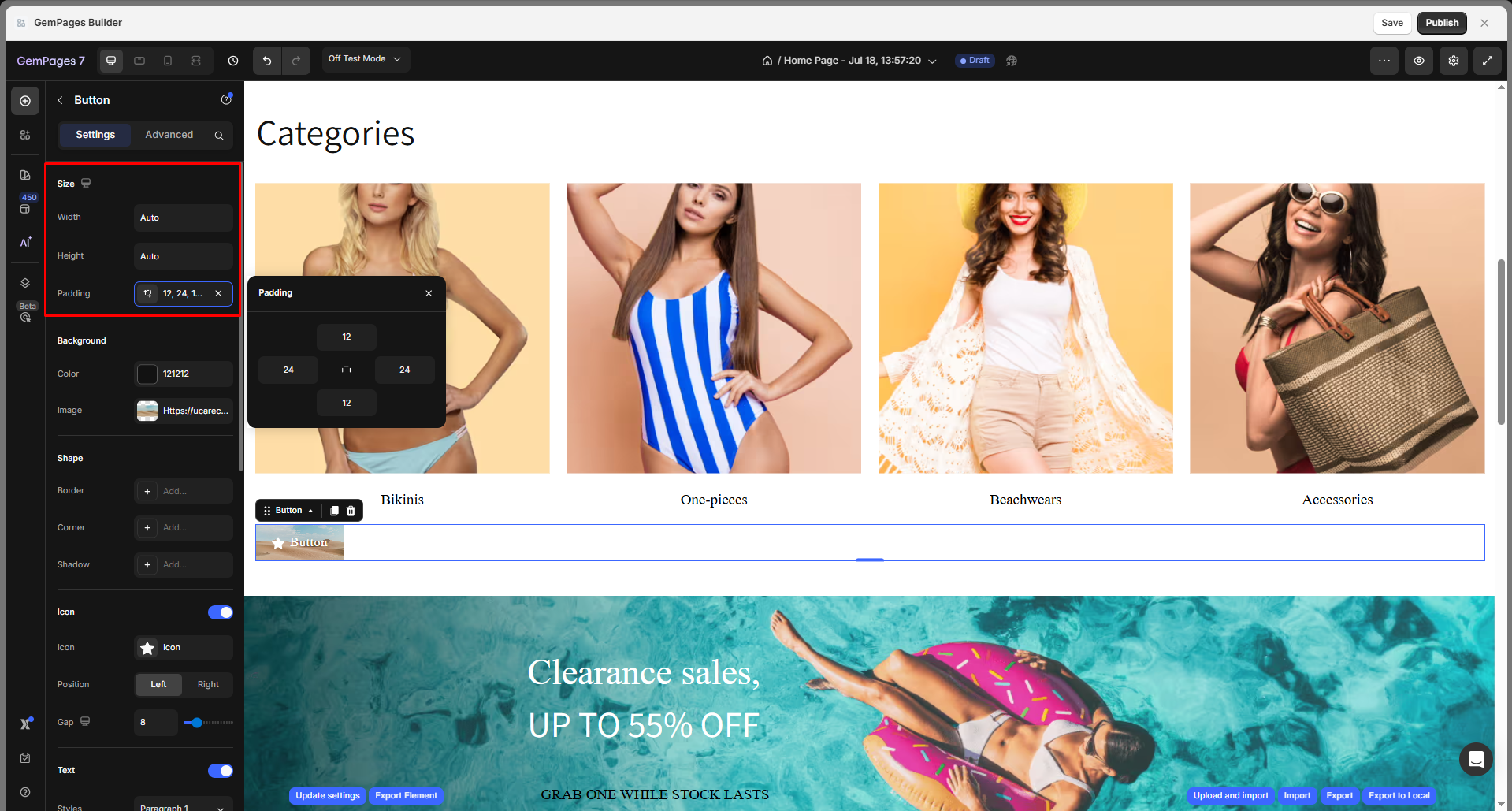
Size
Control the overall dimensions of the button with flexible width and height options:
Width: Choose how the button should scale horizontally:
- Fit content: The button will adjust to the size of its content (text and icon).
- Auto: Inherit size based on parent container or other styles.
- Full (100%): The button will expand to fill the full width of its container.
Height: Set the height to Fit Content (Auto) or a fixed pixel value.
Padding: Define internal spacing inside the button.
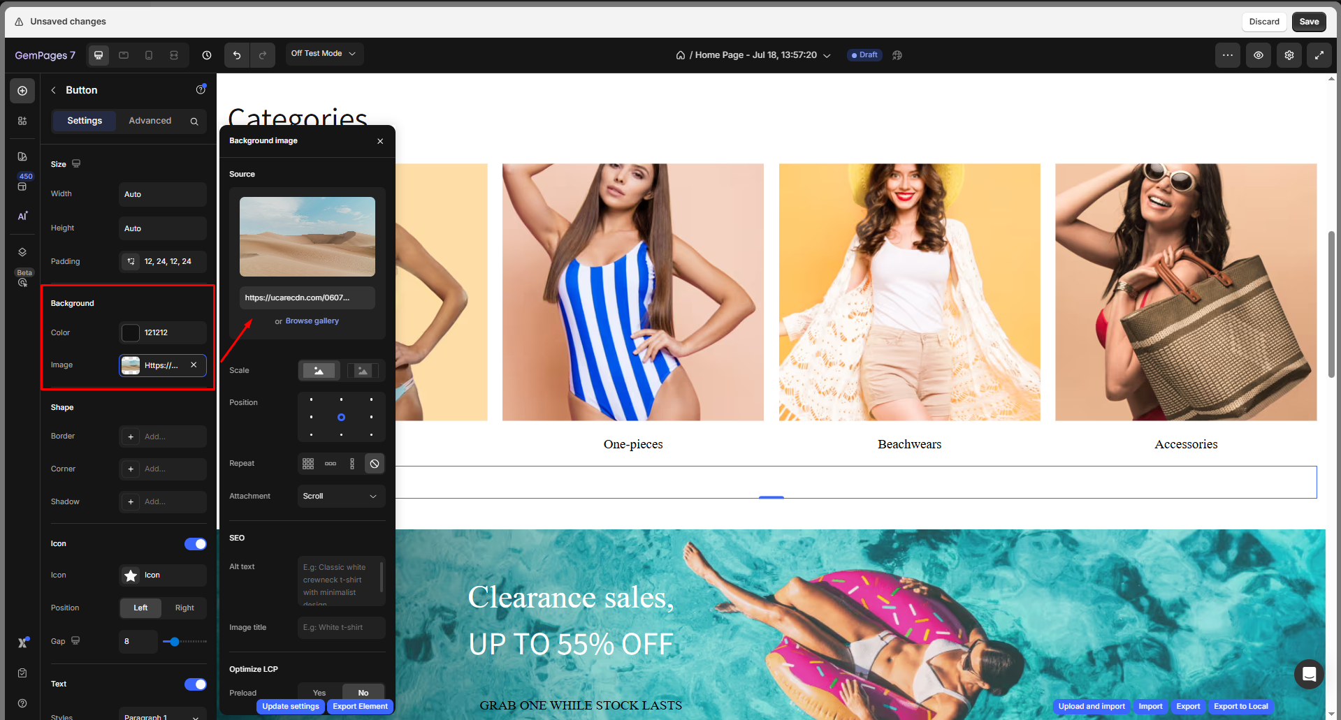
Background
Set a solid or gradient color background for your add-to-cart button. You can adjust the color by:
- Enter the color code
- Drag or select from the color swatches
- Use the color picker to select any color on your current page
- Choose one from the Recent colors or Suggested for you lists
If you prefer an image background, upload a new image or choose from your gallery to set it as the element’s background, then configure the image:
- Scale: Cover, Contain, or Auto
- Position: Set image alignment (center, top-left, etc.)
- Repeat: Toggle repeat settings
- Attachment: Choose between Scroll or Fixed
- SEO: Add Alt text and Image title for accessibility and SEO
- Preload: Toggle preload to improve Largest Contentful Paint (LCP)
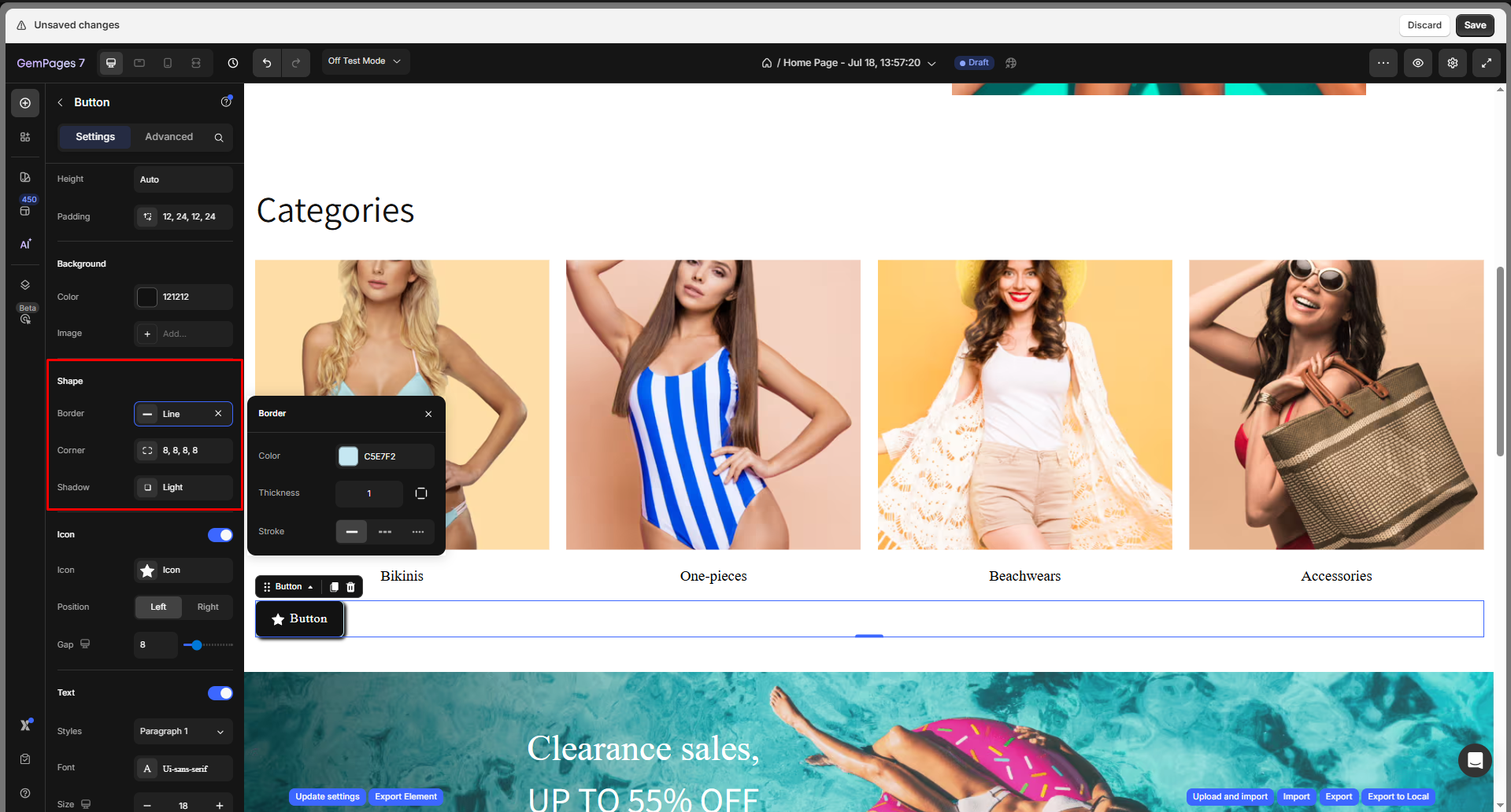
Shape
- Border: You can change the border color, thickness, and stroke.
- Corner: The section corner can be square, round, or pill-shaped. Also, you can enter an exact radius to customize the element’s corner your way.
- Shadow: Add a shadow and adjust its display (size, color, blur, and distance).
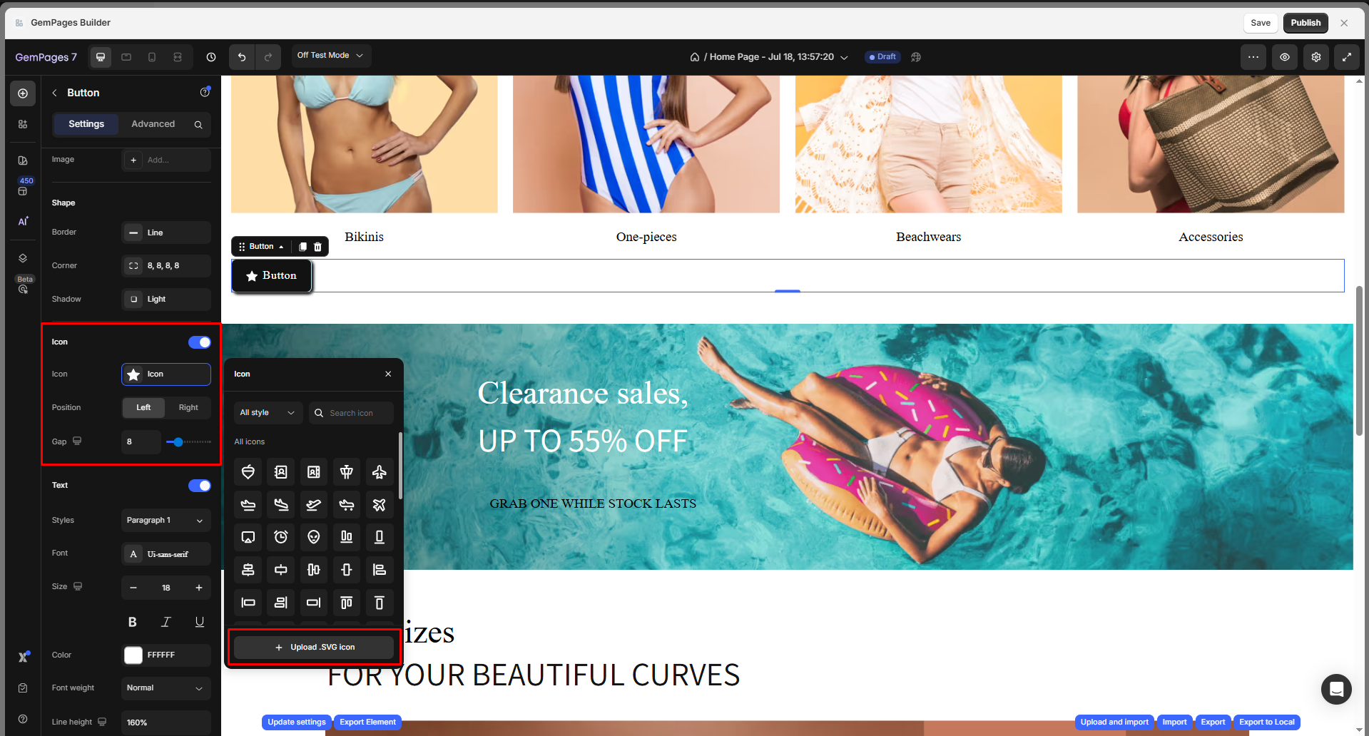
Icon
Enable this toggle to display an icon inside the button:
- Icon: Choose from built-in icons or upload custom .SVG icons.
- Position: Place the icon to the left or right of the text.
- Gap: Adjust spacing between the icon and text using the slider or number input.
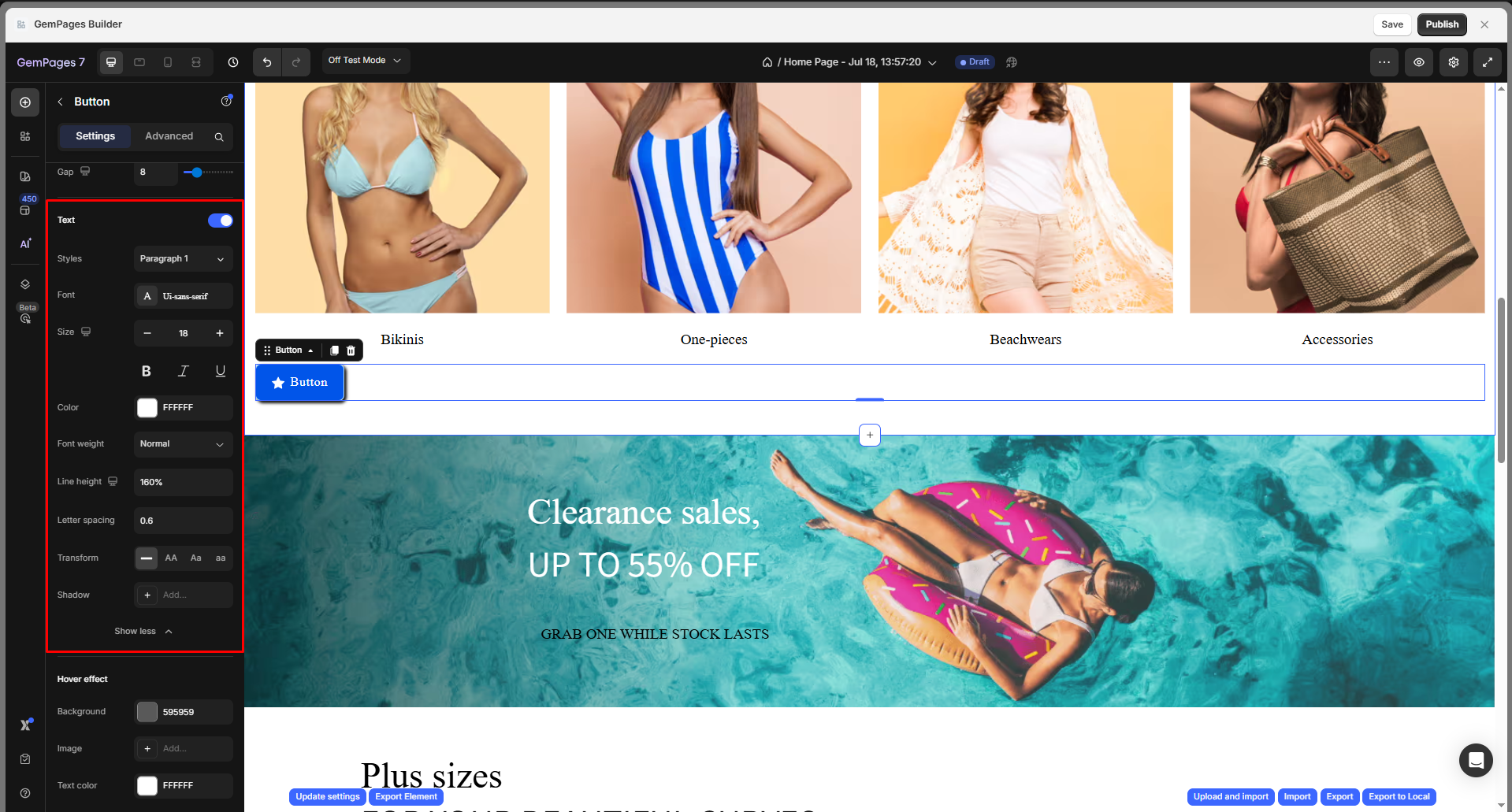
Text
This section allows you to customize the button label’s typography and appearance:
- Styles: Choose a text preset such as Paragraph 1, Heading, or custom text styles.
- Font: Select from available font families (e.g., Ui-sans-serif) to match your store branding.
- Size: Adjust the text size using the +/– controls.
- Formatting: Apply Bold, Italic, or Underline styles as needed.
- Color: Set the font color using the HEX code or the color picker.
- Font Weight: Choose from Normal, Medium, Semi-bold, Bold, etc.
- Line Height: Control the vertical space between lines of text (e.g., 160%).
- Letter Spacing: Adjust the space between letters (e.g., 0.6).
- Transform: Choose how the text appears:
- AA: UPPERCASE
- Aa: Capitalize Each Word
- aa: lowercase
- Shadow: Apply a text shadow for added contrast or visual depth.
Hover Effect
Customize how the button reacts when hovered:
- Background: Change background color on hover.
- Image: Add a background image for the hover state.
- Text Color: Change the text color on hover.
- Border: Add or customize the border style when hovered (color, thickness, stroke).
- Corner: Adjust the corner radius on hover to make edges more rounded or squared.
- Shadow: Apply a shadow effect to give the button more depth when hovered.

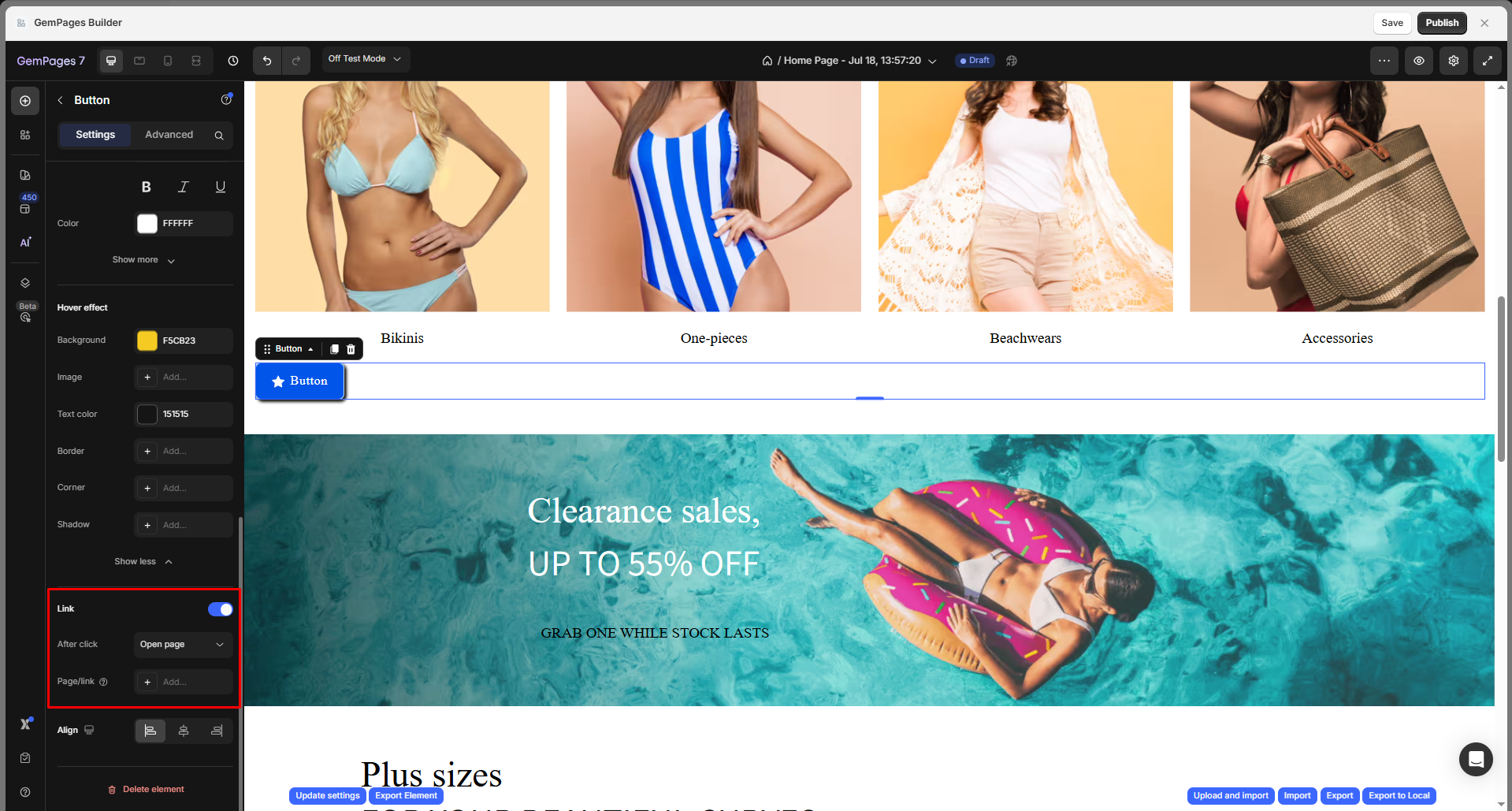
Link
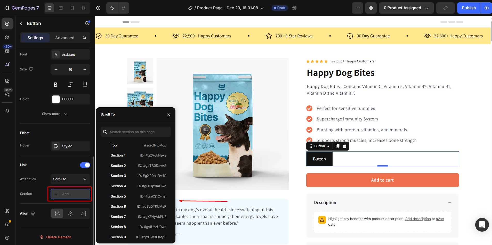
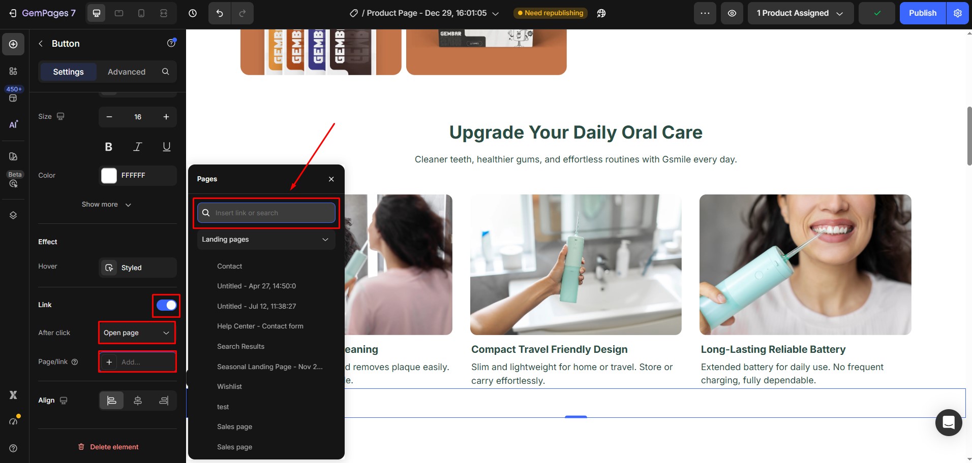
Turn your button into a clickable element by enabling the Link toggle. Once enabled, you can define what happens when users click the button:
After click: Choose the action triggered by the button:
- Open page: Redirect the user to a specific page or URL.
- Scroll to: Smoothly scroll to a specific section on the same page using an anchor ID (e.g., #features).
- Open popup: Trigger a pop-up window built using GemPages.
- Send email: Open the user’s email client with a pre-filled recipient address.
- Make phone call: Initiate a phone call on mobile devices using a tel: link.
Page/Link: Click “+ Add…” button to search or paste a URL directly into the search bar
- Select from your existing Shopify pages
- Use the dropdown filter (e.g., “Landing pages”) to narrow your results
- Click View to preview the page before confirming
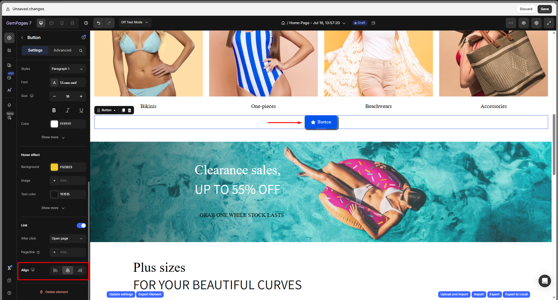
Align
Set the horizontal alignment of the button within its container: Left, Center, or Right.
Configure the Advanced Tab
For more advanced customization, please navigate to the Advanced tab and follow the instructions in this article.
FAQs
1. How do I change the button color?
Go to the Settings tab > Background > Color. Use the color picker or enter a HEX code to update the button’s background color.
2. Why does my button color not change on hover?
Check the Hover Effect settings. Make sure the hover background or text color is set to a different value from the normal state.
3. Can I add a gradient or background image to the button instead of a solid color?
Yes. Under the Settings tab > Background, you can upload an image and adjust scale, position, and repeat options. For gradients, you can add custom CSS in the Advanced tab.
4. Why is my button not showing the new color on the live page?
Make sure you click Publish after editing. If the issue persists, clear the browser cache or disable the conflicting custom code.
5. How do I connect my button to a product category (collection) in Shopify?
Step 1: Add a Button element to your product page (or any page where you want the category button to appear).
Step 2: Go to the Settings tab > Link > After click, then choose Open page.
Step 3: In the Page/Link field, either:
- Select your desired collection (category) from the Shopify pages list, or
- Paste the collection link you want to redirect to.
Step 4: Click Save and Publish your changes.
6. How do I make a button go to the next section on the page?
Go to Settings > Link, enable the Link toggle, then choose Scroll to as the After click action. Enter the target section’s anchor ID. When users click the button, the page will smoothly scroll to that section.
7. How do I make a button link to an external URL?
To link a Button element to an external URL, go to the Settings tab, enable the Link toggle, then select Open page as the After click action. In the Page/Link field, paste the full URL you want the button to open, then save and publish the page.


Thank you for your comments