


What is the Breadcrumb element in GemPages?
A breadcrumb is a navigational element that helps users understand their current location within a website or application. It typically appears as a trail of clickable links at the top of a webpage or interface, showing the hierarchy of pages or sections the user has navigated through to arrive at the current page.
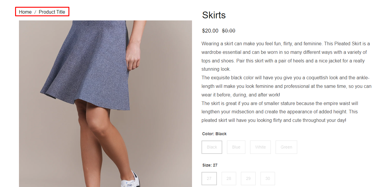
When working with subcategory pages in Shopify (for example, “Men’s Shoes” under “Shoes”), breadcrumbs become even more important. They allow customers to quickly jump back to the parent collection or navigate between sibling subcategories without manually browsing menus.
Using breadcrumbs for subcategory pages also helps search engines better understand the site structure, which can improve SEO by clearly signaling the relationship between main categories and their subcategories.
How to add and configure the Breadcrumb element?
We will go over all the settings for the Breadcrumb element in GemPages Editor Version 7 in the section below.
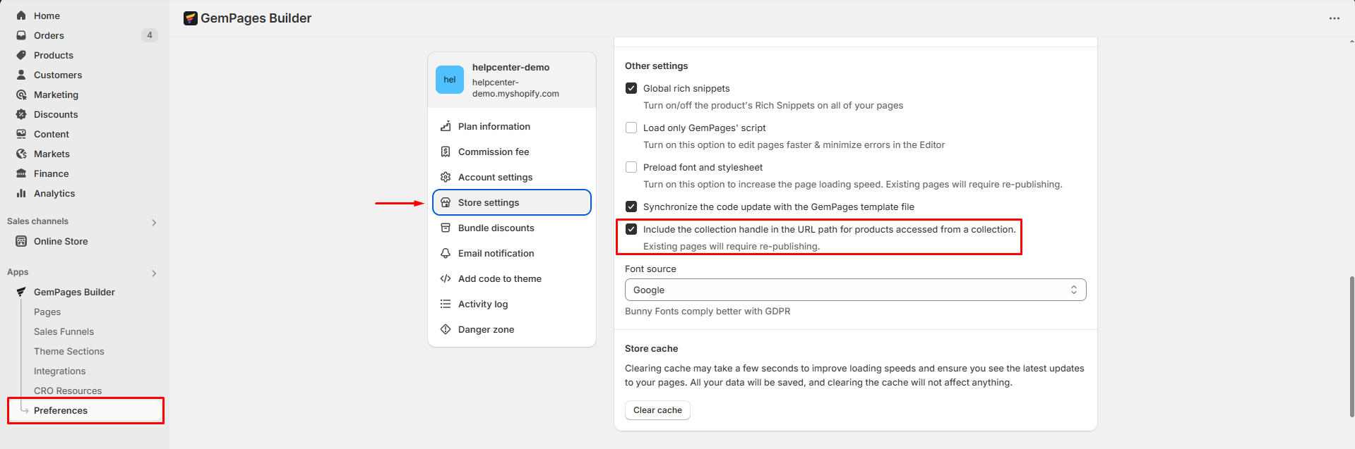
Step 1: Go to GemPages Dashboard > Preferences > Store settings. Under the Other settings section, turn on “Include the collection handle in the URL path for products accessed from a collection.“
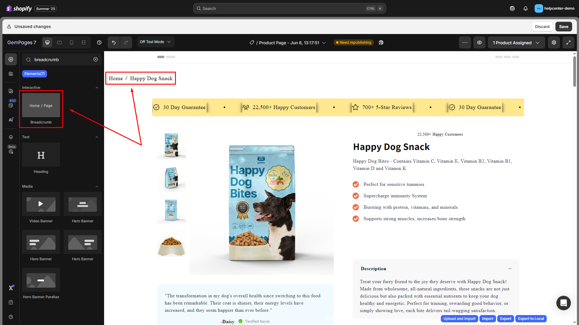
Step 2: Go back to the Pages section and locate your target page to open the editor.
Step 3: From the left sidebar, enter Breadcrumb in the search bar, then drag and drop the element to the top of your page.
Configure the Settings tab
The Settings tab of the Breadcrumb element helps you fine-tune the appearance, layout, and interactive behavior of the navigation trail.
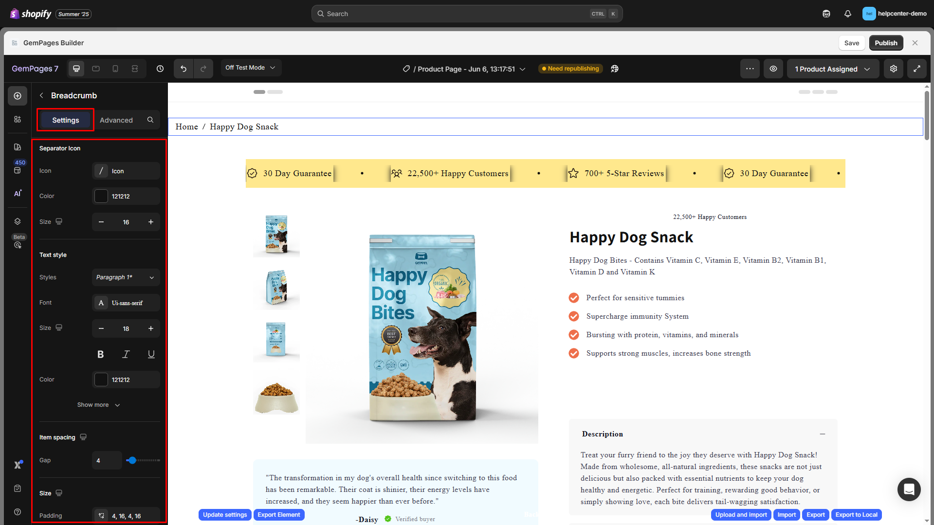
Separator Icon
Customize the separator between breadcrumb items (e.g., /, >, →):
- Icon: Choose an icon or character. You can also upload your own .SVG icon.
- Color: Select icon color via HEX or color picker.
- Size: Adjust icon size using +/– buttons.

Text Style
Style the breadcrumb text with full typography controls:
| Option | Description |
| Styles | Choose a predefined text style (e.g. Paragraph 1, Heading 3, etc.) |
| Font | Select a font family from the available options (e.g. Ui-sans-serif) |
| Size | Adjust the font size using +/– buttons |
| Formatting | Enable formatting options: Bold, Italic, or Underline |
| Color | Pick a custom color using HEX or a color picker |
| Font Weight | Choose between weight levels: Normal, Medium, Bold, etc. |
| Line Height | Set the vertical spacing between lines (e.g., 160%) |
| Letter Spacing | Define spacing between characters (e.g., 0.6) |
| Transform | Choose text transformation: AA (uppercase), Aa (capitalize), aa (lowercase) |

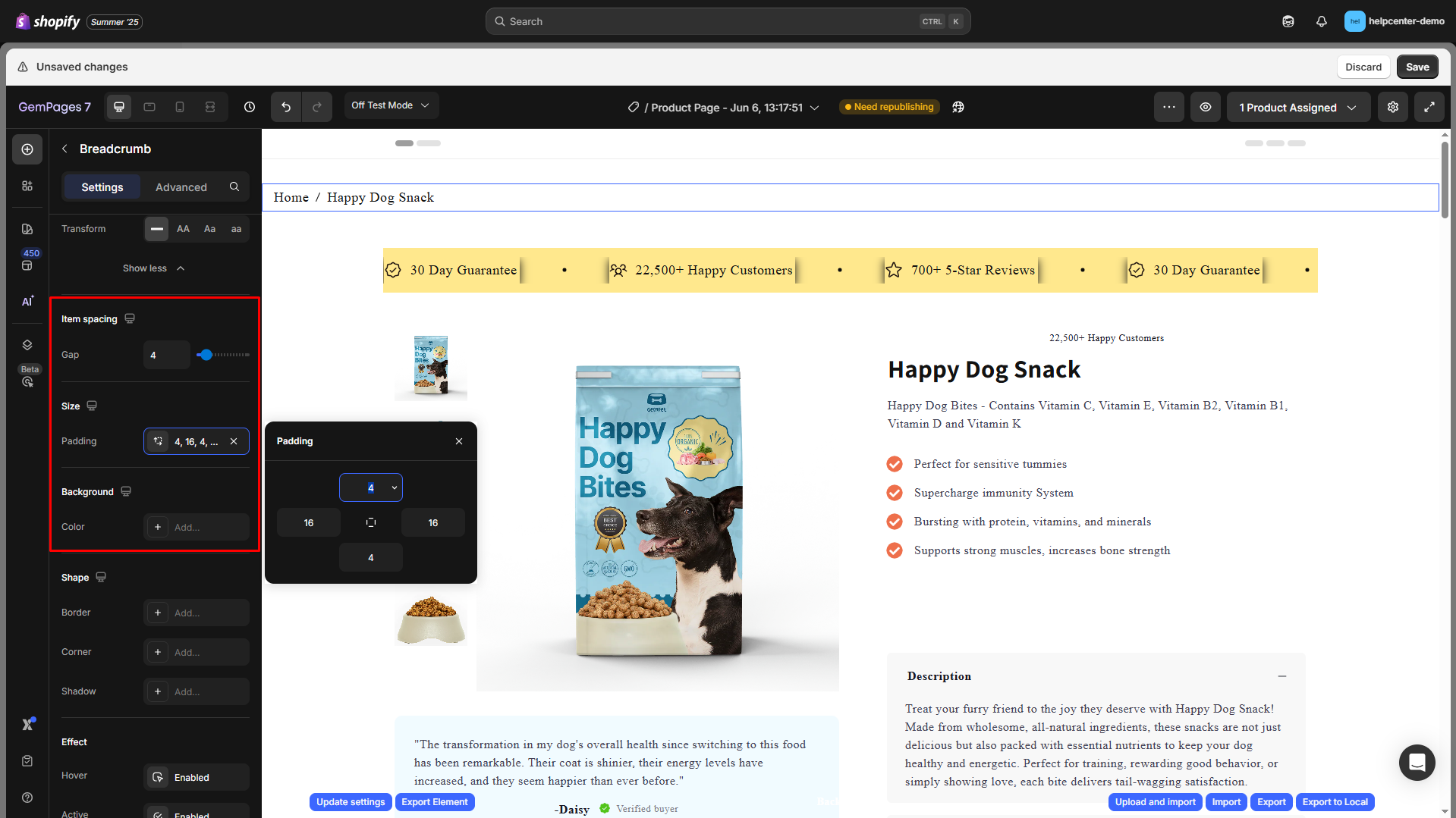
Item spacing, Size, and Background
Gap: Adjust the horizontal spacing between breadcrumb items by dragging the slider or entering a specific value manually.
Padding: Adjust the inner spacing of the breadcrumb container (top, right, bottom, left) to create breathing room or align the element with your layout.
Background color: Set a background color for the breadcrumb bar using the color picker or by entering a HEX code for precise control.
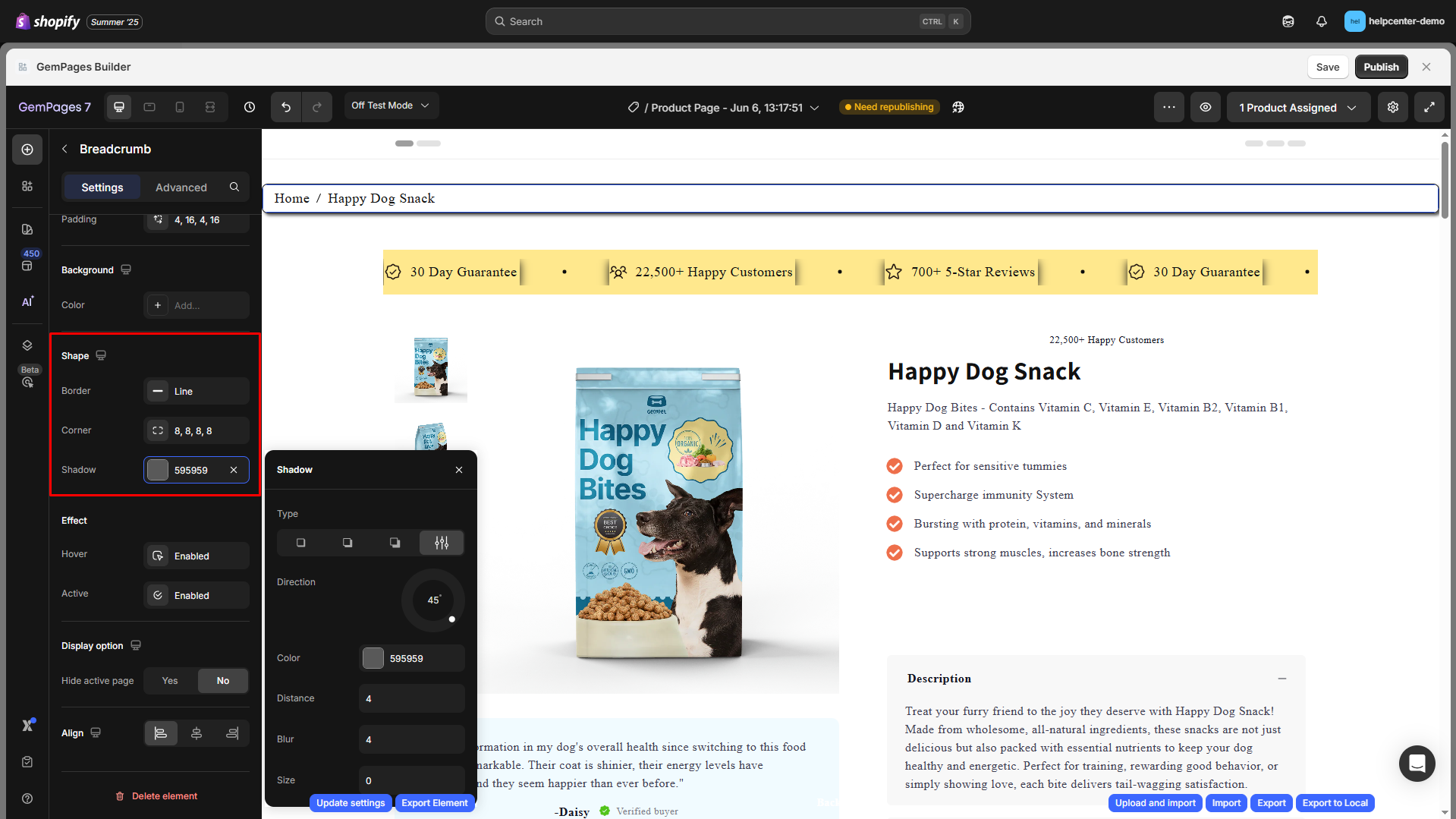
Shape
You can give the breadcrumb container a distinctive look:
- Border: Set color, thickness, and stroke style.
- Corner: Define border-radius to round corners (e.g., 8px).
- Shadow: Add subtle or bold shadows, then modify type, direction, color, distance, blur, and size.
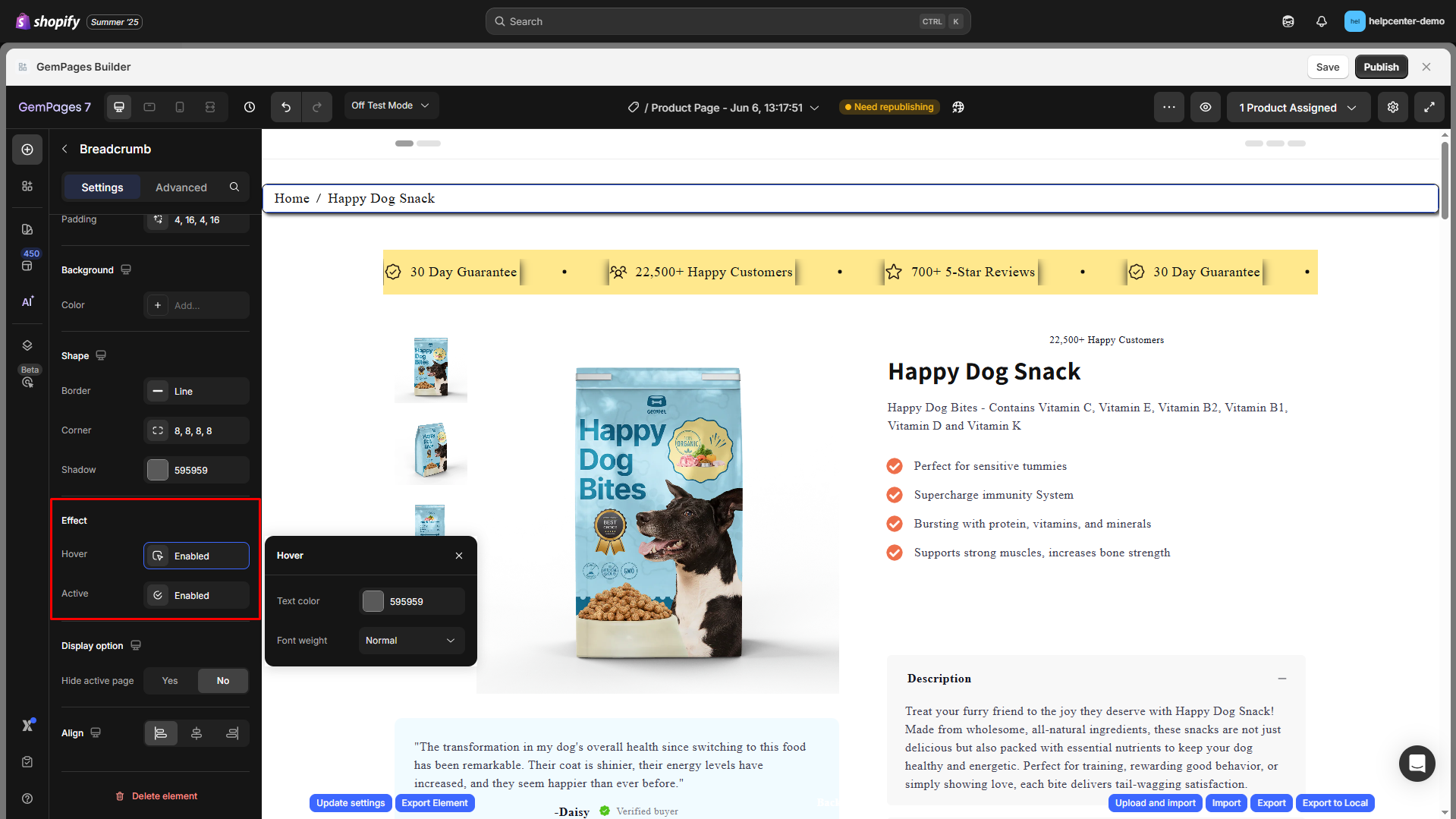
Effect
- Hover: Enable hover styles when users interact with breadcrumb links.
- Active: Highlight the current (active) breadcrumb item differently from the rest.
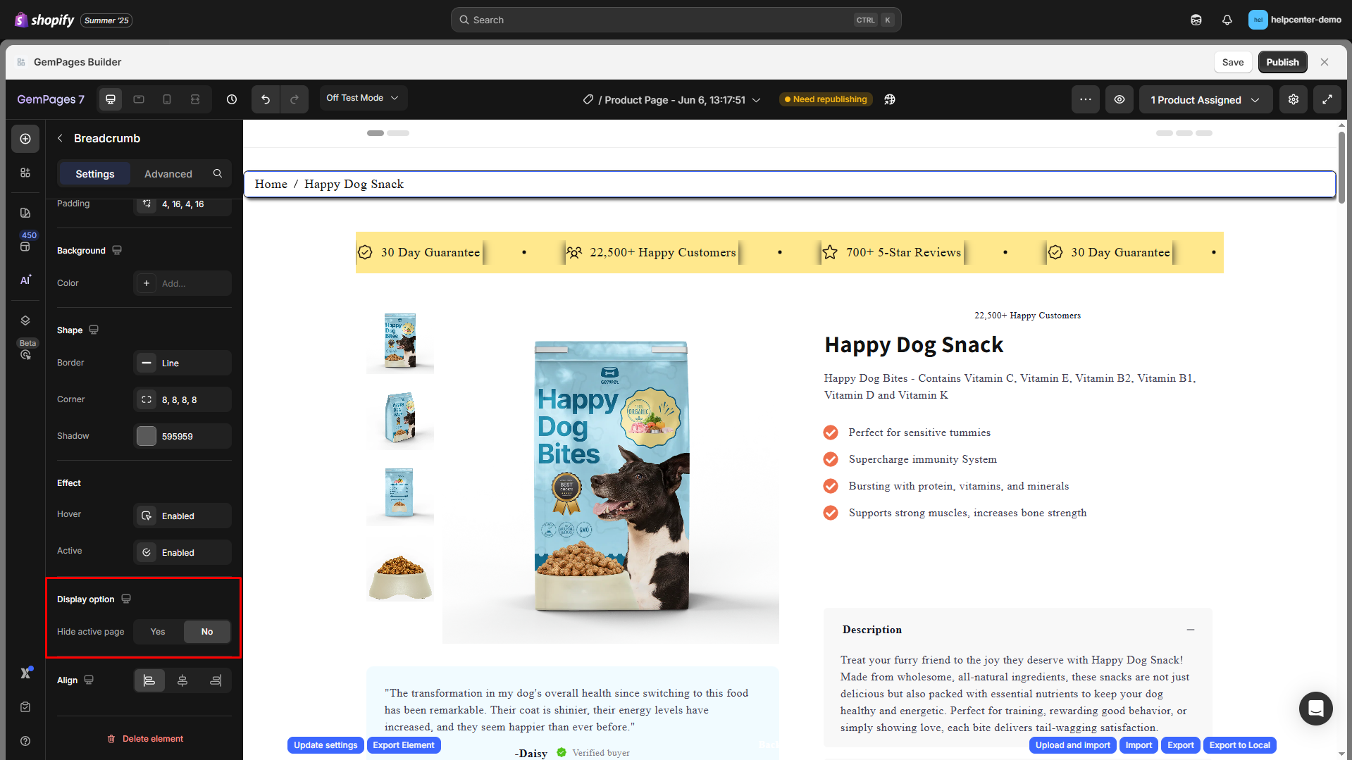
Display options
Hide active page:
- Yes: Hide the current page (last breadcrumb item, e.g., Happy Dog Snack).
- No: Show the complete breadcrumb trail.
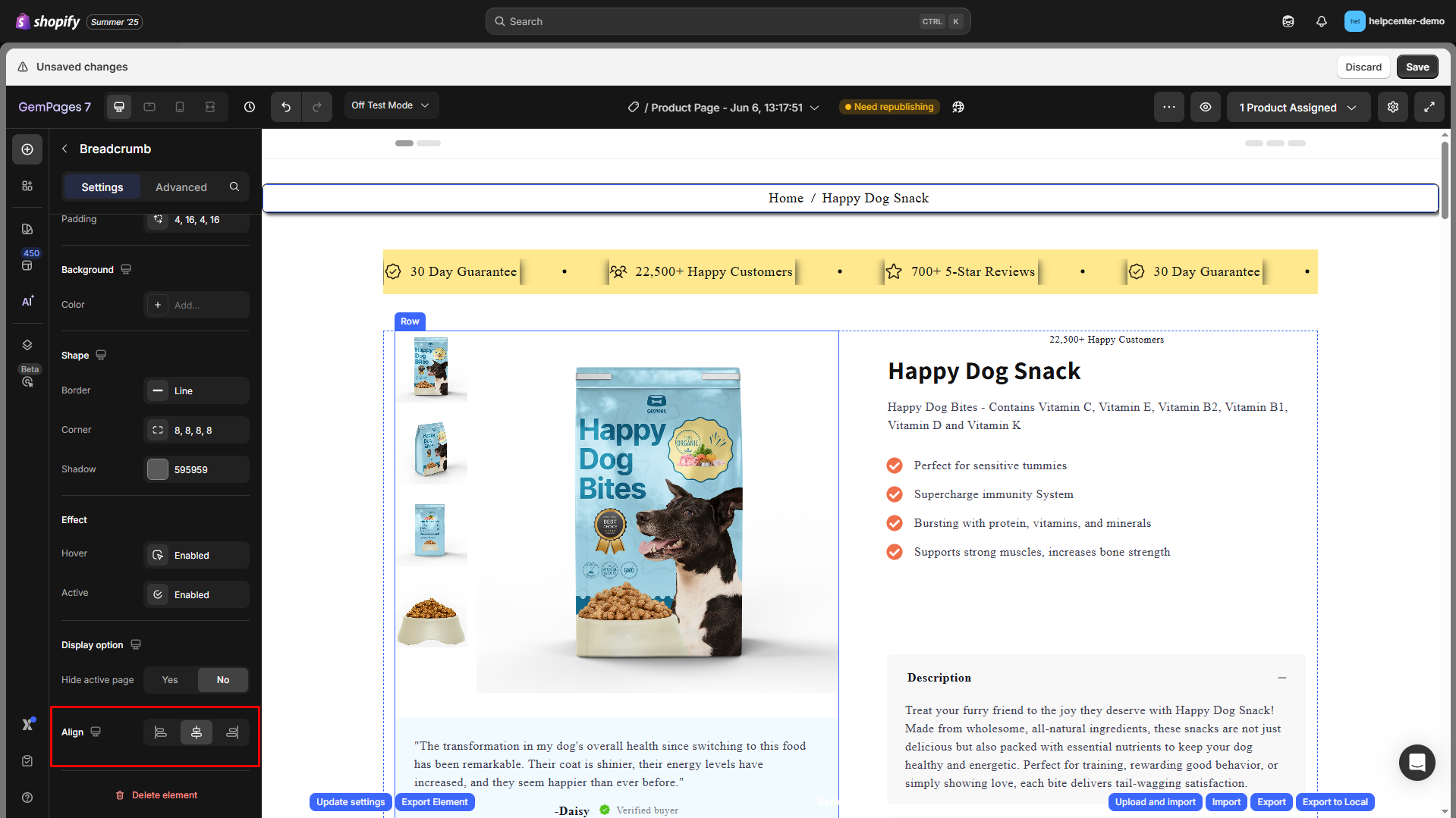
Align
This parameter allows you to determine how the element is positioned on your page. You have three options: left-aligned, centered, and right-aligned.
Configure the Advanced tab
For more advanced customization, please navigate to the Advanced tab and follow the instructions in this article.
You can also find more helpful tips and video tutorials at GemPages Academy.
FAQs
1. How do breadcrumbs help with subcategory pages?
Breadcrumbs clearly show the hierarchy from main categories to subcategories, improving both user navigation and SEO. This helps customers know exactly where they are and easily move between sections.
2. Can I customize breadcrumbs differently for subcategory pages?
Yes. You can apply different styling, separators, or background colors for breadcrumbs on subcategory pages to make them stand out.
3. What happens if my subcategory page doesn’t show in the breadcrumb?
This can happen if the product URL doesn’t include the collection/subcategory handle. Make sure the Shopify setting “Include the collection handle in the URL path” is enabled.
4. Do breadcrumbs improve SEO for subcategory pages?
Yes. They help search engines understand the relationship between your main categories and subcategories, which can improve indexation and internal linking structure.


Thank you for your comments