


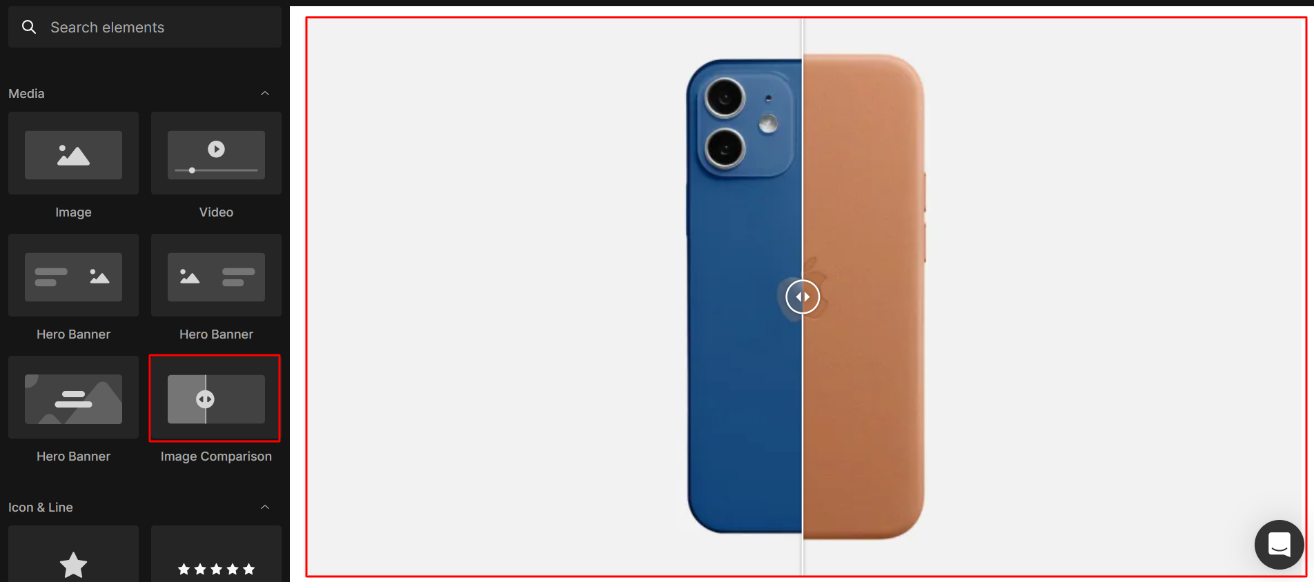
About the Image Comparison element
The Image Comparison element allows you to highlight the advantages of your product or service by comparing before-and-after images within a single frame. This element operates similarly to the Before & After Image element found in previous versions.
Example use cases:
Use Image Comparison to highlight the impact of your products and build trust with customers:
- Product demos: Show before/after improvements (e.g., skincare, cleaning effects).
- Lifestyle visuals: Compare real-life usage vs. no usage.
- Design showcases: Display redesigns, upgrades, or transformations.
How to Add an Image Comparison Element to Your Page?
The Image Comparison is a flexible element and can be used in any spot on your page by following the steps below:
Step 1: Access the GemPages Dashboard > Pages, then click on your target page to locate the editor.
Step 2: From the left sidebar, search “comparison”, then drag & drop it into the desired section.
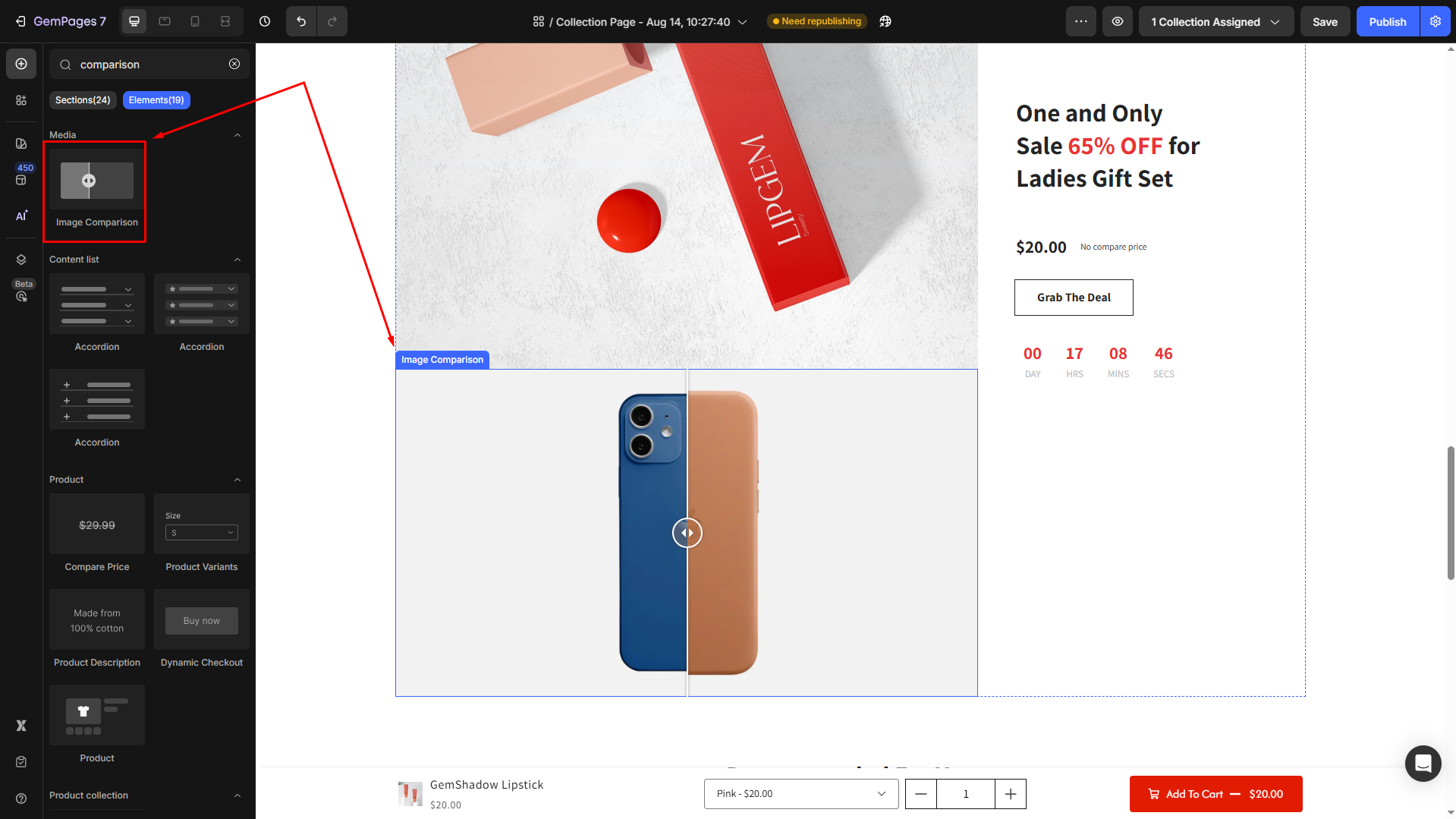
Step 3: Click on the element to open its Settings panel and start customizing.
Configure the Settings Tab
Under the Settings tab, you can adjust the following options:
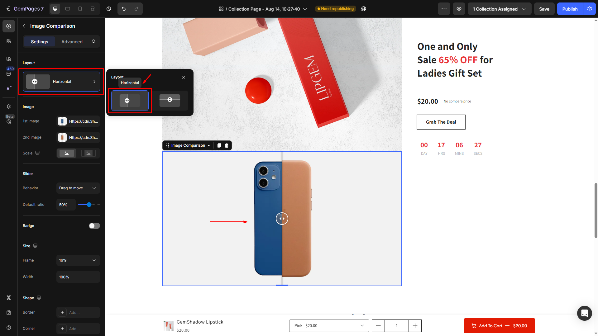
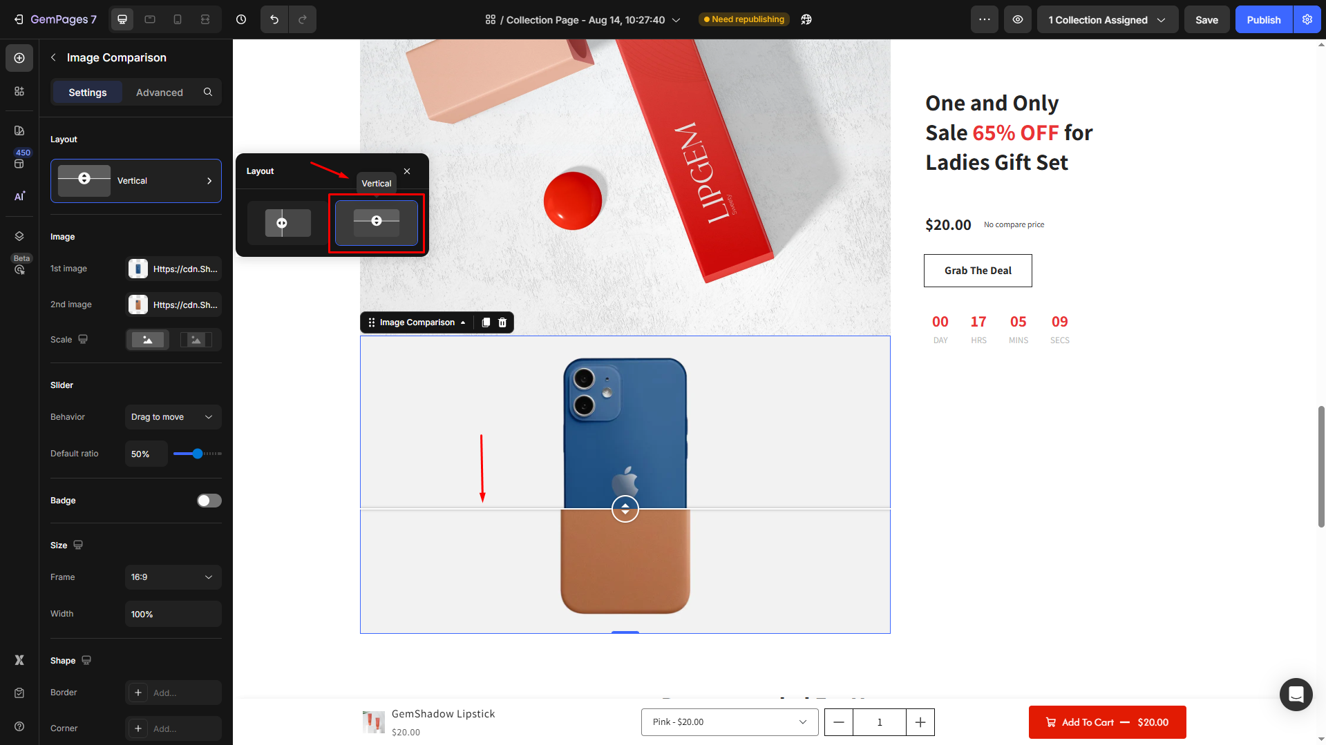
Layout
Choose how the two images will be displayed in the comparison frame:
- Horizontal: Images are compared left to right.
- Vertical: Images are compared top to bottom.
Image
Upload and adjust the images you want to compare.
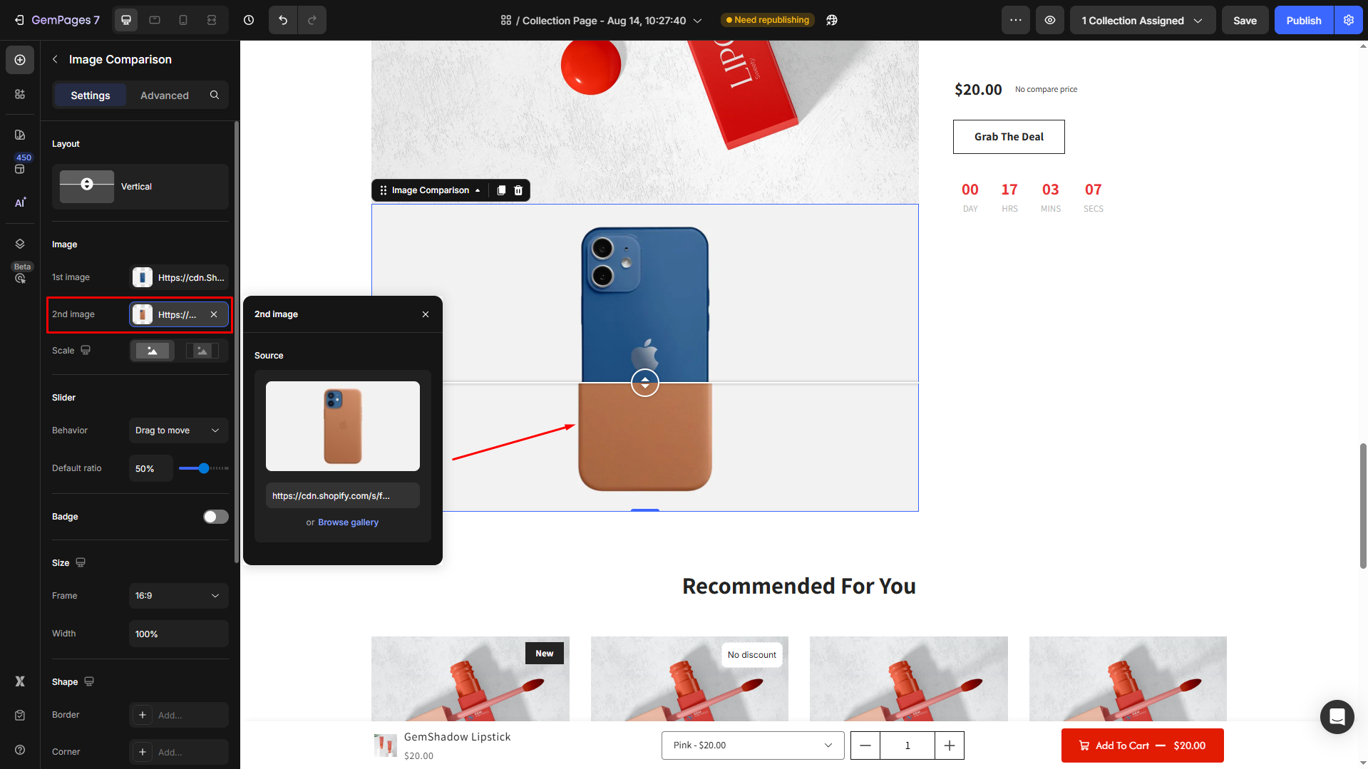
1st image: Upload or select the first image.
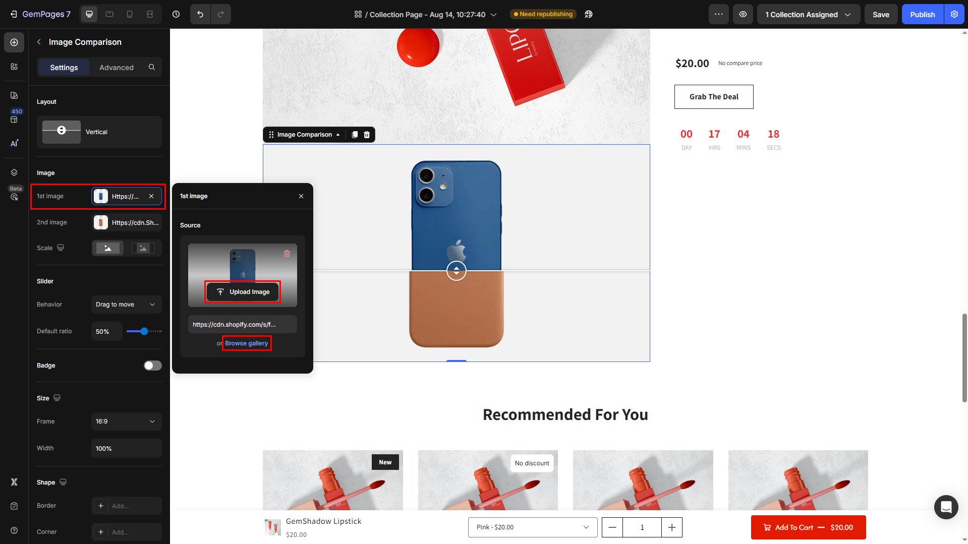
2nd image: Then, choose the 2nd image for comparison.
Scale:
- Fill image: Stretches the image to fit the container. Aspect ratio may be distorted.
- Fit image: Adjusts the image to fit within the container while maintaining its aspect ratio.
Slider
Decide how your visitors interact with the comparison slider.
Behavior:
- Drag to move: Visitors drag the slider manually.
- Hover to move: The slider moves automatically when hovered.
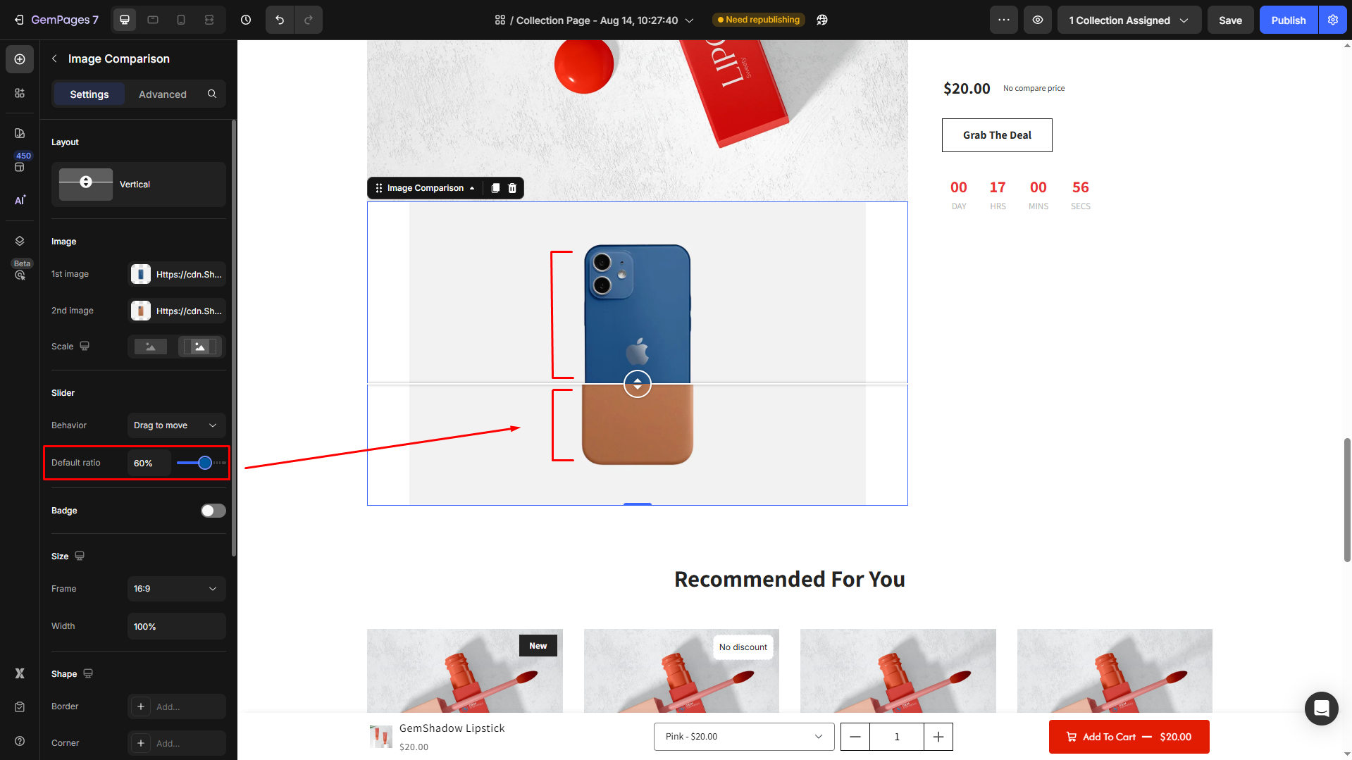
Default ratio: Set the initial split ratio (in %).
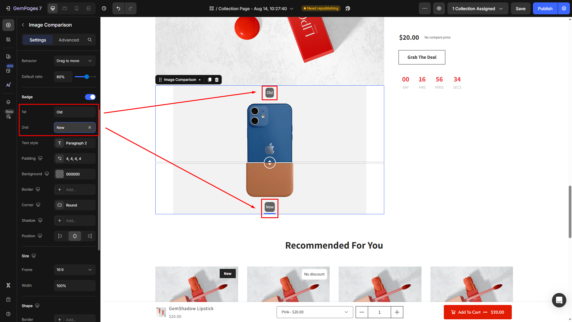
Badge
Enable the Badge feature to help visitors clearly identify the two compared images.

Then, you can customize the text badge your way, including:
1st and 2nd texts: Add a label for both the 1st and 2nd images. For example, “Old” vs. “New” or “Before” vs. “After”.
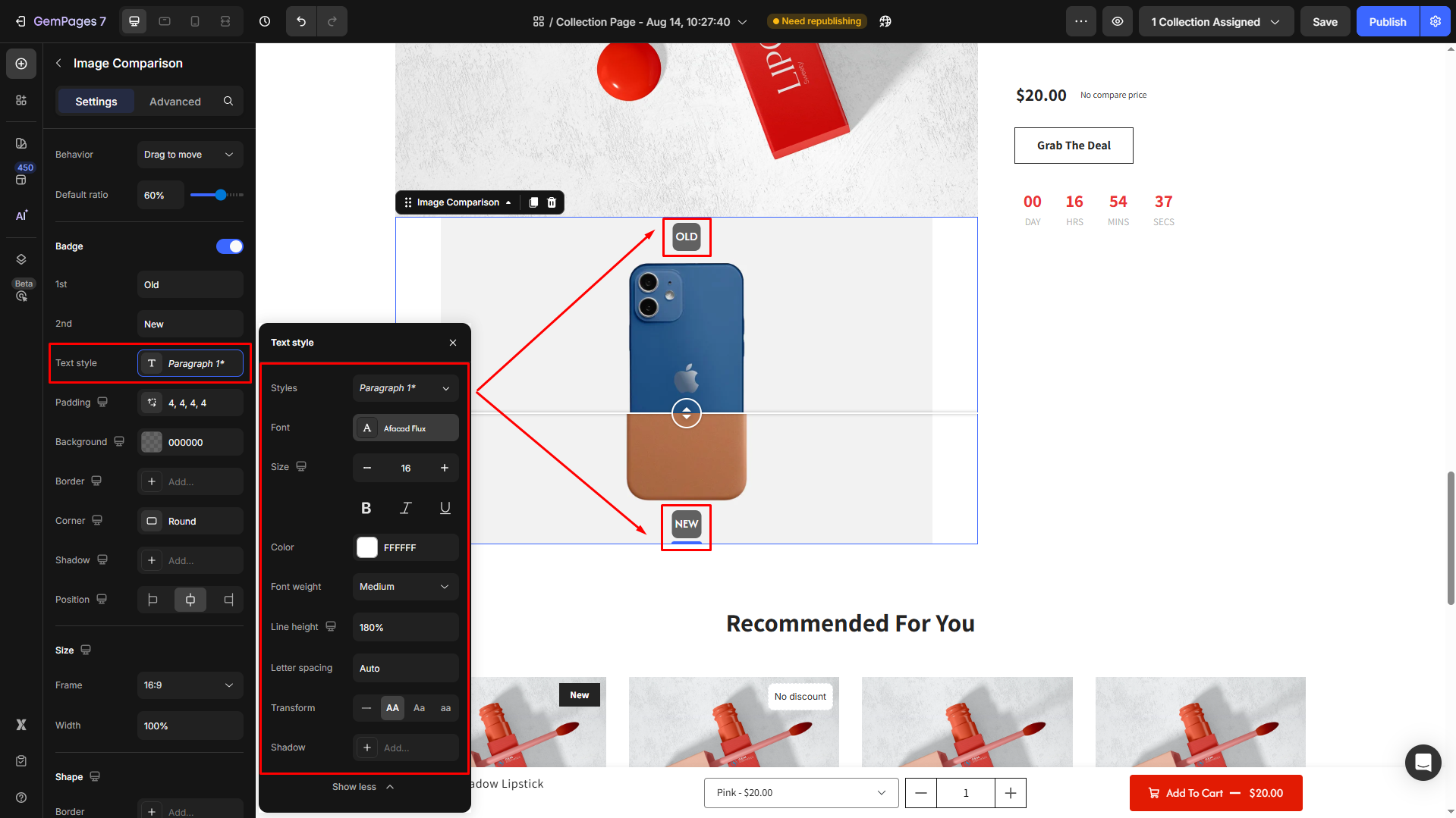
Text style: Adjust typography to match your store design. You can:
- Choose from available text styles (Heading, Paragraph, etc.).
- Select a font family.
- Change the font size.
- Apply bold, italic, and underline.
- Pick a font color.
- Control line height and letter spacing.
- Apply text transform (uppercase, lowercase, capitalize).
Padding: Define the spacing inside the badge to control how much room the text has around it.
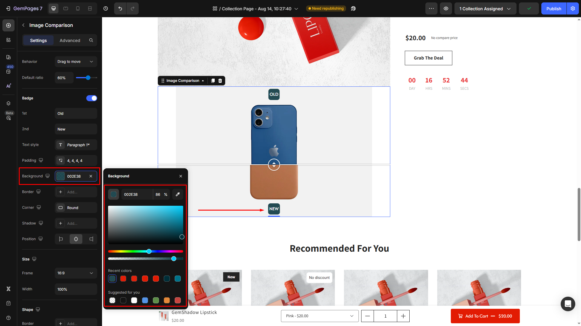
Background: Set the background color of the badge for visibility (e.g., a dark-color background for the white text).
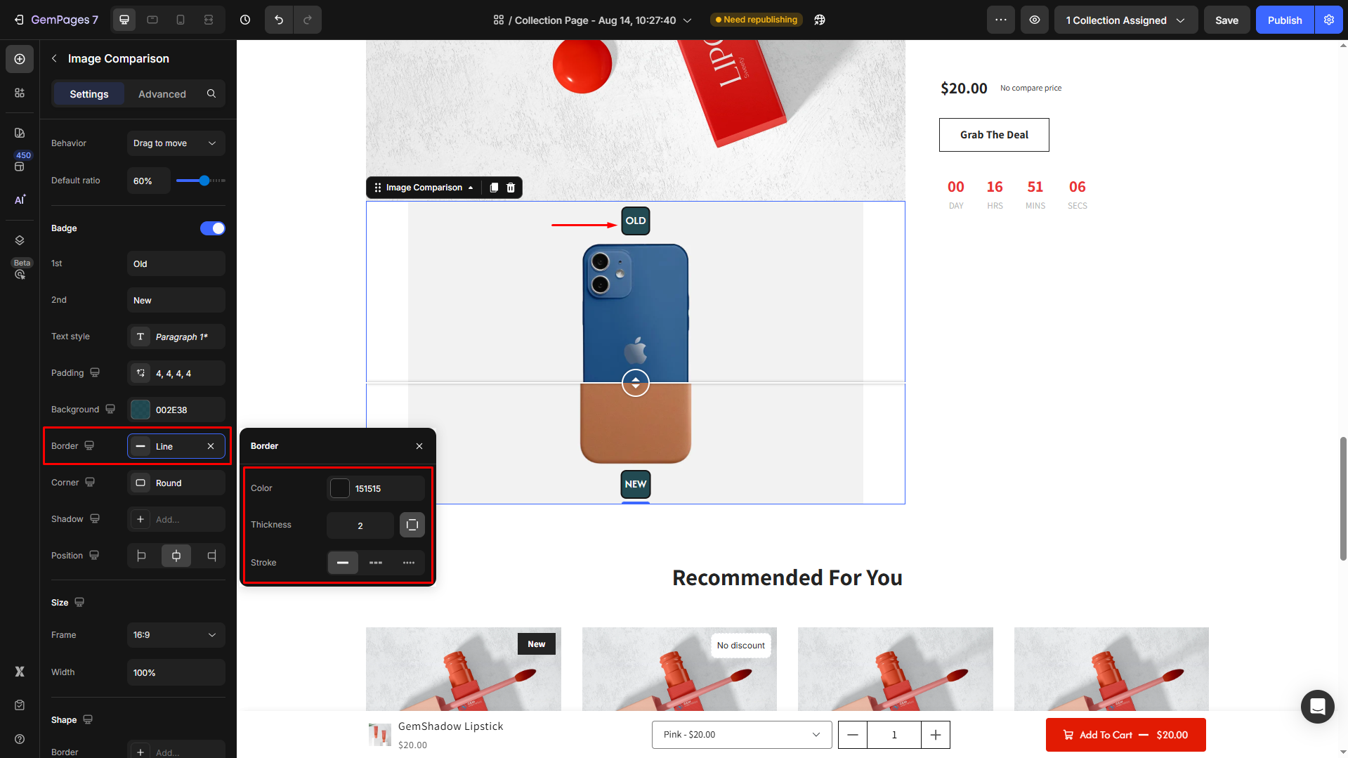
Border: Customize the border’s thickness, style, and color.
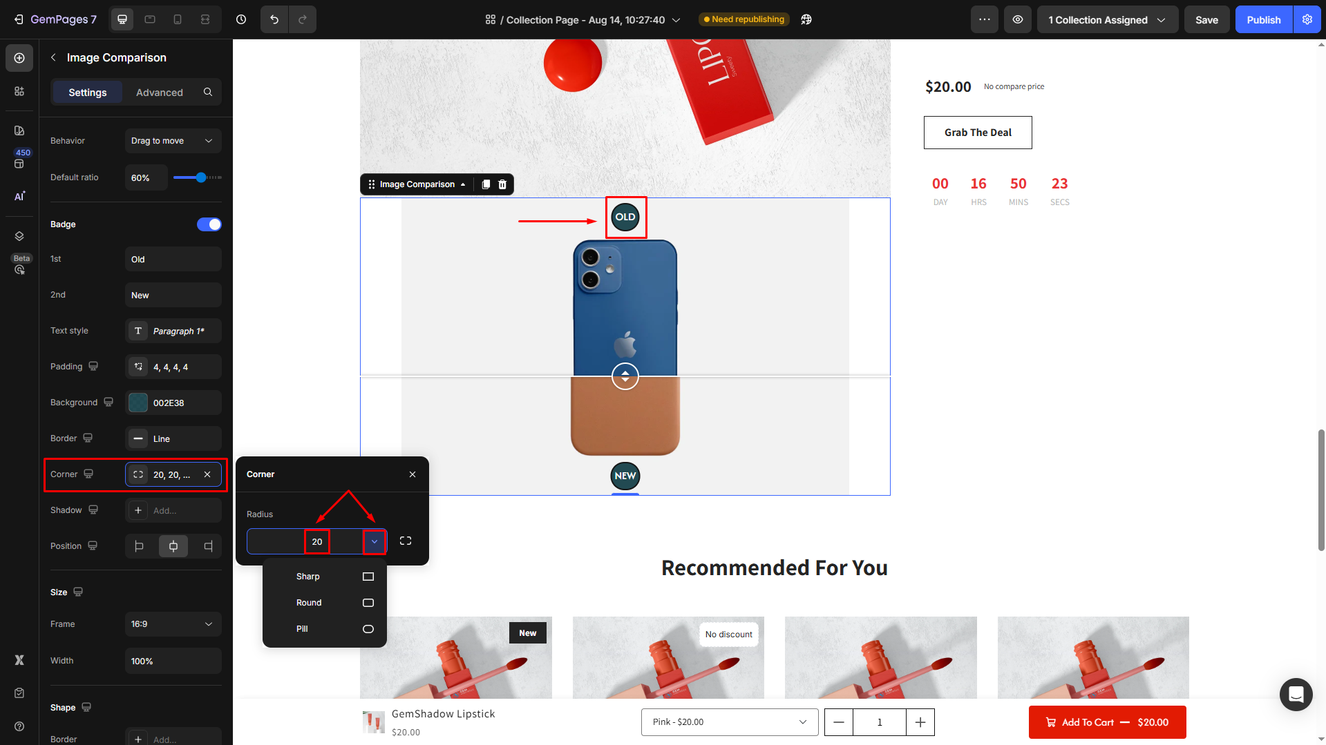
Corner: Decide if badge corners are sharp, rounded, or pill-shaped. Enter a radius for full control.
Shadow: Add depth with shadow effects. Adjust shadow size, blur, color, and distance.
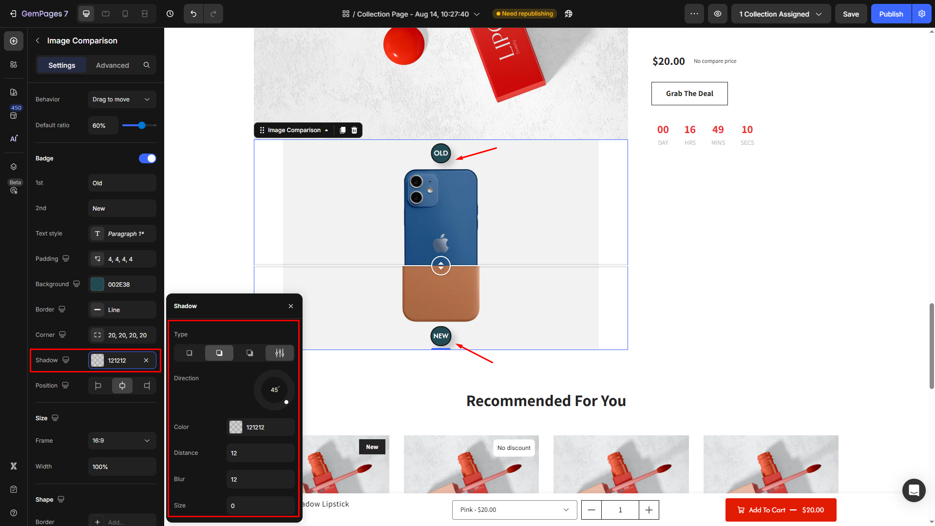
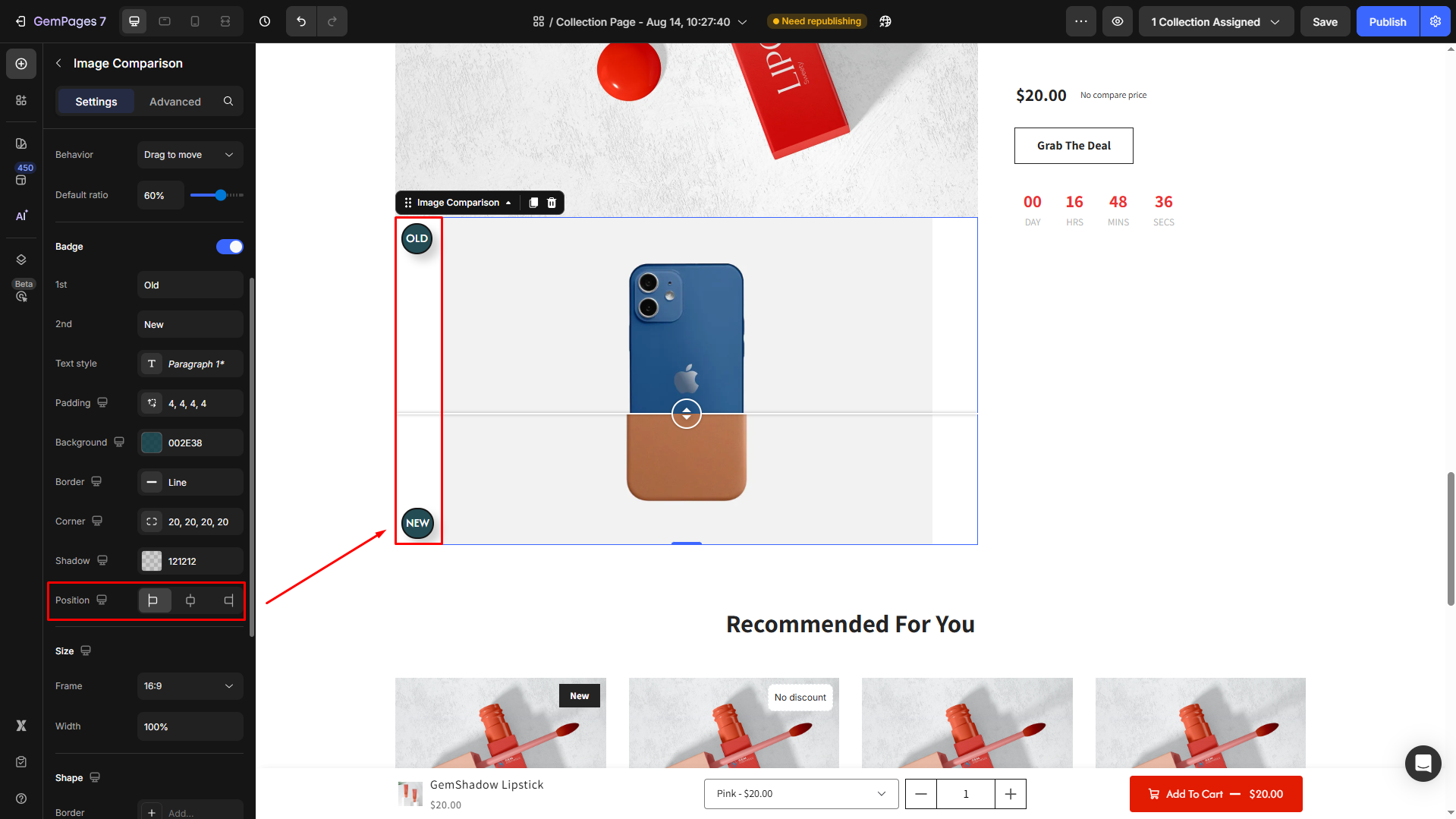
Position: Choose where the badge should appear (e.g., top-left, top-right, bottom-left, bottom-right).
Size
Adjust the frame and width of your element.
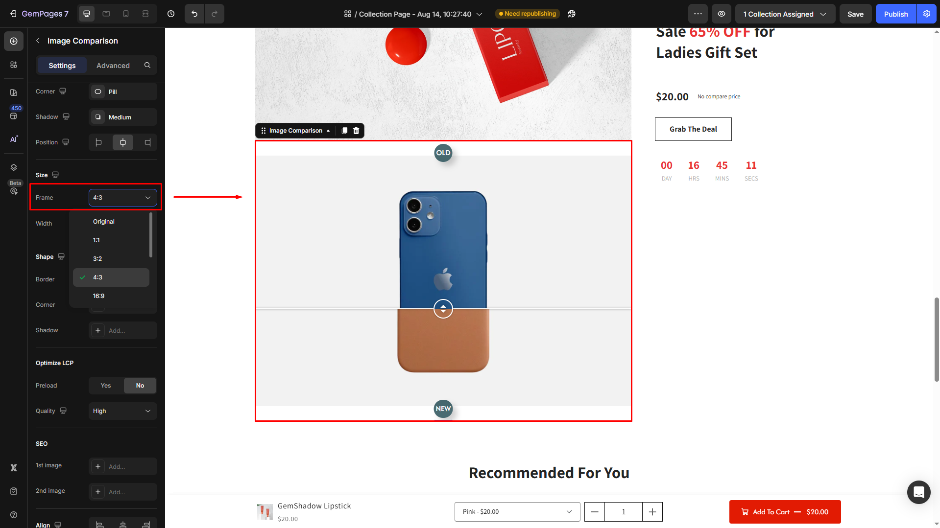
Frame: Select the aspect ratio for the frame from the dropdown (e.g., 16:9, 4:3).
Width: By default, the width is set to 100% (Full). If you prefer, change the width by entering a specific number in the box.
Shape
Customize the overall appearance of the comparison frame.
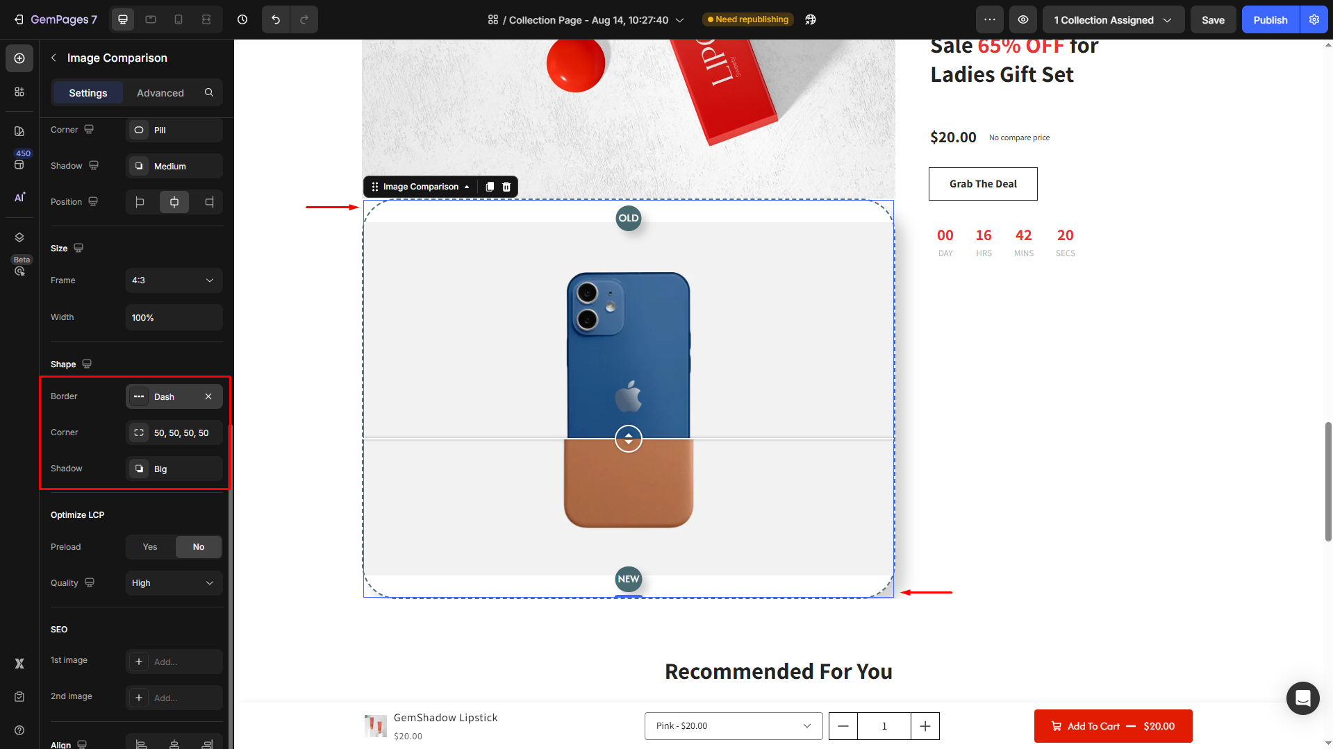
- Border: You can change the border color, thickness, and stroke.
- Corner: The section corner can be square, round, or pill-shaped. Also, you can enter an exact radius to customize the element’s corner your way.
- Shadow: You may add a shadow and adjust its display (size, color, blur, and distance).
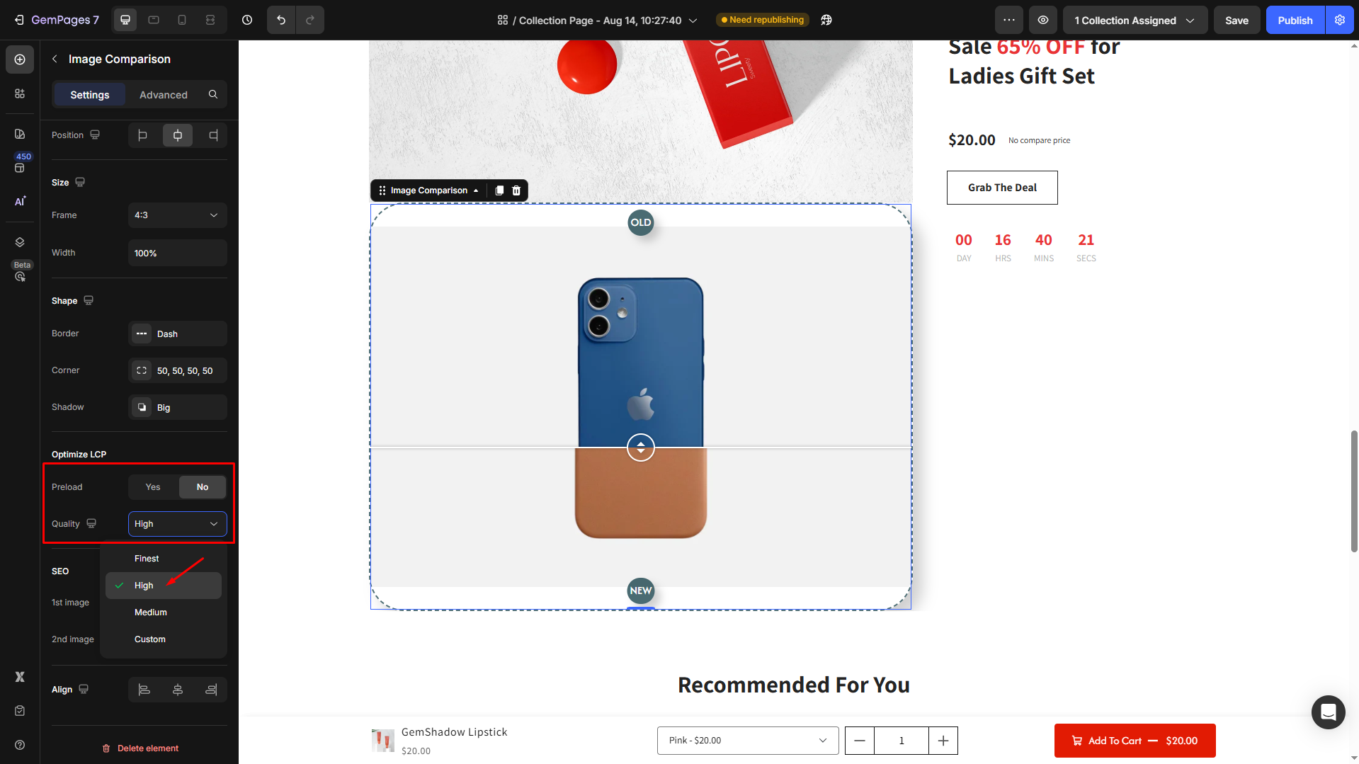
Optimize LCP
This setting helps improve your page’s Largest Contentful Paint (LCP) score, which is a key Core Web Vitals metric for performance and SEO.
Preload: Enable this option if the image appears above the fold and is one of the main visual elements on the page.
- If Preload = Yes: The image preloads to improve speed.
- If Preload = No: The image loads normally.
Quality: Choose the right image compression level to balance clarity and loading speed:
- Finest: Highest quality, larger file size.
- High (default): Balanced quality and performance.
- Medium: Faster loading, slightly reduced quality for image-heavy pages.
- Custom: Define your compression settings for advanced control.
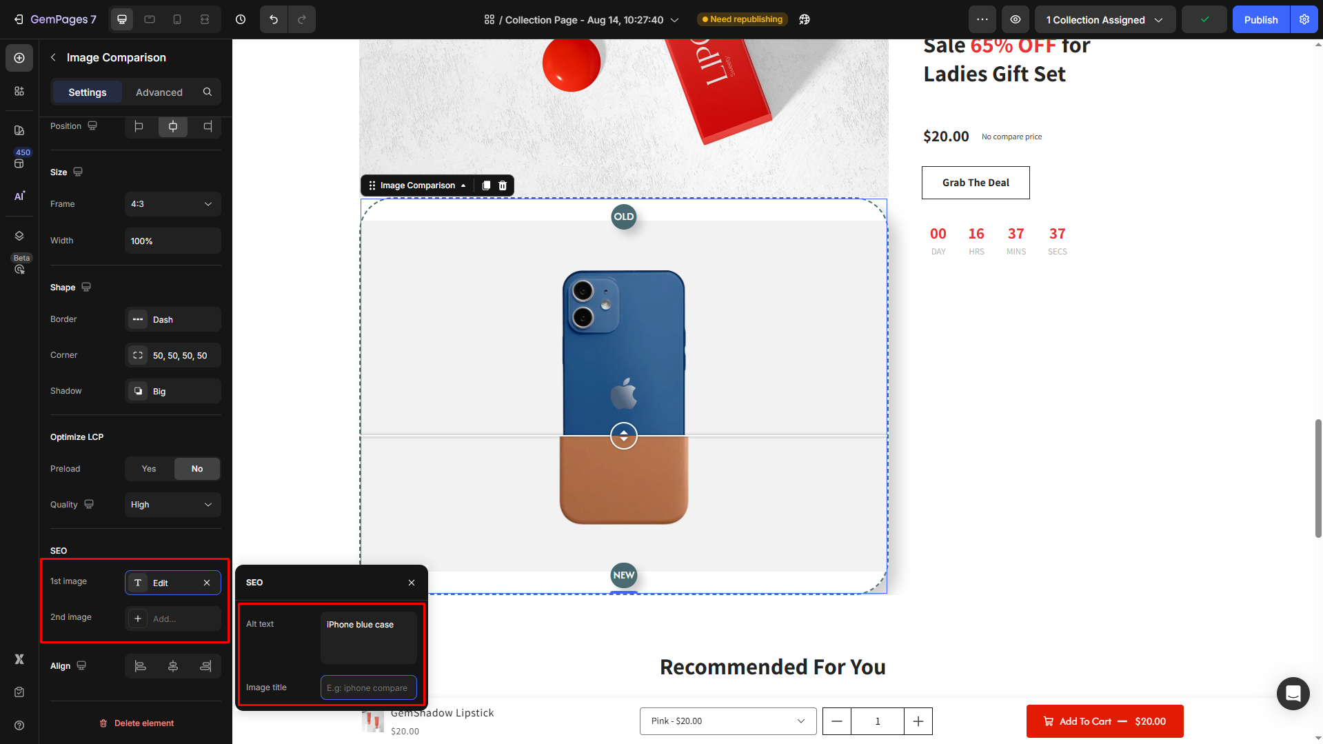
SEO
Help your page rank get better by providing image information. Add Alt text and Image title for each image.
Align
Adjust the alignment of your element inside the container: left-aligned, center-aligned, or right-aligned.
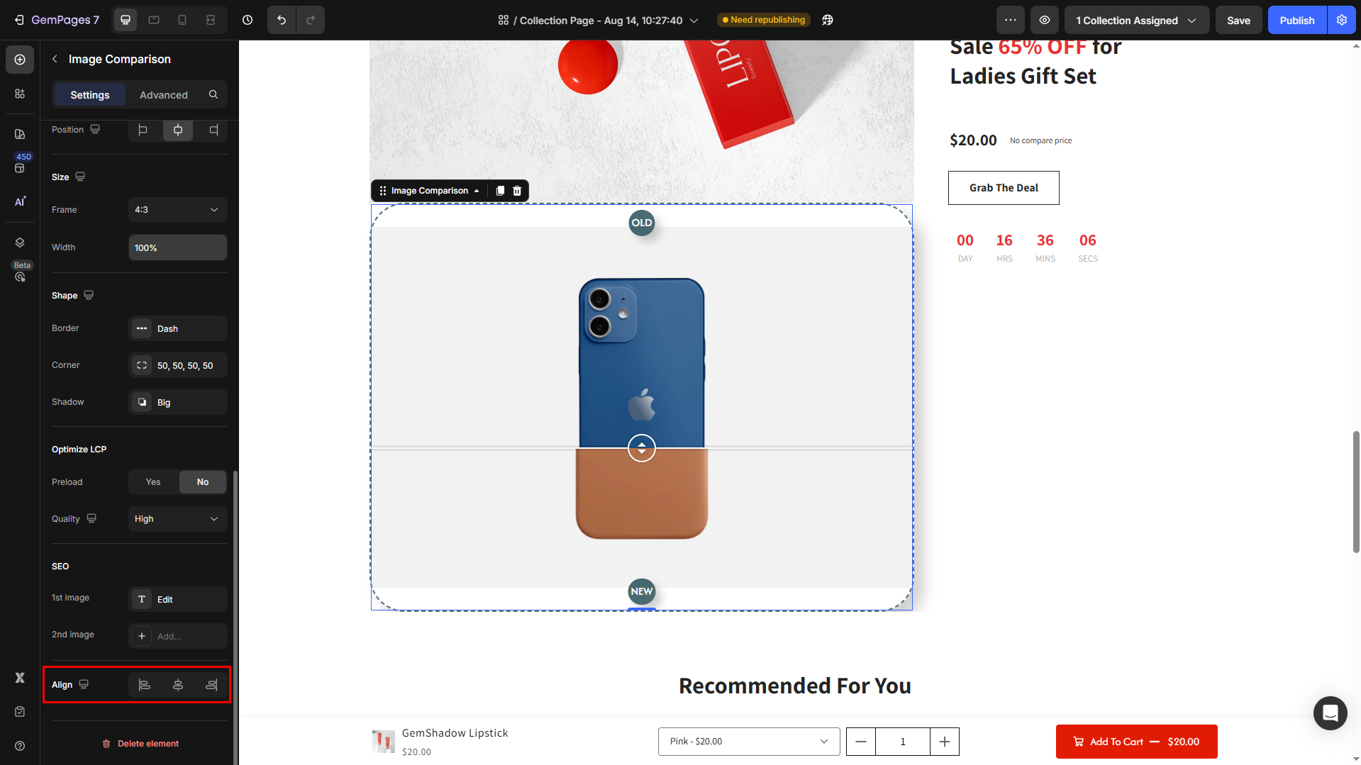
Note: Align is not supported if the width is set to 100% or greater.
Configure the Advanced Tab
For more advanced customization, please navigate to the Advanced tab and follow the instructions in this article.
FAQs
1. Can I add more than two images in the Image Comparison element?
No. The Image Comparison element is designed to compare only two images at a time (before vs. after). If you want to show more comparisons, you can duplicate the element on your page.
2. Does the Image Comparison element work on mobile?
Yes. The slider is fully responsive and works on both desktop and mobile. Visitors can drag the handle with their finger on mobile devices.
3. Can I adjust the slider handle style?
Yes. You can customize the handle’s color, shape, and shadow in the Slider section.
4. How do I make sure images don’t look stretched?
Use the Fit image option under Scale to preserve the original aspect ratio of your images.
5. Can I add text labels like “Before” and “After”?
Yes. Toggle on the Badge option to add customizable labels to each image.


Thank you for your comments