What Are Negative Margins in GemPages?
Negative margins are a CSS property that applies a negative value to the space around an element, allowing it to move closer to neighboring elements or even overlap them.
Unlike positive margins—which add space around elements—negative margins reduce or completely remove that space, often creating a more dynamic and layered design.
Why Use Negative Margins?
- Overlap Elements: Negative margins are perfect for creating a layered design, where elements like text, images, or sections overlap one another. This effect can enhance the visual appeal of your page, adding depth and dynamism.
- Adjust Alignment: If your elements are slightly misaligned, negative margins offer a quick and efficient way to make fine-tuned adjustments. Instead of redesigning the entire section, you can nudge the elements into place using negative margin values.
- Fix Layout Issues: When standard margins or spacing settings are too wide, negative margins help reduce the gap between elements, tightening the layout and improving the overall design flow. This is especially useful when working with fixed layouts or templates that leave too much space between sections.
How GemPages Negative Margins Work?
Negative margins affect the space around an element in four directions: top, bottom, left, and right.
Here’s how it works:
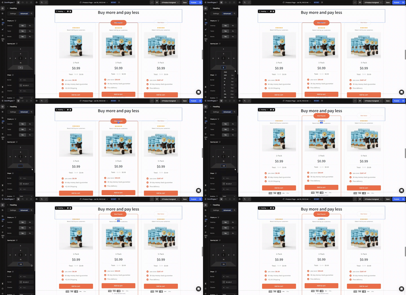
Margin Top: Removes space, pulling the element upward.
Applying a negative value to the top margin pulls the element upward, effectively removing the space above it. This can help bring an element closer to the one above it, creating the desired overlap or adjustment in alignment.
It’s particularly useful for adjusting the vertical positioning of elements that need to visually connect or align more closely without altering the overall layout structure.
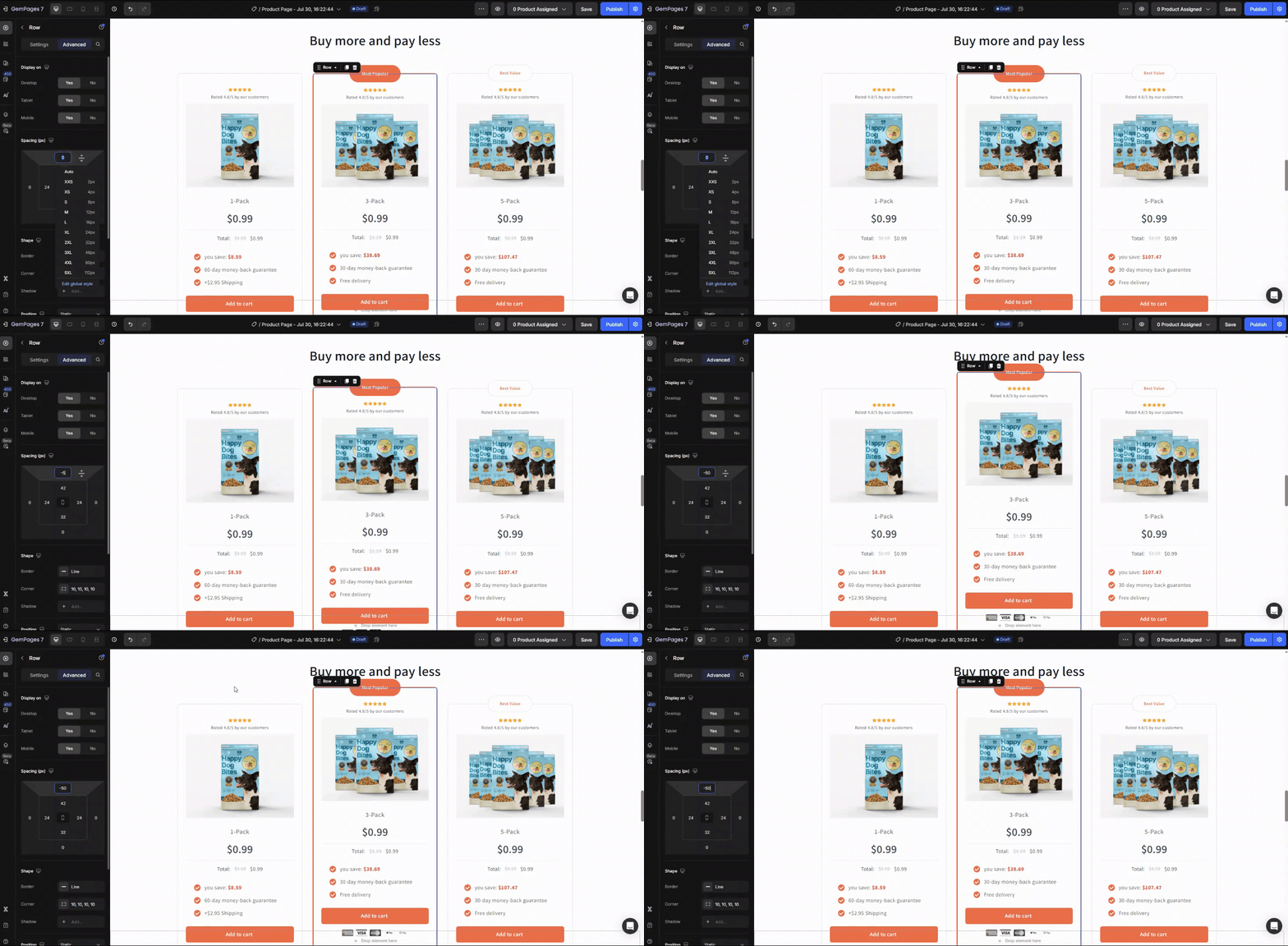
Margin Bottom: Pulls the element upward, bringing it closer to the element above.
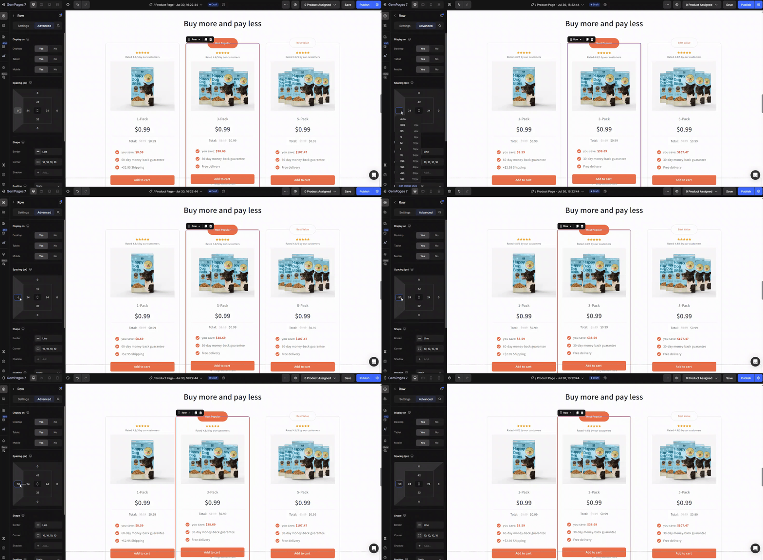
Margin Left: Pulls the element leftward, overlapping the content next to it.
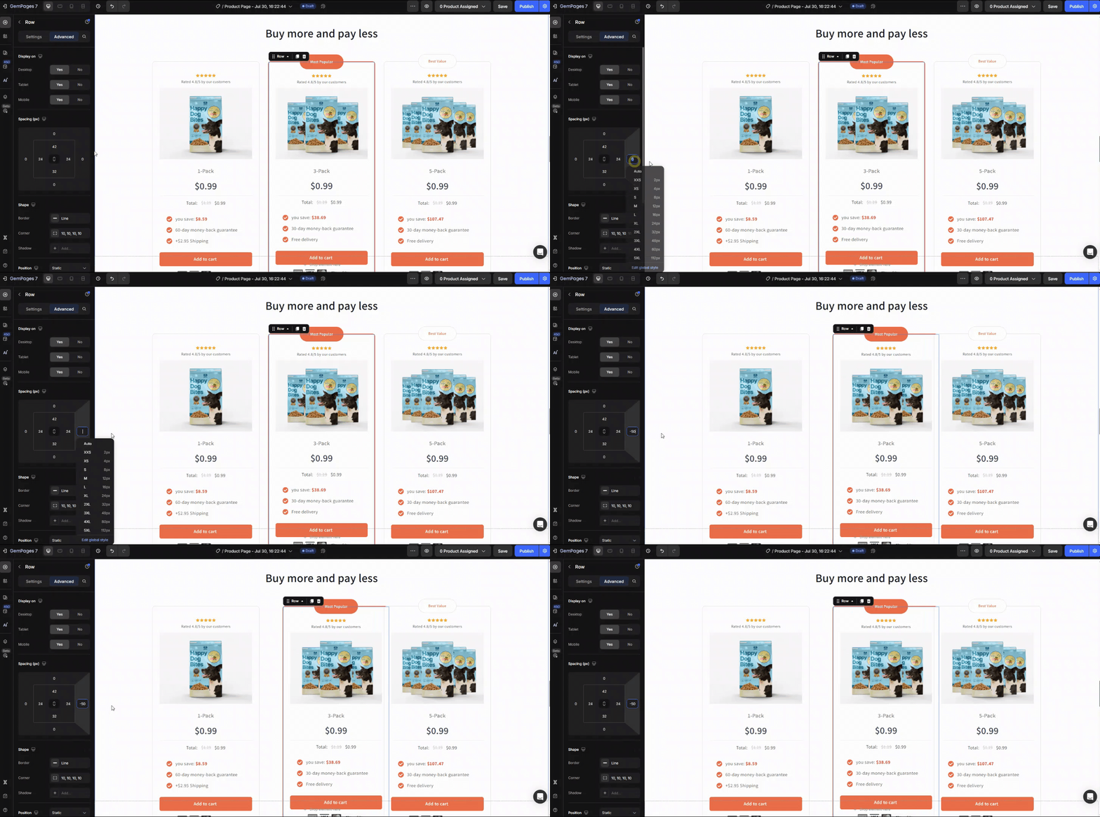
Margin Right: Pulls the element rightward, closing the gap or overlapping adjacent elements.
How to Use Negative Margin in GemPages?
Using negative margins in GemPages allows you to adjust the positioning of elements, creating unique designs or fixing layout issues.
Here’s a step-by-step guide to help you apply negative margins to any element or section in GemPages.
Step 1: Open the page you want to edit.
Step 2: In the GemPages editor, click on the element or section you want to adjust.
This could be an image, text block, button, or any section you want to move.
Step 3: In the Advanced Tab, scroll down to locate the Spacing section.
You’ll see options for Padding and Margin. We’ll be working with the Margin settings.
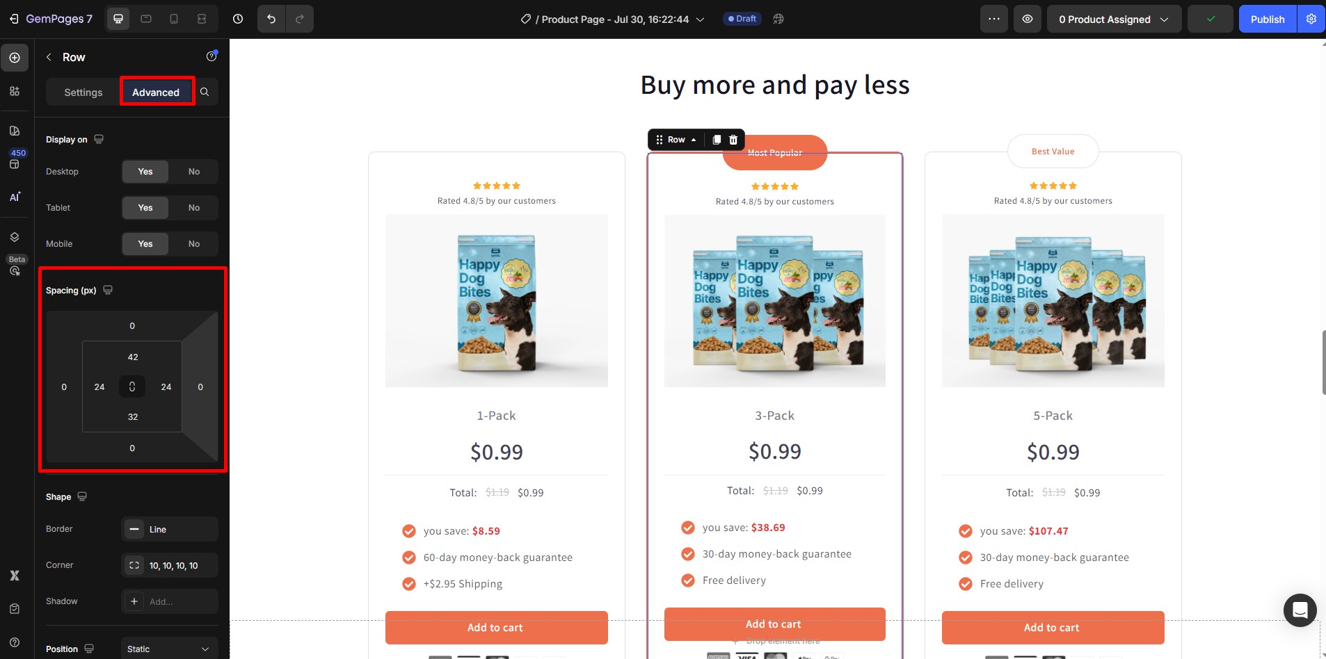
Step 4: Adjust the margin values for the Top, Bottom, Left, or Right as needed as guided above.
Enter a negative value (e.g., -20, -50) in the margin field for the side you want to adjust. Example: Enter -50 in the Top Margin to pull the element upwards
As you input the negative values, the element will shift accordingly, and you can see the changes in real-time.
Step 5: Use the Preview button at the top of the GemPages editor to see how the changes affect your page across different devices (desktop, tablet, mobile).
Step 6: Once you’re satisfied with the positioning and layout, click “Save”.
If you’re ready to publish the changes to your live site, click “Publish” to apply the adjustments.


Thank you for your comments