


In this guide, you’ll learn how to customize the hover styles of buttons in GemPages.
What are Hover Styles?
Hover styles refer to the changes that occur when a user moves their mouse pointer over a button.
These styles can include alterations in color, text, size, or shadows, providing visual feedback and encouraging user interaction.
Customizing hover styles in GemPages is easy and can significantly enhance your page’s user experience.
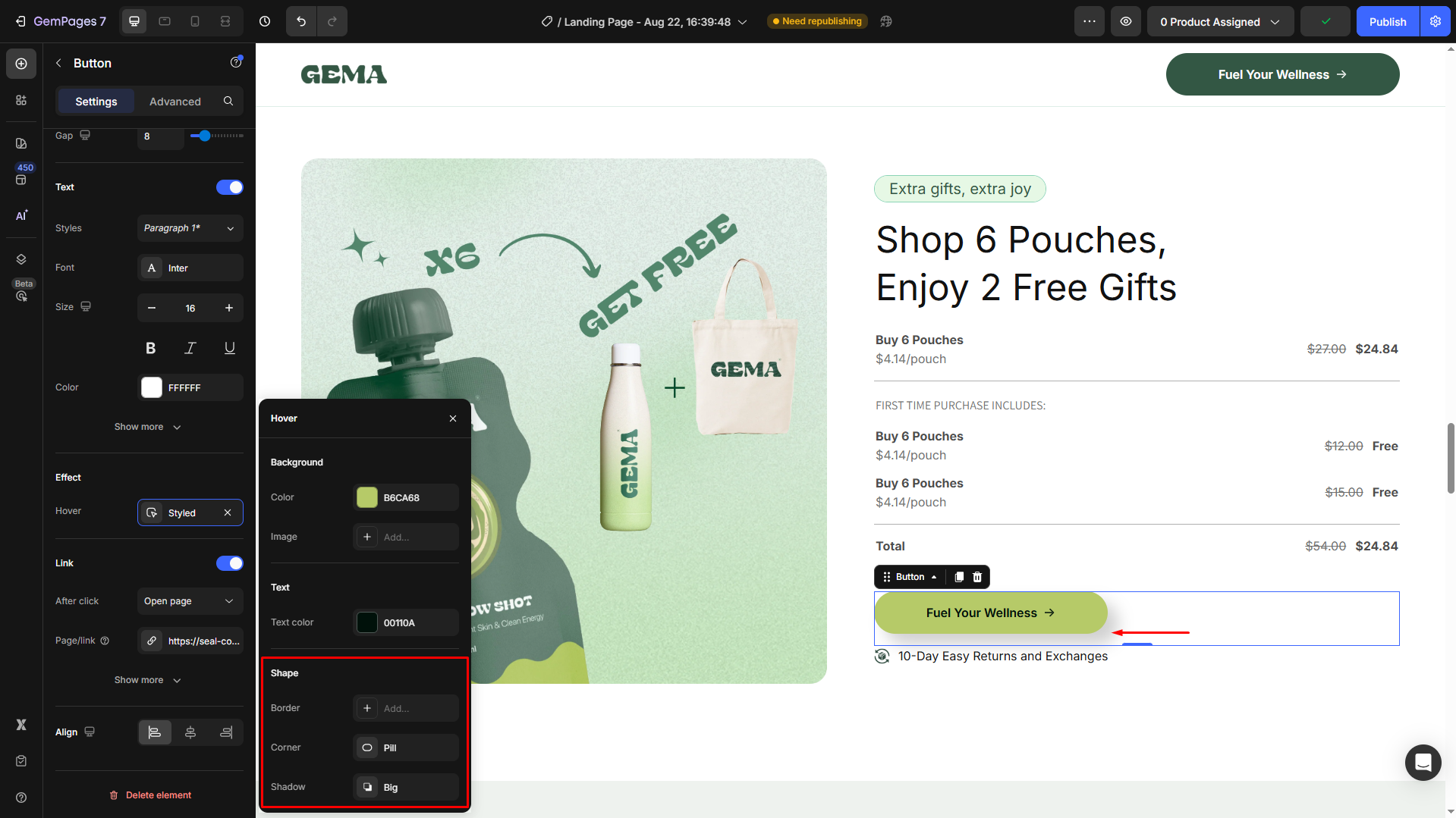
How to Change the Hover Styles of a Button in GemPages?
Step 1: In the editor, click on the button to open its settings panel in the left sidebar.
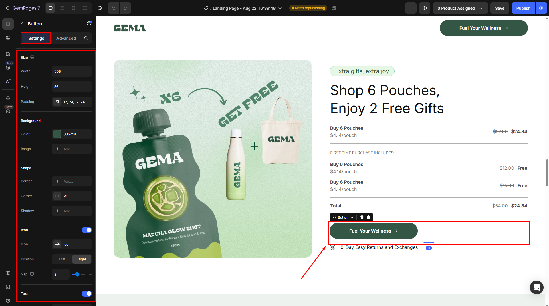
If you don’t already have a button on your page, drag and drop a Button Element from the element menu to your page.
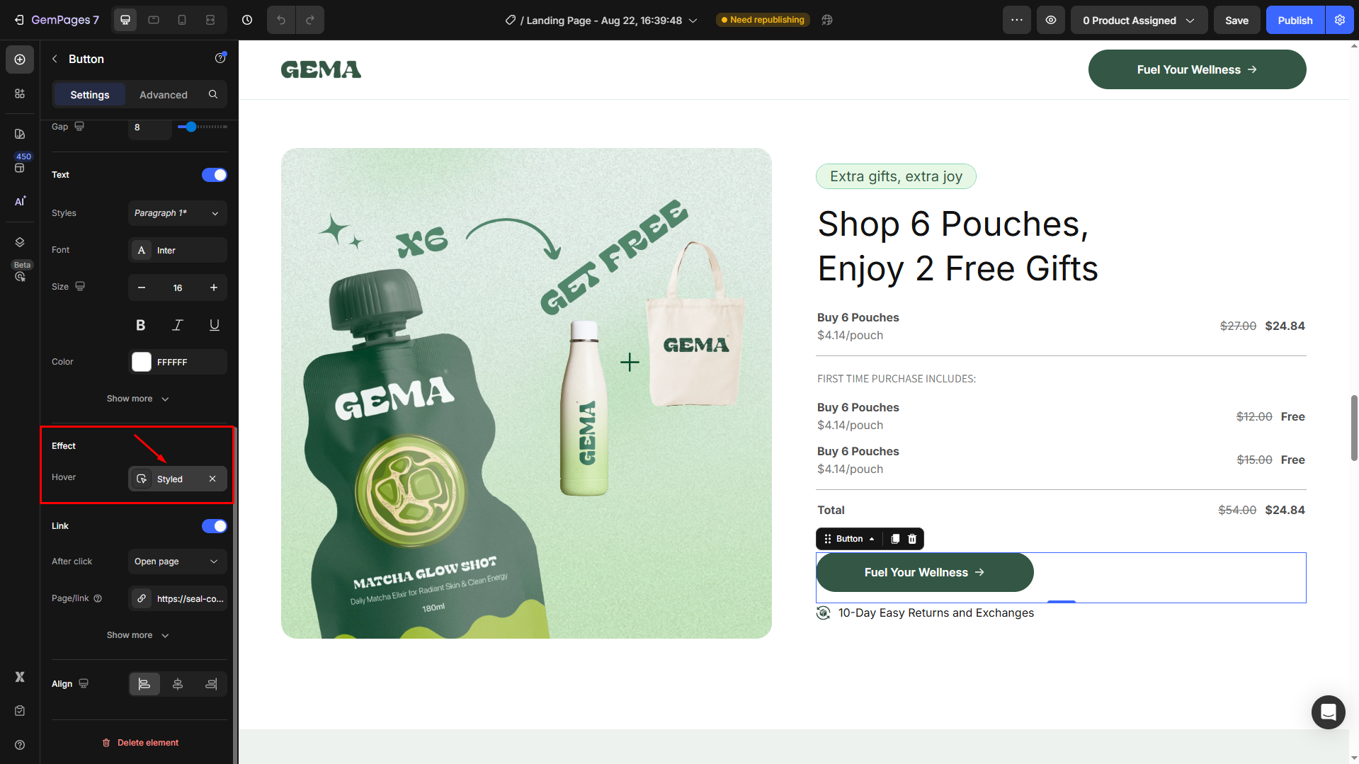
Step 2: Under the Settings tab, scroll down to the Effect section. Click on the Styled box next to the Hover field.
Step 3: Customize the hover styles as you prefer, including:
- Background: Choose a color that aligns with your page’s theme. Also, you can use a background image to catch more attention.
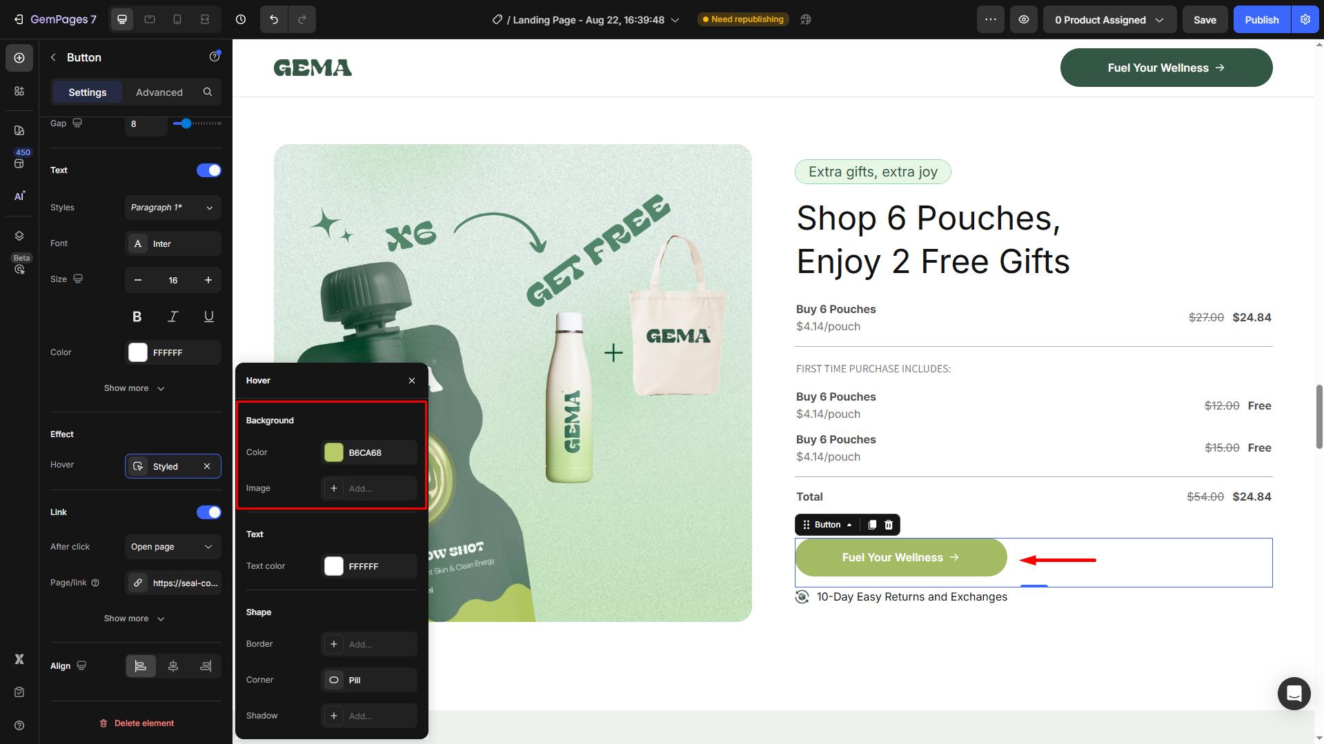
- Text Color: Select a contrasting or complementary color for better visibility.
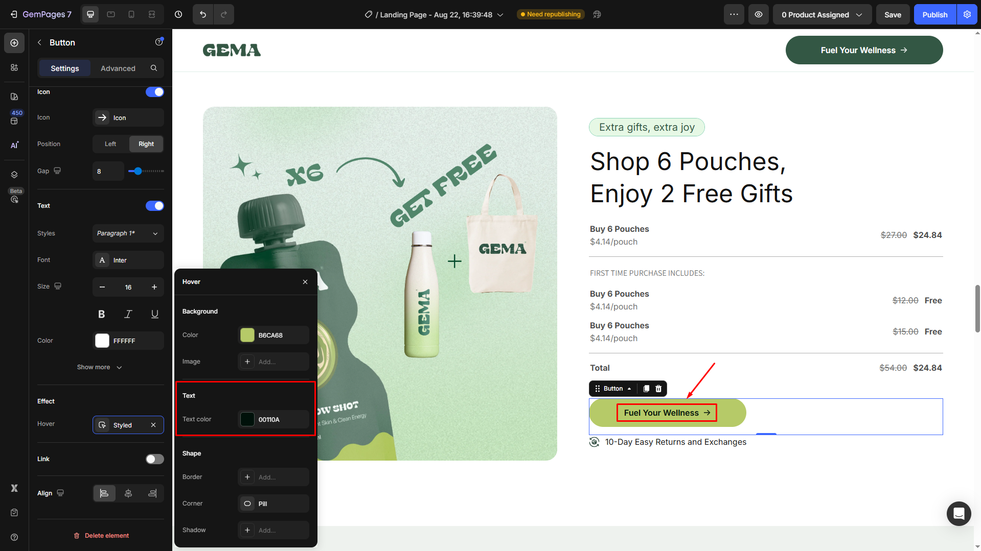
- Shape: You can adjust the bold appearance, set rounded corners for a soft look or sharp edges for a modern feel, and add a shadow effect to give your button a 3D appearance and make it pop.


Thank you for your comments