


This article will show you how to use the Product Custom Field element in GemPages to collect extra information from customers on your Shopify product pages.
What is the Product Custom Field Element?
The Product Custom Field element is a flexible tool that allows you to capture additional details from customers when they purchase a product. Depending on your needs, you can display different field types, such as text boxes, checkboxes, dropdowns, or radio buttons, to gather specific information.
Examples include:
- Collecting personalized notes or engraving text.
- Asking customers for delivery instructions.
- Offering customization choices (color, size, packaging).
- Capturing information that isn’t covered by Shopify’s default product options.
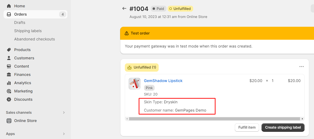
All data collected through Product Custom Fields will be attached to the order and displayed in your Shopify Admin > Orders once the order is confirmed.
How to Add a Product Custom Field
Note: Since the Product Custom Field is a child element of the Product module, it must always be placed inside a Product module to work correctly.
Follow these steps:
Step 1: In the GemPages Dashboard, select your page to work on the enter the Editor.
Step 2: If you don’t have a Product Module, drag & drop one onto your page.
Step 3: Drag & drop the custom field element inside the Product module, on your preferred spot.
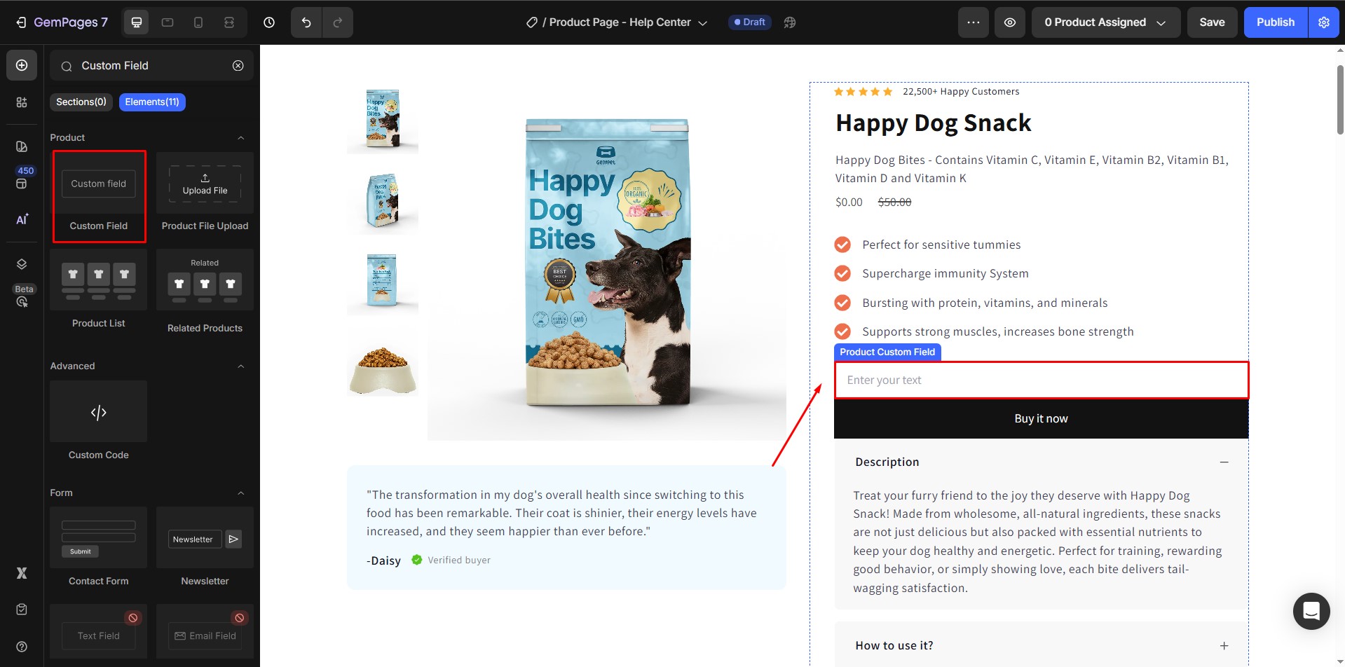
Tip: You can add more than one Product Custom Field inside a Product module if you need to collect multiple pieces of information.
Once added, click on the element to open its Settings panel on the left sidebar. This panel contains two tabs: Settings and Advanced:
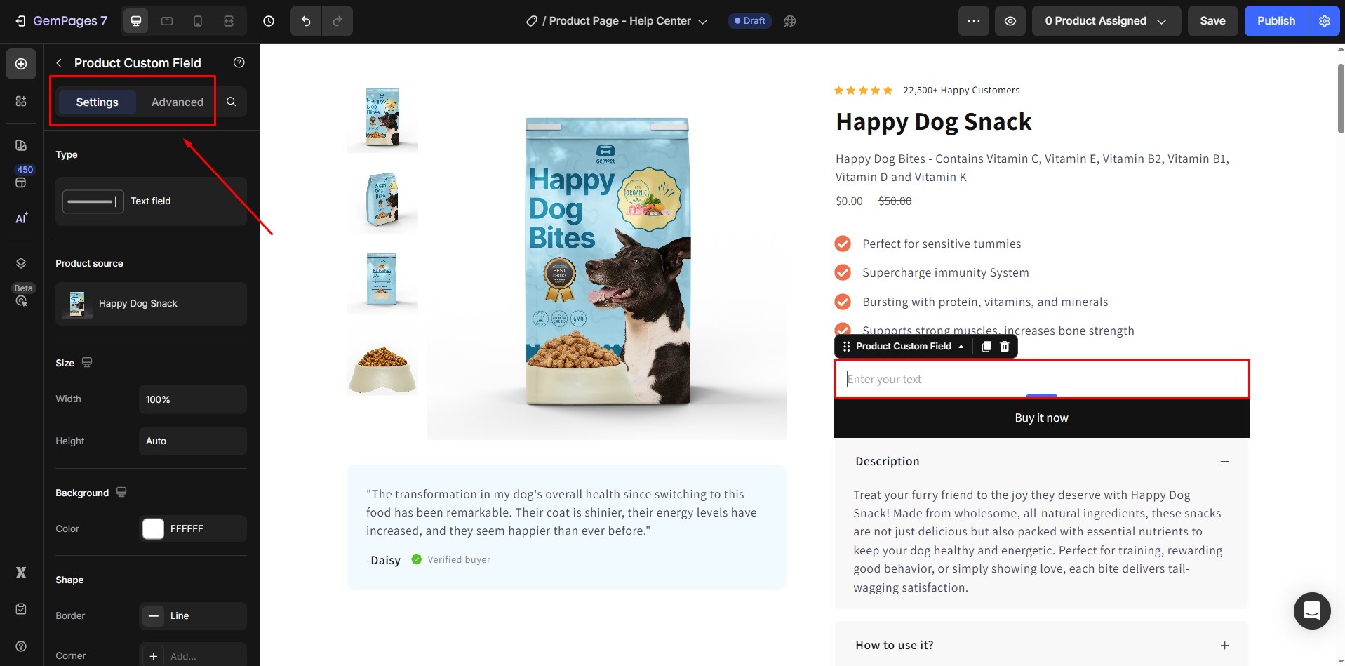
Configure the Settings Tab
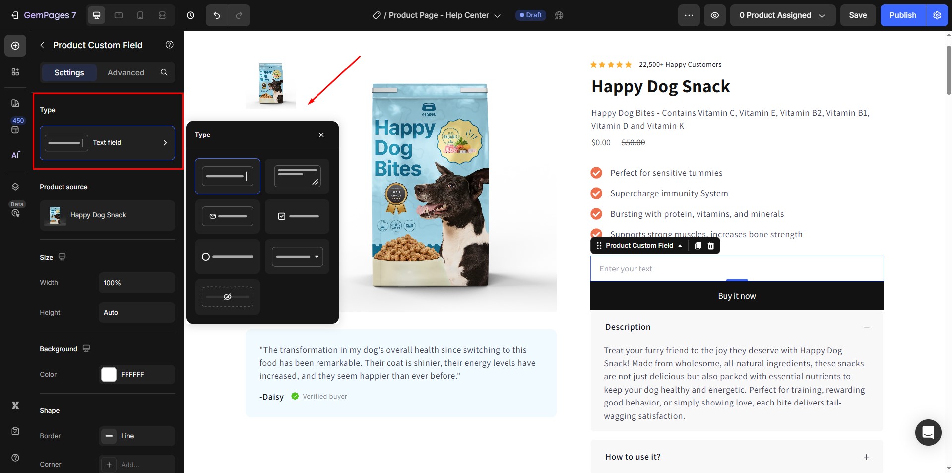
1. Type
Choose the input style. You can select from:
- Text: Single-line input for short notes.
- Text Area: Multi-line box for longer comments.
- Email: Input field formatted for email addresses.
- Checkbox: Allows customers to select multiple choices.
- Radio Button: Customers can select only one option from a group.
- Dropdown: A compact selection box for single-choice options.
- Hidden: Invisible to customers but still sends a pre-defined value with the order.
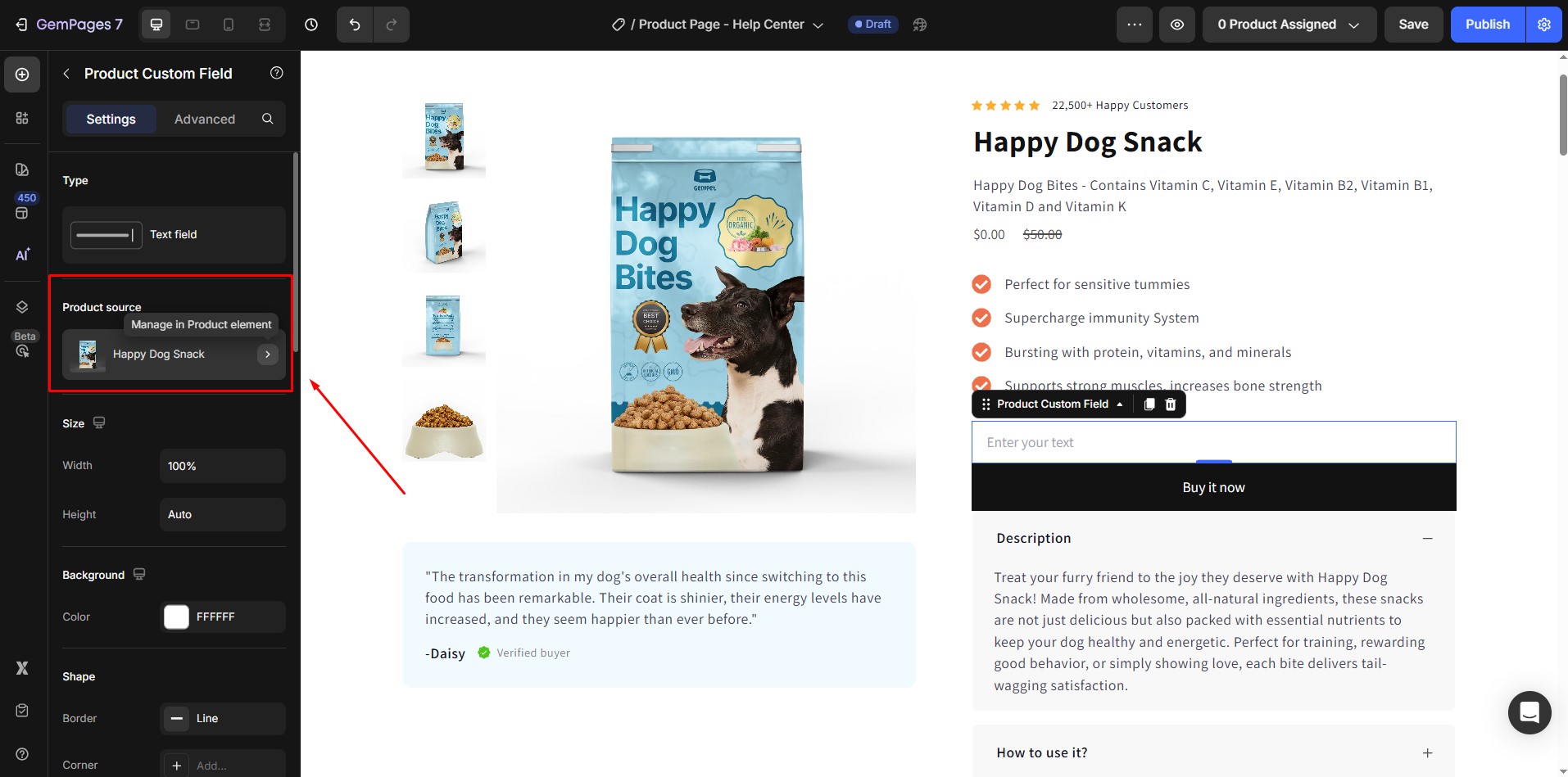
2. Product Source
Displays which product the custom field belongs to. To change it, open the Product Picker in the Product module.
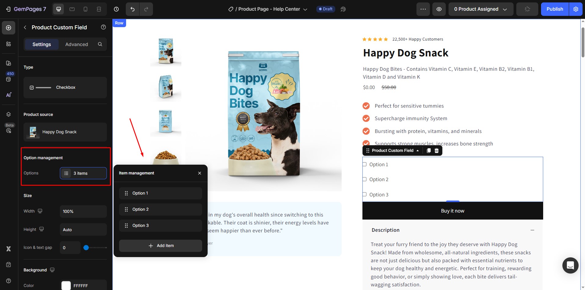
3. Option Management
Available for Checkbox, Radio, and Dropdown types. Here, you can:
- Add or remove options.
- Edit option labels.
- Reorder choices to control the display sequence.
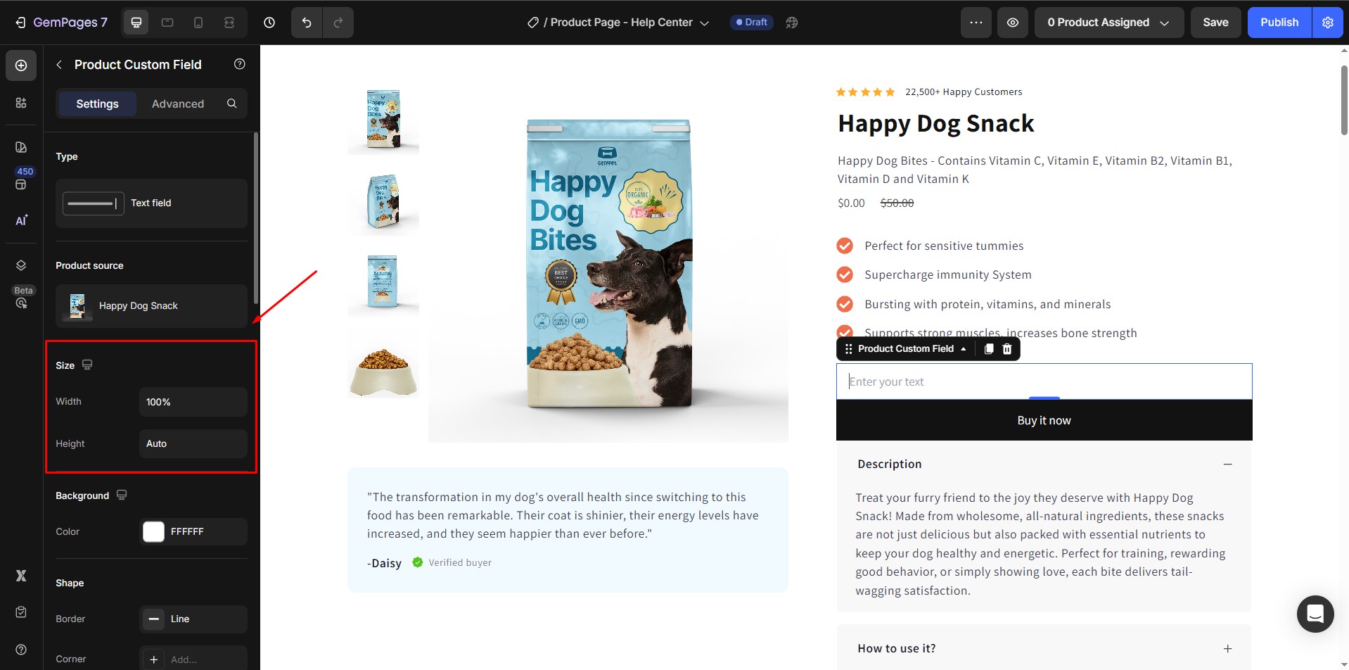
4. Size
(Not available for Hidden type)
- Width: By default, fields span 100% of the container. You can switch to Fit Content (auto) if preferred.
- Height: Default is auto. Adjust if you want a taller input field.
- Icon & Text Gap: Controls spacing between the icon and text in Checkbox or Radio layouts.
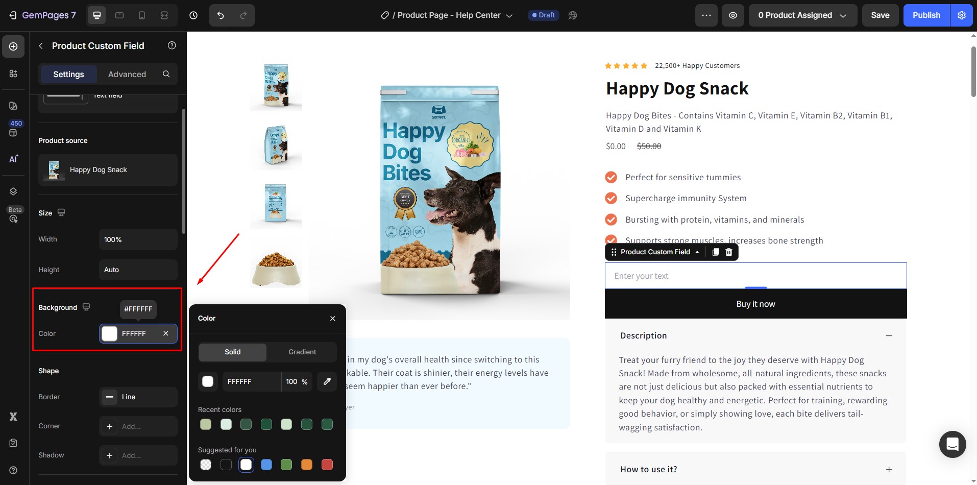
5. Background
(Not available for Hidden type)
Set a background color or pattern for your input field.
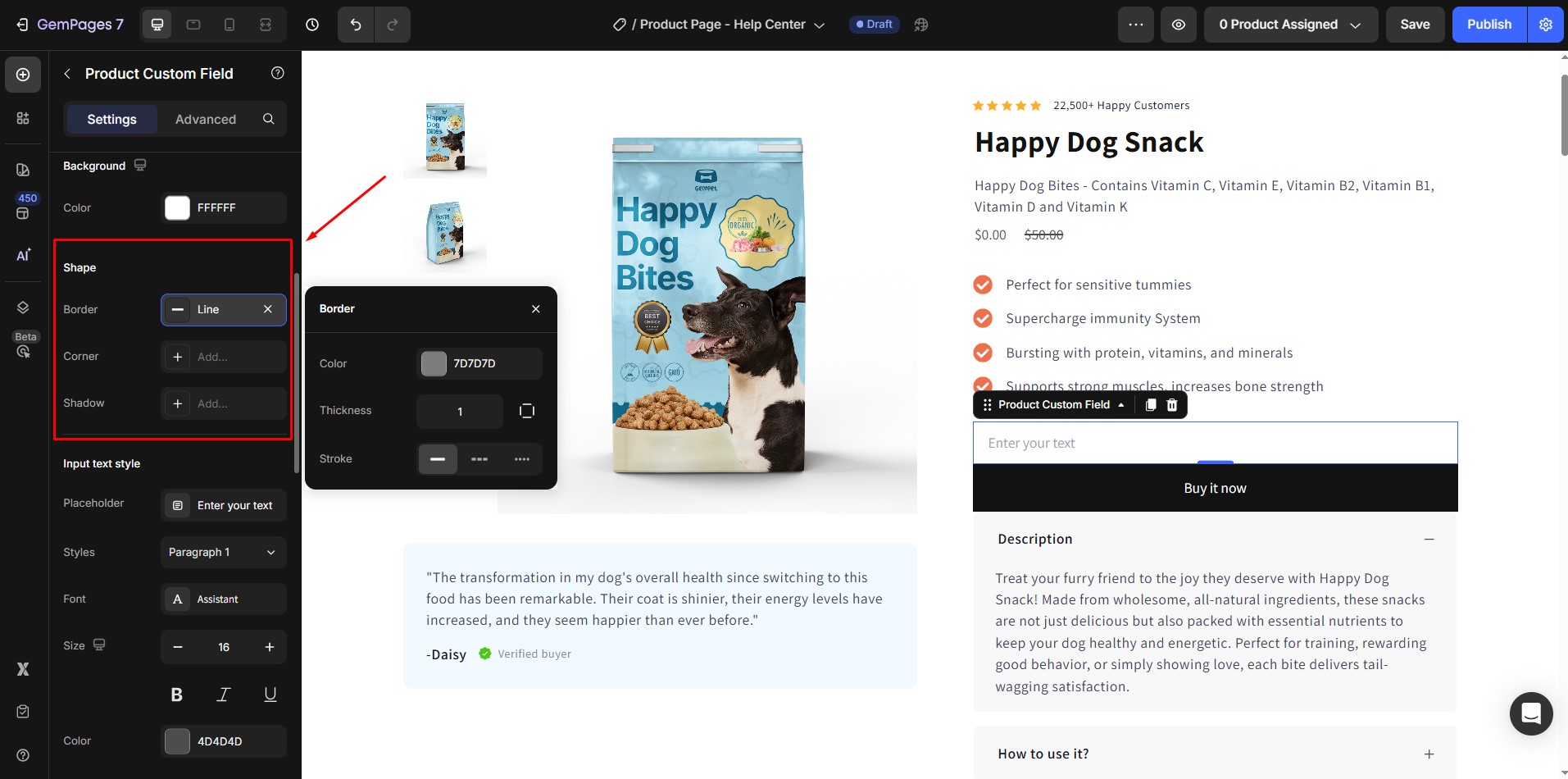
6. Shape
(Not available for Hidden type)
These settings control the overall shape and style of the input field:
- Border: Adjust the border thickness, style (solid, dashed, dotted), and color.
- Corner: Set the border radius.
- Shadow: Apply drop shadows to add depth and make the field stand out.
7. Input Text Style
Available for Text, Text Area, and Email types. Options include:
- Placeholder: Default text shown before input.
- Font: Choose from available fonts or apply a custom font.
- Size, Color, and Weight: Adjust typography for readability and branding.
- Line Height & Letter Spacing: Fine-tune text spacing.
- Text Transform: Convert text to uppercase, lowercase, or capitalize.
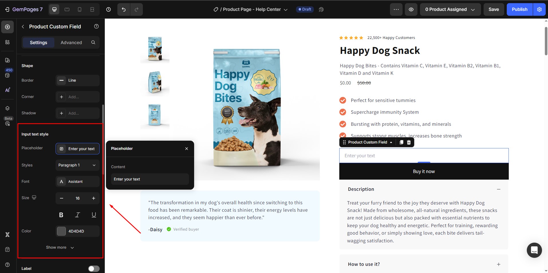
For Checkbox, Radio, and Dropdown fields, this section customizes the option labels.
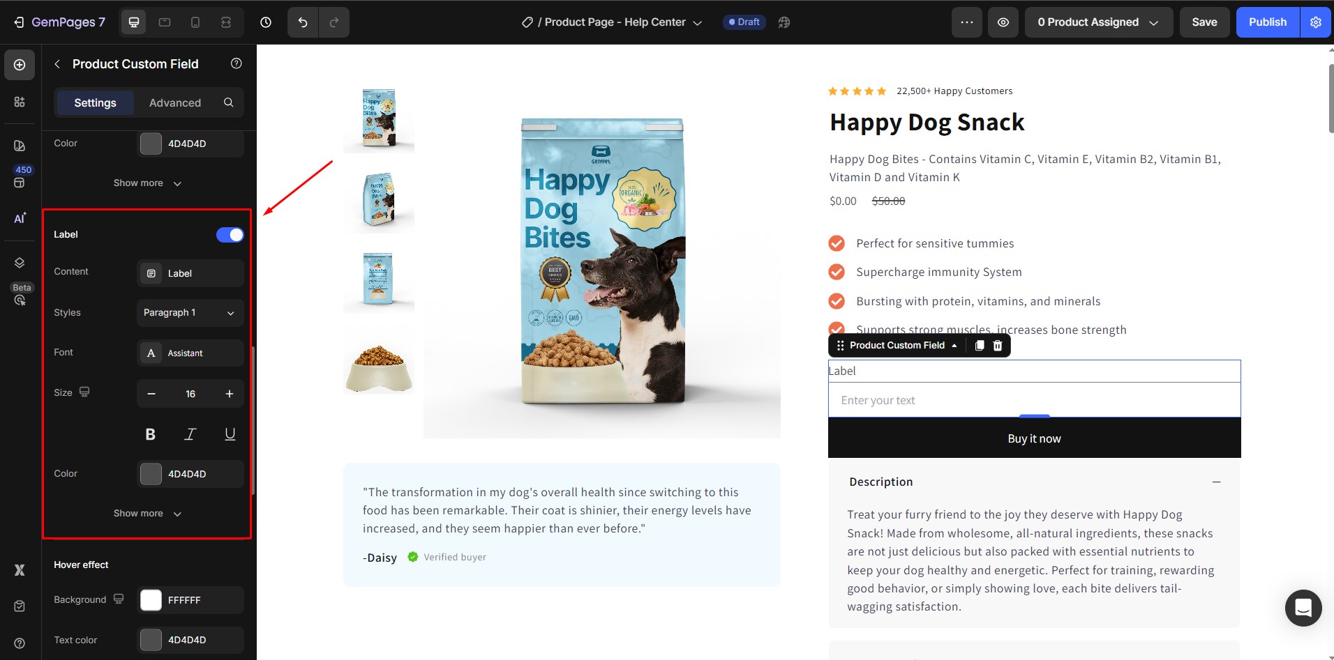
8. Label
(Not available for Hidden type)
Show or hide the field label. You can customize:
- Content text.
- Font, size, color, weight.
- Spacing and text transform.
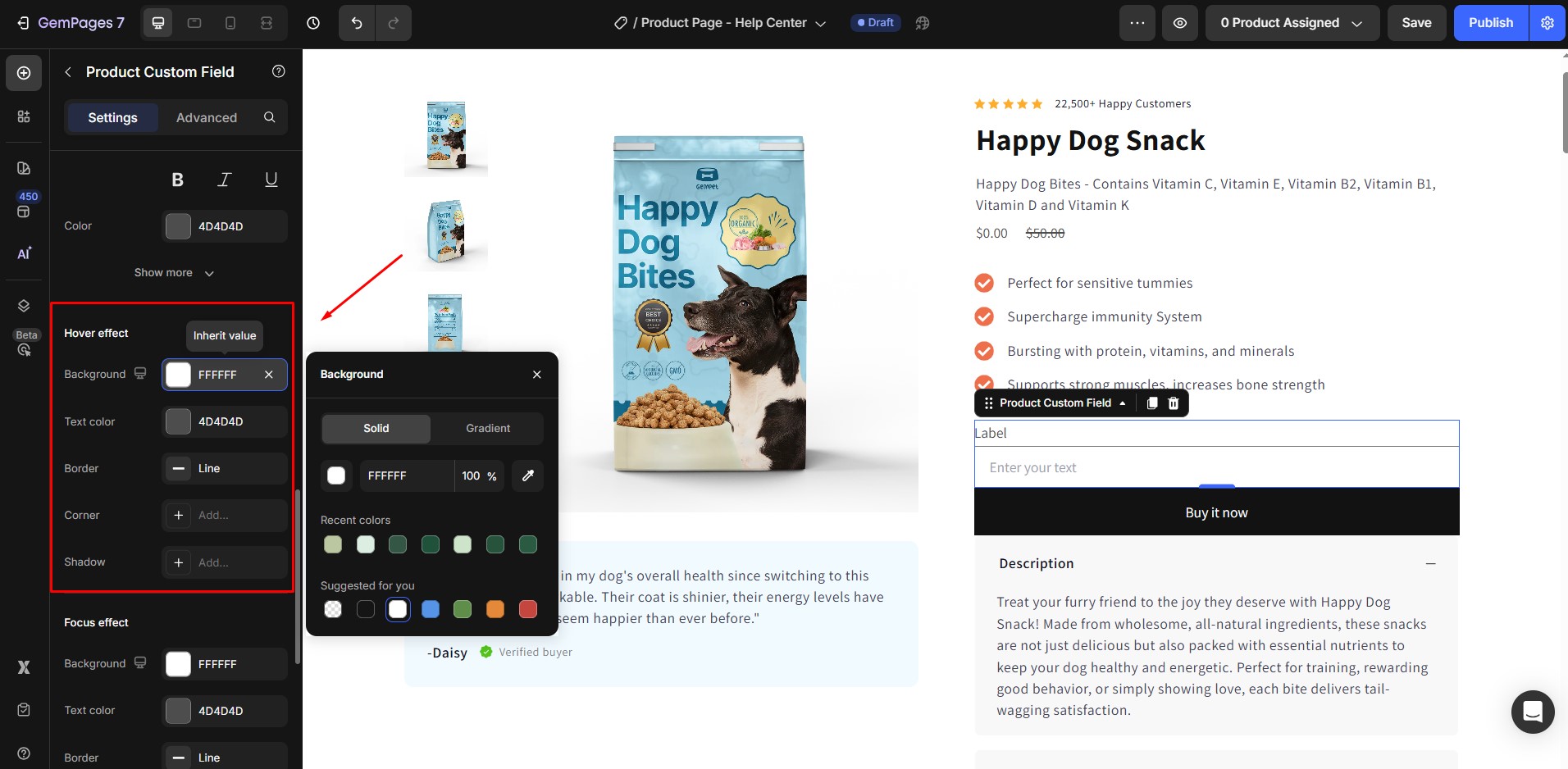
9. Hover Effect
Control how the field looks when hovered:
- Background color.
- Text color.
- Border styling.
- Corner radius.
- Shadows.
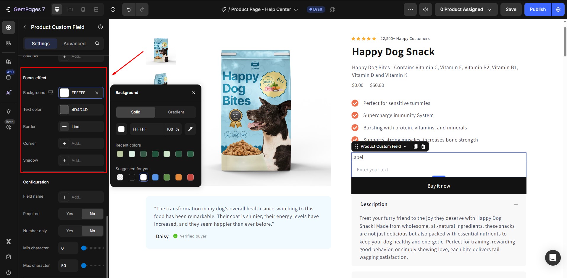
10. Focus Effect
Customize the style when a field is active or selected:
- Background.
- Text color.
- Border.
- Corner radius.
- Shadow.
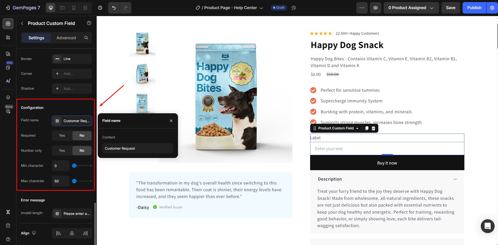
11. Configuration
- Field name: Assign an identifier for backend reference.
- Required: Activate this switch to prevent users from bypassing this information.
- Number only: Enable this choice to exclusively allow number inputs.
- Min/Max character(s): Use the slider to adjust the minimum and maximum permissible characters as desired.
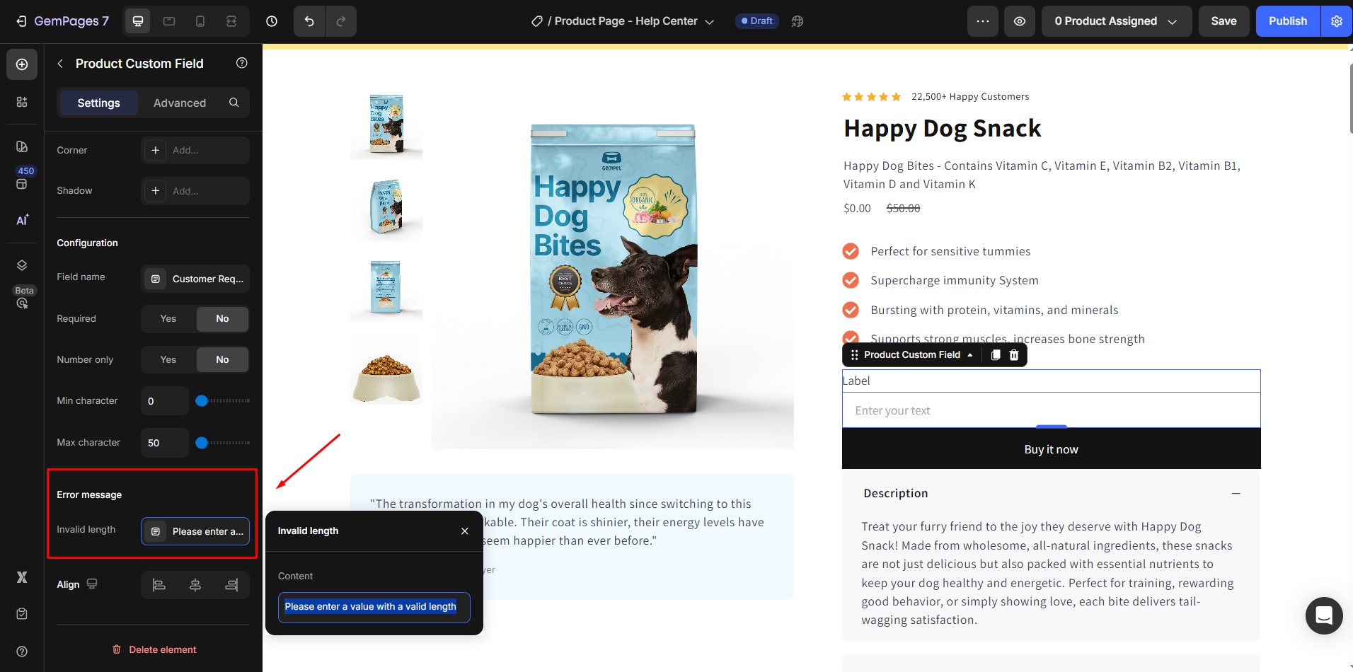
12. Error Message
Enter a custom error message for invalid input or missing required fields.
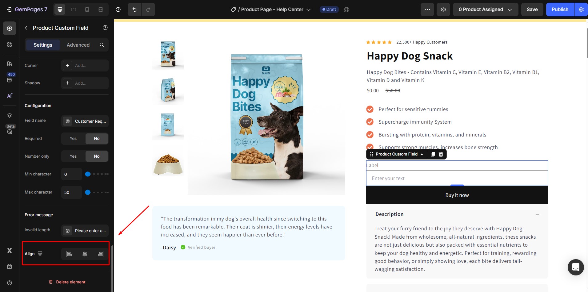
13. Align
Align the field to the left, center, or right within the container.
Configure the Advanced Tab
For more advanced customization, please navigate to the Advanced tab and follow the instructions in this article.


Thank you for your comments