


Why Create a 5-Column Grid on Your Page?
A clean and engaging layout is crucial for showcasing products and driving conversions.
The 5-column grid gives you more flexibility, especially when you want to:
- Maximize product visibility: Display multiple products, features, or categories on a single row for a broader overview.
- Enhance user experience: Allow customers to view more items at once, helping them make faster purchasing decisions.
With the latest update in GemPages v7, you can now set up a 5-column grid more easily and with better customization options.
How to Create a 5-Column Grid in GemPages?
In GemPages v7, it’s easy to design a 5-column grid layout on your page using the Row Element or the Carousel Element.
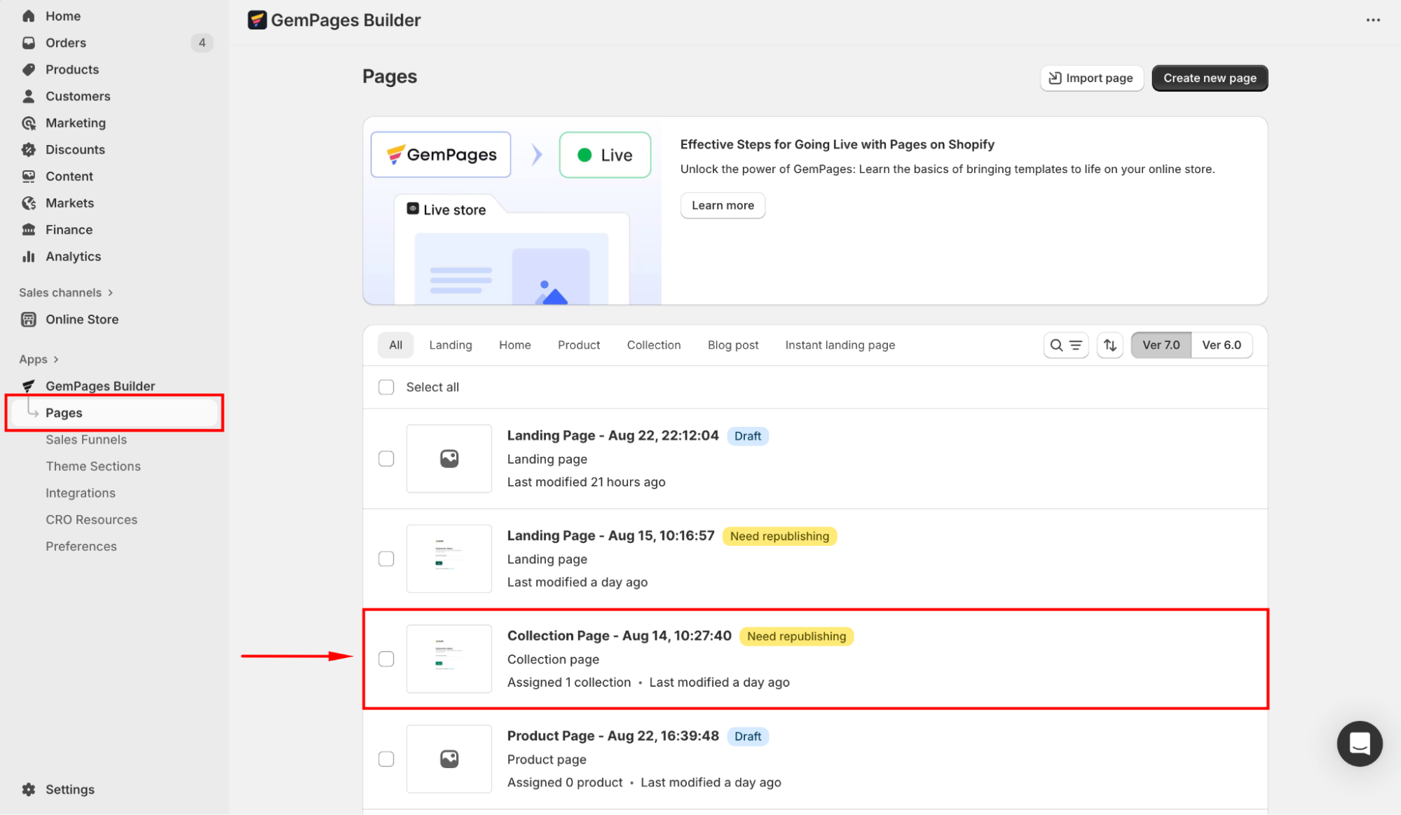
First, you need to locate the editor:
- From your Shopify admin, navigate to the GemPages Builder app under the Apps section.
- Go to Pages, where you can find all your pages built with GemPages.
- Click on the target page to enter the editor.
If you prefer to design a new template, click Create new page.
Refer to this article for further instructions on creating a new page with GemPages.
Method 1: Use the Row Element
Follow these steps to create the 5-column grid layout with GemPages’ Row element.
Step 1: From the left sidebar, drag and drop the Row Element to any position on your page.
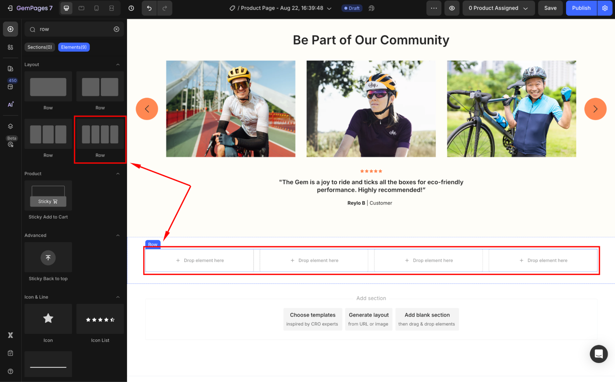
Step 2: Click on the element to open its settings panel. Under the Layout section, select the 5-column layout.
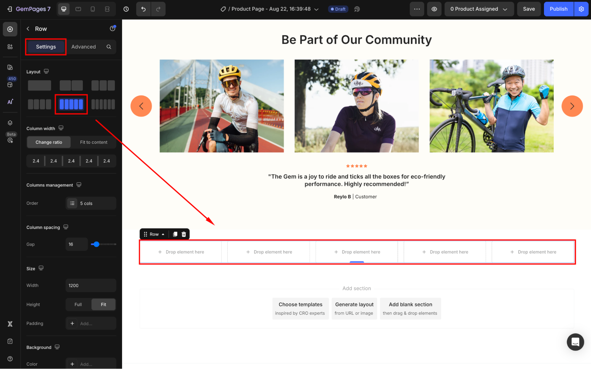
Step 3: Customize the layout to your preference. You can:
- Drop an element inside each column
- Adjust the column spacing
- Change the grid background color
- Modify the element’s shape
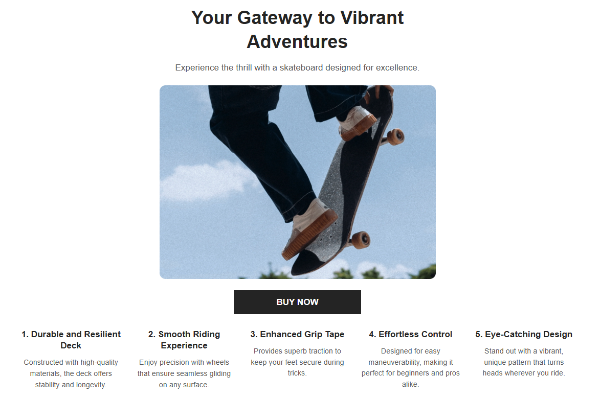
Tips: Use consistent product image sizes for your products to keep the 5-column grid visually balanced.
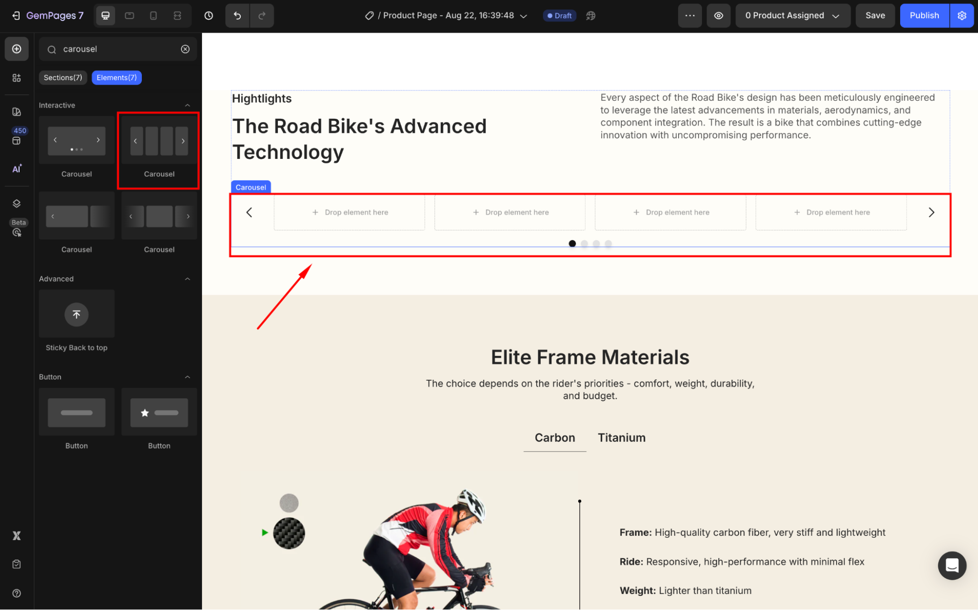
Method 2: Use the Carousel Element
While the Row Element is straightforward, it may not always be the most efficient solution, especially on mobile devices, where a 5-column grid can consume too much vertical space.
The Carousel element offers a more dynamic and space-saving option for displaying products. Here’s how to set it up:
Step 1: Drag and drop the Carousel Element onto your page where you want the grid to appear.
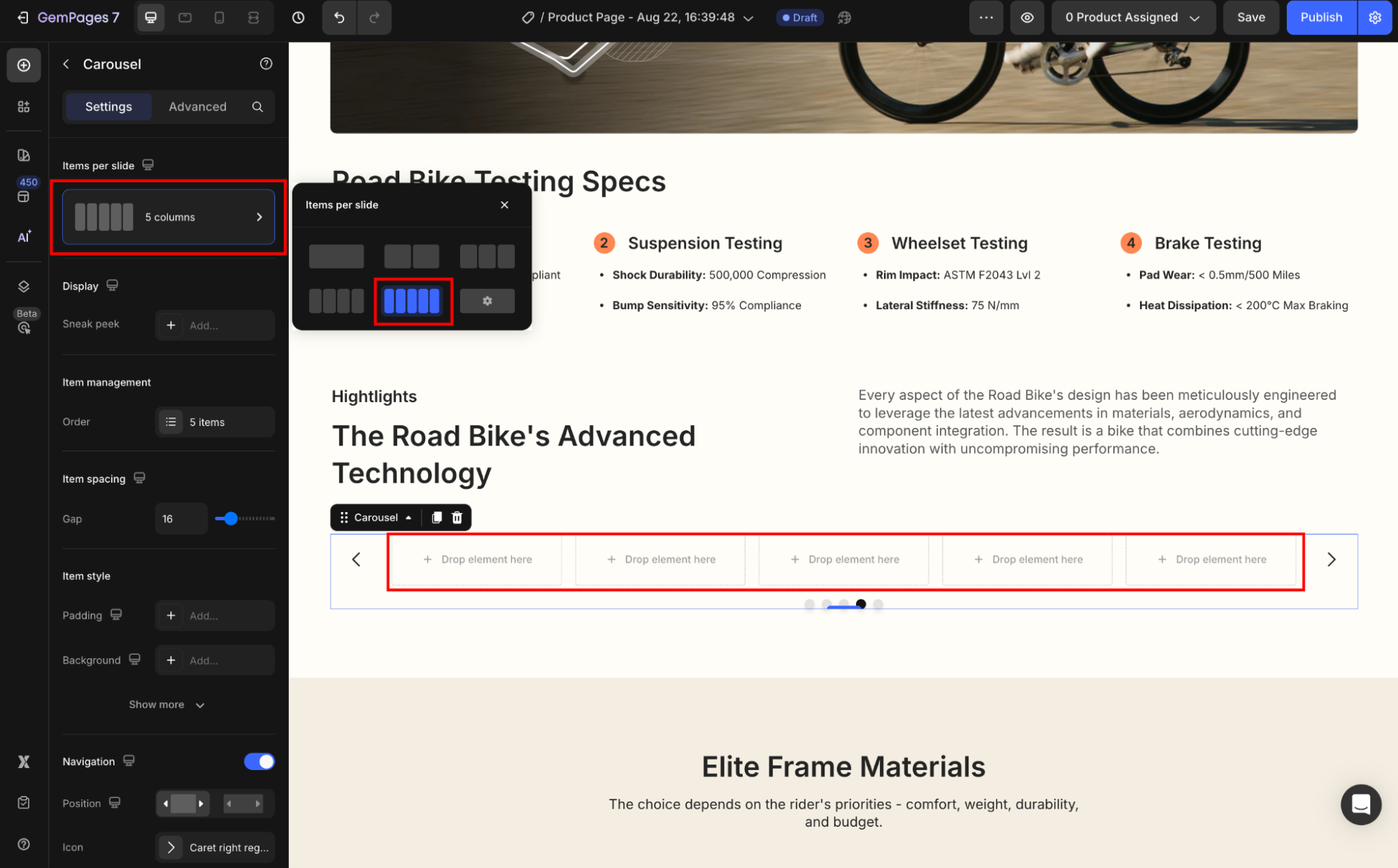
Step 2: Under the Items per slide section, select the 5-item grid.
Step 3: Now, design the 5-column grid carousel to fit your branding.
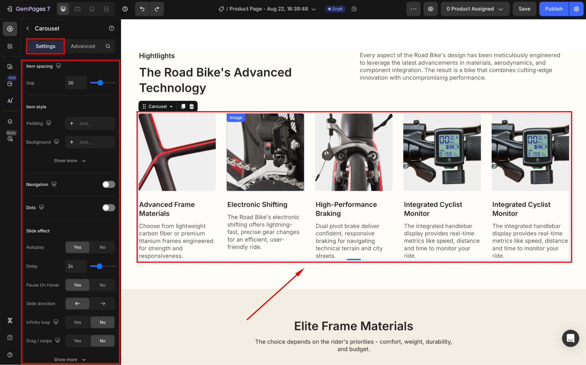
You can also enable autoplay, navigation arrows, or swipe gestures for a smoother browsing experience on mobile.
FAQs
1. Can I create more than 5 columns (e.g., 6 or 7)?
Currently, GemPages supports up to 6 columns in the Row element. For layouts requiring more items, the Carousel element is the recommended option.
2. Is the 5-column grid responsive on mobile?
Yes. The layout will automatically adjust on mobile devices. However, for better readability, fewer items (e.g., 2–3 columns) may display per row depending on the screen size.
3. Which element should I use: Row or Carousel?
Use the Row element for a static 5-column layout. If you want a space-saving, scrollable design (ideal for mobile), the Carousel element is the better choice.
4. Can I mix different elements inside the 5-column grid?
Yes. You can drop product elements, images, or any other elements into each column.


Thank you for your comments