


For an in-depth understanding of the Row element and its capabilities, check out our Row Element article.
Here are some key layout examples using row and step-by-step guides.
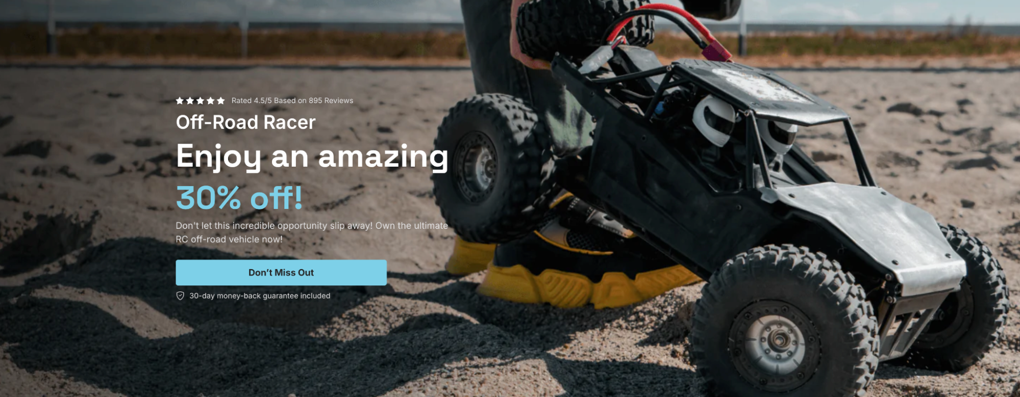
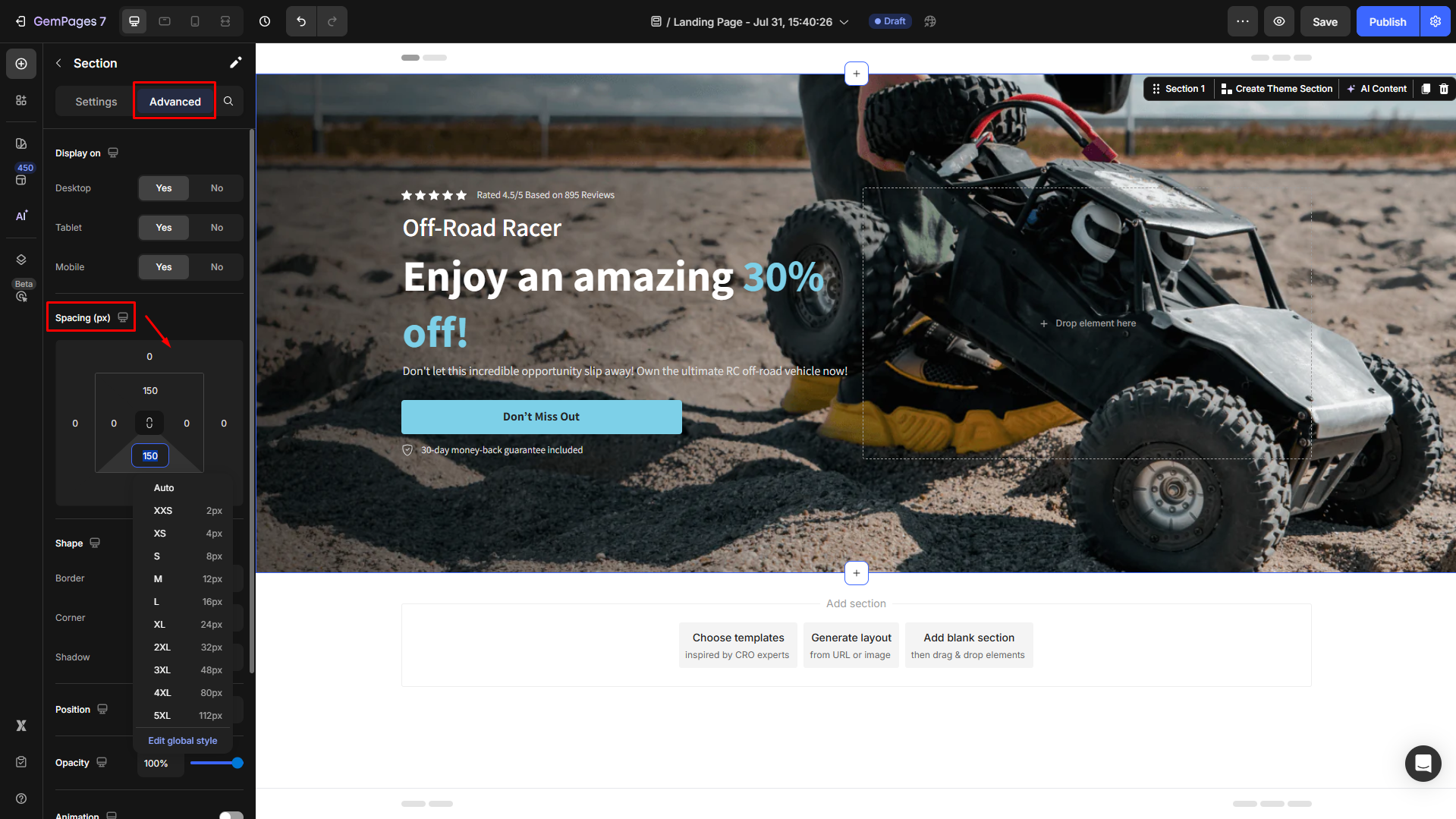
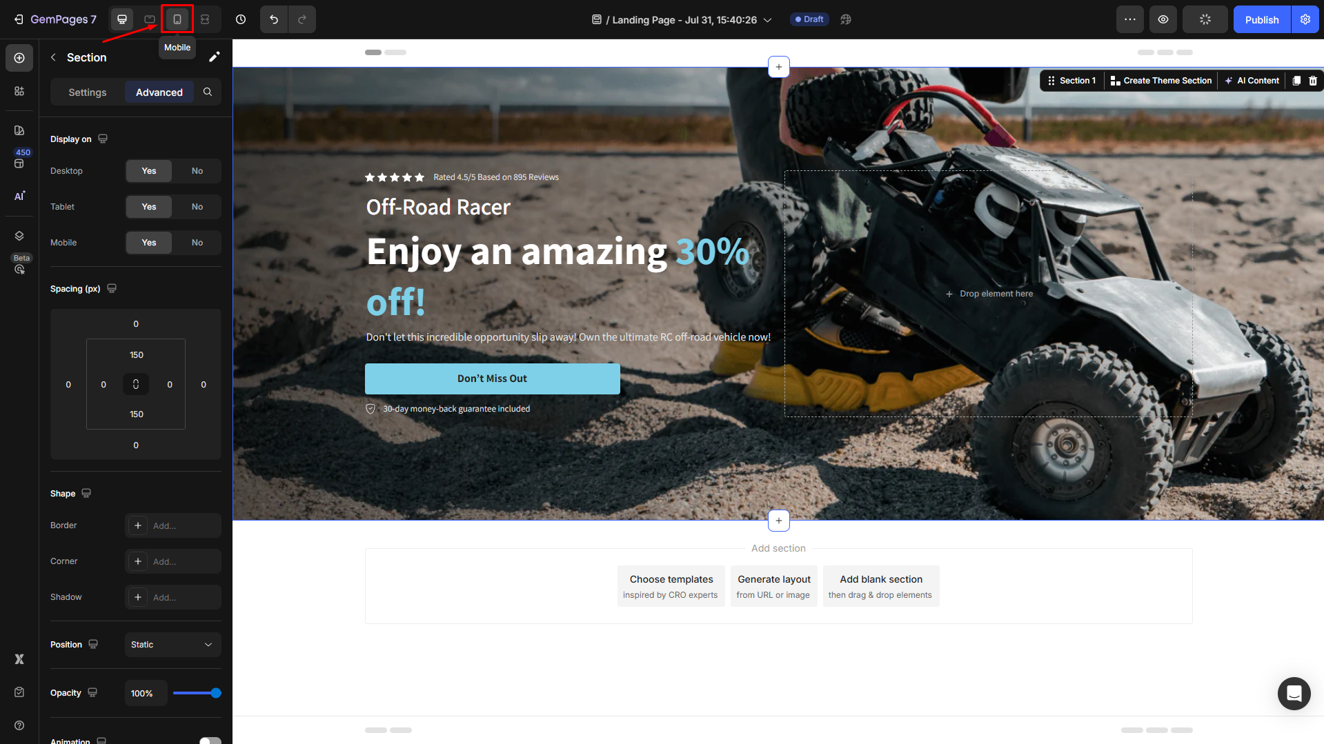
Design Hero Banner
A hero banner is a prominent banner placed at the top of your page, usually with a background image, headline, and call-to-action button.
While you can use a pre-designed Hero Banner element for this, the Row element gives you greater control and flexibility.
Steps to Create It:
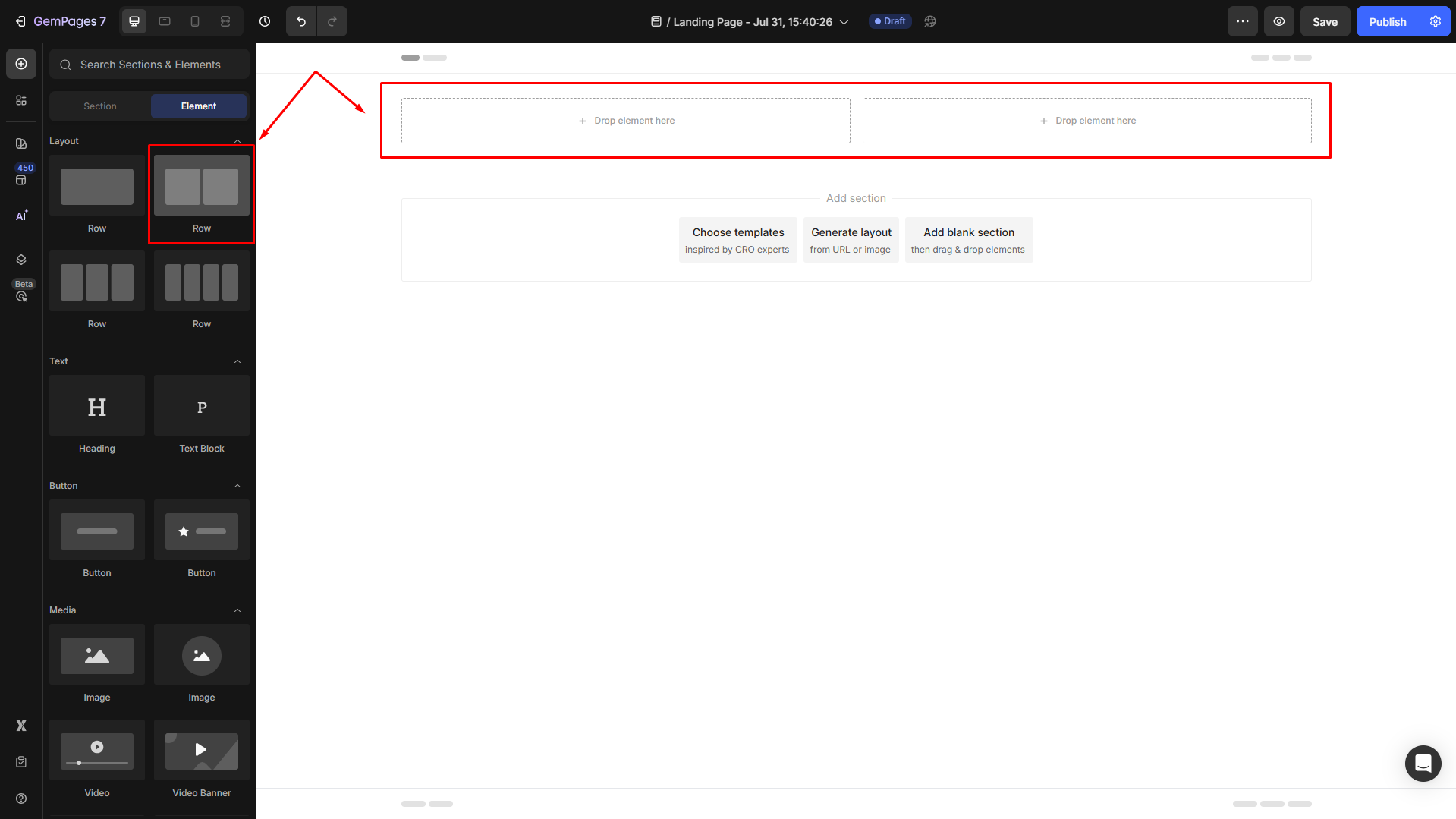
Step 1: Drag and drop a 2-column row. This creates the base layout for your hero banner.
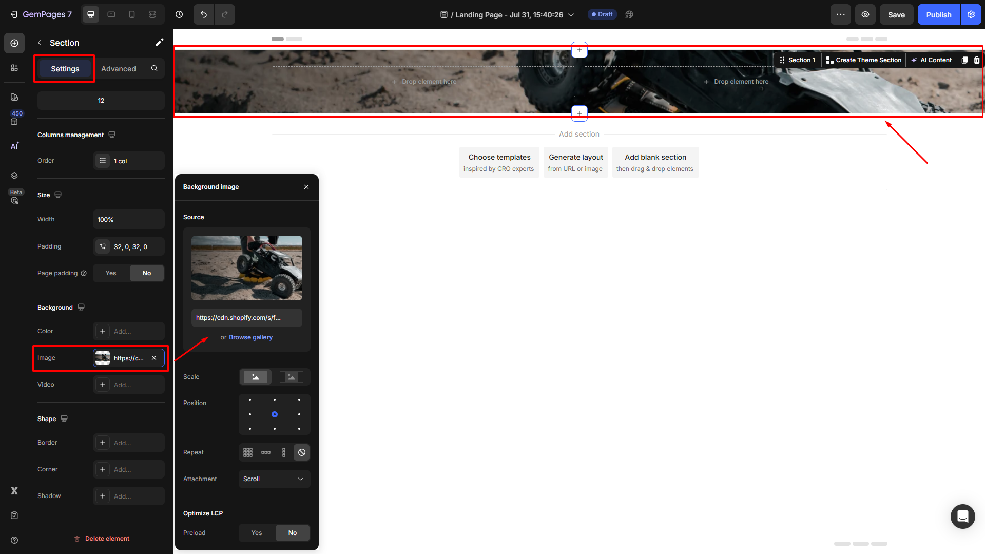
Step 2: Customize your hero banner in the Settings tab.
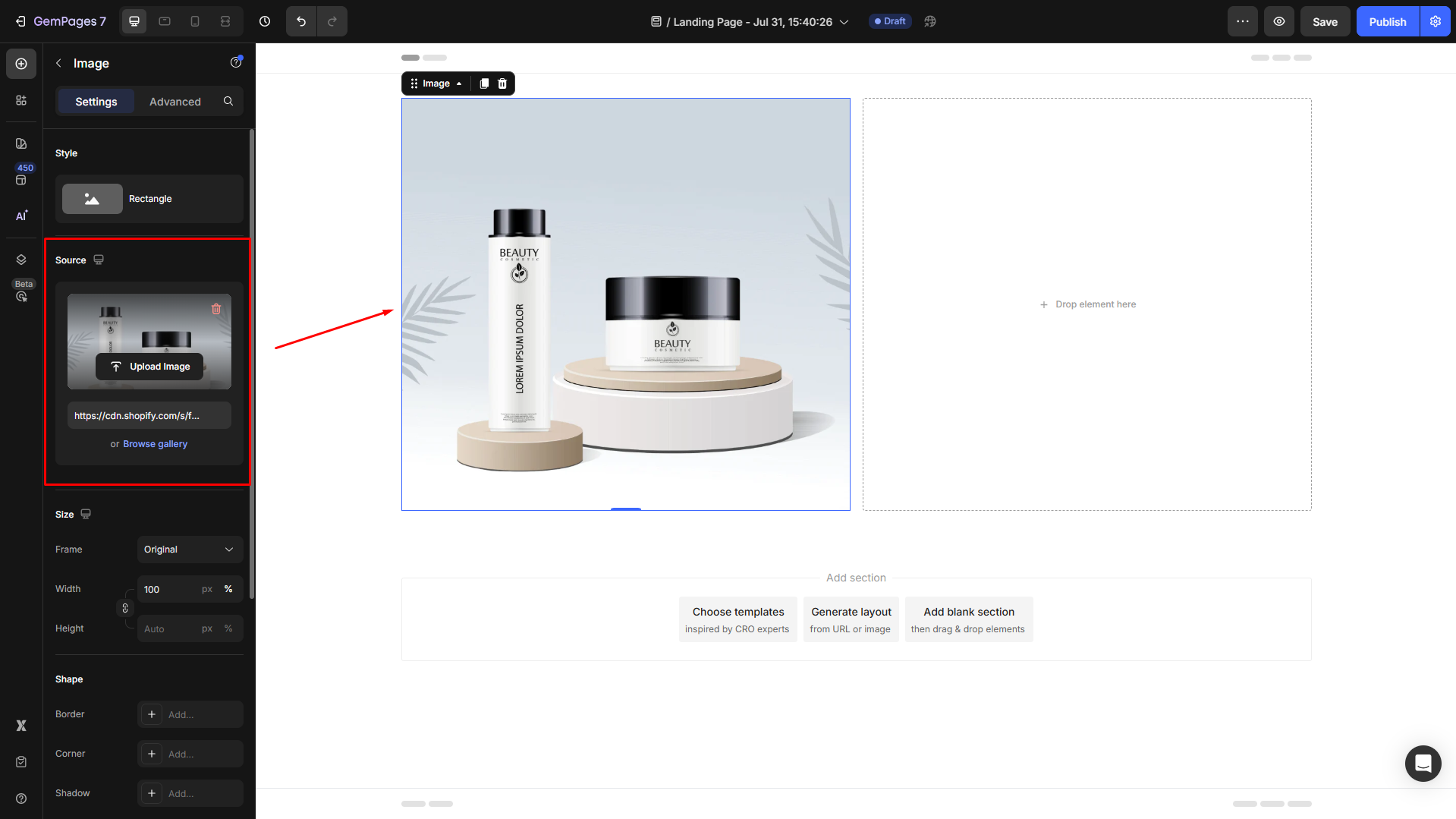
Scroll down to Background and click on the box next to Image to set an image background for the section.
You can browse the gallery to choose an available image or upload a new one.
Step 3: Drag and drop a text block, heading, or any other element, such as a button element, into your layout.
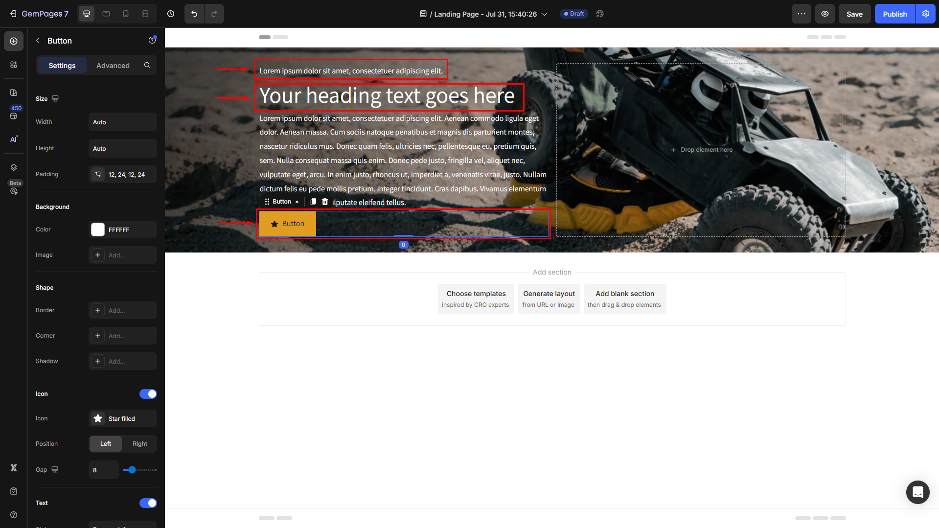
Customize each element via the Settings and Advanced tabs for adjustments.
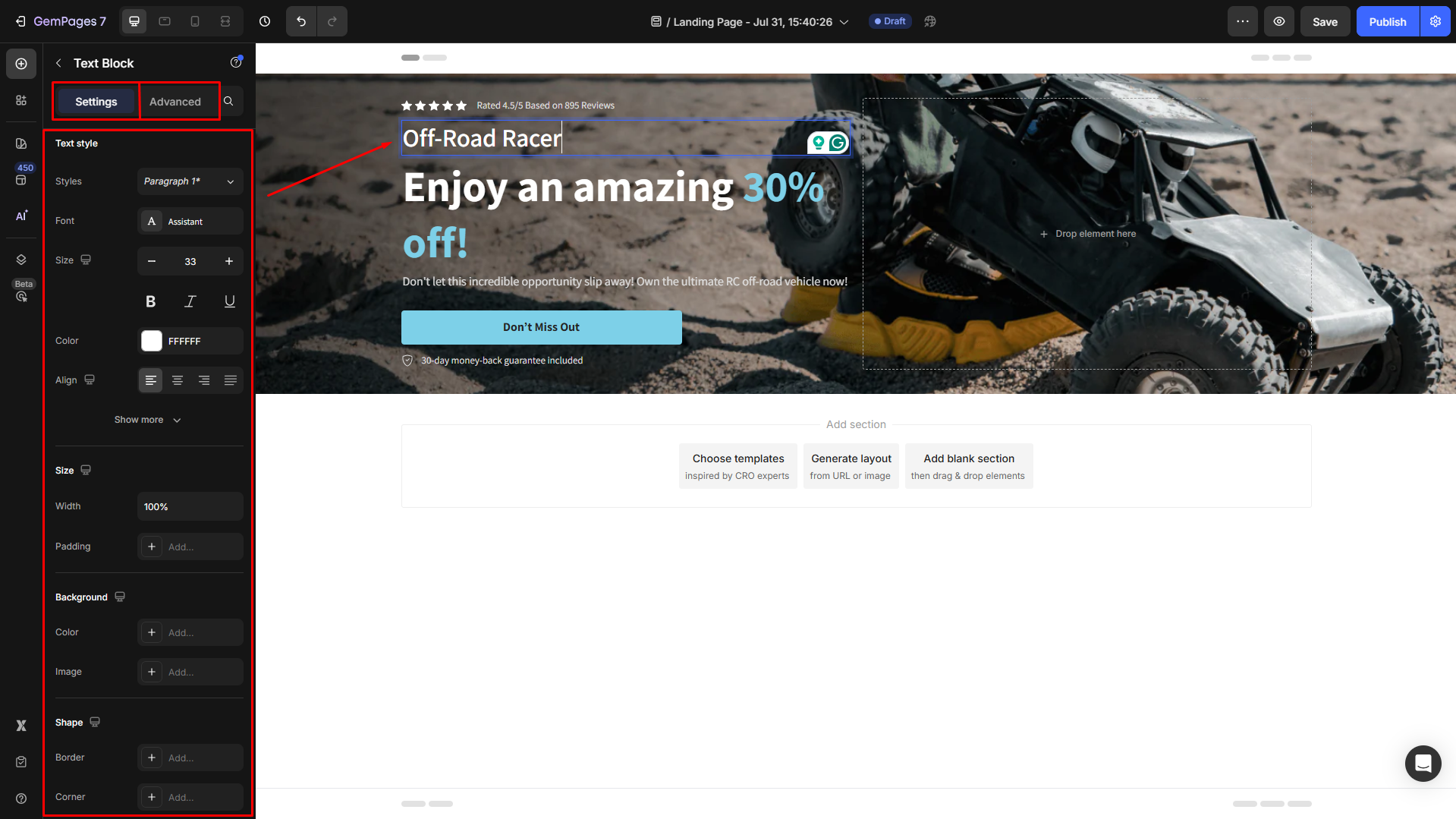
Step 4: To adjust the background size, click on the section to open its configuration.
Navigate to the Advanced tab to fine-tune margins and padding under the Spacing section for an ideal fit.
Step 5: Switch to mobile view and adjust the layout for responsiveness.
Design Product Breakdown Section
The layered product breakdown layout is perfect for highlighting product features or specifications in a structured, visually appealing way.
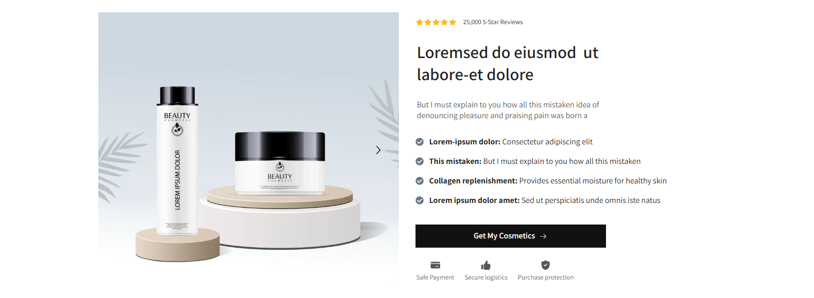
Steps to Create It:
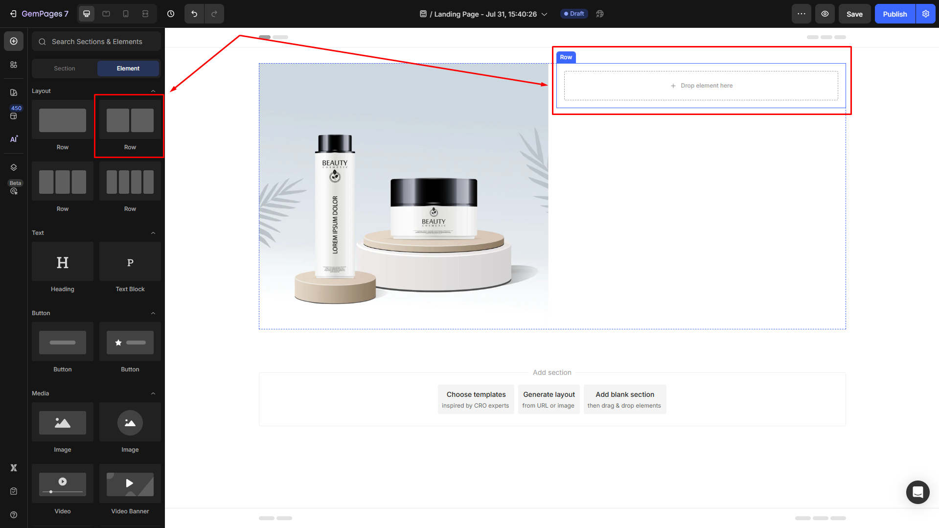
Step 1: Drag and drop a 2-column row. This forms the foundation for your product breakdown layout.
Step 2: Drag an image element to the left column and upload your desired image.
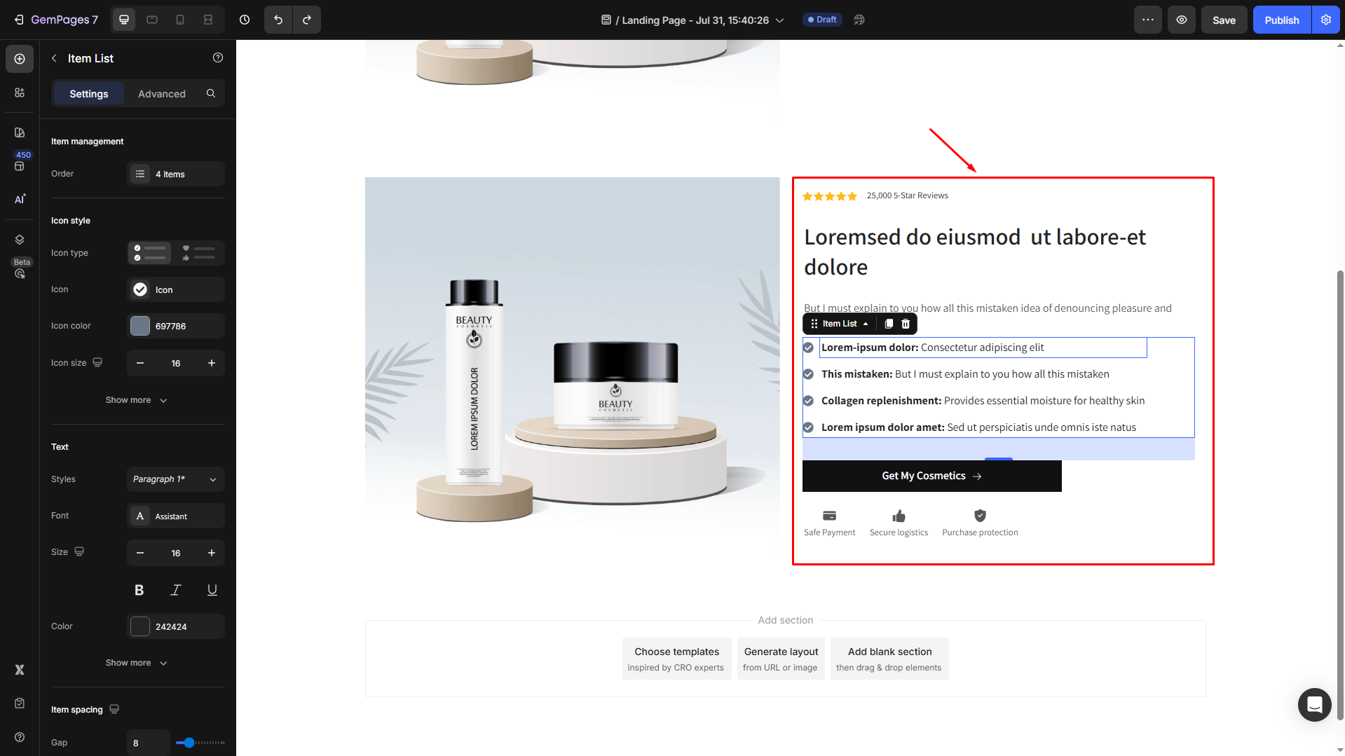
Step 3: To create the breakdown content with icons and text blocks similar to the sample, drag and drop another Row Element into the right column.
Step 4: Add your preferred elements into the column, such as an icon, text blocks, a heading, an item list, and a button element.
Then you can customize them your way in the Settings tab.
Step 5: Switch to mobile view and adjust the layout for responsiveness.
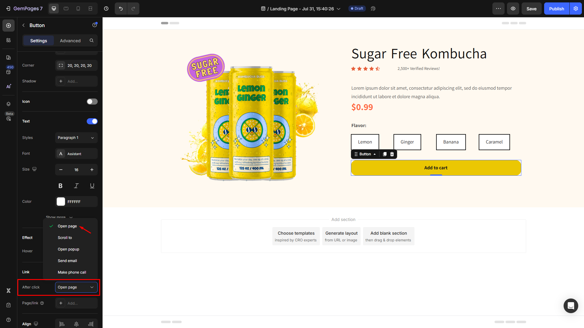
Design Product Details
For a detailed product section, you can create a custom layout that organizes product images, descriptions, and purchase options.
Steps to Create It:
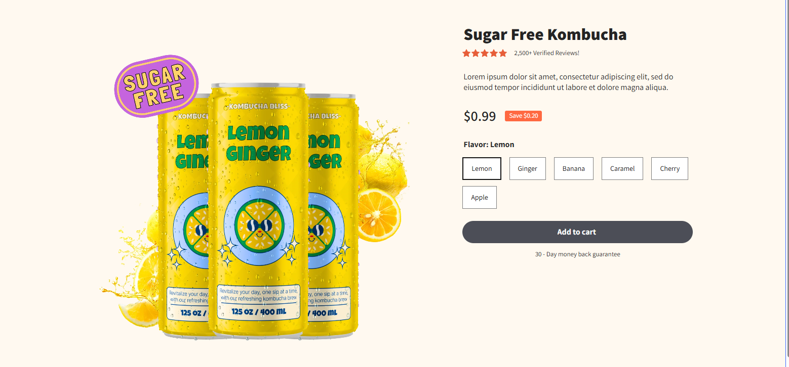
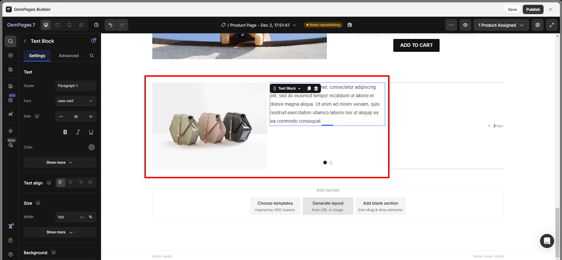
Step 1: Drag a 2-column row to your editor.

Step 2: Place an image in the left column. Add headings, text blocks, buttons, etc., in the right column.
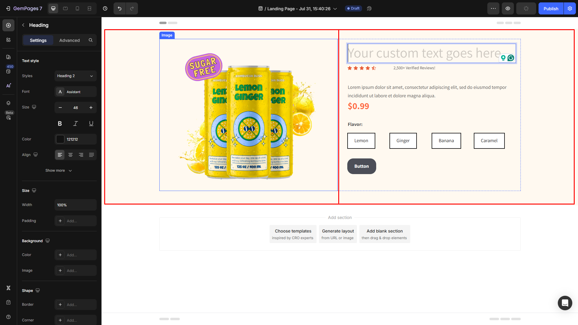
Step 3: Replace placeholder text, upload an image, and customize the added elements your way. Also, add a link to your CTA buttons:
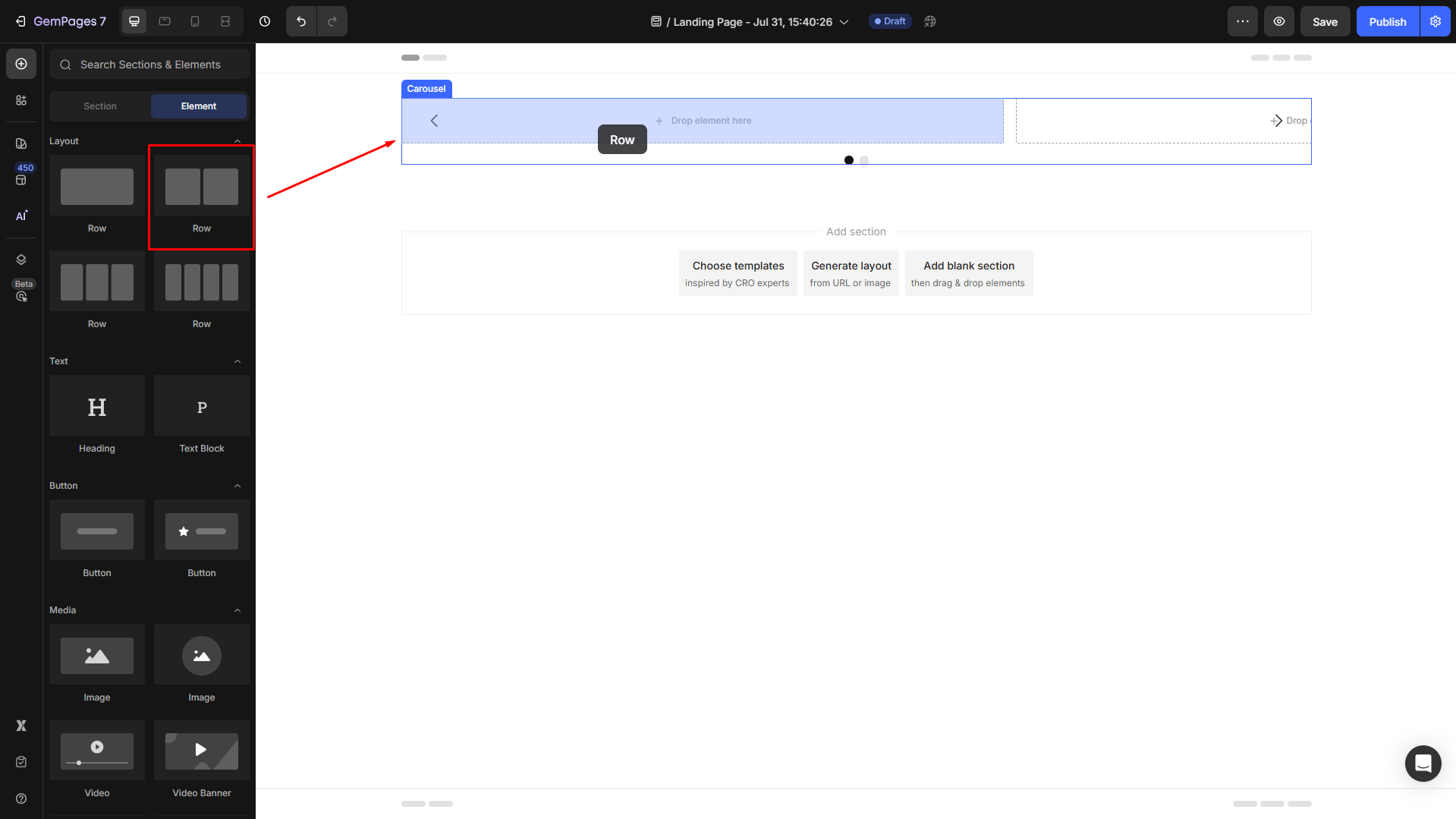
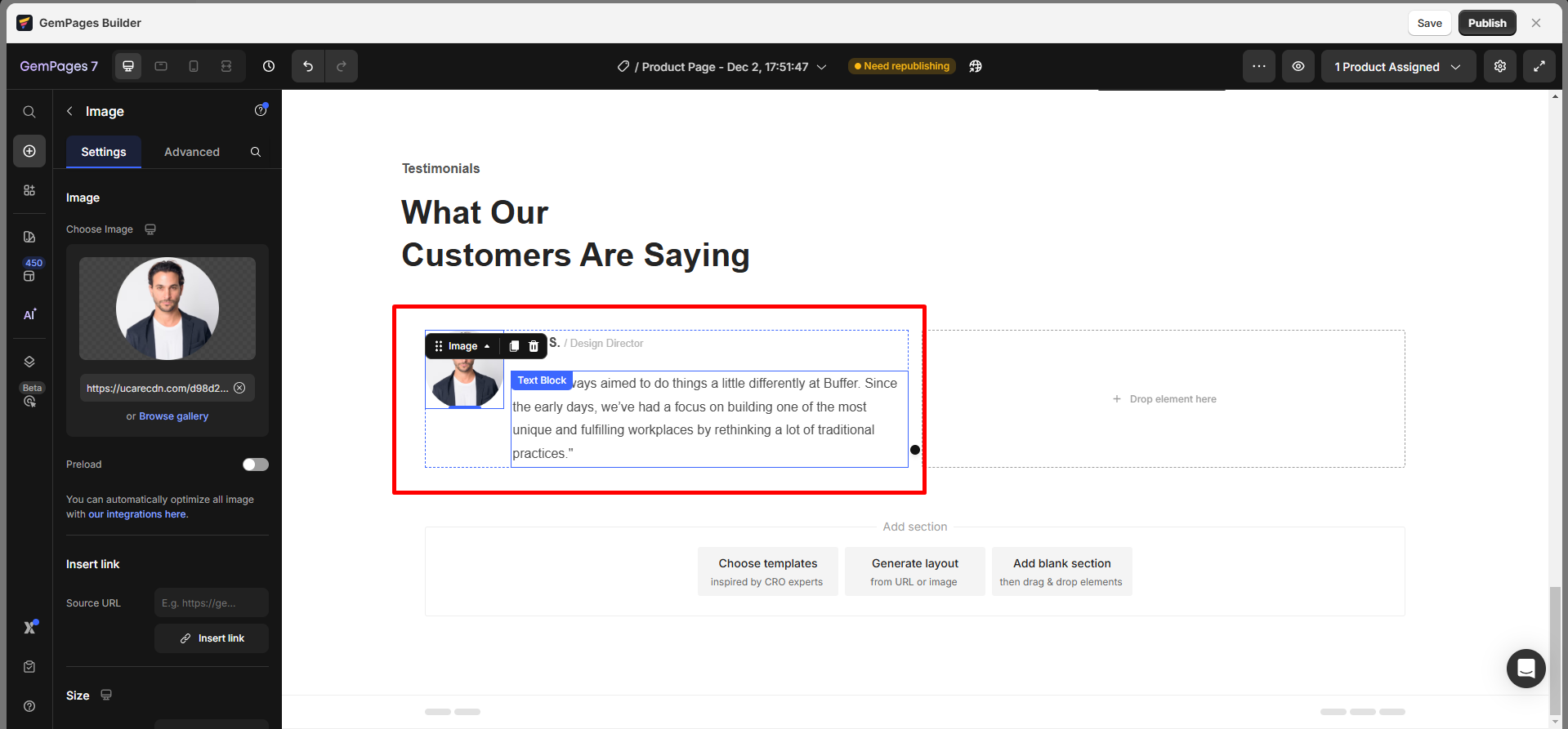
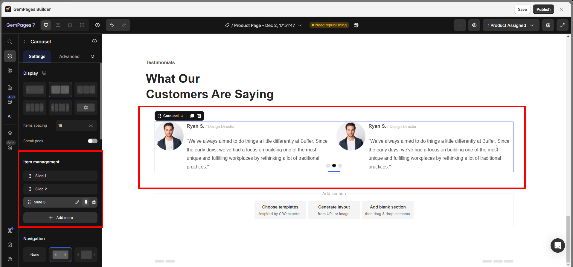
Design Testimonial Box within a Carousel
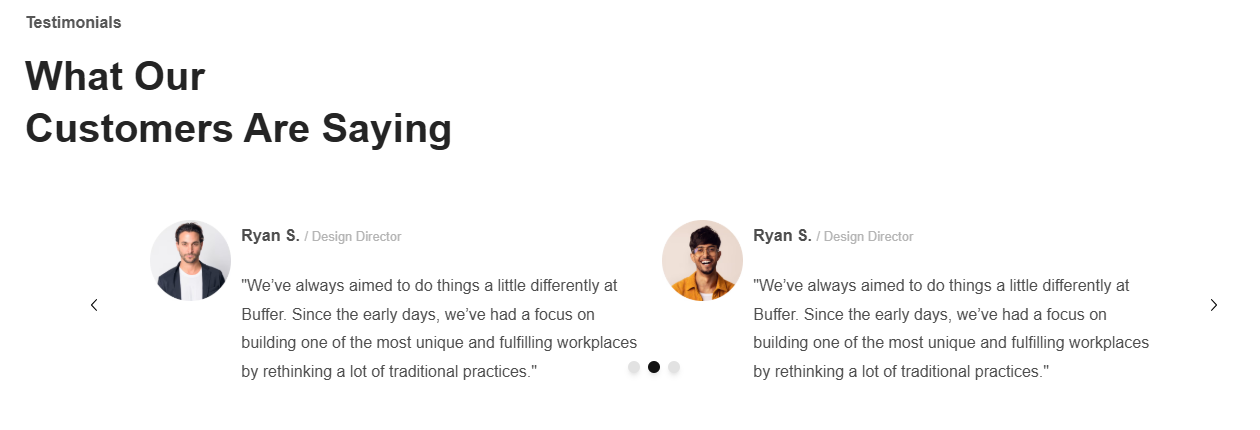
To design a Testimonial Box within a Carousel, follow these steps:
Step 1: Drag the Carousel element to your page.
Step 2: Within the carousel, add a 2-column row. Adjust the column sizes to your preference. Then insert images into the left column and text into the right column.
Step 3: Adjust the appearance of each element to suit your style.
Step 4: Use the Copy/Paste feature to replicate slides, then update each with new content.
For more design tips and in-depth tutorials on creating optimized layouts, explore our GemPages Academy.


Thank you for your comments