


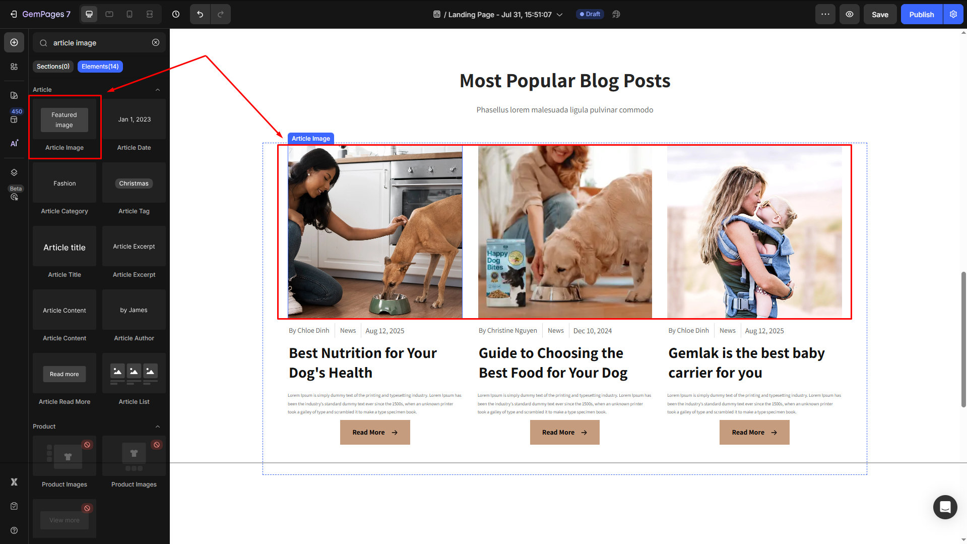
About Article Image Element
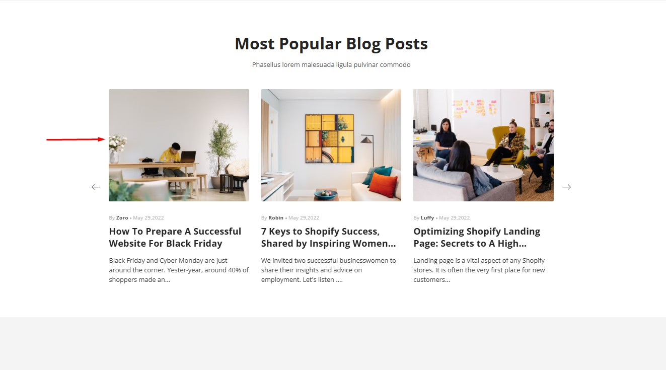
The Article Image Element is primarily used within the Article List Element to showcase article thumbnails or featured images.
This element helps in creating visually appealing article lists, enhancing the overall user experience. It can also be added to individual article pages, though it is less commonly used in that context.
The article image element can only be used when placed within the article list element.
How to Add an Article Image Element to Your Page?
Step 1: Access the GemPages Dashboard > Pages, then click on your target page to locate the editor.
Step 2: From the left sidebar, search for the Article Image Element and drag & drop it to the preferred position on your page.
Step 3: Click on the element to open its settings for further customization.
Configure the Article Image Element Settings tab
The Article Image Element includes several customization options to suit your design and functionality needs:
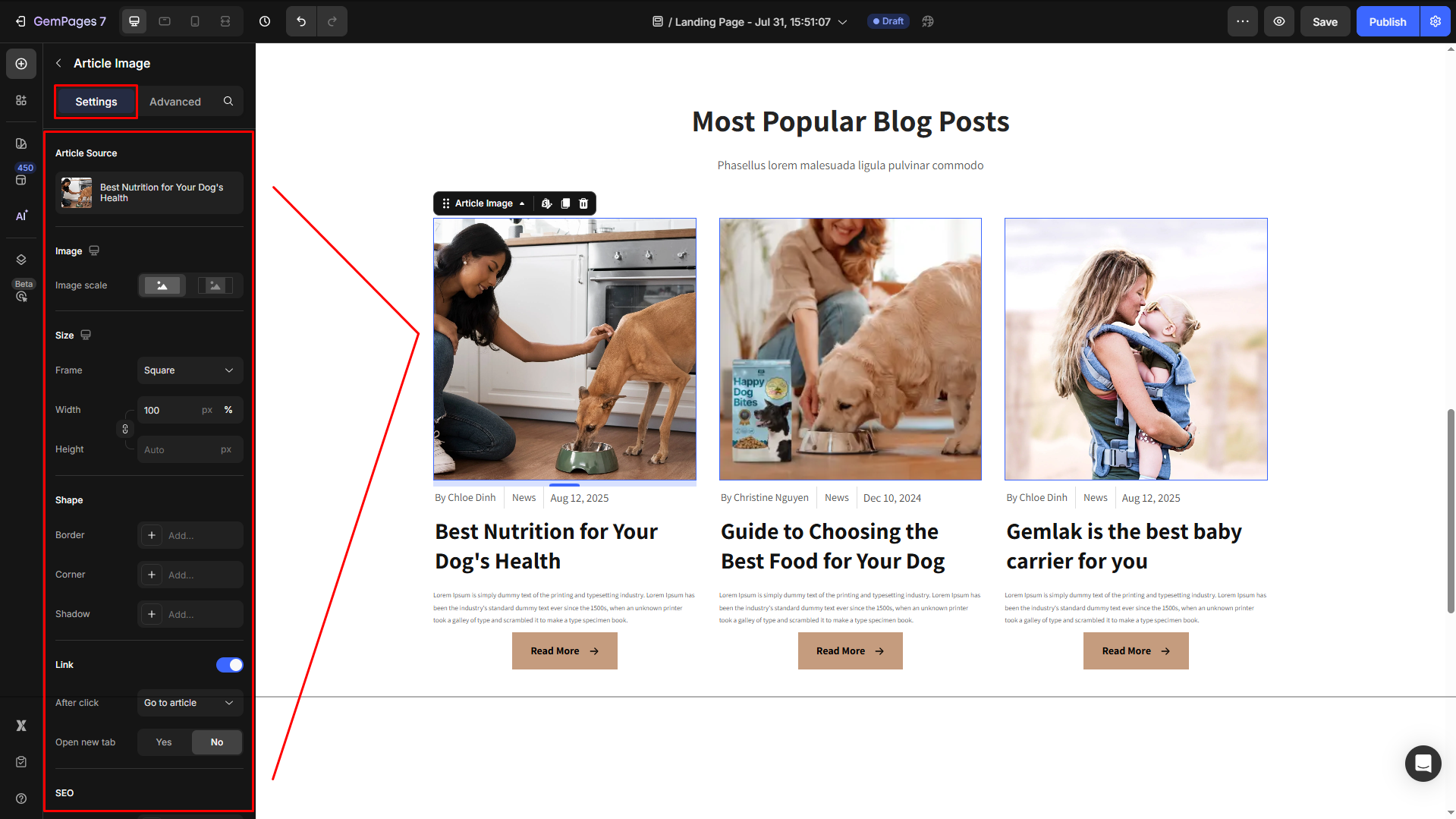
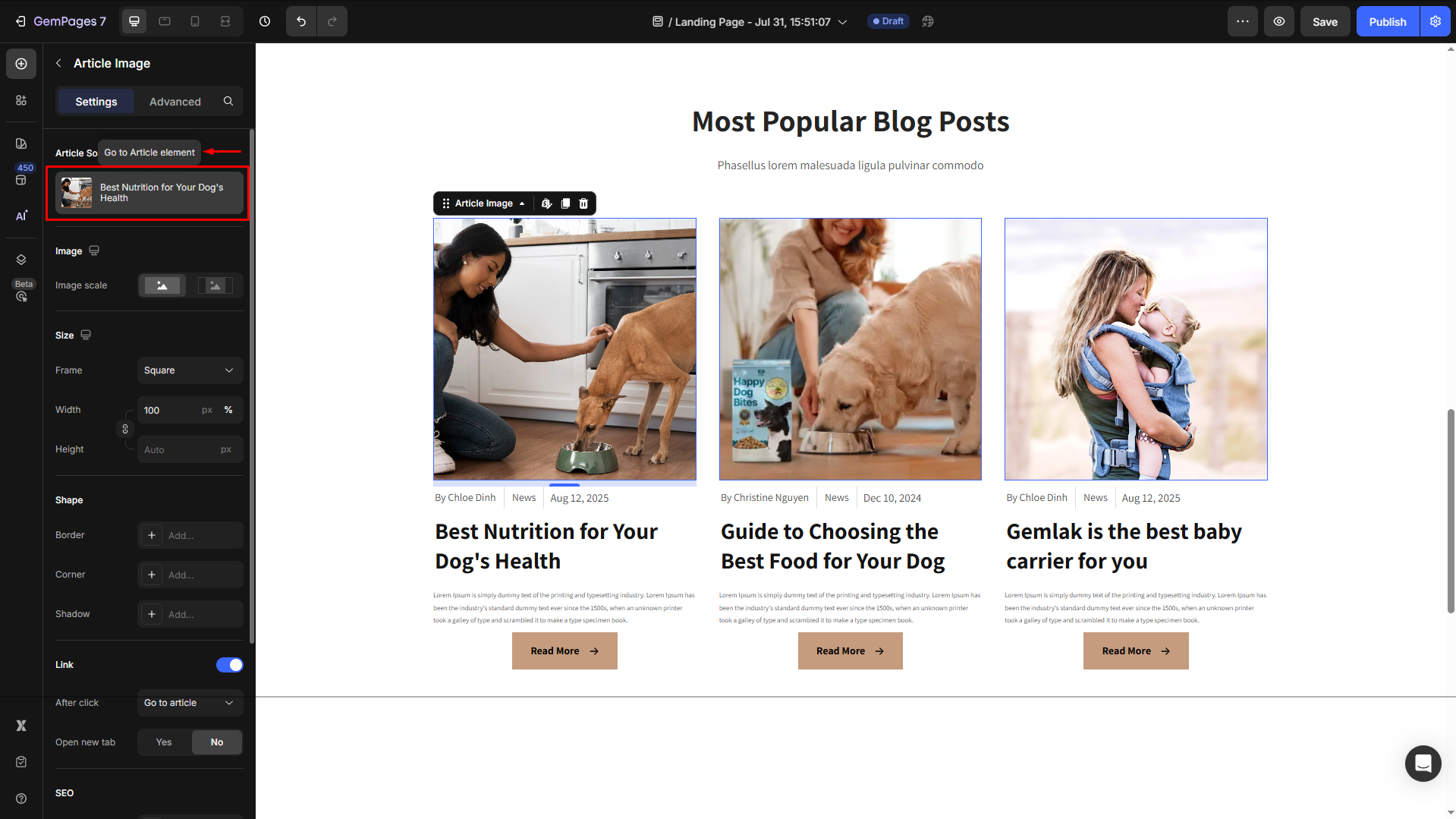
Article Source
Click on the box to configure the article sources in the Article List element.
Image
Select how the featured image of your article will display on the page:
- Fill image: The image will be resized or cropped to fill the frame’s dimensions.
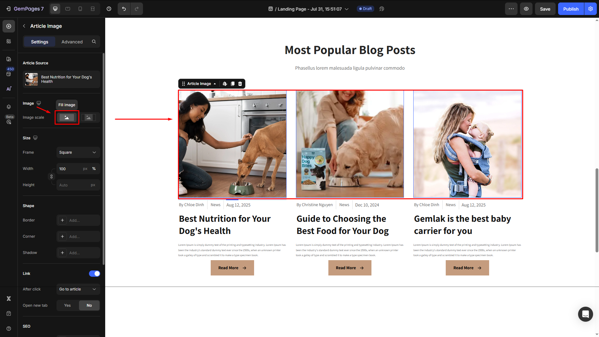
This may cut off parts of the image if its aspect ratio is different from the frame.
- Fit image: The image will be scaled down or up to fit entirely within the frame while preserving its original aspect ratio.
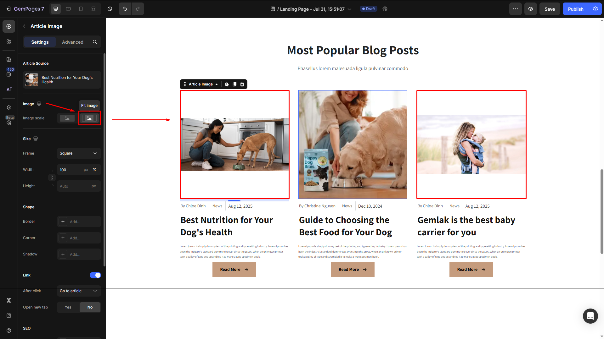
This ensures the whole image is visible but may leave space (padding) around the edges if the aspect ratio doesn’t match the frame.
Size
Proportion: Choose how the image is cropped or displayed:
- Square: Equal width and height.
- Vertical: Taller than it is wide.
- Horizontal: Wider than it is tall.
- Original: Keeps the image’s original aspect ratio.
- Custom: Manually adjust the width and height.
Width and Height: Set precise dimensions for the image in pixels.

Shape
- Border: You can change the border color, thickness, and stroke for this element.
- Corner: The section corner can be square, round, or pill-shaped. You can adjust the corner radius as preferred.
- Shadow: You may add a shadow of the Article List section and adjust the shadow display (size, color, blur, and distance)

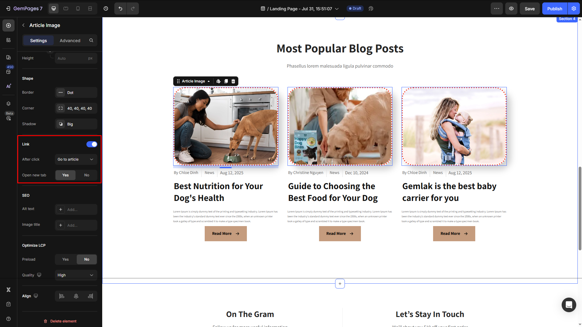
Link
By default, in the Link section, the after-click action is set to “Go to article”. You can change it to “Scroll to” and insert the target section as preferred.
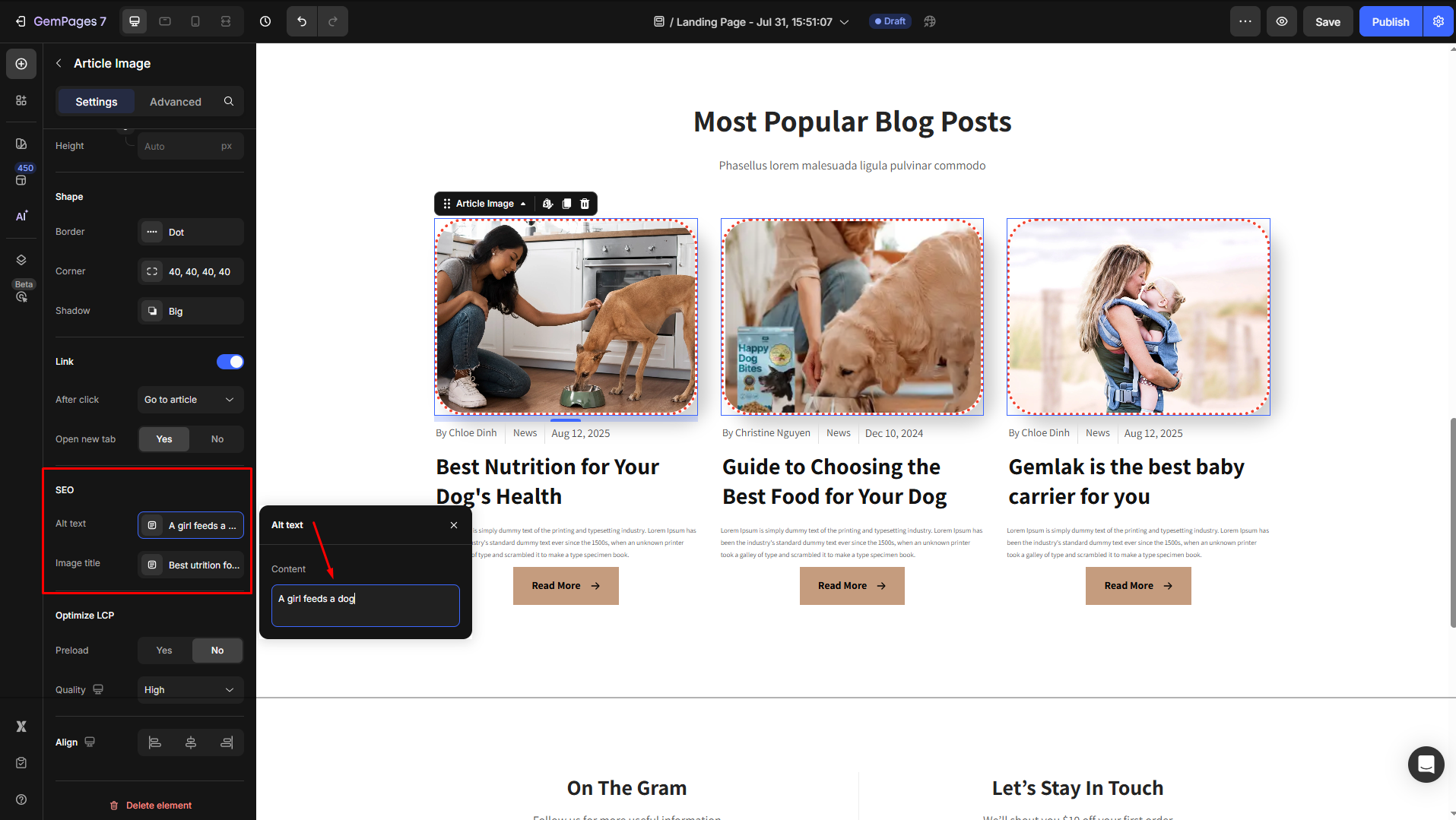
SEO
- Alt Text: Provide a description of the image for accessibility and SEO. This text is displayed if the image fails to load and helps search engines understand the content.
- Image Title: Add a tooltip that appears when a user hovers over the image, giving additional context or information.
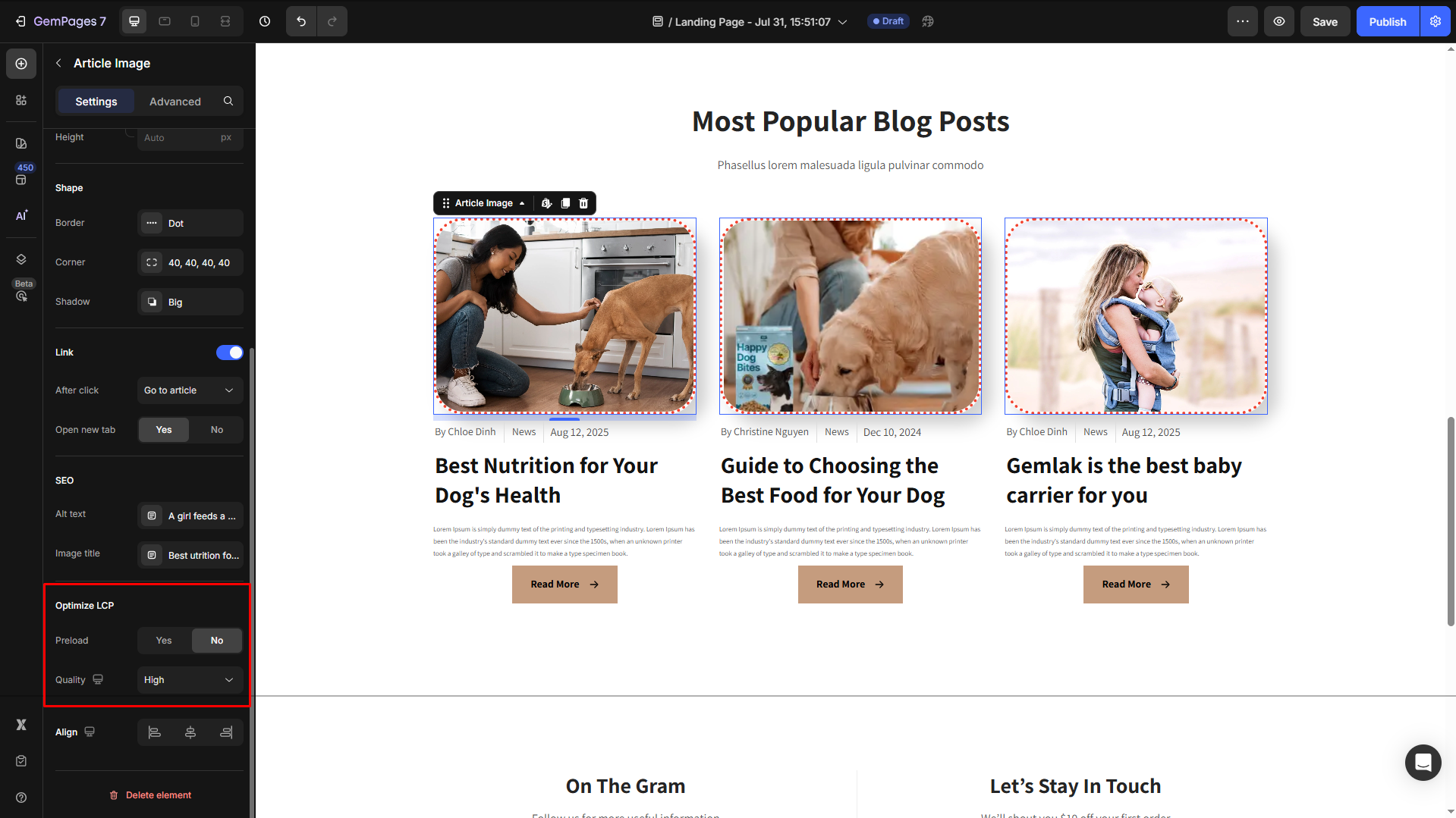
Optimize LCP
This setting helps improve your page’s Largest Contentful Paint (LCP) score, which is a key Core Web Vitals metric for performance and SEO.
Quality: Choose the right image compression level to balance clarity and loading speed.
- Finest: Highest quality, larger file size.
- High (default): Balanced quality and performance.
- Medium: Faster loading, slightly reduced quality for image-heavy pages.
- Custom: Define your own compression settings for advanced control.
Preload: Enable this option if the image appears above the fold and is one of the main visual elements on the page.
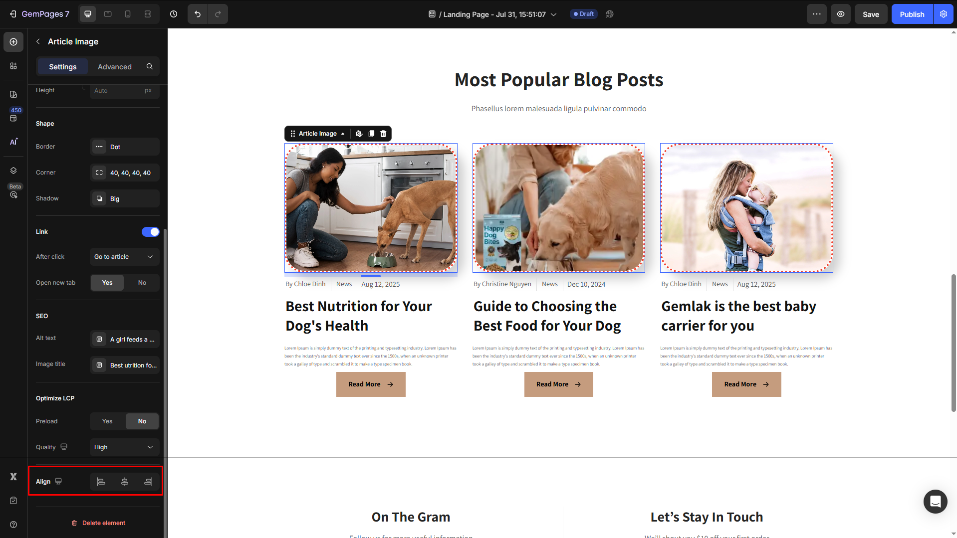
Align
Adjust the heading’s alignment for better readability. You can choose from left-aligned, center-aligned, or right-aligned.
Configure the Advanced tab
For more advanced customization, please navigate to the Advanced tab and follow the instructions in this article.


Thank you for your comments