


What is Sticky Back to Top?
The Sticky Back to Top element is a floating button designed to improve the navigation experience on your website. When visitors scroll down to the bottom of the page, this button allows them to return to the top with a single click instantly.
This element is particularly useful for long pages with extensive content, as it helps reduce user effort and improves overall engagement.
How to Add the Sticky Back to Top Element?
Follow these steps below to drag and drop a sticky back to top element into your page using GemPages Editor v7:
- Log in to your Shopify admin > GemPages Builder app > Pages.
- Click on the page where you want to add the sticky back to top element to enter the editor.
- From the left sidebar, search for this element, and drag and drop it to the desired position on your page.
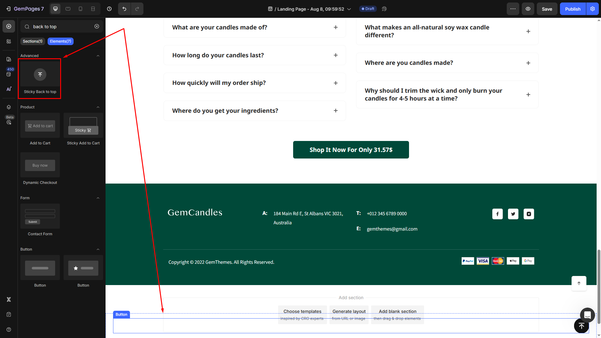
- Locate the element to open its settings for further customization.
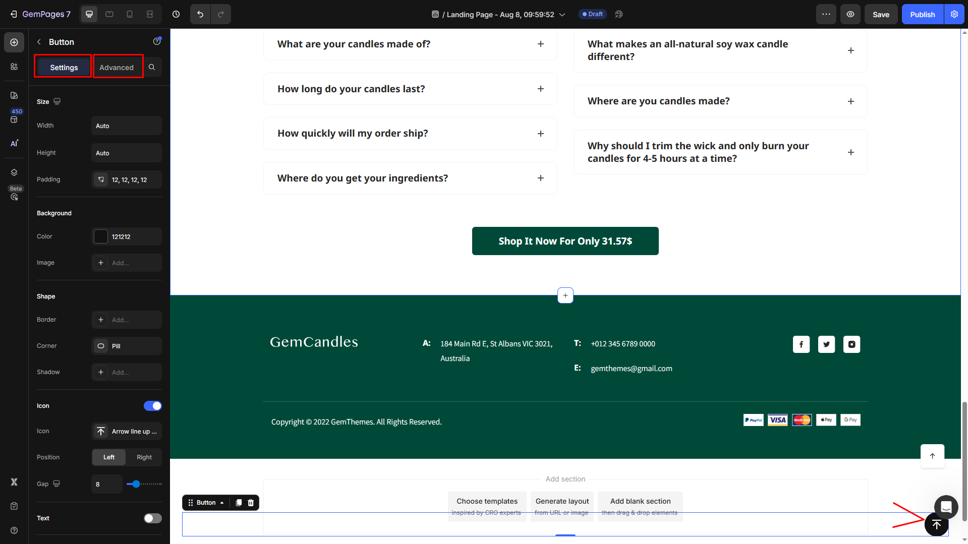
Configure the Settings tab
Under the Settings tab, you can configure the icon’s visibility as you prefer:
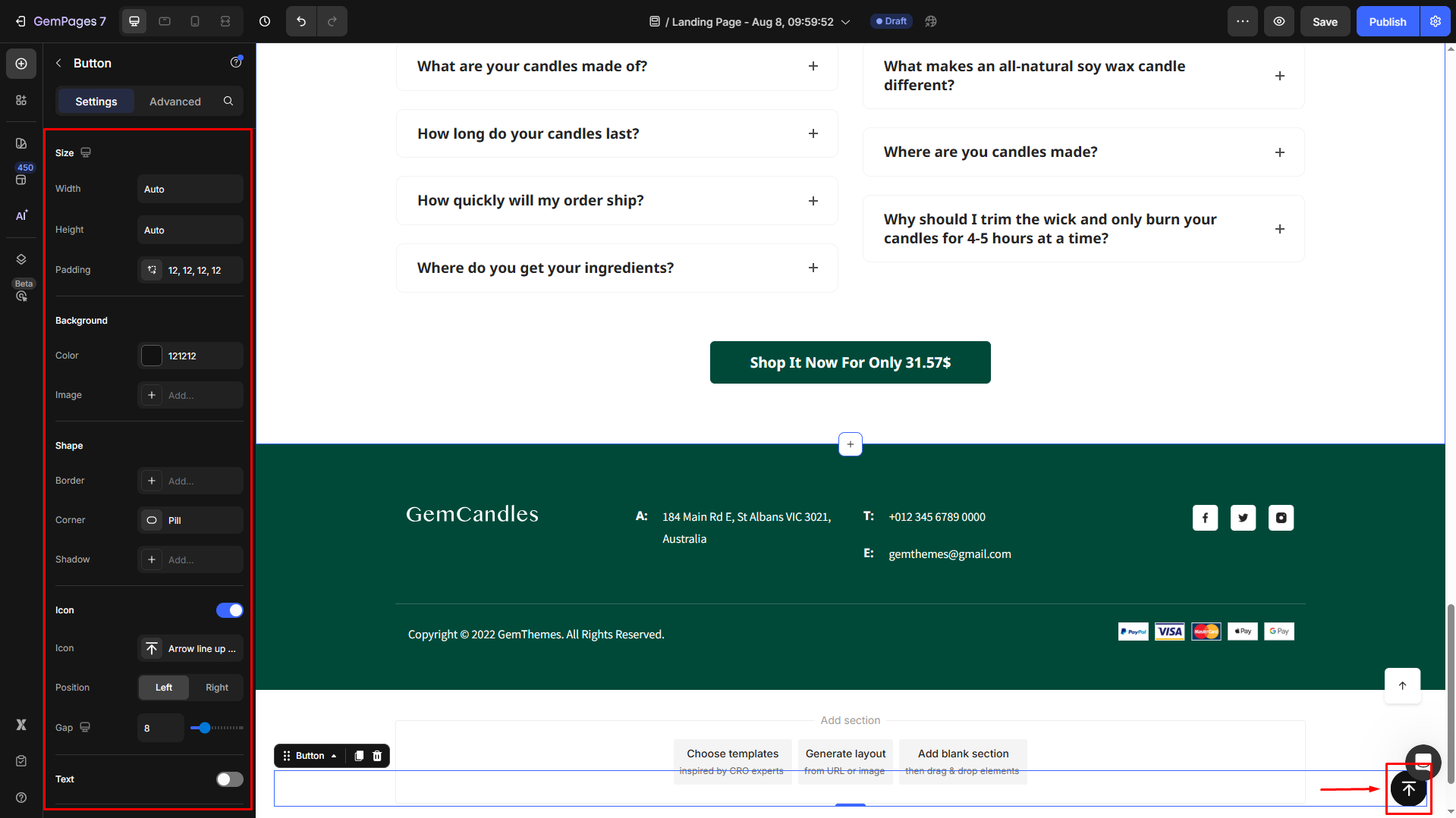
Size
Width and Height: Define the dimensions of the button to ensure it’s noticeable yet not obtrusive.
Padding: Adjust the internal spacing within the button for better alignment of text or icons.
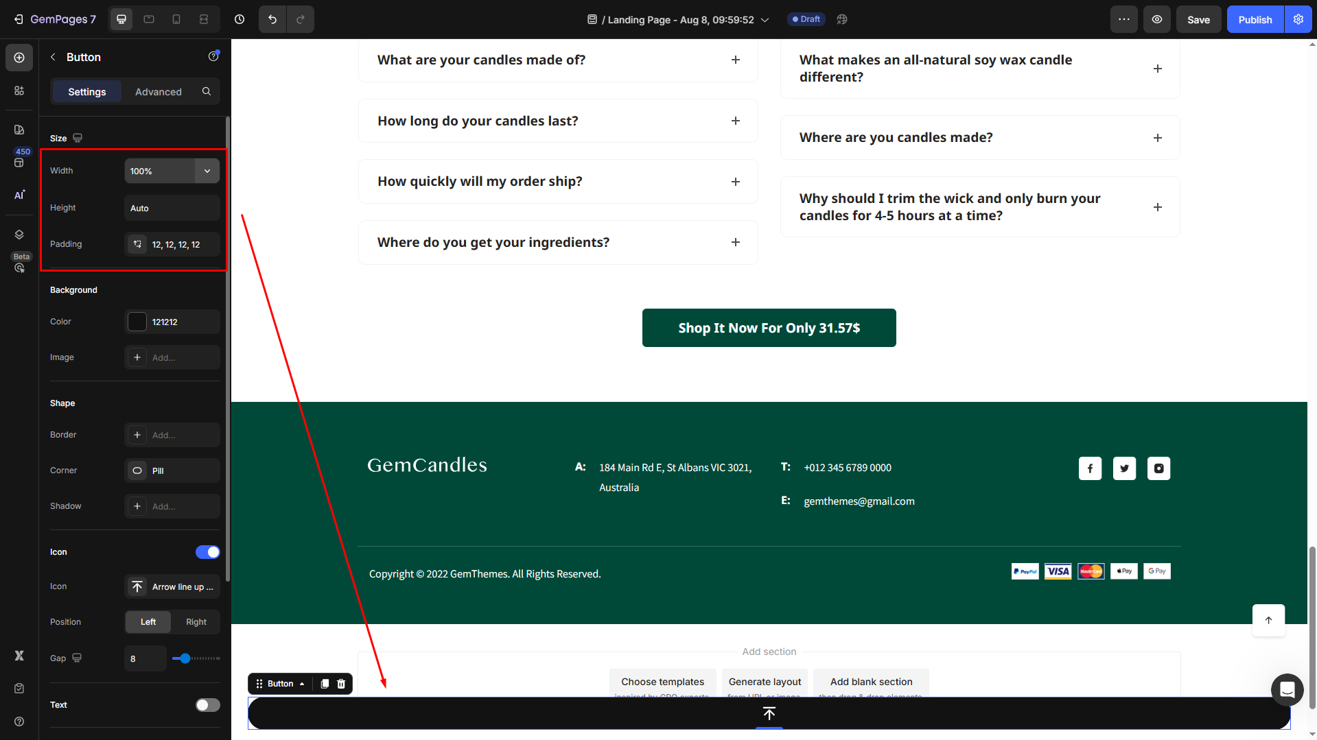
For example, we set the Width = 100% (Full) and the Height = Auto. The Sticky Back-to-Top button will display full screen.
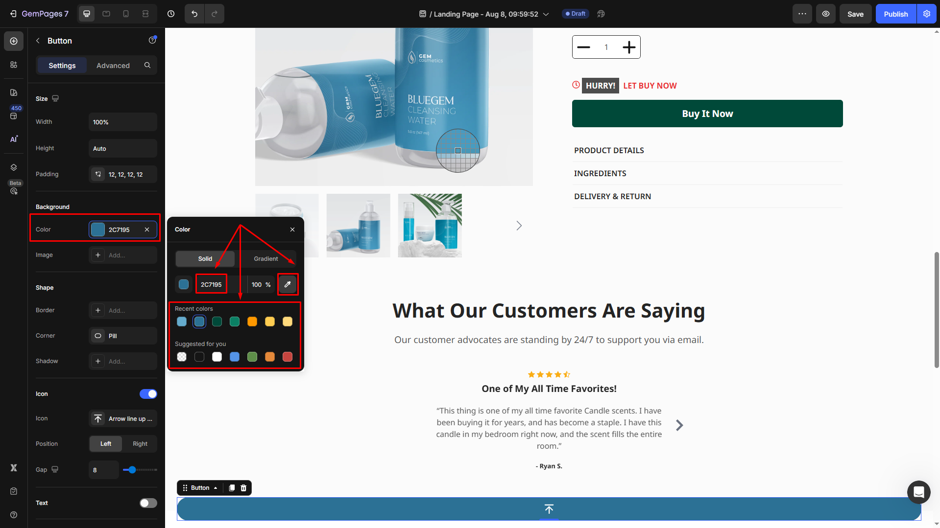
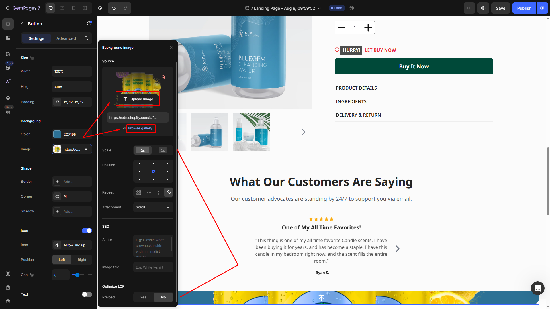
Background
Set a solid/gradient color or image as the background.
- Color: Enter the color code, choose from the “recent colors”/“suggested for you” list, or use the color picker to set the background color.
- Image: Upload a new image or choose from the library to set as the background.
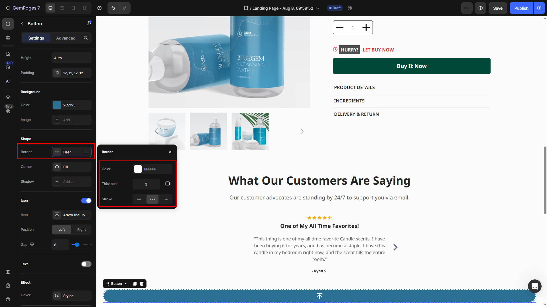
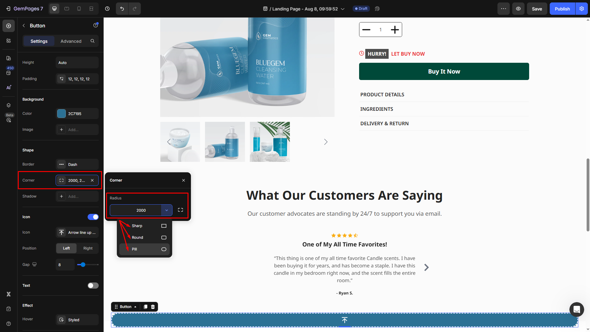
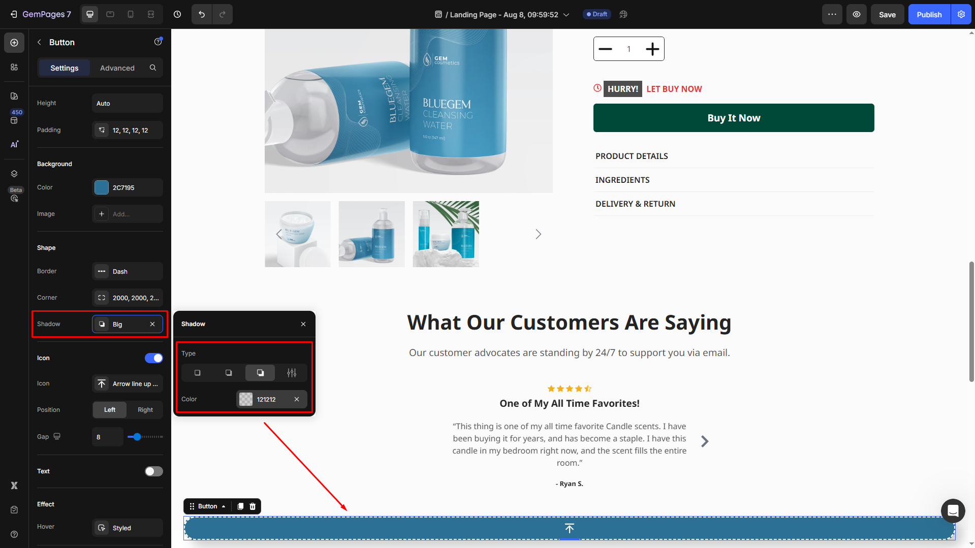
Shape
Customize the shape using:
- Border: Select the border styles (line/dash/dot stroke), and change border color and thickness to align with your brand design.
- Corner: Adjust the corner radius for better visibility.
- Shadow: Apply shadow effects for depth.
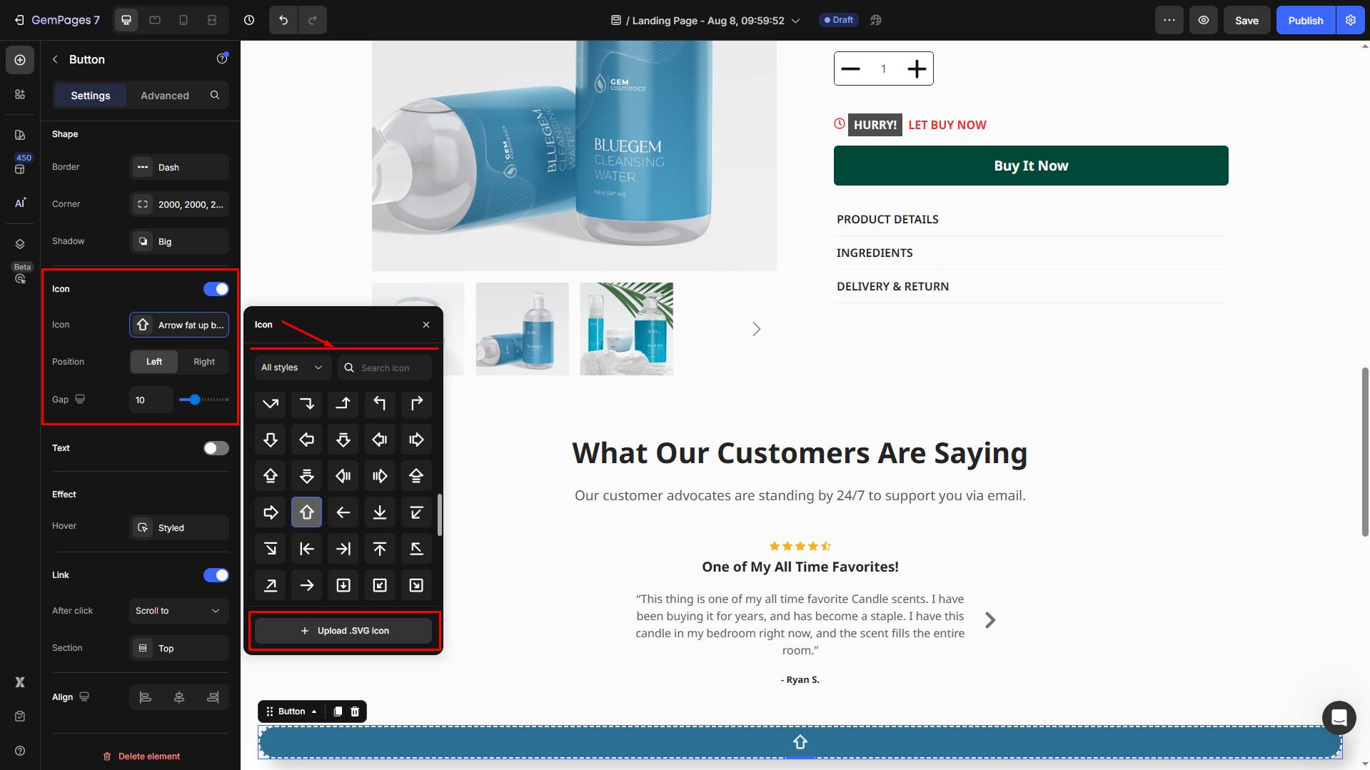
Icon
Toggle the icon visibility. You can turn it off to use text only.
If On:
- Choose Icon: Select an icon from the library that matches your site’s theme or upload a custom icon (SVG file only).
- Position: Decide whether the button appears on the left or right side of the screen.
- Spacing: Adjust the distance between the button and the screen edges for precise placement.
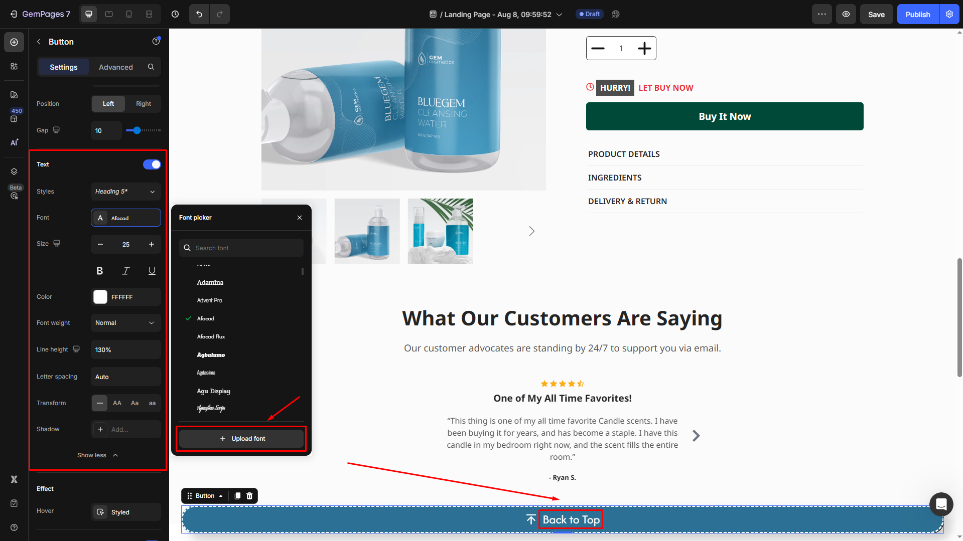
Text
If you include text in the button, you can style it to suit your branding:
- Styles: Select from heading styles for prominence.
- Font: Choose a font family that matches your store’s typography.
- Size: Adjust the text size for visibility.
- Bold/Italic/Underline: Add emphasis to these text styles.
- Font Weight: Control the thickness of the text.
- Line Height: Fine-tune the spacing between lines for multiline text.
- Letter Spacing: Adjust the space between individual characters for readability.
- Transform: Format text to uppercase, lowercase, or capitalize each word.
Effect
Customize the appearance of the button in hover states:
- Background Color: Choose distinct colors for each state to improve visual feedback.
- Image: The button’s background changes to an image when hovering.
- Text Color: Set a readable text color that complements the background.
- Border: Define border width, style, and color to outline the button.
- Corner: Adjust the roundness of the button’s corners for a modern or classic look.
- Shadow: Add a shadow effect to create depth and make the button stand out.
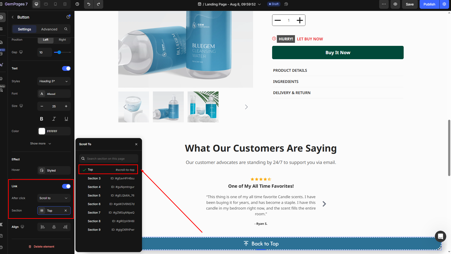
Link
As this is a back-to-top button, the after-click action is set to Scroll to Top by default. Therefore, you can ignore this Link section.
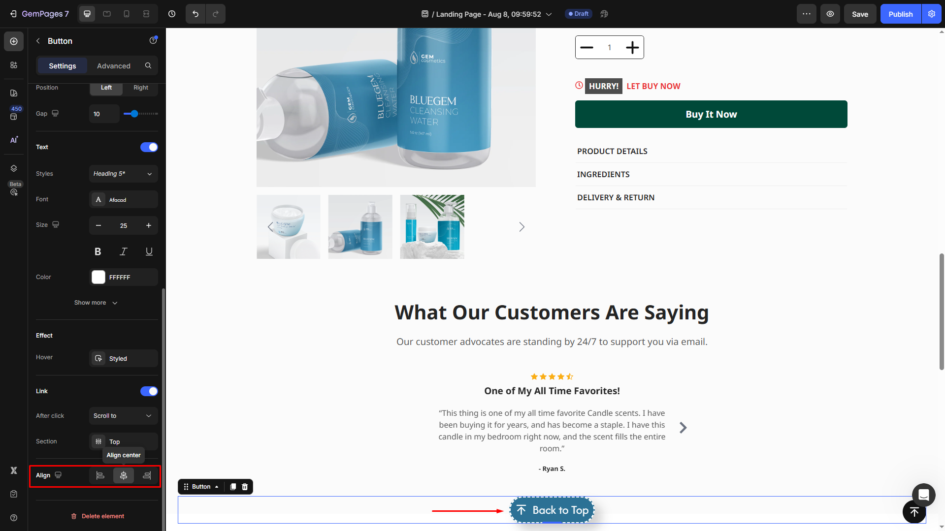
Align
If the button’s width = Fit content (Auto), choose how the button is aligned:
- Left: Align the button to the left edge.
- Center: Center the button within the button.
- Right: Align the button to the right edge.
Configure the Advanced tab
For more advanced customization, please navigate to the Advanced tab and follow the instructions in this article.


Thank you for your comments