


Most common reasons
Let’s go through each common reason and find the best solution for your website.
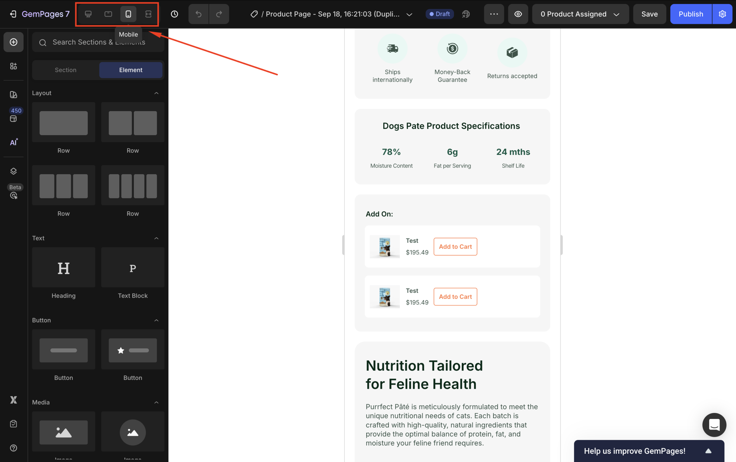
1. Responsive Design Variations
Reason: GemPages employs responsive design principles, allowing elements to adjust based on screen size. However, modifications made in one device view (e.g., mobile) can inadvertently affect other views (e.g., desktop) if not managed correctly.
Solution: Utilize the Visibility Settings feature to create device-specific sections. For instance, design separate sections tailored for desktop and mobile, and set them to display only on their respective devices. This approach ensures that changes in one view do not impact others.
2. Element-Specific Adjustments
Reason: Adjusting elements like font size, alignment, or spacing for one device can lead to inconsistencies on other devices if not properly configured.
Solution: GemPages allows for device-specific styling. Adjust visual properties such as font size, margins, and padding separately for desktop, tablet, and mobile views to maintain consistency across devices.
3. Browser and Operating System Differences
Reason: Different browsers (e.g., Chrome, Firefox, Safari) and operating systems (e.g., Windows, macOS) have unique rendering engines, leading to variations in how they display websites.
Solution: Test your website across multiple browsers and operating systems to identify inconsistencies. Utilize browser developer tools to inspect and adjust your site’s code for compatibility.
4. Screen Resolution and Display Settings
Reason: Variations in screen resolutions and display settings (like DPI scaling) can alter how content is displayed, leading to layout shifts or resizing issues.
Solution: Design your website responsively using relative units (e.g., %, em, rem) and media queries to adapt to various screen sizes and resolutions. Regularly preview your site on different screen sizes using GemPages’ built-in preview tools.
5. Browser Extensions and Add-ons
Reason: Installed browser extensions or add-ons can interfere with website rendering, causing elements to display incorrectly or not at all.
Solution: Advise users to disable extensions when experiencing display issues. During development, test your website in browsers with extensions turned off to identify potential conflicts.
6. Caching Issues
Reason: Browsers store cached versions of websites, which might not reflect recent updates, leading to outdated or inconsistent displays.
Solution: Clear browser caches regularly during development and advise users to do the same if they encounter display anomalies. Implement cache-busting techniques to ensure users receive the latest version of your site.
Quick solutions at a glance
| Issue | Quick Fix |
| Layout shifts between desktop and mobile | Use Visibility Settings to separate mobile vs desktop sections |
| Fonts or spacing look inconsistent | Apply device-specific styling for text, margins, and padding |
| The site looks different across browsers | Test on Chrome, Firefox, Safari, Edge → adjust via developer tools |
| Content resizes strangely on big/small screens | Use relative units (% / em / rem) + media queries |
| Elements missing or broken | Disable browser extensions and test again |
| Outdated version showing | Clear the browser cache or use cache-busting |


Thank you for your comments