


About Product Cart Button
The Add to Cart button holds significant importance for any store, as it enables customers to add products to their shopping cart with a simple click. In GemPages, this button is referred to as the Product Cart Button, and it offers a wide range of functionalities beyond just adding products to carts.
To add the Product Cart Button to your page, please follow the steps below.
Step 1: In the GemPages Dashboard, select your page to work on the enter the Editor.
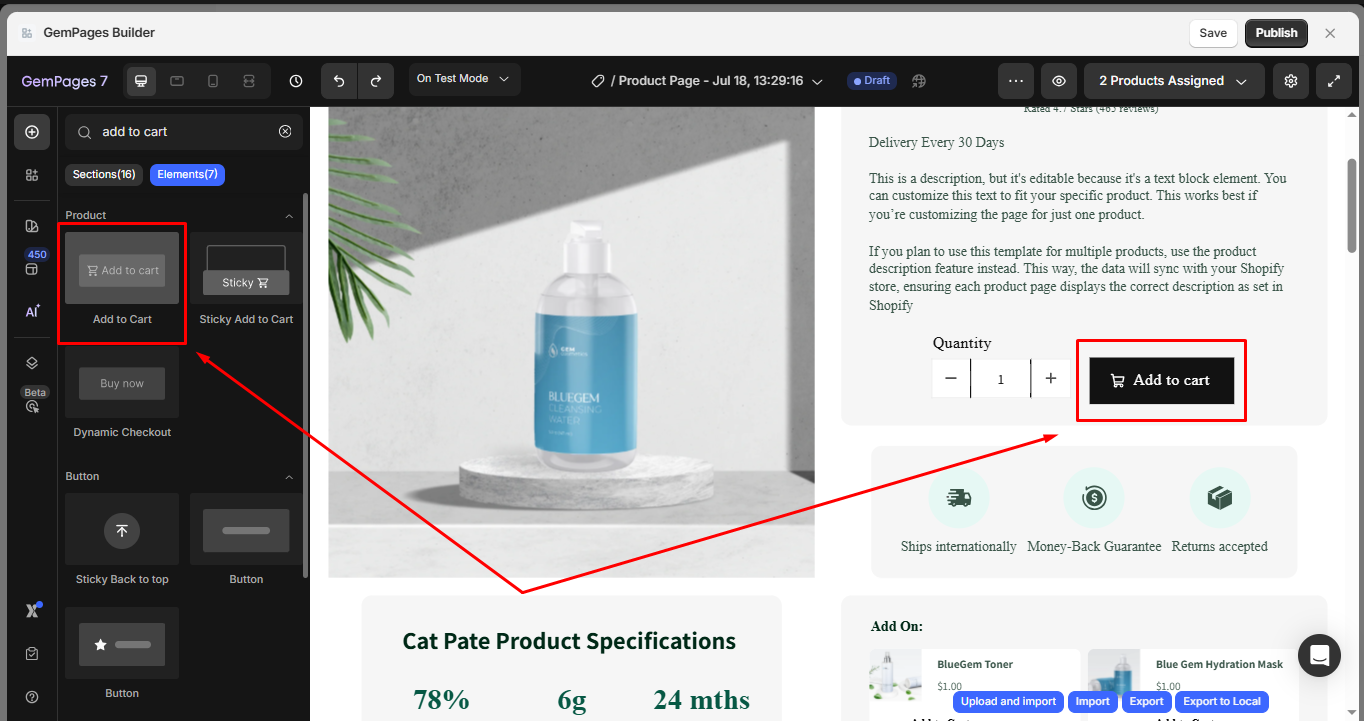
Step 2: Since the Product Cart Button is a child element of the Product Element, it has to be nested inside a Product module to function correctly. If you don’t have a Product module, drag & drop one onto your page.
Step 3: Drag & drop the Product Cart Button element inside the Product module, in your preferred spot.
Once added, click on the element to access the settings on the left sidebar. The configuration is divided into two main tabs: Settings and Advanced.
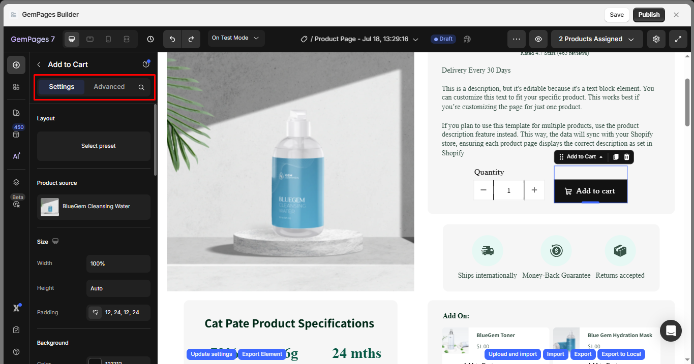
Configure the Settings Tab
Layout
Choose the button’s layout settings to fit your page design.
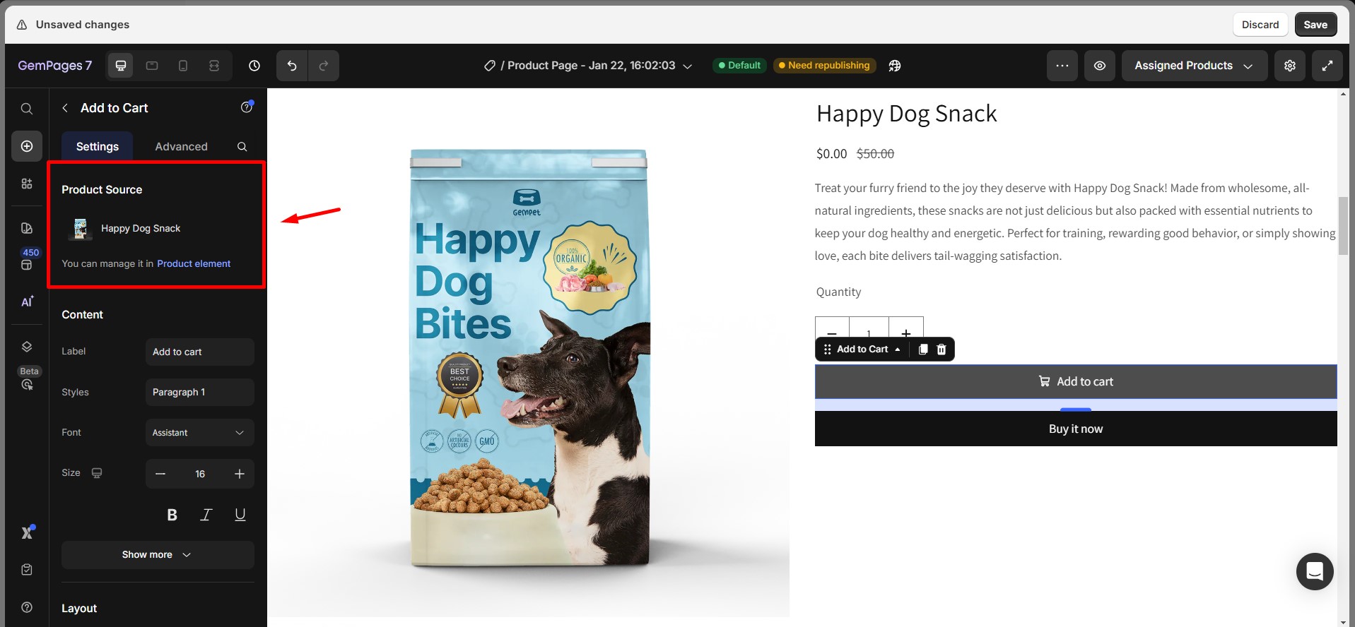
Product Source
Specify which product the button should be linked to. This ensures the button functions properly by syncing with the correct product data.
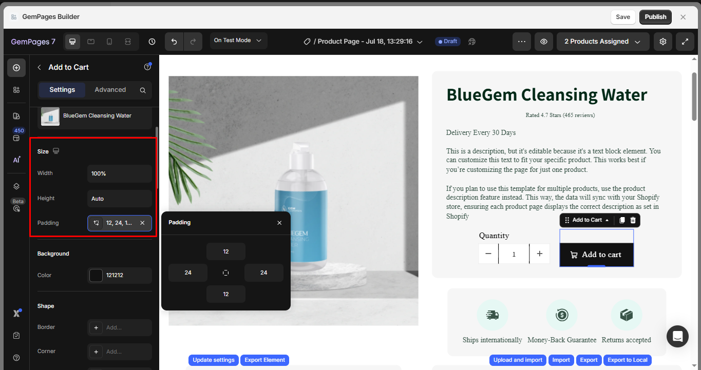
Size
- Width: Set the button width.
- Height: Adjust the height of the button.
- Padding: Define the padding inside the button.
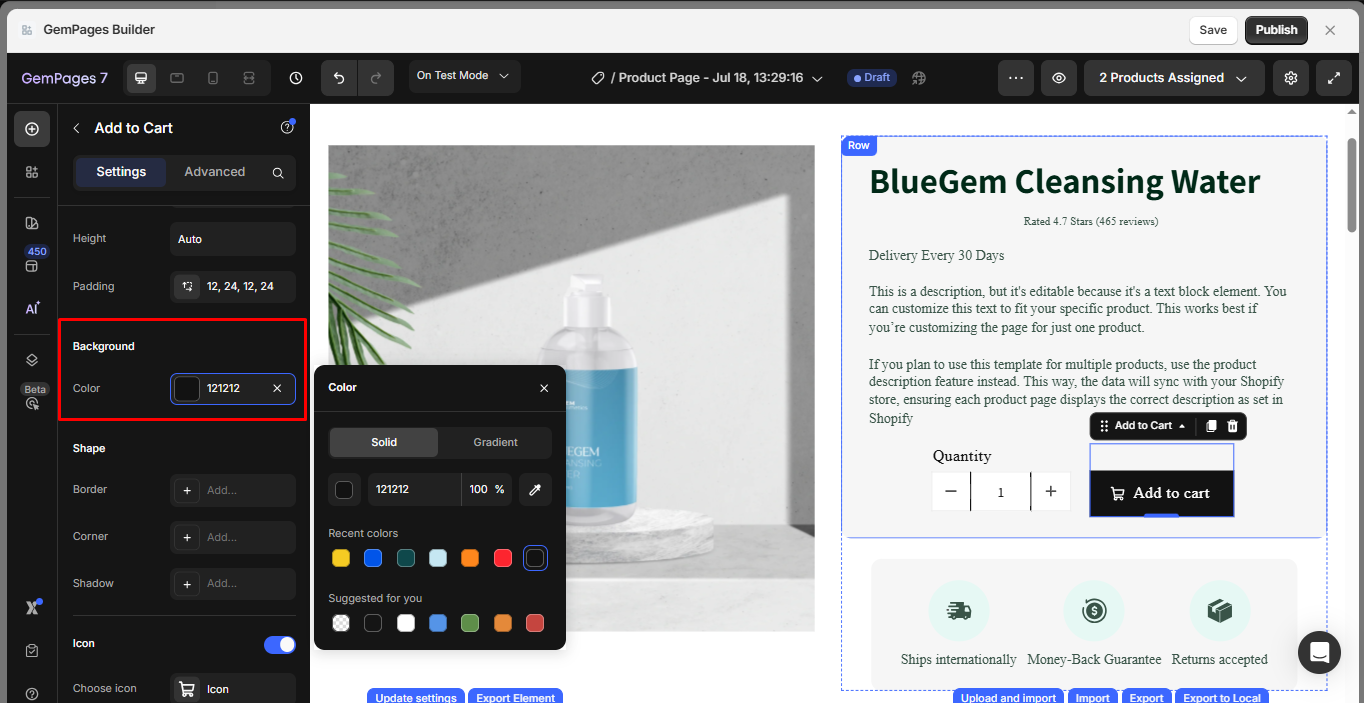
Background
Customize the background color of the button using the color picker. This helps match the button with your brand style.
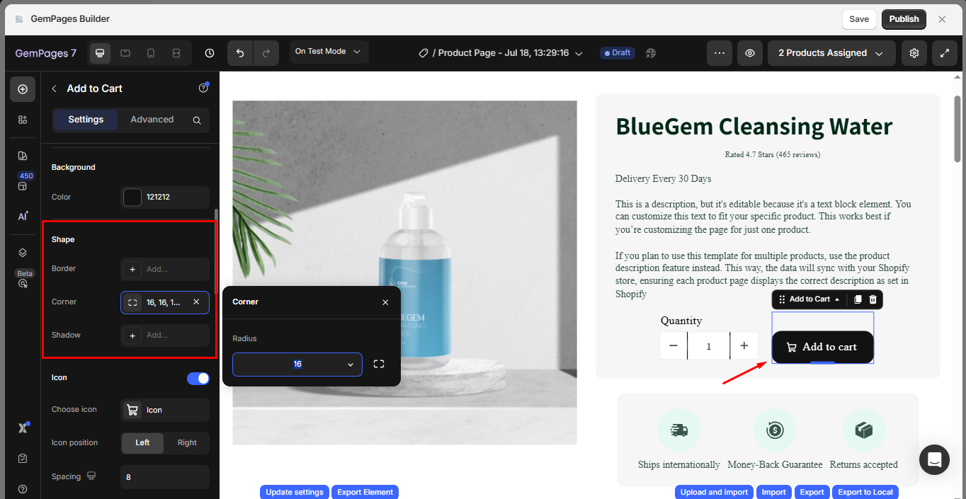
Shape
- Border: Choose the border style, such as Line or Solid, to give the button a visual outline.
- Corner: Select how rounded the corners should be (Sharp, Rounded, or Pill).
- Shadow: Apply and customize a drop shadow to give the button a lifted or layered appearance.
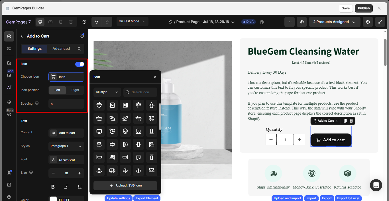
Icon
- Choose Icon: Select an icon to display on the button, or you can upload a new SVG file.
- Icon position: Position the icon on the left or right side of the text.
- Spacing: Adjust the spacing between the icon and text.
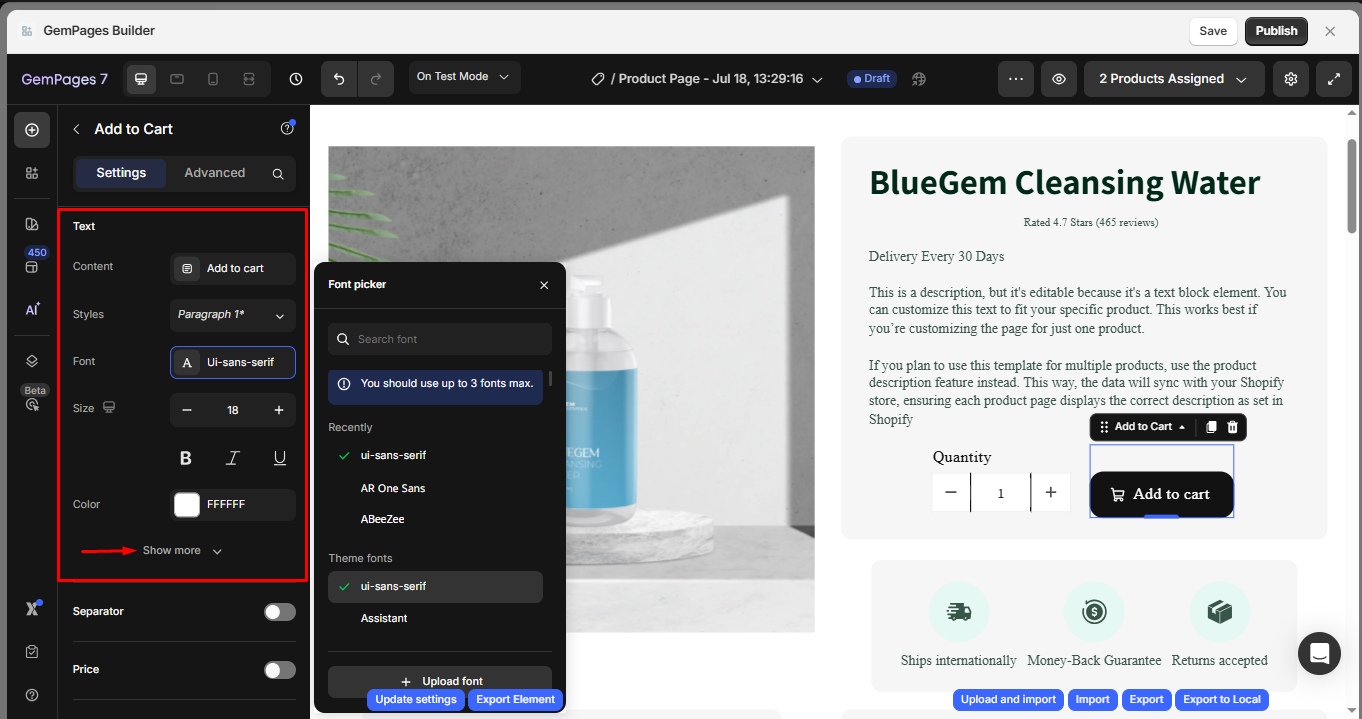
Text
- Content: You can fully customize the text displayed on the Cart button. The default text is “ADD TO CART,” but you can modify it to any text that aligns with your design and objectives.
- Styles: Select a style for the cart button label from the available predetermined styles.
- Font: Choose the font for your text label from the drop-down menu. In case you would like to use other fonts, check out how to use a custom font here.
- Sizes: Determine your preferred font size.
Click on the “Show more” button to reveal more customization options.
- Font Weight: Choose your desired font weight from the provided drop-down menu.
- Line Height: Adjust the height of the text by specifying a percentage value.
- Letter Spacing: Modify the spacing between letters by inputting a value in pixels.
- Transform: Transform the text to uppercase, lowercase, or capitalized as desired.
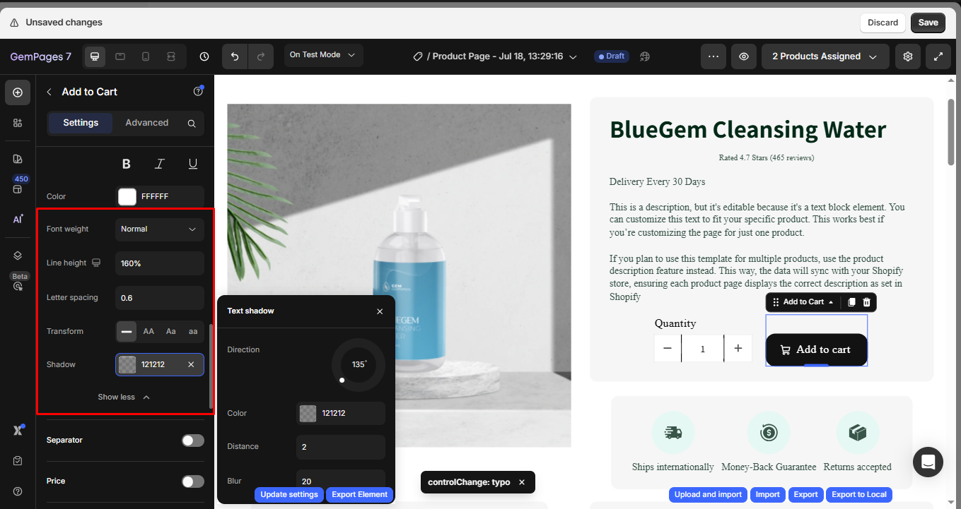
Separator
Enable this toggle to add a visual separator between the text and price inside the button. You can choose from line, dot, or bar styles.
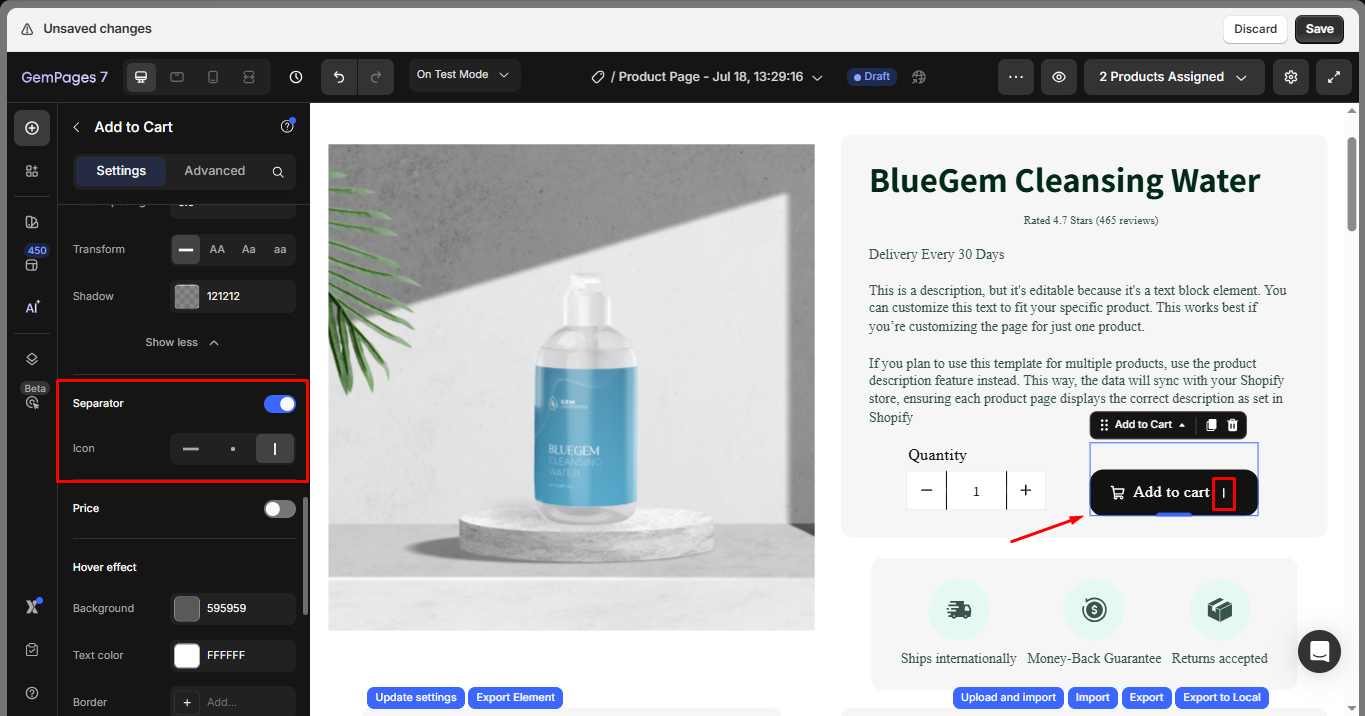
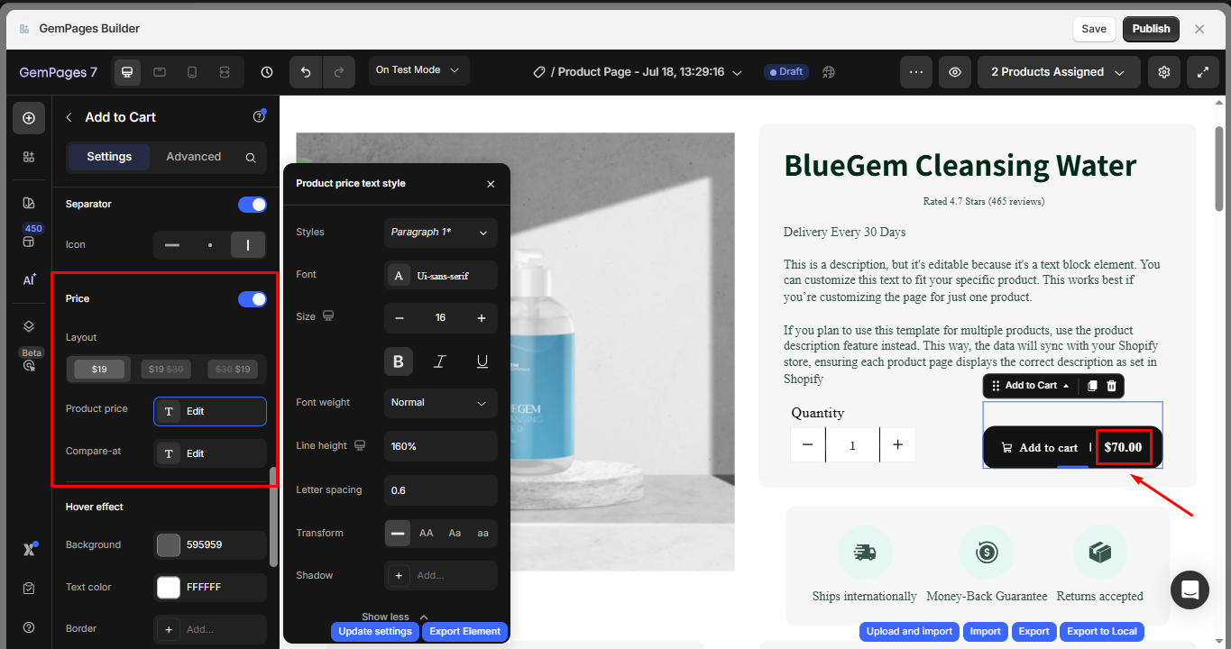
Price
Enable this option to show the product’s price on the button.
- Layout: Select the preferred layout for price display.
- Product Price: Customize how the current price appears.
- Compare-at Price: Optionally show the original (strikethrough) price for promotions.
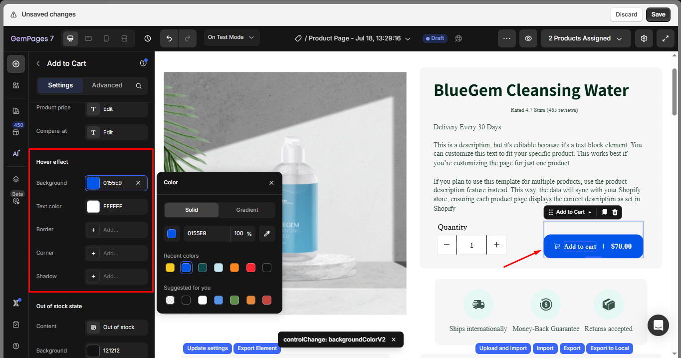
Hover effect
Customize the button’s hover behavior.
- Background: Set a new background color when hovering.
- Text Color: Change the text color on hover for better interactivity.
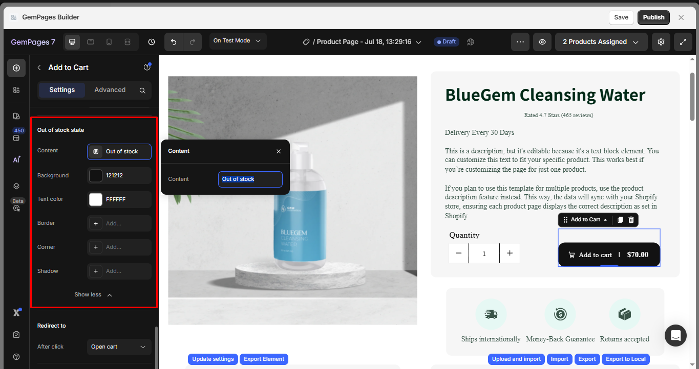
Out of stock state
This option enables you to customize the display of the cart button when the product’s inventory reaches 0. By enabling the Custom Style switch, additional styling options for the button will be revealed, allowing you to customize its appearance further.
Redirect to
This option defines what will happen after a customer clicks the Add to Cart button. You can choose from the following actions:
- Keep shopping: No redirection. The customer remains on the current page after adding the product to the cart.
- Go to checkout: Directs the customer to Shopify’s default checkout page with the items existing in the cart (if any).
- Open cart: Opens the cart drawer or cart page, depending on your theme settings.
- Open URL: Redirects the user to a specific URL. A new input field will appear for you to paste the destination link.
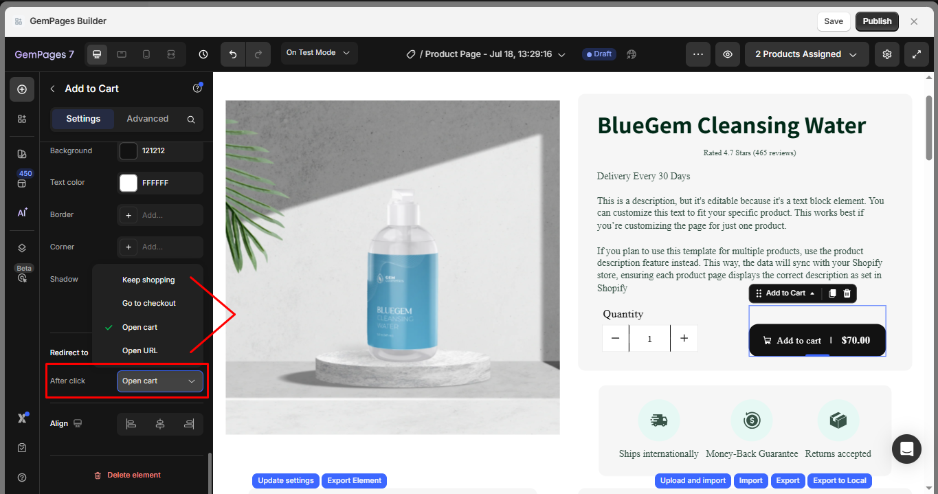
Use this setting strategically to guide customers through your conversion funnel. For example, leading them to the cart for cross-sell opportunities or straight to checkout for impulse purchases.
Align
Choose the alignment of the button within its section: left, center, or right.
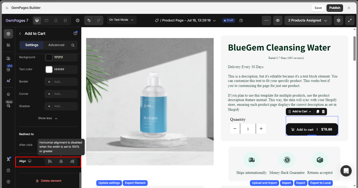
Note: Horizontal alignment is disabled when the width is set to 100% or greater.
Configure the Advanced Tab
For more advanced customization, please navigate to the Advanced tab and follow the instructions in this article.
Use with Subscriptions (Subscription Add to Cart)
Before you start
- Install & configure a subscription app (e.g., Appstle, Recharge, Subify, Seal, etc.) and set Purchase options (selling plans) for the product in Shopify Admin.
- Ensure the app’s subscription widget (one-time vs. subscribe toggle, delivery interval, etc.) is enabled for that product.
Set up in GemPages
Step 1: Place the Product element, variant selectors, the subscription widget, and the Product Cart Button inside the same Product module (order: selectors → widget → Add to Cart).
Step 2: In Product Cart Button > Settings > Product Source, confirm it points to the same product as the widget.
Step 3: In Redirect to, prefer Open cart or Keep shopping so the selling plan attaches properly before checkout.
Step 4: Save and publish your page. On the live page, select a subscription in the widget and click Add to Cart to verify that the cart line item shows as a subscription.
Important notes
- Widget selection controls behavior: if Subscribe is selected, the cart line includes a selling_plan_id; if One-time, it doesn’t.
- Place the subscription widget and Product Cart Button inside the same Product module (widget above the button).
- The button shows the variant price; subscription discounts/labels show in the widget or cart drawer/checkout.
- Prefer “Open cart” or “Keep shopping” for the Redirect to section so the selling plan attaches before checkout.
- The selected variant must belong to the product’s selling plan.
- Use the Product Cart Button for cart actions, not the generic Button Element.
Troubleshooting Add to Cart Issues in GemPages
If your “Add to Cart” button in GemPages isn’t functioning as expected, here are some common issues and their solutions:
1. Ensure the Button is Nested Inside a Product Module
The Product Cart Button must be placed within a Product Module to function correctly. If it’s outside this module, it won’t work.
Solution:
- In the GemPages Editor, drag and drop a Product Module onto your page.
- Then, place the Product Cart Button inside this module.
This setup ensures the button is correctly linked to the product’s data.
2. Configure the Button’s Action Correctly
Ensure the button’s action is set to “Add to Cart.” If it’s set to another action, like “Link to Page,” it won’t add products to the cart.
Solution:
- Select the Add to Cart button in the GemPages Editor.
- In the settings panel on the right, ensure the action is set to “Add to Cart.”
This configuration ensures the button performs the desired action.
3. Avoid Using the Generic “Button” Element for Cart Actions
GemPages offers a generic Button element, but it’s not designed for cart functionalities. Using it for adding products to the cart can lead to issues.
Solution: Use the Product Cart Button instead of the generic Button element.
These specialized buttons are tailored for cart actions and ensure proper functionality.
4. Verify Product Visibility and Availability
If the product isn’t active or available on the Online Store sales channel, the “Add to Cart” button won’t function.
Solution:
- In your Shopify Admin, navigate to Products and select the relevant product.
- Ensure the product status is Active.
- Under Sales channels and apps, confirm that Online Store is selected.
This ensures the product is available for purchase in your store.
FAQs about the Product Add to Cart Element
1. Why can’t I add an Add to Cart button to a saved theme section?
Saved Theme Sections in GemPages can’t be edited, and you can’t add new elements inside them, including the Add to Cart button. To use an Add to Cart button, create a new section, insert all needed elements (Product → Add to Cart), then save the entire section as a new reusable theme section.
Learn more about the Theme Section: GemPages Theme Section & FAQs.
2. Why is the price not showing on my Add to Cart button?
Make sure the Price toggle is enabled in the Settings tab. If your product has no price or is unavailable, the price may not appear.
3. Why does the Add to Cart button look different on hover?
Check the Hover effect settings. You may have different background or text colors configured for the hover state.
4. Why is the alignment option disabled?
Alignment is disabled when the button width is set to 100% or greater because the element already occupies the full available width.
5. Can I place the Add to Cart button inside a popup?
- Use a regular Button element to open the popup.
- Keep the actual Add to Cart button on the main product page.
6. How can I make the Add to Cart button open a slide cart?
You don’t need custom code—set Product Cart Button → Redirect to → Open cart, then configure your theme’s cart drawer or slide cart by following this guide.


Thank you for your comments