


What is the Advanced List Element?
GemPages offers two elements for displaying content in a list:
- Item List element: Designed for simple lists. Each item begins with an icon, which you can select from the GemPages icon library or upload your own. This element works well for displaying short points such as product benefits, features, or quick highlights.
- Advanced List element: Instead of being limited to icons, it allows you to include images alongside each list item, giving you more visual control over the layout. This makes it ideal for use cases that require richer visuals, such as showcasing product features with images, step-by-step guides, or visual comparisons.
How to Add the Advanced List Element to Your Page
Step 1: In the GemPages Dashboard, select your page to enter the Editor.
Step 2: Within the Editor, locate the Advanced list element under the Content list section. Drag & drop it onto the desired location on the page.
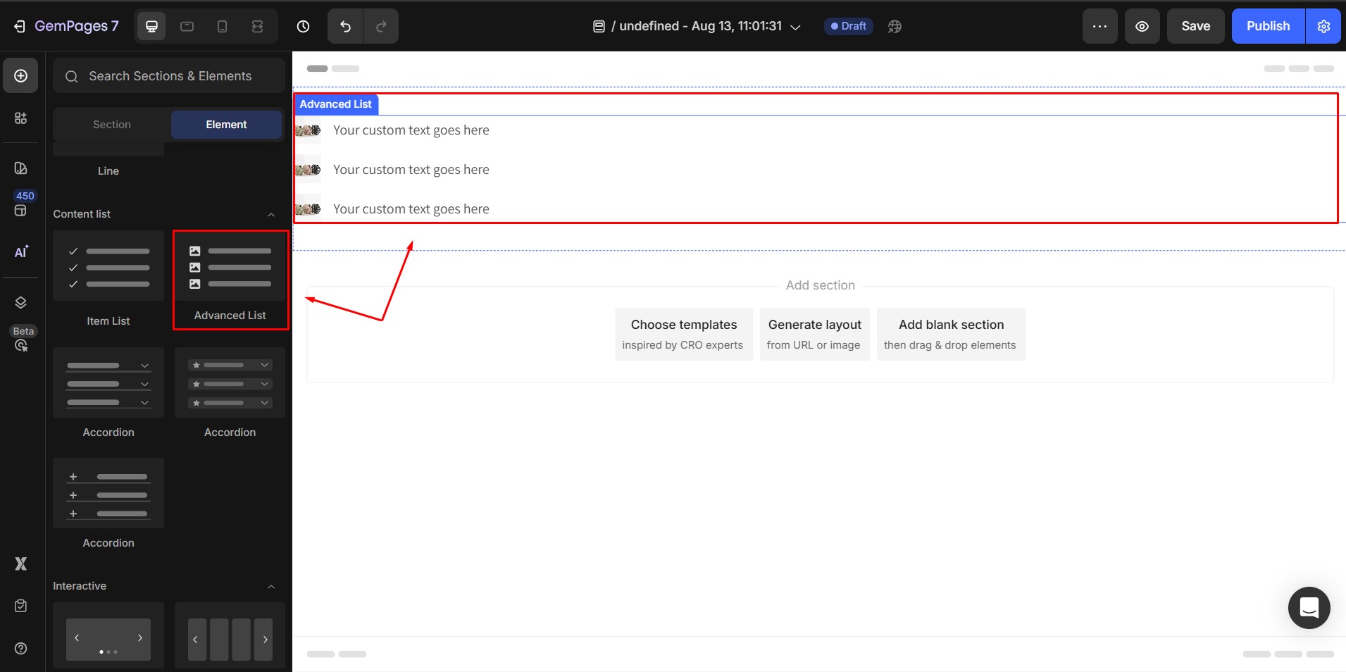
Click on the element, you will find the configuration revealed on the left sidebar.
Configure the Settings Tab
1. Item management
This section lets you add, remove, or duplicate list items.
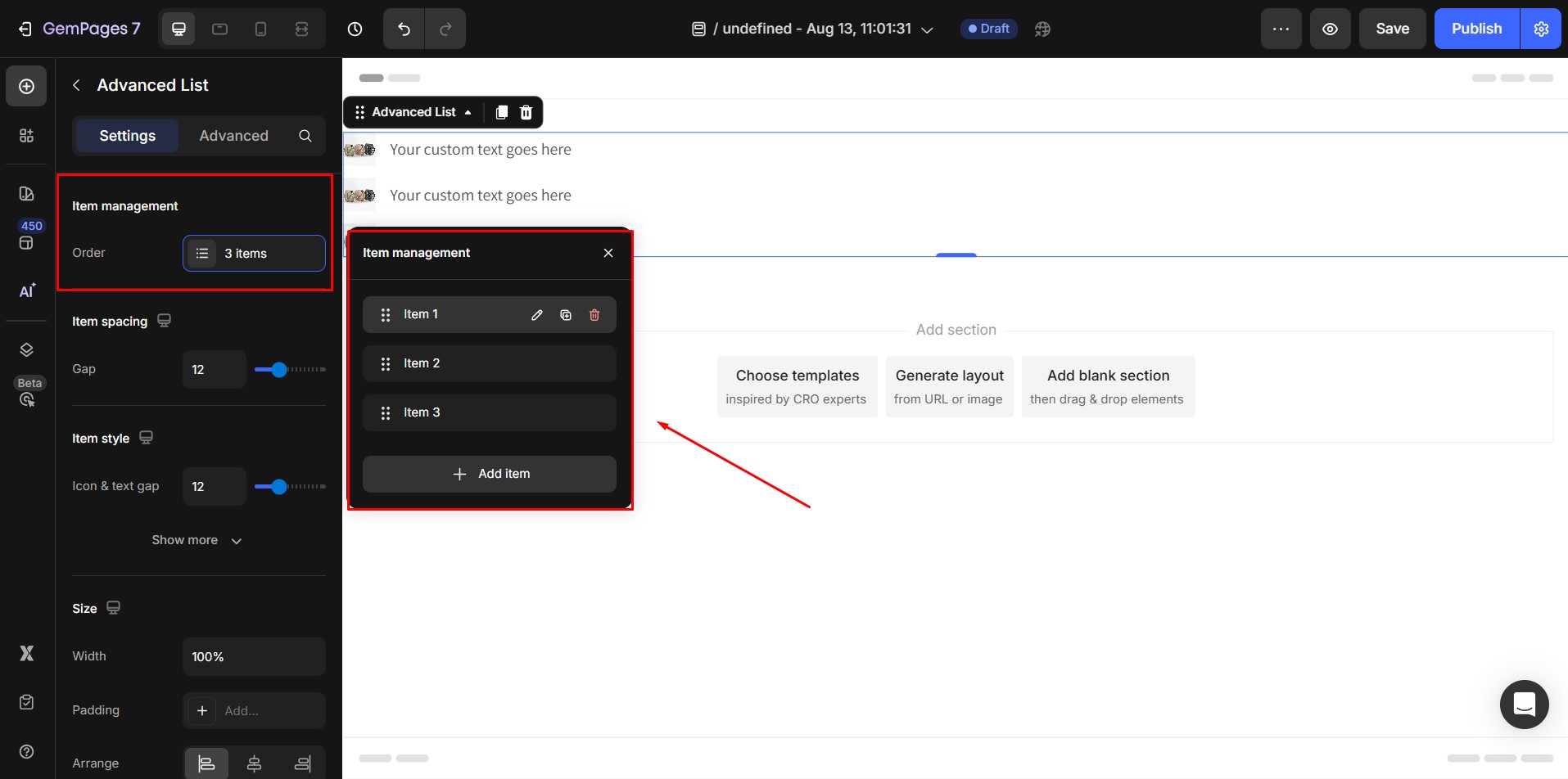
- To add a new item, click the Duplicate icon next to an existing item. A new item will appear immediately below the original.
- To remove an item, click the Trash icon on the item you want to delete, then confirm the deletion.
2. Item spacing
The Item Spacing controls the vertical space between each item in your list. Use the slider or input value to adjust the distance.
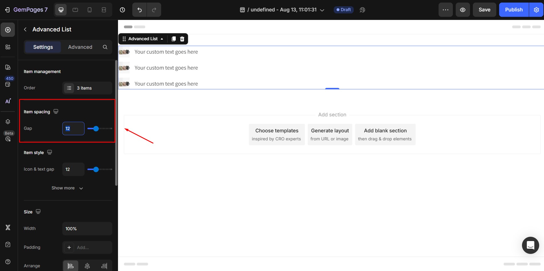
- Default: 12px
- Larger spacing can make the list easier to read, while smaller spacing creates a more compact design.
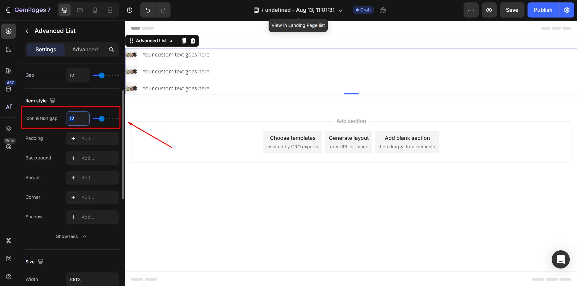
3. Item style
Icon & Text Gap : This adjusts the horizontal space between the icon (or image) and the text.
- Default: 12px
- Increase the gap for a more open layout; reduce for a tighter appearance.
Padding: Adds space around each list item.
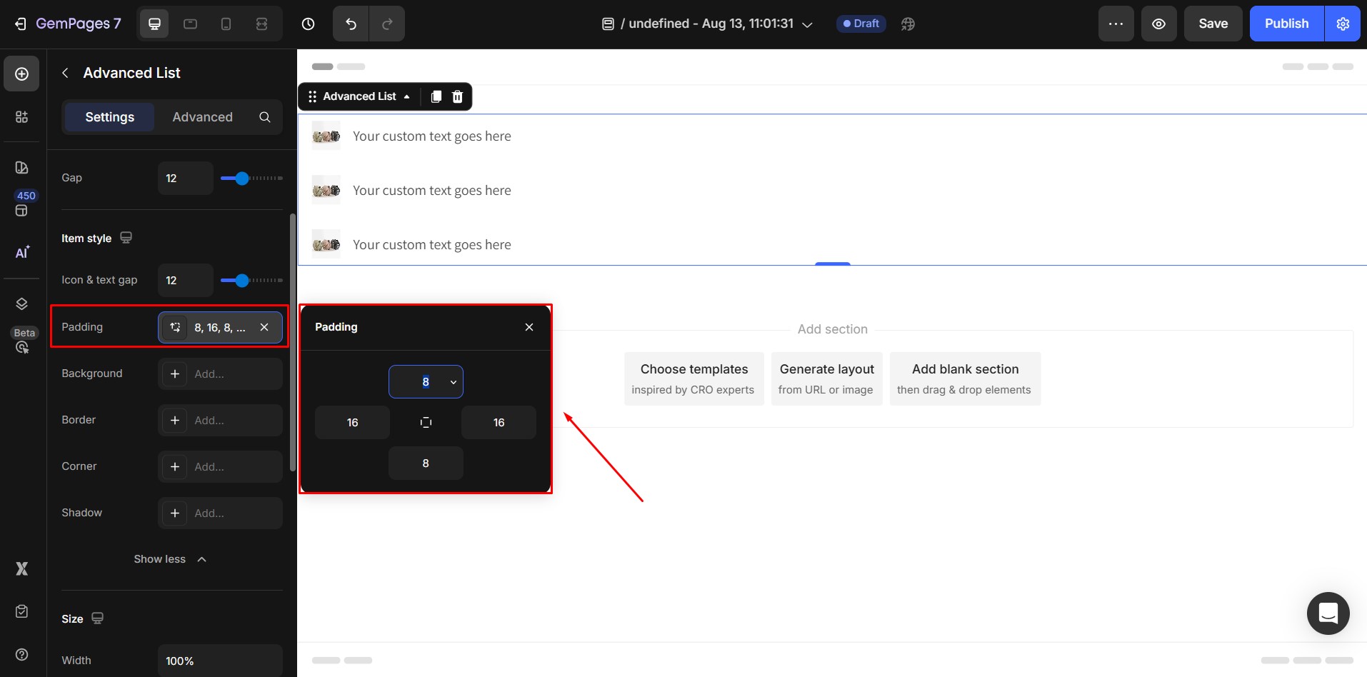
- Click Add padding and enter the number of pixels you want.
- This ensures your content does not touch the edges of the item box.
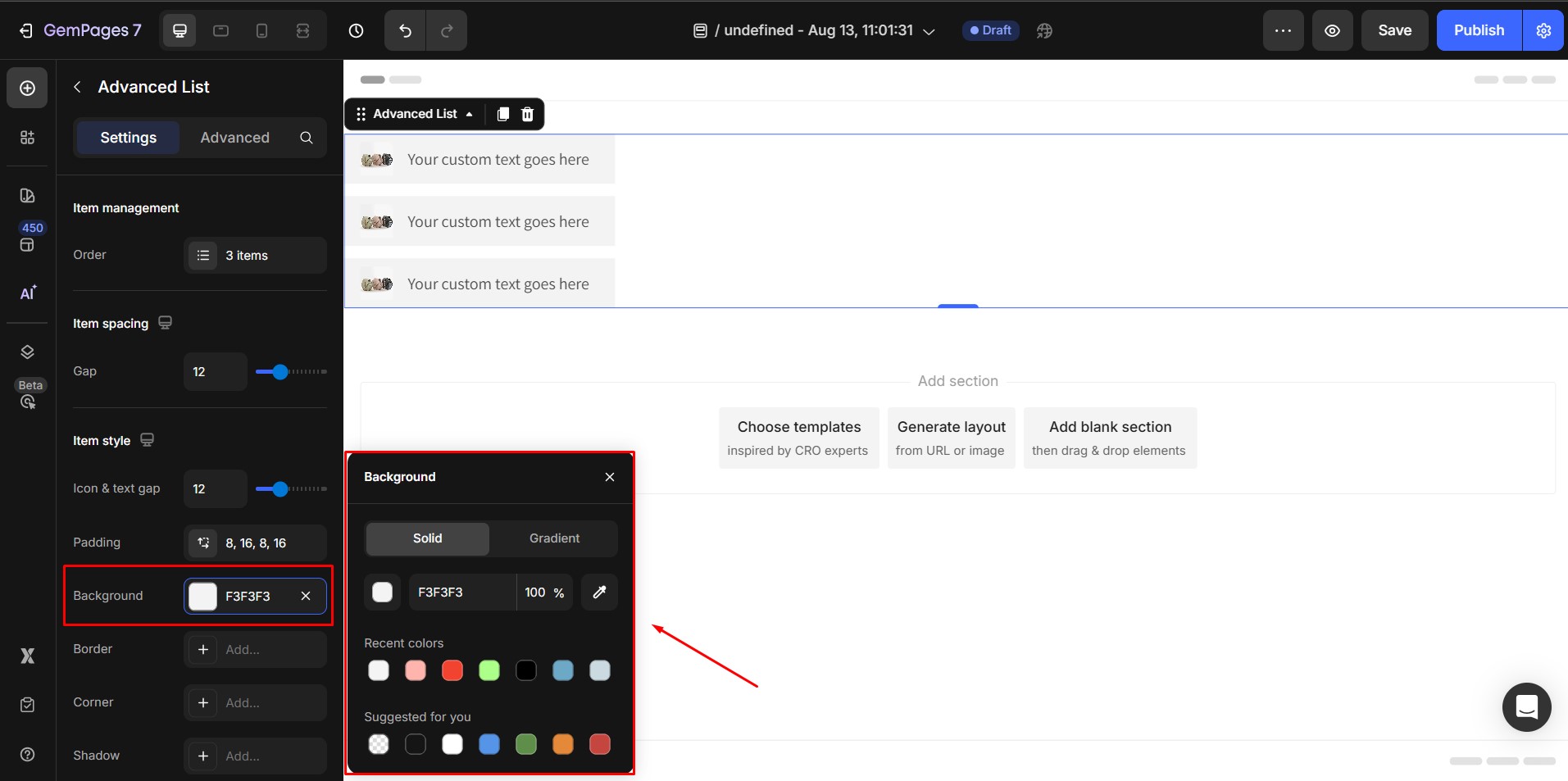
Background: You can add a color background behind item.
Border, Corner, and Shadow: These options allow you to style the item container.
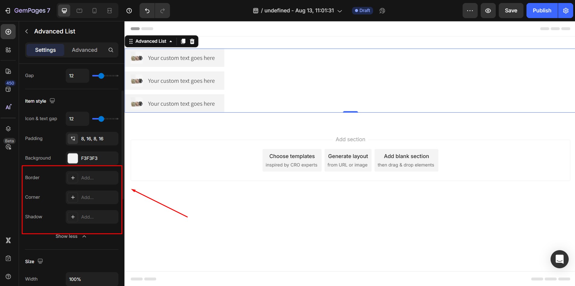
- Border: Choose style (solid, dashed, dotted), thickness, and color.
- Corner: Adjust the border-radius to round the corners.
- Shadow: Add shadows to create depth or highlight items.
4. Size
Width: Controls the width of the content box inside the element:
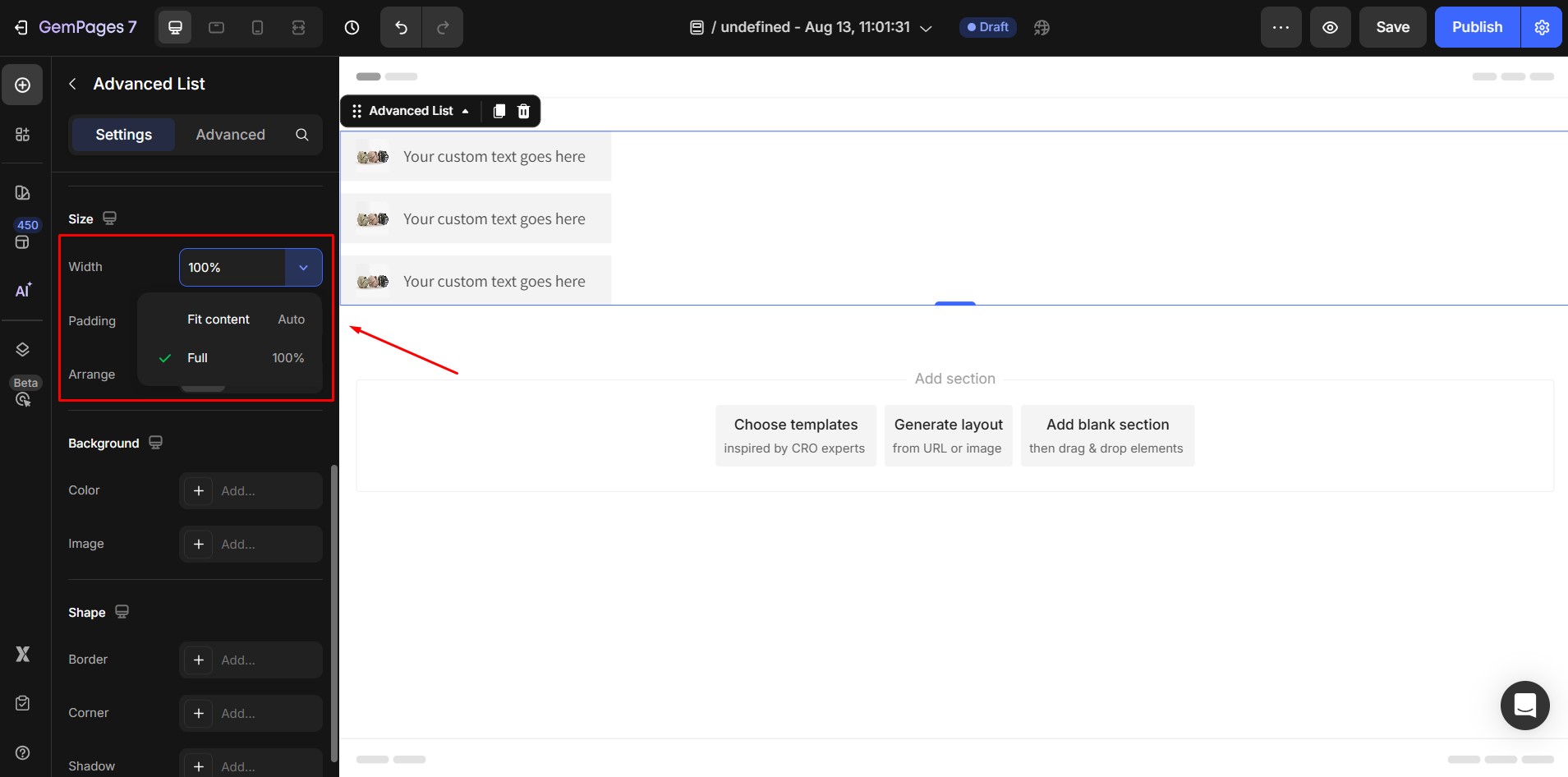
- Fit to Content: The box automatically adjusts to the size of the content.
- Full: The box expands to 100% of the container width.
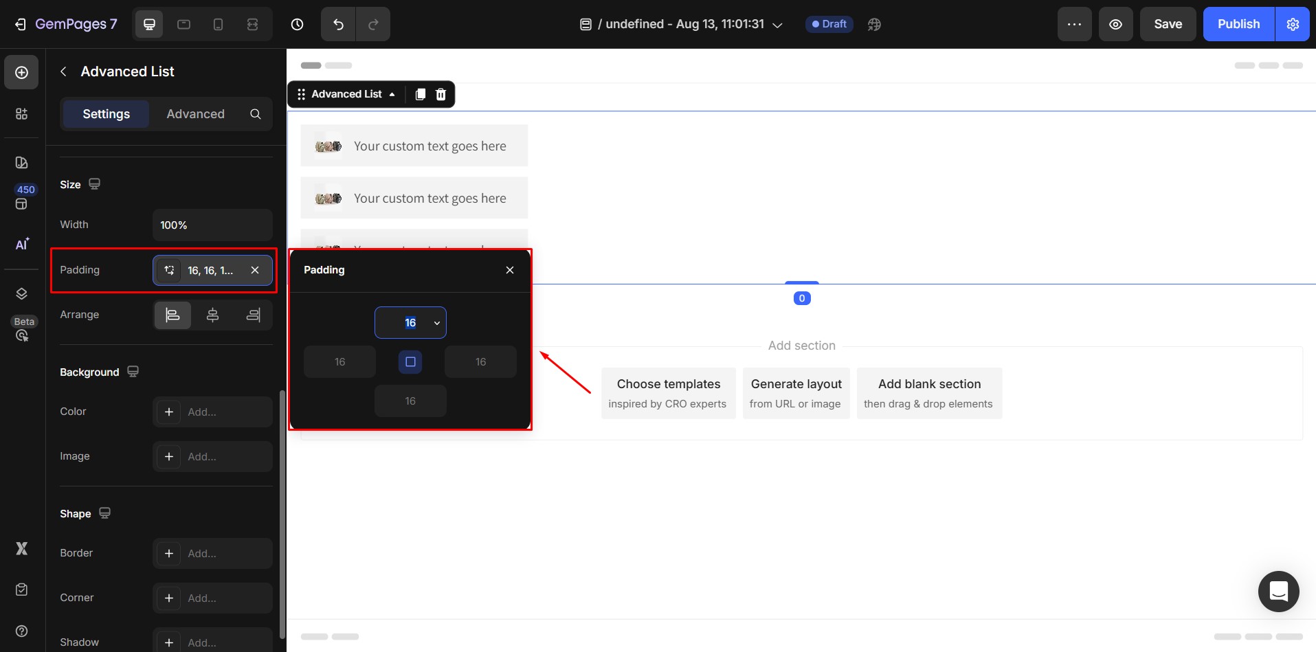
Padding: Adjust the spacing between the edges of the content box and the content inside. Click Add padding and enter your desired value in pixels.
Arrange: Align the content inside the box: Left, Center, or Right.
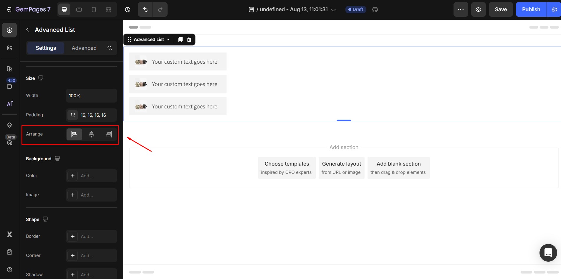
- This setting will be hidden if the width is set to Auto.
- Default alignment is Left.
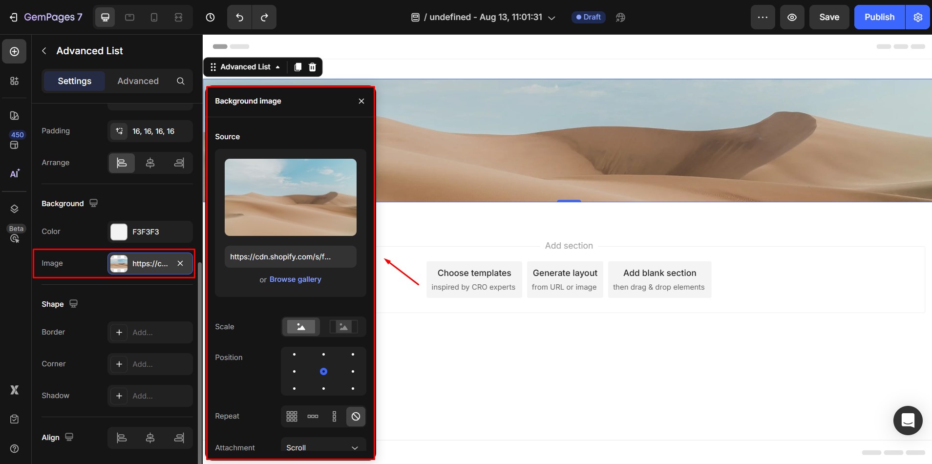
5. Background
You can also set a background for the entire Advanced List element:
- Color:

- Image:
6. Shape
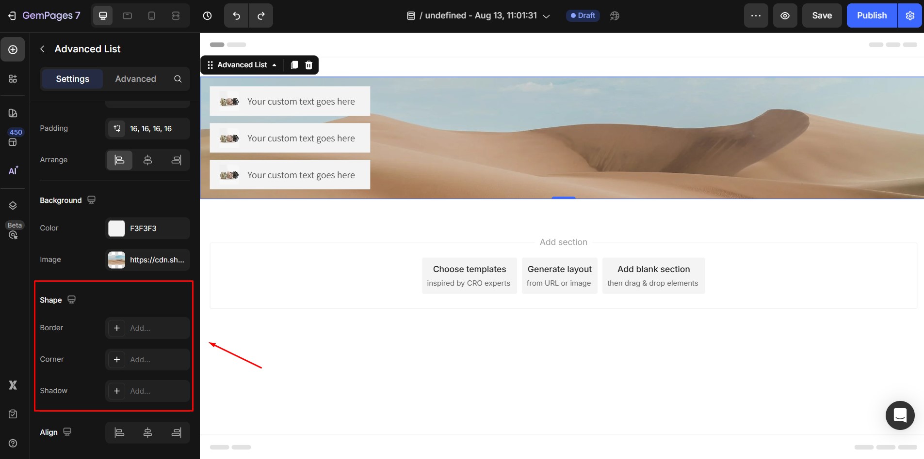
- Border: Set the border style, thickness, and color for the overall element.
- Corner: Round the corners of the element with a border-radius.
- Shadow: Apply shadow effects to make the list visually stand out.
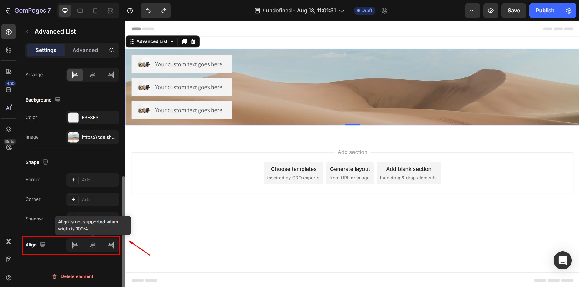
7. Align
Determine how the element is positioned on your page. There are three options to choose from left-aligned, centered, and right-aligned.
Configure the Advanced Tab
The Advanced tab allows for more customization:
- Add custom CSS to style your list in ways not available in the default settings.
- Adjust visibility per device to hide or show the list on desktop, tablet, or mobile.
- Apply animations or interaction effects to make your content more dynamic.
For more detailed customization, please navigate to the Advanced tab and follow the instructions in this article.


Thank you for your comments