


You can build your product details page by either:
- Using a pre-designed product detail section from the template library.
- Starting from scratch with Product Elements
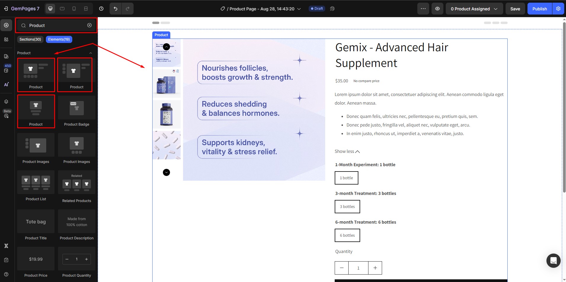
What are the Product Elements?
The Product Element in GemPages allows you to dynamically display Shopify product information on your page.
Usage: Can only be used inside a Product Module, which serves as a container for all product-related elements.
Child Elements: Enhance your product details page with the following:
- Main Elements: Image, Title, Description, Price, Variants, Add to Cart Button
- Other Elements: SKU, Product Badge, Conversion Boosters (Countdown Timers, Stock Counters, etc.)
How to Design a Product Details Page Using Product Elements
Note: Ensure your products are set up correctly in Shopify before starting.
Step 1: Open the GemPages Editor on your Shopify store. Select the product page you want to edit or create a new page from scratch.
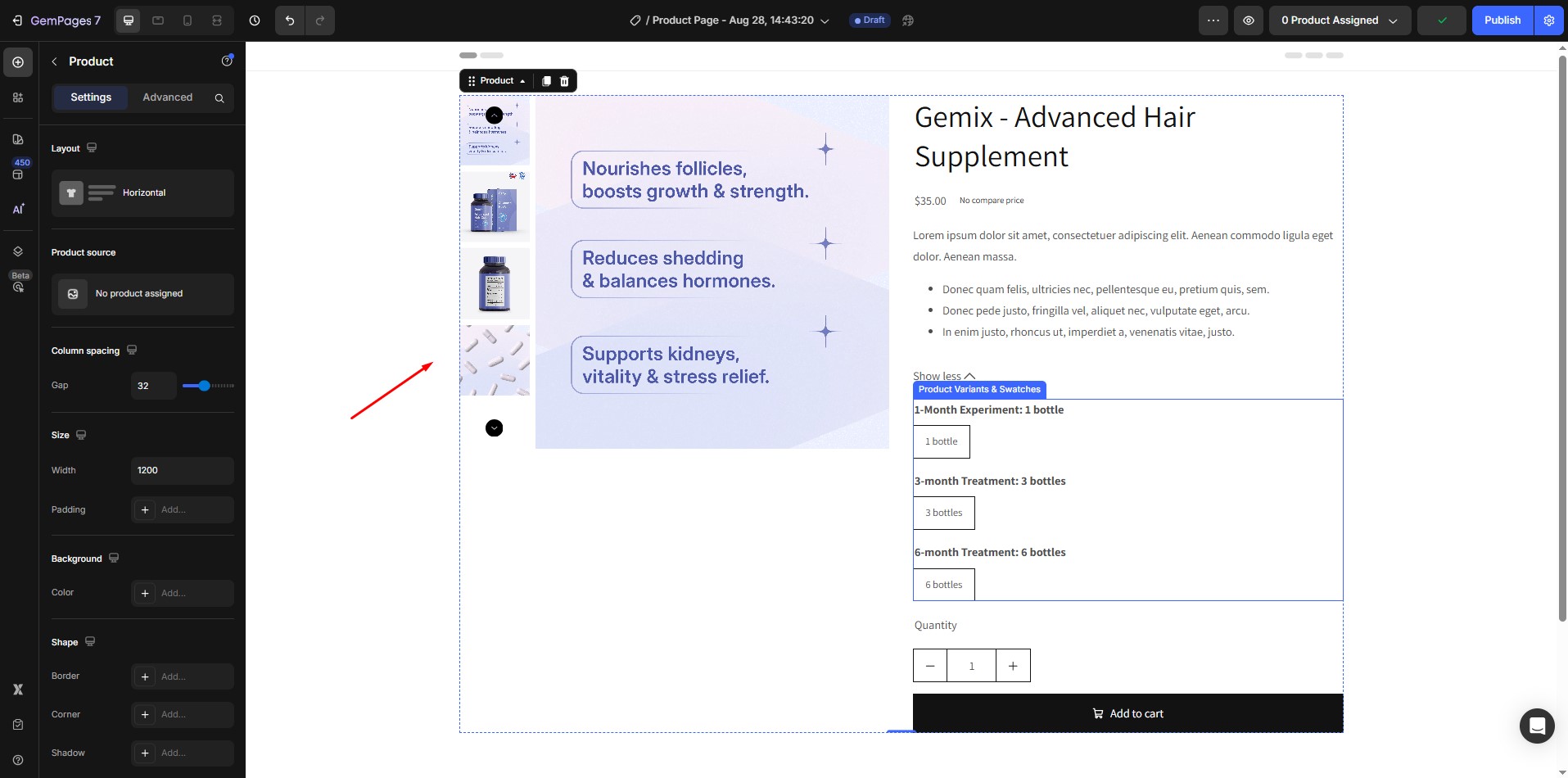
Step 2: In the left-hand sidebar, drag and drop a Product Module onto your page.
By default, the module includes main elements like Image, Title, Description, Price, Variants, and Add to Cart Button, automatically synced from Shopify.
Key Product Elements to Add and Customize
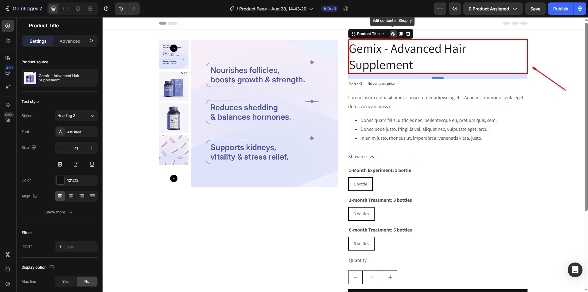
1. Product Title
The title will display by default when you add the element. If it’s removed or needs repositioning, drag and drop it from the sidebar.
2. Product Images and Thumbnails (Image, Video, Video Banner, etc.)
The image will display by default when you add the product module. If removed or if additional image placement is desired, drag the Product Image element from the sidebar to a new position. This element supports product images, video, and video banners to help showcase your product visually.
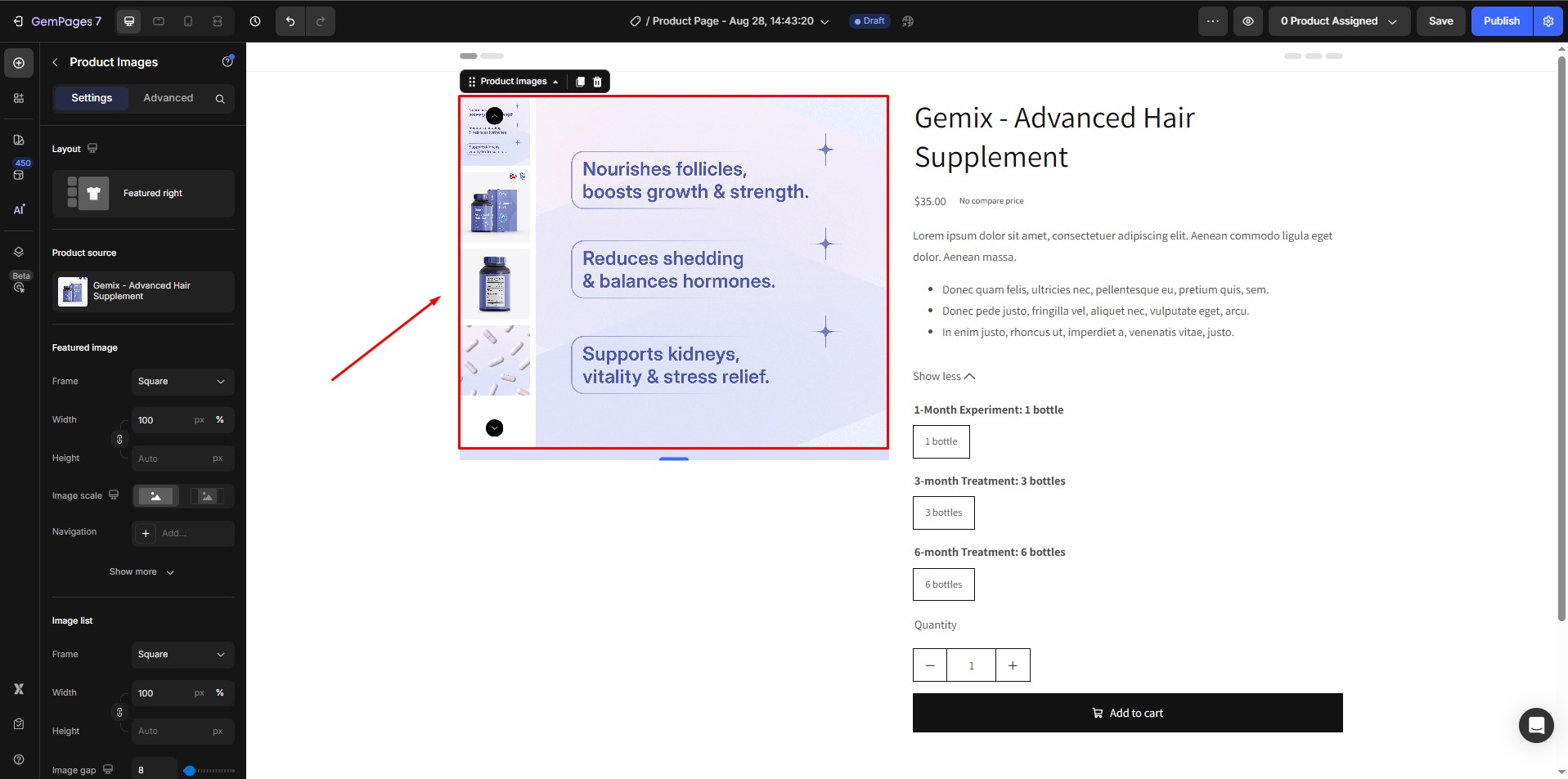
Read more: Product Image Element Guide
3. Product Badge
Product badges, like “Sale 50% Off” or “Limited Edition,” help highlight special attributes of your product.
In the Product Element, drag and drop the Product Badge element into the GemPages editor.

Read more: Product Badge Element Guide
4. Product SKU
Displaying the SKU (Stock Keeping Unit) helps both customers and store managers track products efficiently.
Search for the Product SKU in the product element. Drag and drop it into the GemPages editor.
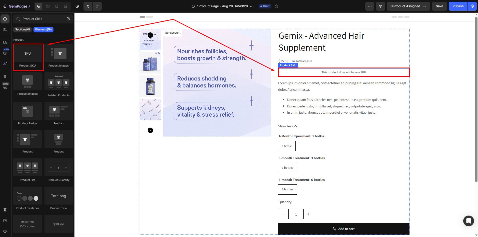
Read more: Product SKU Element Guide
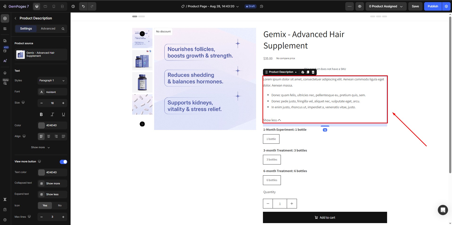
5. Product Description
Product descriptions appear by default but can be moved.
Drag the Product Description element from the sidebar if adjustments are needed.
Read more: Product Description Element Guide
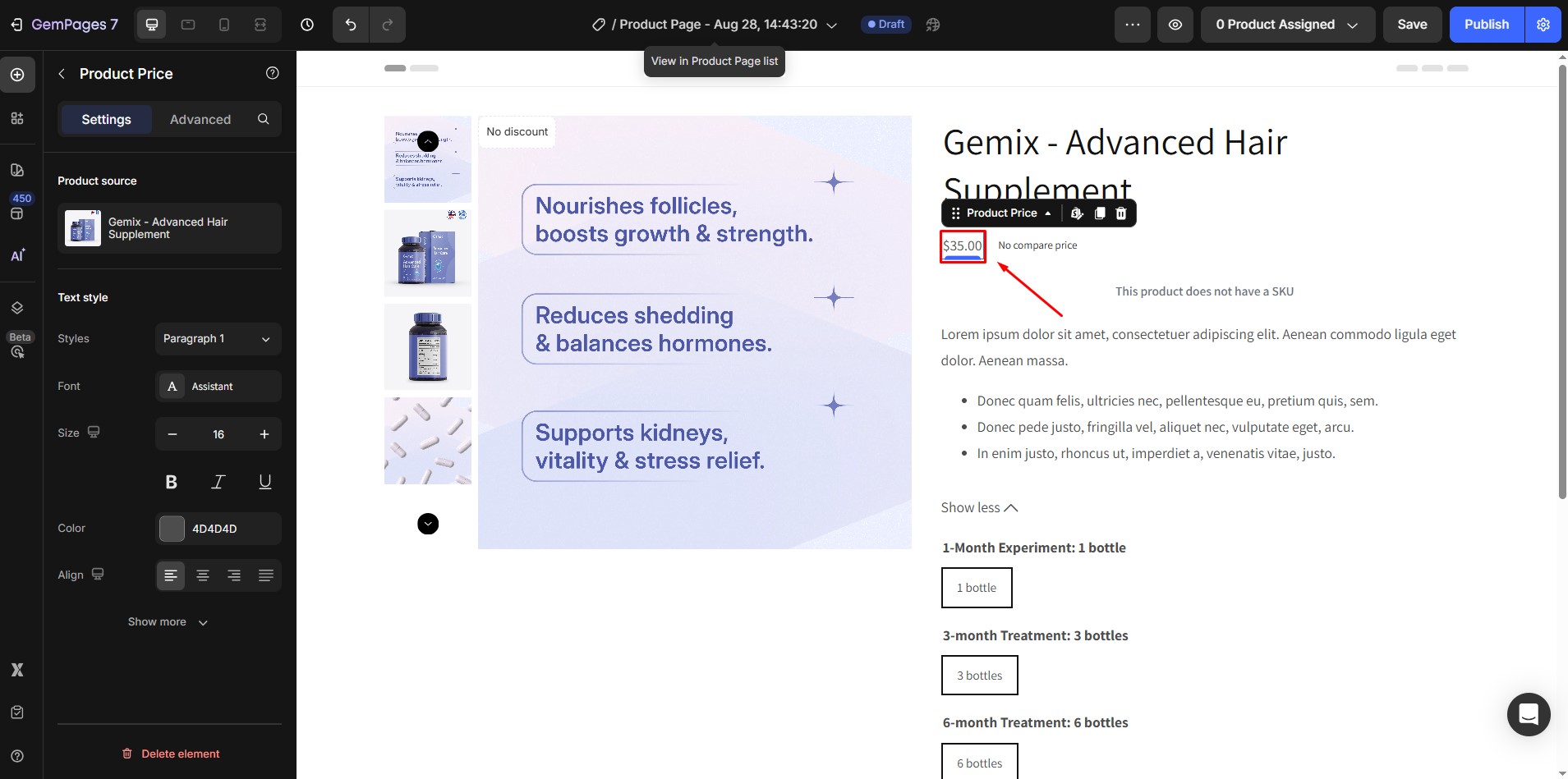
6. Product Price
The price appears by default and is pulled directly from Shopify.
Reposition the Product Price element by dragging it to your preferred spot if needed.
Read more: Product Price Element Guide
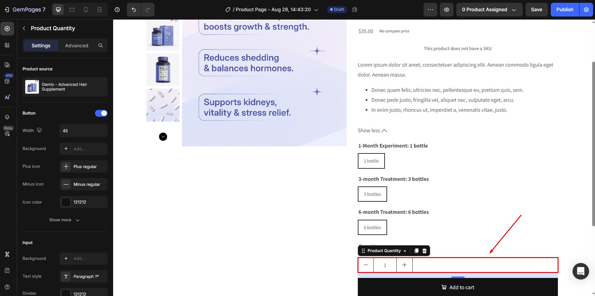
7. Product Quantity
Display the quantity selector, allowing customers to choose the number of items they want to purchase.
If you reposition or remove the Product Quantity element, drag it back from the sidebar to where you’d like it displayed.
Read more: Product Quantity Element Guide
8. Product Options/Variants
Product variants such as color, size, and material load automatically.
To adjust the display or change the position of product options, drag the Product Variants element to your desired location. You can customize variant styles with swatches for color options or dropdowns for easier selection.

Read more: Product Variants & Swatches Guide
Variants handle attributes like color, size, and material (if defined as Shopify variants). However, for extra information that doesn’t affect SKU (like care instructions), use Shopify Product Metafields and display them via Dynamic Text or Custom Blocks inside your product module.
9. Add to Cart/Buy Now Button
This button is included by default, and you can customize its color, text, and size to make it stand out on the page.
Drag the button from the sidebar if it’s removed or repositioned. Customize the button’s behavior to either redirect to checkout, open the cart drawer, or stay on the same page.
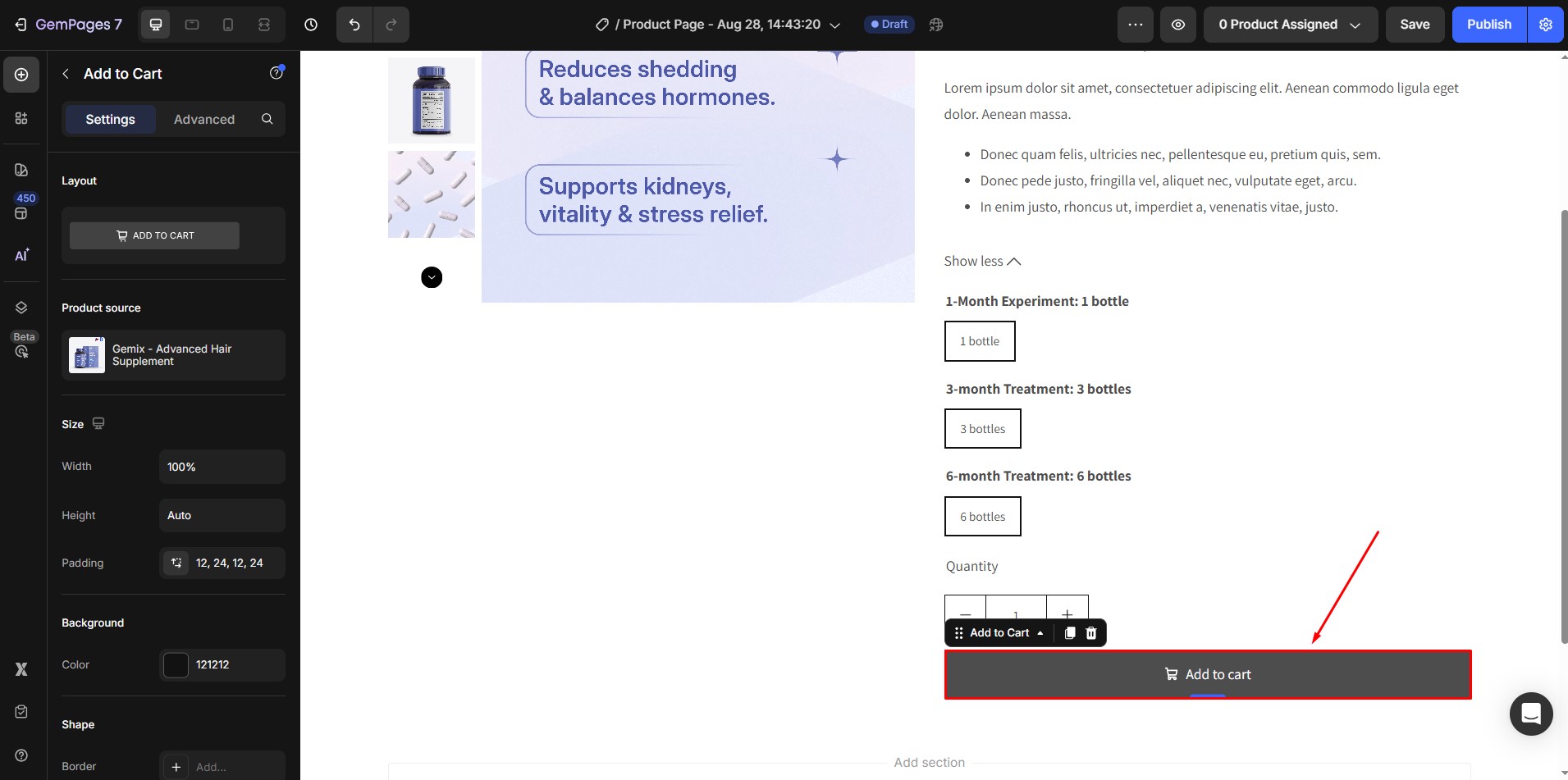
Read more: Add to Cart Button Element Guide
10. Conversion Boosters
Adding elements that create urgency or provide social proof can significantly boost conversions.
- GemPages allows you to add Countdown Timers or Stock Counters
- You can also integrate Trust Badges or Customer Reviews from third-party apps. For detailed instructions on integrating a third-party app with GemPages, refer to this article.
Step 4: Once you’re satisfied with your design, save your progress and publish your changes.
FAQs
1. Can I use one product page template for different products with different information?
Yes. You can create a universal product page template using the Product element and pull unique product-specific content using Shopify Product Metafields. This allows each product to display its own dynamic content even when sharing the same page design.
2. Can I edit the product title or description directly inside GemPages?
No. The Product Title and Product Description elements automatically pull data from Shopify Admin. If you need to change these, you must edit them directly in your Shopify Admin.
3. Are product metafields supported in all GemPages plans?
Product Metafields are supported in GemPages V7. However, ensure that your plan includes Dynamic Text functionality to fully utilize this feature.


Thank you for your comments