


About the Product List Element
The Product List plays a crucial role by showcasing a range of products. Its purpose is to effectively increase sales value by enabling upselling and cross-selling to your customers. Unlike its previous version, the Product List element V7 offers the ability to selectively choose specific products to display, enhancing the flexibility of webpage design.
How to Add a Product List Element to Your Page?
To start using the Product List element in GemPages, follow these steps:
Step 1: Log in to your Shopify admin and access GemPages Dashboard > Pages.
Step 2: Locate the target page to open the editor.
Step 3: From the left sidebar, drag and drop the Product List element under the Product section into your preferred section on the page.
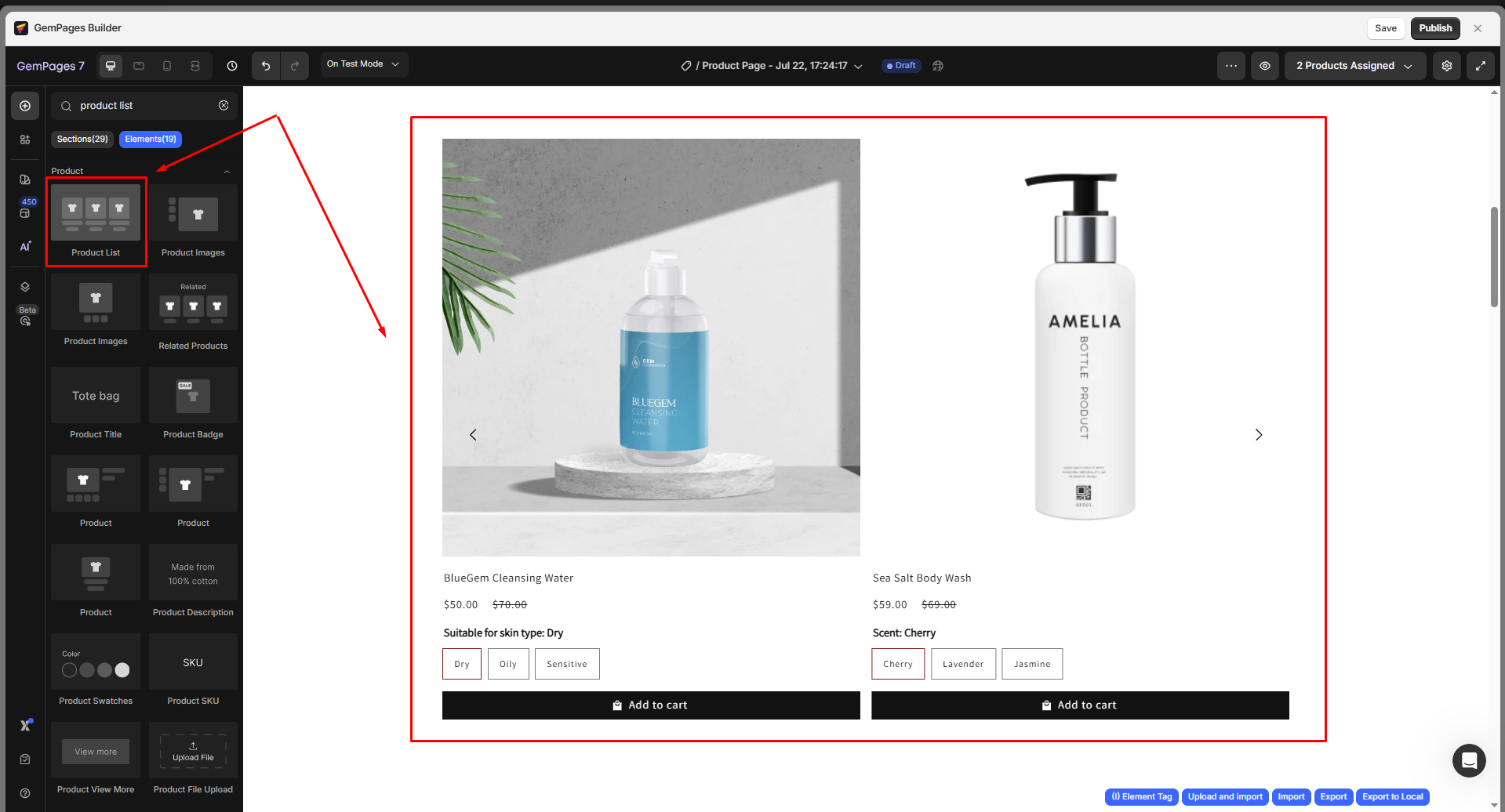
Step 4: Click on the element to access its configuration options, which include Settings and Advanced tabs.
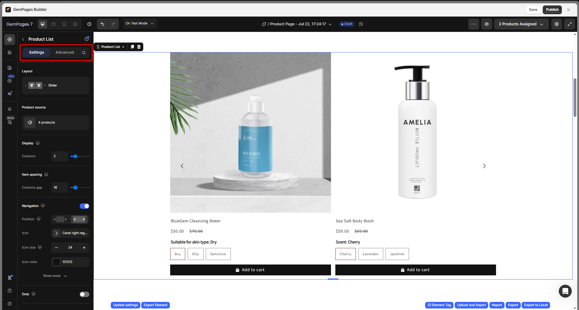
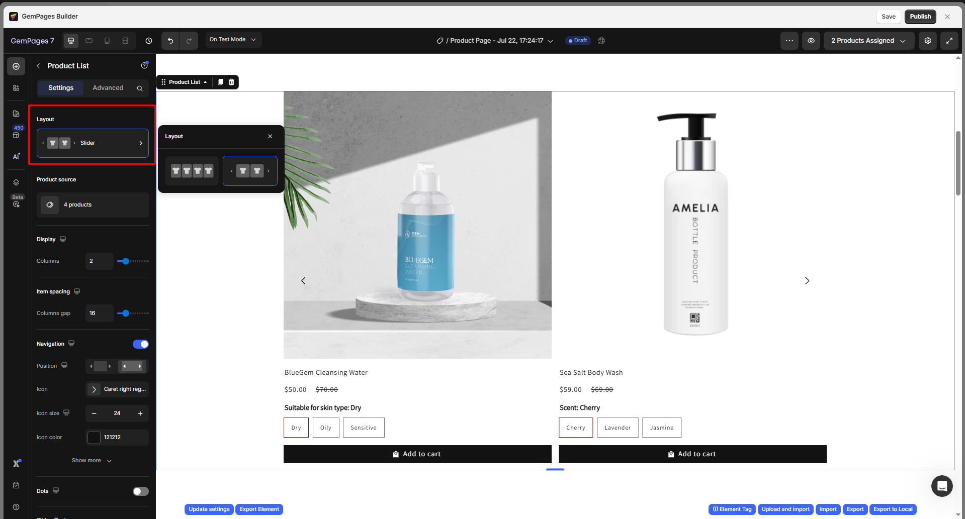
Configure the Settings tab
Layout
You have two options to choose from for showcasing your product list:
- Grid: The product list will be presented in the default style.
- Slider: The product images will be displayed in a carousel.
Product source
You can choose how products will be displayed by selecting one of the following options:
- Products: Manually select specific products to showcase.
- Collection: If you wish to showcase products from a particular collection, select this option. Please ensure that you have set up the collections in your Shopify Admin beforehand, as the element will retrieve information from there.
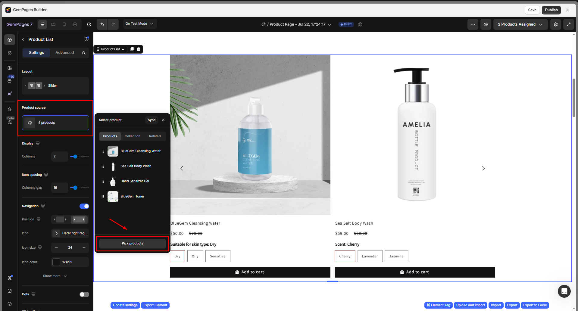
- Related: Automatically display products associated with the current one, based on the same collection, vendor, or tag.
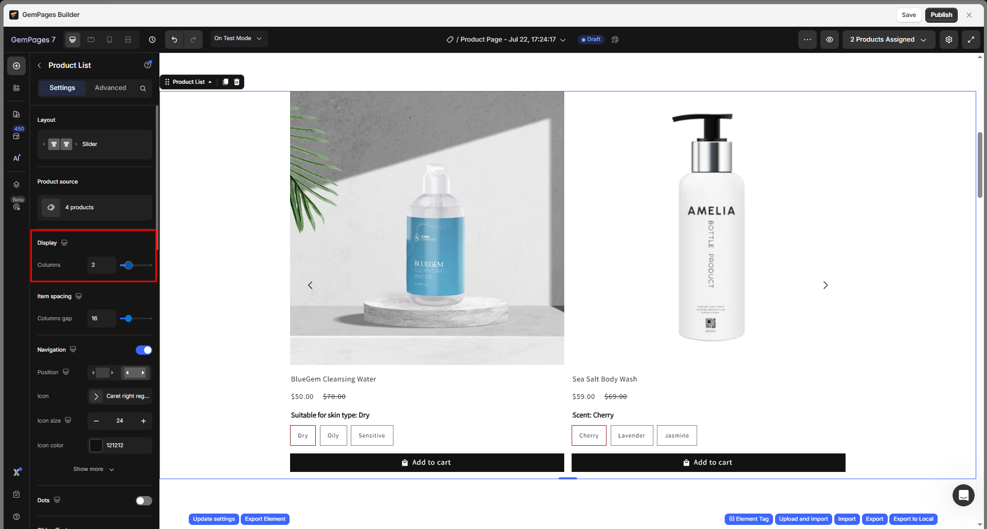
Display
Use the slider or enter an exact number to choose how many products should appear in a single row.
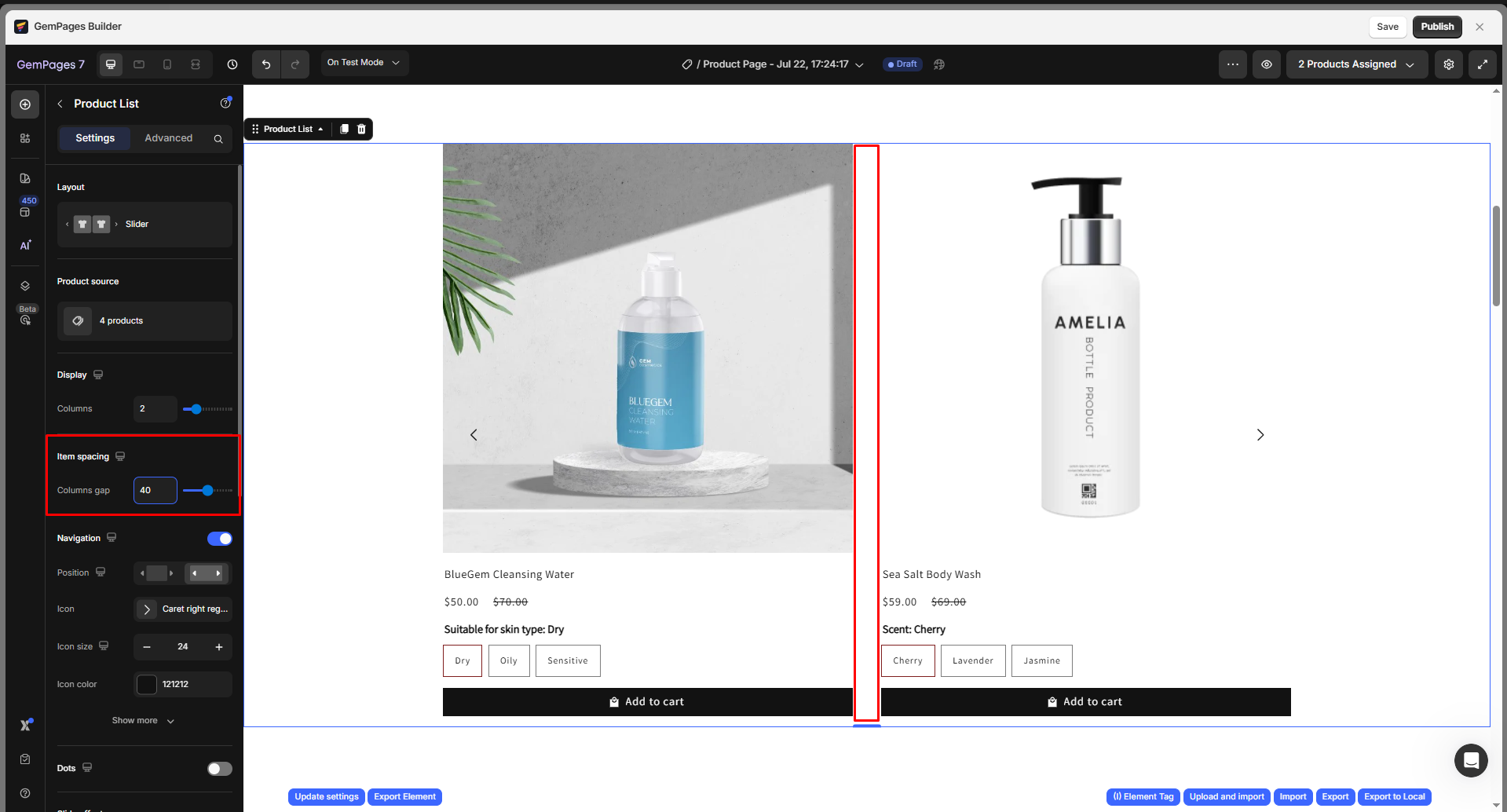
Item spacing
Adjust the spacing between your items in the Product List.
Navigation
In this section, you can configure the Navigation settings for the slider product list, including:
- Position: Choose to display the arrow inside or outside of the list.
- Icon: Select your preferred icon from the available list, or you can upload a new SVG file.
- Icon size: Adjust the icon size.
- Button size: Modify the button size of the icon.
- Background: Set the background color for the icon button.
- Border: Add a border around the button and customize its width and color.
- Corner: Set the corner radius to control how rounded the button edges appear.
- Shadow: Enable and customize drop shadow for the button.
- Gap to edge: Space between arrow and slider edge
- Show on hover: Show arrows only when hovering over the product list.

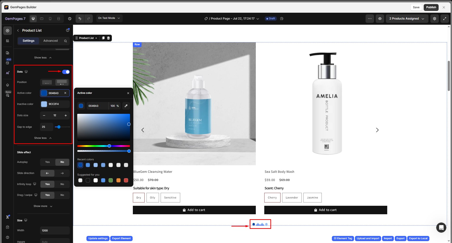
Dots
Toggle the visibility of the dots below the slider to configure the Dots settings to show pagination indicators below your slider, including:
- Position: Choose the location of the dots.
- Active color: Set the color of the currently active (highlighted) dot.
- Inactive color: Set the color of the inactive (unselected) dots.
- Dot size: Adjust the size of each dot (in pixels).
- Gap to edge: Control the distance between the dots and the edge of the container.
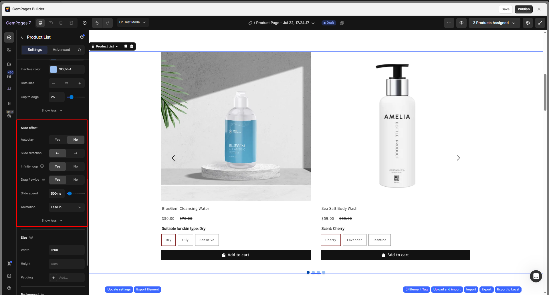
Slide effect
Under the Slide effect section, you can configure:
- Autoplay: Automatically scroll through products without user interaction.
- Slide direction: Choose the direction the slider moves: left or right.
- Infinity loop: Enable continuous looping so the slider cycles back to the beginning after reaching the last product.
- Drag/swipe: Allow users to manually drag (desktop) or swipe (mobile) through the slider.
- Slide speed: Set the duration of the slide transition (e.g., 500 ms).
- Animation: Select the animation easing type for smoother slide transitions (e.g., Ease in, Ease out, Linear).
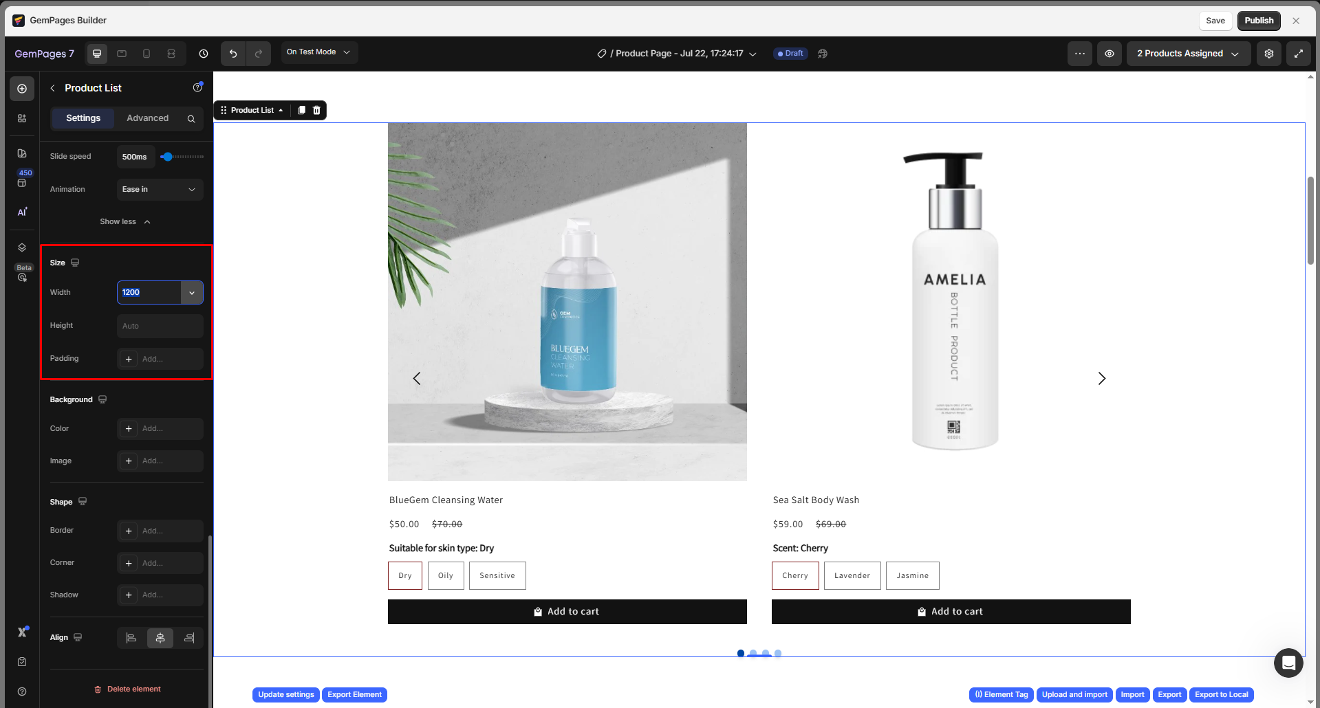
Size
In this section, you can define the size of the Product List container, including:
Width: Enter a fixed width value (in pixels), or activate Full-width to make the element span across the entire page width.
Height: Choose between
- Auto: The height will adjust based on the content.
- Custom: Enter a specific height value to define a fixed height.
Padding: Set the spacing inside the element’s borders to create breathing room for the content.
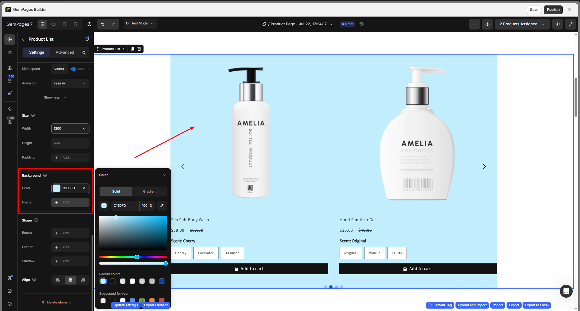
Background
This section allows you to customize the background style of the Product List element:
- Color: Use the color picker to apply a background color. You can choose from presets, enter a HEX code, or select from recent colors.
- Image: Upload an image to use as a background. This can be a pattern, texture, or promotional visual depending on your design.
Shape
In this section, you can shape the corners of the Product List container:
Corner radius: Adjust the roundness of each corner (top-left, top-right, bottom-left, and bottom-right) individually.
- 0px = sharp corner
- 50px+ = fully rounded corner
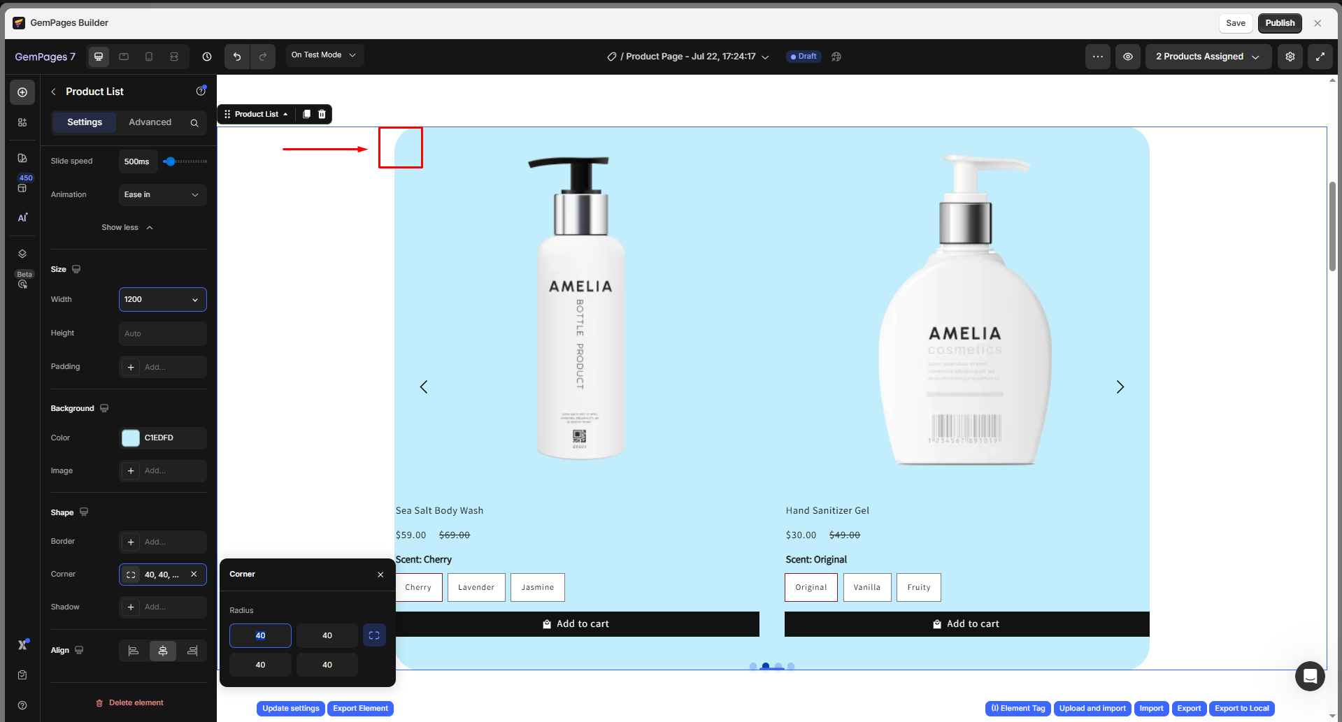
Use the predefined layout buttons to quickly apply consistent values across all corners or reset to the default.
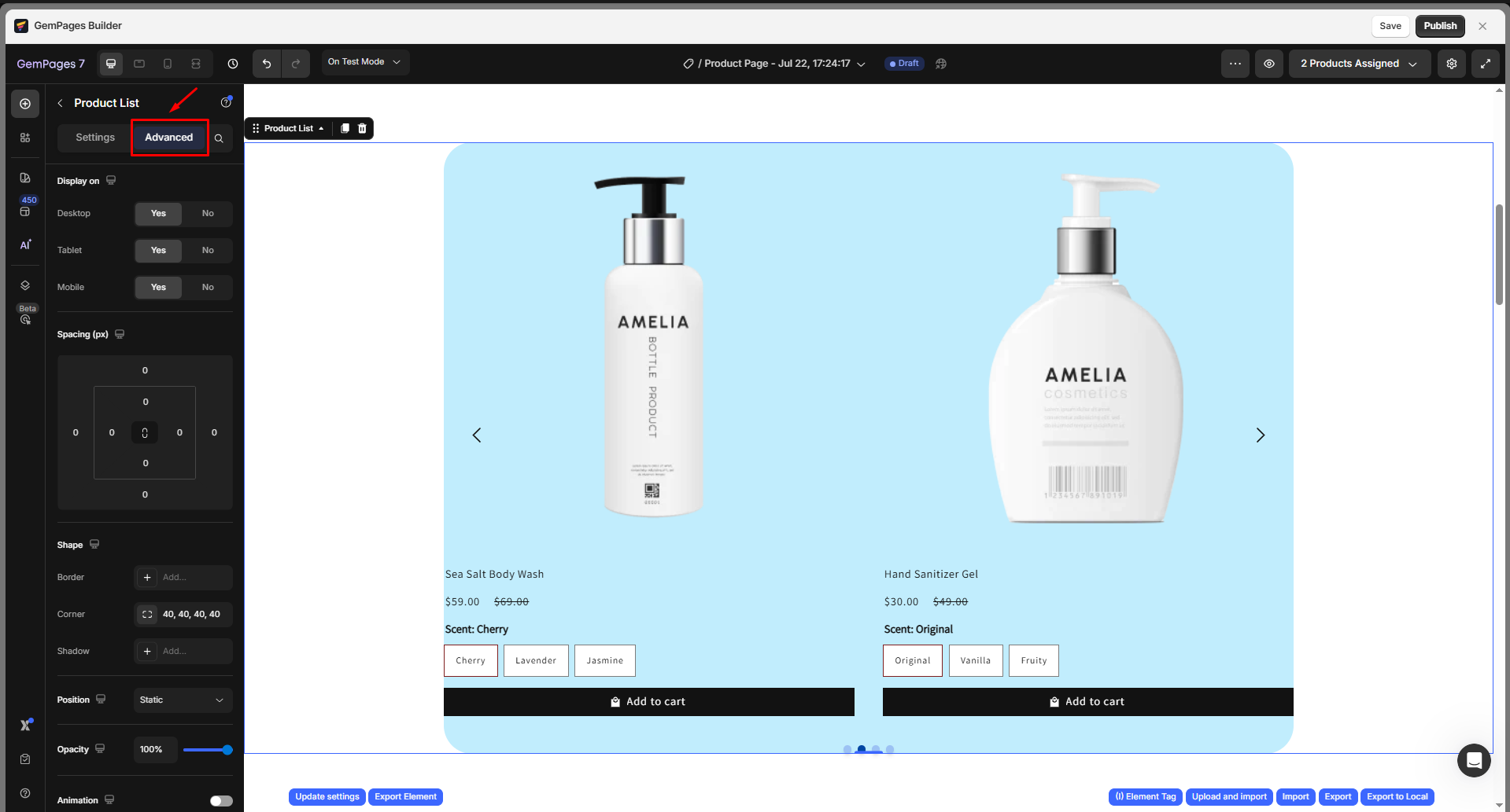
Configure the Advanced Tab
For more advanced customization, please navigate to the Advanced tab and follow the instructions in this article.
FAQs
1. Can I display different products for different pages?
Yes. You can manually select specific products or collections per page using the “Multiple Products” or “A Collection” options in the Product List settings.
2. How do I show the product list in 2 columns on mobile?
Click the device icon next to the “Products per Row” slider > switch to Mobile view, then set the number to 2.
3. Why is my product list showing blank or no products?
This may happen if:
- The linked Shopify collection is empty or unpublished.
- The selected products are out of stock and hidden from the storefront.
- You’re previewing a product-specific page using the wrong product handle.
- Double-check your Shopify settings and preview context.
4. Can I filter products inside the Product List element?
No. The Product List element does not support live filtering or smart filters. If you’re using Smart Product Filter & Search, it will replace the product list with its own output.
5. Is it possible to style the product cards inside the list?
Yes. You can style product titles, prices, buttons, spacing, and layout using the Advanced tab and individual block settings within the Product List.
6. Can I use the same product list element across multiple pages?
Each Product List element is unique to its page. However, you can duplicate a page or save it as a template if you want to reuse the setup on other pages.
7. Can I use GemPages Product List with Smart Product Filter & Search?
No. The Smart Product Filter & Search app generates its own product list and filter structure. Therefore, it is not compatible with the Product List element in GemPages.
8. Why isn’t my product list showing on the homepage?
- Make sure your GemPages homepage is set as Default. If not, Shopify will continue displaying the theme’s homepage instead.
- Ensure the homepage is published, not just saved.
- If you’re using Collection as the product source:
- The collection is published in Shopify.
- The collection contains products that are visible on the Online Store.
- If you’re using Products as the product source:
- At least one product is selected in the Product List settings.
9. Can I change the product order in the Product List element?
Yes, if you select Products (manual pick), you can arrange the product order as you like; however, if you use Collection as the source, the order follows the collection’s default sorting.


Thank you for your comments