


Why Preview on Different Devices?
GemPages is designed with responsive principles, so your pages automatically adjust to various screen sizes, from desktops to tablets and mobile phones. However, previewing your page on each device type allows you to:
- Verify your layout looks perfect everywhere
- Identify and fix any design issues specific to certain screen sizes
- Optimize the user experience for desktop, tablet, and mobile visitors
How to Preview Your Page on Different Devices?
With GemPages, you can easily preview and optimize your page for Desktop, Tablet, and Mobile. Here’s how:
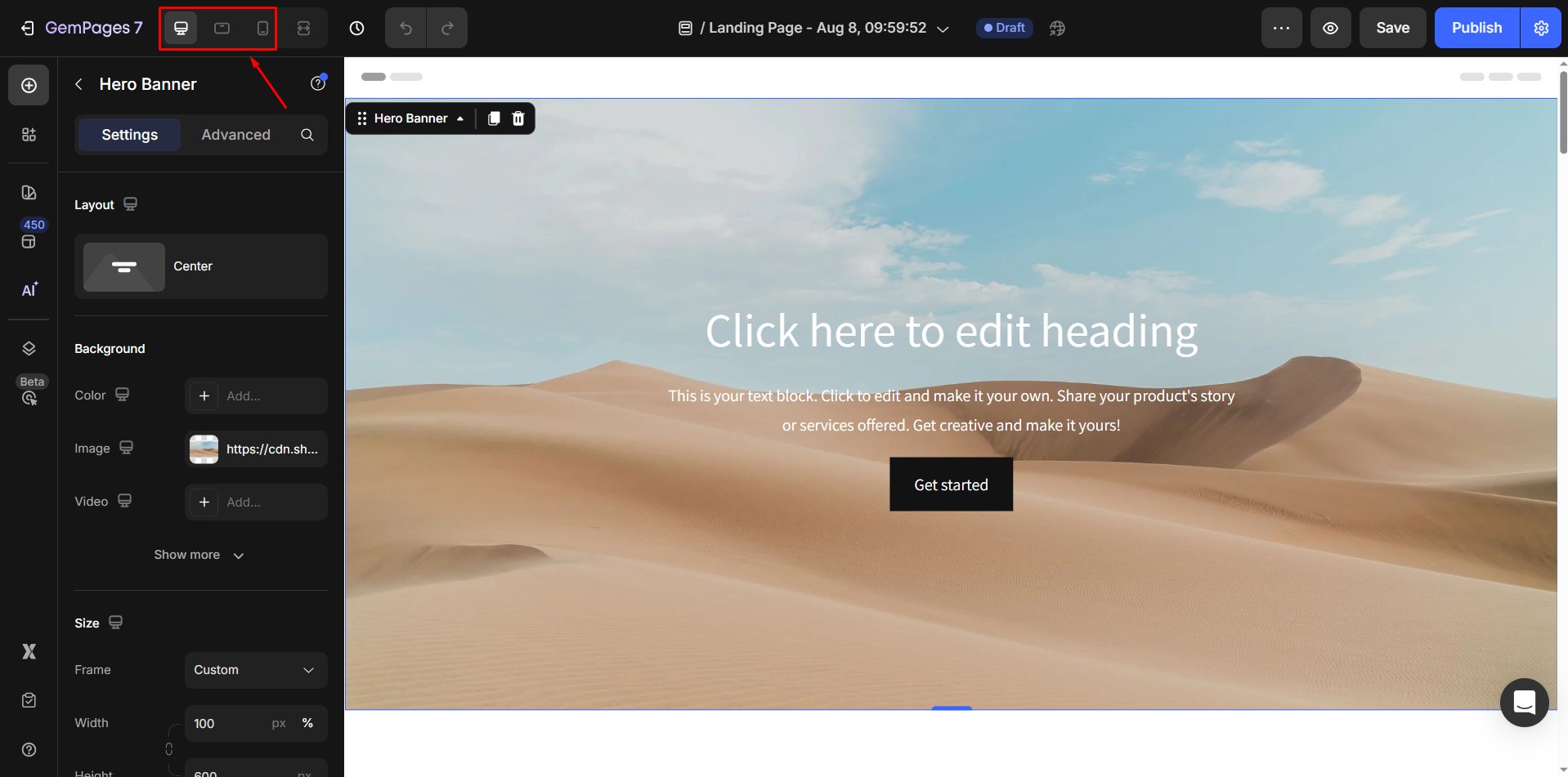
Step 1: Select the page you want to preview or edit. Click on it to open the GemPages Editor.
Step 2: Use the responsive preview tool
GemPages provides built-in tools to preview your page on multiple devices: Desktop, Tablet, and Mobile.
Look at the top bar in the GemPages editor. You will find desktop, tablet, and mobile icons:
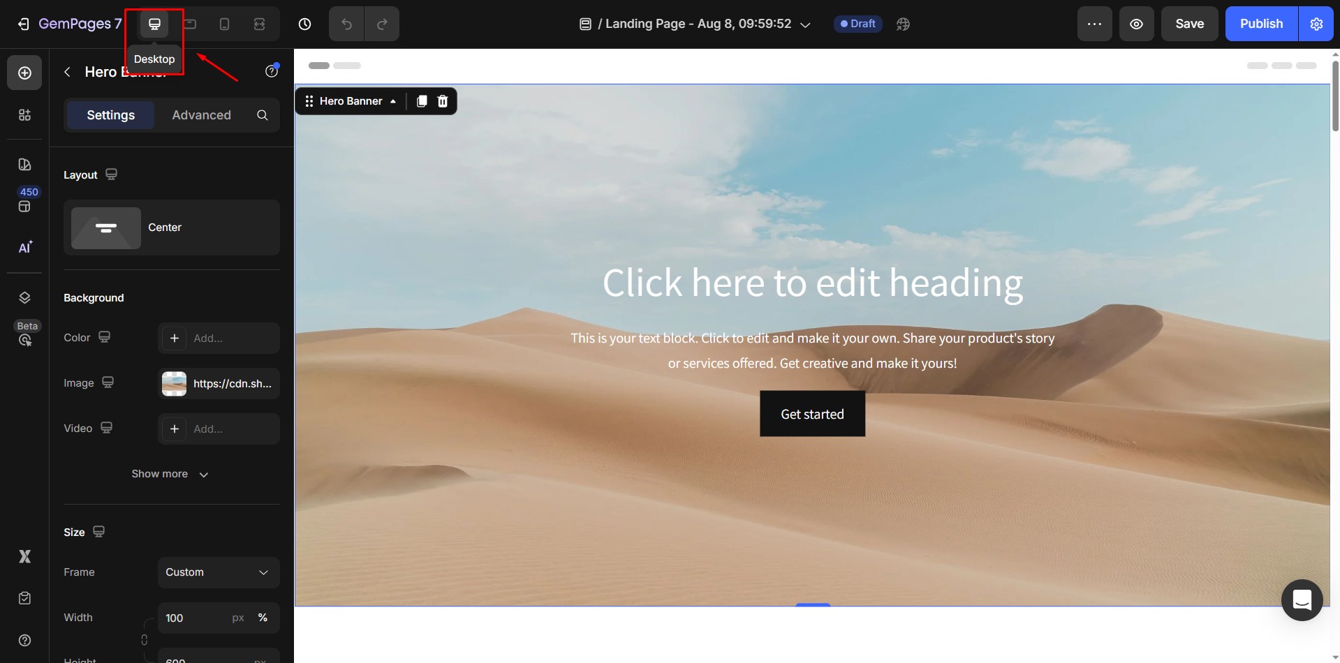
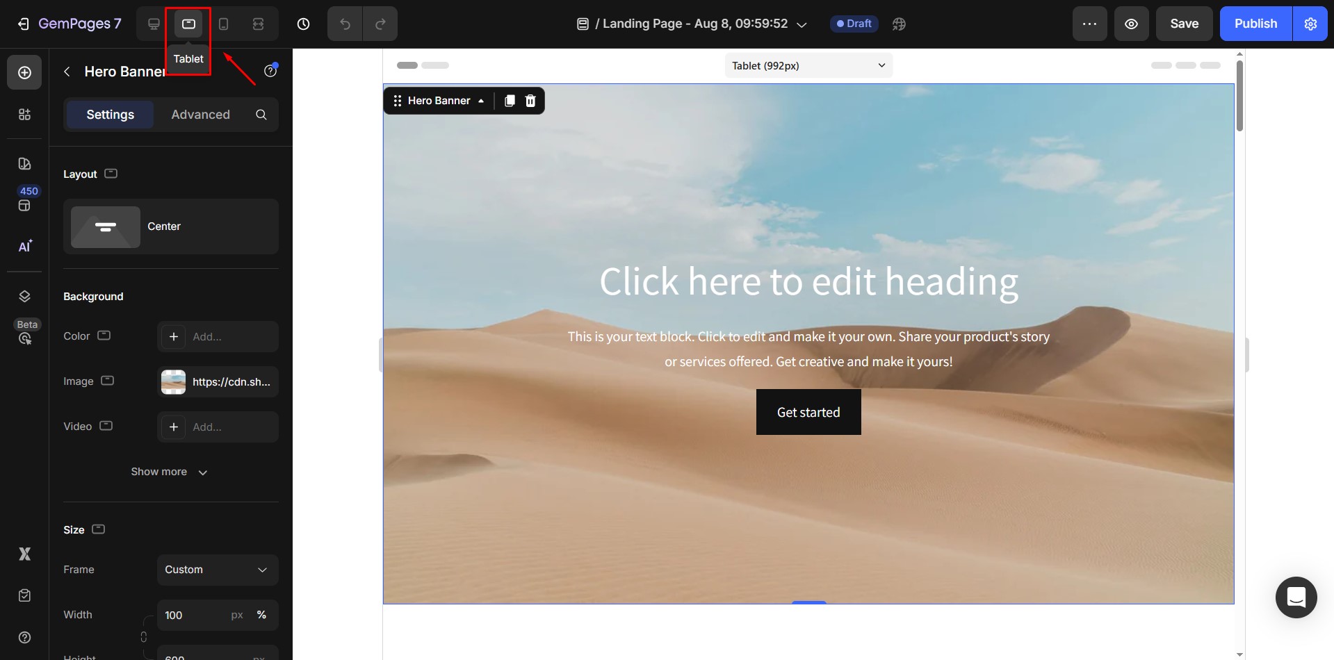
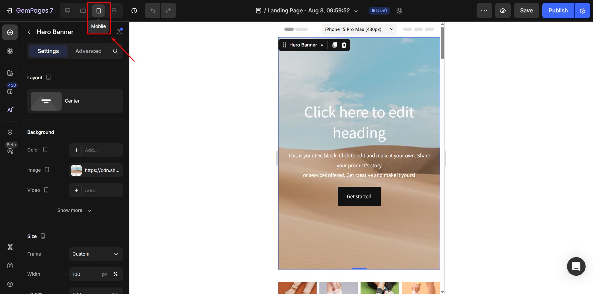
Step 3: Click on the desired device icon to switch to the preview mode.
- Desktop: See how your page looks on larger screens.
- Tablet: Test layouts for medium-sized screens like iPads.
- Mobile: Preview the page as it appears on mobile phones.
Step 4: Adjust the design for each device.
GemPages allows you to customize the layout for specific devices. Use the Settings or the Advanced Tab to make adjustments tailored for each screen size.
For more information, refer to these articles:
How to optimize the design for mobile which is not impacted to desktop?


Thank you for your comments