By default, Shopify themes often include top padding or margin beneath the header to ensure content doesn’t clash with the navigation bar. However, when using a visual editor like GemPages, this default spacing can result in:
- Unwanted white space at the top of your page
- A layout that looks misaligned or disconnected
- A less polished user experience
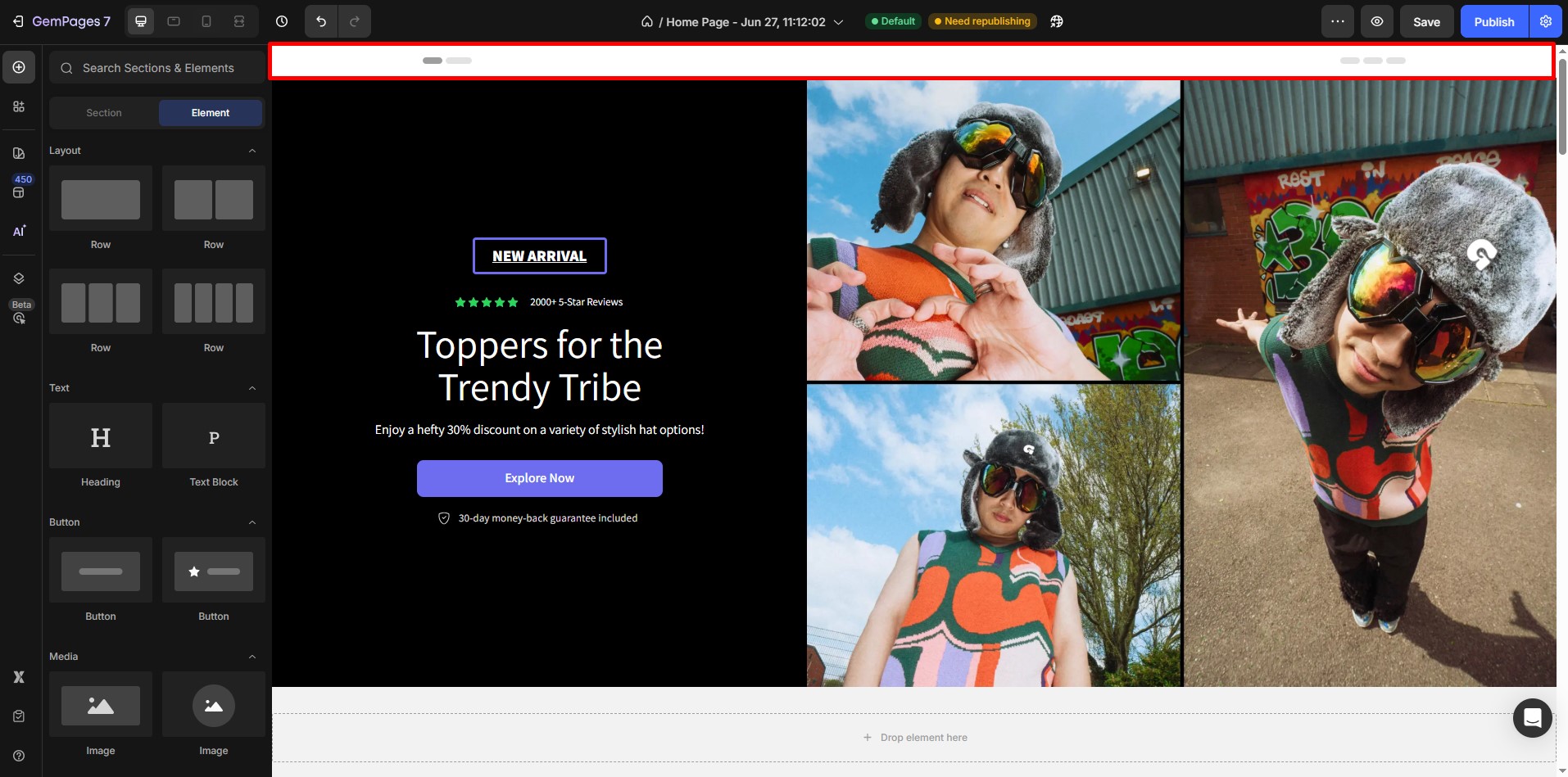
How to Remove Spacing Gaps Between Theme Header & Page Content
The most effective way to remove these gaps is by using Negative Margins. Here’s how you can do it:
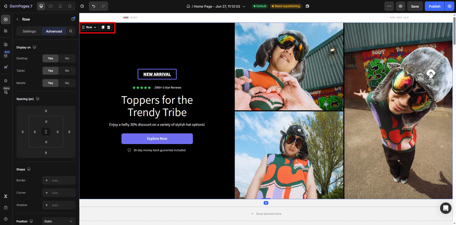
Step 1: Select the Element You Want to Adjust
Identify the element (e.g., a section or the first row of the page content) that needs adjustment to close the gap.
Click on the element to access its settings.
Step 2: Open the Left Sidebar Settings
Once the element is selected, the Left Sidebar Settings will display configuration options for the element.
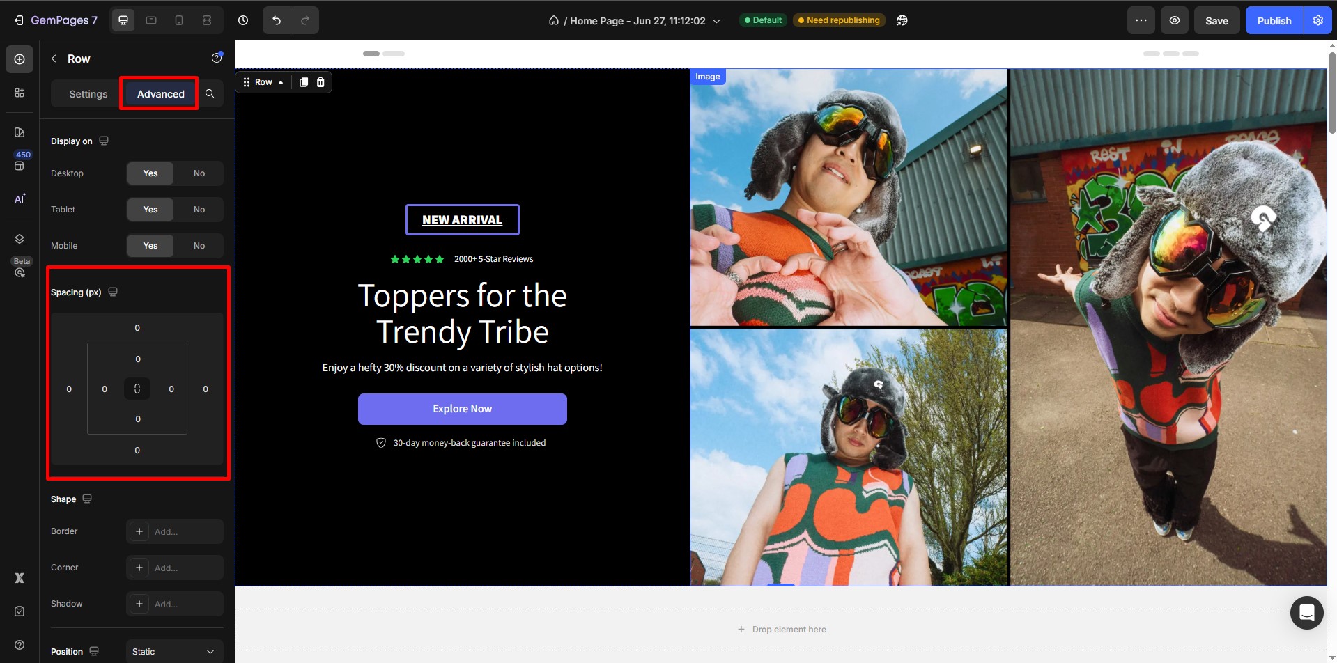
Step 3: Navigate to the Advanced Tab
Within the sidebar, locate and open the Advanced Tab.
Look for the Margin Settings in this section.
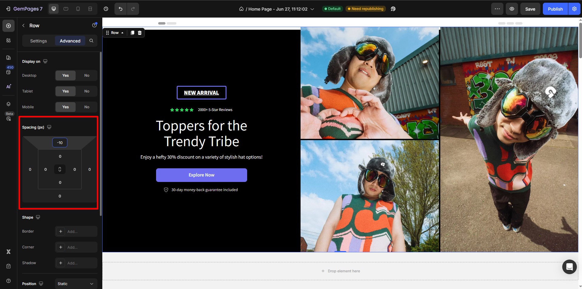
Step 4: Apply a Negative Margin
Adjust the margin value to a negative number, such as -30px.
This effectively pulls the page content upward, reducing or eliminating the gap between the header and content.
Test different negative margin values to find the one that best suits your layout.
By following these steps, you can easily remove the unnecessary spacing between your theme’s header and page content, resulting in a cleaner, more professional design that aligns with your aesthetic goals.


Thank you for your comments