


What is Global Styles?
Global Styles is an important feature in GemPages that helps you keep a consistent look across sections and elements on your website. As you create more pages, maintaining a unified design can become challenging. With Global Styles, you can save time and ensure your site looks polished and professional.
In Version 7, this feature has been simplified. While Version 6 included multiple presets, Version 7 offers just one preset. However, you can still define specific styles—like default font, colors, and spacing—and apply them to your pages. Any changes you make will automatically update across all linked pages once you confirm them.
How to Access the Global Styles
Step 1: From the GemPages Dashboard, select your preferred template to access the Editor.
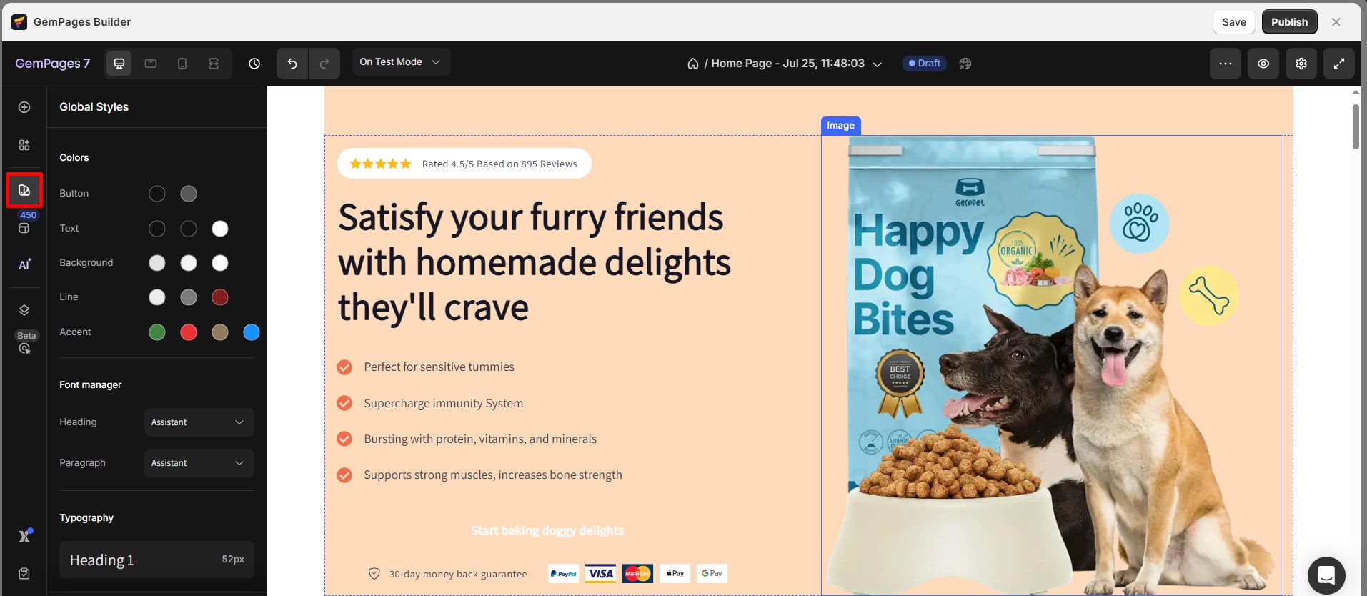
Step 2: Within the Editor’s left sidebar, click on the second icon to access the Global Styles.
How to Customize Global Styles?
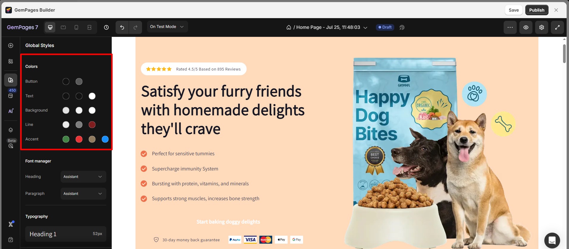
Colors
Global Styles supports 15 global colors divided into 5 categories:
- Button color
- Text Color
- Background Color
- Line Color
- Accent Color
These colors will be generated from your published theme. To replace the existing color, click on it and choose another one from the palette.
What each color option affects:
- Button Color: Applies to all buttons built with the Button element (e.g., Add to Cart, CTA buttons). It controls the main fill color and hover state if defined.
- Text Color: Sets the default font color for headings, paragraphs, and other text-based elements.
- Background Color: Set a preset background color for supported elements, including Carousel, Custom Code, Popup, Icon, Product List (dot color), Countdown Timer, Hero Banner, Icon List, Advanced List, Marquee, Bundle Discount, and Product Custom Field.
- Line Color: Affects the color of divider lines, borders, and separators across your layout.
- Accent Color: Used for highlights or interactive elements such as links, icons, and hover effects.
To change a color, click on the color box and select a new shade from the palette. Any changes will automatically apply to all elements linked to these global color variables.
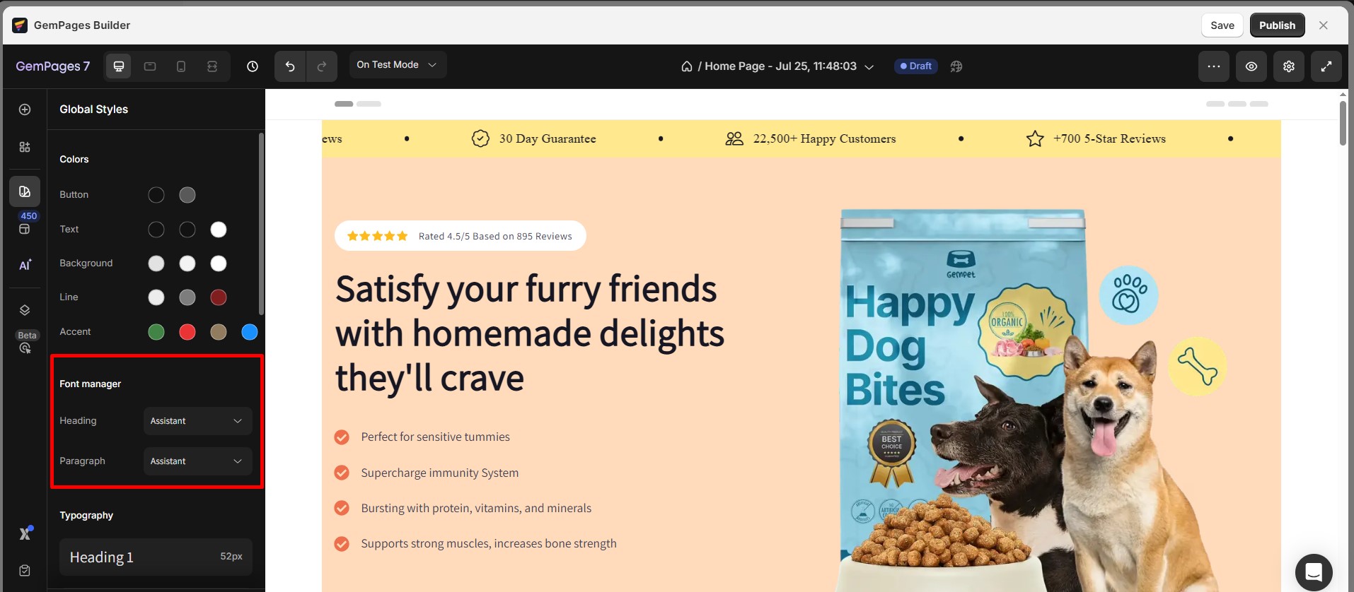
Font Manager
Global Styles provides two types of text styles, namely Heading and Paragraph. You can select your preferred option from the drop-down menu, and the font used is taken from Google Fonts.
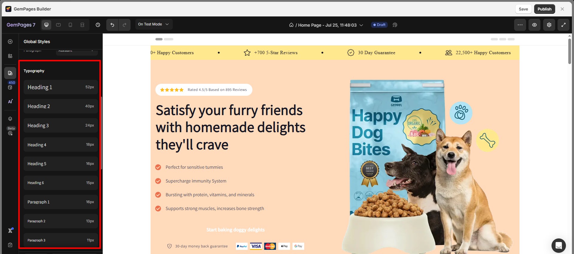
Typography
GemPages supports 6 types of Headings and 3 types of Paragraphs. In the element settings, all settings related to text styles will be selected from these Global typography settings.
When you install GemPages, it will synchronize the global typography with text styles from your themes. The typography information synced from your Shopify theme includes Font Family, Font-size, Line Height, Font Weight, Font Style, and Letter Spacing.
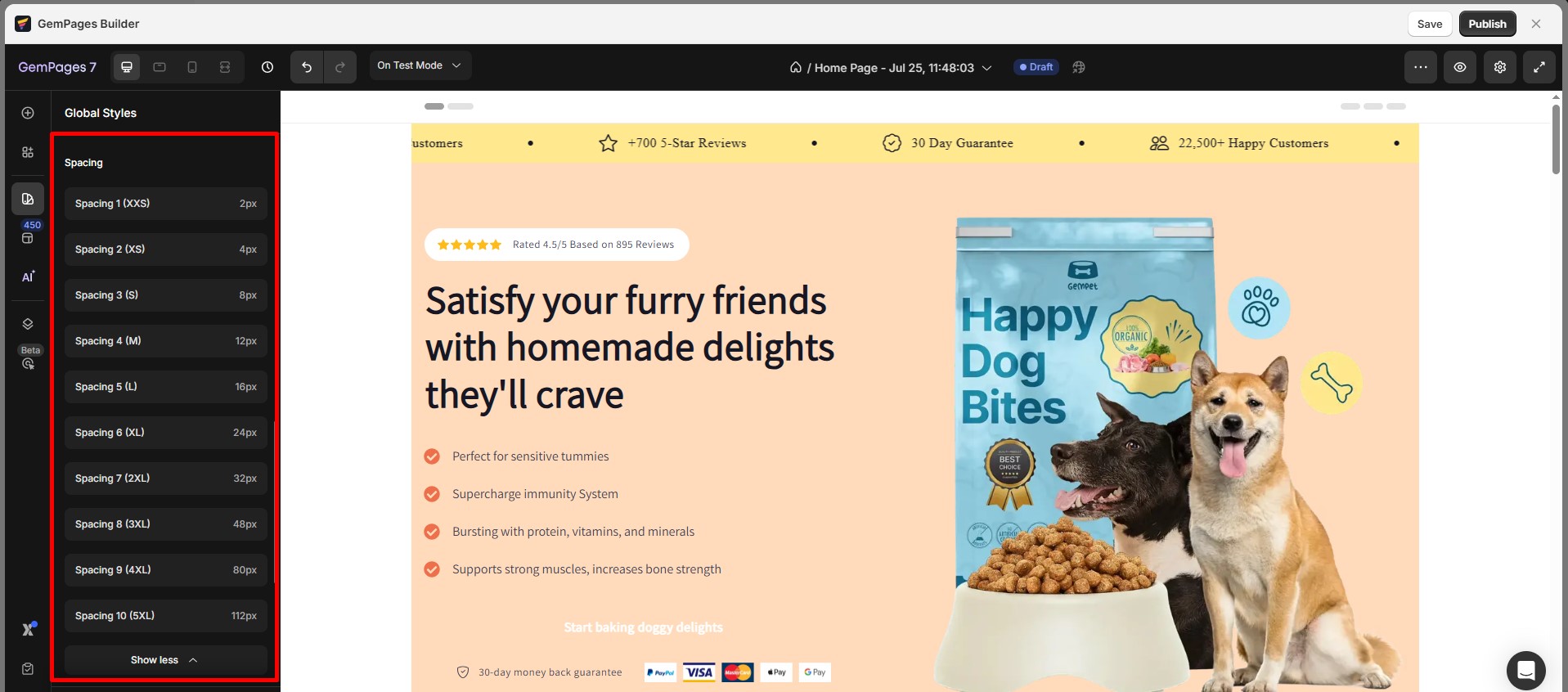
Spacing
GemPages allows you to synchronize spacing on your website by configuring global spacing values. There are 10 types of global spacing available, each of which can be customized with values for three devices: Desktop, Tablet, and Mobile.
The default unit for global spacing is pixels (px). Global spacing can be used for configuring margin, padding, item spacing, or column gaps.
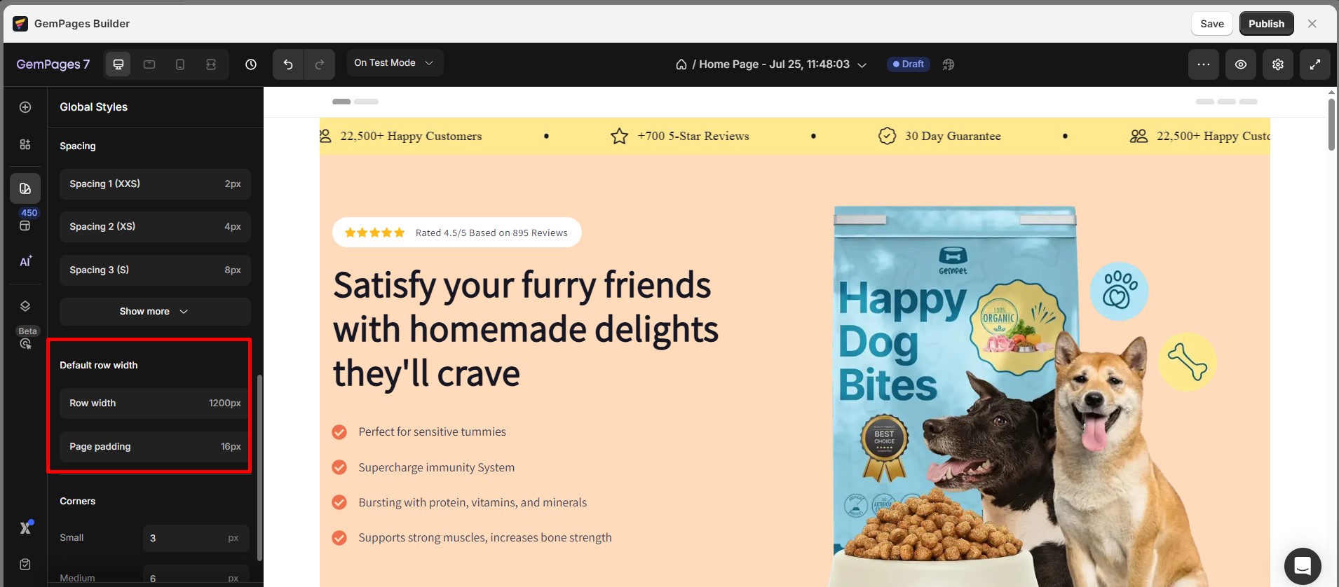
Default Row Width
About Default Row Width
A page usually consists of multiple sections, each of which requires a distinct style. For instance, sections like Hero Banner usually have backgrounds, and you may prefer to set them to full width. However, other sections have a fixed width to maintain the layout and center the content on the screen. Thus, a universal value is required to automatically adjust the width of such sections.
How to use
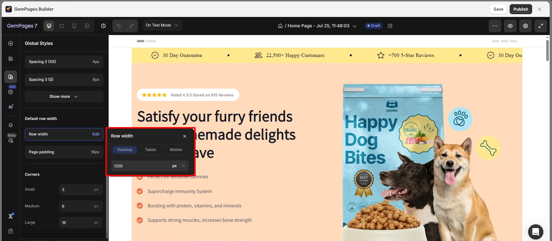
- Row Width
GemPages sets the default width value to 1200px for Desktop and 100% for Tablet and Mobile, which is suitable for all current templates. You don’t need to make any adjustments as GemPages will automatically apply this value.
However, if you prefer a different width value, you can enter a number in the box. For instance, if you enter 1000px, the default width for non-full-width sections/rows will be 1000px.
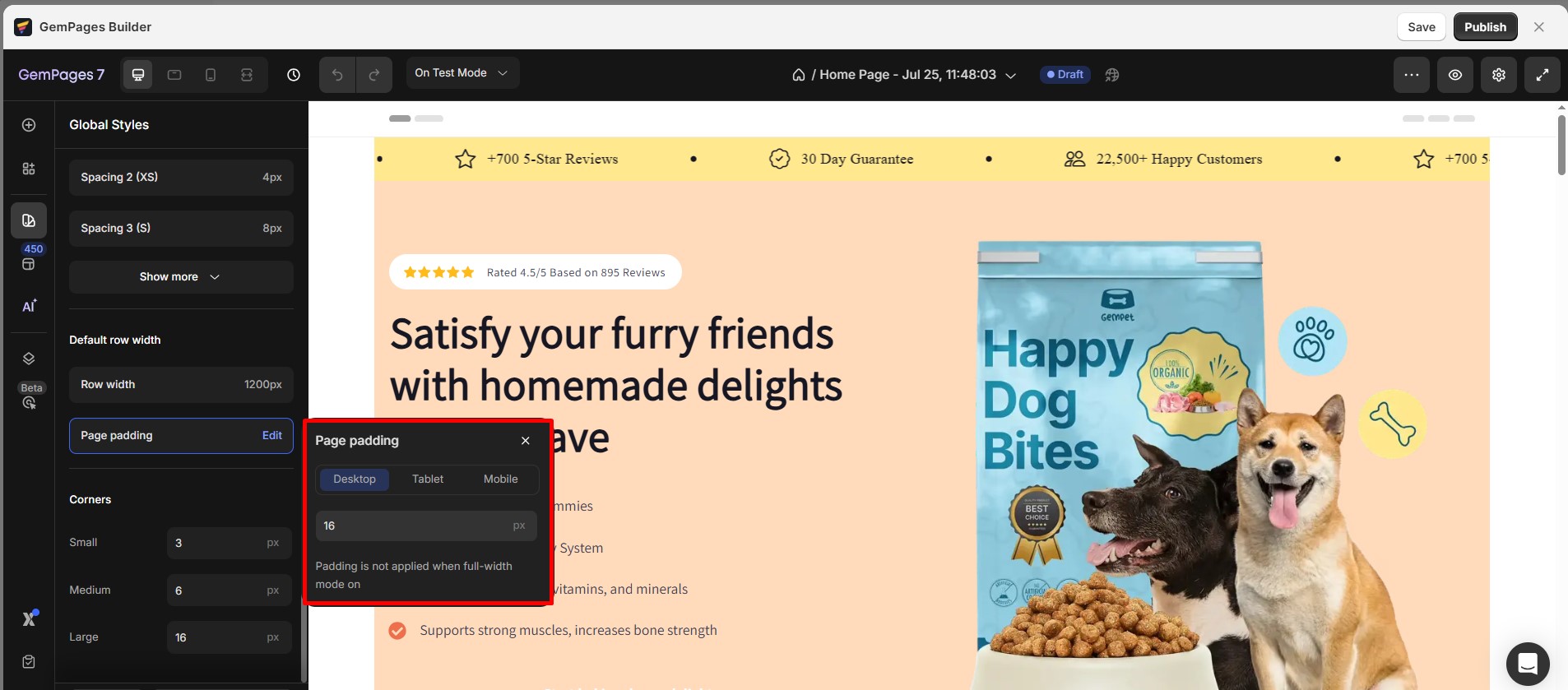
- Page Padding
Enter a number for your preferred padding for sections/ rows. Please note that this padding will not be applicable for full-width sections/rows.
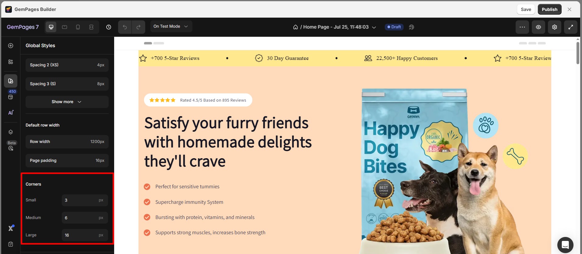
Corners
GemPages allows you to synchronize the corners used on your website by configuring a global corner value. You can define three corner styles: Small, Medium, and Large. Simply click on the pencil icon to input the value in pixels.
FAQs
Can I disable Global Styles in GemPages?
- Select the element in the Editor
- Manually set its color, font, spacing, or border values in the element’s Settings tab


Thank you for your comments