


About the Product Badge Element
GemPages’ Product Badge element is designed to emphasize key details about a product, such as labeling a new arrival or showcasing a promotion directly on the featured image.
With this element, you can gain multiple advantages for your eCommerce store:
- Enhanced Visibility: Increase product visibility by making particular items stand out, ensuring they capture customers’ attention.
- Increased Brand Trust: Boost credibility with badges like “Top Rated” or “Customer Favorite”, showcasing positive reviews and endorsements to build trust with buyers.
- Encouraged Action: Create urgency with badges like “Only 2 Left!” or “Ending Soon,” prompting customers to act quickly and complete their purchases.
- Tested Pricing Strategy: Experiment and determine the most effective pricing strategy for each item by offering different discounts for every product.
- Enhanced Inventory Management: Sell slow-moving or excess items more quickly, cutting storage costs and making room for new stock with badges like “Stock Clearance” or “Inventory Reduction”.
- Targeted Promotion: Set different discounts for various product categories, inventory levels, or sales goals. Badges like “Category Sale”, “Seasonal Promotion”, or “Weekly Deal” make it easier to create promotions that match their business needs.
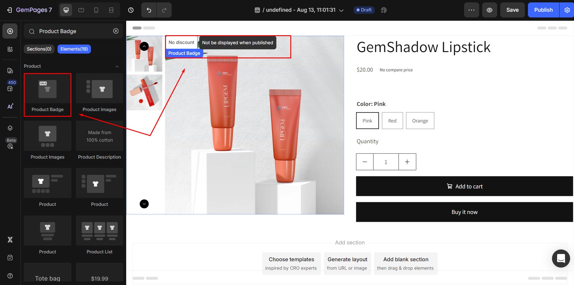
How to Add the Product Badge Element
Step 1: Open your GemPages editor and locate the Product Badge Element in the search bar.
Step 2: Drag the element from the sidebar and drop it into your design area. You can only add the Product Badge to a Product element, Product List element, or directly on their Product Images. Badge settings may vary depending on its placement.
Step 3: You can add multiple badges to the same product. By default, badges appear in the top-left corner. If multiple badges are added, they will stack vertically. To adjust their order or visibility, use the Layer Tree feature.
Step 4: After placing your badges, click Publish to see them live. In the editor, badges are always visible for easier adjustments, but they only appear on the live page if they meet the display conditions you set.
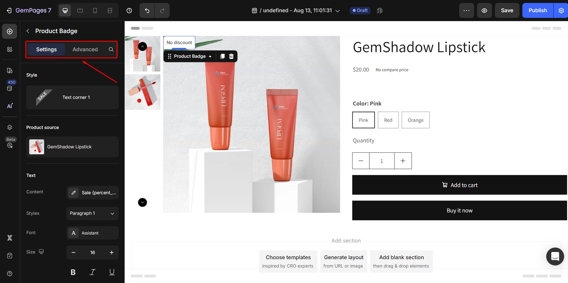
To access badge settings, click on the element. The left sidebar will show two tabs: Settings and Advanced:
Configure the Settings Tab
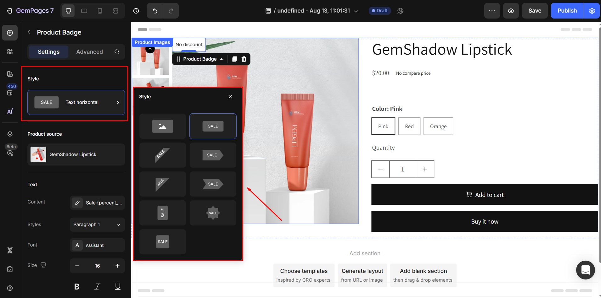
1. Style
Choose the badge style that fits your design. Available options include:
- Image
- Text Horizontal
- Text Corner 1
- Text Ribbon 1
- Text Corner 2
- Text Ribbon 2
- Text Vertical
- Text Star
- Text Square
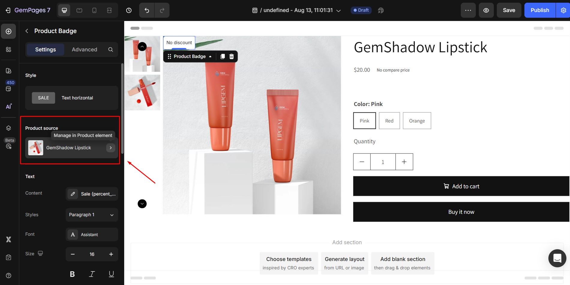
2. Product Source
The Product Source shows which product the badge is displaying information from. To change the product, click Product Picker in the product module and select the desired item.
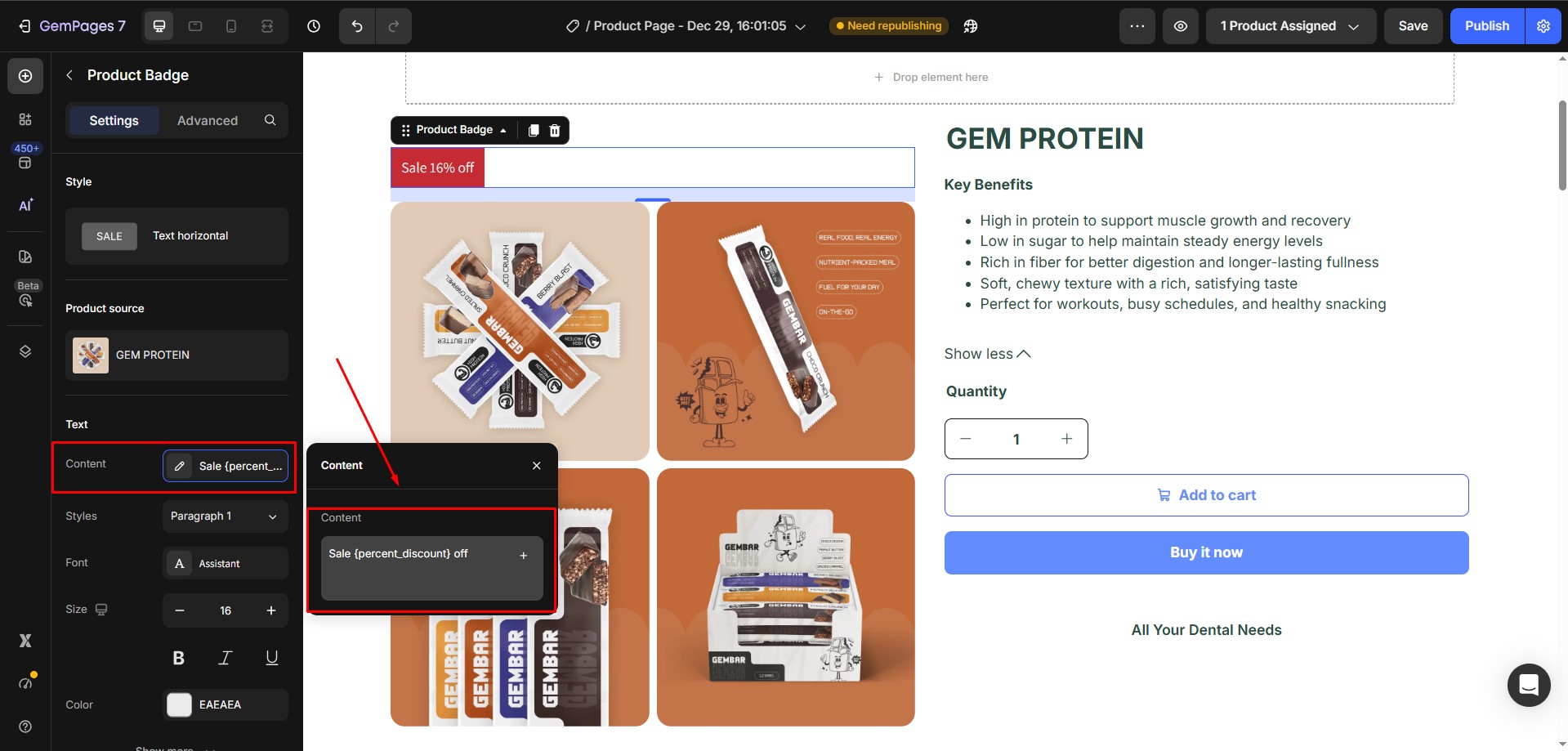
3. Text
Text settings are available for styles that display text content.
- Default Text Style: Paragraph 1
- Default Color: FFFFFF (white)
In GemPages, editing text content requires opening a popover. You can:
- Enter long text with line breaks.
- Use Markdown snippets to display dynamic product information from Shopify.
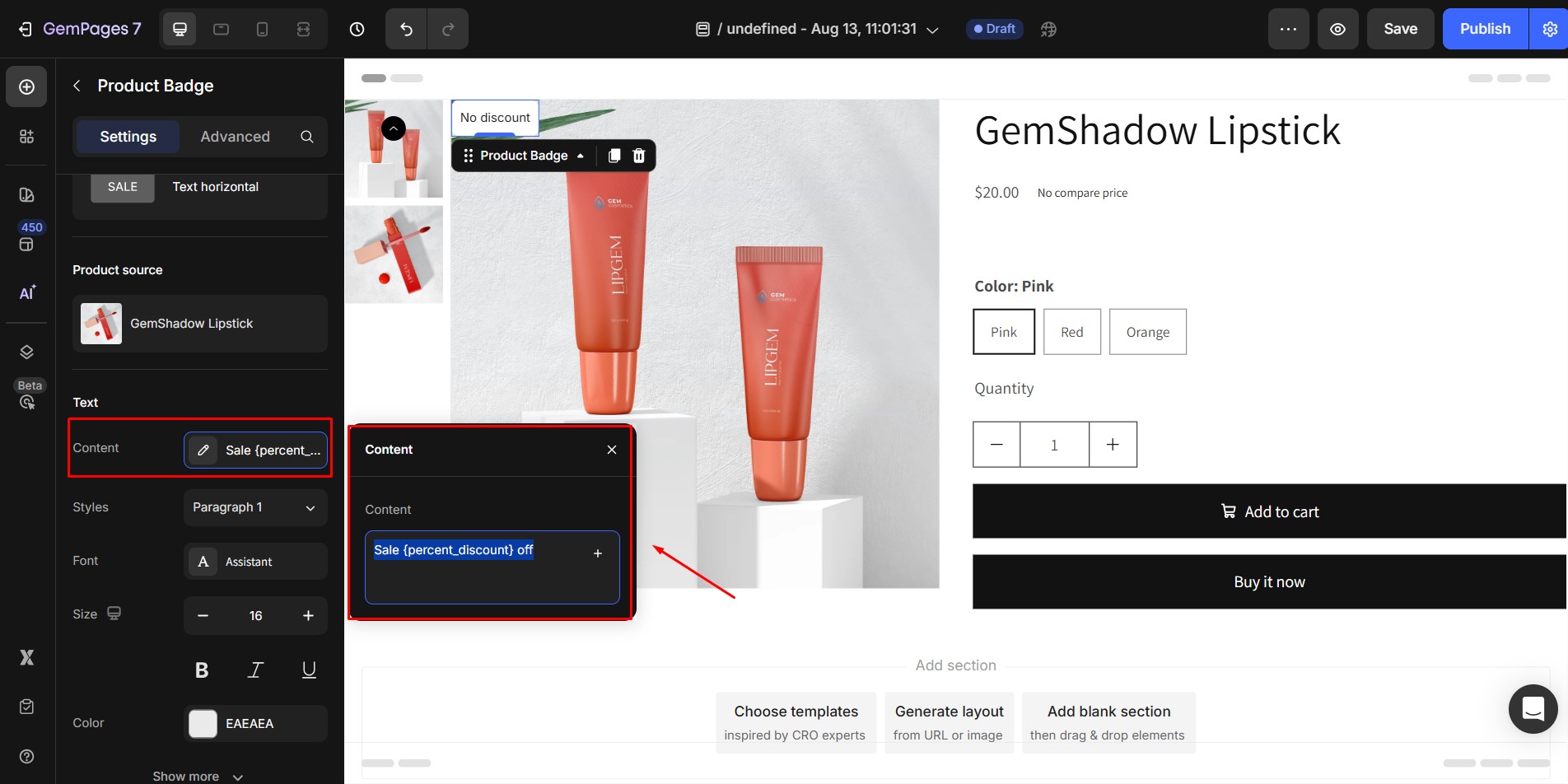
To use markdowns:
- Manually type a markdown using the correct format. Only valid formats render live data.
- Click the “+” icon inside the input field to open a list of supported markdowns.
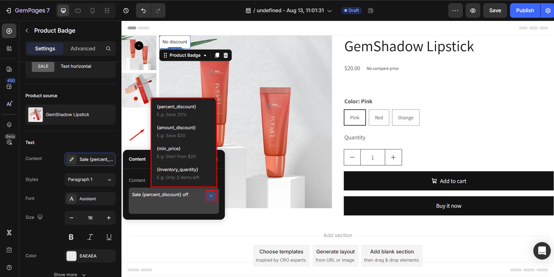
- Select a markdown from the list to insert it, or insert the same markdown multiple times.
Supported Markdown Patterns:
- {%_discount} – Shows the percentage discount.
- {amount_discount} – Displays the discount amount in your store currency.
- {product_type} – Shows the product type.
- {min_price} – Displays the lowest price among all product variants.
- {inventory_quantity} – Displays remaining inventory. This only works if Track Quantity is enabled for the product.
4. Badge Style
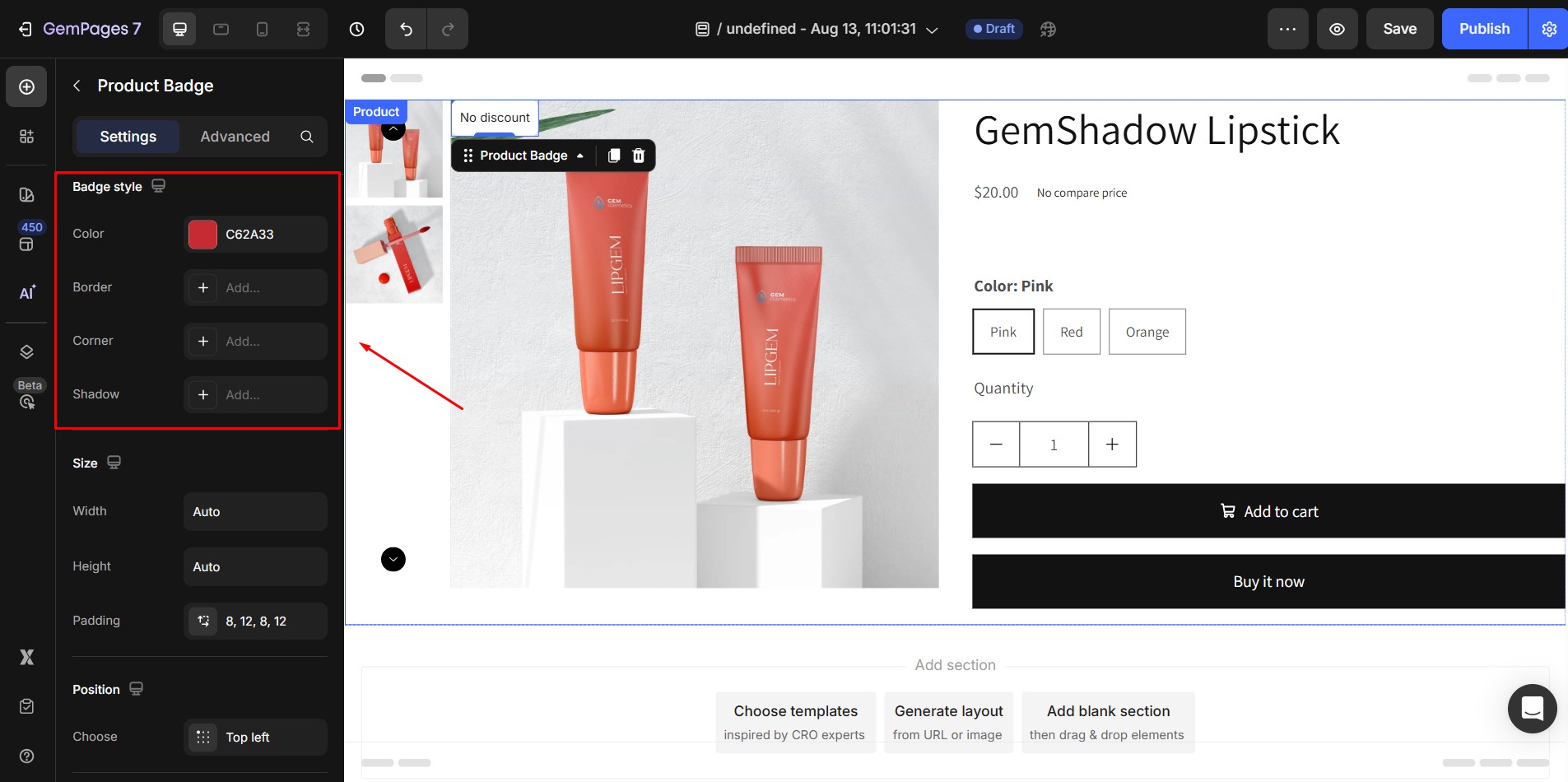
This setting allows you to adjust the shape and visual style around the text. You can customize:
- Border
- Corner
- Shadow
5. Size
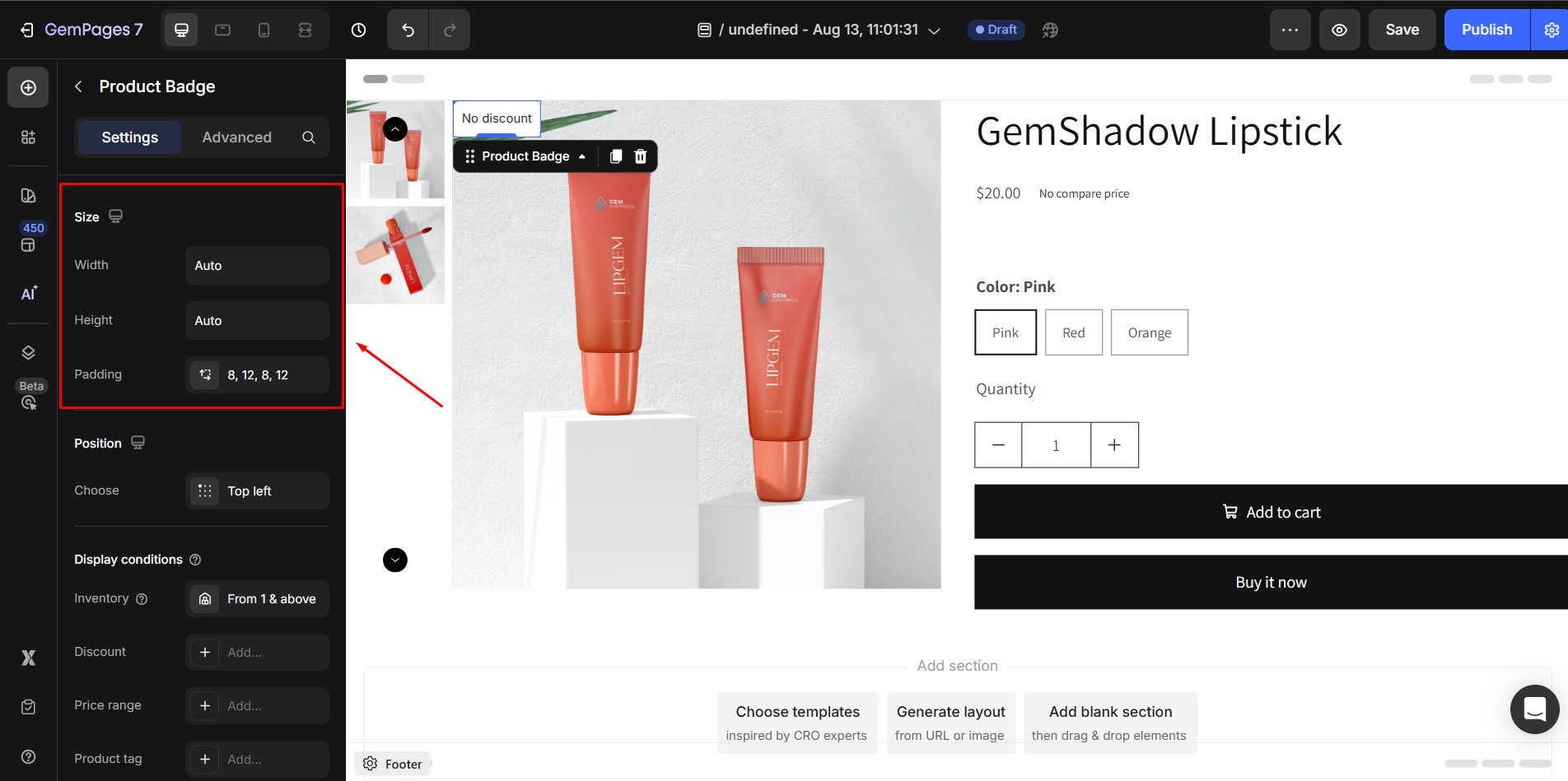
Set the Width, Height, and Padding of your badge to match your layout.
6. Position
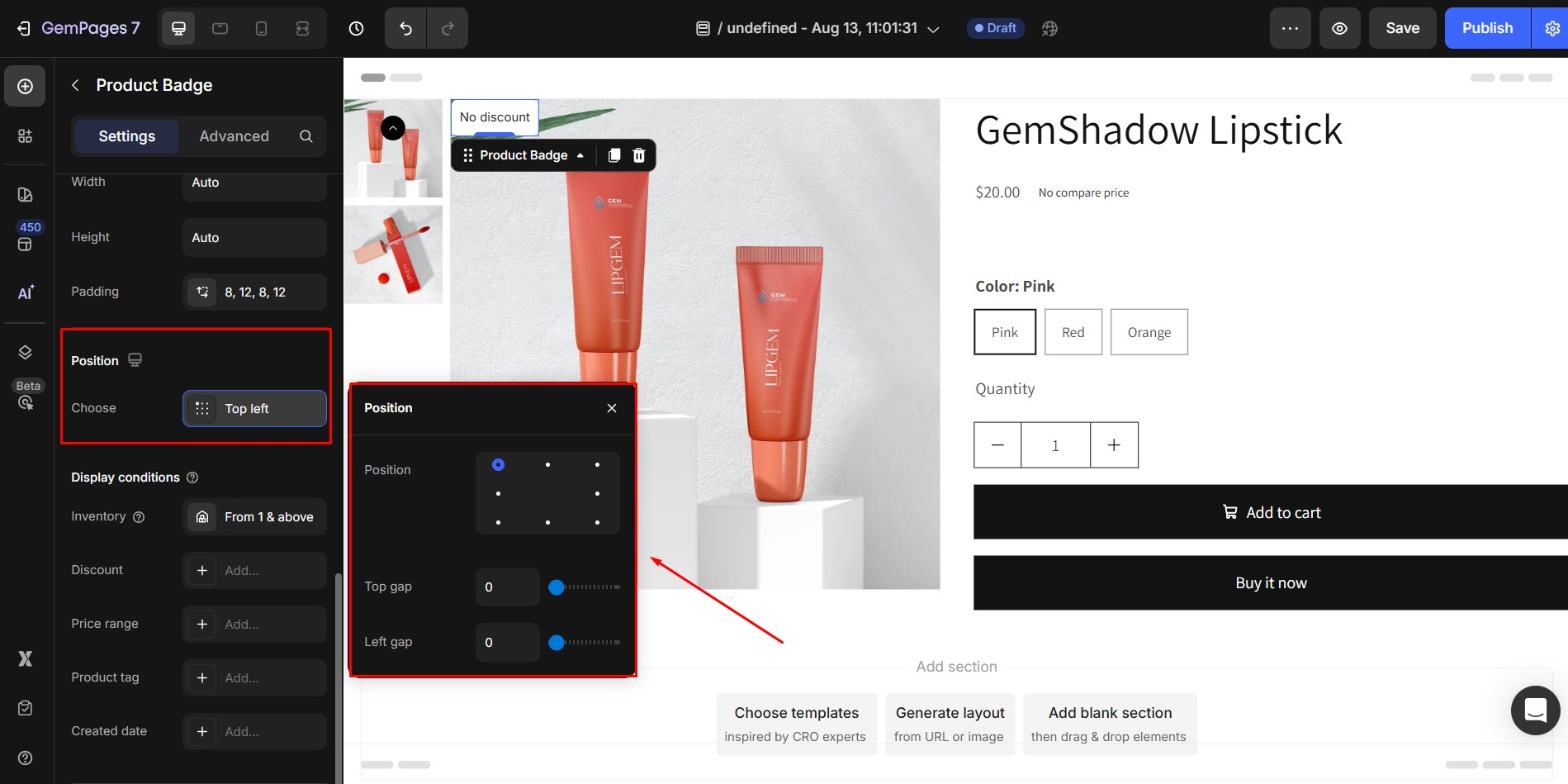
Global positioning settings apply to all badge styles. When you switch styles, your position settings are preserved.
Gap Settings:
- Depending on the badge’s position, you may adjust the spacing using a Gap Slider.
- Only integer values are allowed; negative or decimal values are not supported.
7. Image Style
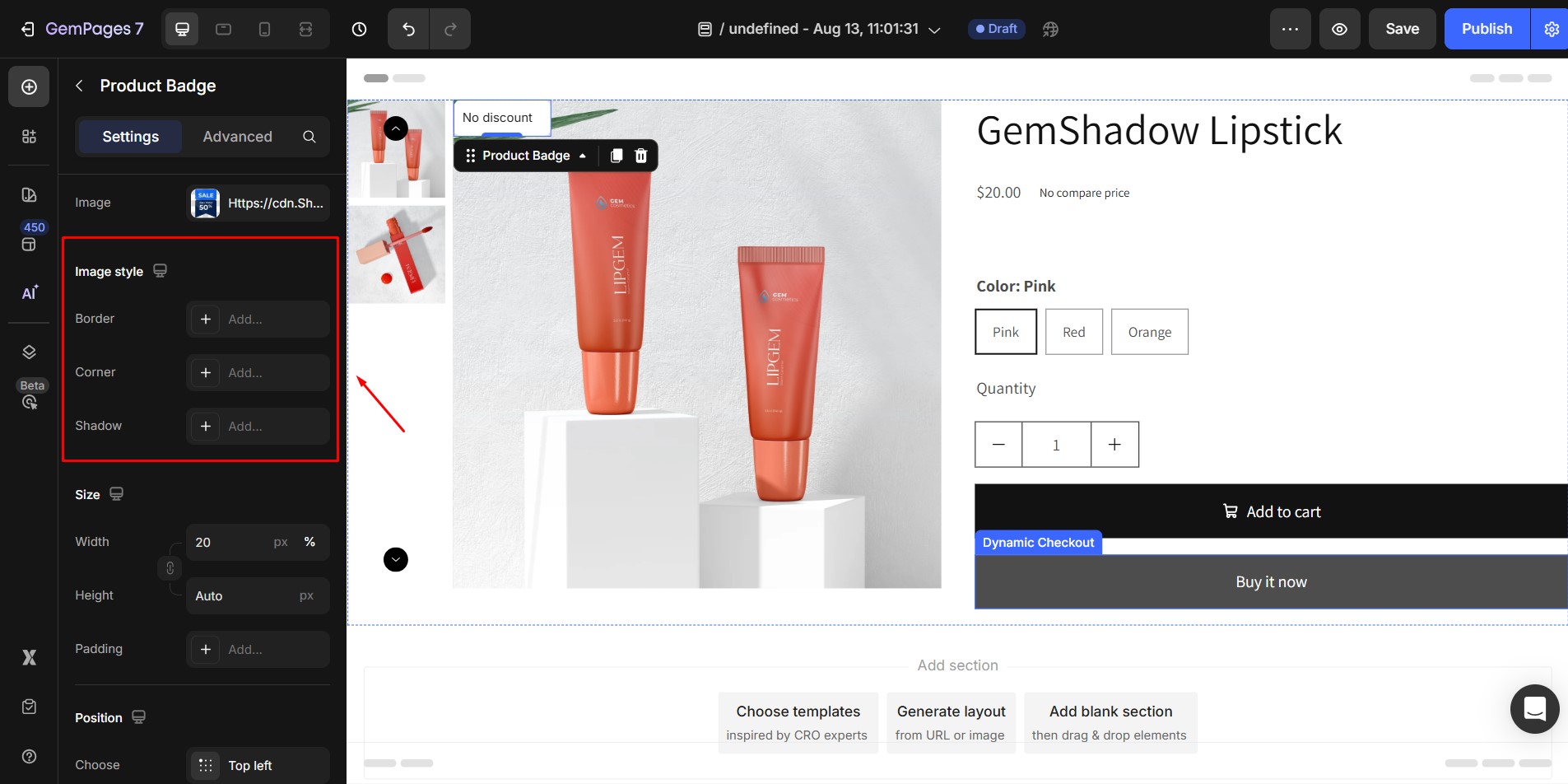
If your badge uses an image instead of text, you can customize:
- Border
- Corner
- Shadow
8. Display Conditions
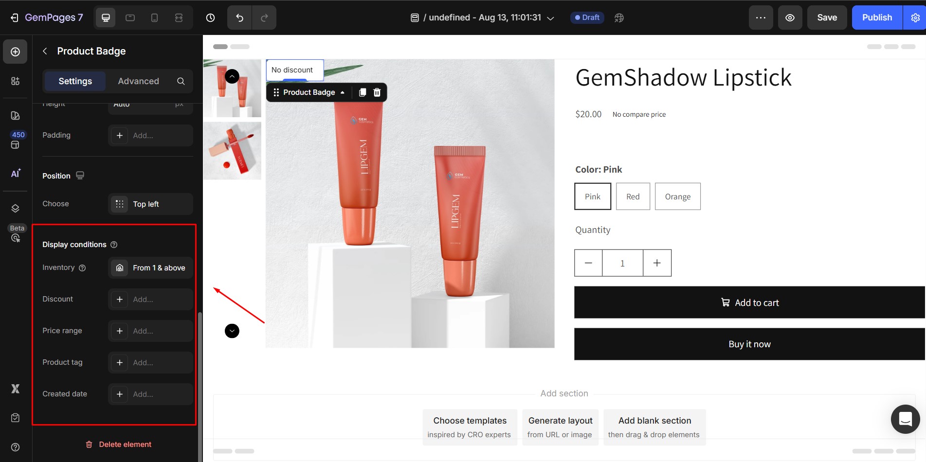
Display conditions control when a badge appears on the live page. Switches between styles retain all previously set values.
Trigger Types:
You can apply multiple triggers by clicking the ➕ icon. Available triggers include:
- Product Inventory: Required and cannot be removed. Shows when inventory matches a specified amount.
- Discount Price: Shows when the discount reaches a set percentage or amount.
- Price Range: Shows if the product price is within a specific range.
- Product Tags: Shows if the product has the selected tags.
- Created Date: Shows if the product was created within X days, on a specific date, or between two dates.
Special Condition: Inventory is the only active trigger if:
- The product is manually selected.
- Only one product is assigned in dynamic mode.
- The Product List contains a single product.
Click inside the trigger input field to open the popover and configure detailed settings for each trigger.
How to Show Discount Percentage with the Product Badge
Step 1: Select the Product Badge element that you’ve added to your page.
Step 2: In the left sidebar, open the Settings tab.
Step 3: Go to the Text section.
Step 4: Click inside the text input field to open the popover.
Step 5: Insert the {%_discount} markdown by:
- Typing it manually, or
- Clicking the “+” icon and selecting Discount (%) from the markdown list.
Step 6: Customize the text style, color, and typography as needed.
Step 7: (Optional) Adjust the Badge Style, Size, and Position to match your design.
Step 8: Click Publish to apply the changes.
Configure the Advanced Tab
For more advanced customization, please navigate to the Advanced tab and follow the instructions in this article.


Thank you for your comments