


About Article Read More Element
The Article Read More Element is designed to work within the Article List Element.
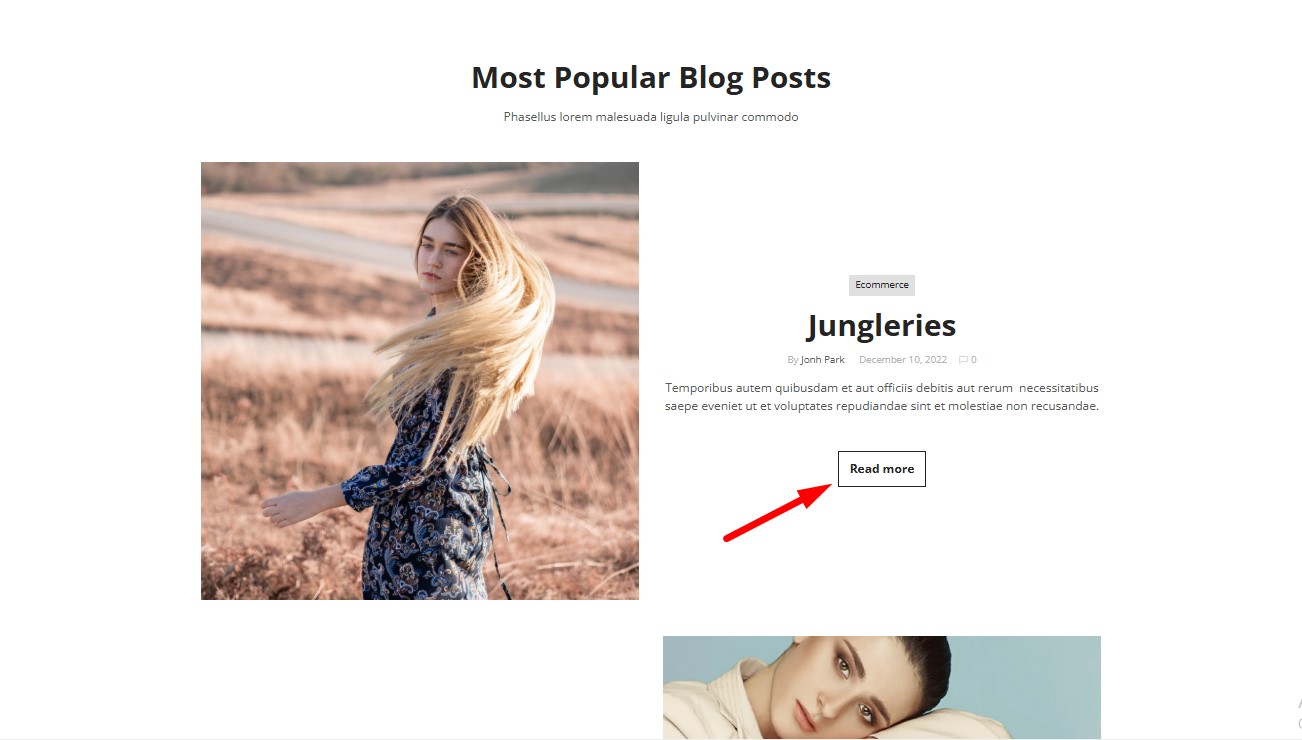
It provides a clear and user-friendly way for visitors to navigate to full articles by adding a button or link beneath article previews.
How to Add an Article Read More Element to Your Page?
Step 1: Access the GemPages Dashboard > Pages, then click on your target page to locate the editor.
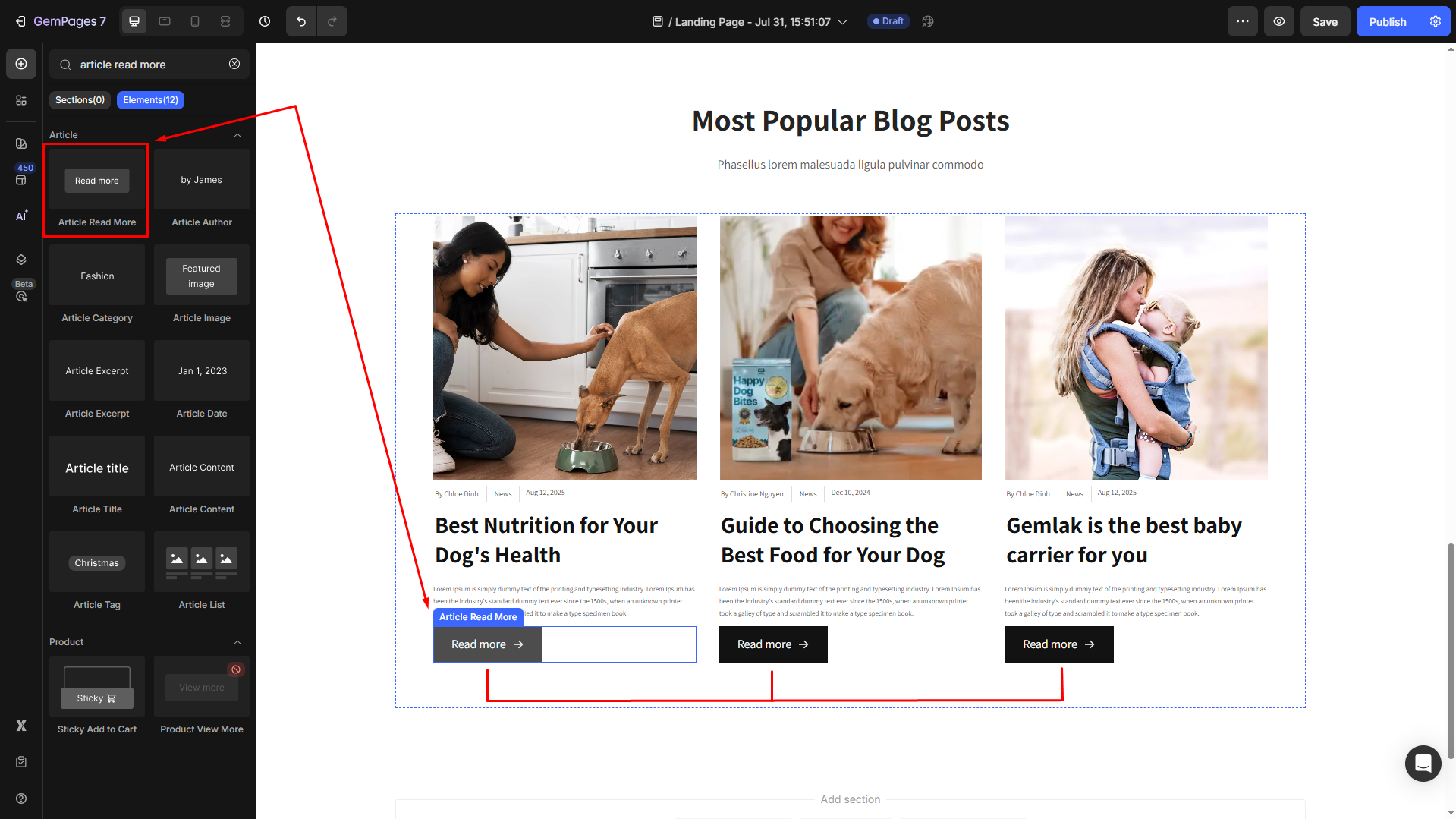
Step 2: From the left sidebar, search for the Article Read More Element and drag & drop it to the preferred position on your page.
Step 3: Click on the element to open its settings for further customization.
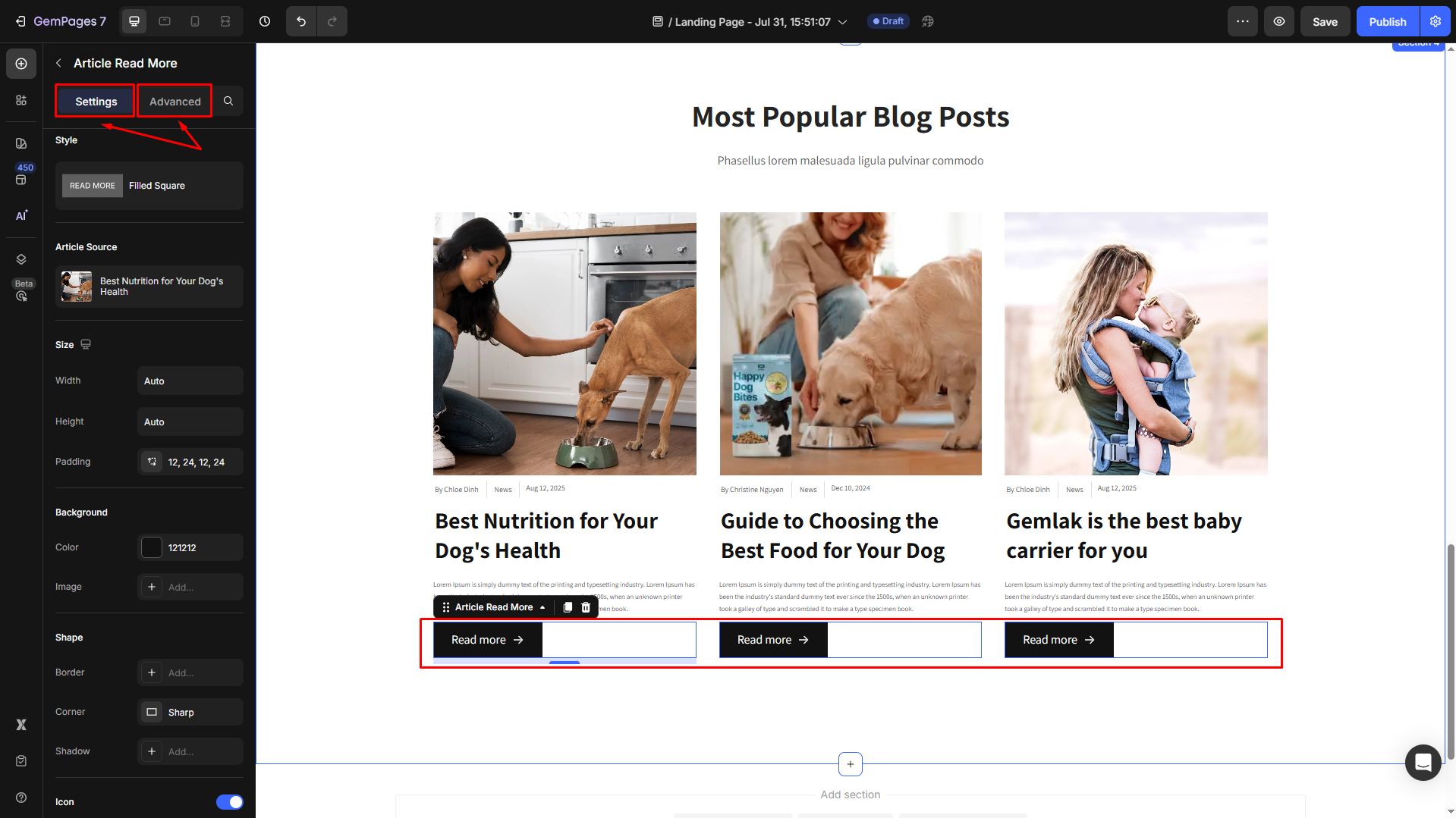
Configure the Settings tab
The Article Read More Element comes with multiple customization options to match your design and functional needs:
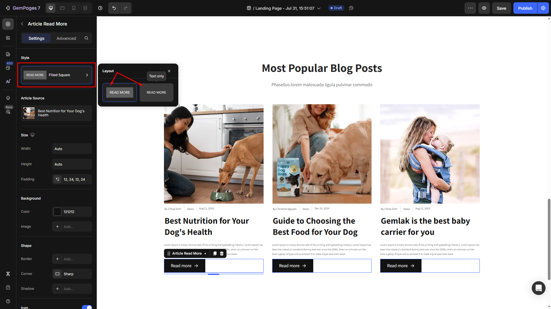
Style
Select your preferred layout for your Article Read More element: with or without filled square brackets (text only).
Article Source
Click on the box to configure the article sources in the Article List element.

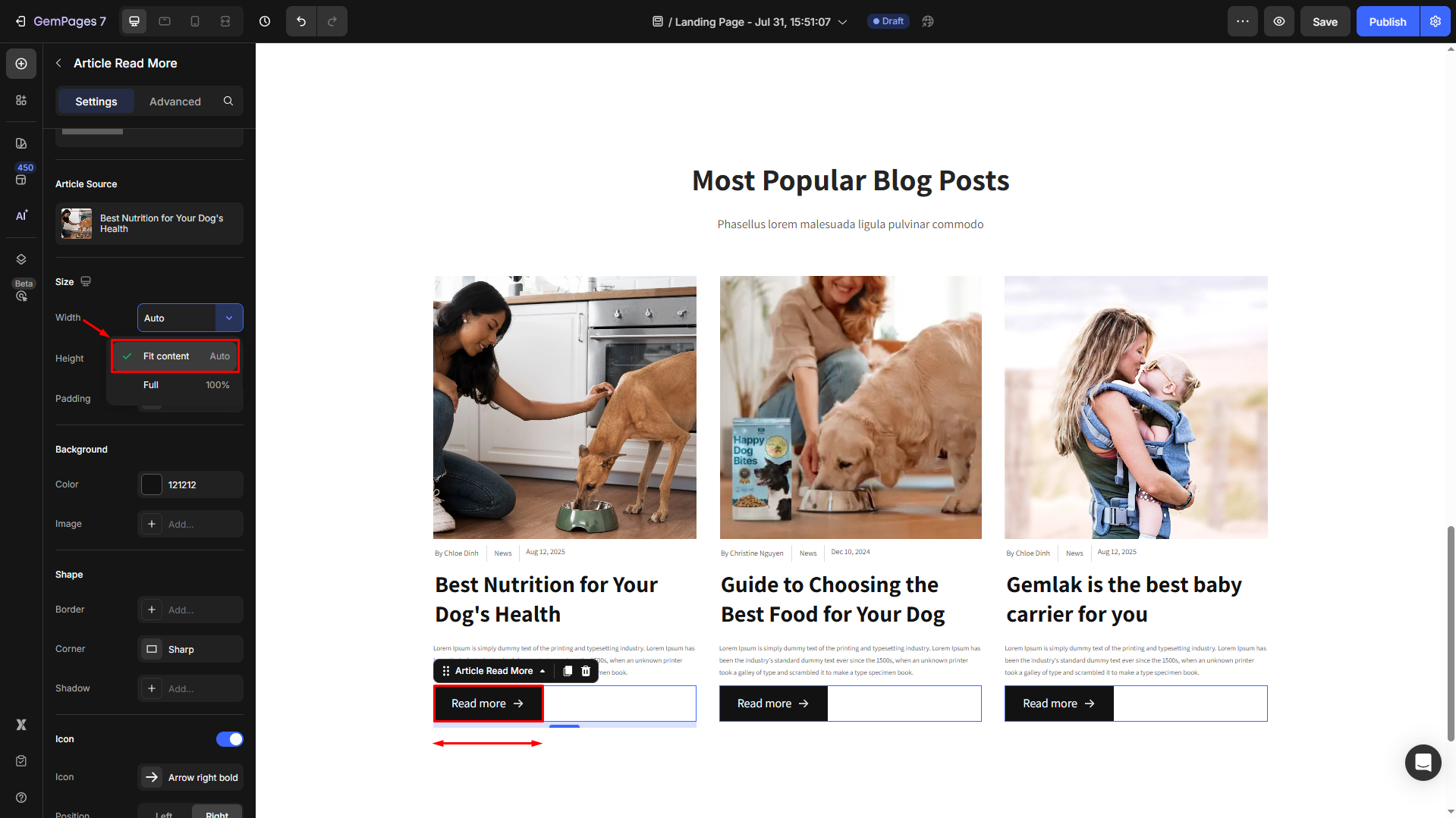
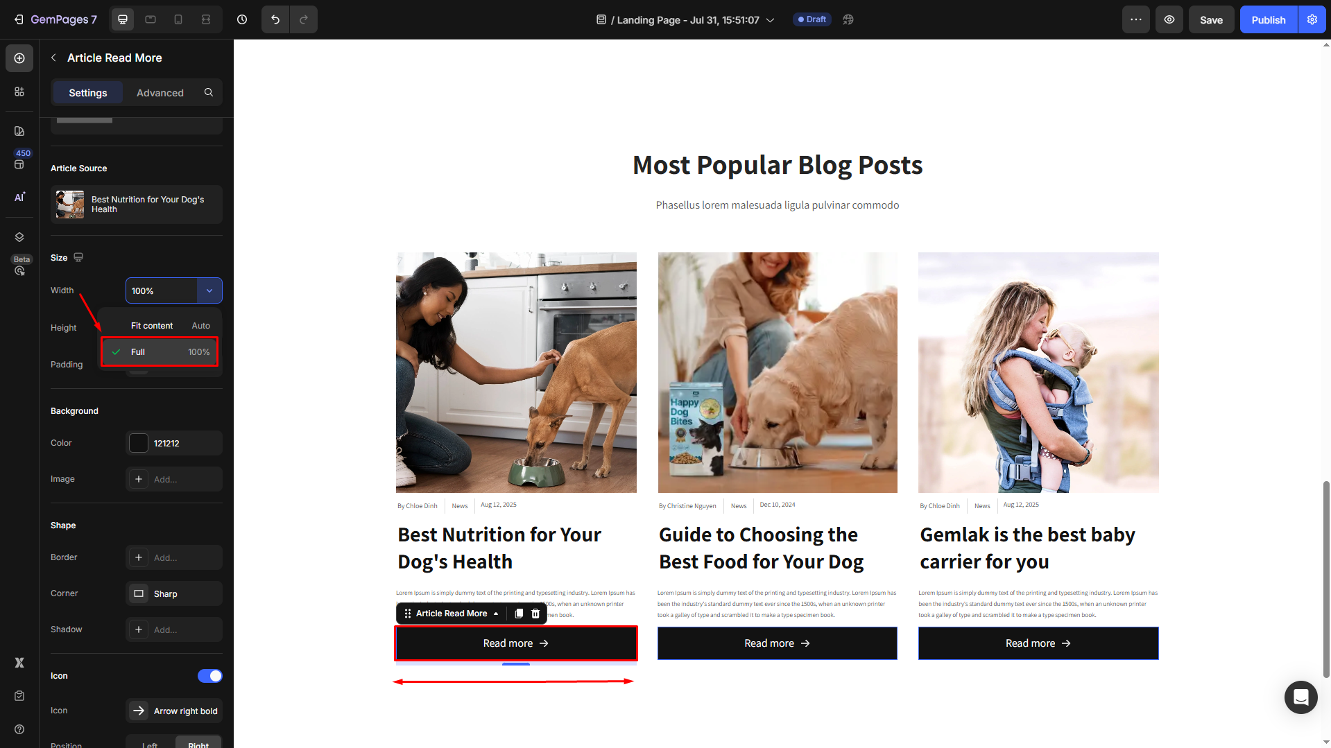
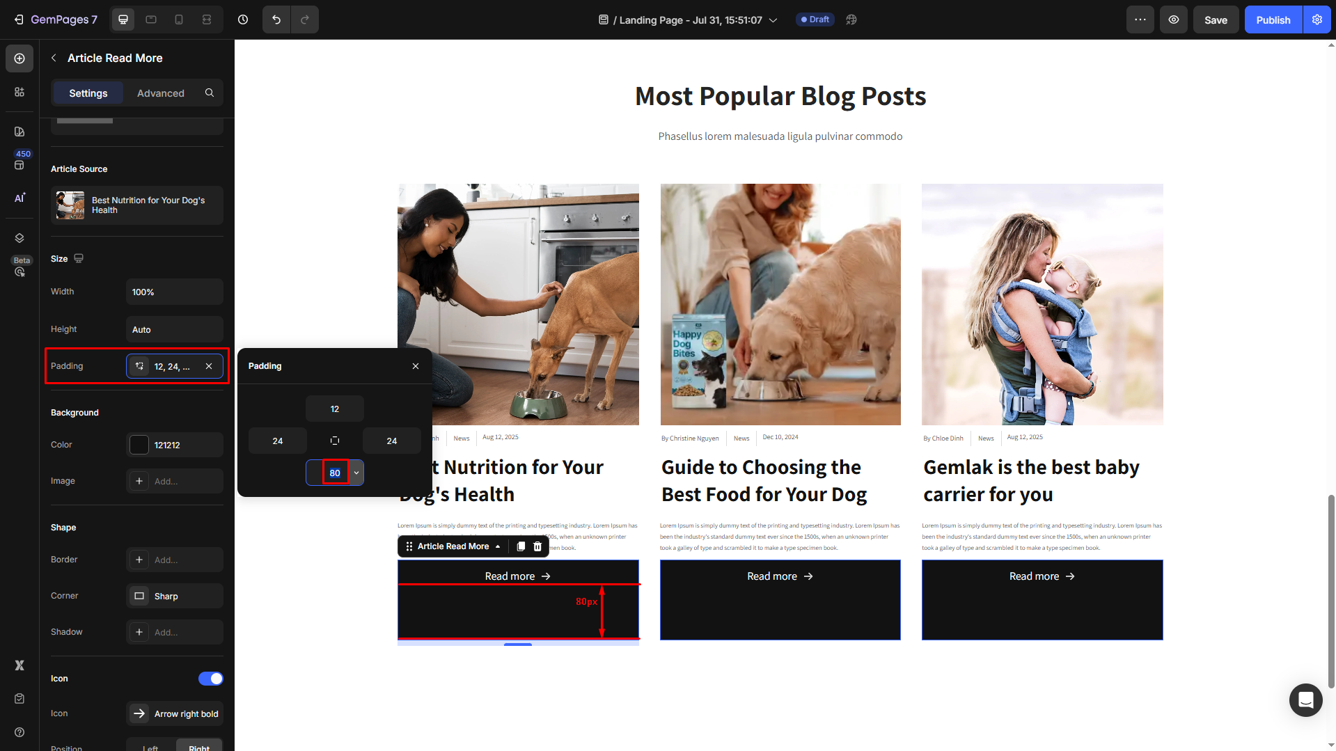
Size
- Under the Size section, modify the width, height, and padding of the element to ensure it fits within your page design.
If the width = Fit content (Auto):
If the width = Full (100%):
- Adjust the padding manually for better visibility if you prefer.
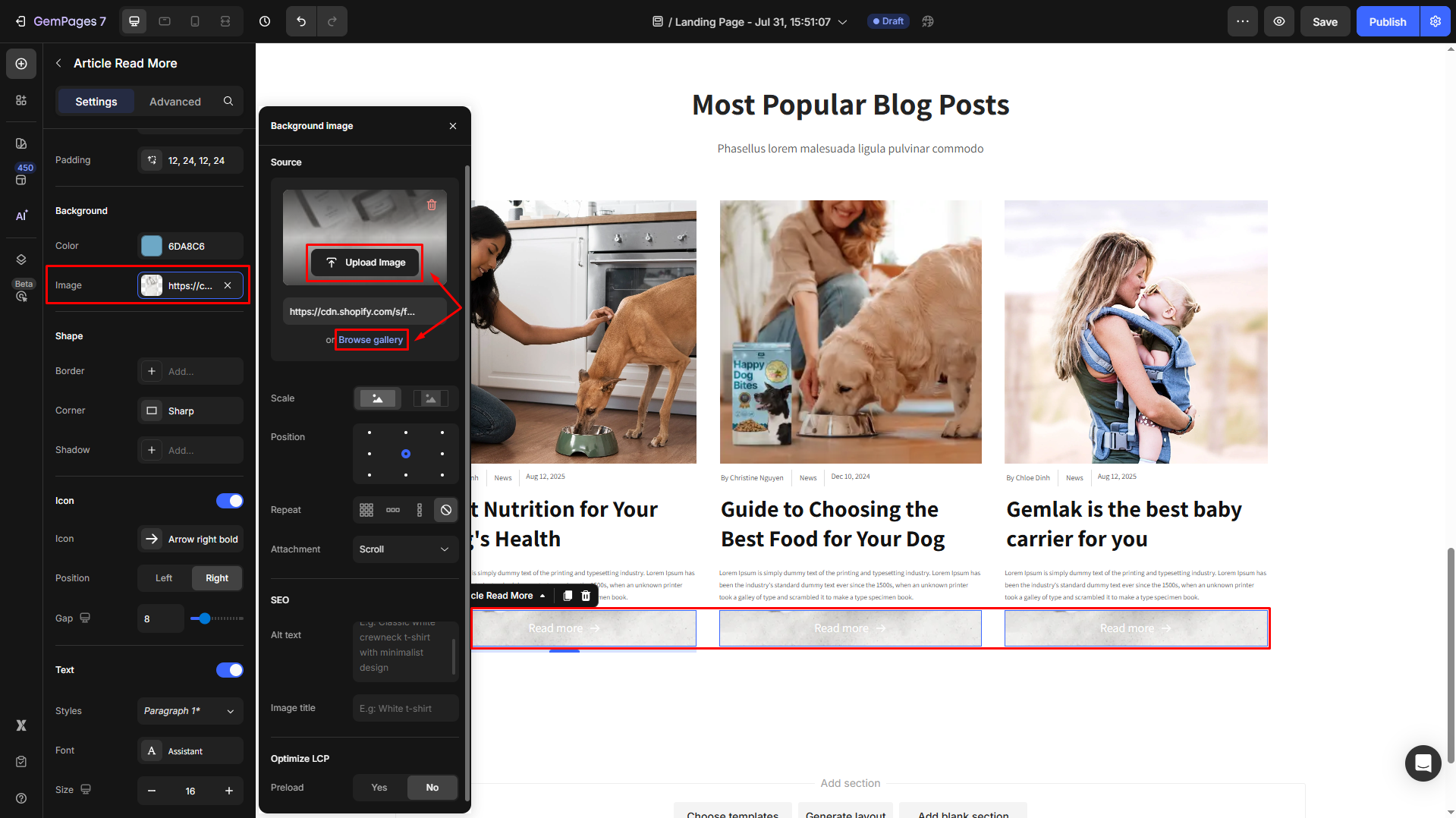
Background
- Change the background color of the entire section, based on your preferences, with this setting.
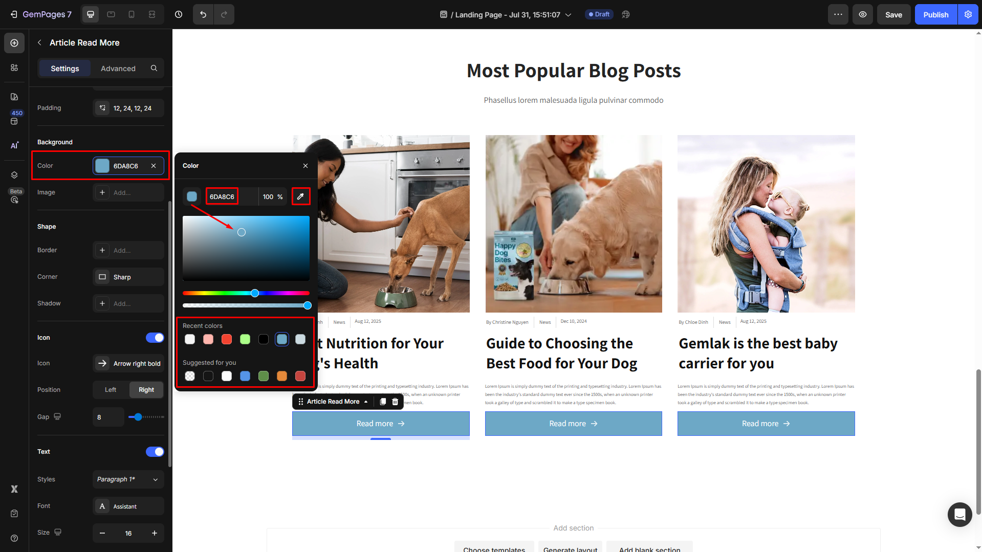
Try to enter a color code, choose from the color swatch, or use the color picker. Also, you can select a preferred color from the Recent colors and Suggested for you lists to save time and effort.
- If you prefer an image background, click on the box next to the Image option to upload a new image or import from your library to set it as the background image.
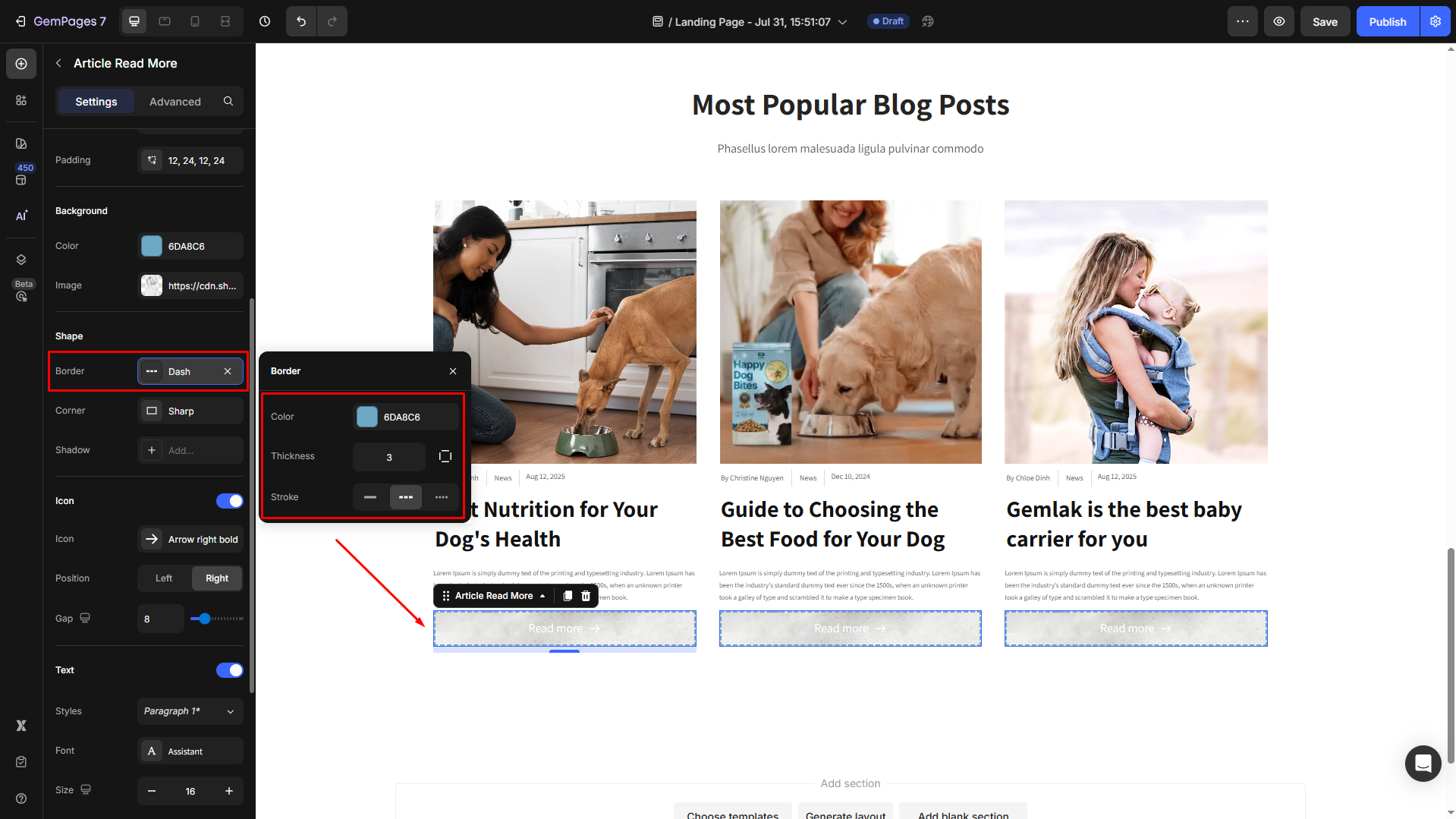
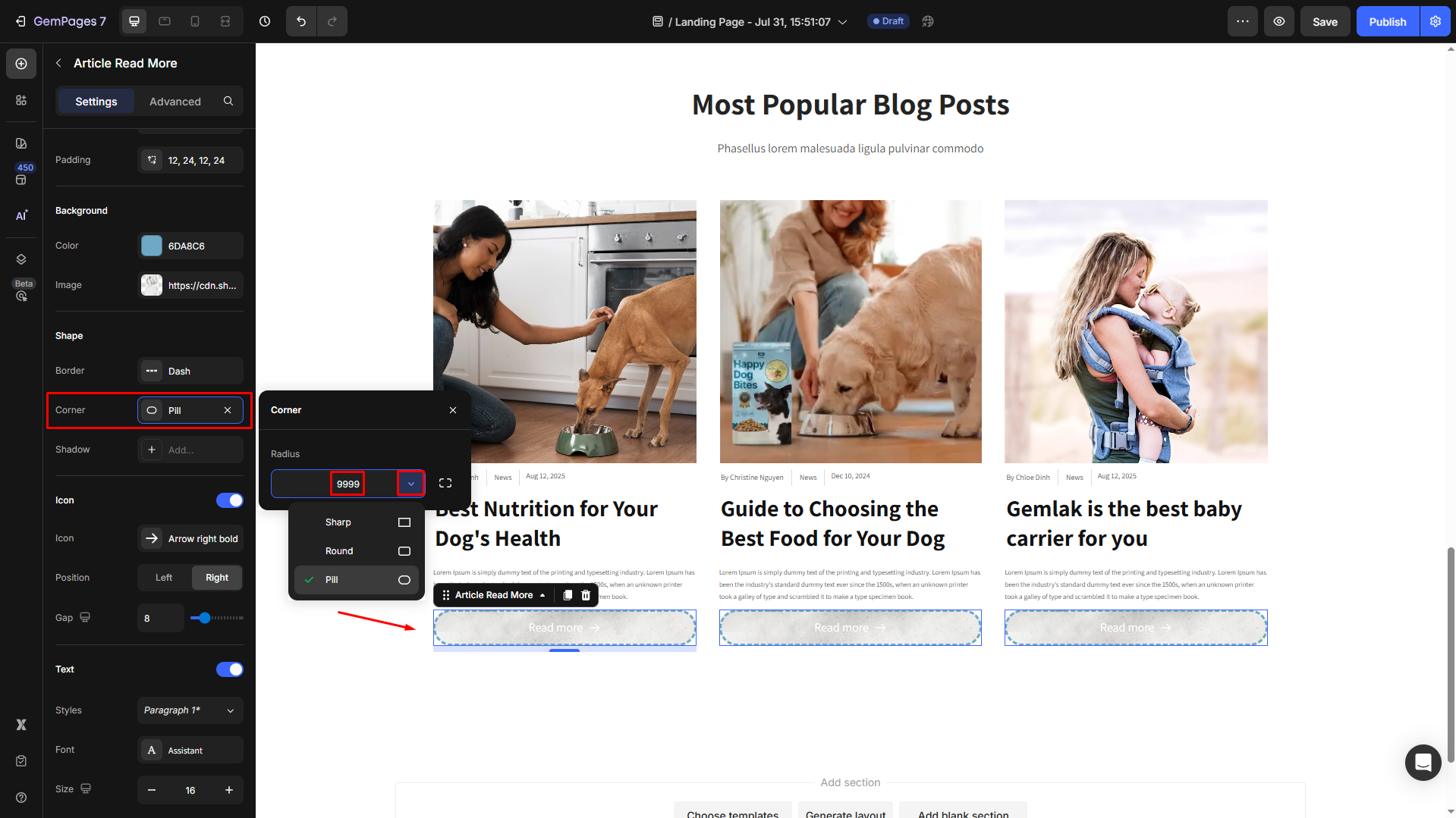
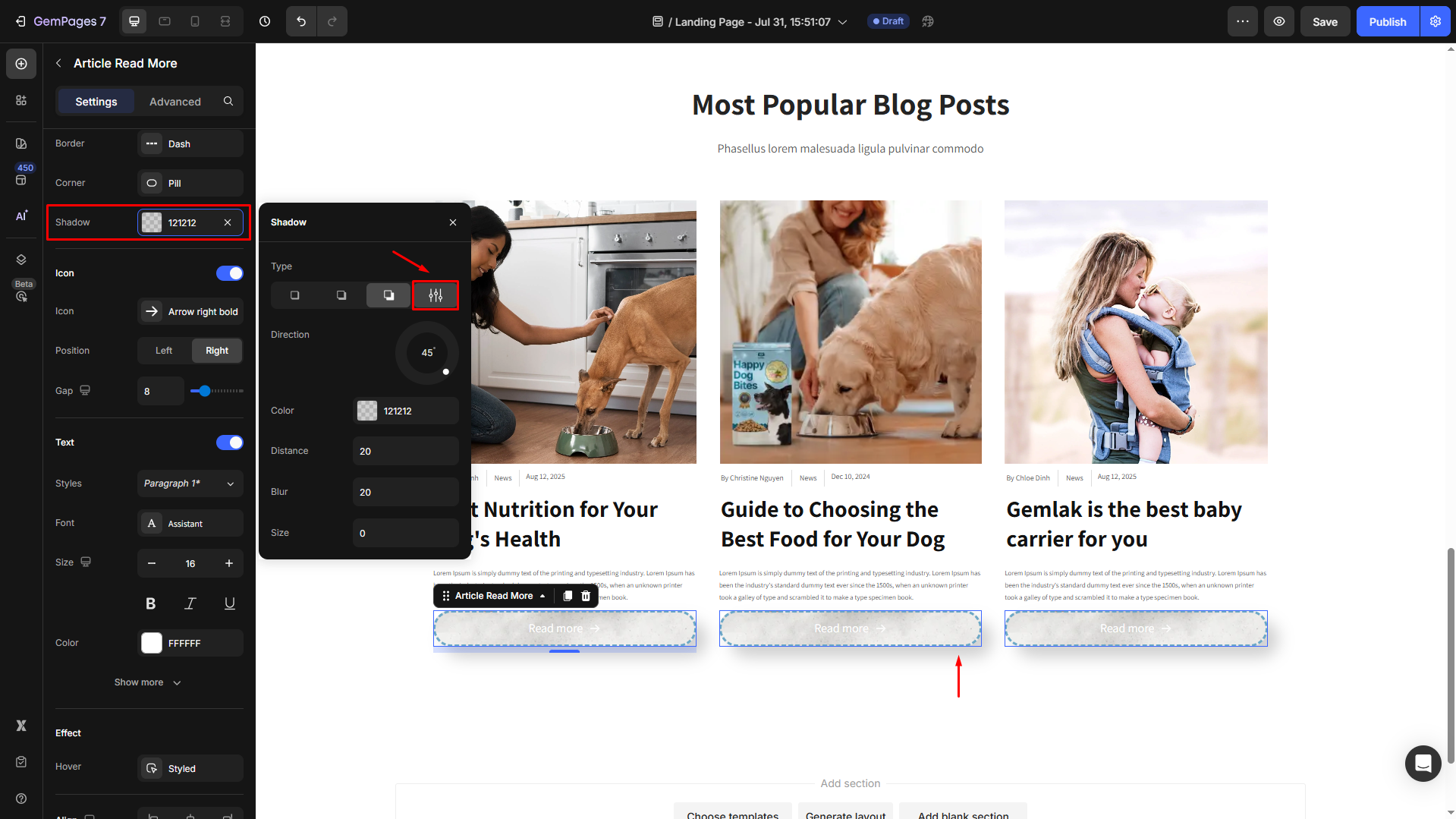
Shape
Shape settings are for the whole section that contains your Article List element.
- Border: You can change the border color, thickness, and stroke for your Article List section.
- Corner: The section corner can be square, rounded square, or round.
- Shadow: You may add a shadow of the Article List section and adjust the shadow display (size, color, blur, and distance).
Icon
Ensure that you have toggled it ON to open its settings:
- Icon: Choose from GemPages’ available icon list, or you can upload your own (.SVG file only).
- Position: Select the position for the icon in your button to be left or right.
- Gap: Adjust the spacing between the text and the icon for better visibility.

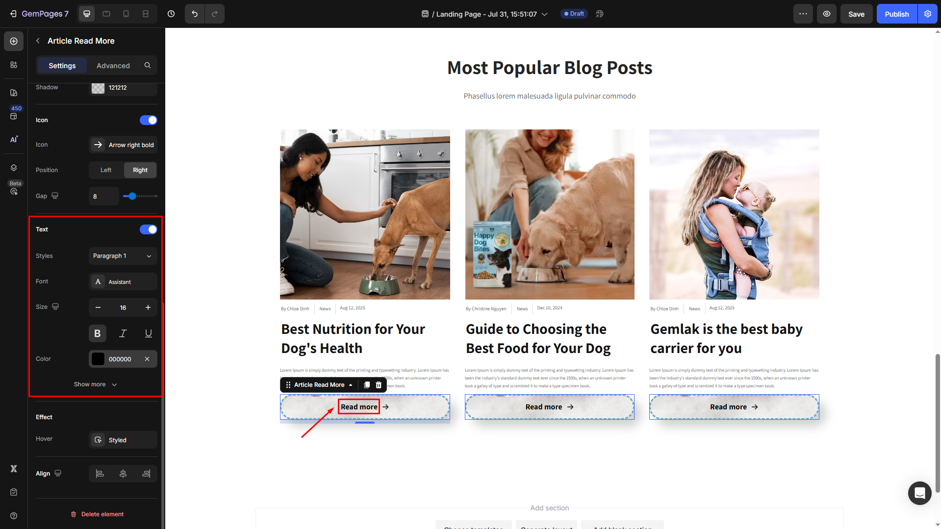
Text
Configure the button text your way, including:
- Style: Choose the heading
- Font: Select a font style that matches your brand identity.
- Size: Adjust the font size to make the heading prominent.
- Color: Pick a color that complements your design.
- Align: Adjust your text alignment to left, center, right, or justify.
Click Show more to expand the full settings in the Text style section:
- Font Weight: Control how thick or thin the text appears.
- Line Height: Adjust the space between lines for better readability.
- Letter Spacing: Create a more modern or compact look by changing the space between letters.
- Transform: Convert the text to uppercase, lowercase, or capitalize the first letter of each word.
- Shadow: Add a text shadow to give your headings depth.

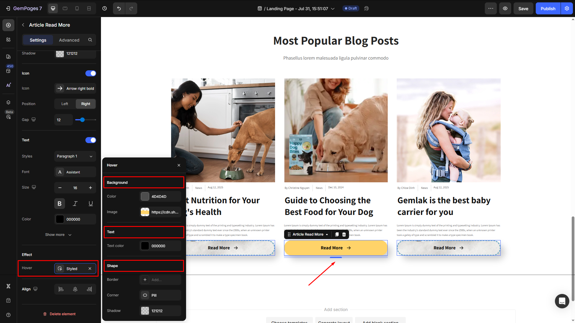
Effect
Hover State: Define how the element changes when users hover over it.
Options to customize for the hover effect, including
- Background: Apply a different background to the button for better emphasis.
- Text: Change the text color when hovered over.
- Shape: Customize the border size, style, and corner radius for hover effects.
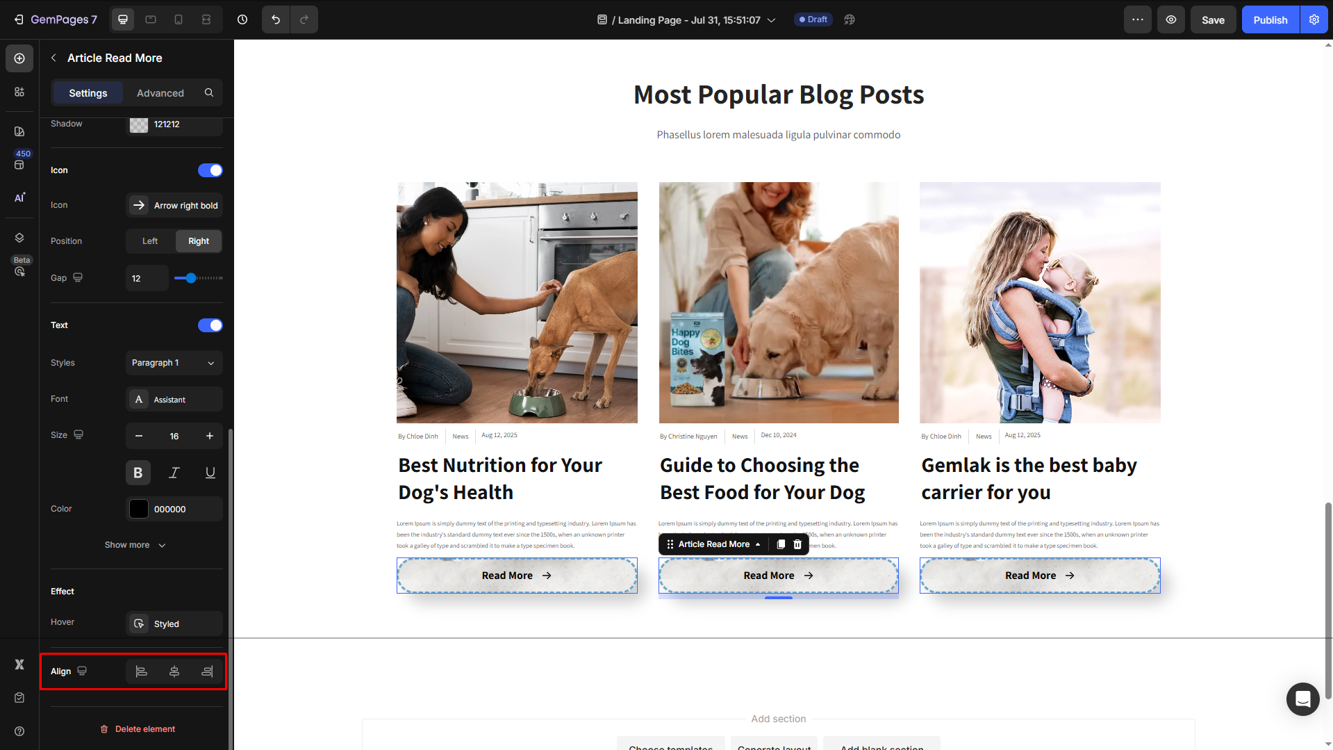
Align
Adjust the heading’s alignment for better readability. You can choose from left-aligned, center-aligned, or right-aligned.
By customizing the Article Read More Element, you enhance navigation and improve the user experience, making it easier for visitors to explore your content.
Configure the Advanced tab
For more advanced customization, please navigate to the Advanced tab and follow the instructions in this article.


Thank you for your comments