About Collection Toolbar Element
The Collection Toolbar is typically used on Collection Pages to improve usability. It allows visitors to sort and filter products by specific criteria:
- Best Selling: Display popular items based on sales.
- Featured: Highlight products selected by the store owner.
- A-Z/Z-A: Organize items alphabetically.
- Price (Low-High / High-Low): Sort by price range.
- Date (Old-New / New-Old): Showcase items by their upload or update date.
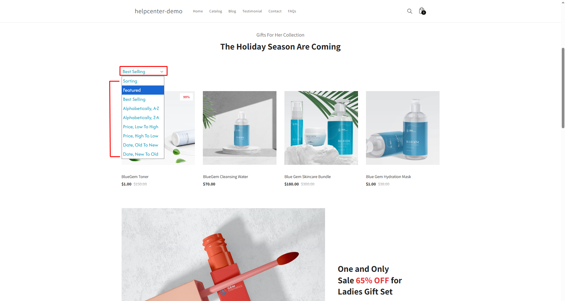
This functionality ensures that users can quickly navigate your product catalog, enhancing the overall shopping experience.
How to Add a Collection Toolbar Element to Your Page?
To add the Newsletter element to your page, you can follow the steps below:
Step 1: Access the GemPages Dashboard > Pages, then click on your target page to locate the editor.
Step 2: From the left sidebar, search for the Collection Toolbar Element and drag & drop it to the preferred position on your page.
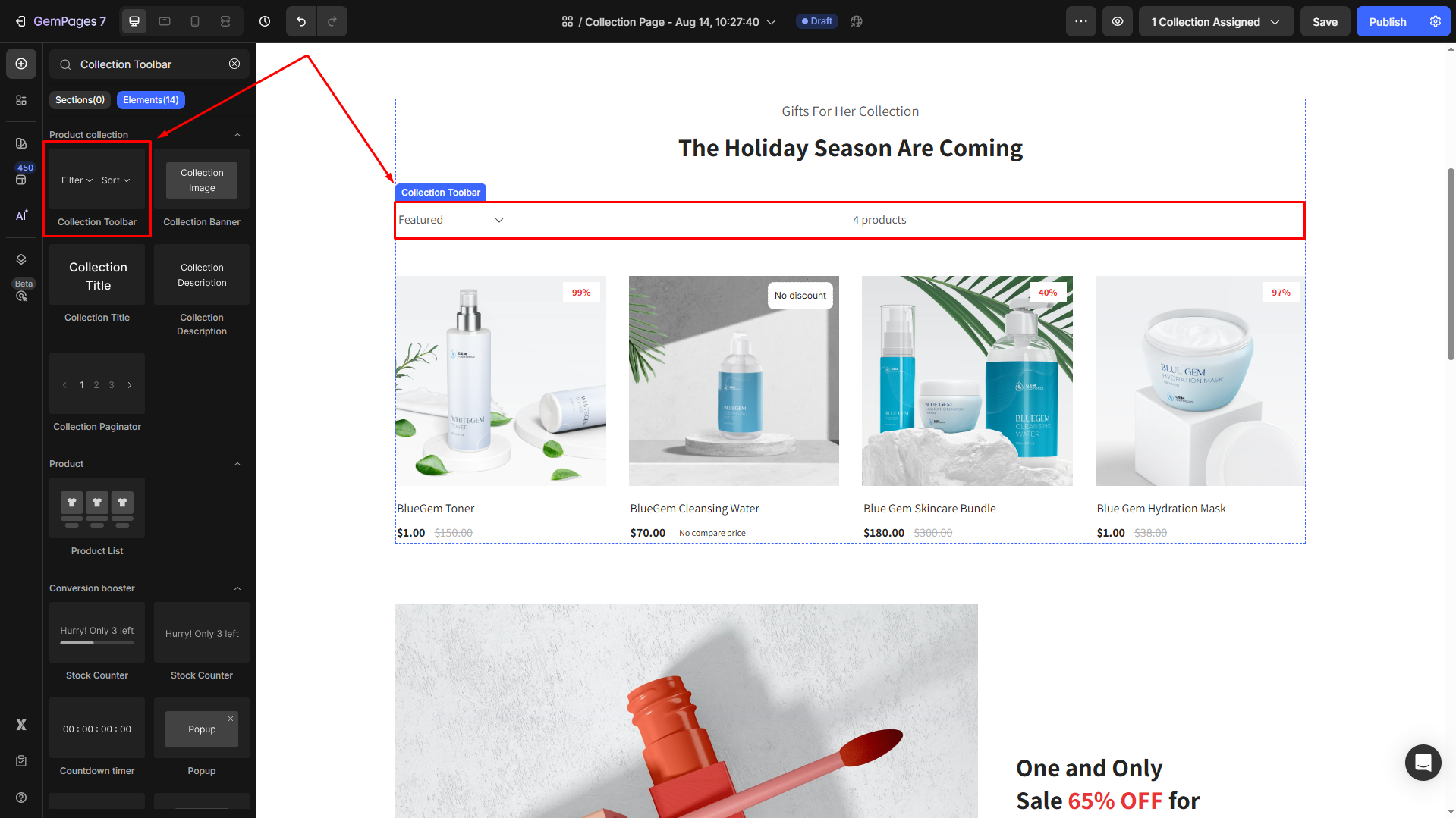
Step 3: Click on the element to open its settings for further customization.
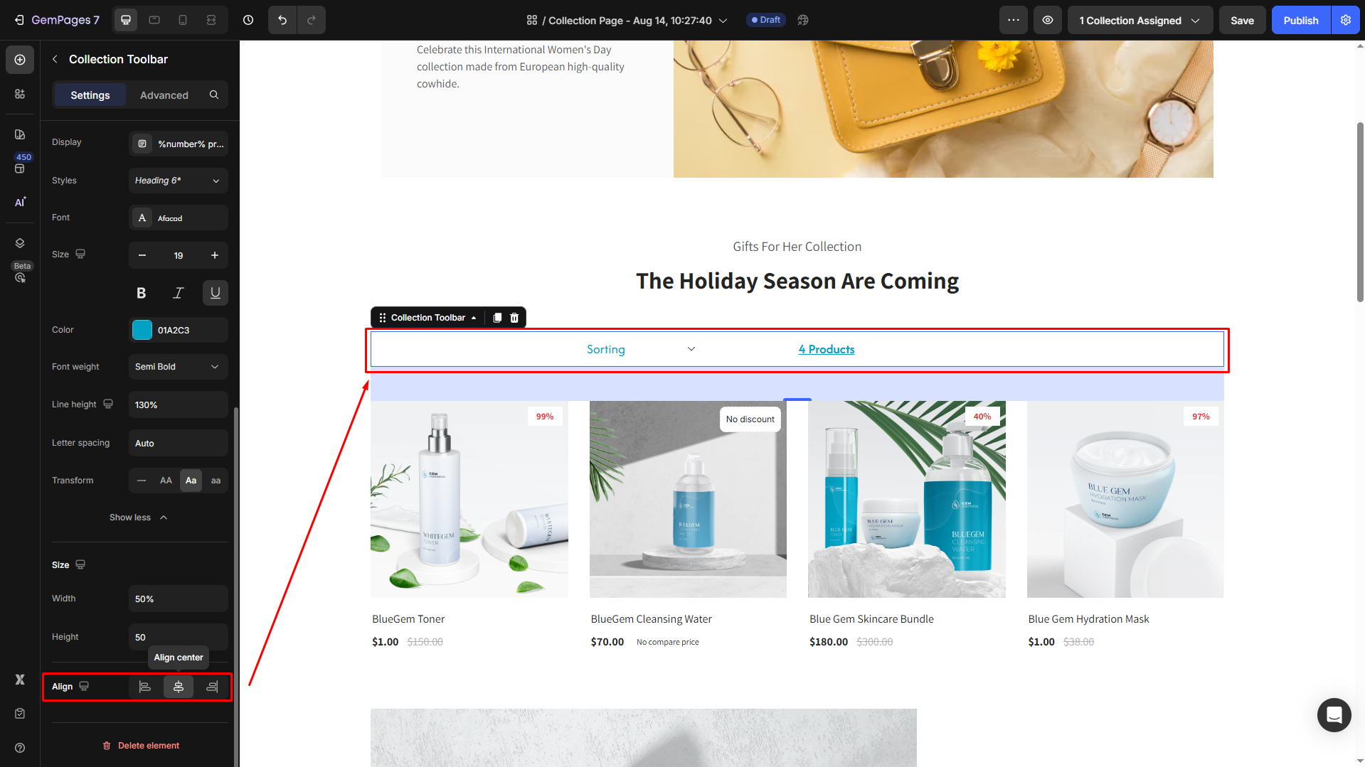
Collection Toolbar Element Settings
The Collection Toolbar Element can be customized to align with your store’s design and functionality. Below is a breakdown of its settings:
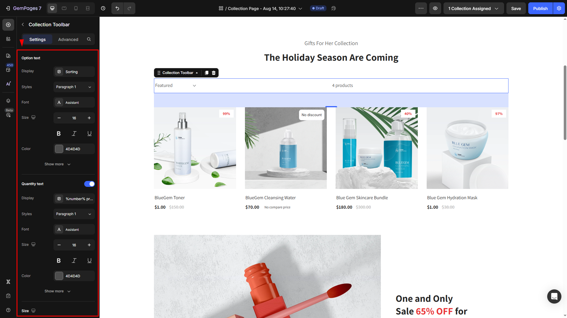
Option text
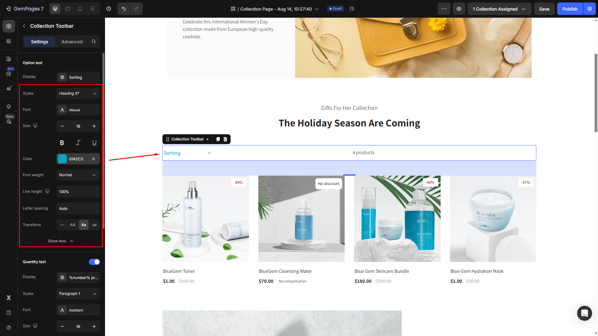
Display: Displays the text for the sorting dropdown menu or labels. By default, it’s set to “Sorting”.
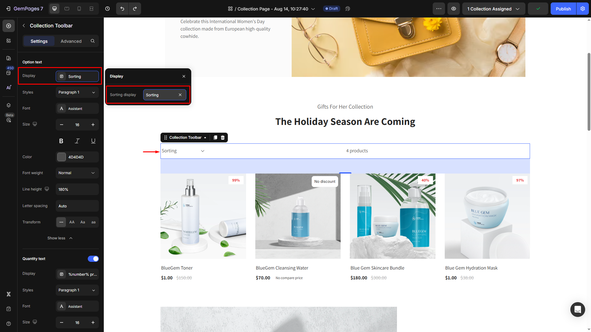
Then, adjust font type, style, size, color, etc., to match your brand’s theme. Click on Show more to expand all settings.
Quantity text
Display: Displays the text for the sorting dropdown menu or labels. By default, it’s set to “%number% products”.
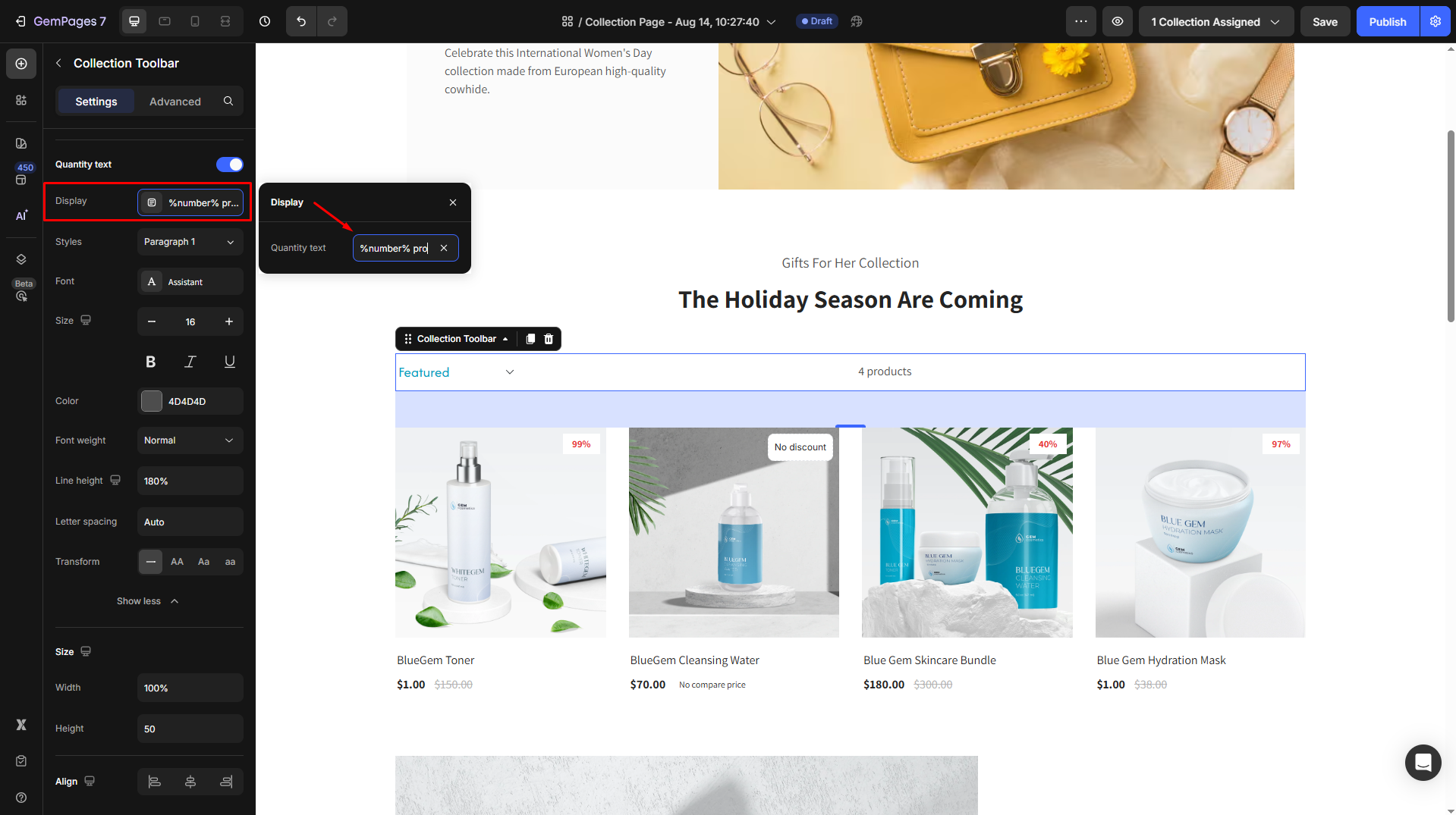
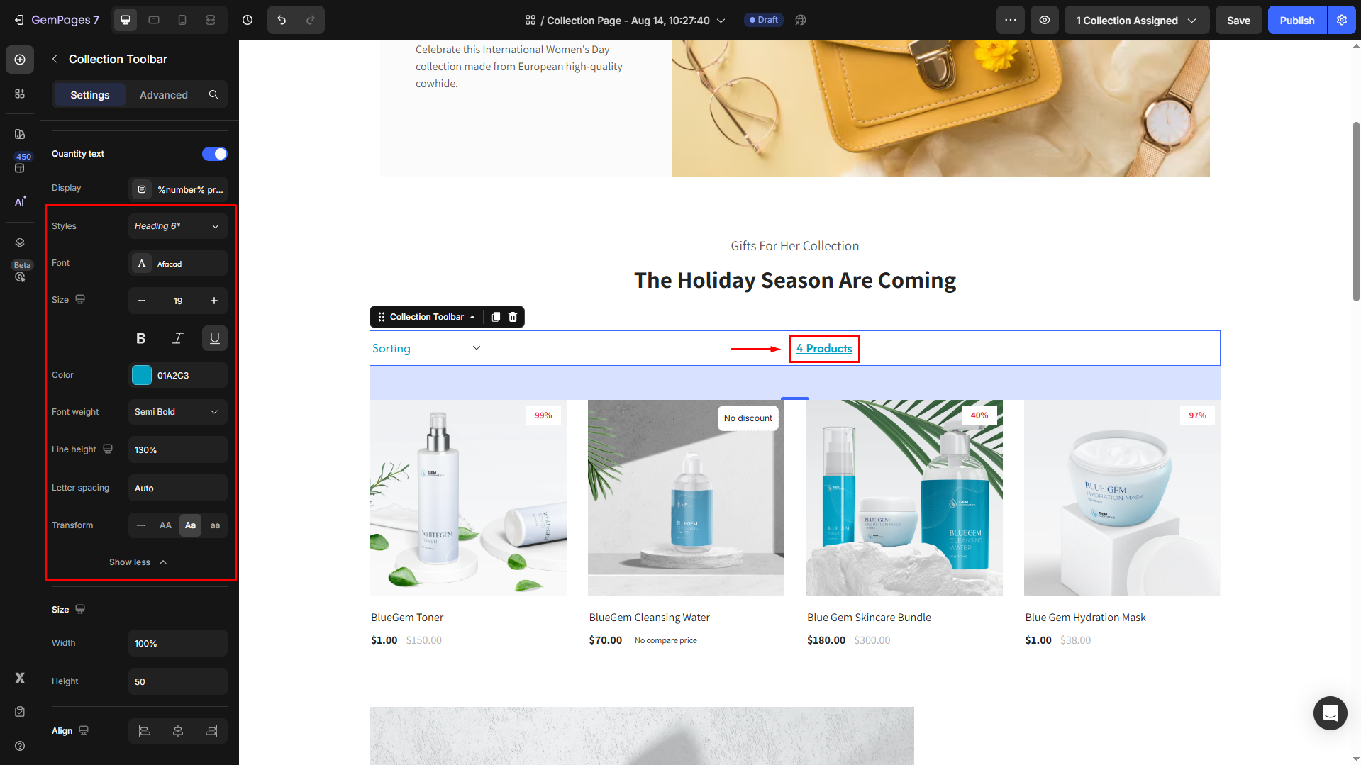
Then, customize the quantity text’s display on your page:
- Style: Choose the heading.
- Font: Select a font style that matches your brand identity.
- Size: Adjust the font size to make the heading prominent.
- Color: Pick a color that complements your design.
- Align: Adjust your text alignment to left, center, right, or justify.
- Font Weight: Control how thick or thin the text appears.
- Line Height: Adjust the space between lines for better readability.
- Letter Spacing: Create a more modern or compact look by changing the space between letters.
- Transform: Convert the text to uppercase, lowercase, or capitalize the first letter of each word.
Size
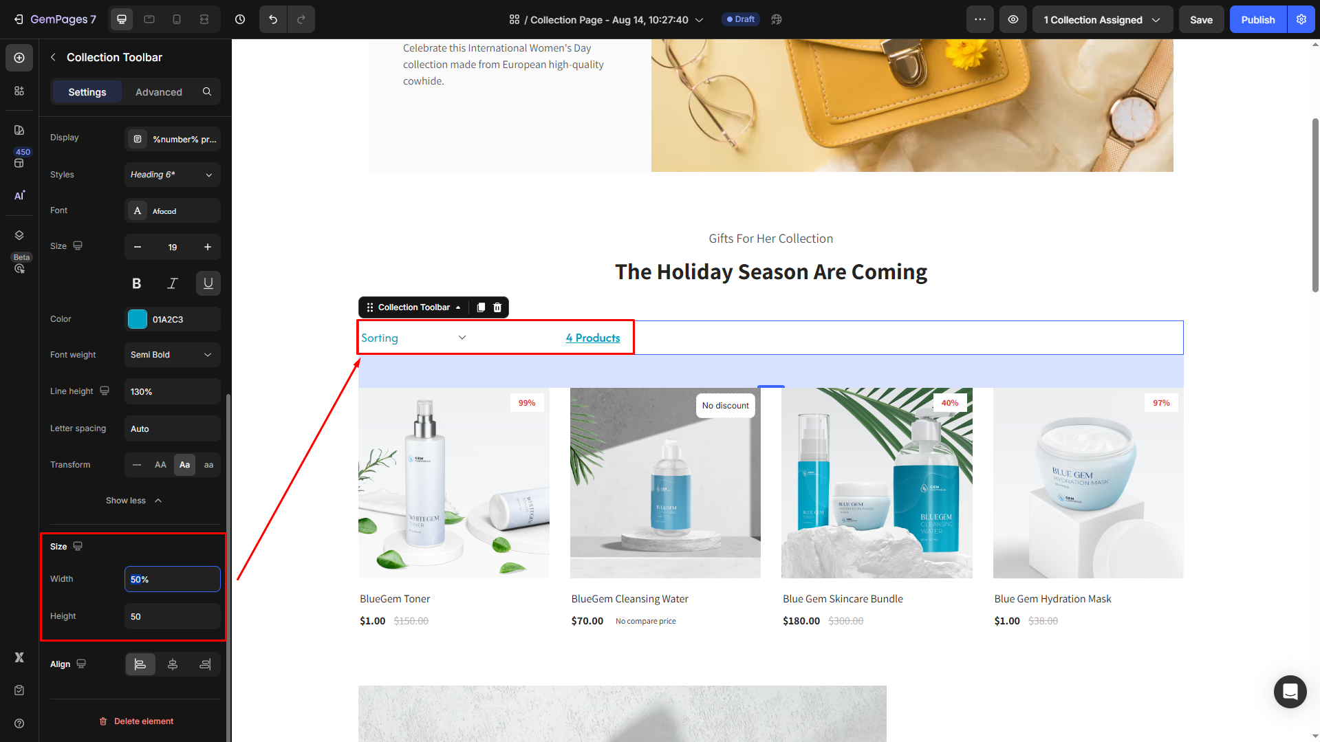
Adjust the dimensions of the toolbar to fit your page layout:
- Width: Set a specific width in pixels for the toolbar.
- Height: Adjust the height of the toolbar to balance it with other page elements.
Align
Align your toolbar to the left, center, or right.
By using and customizing the Collection Toolbar Element, you can create a seamless and user-friendly shopping experience on your Collection Pages, making it easier for visitors to find and sort products.
Configure the Advanced Tab
For more advanced customization, please navigate to the Advanced tab and follow the instructions in this article.


Thank you for your comments