


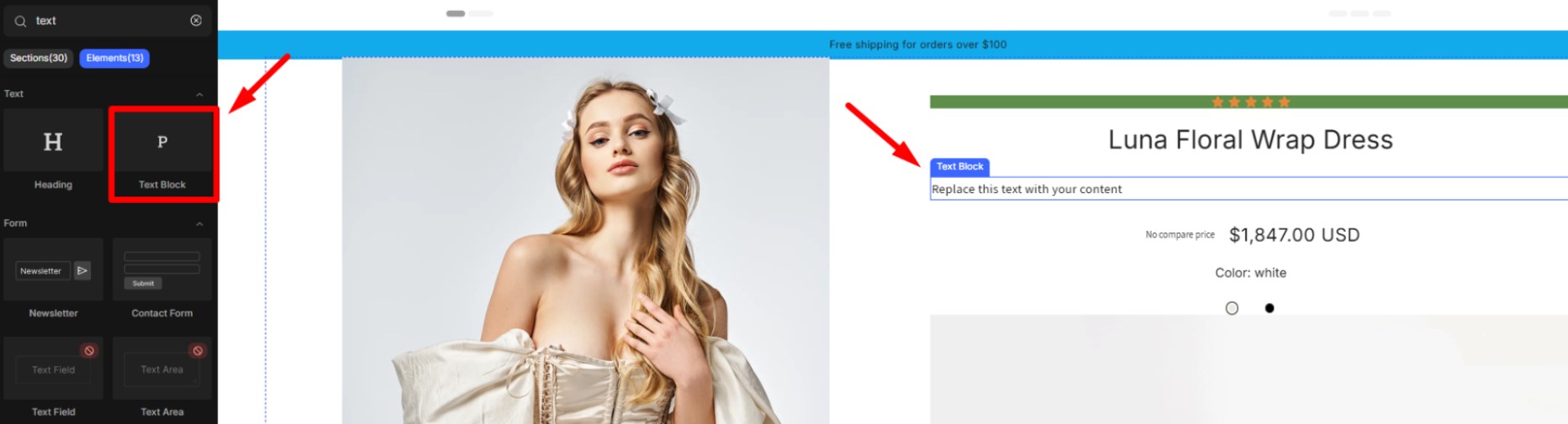
Add the Text Block element on your page
The Text Block is an essential element provided by GemPages. It allows you to display text in the form of either lengthy paragraphs or concise sentences on your page.
To add the element to your page, please follow the instructions below:
Step 1: In the GemPages Dashboard, click on your preferred page to enter the Editor.
Step 2: Within the Editor, simply drag and drop the Text Block element (labeled as Paragraph) onto your preferred location on the page.
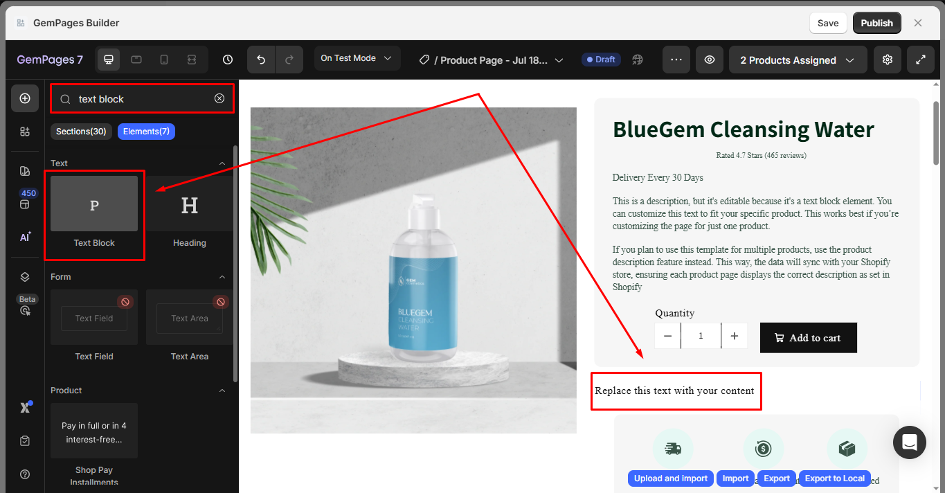
Step 3: Enter your desired text into the Text Block element.
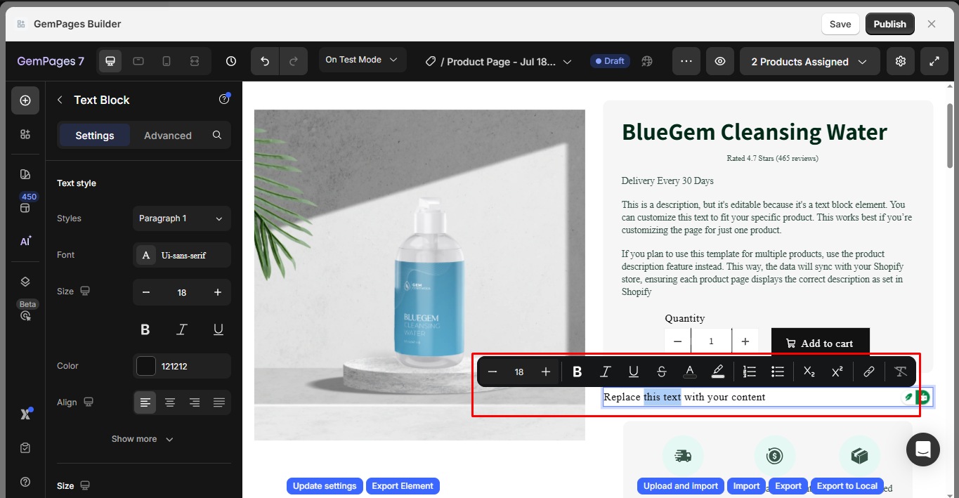
Step 4: To customize the text format in GemPages, utilize the Text Editor toolbar that appears whenever you highlight your text. It provides various formatting options to enhance the visual appeal of your content.
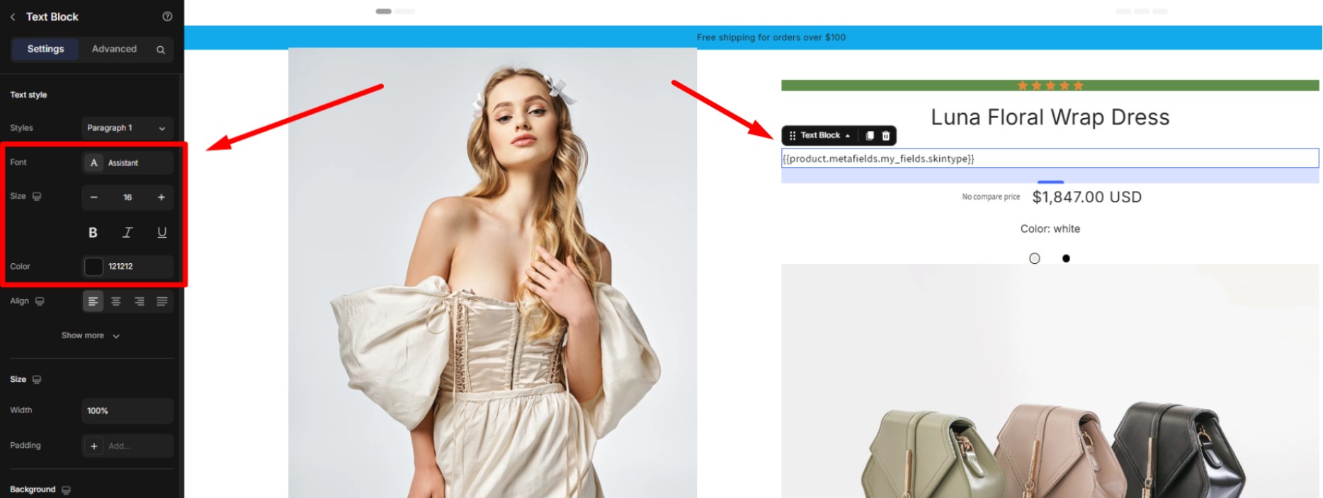
Click on the Text block element, and the configuration options are revealed on the left sidebar, including the Settings and Advanced tabs.
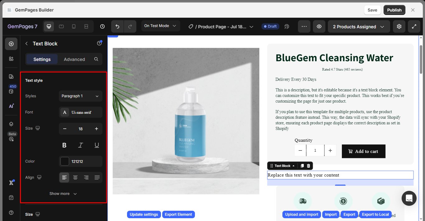
Configure the Settings Tabs
Text style
At this point, you can fine-tune the typography of the text. Here are the available options:
- Styles: Select your desired style from the pre-defined options, which include 6 heading styles and 3 paragraph styles.
- Font: Choose the font you wish to use for the text within this text block. If you want to use a font that is not listed, you can refer to the provided guidance on how to add a custom font in Editor v7.
- Size: Adjust the font size by specifying a value in pixels. GemPages supports responsive design, which means you can adjust font size separately for desktop, tablet, and mobile. To do this, simply switch to the device view you want to edit using the icons at the top of the GemPages Editor. Any font size changes you make in that specific view will apply only to that device.
- Color: Modify the color of the text to your preference.
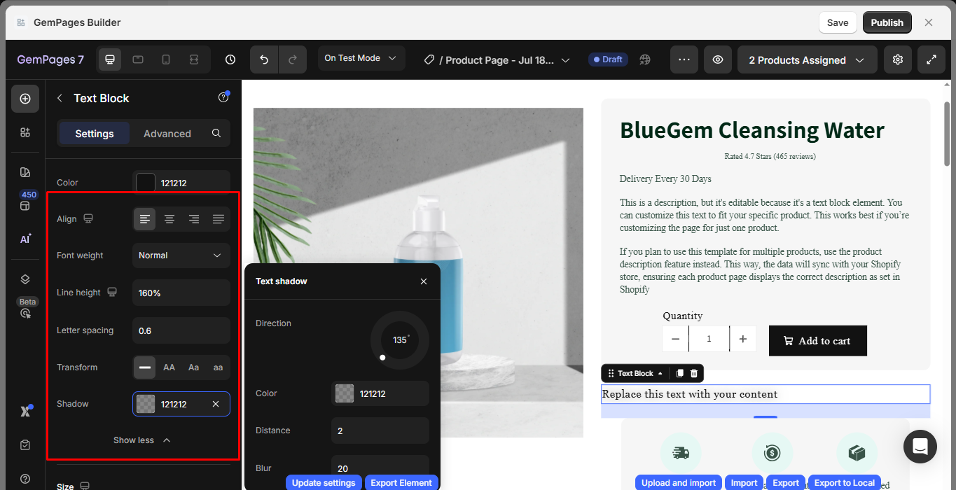
Click on the Show more button to reveal more customization options.
- Font weight: Choose your desired font weight from the provided drop-down menu, from Thin to Black.
- Line height: Adjust the height of the text by specifying a percentage value (100%, 120%, 130%, 150%, or 180%) or entering an exact number.
- Letter spacing: Modify the spacing between letters by inputting a value in pixels.
- Transform: Transform the text in one of the following ways:
- No transformation applied.
- Uppercase (AA): Convert all text to uppercase.
- Capitalize (Aa): Capitalize the first letter of each word.
- Lowercase (aa): Convert all text to lowercase.
- Shadow: You can adjust the shadow of the text block element to bring a better visual to your page.
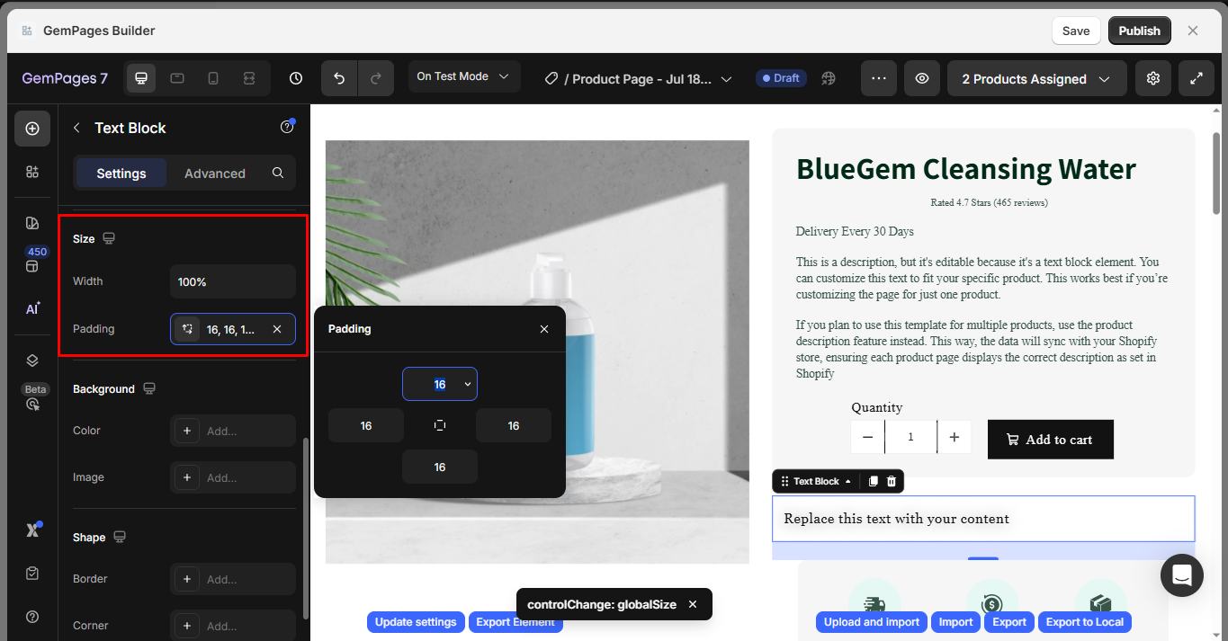
Size
Under the Size section, you can configure the width and padding for the Text Block:
Width: Adjust how wide the Text Block element appears on the page:
- Fit content: Auto width based on the content inside.
- Full: Stretches the element to 100% of the container width, allowing your content to display in full width.
- Default: Fixed at 1200px.
Padding: adds inner spacing between the text and the edges of the Text Block container.
Background
Color: Set the background color of the button.
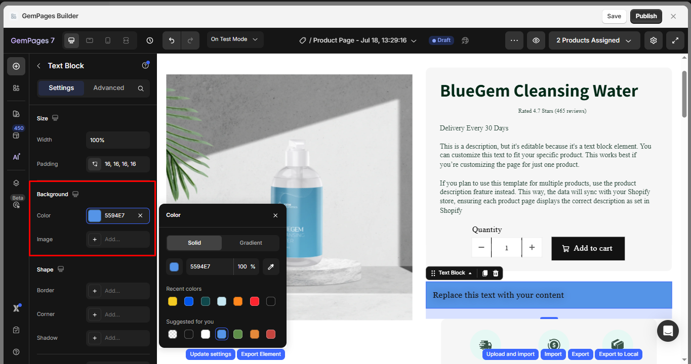
Image: Upload or select a background image. Customize it using:
- Scale: Cover, Contain, or Auto
- Position: Set image alignment (center, top-left, etc.)
- Repeat: Toggle repeat settings
- Attachment: Choose between Scroll or Fixed
- SEO: Add Alt text and Image title for accessibility and SEO
- Preload: Toggle preload to improve Largest Contentful Paint (LCP)
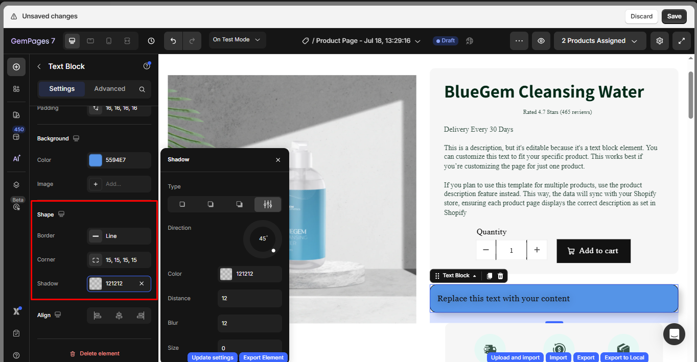
Shape
Style the image container with visual enhancements to better match your design:
- Border: Add a border around the image. Customize:
- Color: Choose any HEX color
- Thickness: Set pixel value
- Stroke style: Solid, dashed, or dotted
- Corner: Round the image’s corners by adjusting the border radius.
- Shadow: Add a shadow effect to give depth or separation from the background. Configure:
- Type: Outer, inner, or centered
- Direction: Control the shadow angle
- Color, Distance, Blur, and Size
Align
This parameter allows you to determine how the text is positioned on your page. There are three options to choose from: left-aligned, centered, and right-aligned.
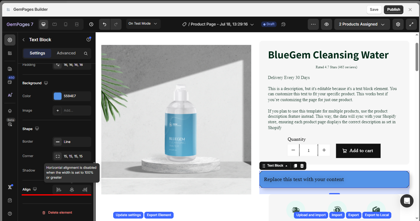
Note: Horizontal alignment is disabled when the width is set to 100% or greater.
Configure the Advanced Tab
To style how the element looks, please navigate to the Advanced tab and follow the instructions in this article.
Using Metafield text in a Text Block
If you are working with Metafield-based content, you can embed the Metafield code directly inside the Text Block element.
This is especially useful when you want the text to dynamically change based on product, collection, or page data.
To do this, simply paste the Metafield variable or code into the Text Block content area. The Text Block will render the Metafield value on the live page.
FAQs
How do I move a text box in GemPages?
- Click and hold the Text Block element.
- Drag it to a new position.
- Release the element when you see the blue placement indicator.


Thank you for your comments