About Text & Typography
Text & Typography are critical elements of design. They go beyond aesthetics to reflect your brand’s personality and influence user experience.
At GemPages, we constantly update our Text & Typography settings to make styling text easier and more intuitive. Whether you’re crafting a heading or customizing body text, these settings offer precision and flexibility.
Text & Typography Settings
Here’s an in-depth look at the options available:
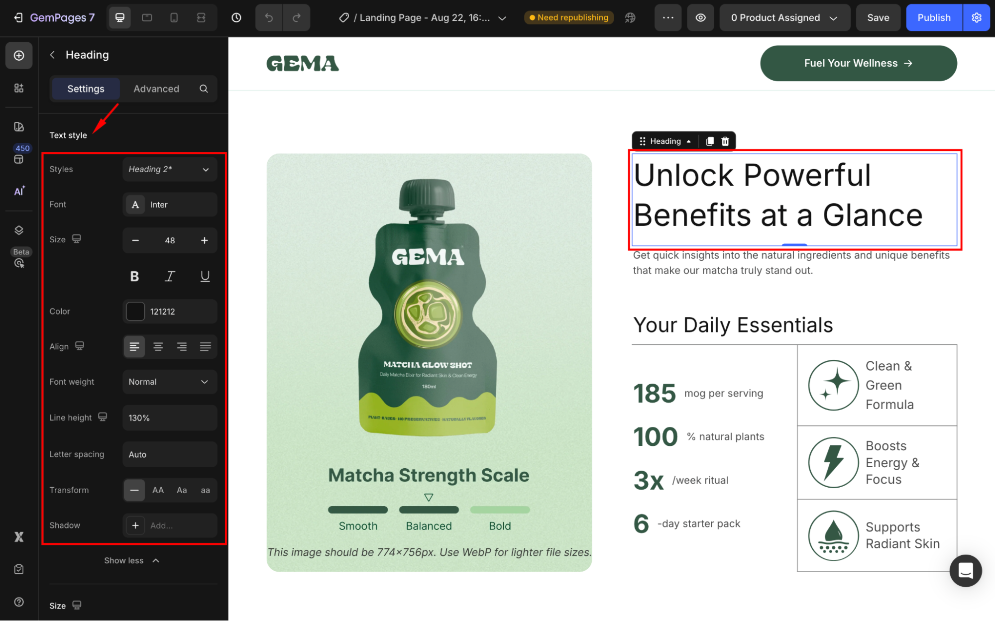
Text style
You can customize the text style to fit your branding:
| Option | Description |
| Styles | Easily select between Headings or Paragraphs to define the purpose of your text. |
| Font | Select fonts from a vast library or upload custom fonts to maintain brand consistency. |
| Size | Set font size in pixels (px) for accurate scaling. |
| Styling Options | Add emphasis with bold, italic, or underline. |
| Color | Customize text colors to match your brand palette. |
| Align | Align text to left, center, right, or use justify for a balanced look. |
| Font Weight | Adjust thickness for better readability (e.g., light, medium, bold). |
| Line Height | Control vertical spacing between lines for a clean layout. |
| Letter Spacing | Fine-tune the spacing between letters to improve readability or achieve a specific design style. |
| Text Transform | Apply effects like uppercase, lowercase, or capitalize. |
| Shadow | Add depth and style with text shadows. |

For more details on text style, refer to this article: How to Change the Text Styles?.
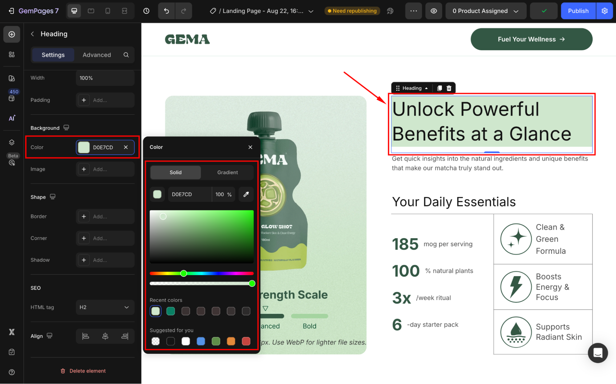
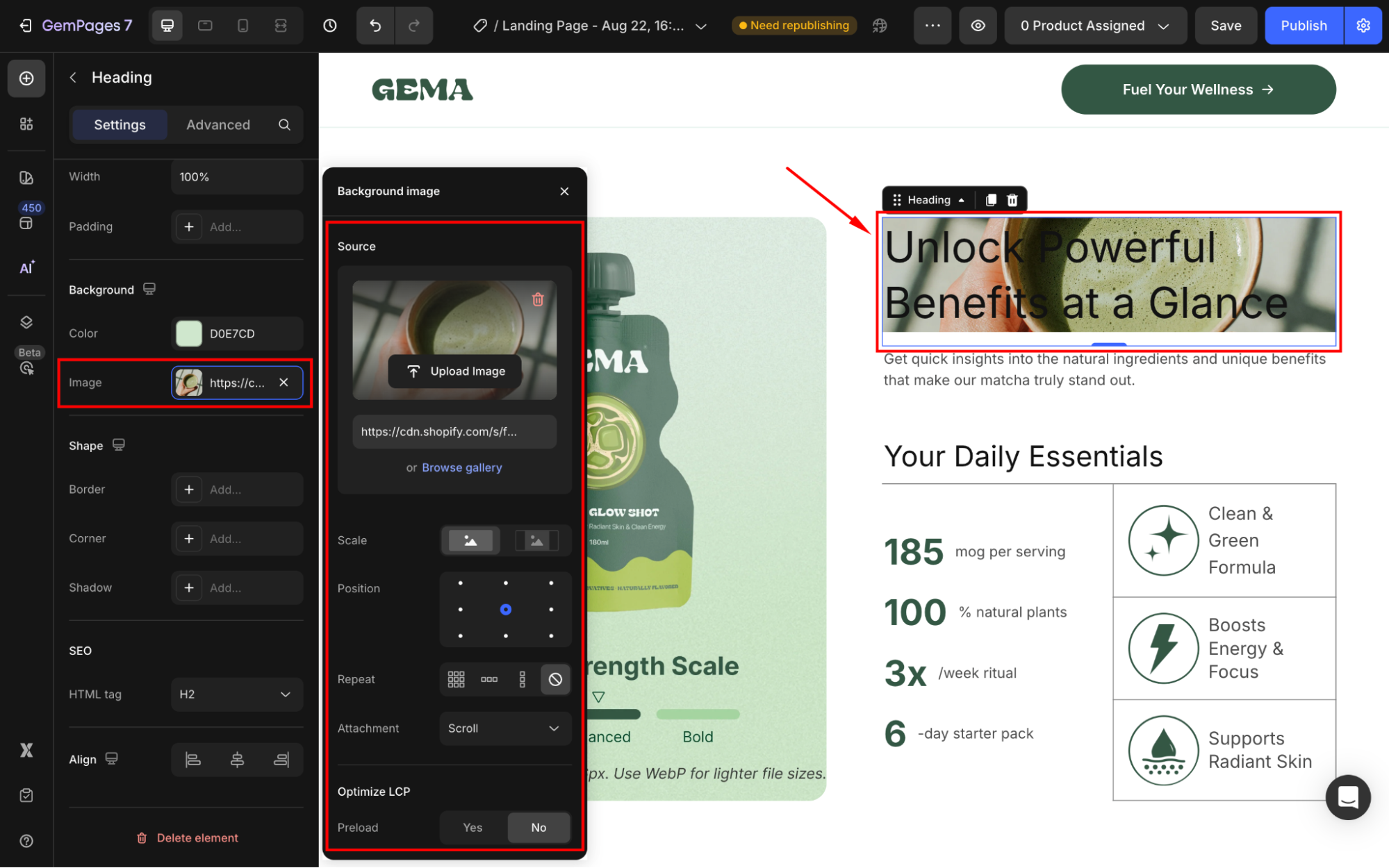
Text Background
You can set a solid/gradient background color or use an image as the text’s background.
- Color: Highlight text with custom background colors.

- Background Image: Add visual interest by placing text over an image.

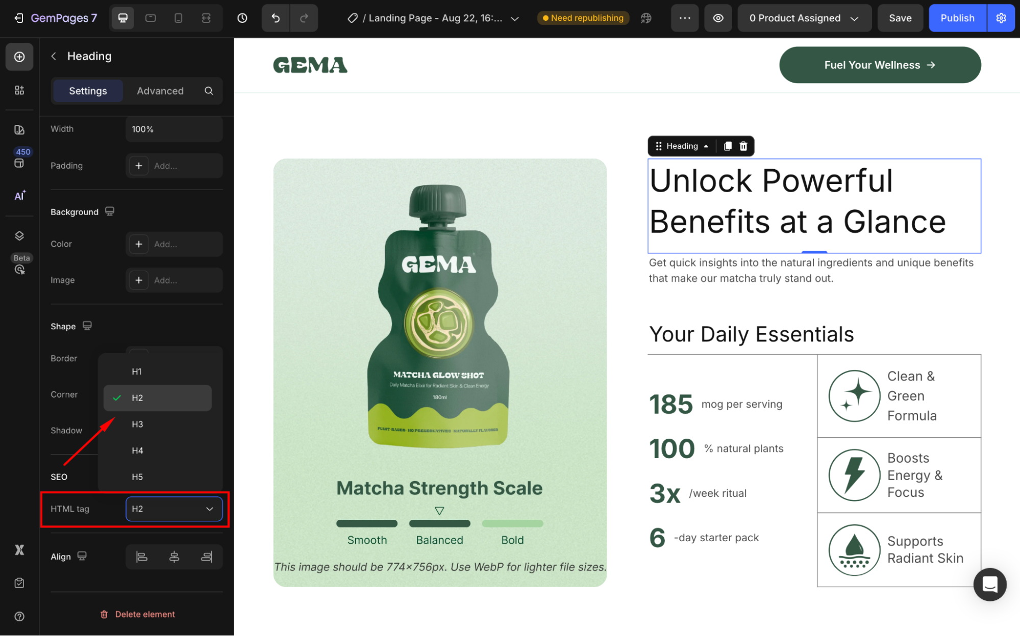
SEO
Heading Tags (H1, H2, H3, etc.): These tags help search engines understand your content hierarchy. For example:
- H1: Use for main headings.
- H2: Use for subheadings.
- Paragraph: Use for standard text.

Generally, it’s best to stick with the default settings.
In GemPages, these styles correspond to font sizes defined in your Global Styles.
Refer to this article for further information about Global Styles.


Thank you for your comments