


About Popup Element
A pop-up is a window that emerges while visitors are browsing a website. Its primary purpose is to generate more leads and serve advertising objectives effectively.
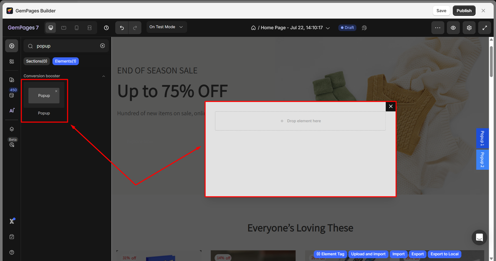
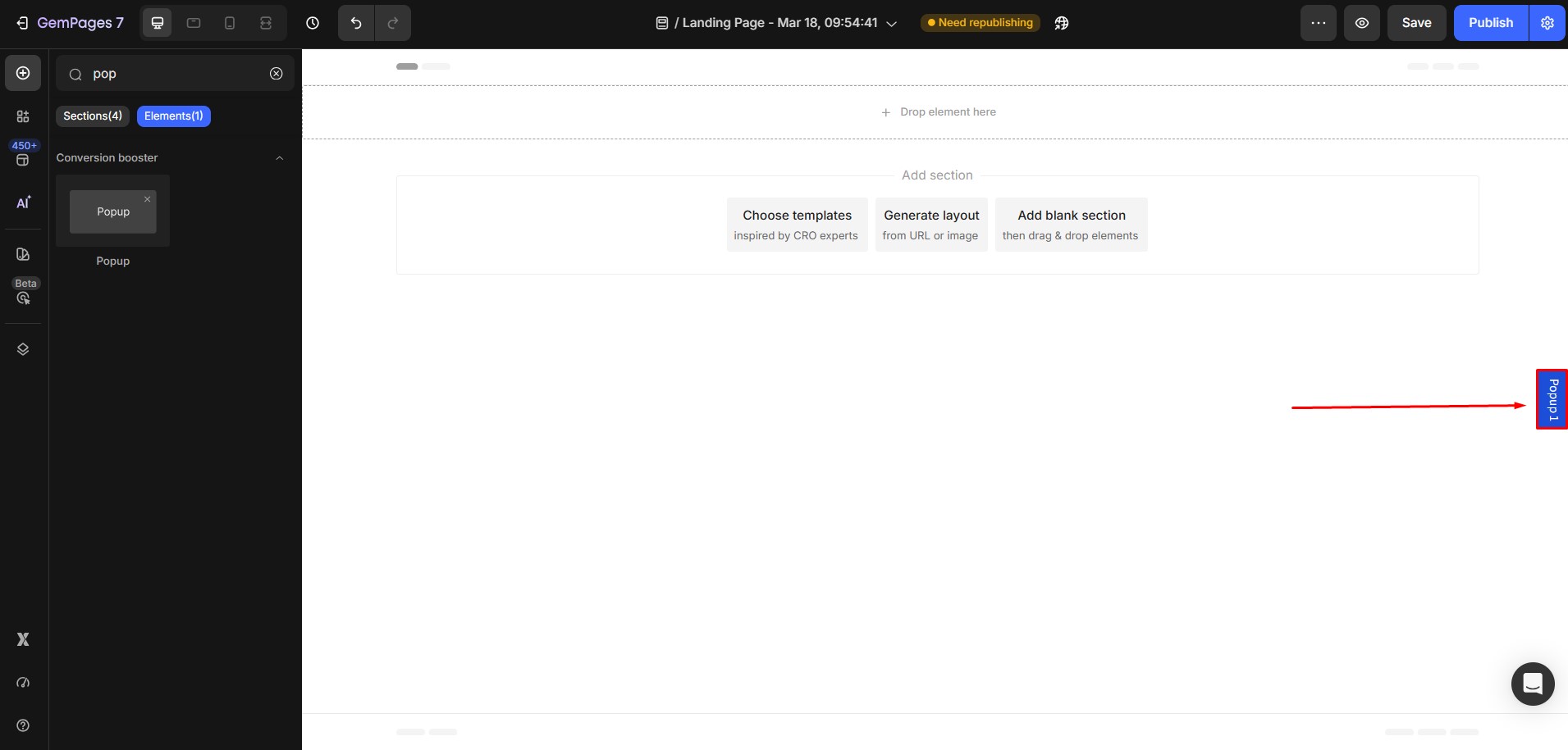
From the GemPages Dashboard, open a template to edit. You can quickly find the element on the left sidebar of the editor, under the Conversion Booster section. Drag & drop the element to any position on your page.
To use the Popup element:
Step 1: From the GemPages Dashboard, locate the target page to open the editor.
Step 2: The Popup element can be found in the left sidebar under the Conversion Booster section.
Step 3: Drag and drop the Popup element to any position on your page.
Once the pop-up is minimized, a small label will appear on the right side of the editor. You can click this label anytime to reopen and edit your pop-up content.
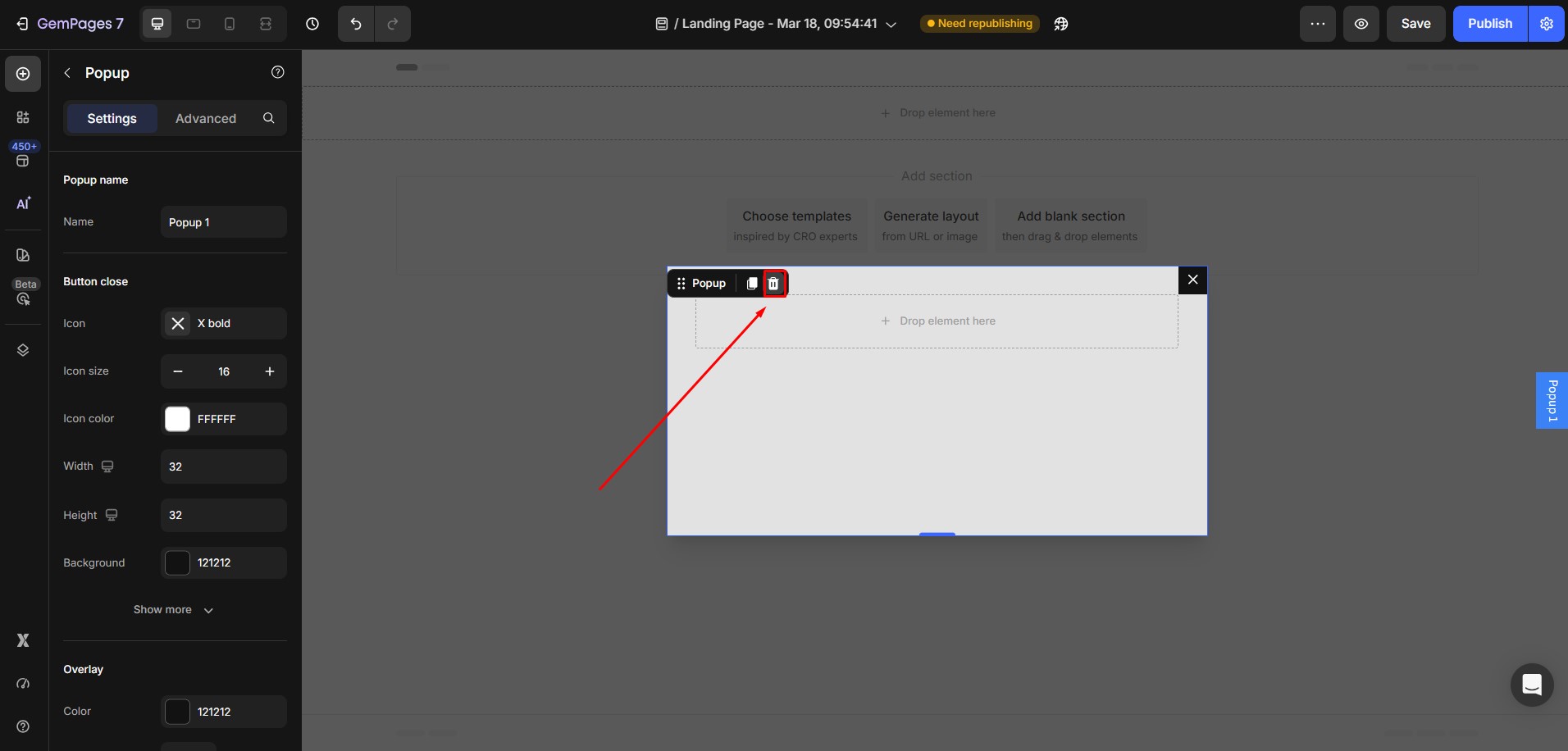
To edit the pop-up content, simply click the pop-up label on the right side of the editor.
The pop-up will reappear on the editor, allowing you to select and edit its inner elements (such as text, images, or buttons) directly.
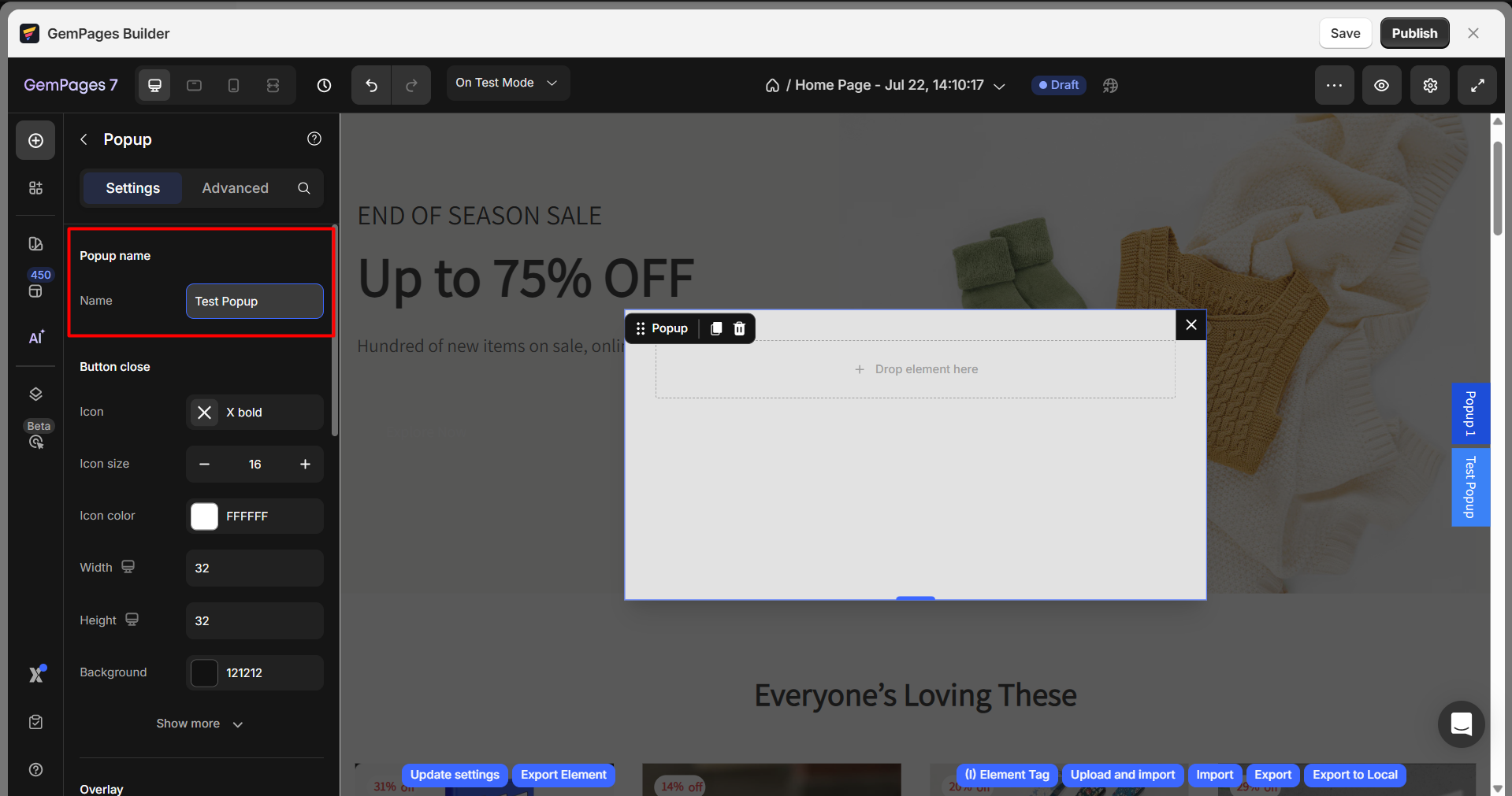
Configure the Settings tab
Popup name
Name: Input your preferred name for the pop-up element.
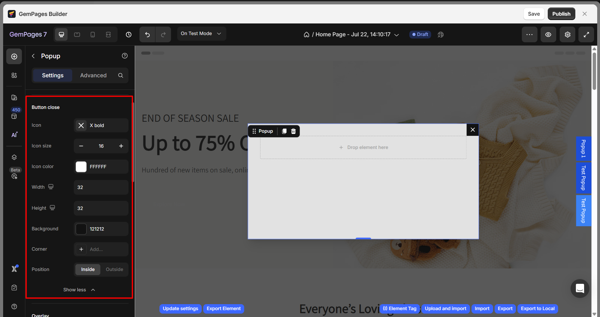
Button close
- Icon: Choose the close button icon (e.g., “X” or “X bold”).
- Icon Size: Adjust the icon size.
- Icon Color: Choose the icon color (e.g., white, #FFFFFF).
- Width & Height: Set the size of the button.
- Background: Select the background color for the close button.
- Position: Choose whether the close button appears inside or outside the popup.
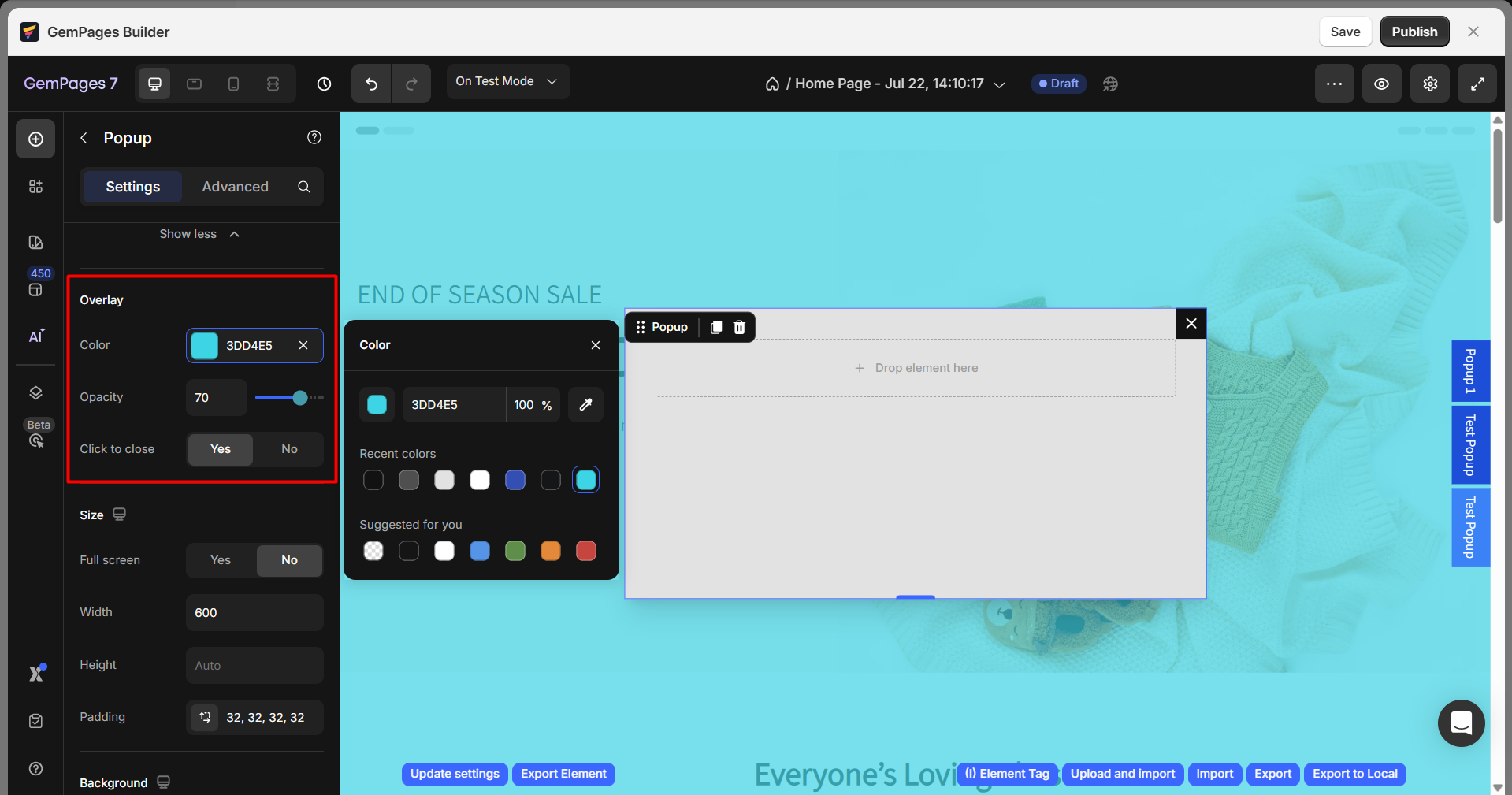
Overlay
The overlay darkens the background page content when the pop-up appears, helping focus attention on the pop-up itself. When enabled, you can customize the overlay color and transparency.
- Color: Pick a color from the palette for the overlay color.
- Opacity: Adjust the opacity of the entire section. A lower numerical value corresponds to a higher level of transparency.
- Click to close: Toggle this switch to enable users to click on the overlay background to close the pop-up.
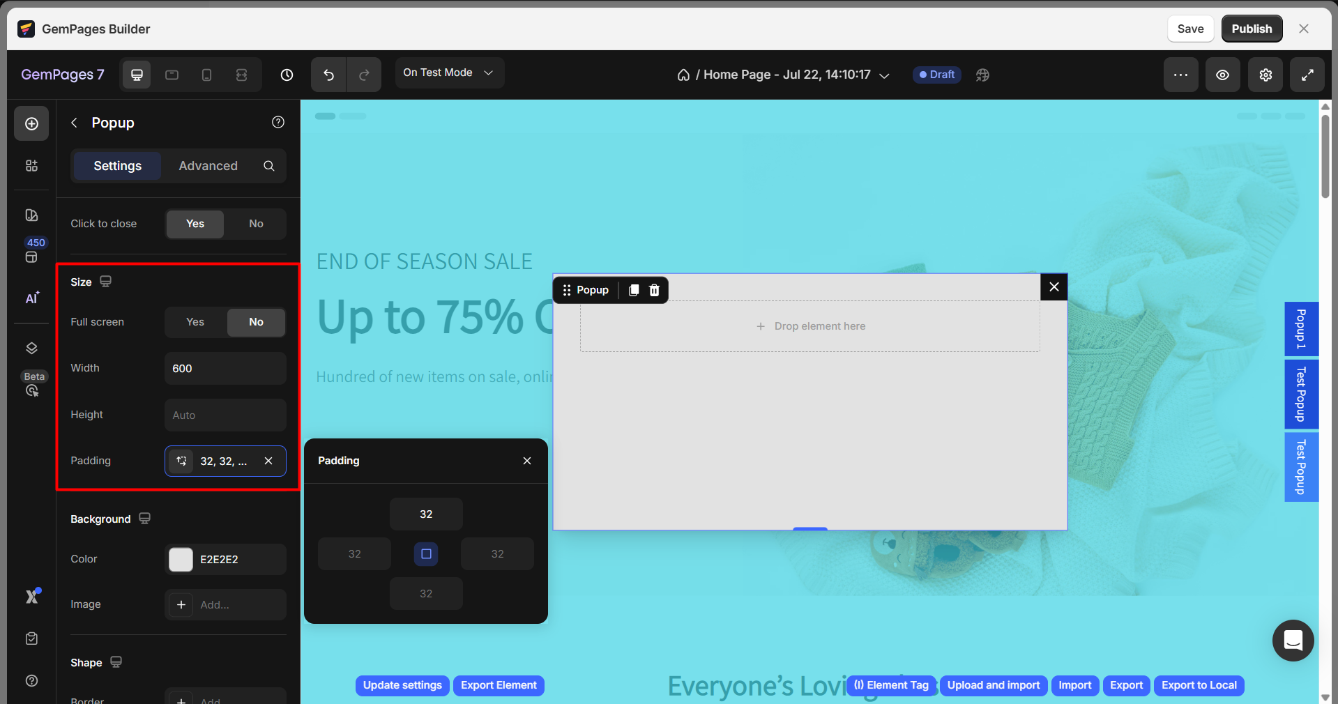
Size
- Full screen: Choose whether the popup should take up the full screen (Yes/No).
- Width: Set the width of the popup (e.g., 600px).
- Height: Adjust the height of the popup (auto or specific value).
- Padding: Define the padding inside the popup element (e.g., 32px all around).
Background
- Color: Choose a background color for the popup (e.g., #FFFFFF).
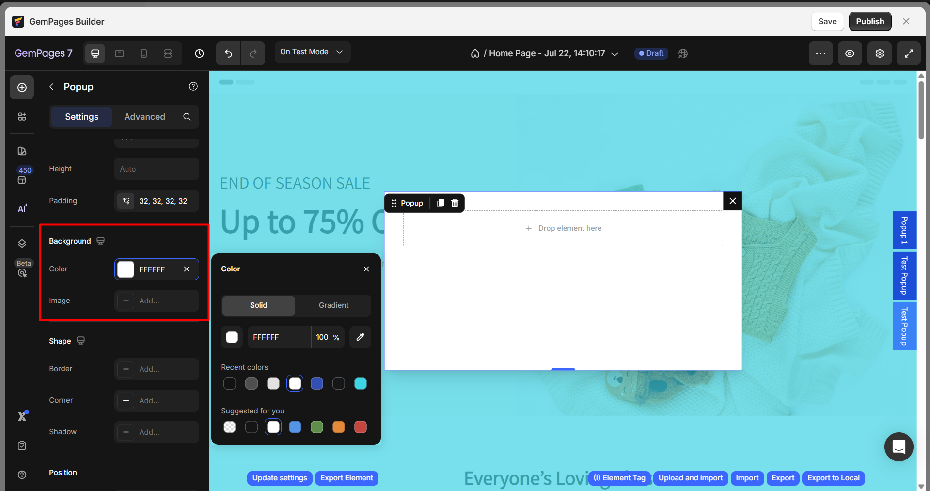
- Image: You can add a background image as well.
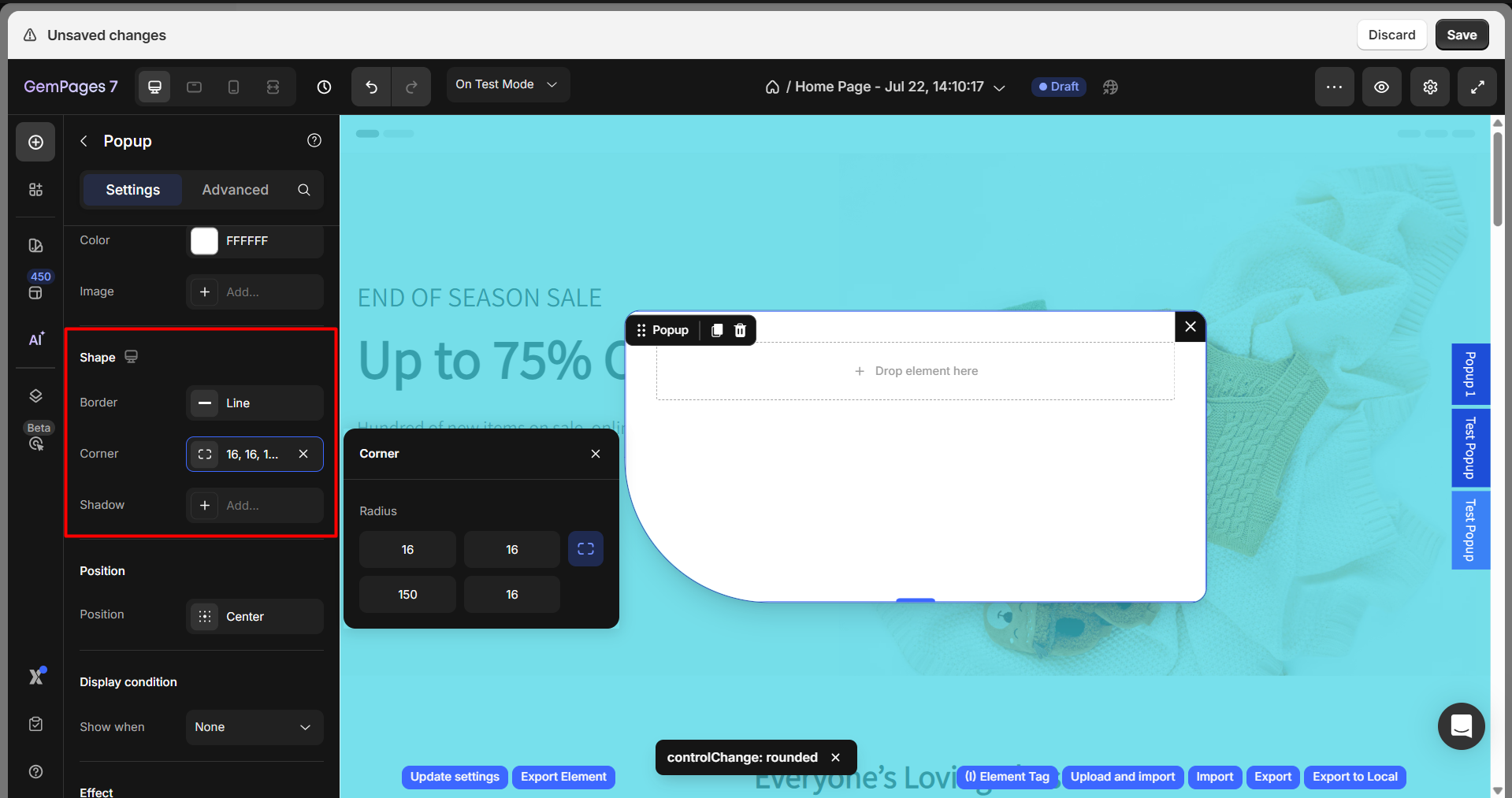
Shape
- Border: Set the type of border (e.g., solid, dashed).
- Corner Radius: Adjust the corner roundness (e.g., 16px for rounded corners).
- Shadow: You can enable or disable shadow effects for the popup.
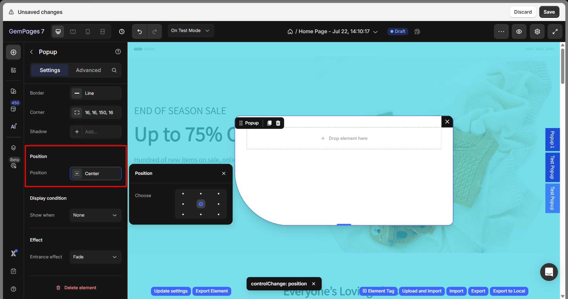
Position
Adjust the position of the image in 9 different positions: top left, top-center, top right, middle left, middle-center, middle right, bottom left, bottom-center, and bottom right.
Display condition
Configure when the pop-up will be triggered:
Show when: Select one of the 5 options from the drop-down menu to set the exact time for the pop-up to appear.
- None: The popup will not be displayed on the live page.
- After page loaded: The popup will show on page load.
- Scroll partially: The popup will be triggered after the user scrolls to a specific percentage of the page.
- About to exit: The pop-up will appear when the user is on the verge of leaving the page.

Delay: This setting appears when you select After page loaded.
Use this option to set how many seconds the system should wait before showing the pop-up after the page loads.
- Enter the delay time in seconds
- Maximum delay time: 100 seconds
Scroll: This setting appears when you select Scroll partially.
Use this option to set how much of the page a user needs to scroll before the pop-up appears.
- Enter the scroll percentage (for example: 50% means the pop-up appears after the user scrolls halfway down the page)
On mobile: This setting appears when you select About to exit.
Choose how the pop-up behaves on mobile devices.
Frequency: This setting controls how often the pop-up is shown.
Available options:
- Once per user: The pop-up will appear only once for each user.
- Each visit time: The pop-up will appear every time the user visits the page.
- After a time: The pop-up will appear again after a specified number of days.
If you select After a time, an additional setting will appear allowing you to enter the number of days before the pop-up is shown again to the same user.
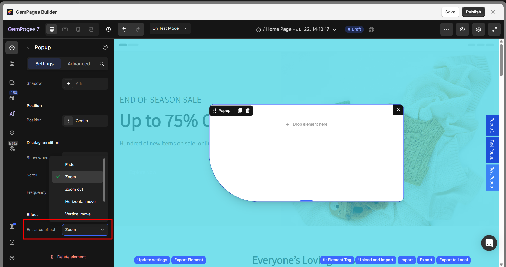
Effect
This element has 7 entrance effects you can choose from:
- Fade
- Zoom
- Zoom out
- Horizontal Move
- Vertical Move
- 3D Unfold
- None: No entrance effect.
Configure the Advanced Tab
For more advanced customization, please navigate to the Advanced tab and follow the instructions in this article.
You can also find more useful tips and video tutorials at GemPages Academy.
Best Practice: Trigger a Popup with a Link
GemPages allows you to trigger popups via hyperlinked text. That means you can obtain the pop-up ID and hyperlink your chosen text with it.
- Select the pop-up you want to open upon being triggered and right-click.
- Select the Copy class to copy the pop-up ID.
- Close the pop-up window and highlight the text you want to turn into a link.
- Click on the hyperlink button and paste the copied link.
- Remove the dot from the start of the ID and replace it with a #, then choose Link to this URL.
How to Add a Form in a Popup
To embed a form in a popup, simply add a Contact Form element inside the Popup element.
Step 1: Open the popup by clicking the popup label on the right side of the editor.
Step 2: Next, from the left sidebar, drag and drop the Contact Form element into the popup area.
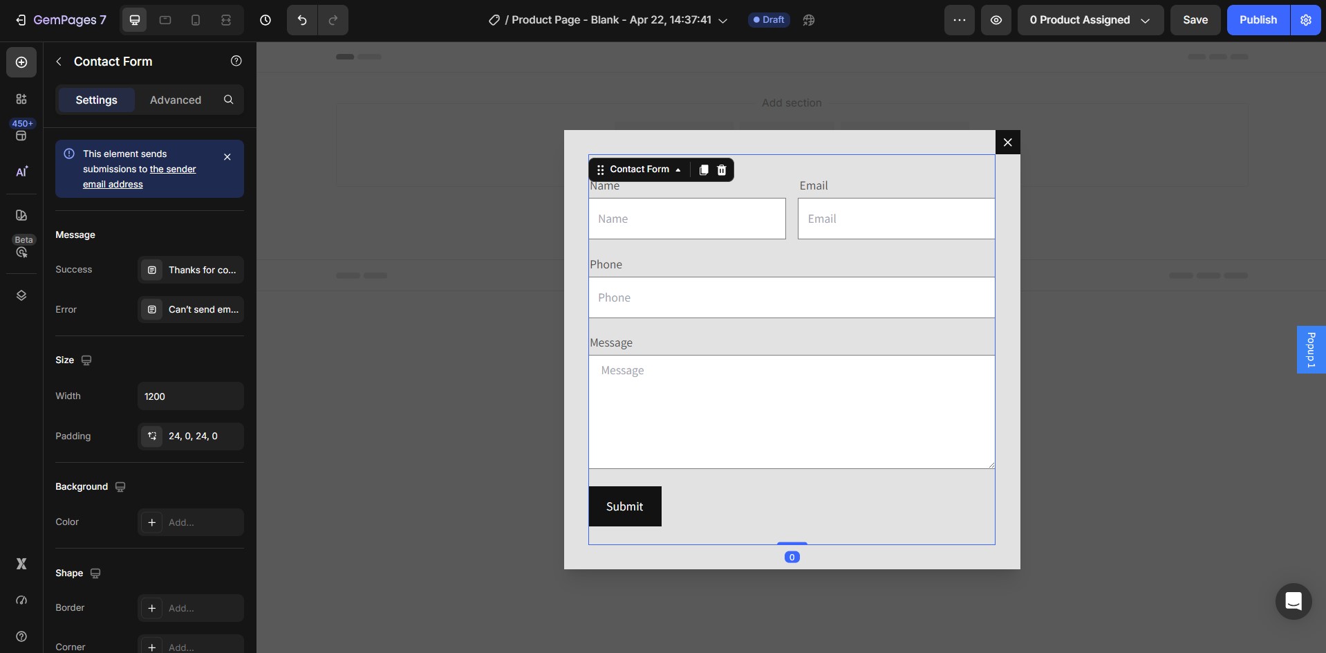
Once added, you can customize the form fields and settings as needed.
Finally, click Save and Publish to apply the changes.
FAQs about the Popup Element
1. Why doesn’t the Popup element work in Theme Sections?
Currently, the Popup element is not supported in theme sections. This means when you create a theme section that includes a popup, it won’t display or function properly on live pages.
In this case, you’ll need to add the Popup element directly on each page instead.
2. How can I edit the popup content after minimizing it?
Once minimized, a popup label will appear on the right side of the editor. Simply click that label, and the popup will reappear so you can edit its content.
3. When will my popup appear on the live page?
The popup display timing depends on your selected Show when condition under Display condition:
- After page loaded
- Scroll partially
- About to exit
- None (the popup will not appear)
4. How can I open a popup with a link or button?
You can trigger a popup through hyperlinked text or buttons by copying the popup’s ID (via “Copy class”) and linking it with a “#” prefix in the URL.
5. What effects can I apply to my popup?
The Popup element includes seven entrance effects: Fade, Zoom, Zoom Out, Horizontal Move, Vertical Move, 3D Unfold, and None.
6. I added a popup in the editor but I can’t find it anymore. Where is it?
When the popup is minimized, it won’t stay visible in the canvas. You’ll see a small popup label on the right side of the editor instead. Click that label to reopen the popup so you can continue editing it.
7. Where can I find the popup ID?
Select the popup in the Editor, right-click on it, and choose Copy > Copy class. The copied value is the popup ID, which you can use to trigger the popup via a link.
8. Can I save a Popup element for global use across multiple pages?
Currently, GemPages only supports global reuse through the Theme Sections feature, which applies to sections only, not individual elements. If you want to use the same popup on multiple pages, you can copy and paste the Popup element instead.
For detailed instructions, see the guide on copying and pasting elements.
9. How do I remove a popup?
You’ll see a small popup label on the right side of the editor. Click that label to reopen the popup, then click the trash icon to delete it.


Thank you for your comments