


What Is a Hero Banner?
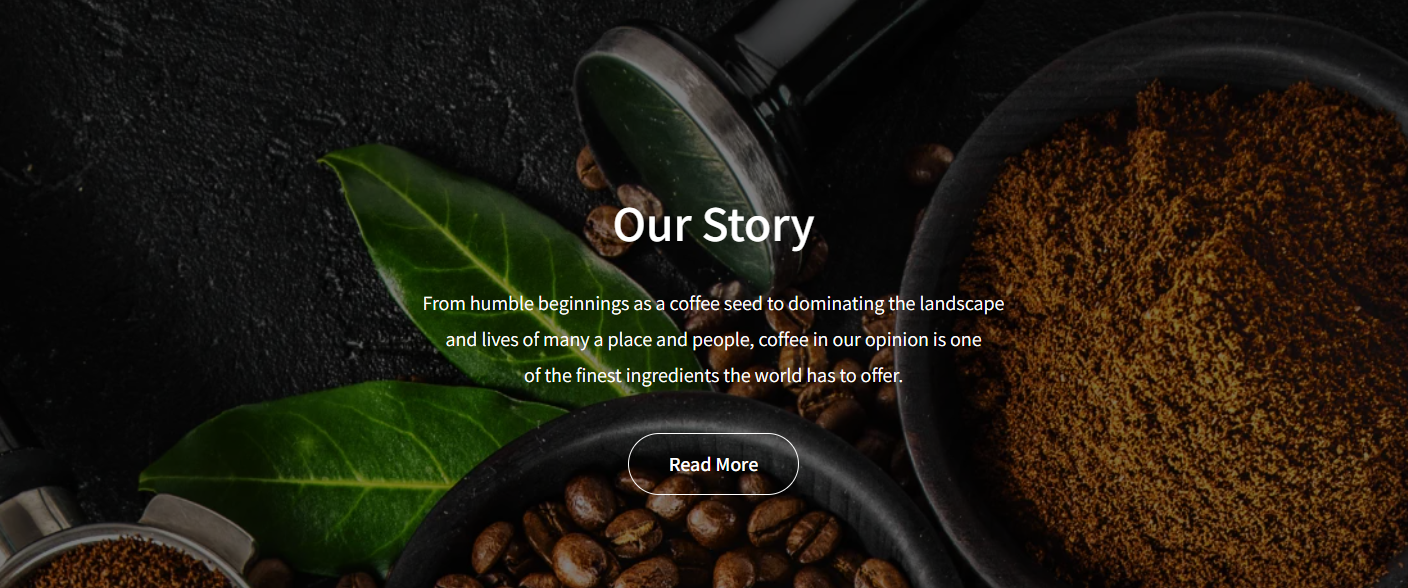
A hero banner is a large visual section placed at the top of a webpage, typically featuring a headline, background image or video, and a call-to-action button.
About the Hero Banner Element
The Hero Banner element allows you to design a striking, full-width section at the top of your webpage that captures visitors’ attention with stunning visuals. Additionally, you can layer elements such as headings, text blocks, and CTAs to make your banner even more engaging.
How to Create a Hero Banner in Shopify Using GemPages
Follow these steps to add a Hero Banner element to your page built with GemPages.
- From the GemPages Dashboard, locate the target page to open the editor.
- In the left sidebar, navigate to the Media section and drag & drop the Hero Banner element to your desired spot.
- (Optional) Drag other elements (e.g., Heading, Button, etc.) onto the banner for added impact.
- Click the Hero Banner to reveal its configuration panel, which includes Settings and Advanced tabs.
Configure the Settings Tab
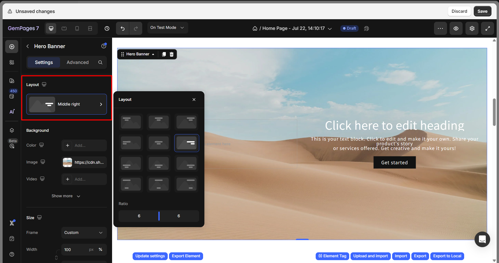
Layout
Choose the content layout and alignment:
- Horizontal position: Left, Center, or Right
- Vertical position: Top, Center, Bottom, or Expanded (fills the full height)
Background
You can set the banner background using one of three sources:
- Color
- Image
- Video
Color background
Select a color from the palette or enter a hex code into the box to set your preferred background color for the banner.
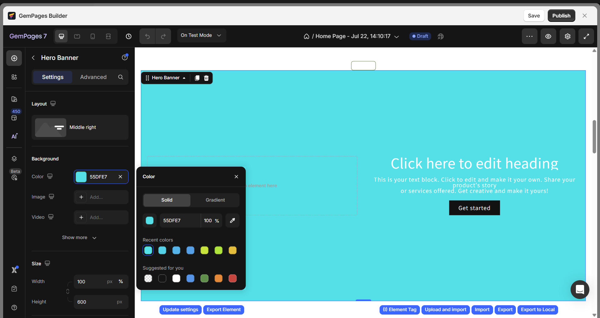
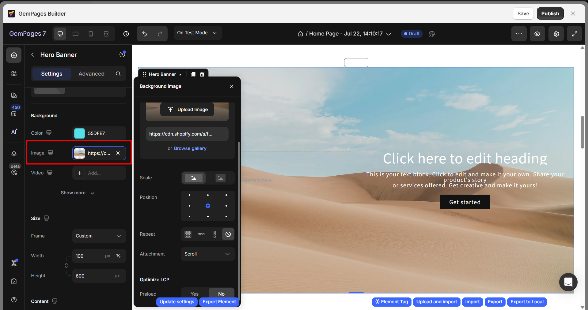
Image background
There are three options for you to change the banner image source:
- Upload Image: This option allows you to select an image from your computer to upload.
- Link Input: This option allows you to input the image link to change the Hero Banner’s image source.
- Browse Gallery: You can pick one image from the gallery, which contains all of your uploaded images.
Tip: For the best display, you can refer to the tooltip shown in the Image tab, under the Banner source section, to find the most optimal dimensions* for the image uploaded in the Hero banner:
| Desktop | 1920×800 px |
| Mobile | 375×200 px or 375×400 px |
| Tablet | 1024×500 px |
To design your Hero Banner on different screens, check out this article.
Video background
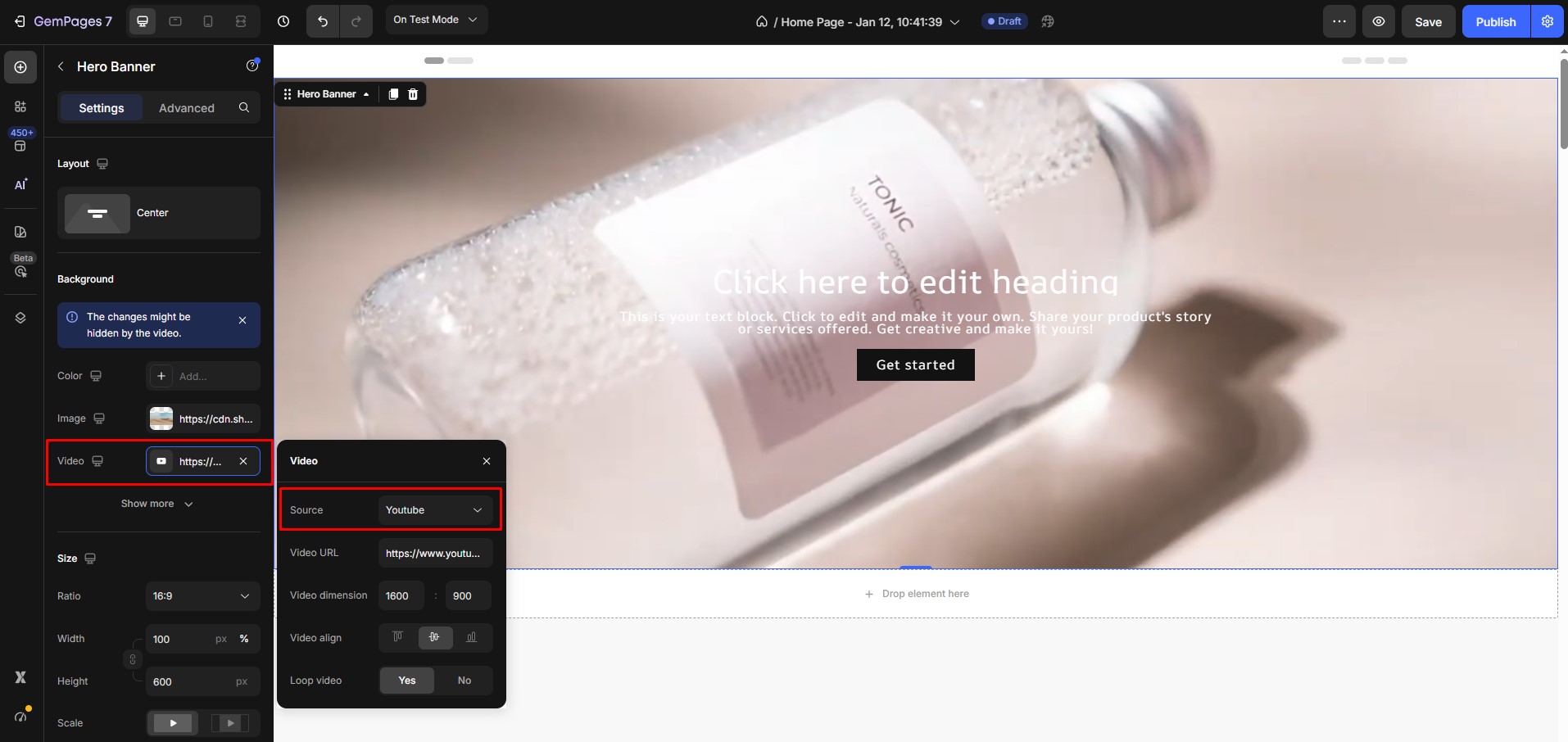
When setting up a video background for your banner, you can choose one of the following video sources:
YouTube: You can use a video from YouTube as the background. This option supports both YouTube Shorts and standard YouTube videos, giving you flexibility in choosing your content.
To help GemPages display the video correctly, we recommend providing the video’s dimensions. This information allows GemPages to calculate the zoom level and ensure the video fits nicely within the banner. Popular video dimensions include:
- 1600:900
- 400:300
- 2100:900
- 100:100
- 900:1600
Video hosting: If you prefer to host the video yourself, choose the Video hosting option. Upload your video to Shopify, then paste the video link into the Weblink field to use it as the background.
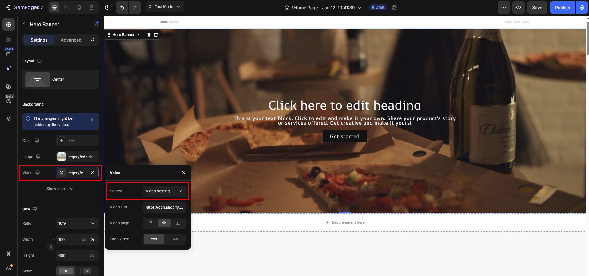
Note: Please note that the result needs to be checked on the live page. For step-by-step instructions on how to upload the video to Shopify, please refer to this article.
Turn on the “Loop video” switch to have the video restart from the beginning once it reaches the end.
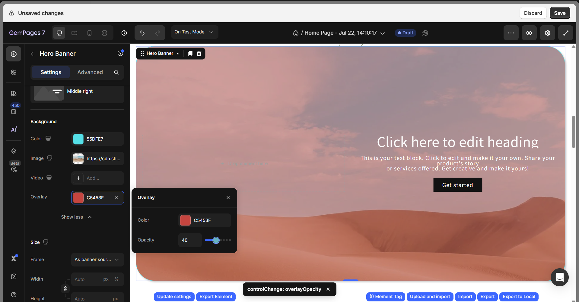
Overlay
Click Show more, then hit Add… to configure:
- Color: Pick an overlay color
- Opacity: Adjust transparency (lower values = more transparent)
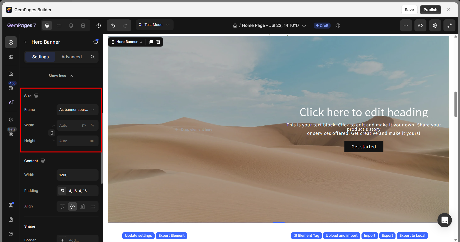
Size
Choose how the banner scales:
- As banner source: Auto-adjusts based on image dimensions
- Custom: Manually set width and height
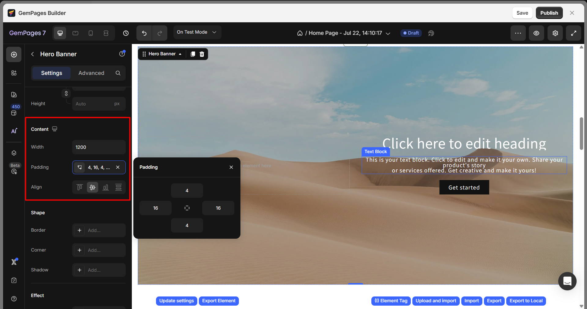
Content
Configure:
- Width: Set the maximum width for inner content
- Padding: Add spacing inside the banner
- Align: Align content horizontally (left, center, right)
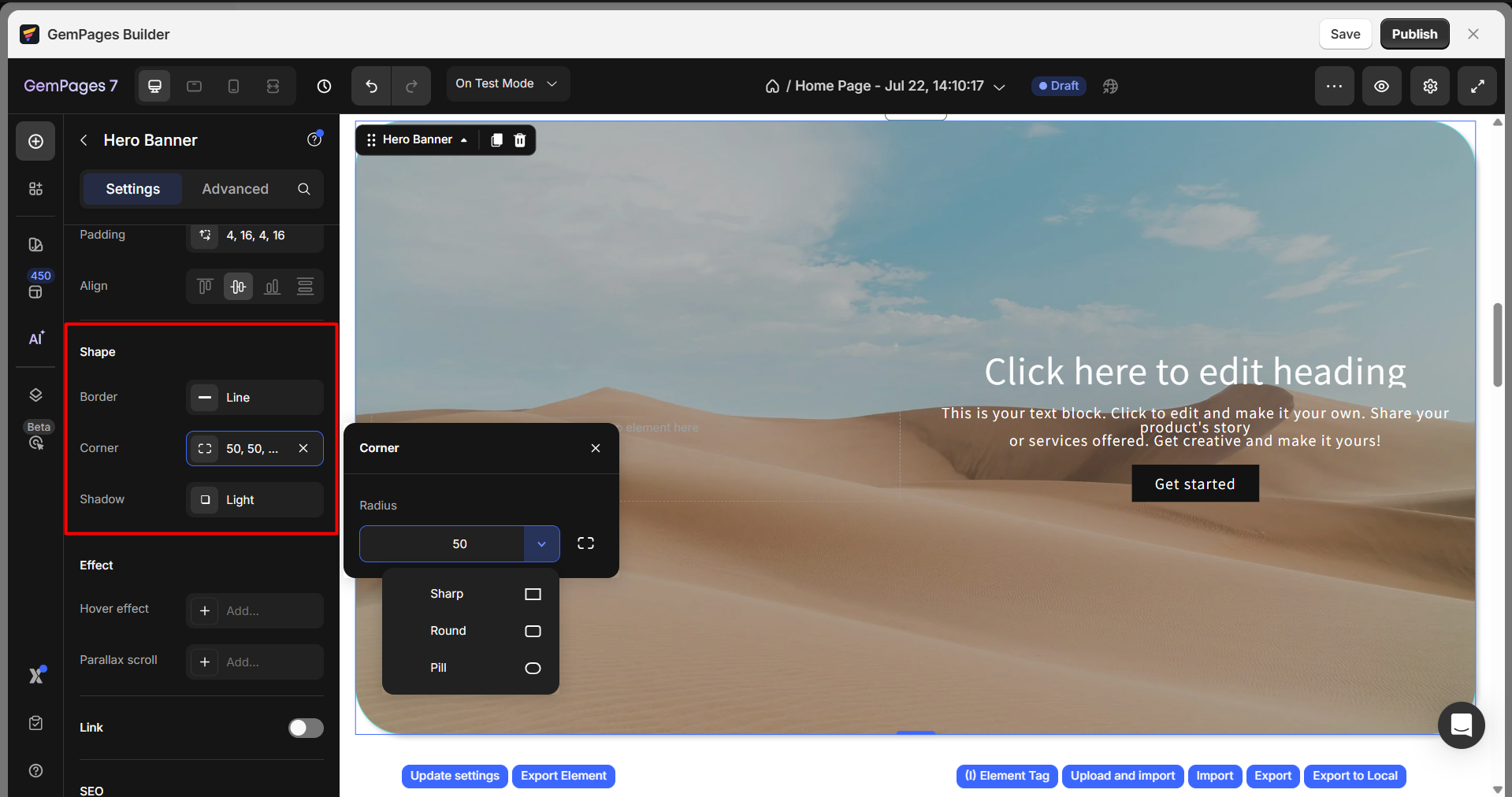
Shape
Customize the shape using:
- Border: Add border styles
- Corner: Adjust the roundness of corners
- Shadow: Apply shadow effects for depth
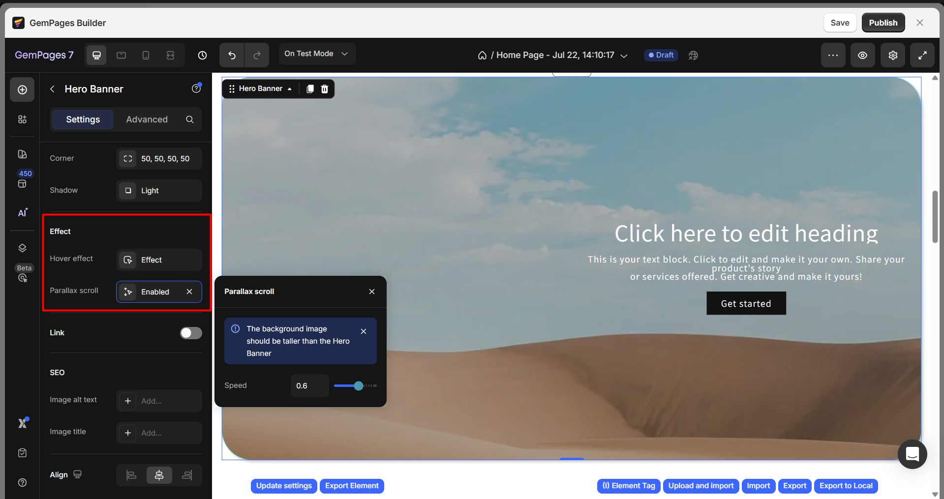
Effect
- Hover effect: Add interactive hover styling
- Parallax scroll (for image only): Adds depth with layered movement as users scroll
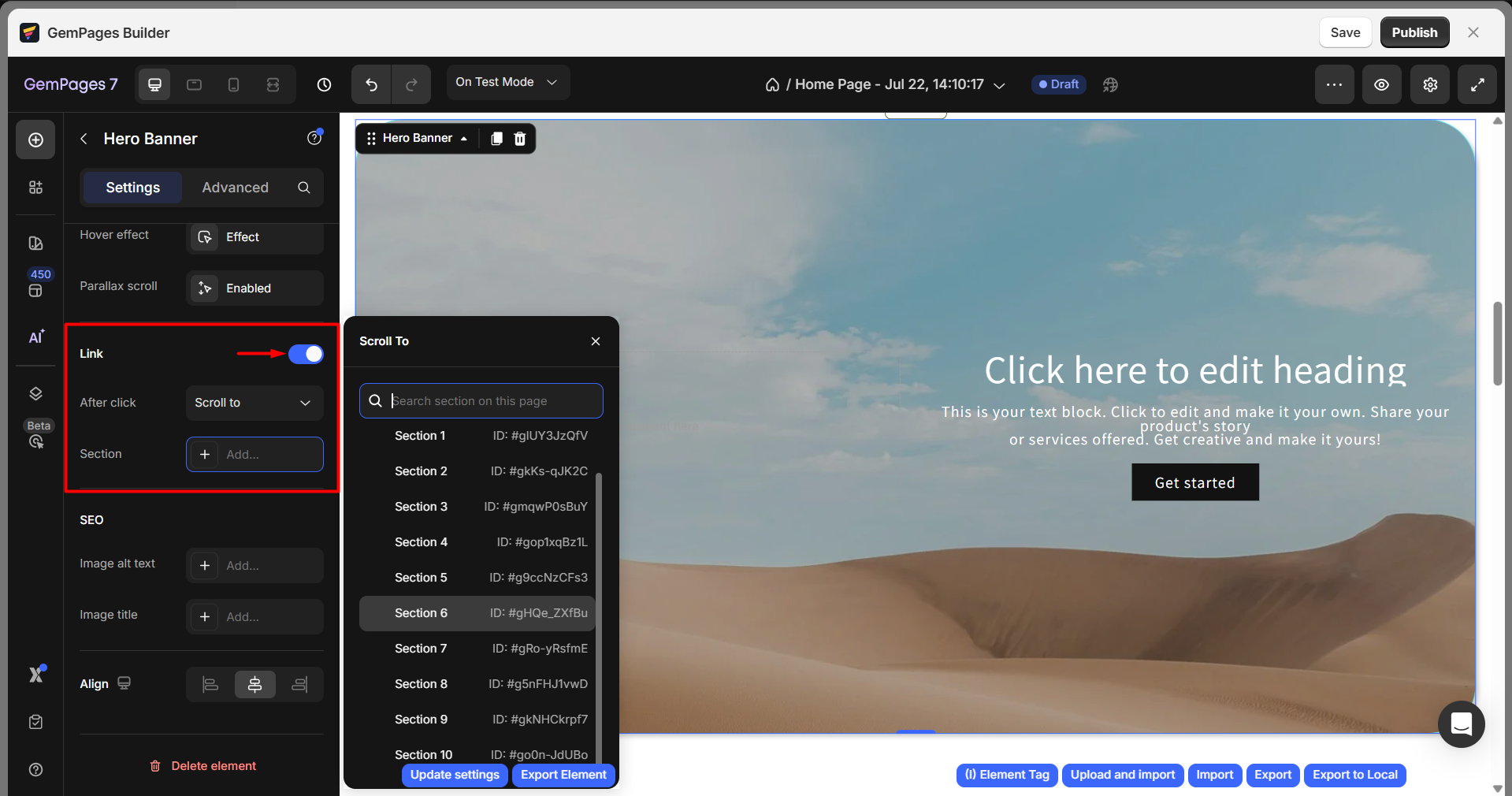
Link
Once you toggle ON, you can configure the Link section:
After click: Choose from the dropdown to decide what happens after visitors click your hero banner: Open page, Scroll to, Open popup, Send email, or Make phone call.
For example, if you choose the Scroll to option, click on the Add… to select the target section from the list.
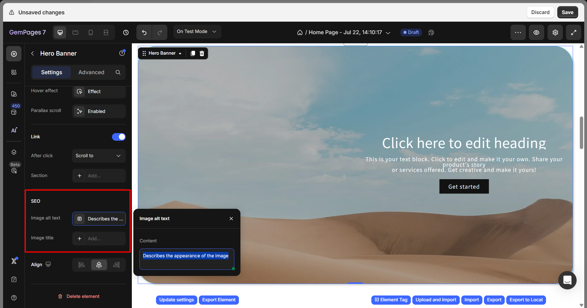
SEO
Under the SEO section, you can add the image alt text and image title to enhance the page SEO.
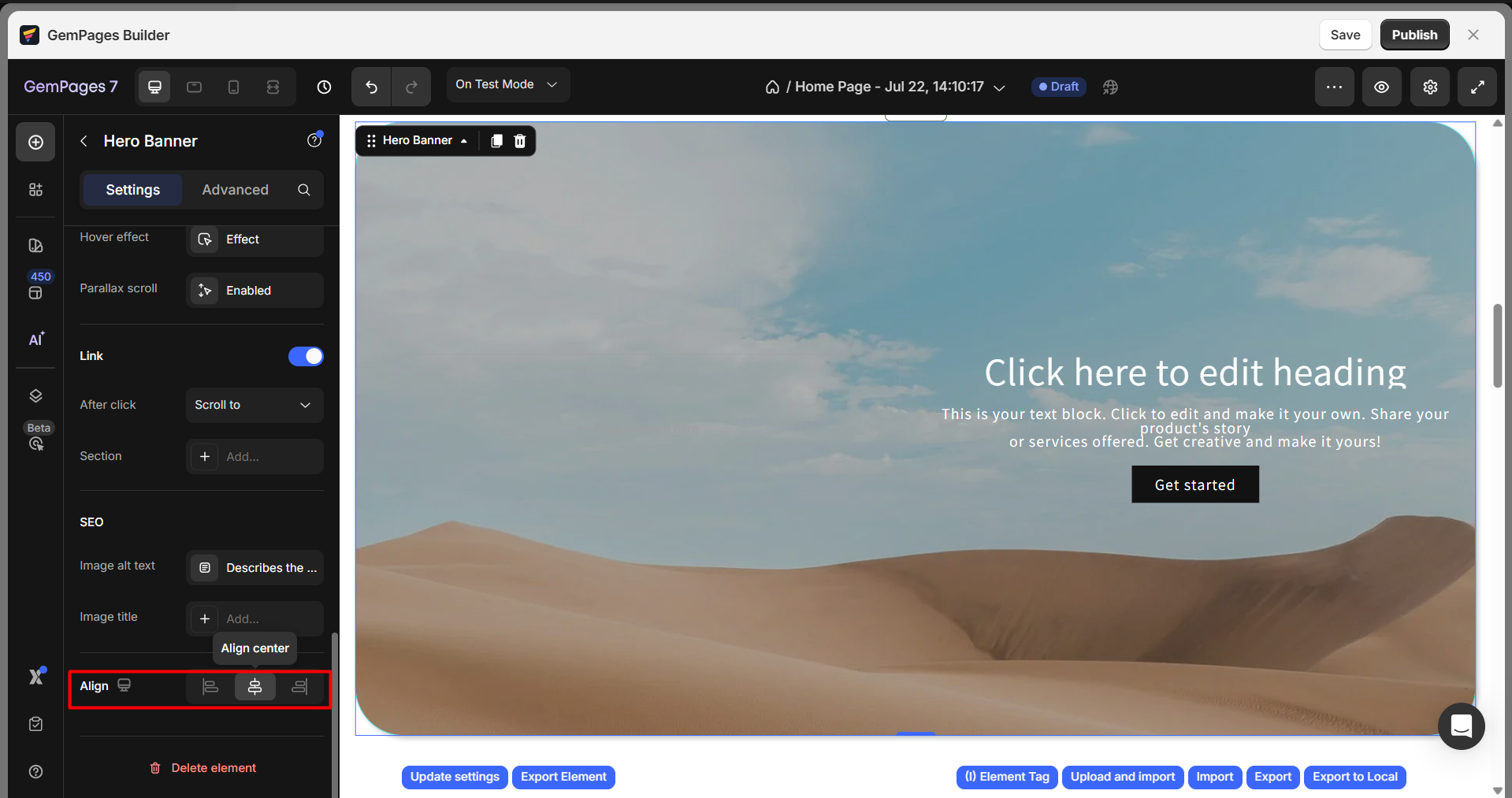
Align
Align the Hero Banner section itself: Left, Center, or Right.
Configure the Advanced Tab
For more advanced customization, please navigate to the Advanced tab and follow the instructions in this article.
FAQs
1. How do I add text to a picture using the Hero Banner element?
After adding the Hero Banner to your page, simply drag and drop a Heading or Text element onto the banner. You can then edit the text, adjust its styling, and position it wherever you want on top of the image background.
2. Can I use a video background in the Hero Banner?
Yes. You can use either a YouTube link or a hosted video from Shopify. Just paste the link in the Video Source settings. Optionally, enable the “Loop video” switch for continuous playback.
3. Can I create a slideshow with the Hero Banner element?
The Hero Banner element is also used to design a slideshow on your webpage. By blending the Hero Banner with the Carousel element, you can easily create an impressive slideshow that captures customer attention. To learn how to do this, check out this instructional video.
4. Why is my text or button not showing on mobile?
Make sure the element is not hidden on mobile. In the Advanced tab, check the Visibility settings to confirm it’s enabled across all screen sizes.
5. How do I align the text or button inside the Hero Banner?
Use the Content > Align setting to position elements left, center, or right. You can also use the Padding and Width controls for precise placement.
6. How do I make my homepage full screen for visitors?
7. Why does my Hero Banner appear higher or in the wrong position on the page?
8. How do I add alt text to a Hero Banner?
To add alt text for a Hero Banner, click on the Hero Banner element to open its settings panel. Under the SEO section, enter your text in the Image alt text field. This alt text helps improve accessibility and SEO by describing the banner image for search engines and screen readers.
9. Can I add a Buy Now button to a Hero Banner?
No, the Hero Banner doesn’t support dynamic checkout (Buy Now) buttons. These buttons require product data, so they’re only available inside Product or Product List elements. If you want a similar effect, you can add a regular button in the Hero Banner and link it to a product page instead.


Thank you for your comments