This article explains how to adjust internal spacing in GemPages using Padding and Gap settings to improve readability, structure, and overall layout balance.
Why Internal Spacing Matters
Internal gaps within your design—whether inside a single element or between multiple elements—are essential for maintaining a clean, readable, and visually appealing layout. Proper spacing can:
- Improve content readability
- Create a sense of balance and structure
- Prevent elements from feeling cluttered or cramped
In GemPages, you can adjust two primary types of internal spacing: Padding and Gap (used in rows and columns).
1. Adjust Internal Padding
Padding controls the space between an element’s content and its outer border. It’s commonly used to:
- Add breathing room around text or images
- Ensure content doesn’t touch the edge of the element
- Create a consistent, polished look
How to Adjust Padding in GemPages:
Step 1: Click on the element (e.g., a button, image, or text block) that you want to adjust.
Step 2: In the left sidebar, go to the Advanced tab.
Step 3: Find the Spacing section, then adjust the Padding values for:
- Top: Space above the content
- Right: Space to the right
- Bottom: Space below
- Left: Space to the left
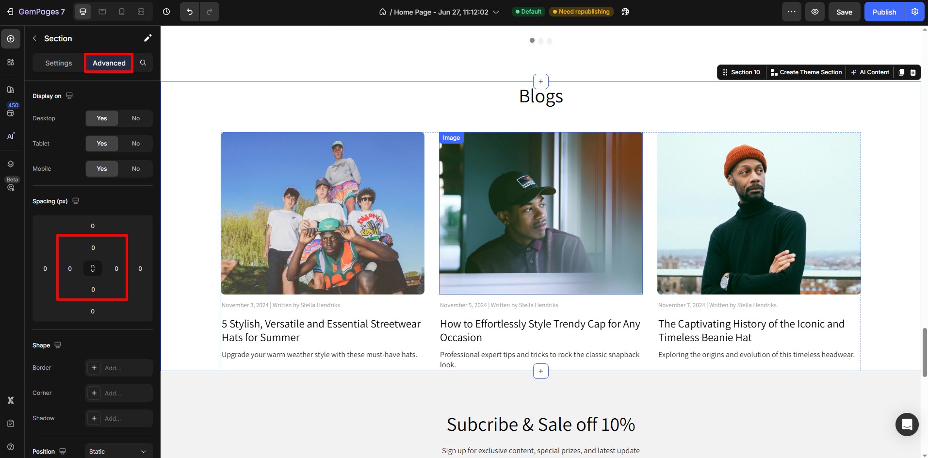
Tip: Use consistent padding values for a uniform appearance, or customize each side for an asymmetrical design.
2. Adjust Gaps Between Child Elements in a Row
When you’re working with a row or a container that holds multiple child elements (e.g., columns, buttons, or images), the spacing between those items is controlled using Column Gap.
How to Adjust Column Gaps:
Step 1: Select the parent container (usually a Row element with two or more columns).
Step 2: In the Settings panel, locate the Column Spacing setting.
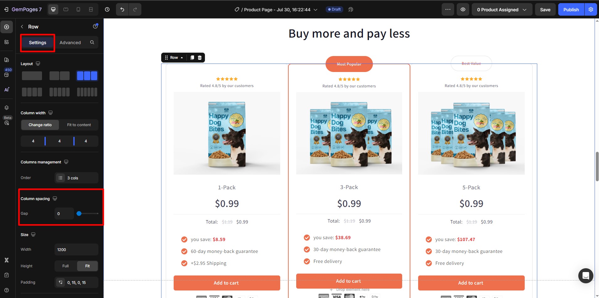
Step 3: Use the slider to increase or decrease the space between child elements.
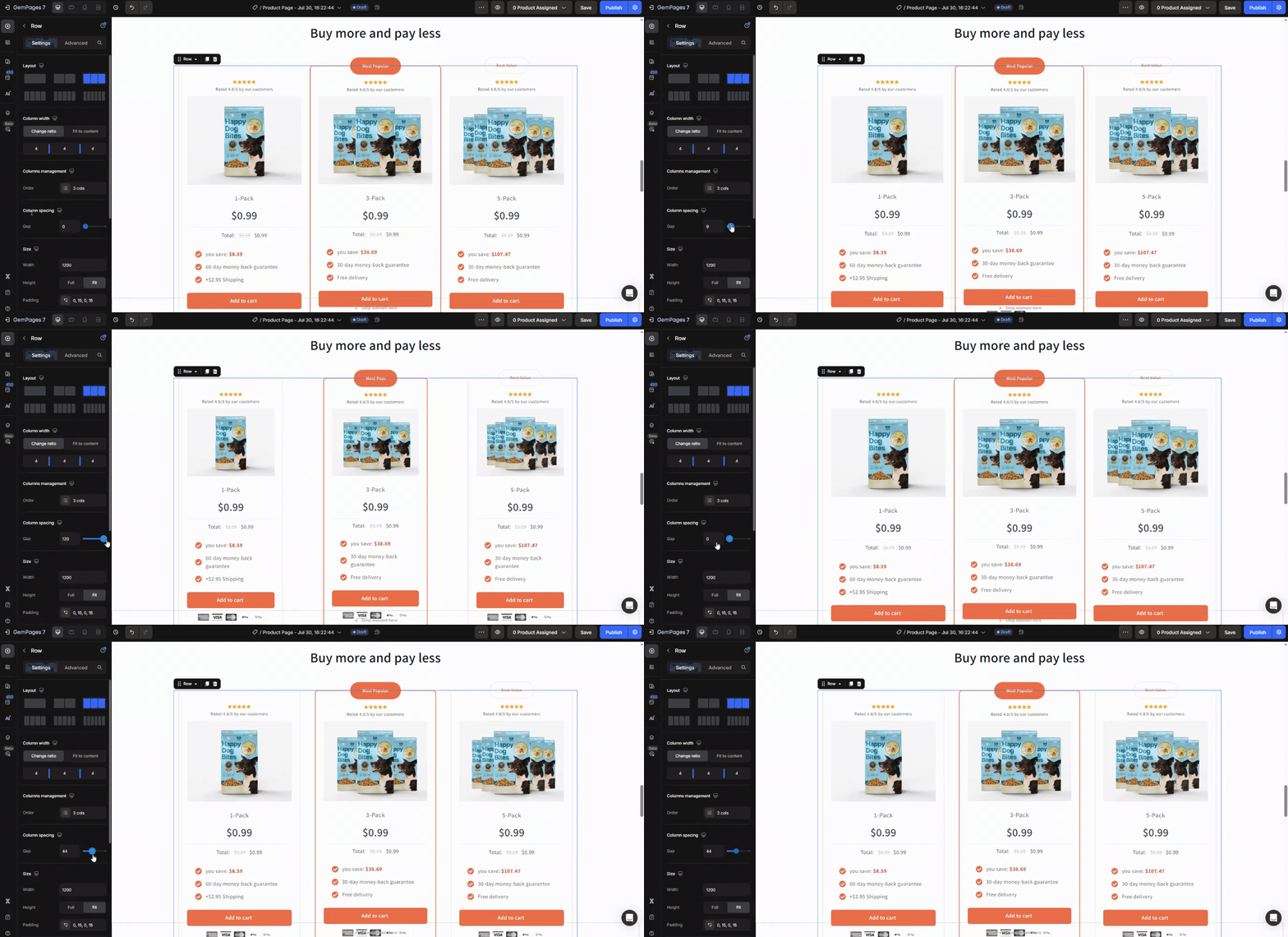
Preview your changes in real time to ensure optimal layout and alignment.
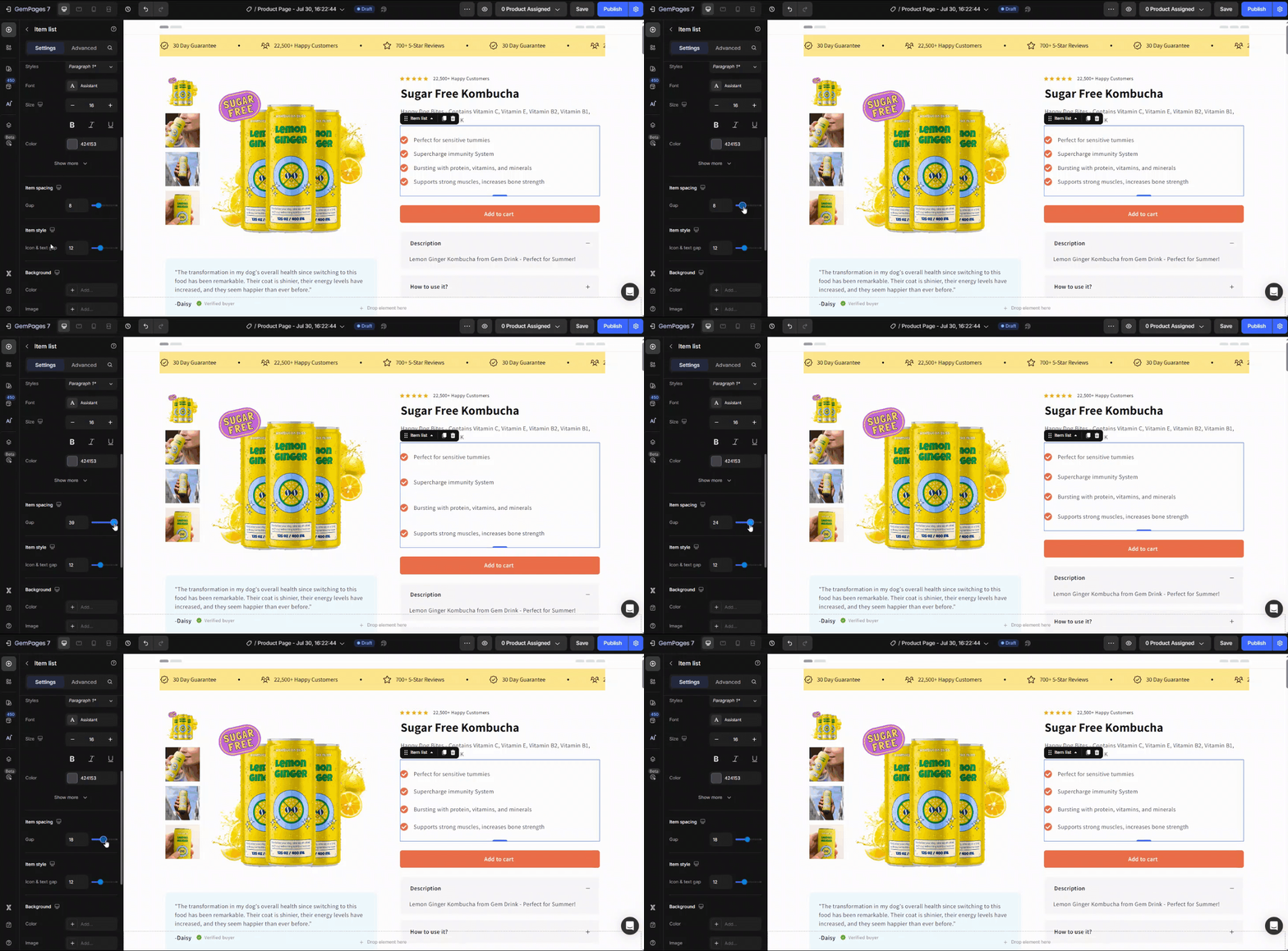
3. Adjust Gaps Between Stacked Rows or Items
For vertically stacked elements—like accordion sections, list items, or content blocks—the space between them is defined by the Item Gap or Row Gap setting.
How to Adjust Row or Item Gaps:
Step 1: Select the container that holds the stacked items (e.g., an accordion or a section with multiple rows).
Step 2: In the left sidebar, go to the Item spacing section.
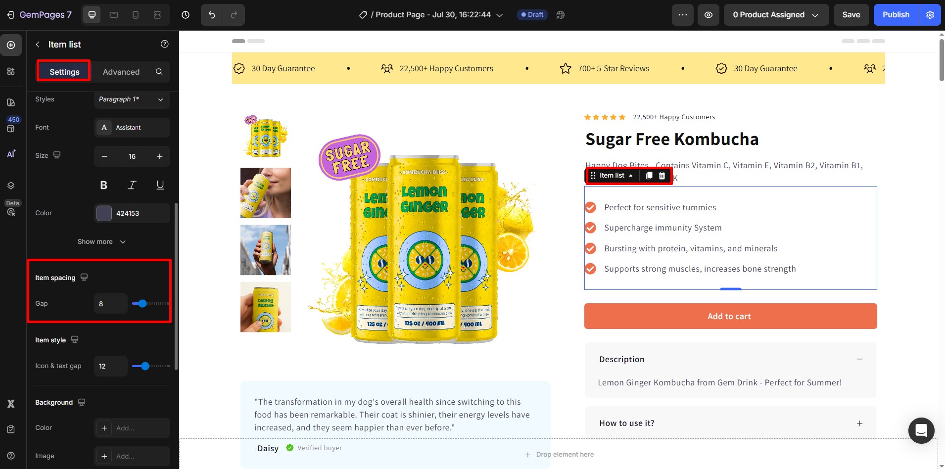
Step 3: Adjust the Item Gap setting using the slider.


Thank you for your comments