What Does “Element Position” Mean in Web Design?
In web design, element position refers to where an object (like a button, image, or text block) appears relative to its parent container or the overall layout. Understanding how different positioning types work allows you to build flexible, pixel-perfect designs.
For example:
A button placed inside a column within a row can be shifted within that column, but only within its container unless advanced positioning is applied..
How to Set Element Position in GemPages
- Margin: Moves the element and also shifts nearby elements to maintain spacing.
- Position: Moves the element without affecting the positions of other elements.
Examples for each case will be provided below.
Method 1: Adjusting Element Position Using Margins
Margins are the most straightforward way to reposition elements in GemPages. They create space around an element and affect how nearby content flows.
Step 1: Click on the element you want to change the position.
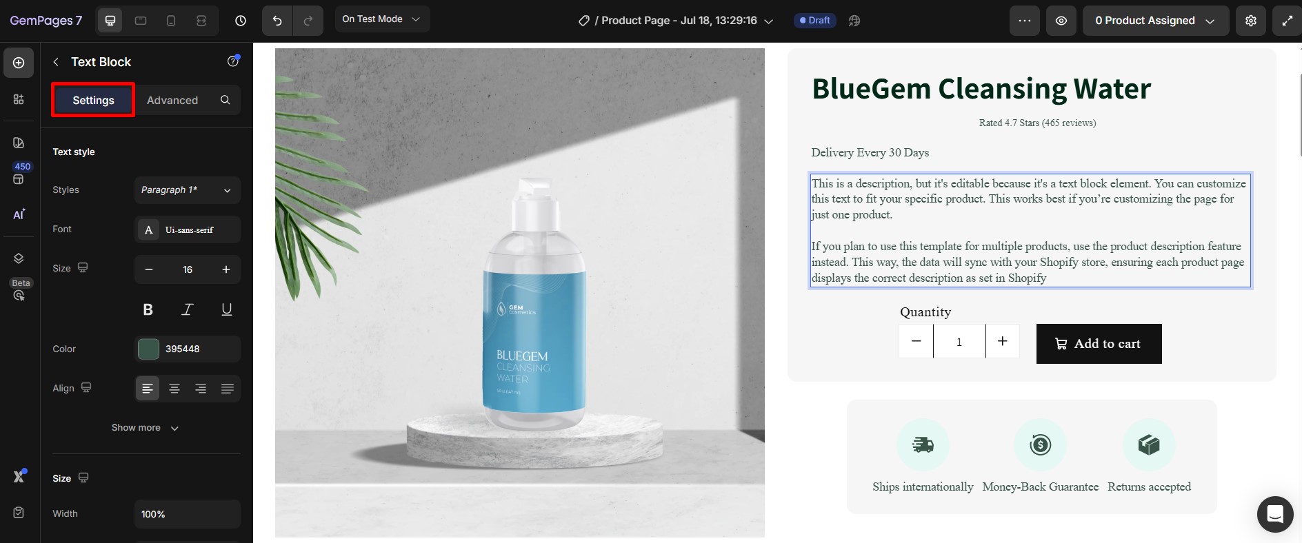
Step 2: In the settings sidebar, navigate to the Advanced tab.
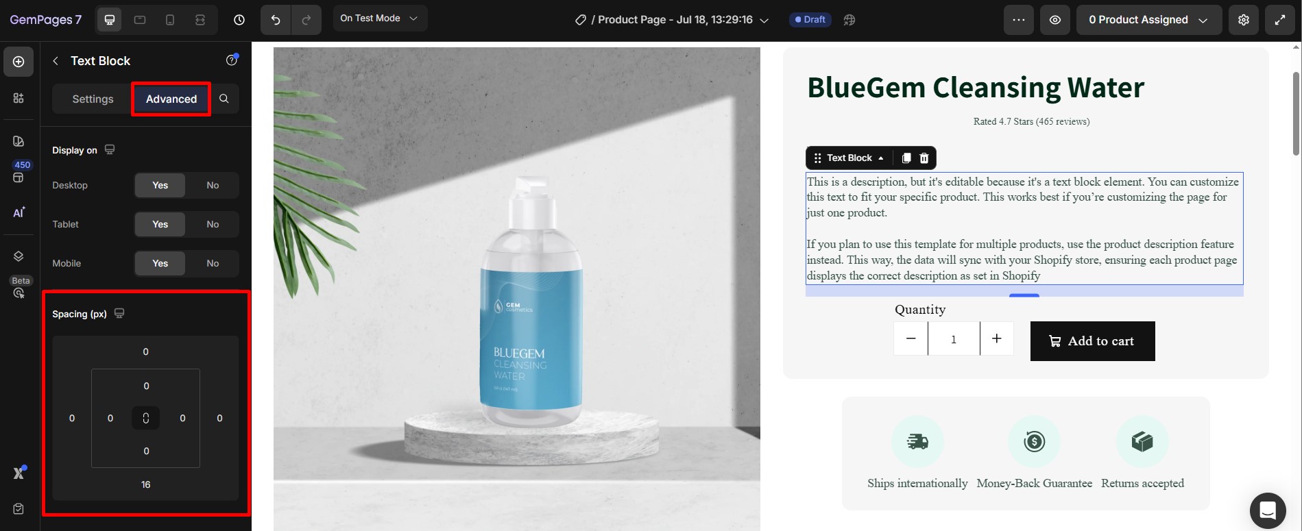
Step 3: Adjust Margins in Spacing:
- Use positive margins to add space around the element.
- Use negative margins to position elements outside the boundaries of their container for unique designs.
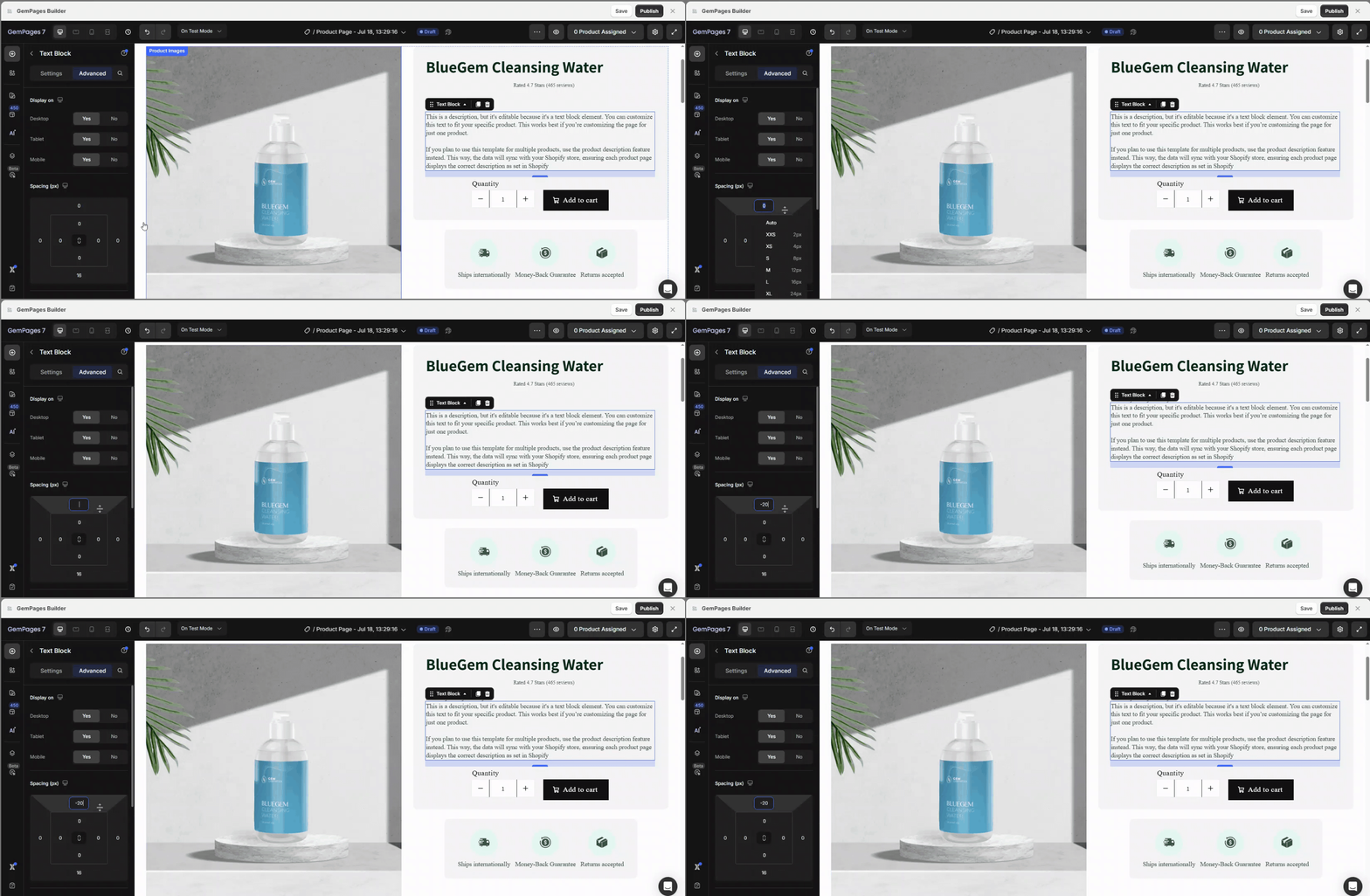
If you set a negative top margin, the element will move upward, and the elements below it will move up as well to fill the gap.
For a detailed guide on margins, see our Margin Settings Article.
Method 2: Setting Element Position Using the Position Property
For more advanced layout control, use the Position setting. This method lets you place elements without affecting others and gives you fine-tuned control over layout behavior on scroll and resize.
Here’s how to edit the position settings of an element:
Step 1: Click on the element you wish to reposition.
 Step 2: Go to the Advanced tab, and find the Position Section:

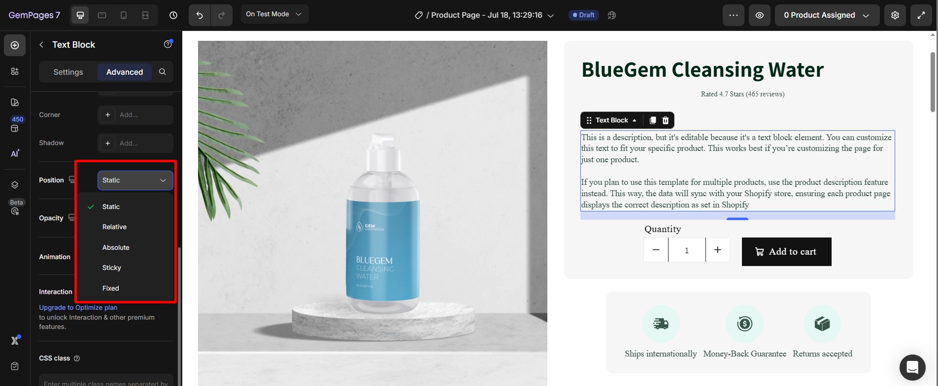 Choose one of the following options:
- Static:
- Default setting; the element follows the normal flow of the page.
- No custom position adjustments are allowed.
- Relative:
- Moves the element relative to its original position.
- Adjust custom values for Top, Right, Bottom, or Left to shift its placement.
- Absolute:
- Positions the element relative to its nearest positioned ancestor (e.g., a Row or Section).
- Use Top, Right, Bottom, and Left to place the element exactly where you want within its containing element.
- Fixed:
- Keeps the element in a fixed position relative to the viewport.
- Great for sticky headers or floating buttons that stay visible during scrolling.
- Sticky:
- Acts as a hybrid of relative and fixed positioning.
- The element behaves as relative until it reaches a specific scroll position, then it becomes fixed.


Thank you for your comments