About Collection Paginator
The Collection Paginator is specifically designed for Collection Pages to simplify browsing through extensive product lists.
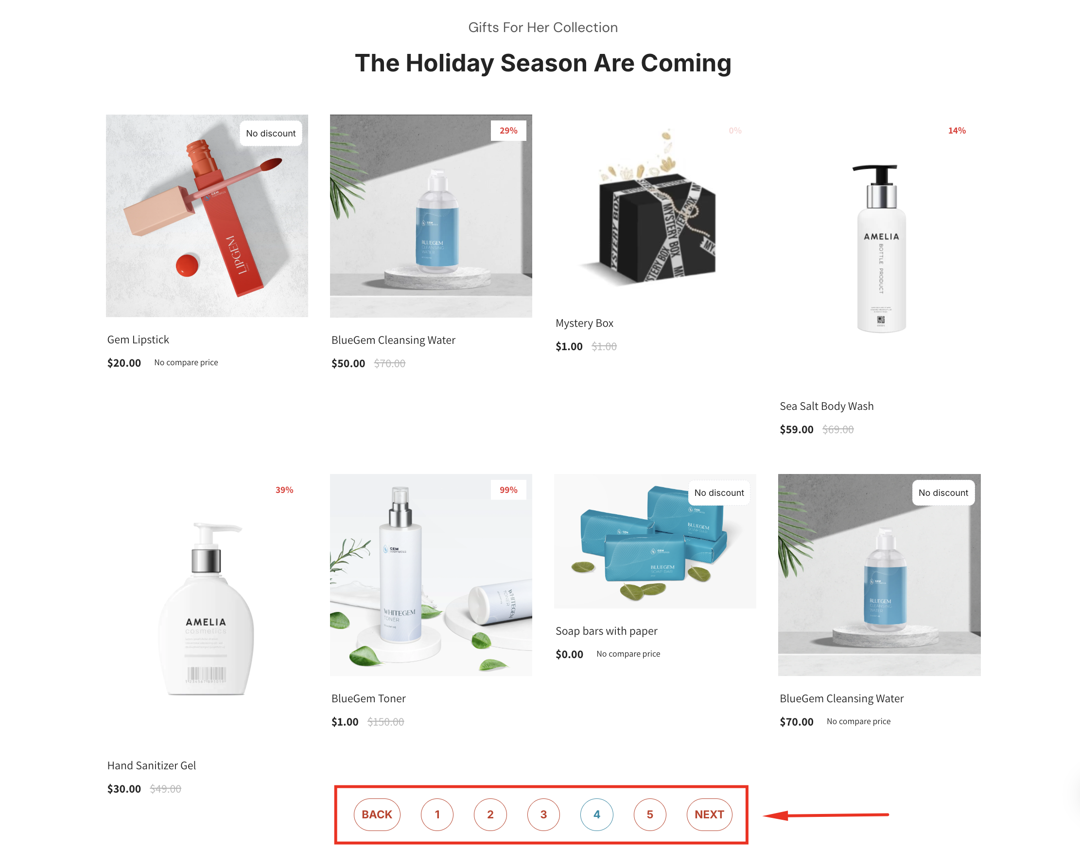
Instead of displaying all products on a single page, it creates a series of pages that users can navigate using Previous, Next, or numbered links. This improves both user experience and website performance.
How to Add a Collection Paginator Element to Your Page?
- Access the GemPages Dashboard > Pages.
- Click on your target page to open the editor.
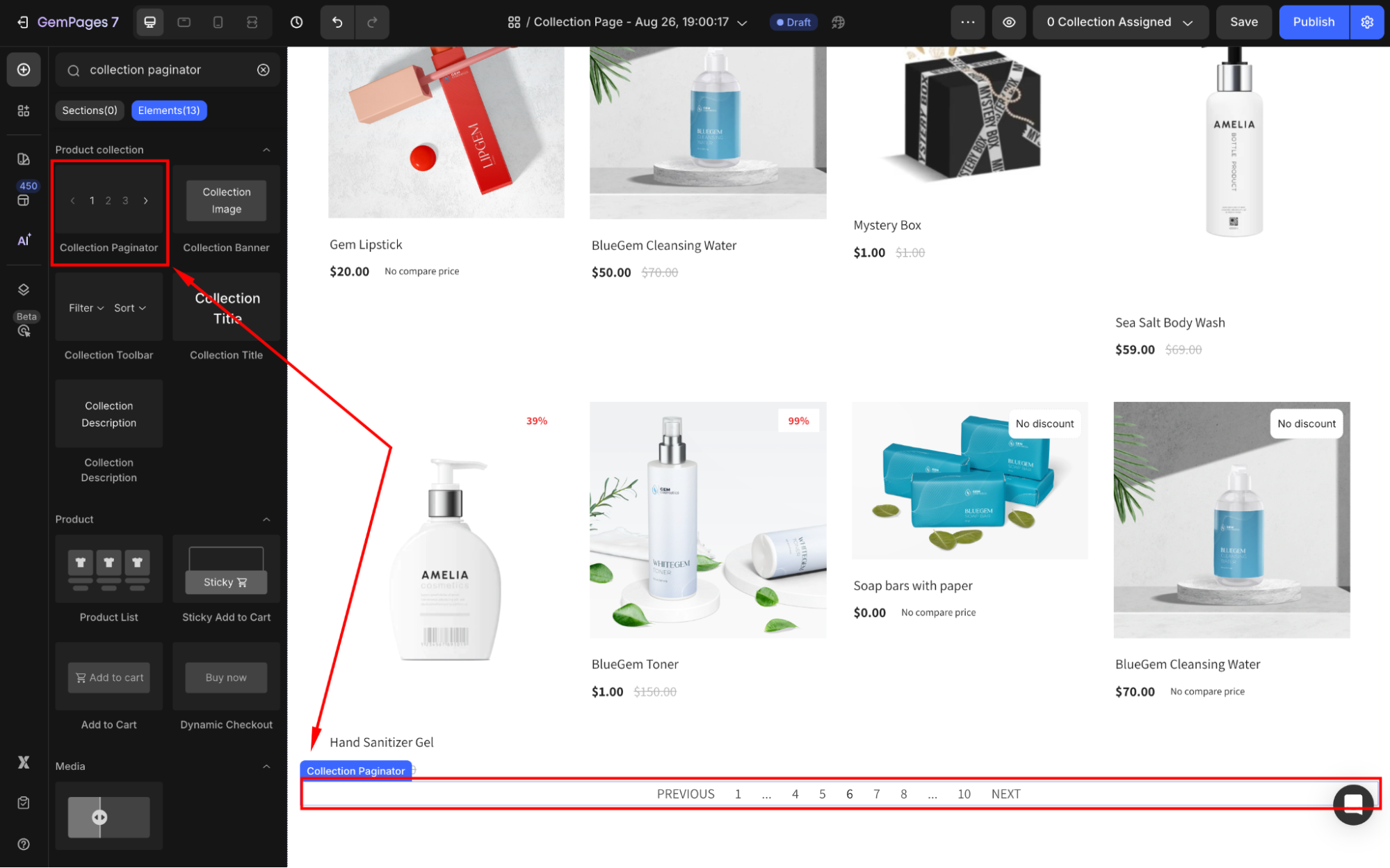
- In the left sidebar, search for “collection paginator”, then drag and drop the element to any position in your collection page.
Then, click on the element to open its settings panel, where you can customize the Collection Paginator your way.
Collection Paginator Element Settings
The Collection Paginator Element offers several customization options to fit your store’s design and functionality needs. Here’s a breakdown of its settings:
Display
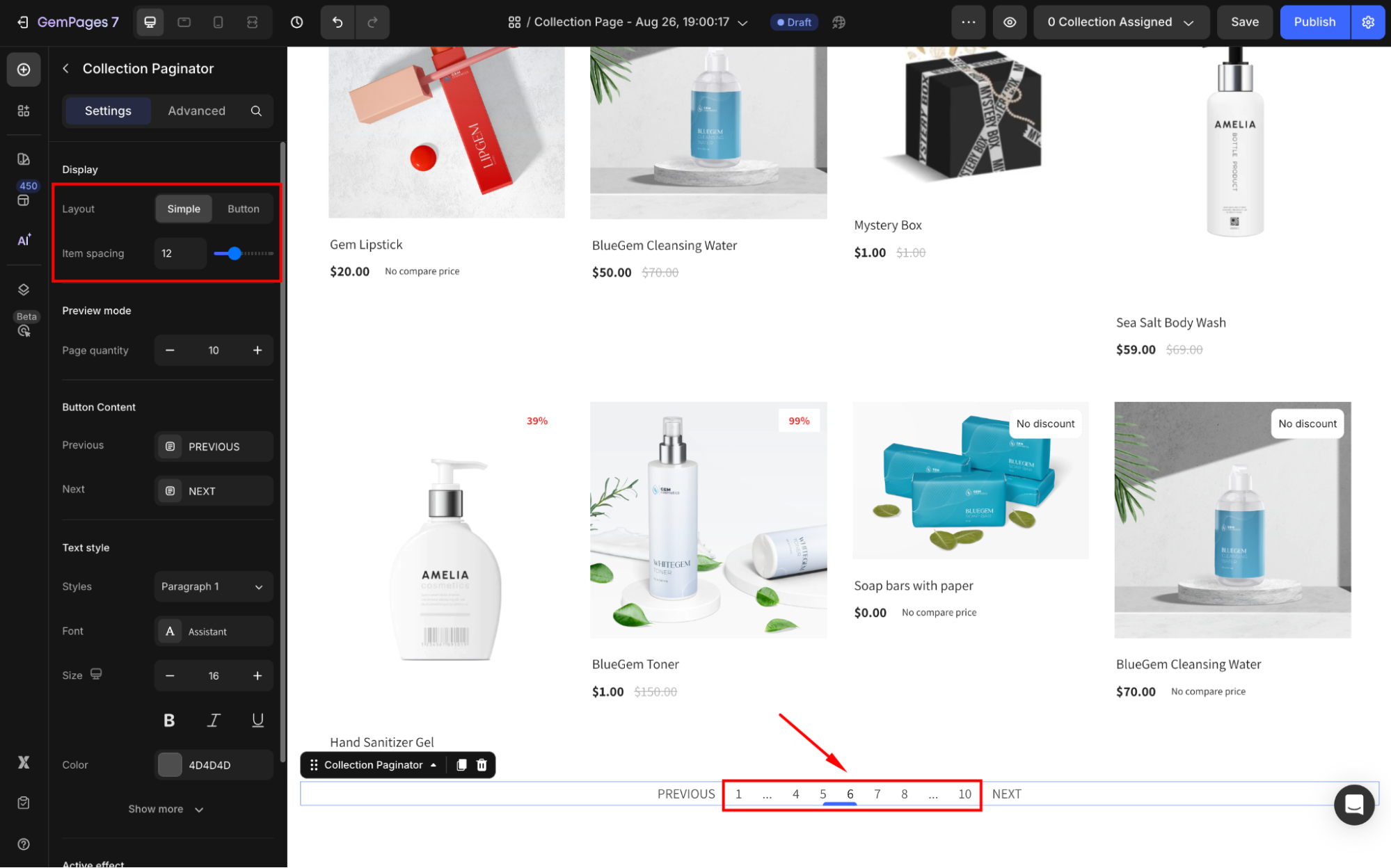
Under the Display section, select your preferred display layout between Simple and Button.
- Simple: Displays plain links (e.g., “Previous 1 2 3 Next”) for a minimal look.
- Button: Adds buttons for navigation. Customize the button shape (circle, square) and size to align with your design.
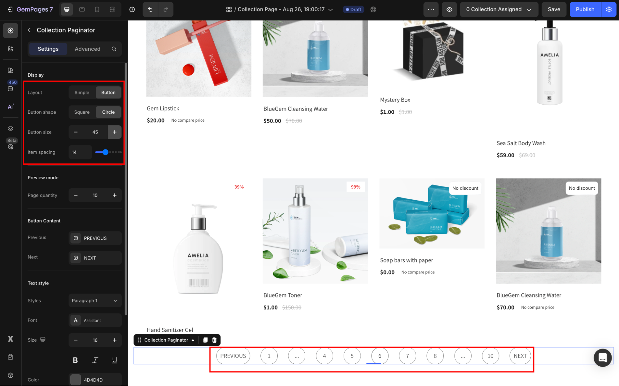
Item Spacing: Adjust the spacing between pagination items to avoid overcrowding and ensure readability.
Preview mode
Adjust the Page quantity to preview different scenarios, such as 5, 10, or 20 products per page.
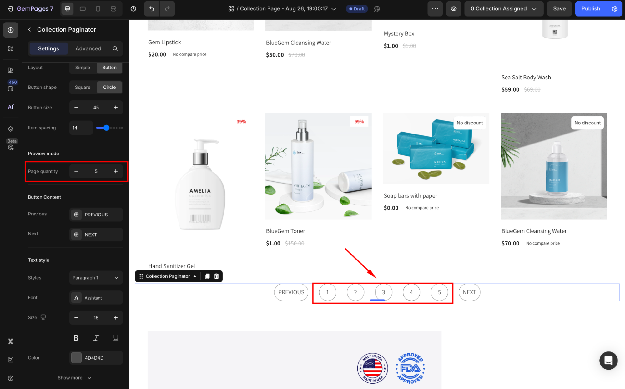
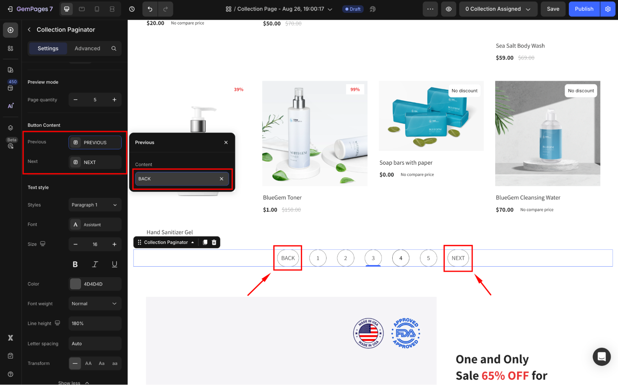
Button Content
Previous/Next text: Customize the text labels for navigation (e.g., “Back” instead of “Previous”). This is useful for localizing the paginator or adding a personalized touch.
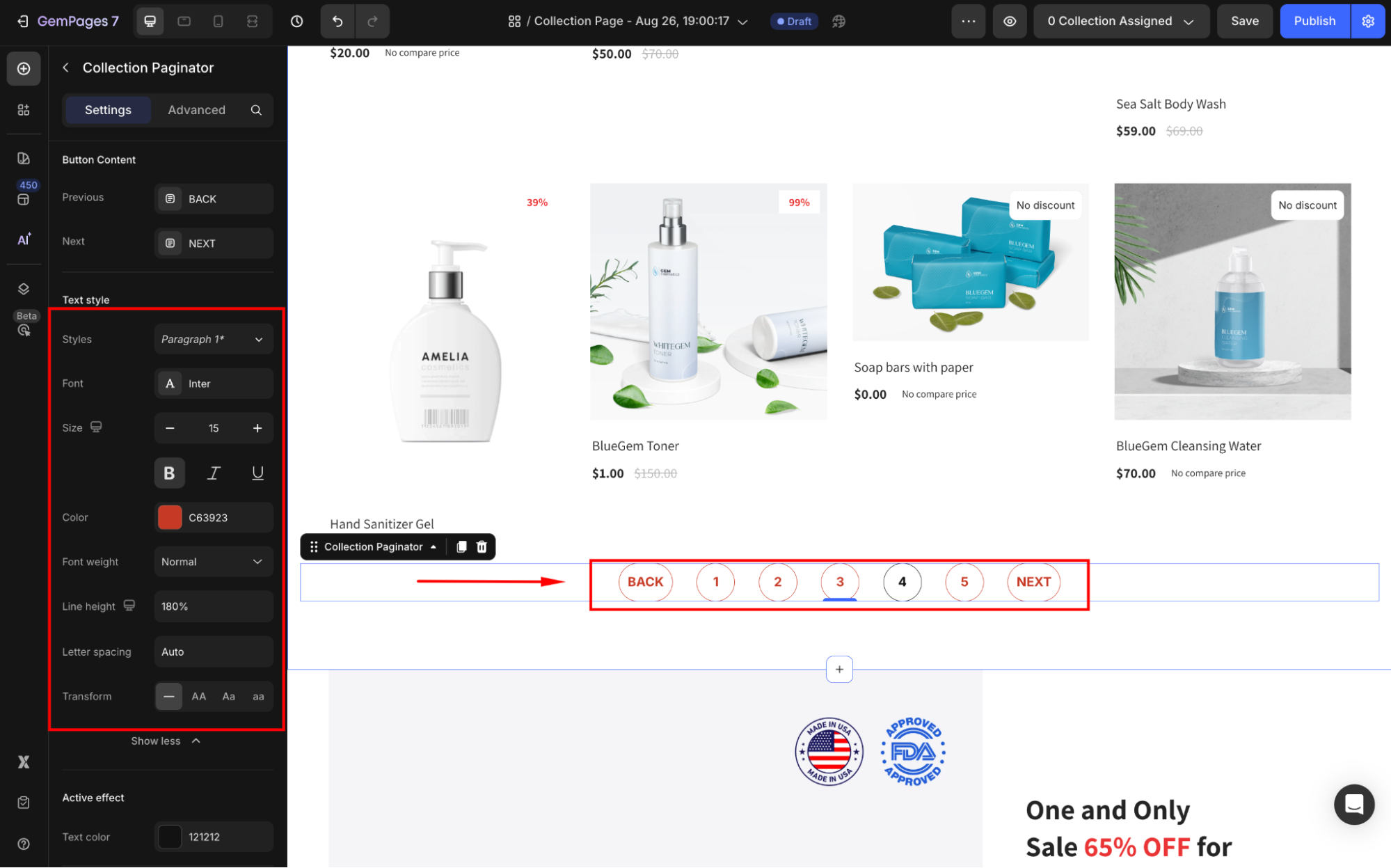
Text style
Under the Text style section, modify the button text as you prefer:
- Style: Choose the text style from Heading 1-6 or Paragraph 1-3 as the global style.
- Font: Select a font style that matches your brand identity.
- Size: Adjust the font size to make the text prominent.
- Color: Pick a color that complements your design.
- Font Weight: Control how thick or thin the text appears.
- Line Height: Adjust the space between lines for better readability.
- Letter Spacing: Create a more modern or compact look by changing the space between letters.
- Transform: Convert the text to uppercase, lowercase, or capitalize the first letter of each word.
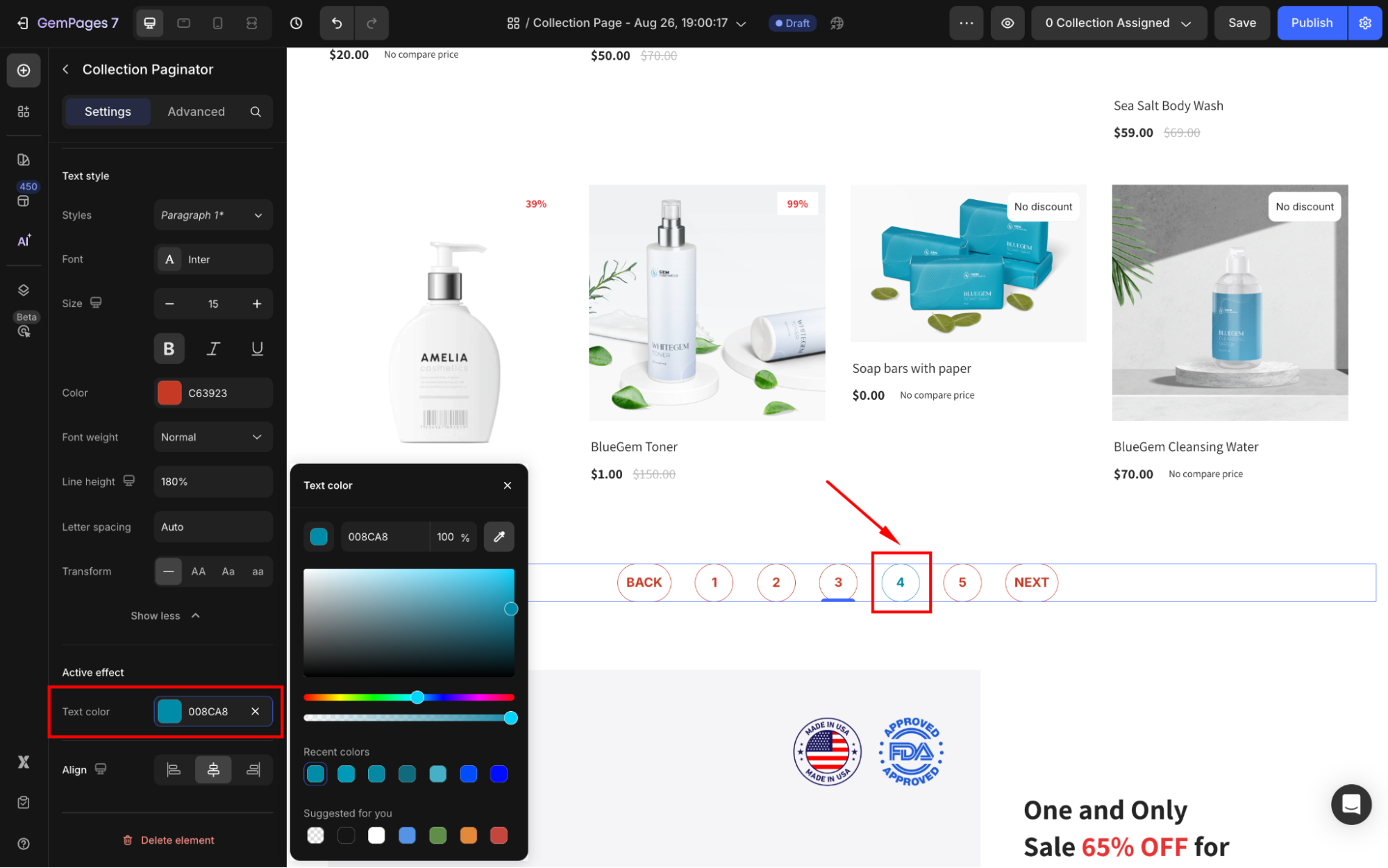
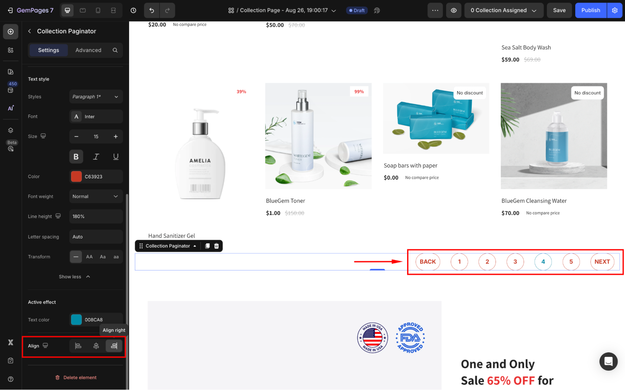
Active effect
Text color: Highlight the current page with a distinct color to improve visibility.
Align
Adjust the horizontal alignment of the paginator (Left, Center, or Right) to fit your page layout.
Configure the Advanced tab
For more advanced customization, please navigate to the Advanced tab and follow the instructions in this article.


Thank you for your comments