With GemPages, you can control the visibility of specific elements or sections across devices, ensuring that your pages look great on both desktop and mobile.
For example, the design and content that work on a desktop may not be ideal for mobile. By showing and hiding elements depending on the screen size, you can ensure a smoother, more effective user experience.
Let’s say you’re designing a call-to-action (CTA) button for your website:
- Desktop: You want the CTA to be larger, and more detailed

- Mobile: Because screen space is limited, you opt for a more streamlined version that simple.

By using GemPages’ show/hide functionality, you can create different versions of the same button, customizing them to fit the unique requirements of each screen size.
How to Show and Hide an Element?
Step 1: In the GemPages editor, either add a new element or click on an existing element that you want to customize for different devices.
For this example, let’s assume you’re working with a Call-to-Action (CTA) button.
Step 2: In GemPages, duplicate the CTA button to create two separate CTA buttons: one for desktop and one for mobile.
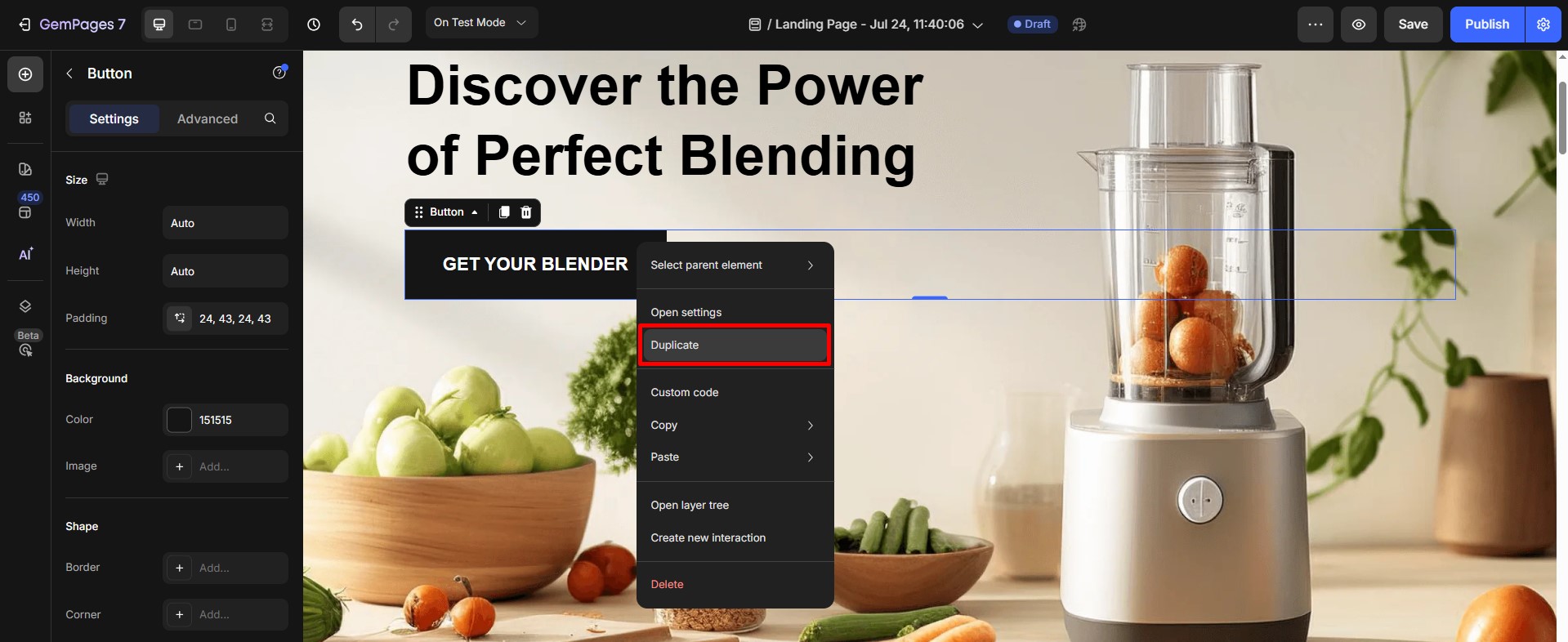
Step 3: Customize the two buttons as you prefer.
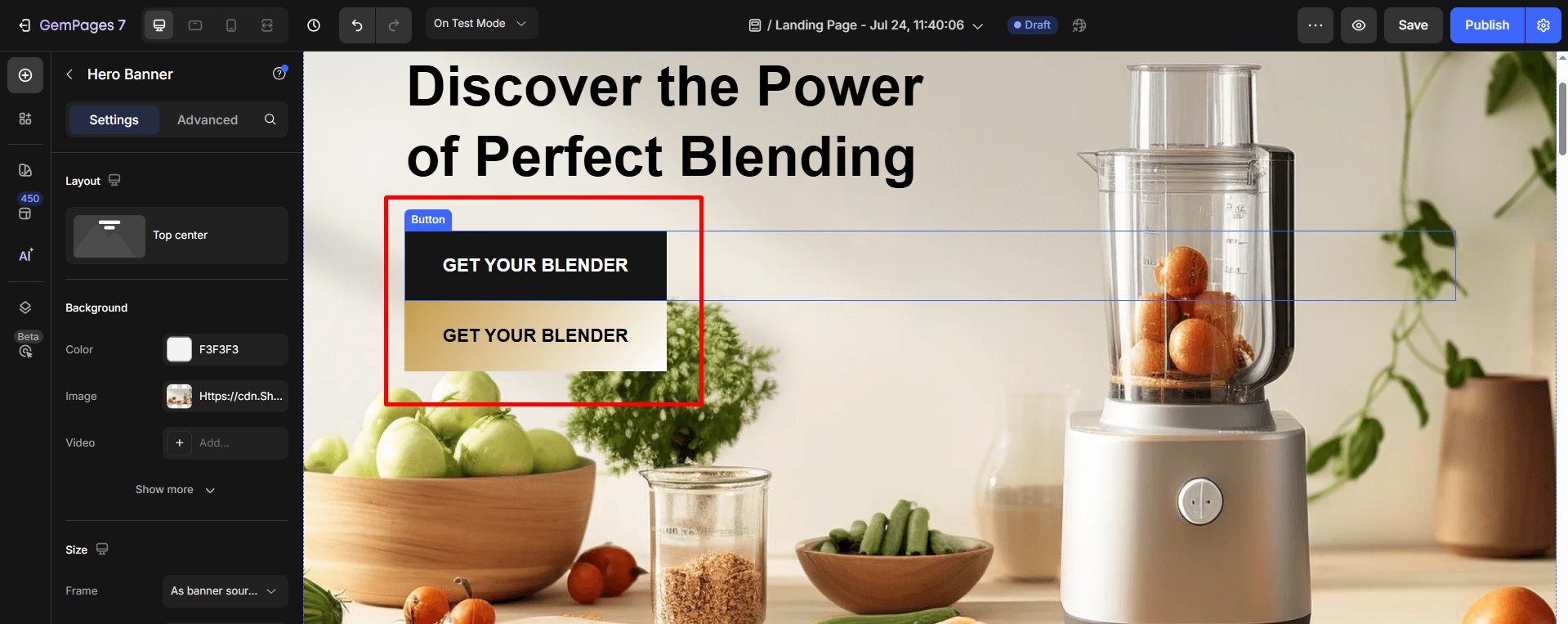
Step 4: Set Display Properties
- Select the button that you want to show on desktop only. In the Advanced tab, use the Display On setting to ensure it only appears on desktop screens.
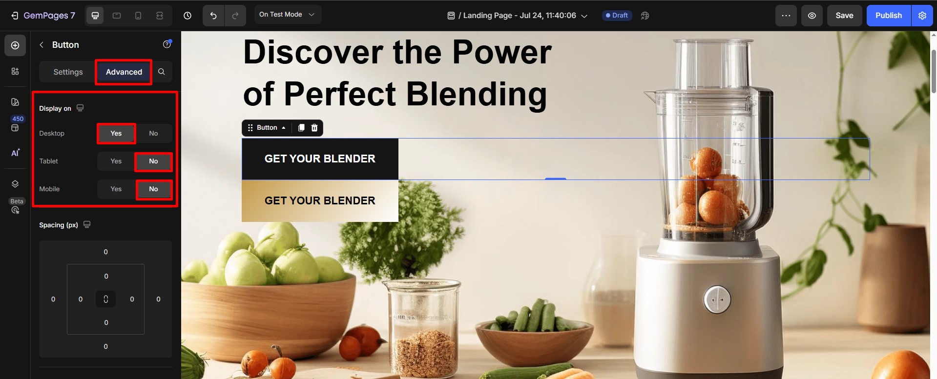
- Select the other one intended for mobile, adjust the Display On setting to hide it from desktop view while keeping it visible on mobile devices.

How to Show and Hide a Section?
You can also show and hide entire sections based on screen size. This is particularly useful if you have large content blocks or specific features that don’t translate well to smaller screens.
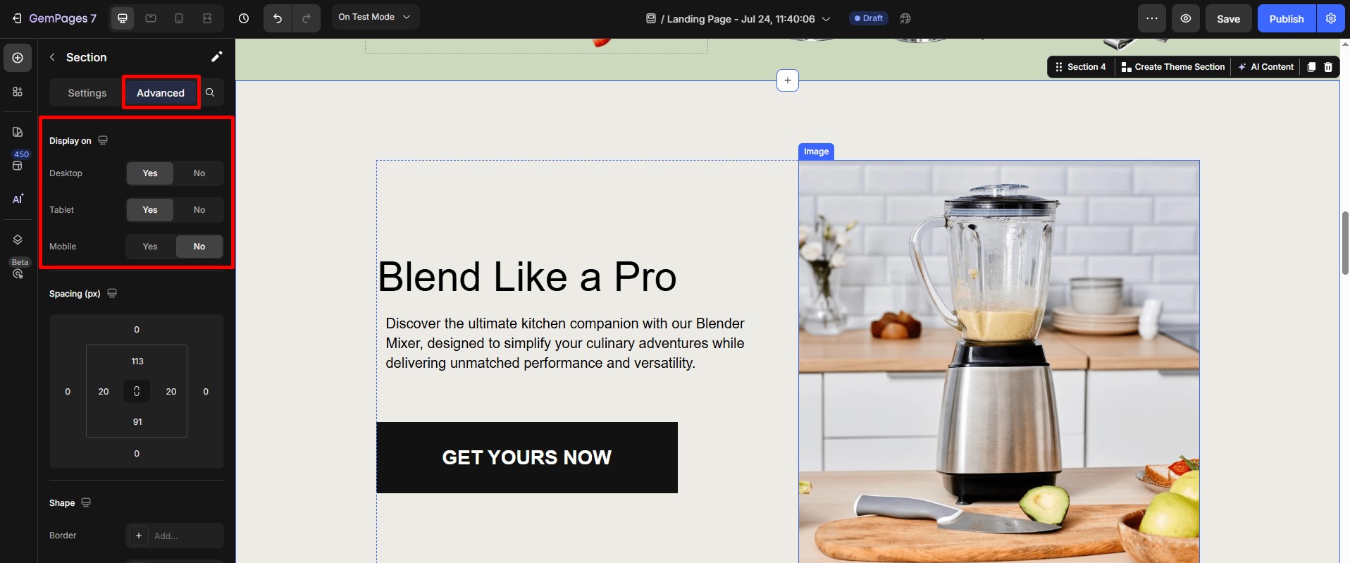
Step 1: Select the section you want to hide on mobile.
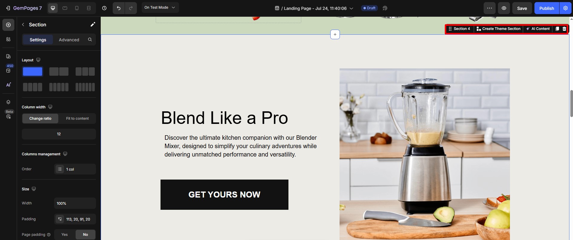
Step 2: Once the element is selected, the settings will appear on the right-hand side of the editor.
Click on the Advanced tab at the top of the settings panel. Using the Display on feature to adjust the visibility.
- Show the section only on desktop screens.
- Hide it when viewed on mobile devices.
FAQs
Why is the Show/Hide feature not working on iPhone?
- Verify the Display On settings: Make sure the element or section is enabled for Mobile in the Advanced tab. If it’s hidden on Mobile, it will not appear on iPhone.
- Avoid overlapping elements: An element may technically be visible but covered by another section or element on mobile. Check spacing, position (especially Absolute/Sticky), and z-index if used.
- Clear cache and refresh: If changes were made recently, clear your browser cache or refresh the page on the iPhone to ensure the latest version is loaded.


Thank you for your comments