


This article shows you how to enlarge an image specifically for mobile devices in GemPages without affecting the desktop layout.
The following method essentially creates separate image elements for desktop and mobile views, allowing you to customize each one independently. For more information, refer to this article.
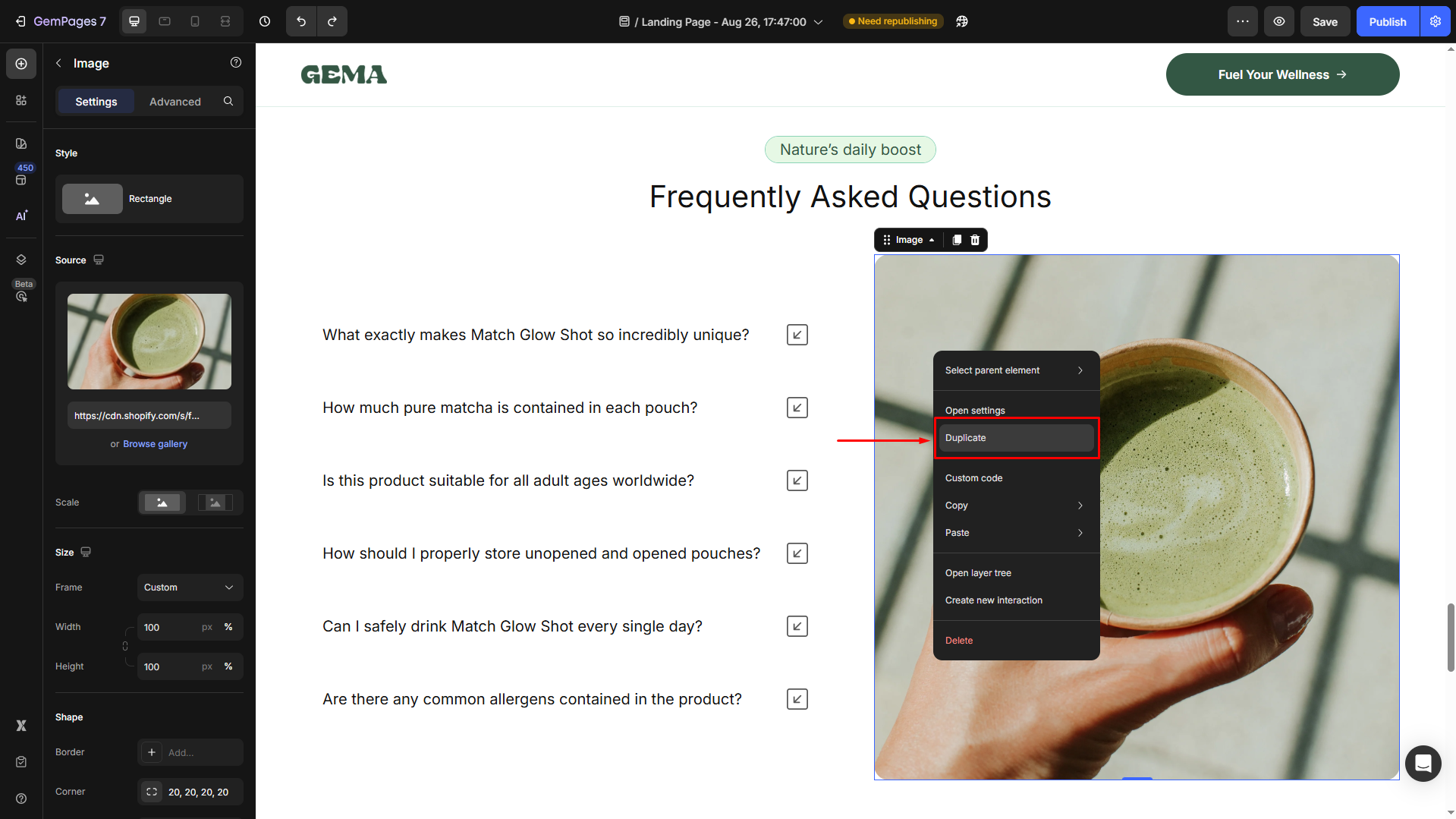
Step 1: Duplicate the Image Section
- In the GemPages editor, locate the image you want to modify.
- Click on the image to select it.
- Use the Duplicate function to create a copy of this image. This duplicate will be used for the mobile version.
Step 2: Configure Visibility Settings
For the Original (Desktop) Section
- Select the original image and navigate to the Advanced tab in the left sidebar.
- Under the Display on section, disable the Tablet and Mobile views.
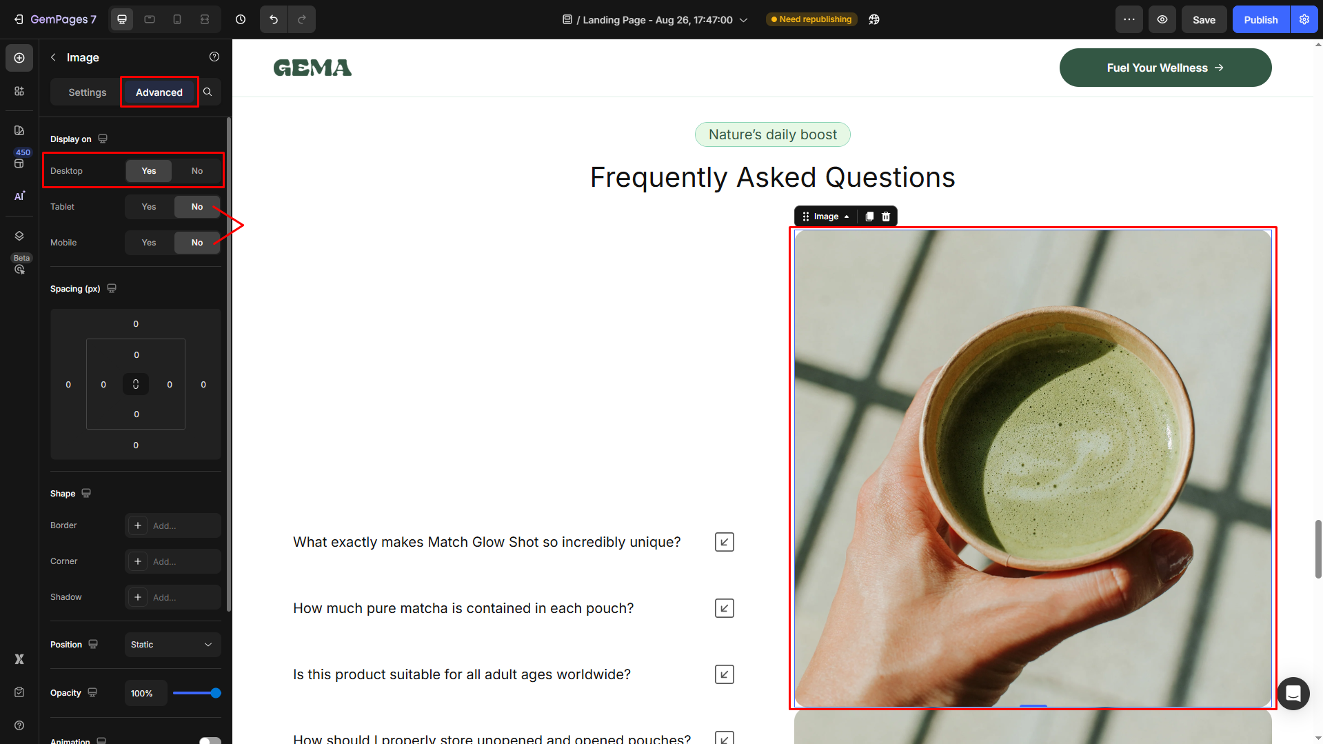
This setting will make the section visible only on desktop devices.
For the Duplicated (Mobile) Section
- Select the duplicated image and navigate to the Advanced tab in the left sidebar.
- Under the Display on section, disable the Desktop and Tablet views.
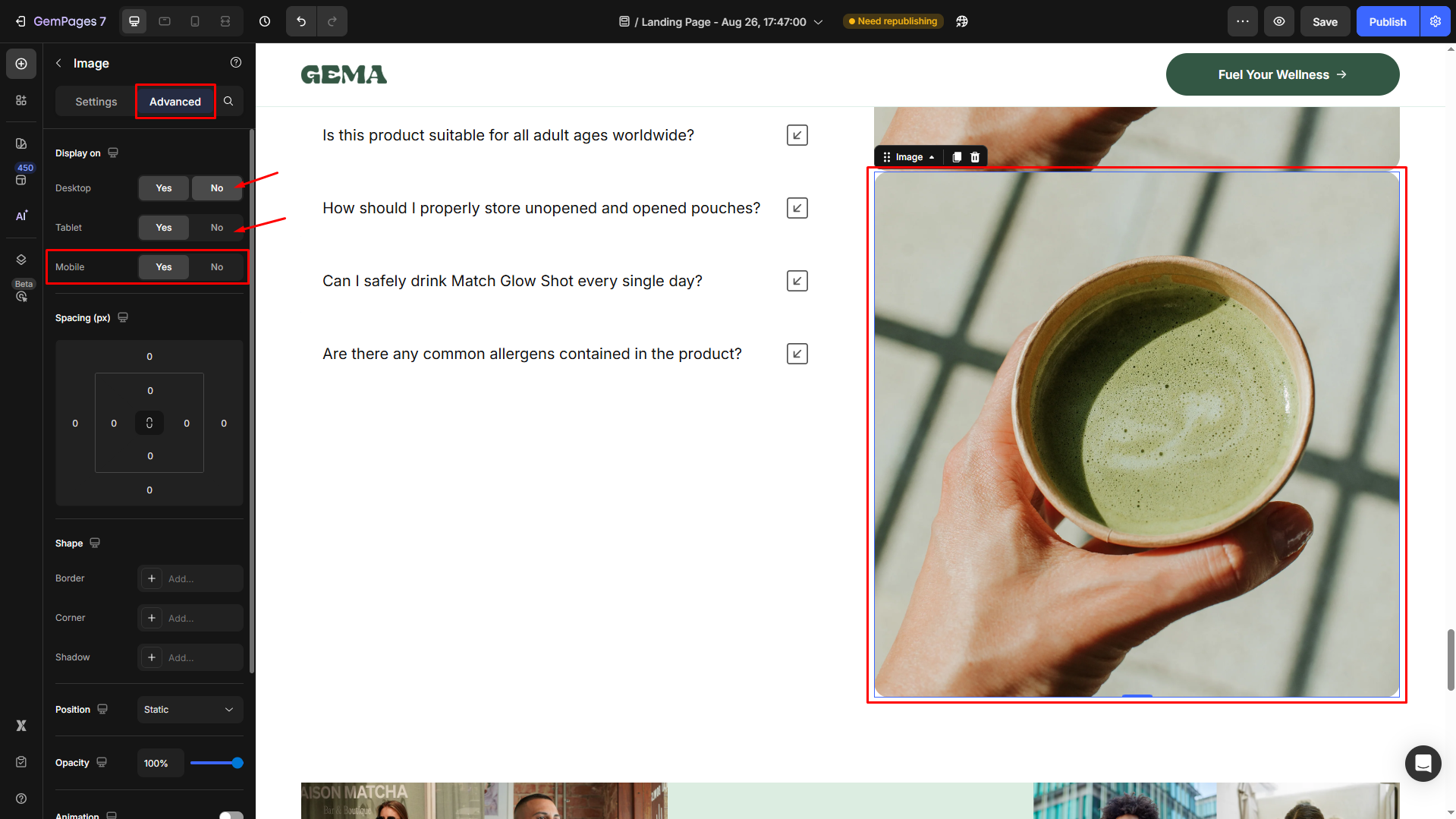
This configuration ensures the section appears exclusively on mobile devices.
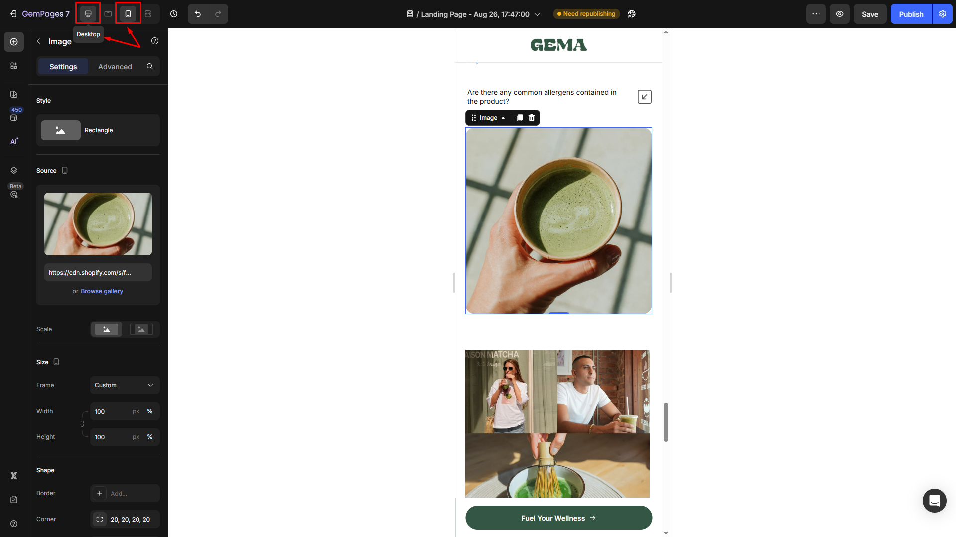
- Once done, the image will be hidden from the editor because you’re currently in the Desktop view. In the left corner of the top bar, switch the view to Mobile.
Step 3: Adjust the Image Size for Mobile
- Once switched to the Mobile-view editor, click on the image to access its settings and scroll down to the Size section.
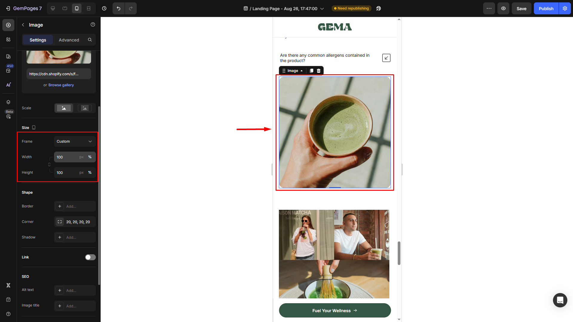
- You can select the Frame and increase the Width/Height values of your image in Mobile view to your desired dimensions.
For more details on changing the image size, please refer to this article.
Step 4: Preview and Test
- Use the device preview icons at the top of the GemPages editor to switch between desktop and mobile views.
- Ensure that the image displays correctly on both versions: the original size on desktop and the enlarged size on mobile.
- Make any necessary adjustments to padding, margins, or other styling settings to achieve the desired appearance on each device.
For more information on responsive web design and visibility settings in GemPages, refer to this article.


Thank you for your comments