


About the Dropdown Element
The Dropdown Element allows users to select from a predefined list of options within the contact/newsletter form element, such as choosing a preferred contact method or subscription type.
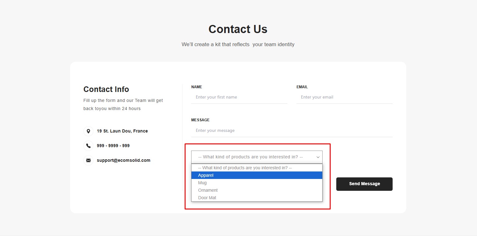
It is an essential tool for creating organized and user-friendly forms, as well as streamlining the collection of structured responses.
How to Add a Dropdown Element to Your Page?
Important: The Dropdown element cannot function independently and must be added within a Newsletter or a Contact Form element.
To add the Dropdown element to your page, follow these steps:
Step 1: Access the GemPages Dashboard > Pages, then click on the target page to locate the editor.
Step 2: From the left sidebar, search for “dropdown”, then drag & drop it into a Newsletter or a Contact Form element.
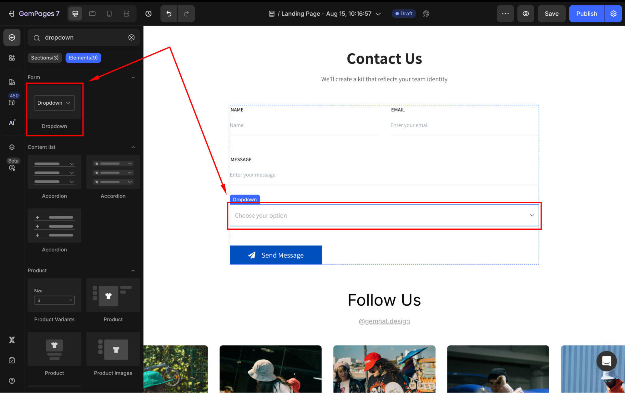
If you do not have any of them yet, add one on your page first, then nest the Submit Button inside.
Configure the Settings tab
Under the Settings tab, you can adjust the following sections:
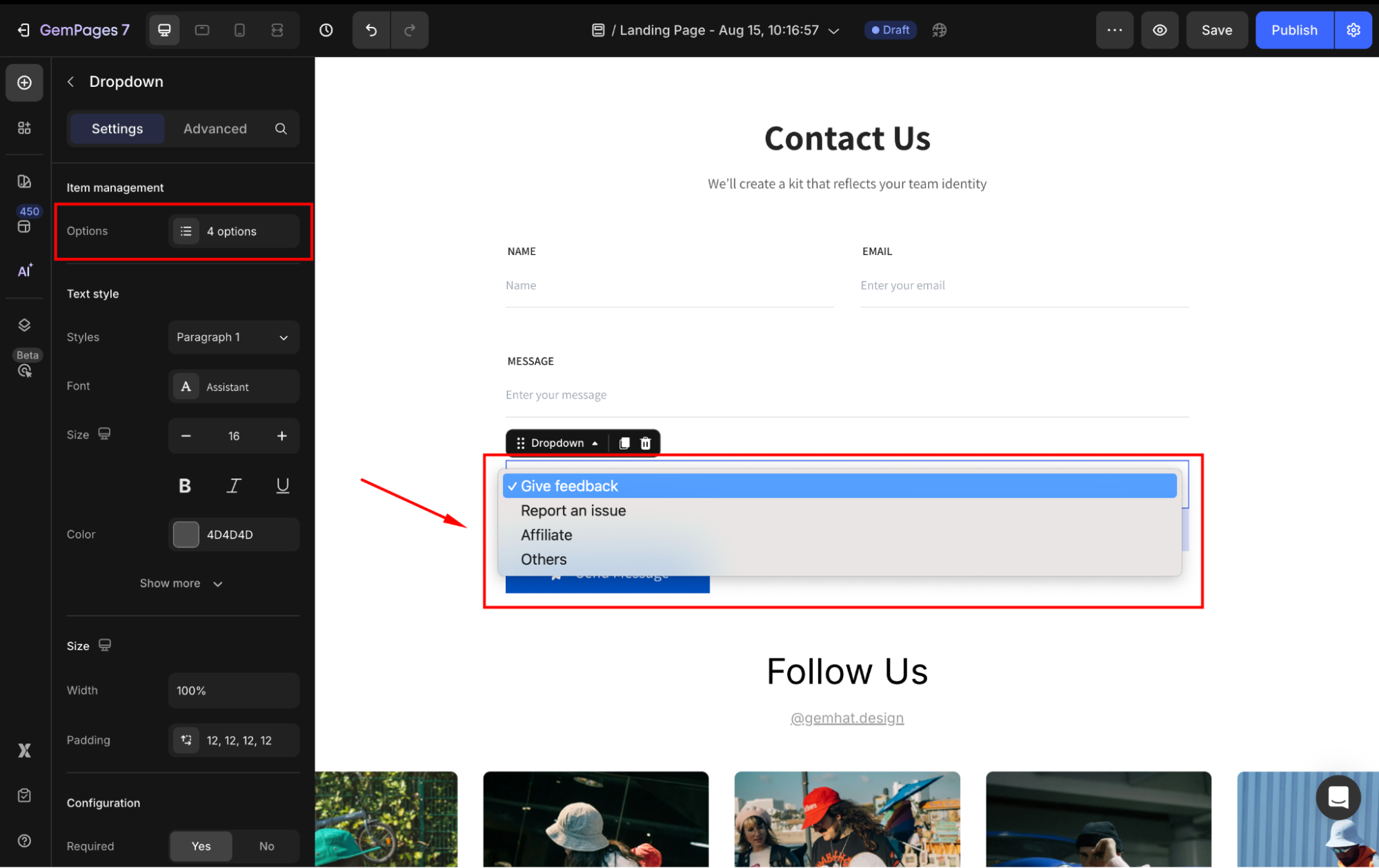
Item Management
Click the box to manage the items in your dropdown. In the panel, hover over any option to edit to rename, duplicate, or delete it.
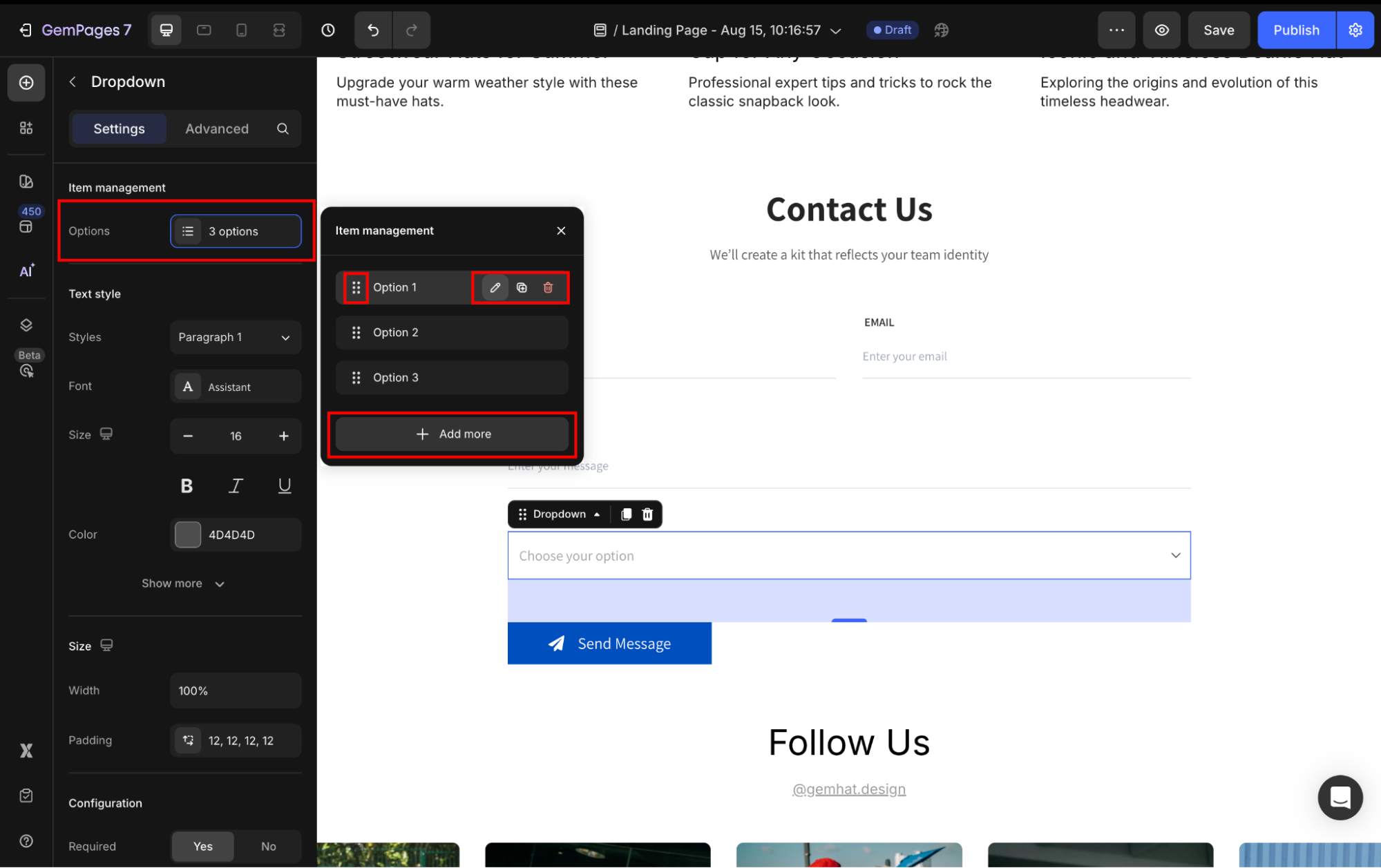
Also, you can rearrange the options’ positions or add more options to the dropdown as you prefer.
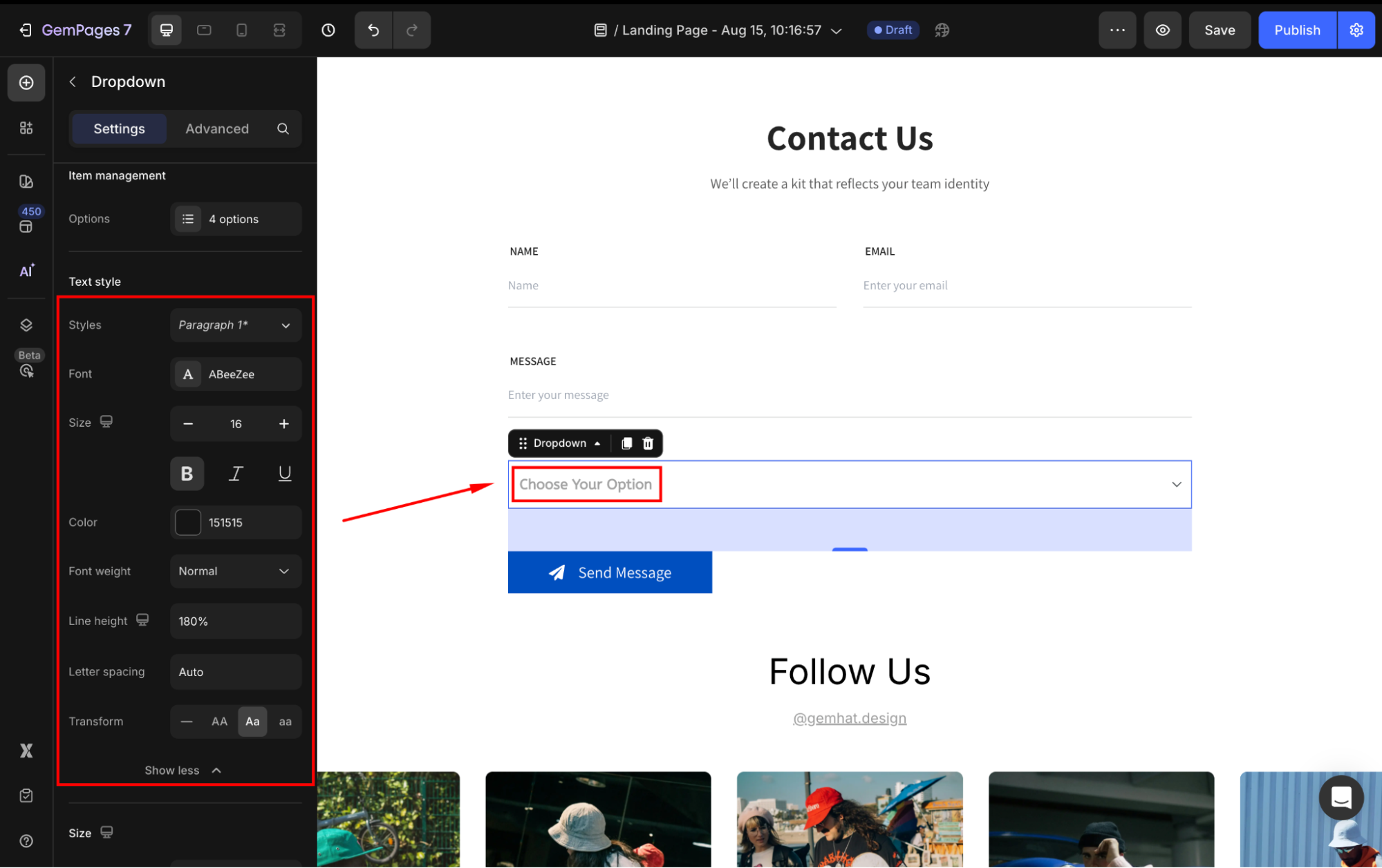
Text style
Under the Text style section, modify the button text as you prefer:
- Style: Choose the text style from Heading 1-6 or Paragraph 1-3 as the global style.
- Font: Select a font style that matches your brand identity.
- Size: Adjust the font size to make the text prominent.
- Color: Pick a color that complements your design.
- Font Weight: Control how thick or thin the text appears.
- Line Height: Adjust the space between lines for better readability.
- Letter Spacing: Create a more modern or compact look by changing the space between letters.
- Transform: Convert the text to uppercase, lowercase, or capitalize the first letter of each word.
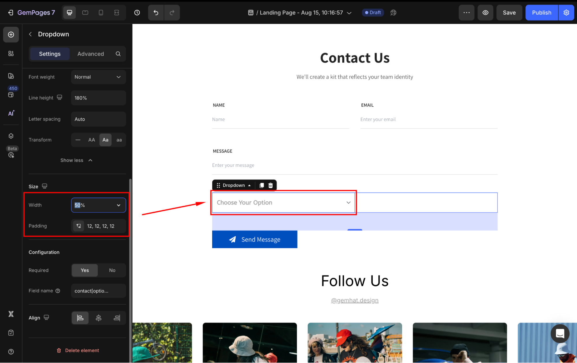
Size
- Width: Adjust the button scales horizontally. You can let it be 100% by default or enter a specific value.
- Padding: Define internal spacing inside the element.
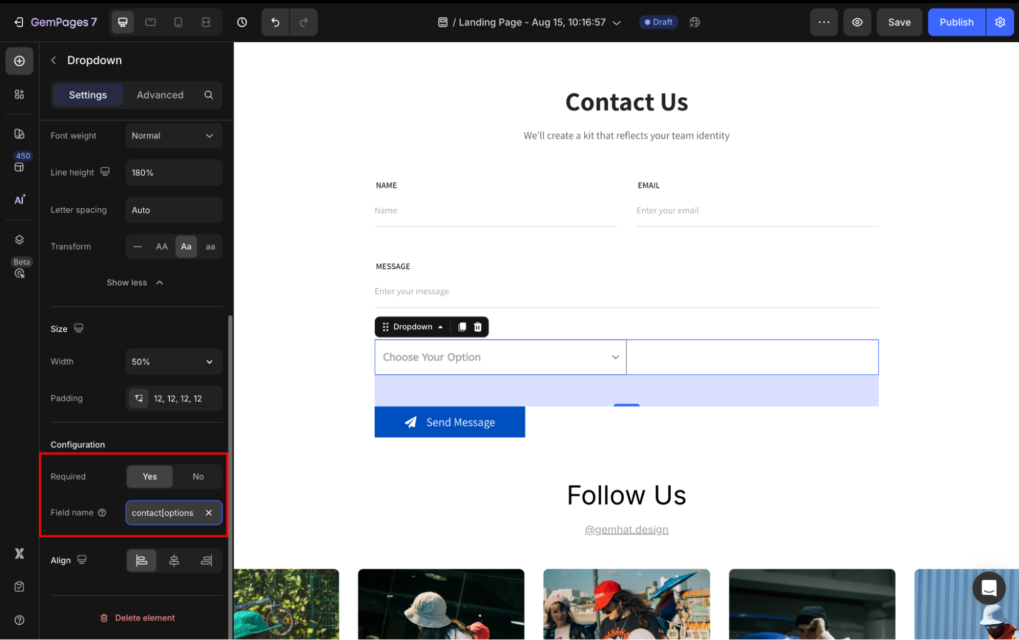
Configuration
- Required: Set to Yes/No to determine whether the field is mandatory for submission.
- Field name: Assign a unique name to the checkbox field for form processing.
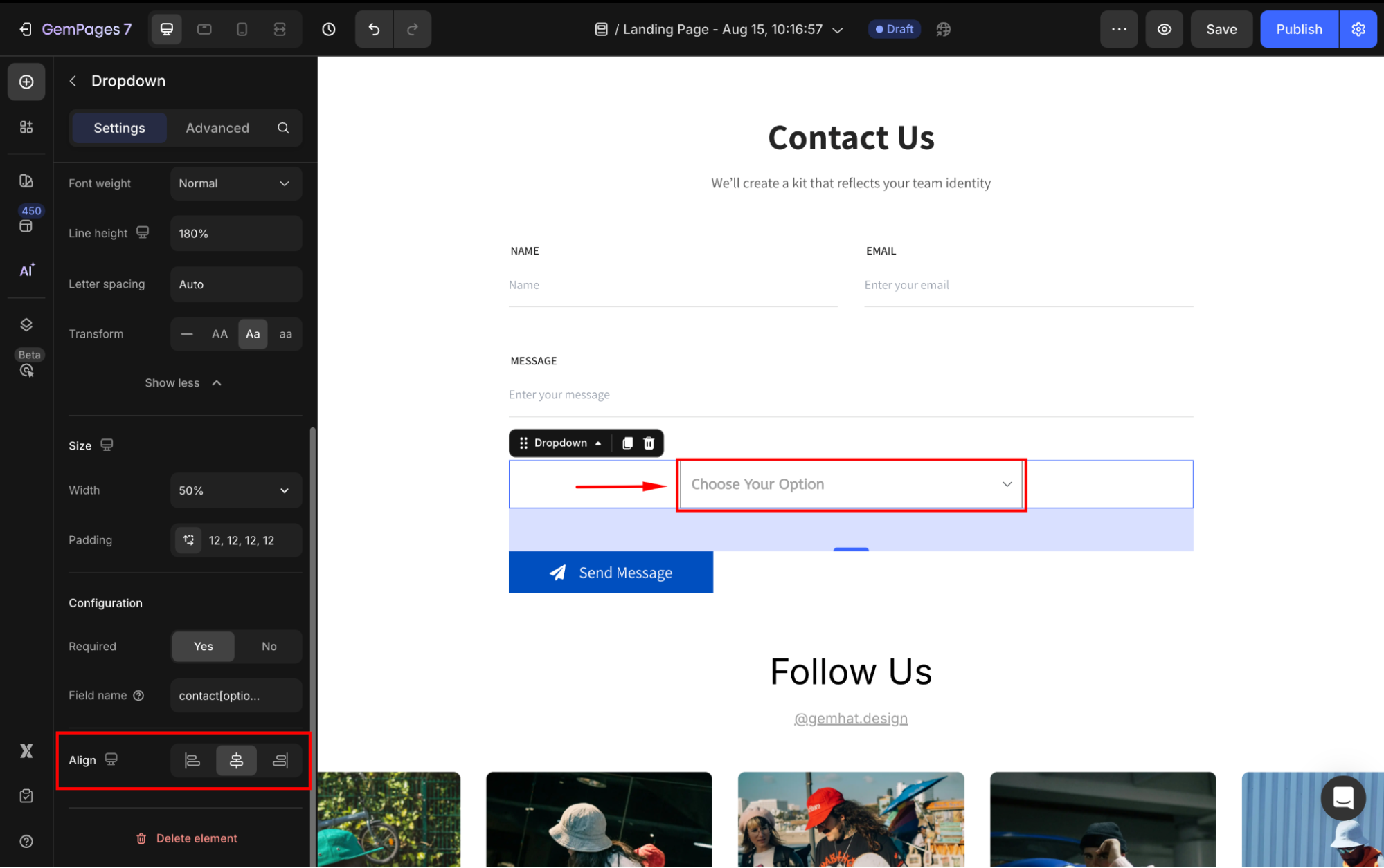
Align
When the button’s width is set to 100% or greater, the horizontal alignment will be disabled. Otherwise, you can align the button to the left, center, or right.
Configure the Advanced tab
For more advanced customization, please navigate to the Advanced tab and follow the instructions in this article.
FAQs
1. Can I add hyperlinks inside the Dropdown element?
No. The Dropdown element in GemPages is designed only for forms (e.g., contact or newsletter forms) to let users select an option. It doesn’t support clickable hyperlinks.
2. What if I want a dropdown with menu links (hyperlinks) in my header?
For navigation menus, you’ll need to manage them in Shopify Admin > Content > Menus. Create or edit your menu items (e.g., Home, Shop, Contact), and those links will automatically appear in your store’s header/footer. If you’re using a GemPages page, the header and footer are pulled from your Shopify theme, so dropdown hyperlinks must be set up through Shopify Menus, not through the Dropdown element
Refer to this article for more information about how to edit the Shopify Header and Footer.


