


About the Contact form
A Contact Form serves as a web-based form that enables store owners to gather information from their customers. These forms not only facilitate customer inquiries but also play a crucial role in marketing by attracting potential leads and expanding the customer base.
Compared to version 6, the contact form element in version 7 remains relatively unchanged. This article will guide you through the setup process and provide insights into the included child elements.
Add the Contact Form to your page
The Contact Form is a flexible element and can be used on any page by following the steps below:
Step 1: Access the GemPages Dashboard and select a page for editing or create a new one.
Step 2: Within the left sidebar, locate the Contact form element and add it to your preferred location on the page.
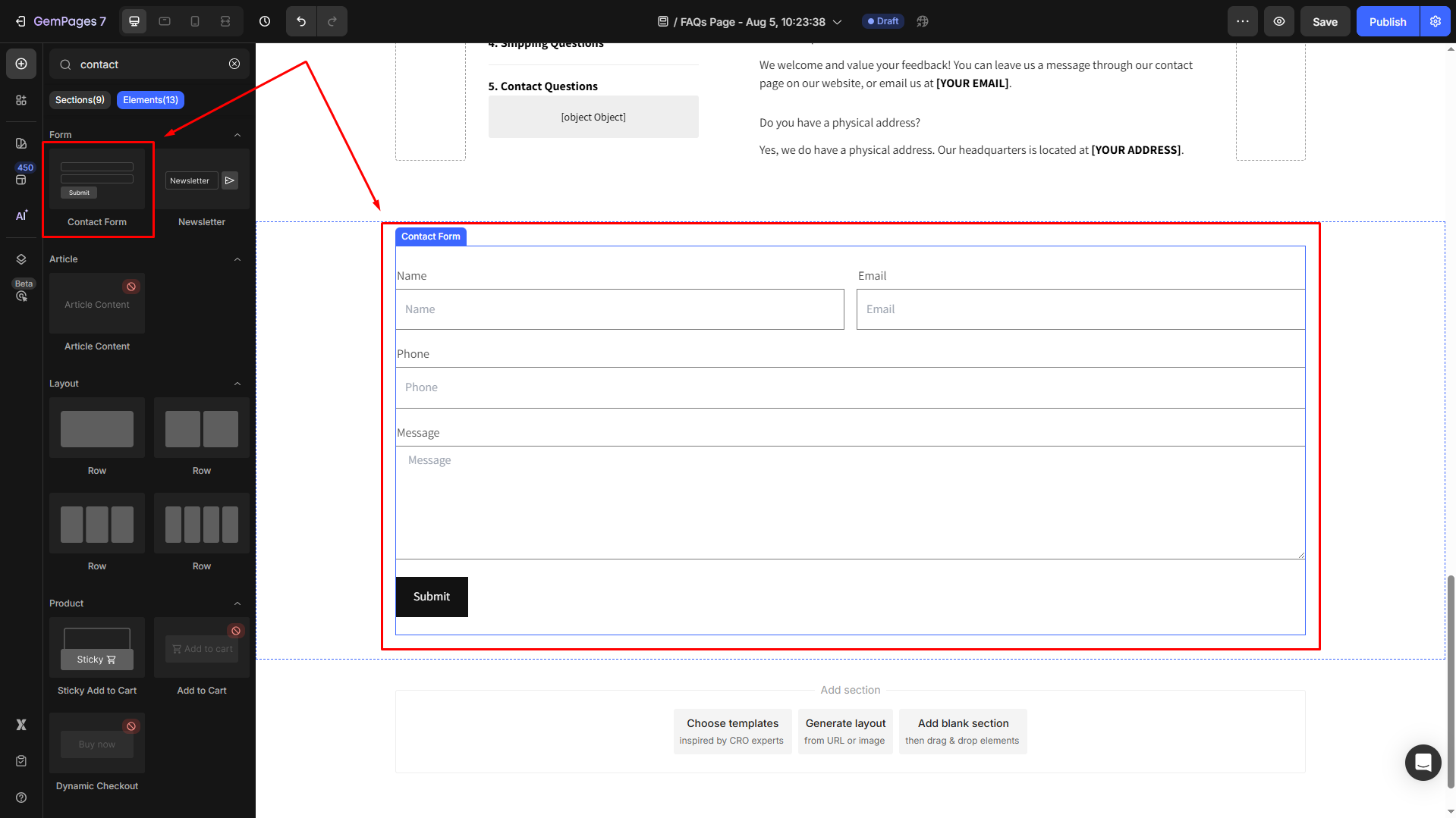
The Contact Form element is fully equipped with all the necessary components to operate as a customer information collection form. No adjustments are required for it to function on your live page.
However, if you wish to enhance the form’s design, GemPages provides several adaptable child elements.
Child elements
The Contact form comes with various child elements. These child elements must be placed inside the Contact form to function correctly. Below is the list of the Contact form child elements:
- Text block: Use this element to add static content like labels, instructions, or notes within your form.
- Text field: Provide a space for customers to enter any type of information.
- Email field: Enable customers to enter their email addresses.
- Text area: Functions similarly to the text field but offers a more expansive input area.
- Submit button: This button is crucial for customers to click to submit the form.
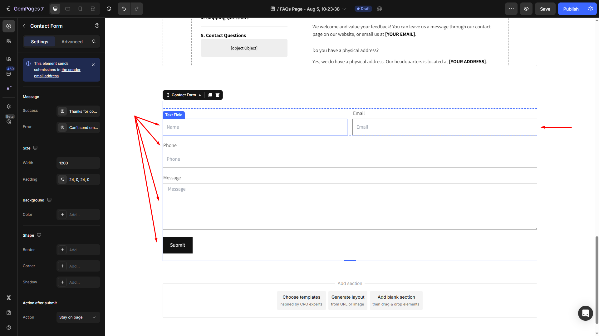
The Email field and the Submit button are essential components that must be included in a Contact Form to operate correctly.
If you intend to use these elements within a Product Module, it’s advisable to use the Product Custom Field element.
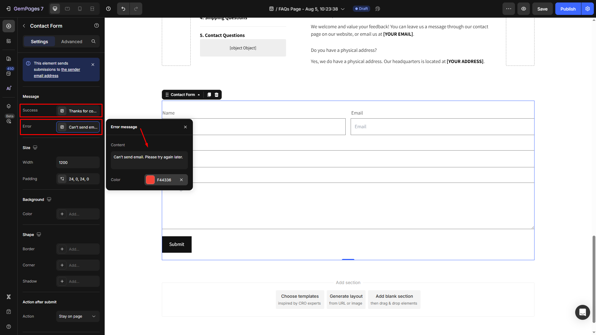
Configure the Settings tab
Message
This Message section is where you enter the message displayed once your users submit the form successfully, and one for error cases. Also, you can change the color of each message.
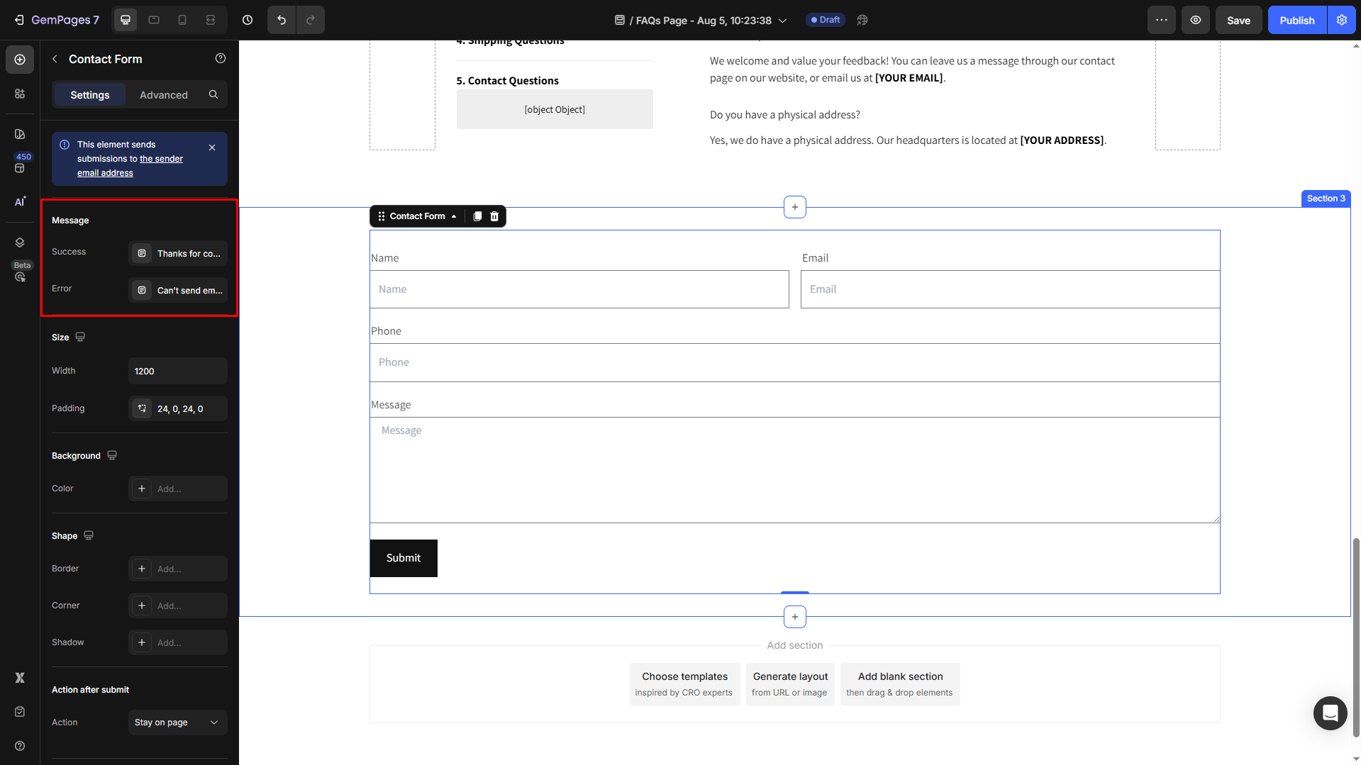
By default, the messages would be displayed as:
- Success: Thanks for contacting us. We’ll get back to you as soon as possible.
- Error: Can’t send email. Please try again later.
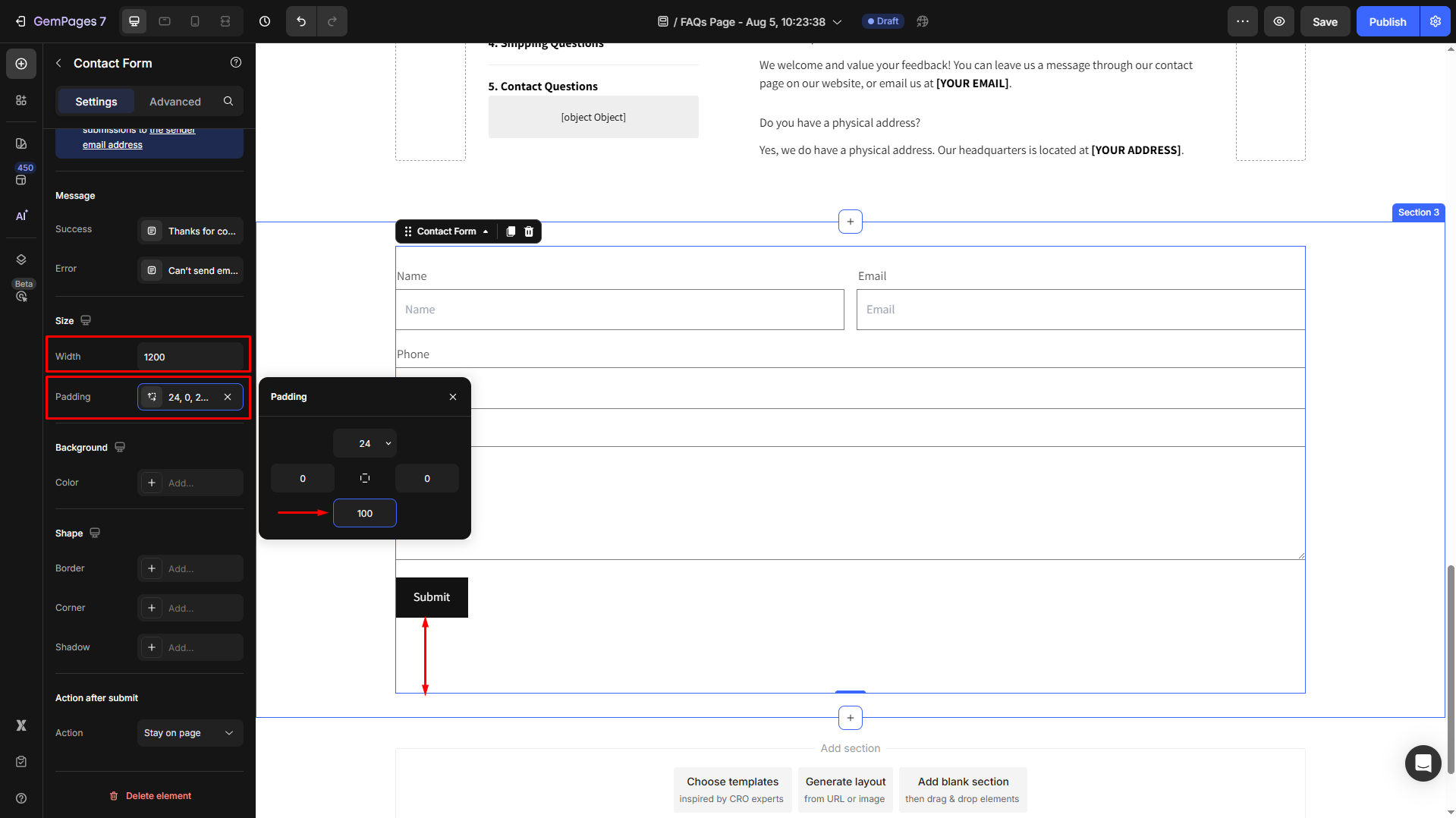
Size
Under this section, you can adjust the width and the padding of your contact form as preferred.
For example, we set the bottom spacing to 100.
Background
Set the background color for the element as a gradient or solid.
- You can choose from the recent colors list or the “suggested for you” list for quick setup.
- Otherwise, enter the color code, select from the color swatch, or use the color picker to pick a color from any part of your page.
- Adjust the color intensity by entering a number in the box next to the color code for better visualization.
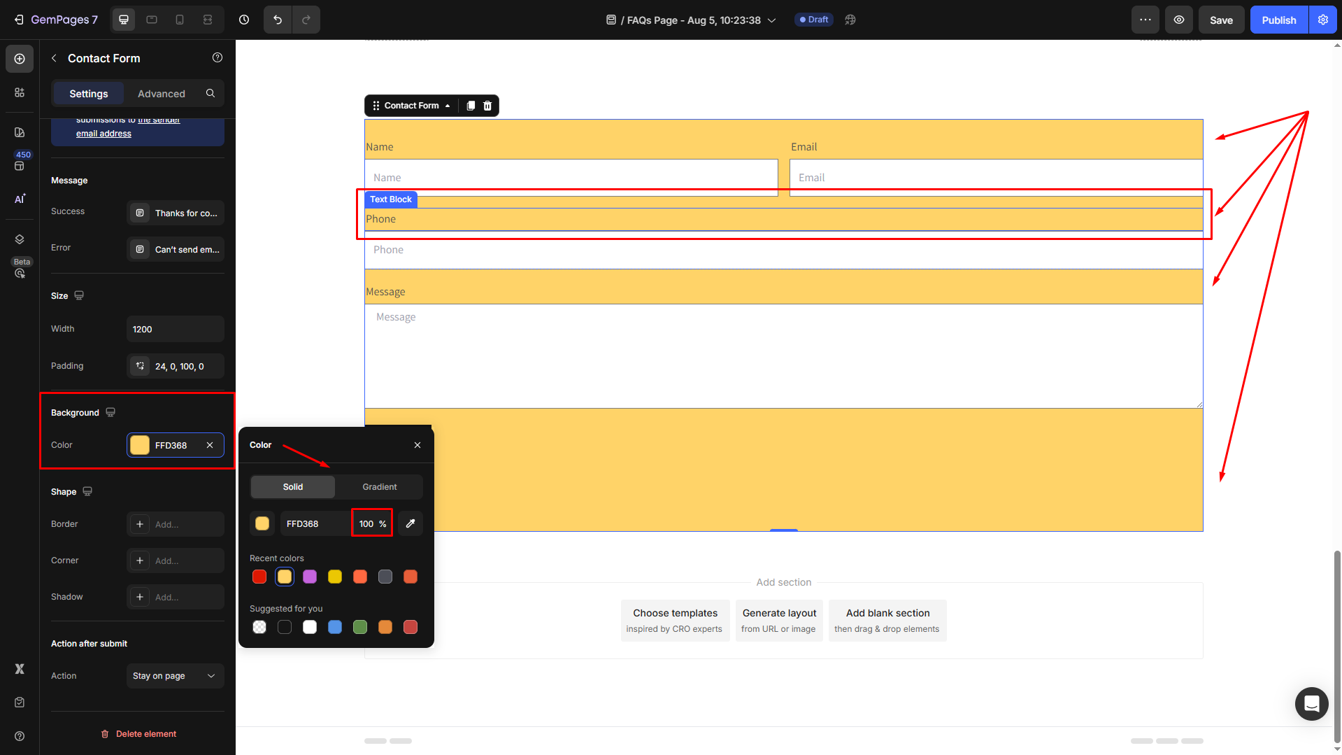
Please note that the background color will be set for the text block child element only.
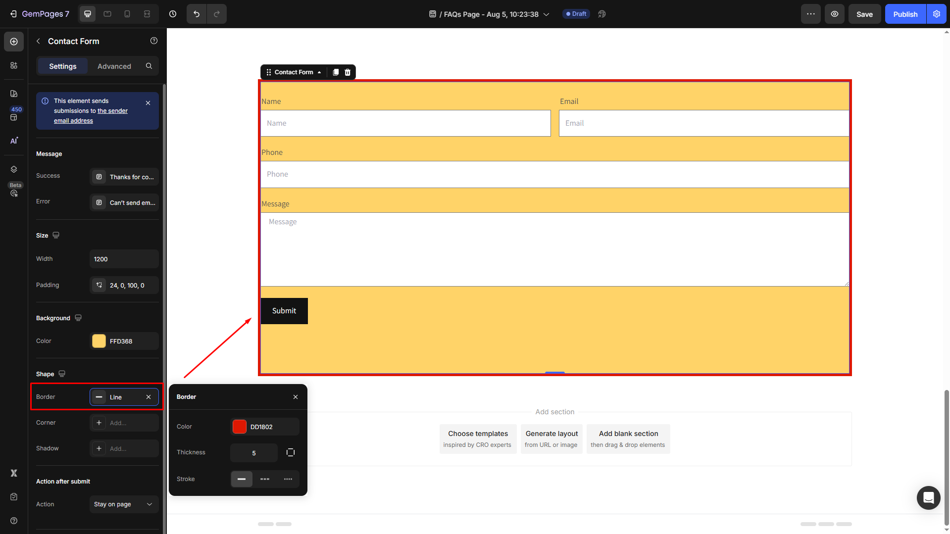
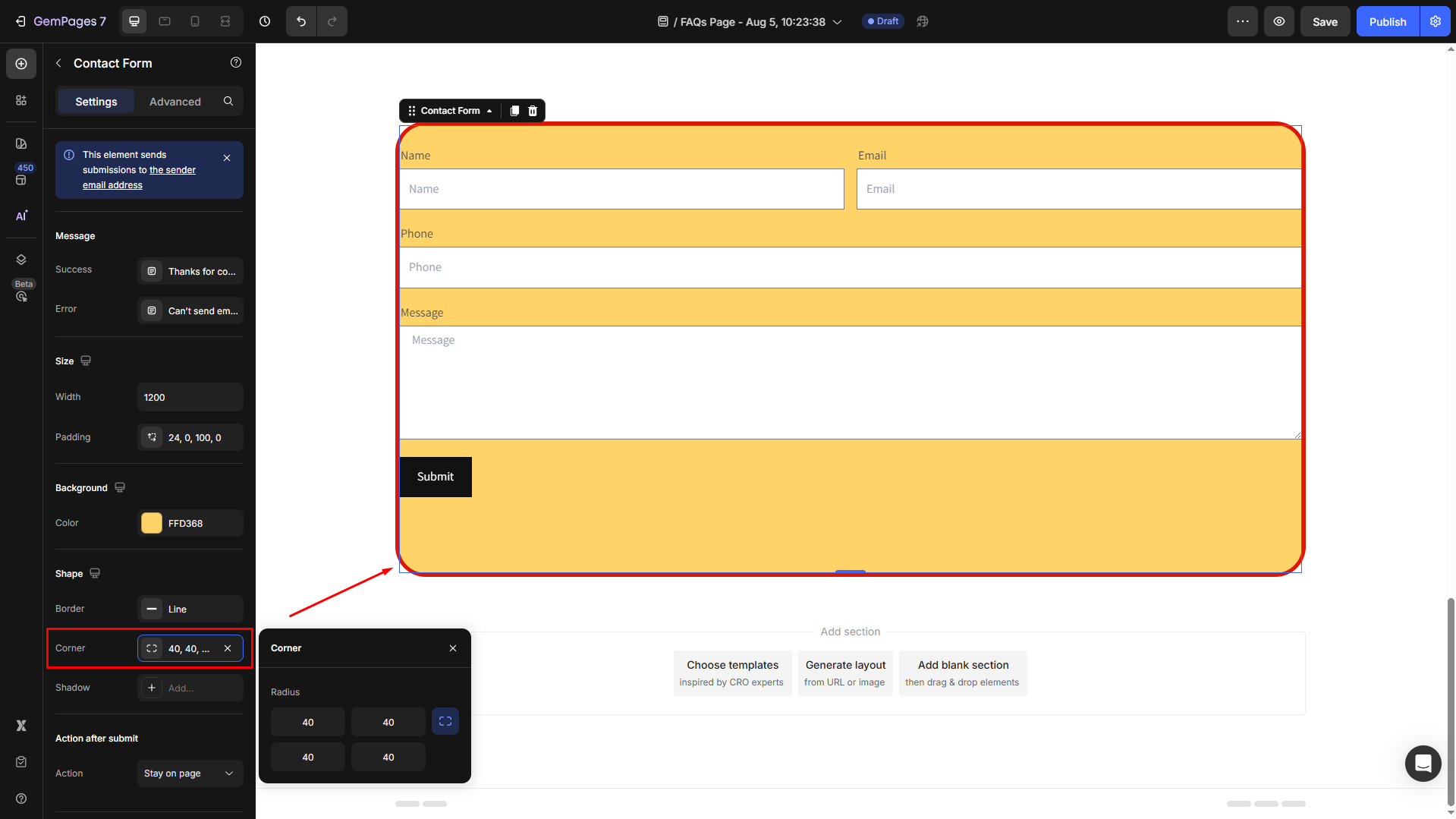
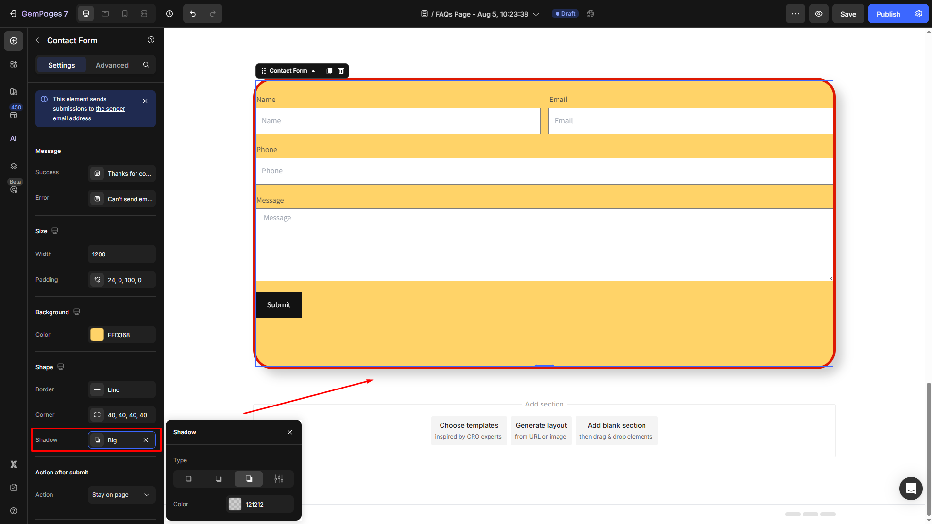
Shape
To customize the shape for the element, scroll down to the Shape section. From here, you can add a border, adjust the corner radius, and add a shadow effect to enhance the contact form’s visual hierarchy.
- Border: Change color and thickness, and select the stroke for the border.
- Corner: Adjust the corner radius of the element’s border. The larger the corner radius, the more rounded the corners will appear.
- Shadow: Add depth and emphasis by applying an outer shadow. You can choose from different shadow types and adjust the color to match your design.
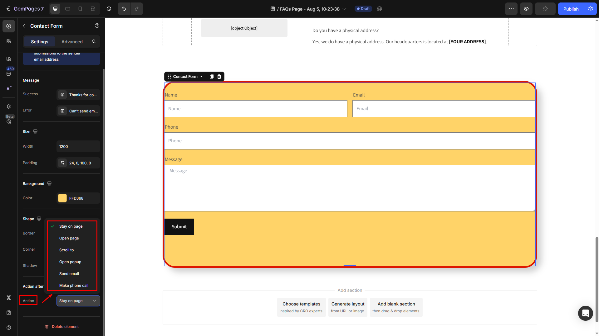
Action after submit
Action: Determine whether you prefer to guide users to a designated destination page or keep them on the current page upon the completion of the form submission, including:
- Stay on page: No action after submit
- Open page: Once submitted successfully, users will be redirected to another page
- Scroll to: Scroll to a target section on your page
- Send email: An email will be sent automatically once users submit the form
- Make phone call: Make a phone call after users hit Submit
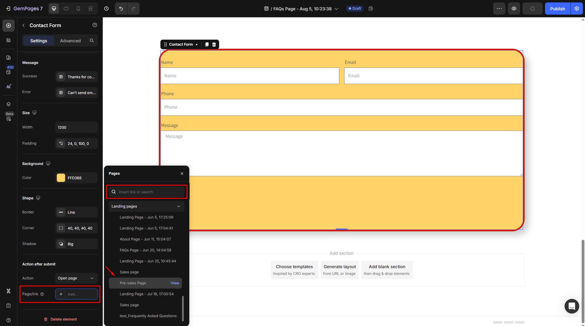
For example, if you decide to send customers to another page, select “Open page” from the dropdown.
Then, click on the “Add…” field next to the Page/link to open the pages panel, where you can insert a target link or choose from the available options in the list.
Configure the Advanced Tab
For more advanced customization, please navigate to the Advanced tab and follow the instructions in this article.
Access your form submissions
All completed form submissions will be forwarded to your email inbox. Depending on your email service provider, you may also want to check the Junk or Spam folder for any misplaced emails.
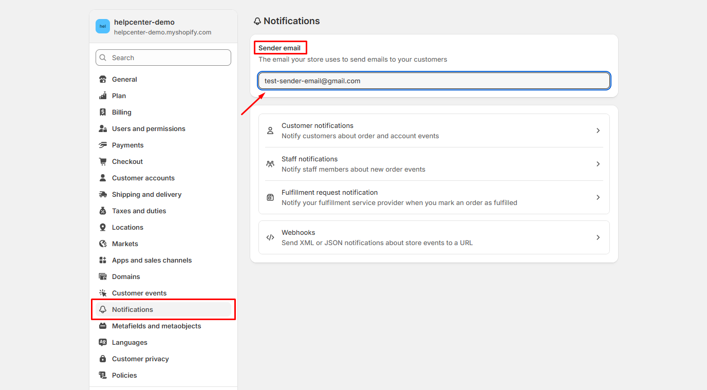
To locate or modify the destination email address within Shopify, follow these steps:
- Navigate to your Shopify Admin and then proceed to Settings > Notifications.
- If you wish to update the email address, simply enter the new email in the designated “Sender email” field.
- Click on the “Save” button to confirm the changes.
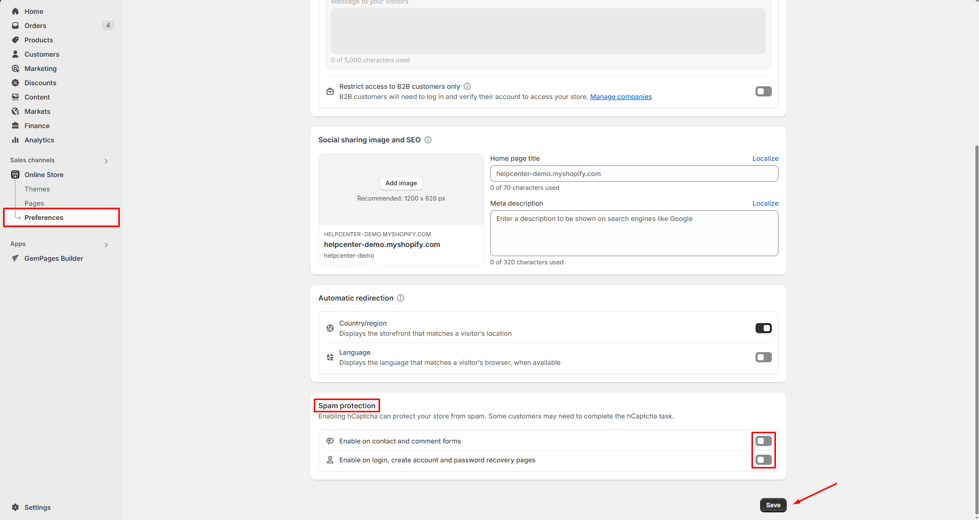
Turn On/Off Google ReCAPTCHA
As a spam protection technology, Google reCAPTCHA is turned on by default for all Shopify stores. This means customers will have to complete a reCAPTCHA test every time they want to submit a form.
If you want to, you can turn off this security policy to make form-filling faster for your customers.
Head to Shopify Admin > Online Store > Preferences, uncheck the two options under the Spam protection section, then hit “Save“.


Thank you for your comments