How does the Hero Banner work?
GemPages automatically resizes Hero Banner images to improve page load speed for different devices:
- Tablet View: The image is resized to a maximum width of 1024 px.
- Mobile View: The image is resized to a maximum width of 768 px.
This resizing may reduce image quality when the same image is used for both desktop and mobile displays. To ensure your Hero Banner looks its best, you have two options:
- Use the same image ratio for all devices.
- Use separate images for each device.
How to Optimize the Hero Banner Images for All Devices?
Option 1: Using a Single Image Ratio for All Devices
If you want to use the same image across desktop, tablet, and mobile, click on the Hero Element to open its settings and follow these steps:
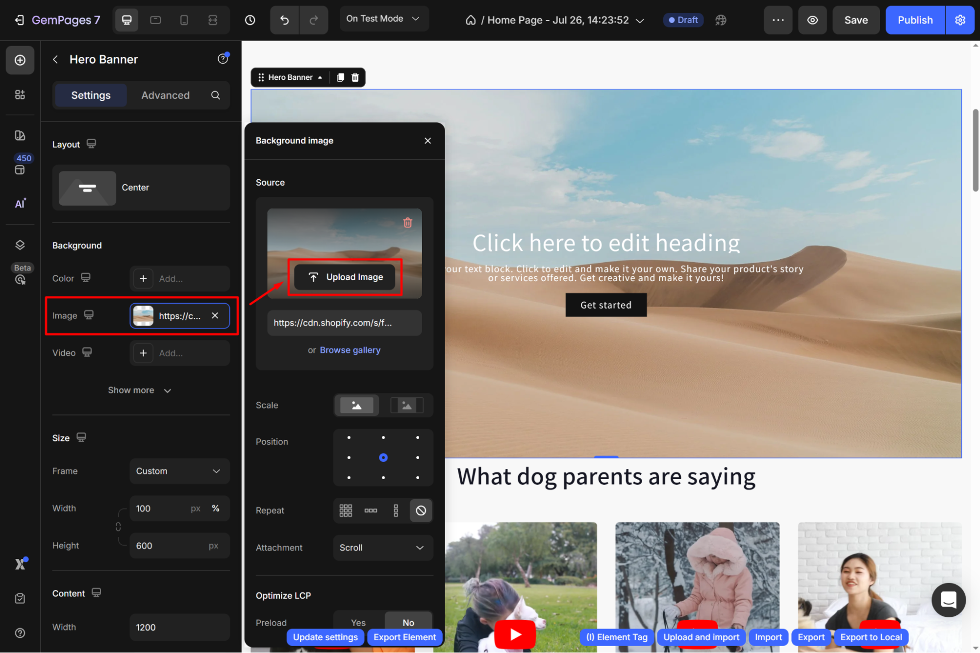
Step 1: Upload your image to the Hero Banner.
- From the Settings tab in the left sidebar, scroll down to the Background section.
- Click the “Add…” button next to the Image option to expand the image background configuration.
- Hit Upload a new image, and make sure the image is at least 1920 px wide.

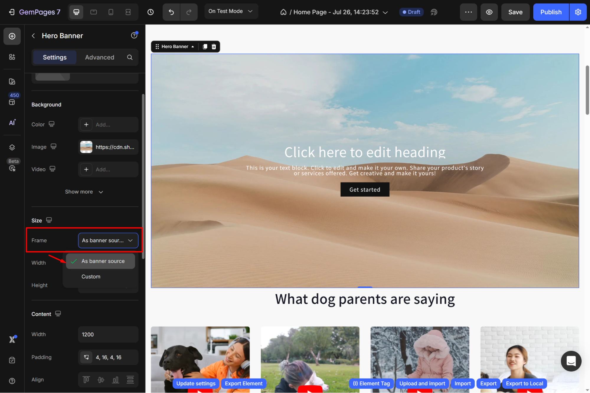
Step 2: Set the size/banner ratio for each device view.
- Find the Frame option under the Size section.
- Choose the As banner source from the dropdown.

The banner will automatically resize to fit the screen size while keeping the original proportions of the image.
Option 2: Using Separate Images for Each Device
For Desktop and Tablet:
Upload your image to the Hero Banner. Make sure to use an image that is at least 1920px wide. This guarantees high-quality visuals on larger screens.
For Mobile:
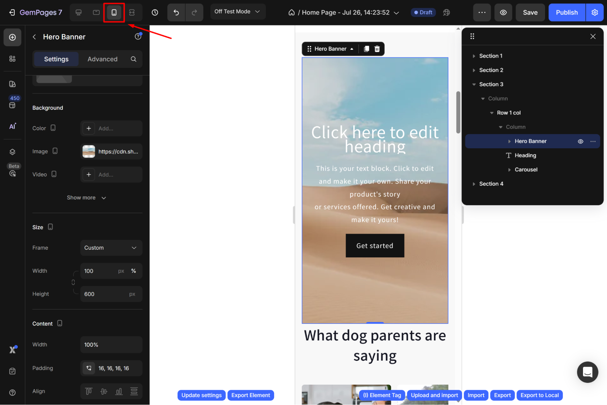
Step 1: Choose the device viewport you want to optimize for.

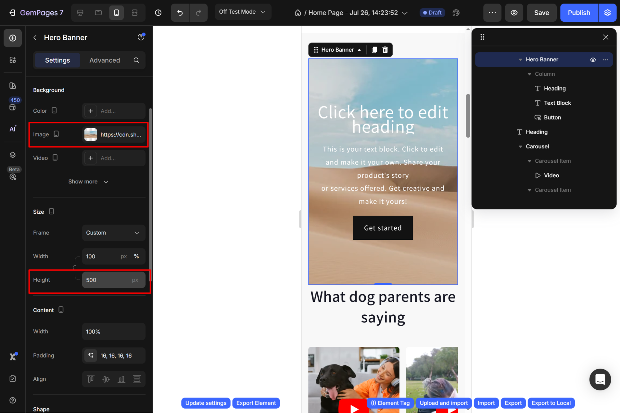
Step 2: Upload an image optimized for mobile devices.
The image should match the banner’s width-to-height ratio and have a minimum width of 768px.

Example: If your banner width is 375px and banner height is 500px, the uploaded image should maintain the same ratio of 375:500 but have a width of 768px.
- Minimum Width = 768px
- Calculated Height = (768/375)×500=1024px
- The optimal size for this example would be 768×1024 px.


Thank you for your comments