About Checkbox Element
The Checkbox Element is used to create interactive fields where visitors can agree or disagree with certain options, such as terms of service, subscription to newsletters, or consent to share information.
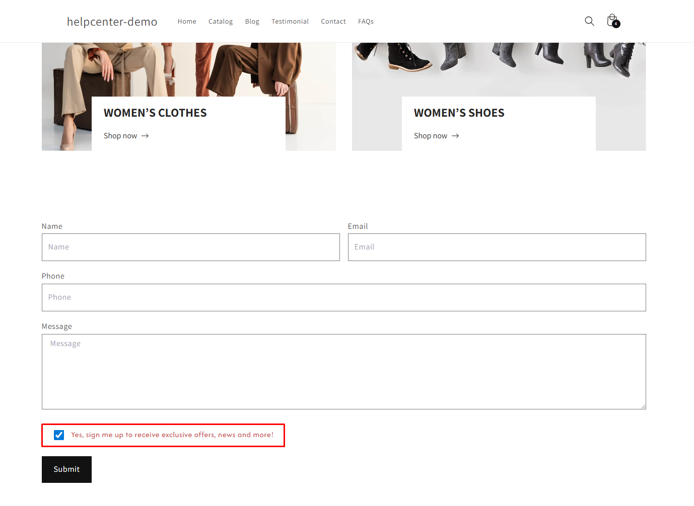
Note: The Checkbox Element can only be used within a Contact Form or Newsletter Form. Ensure you have added one of these forms before using the Checkbox Element.
Check out this article for more information.
How to Add a Checkbox Element?
Step 1: Access GemPages Dashboard > Pages, and locate the target page to open the editor.
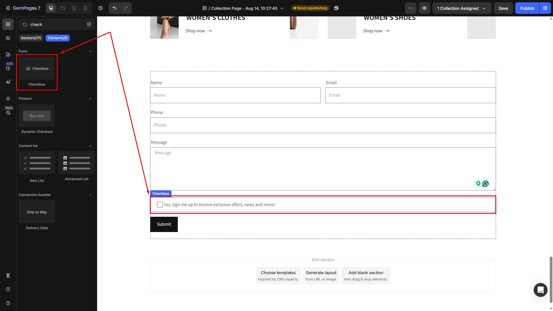
Step 2: In the left sidebar, search for the Stock Counter element, and drag & drop one inside the Product module.
Configure the Checkbox Element Settings tab
Click the checkbox element to open its settings.
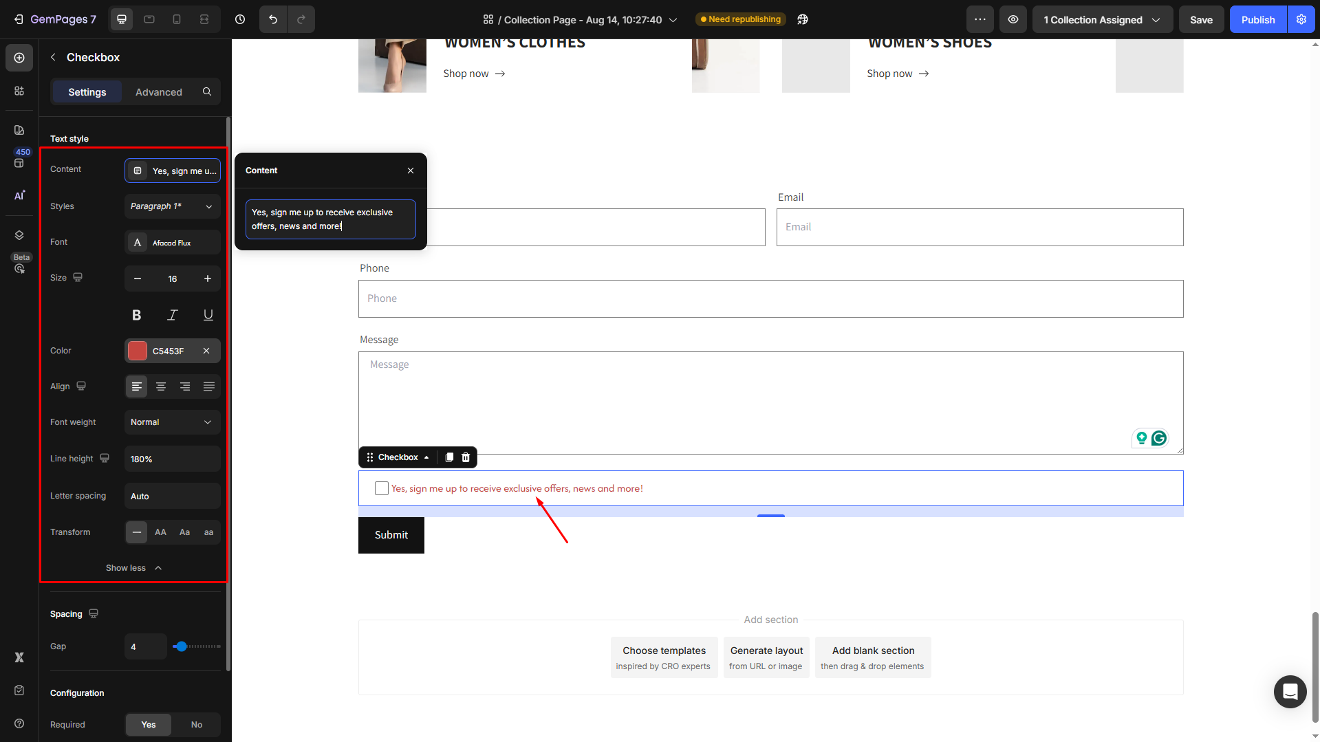
Text style
Define the placeholder text that appears within the field.
- Content: This field allows you to specify the label text next to the checkbox, such as “Subscribe to our newsletter” or “I agree to the terms and conditions.”
- Styles: Choose the text style from Heading 1-6 or Paragraph 1-3 as the global style.
- Font: Select a font style that matches your brand identity.
- Size: Adjust the font size to make the text prominent.
- Font Weight: Control how thick or thin the text appears.
- Line Height: Adjust the space between lines for better readability.
- Letter Spacing: Create a more modern or compact look by changing the space between letters.
- Transform: Convert the text to uppercase, lowercase, or capitalize the first letter of each word.
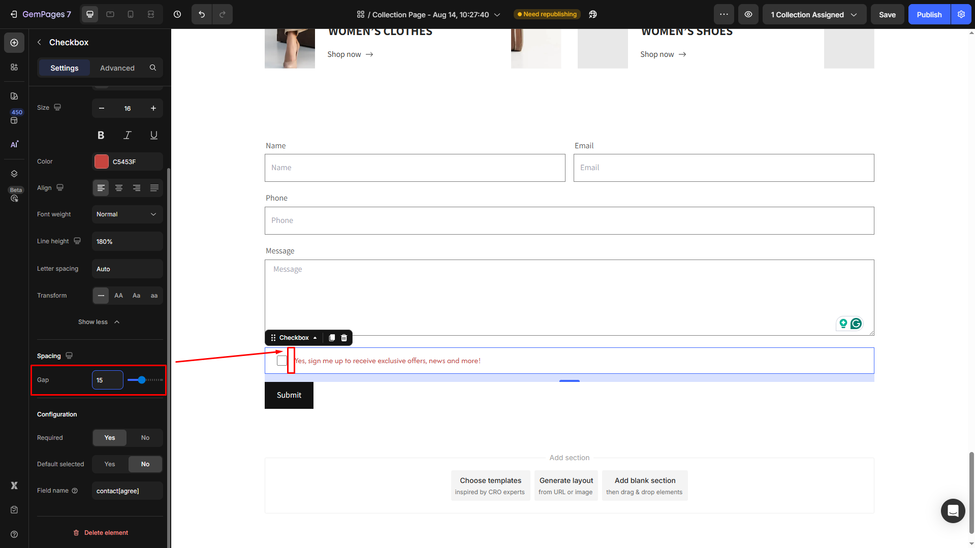
Spacing
Adjust the spacing between the checkbox and its accompanying label text to create a clean and visually appealing layout. This ensures the form design remains organized and easy to read.
Configuration
- Required:
Set it to Yes/No to make the field mandatory or not for submission.
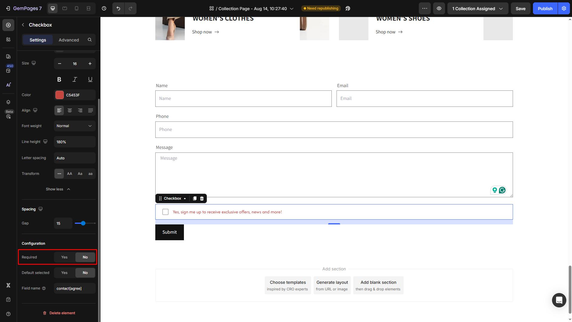
This ensures users must check the box before proceeding with the form, which is useful for legally binding agreements or essential consents.
- Default selected:
When enabled (Yes), the checkbox will appear pre-selected (checked) when the form loads.
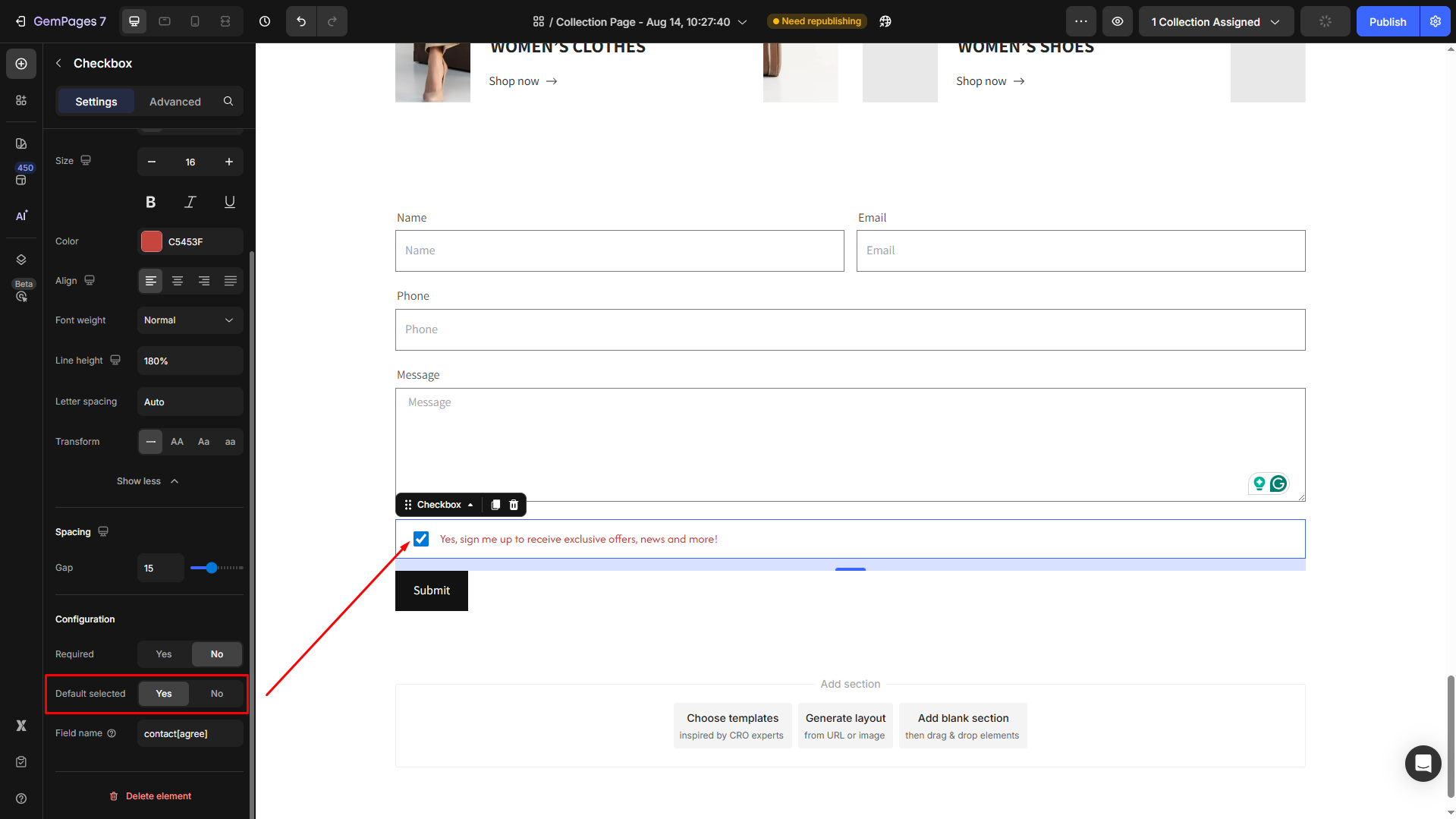
This can be useful for opt-in subscriptions but should be used thoughtfully to respect user choice.
- Field name:
Assign a unique name to the Checkbox field for form processing.
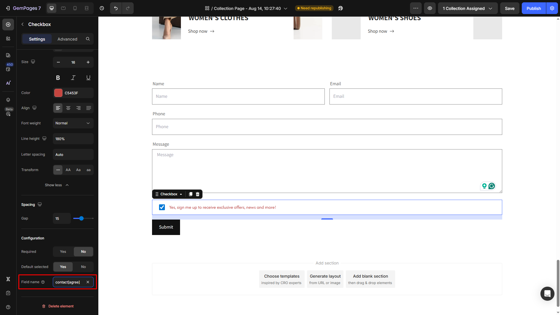
This is especially important if you’re integrating your form with external tools or systems, as the field name will identify the submitted data.
Configure the Advanced Tab
For more advanced customization, please navigate to the Advanced tab and follow the instructions in this article.


Thank you for your comments