What is the Bundle Discount Element?
The Product Bundle Discount Element allows Shopify merchants to create tiered pricing strategies. By automatically applying discounts when customers purchase more items, this feature supports:
- Increased Average Order Value (AOV): Encourage customers to spend more per transaction by offering attractive volume discounts.
- Enhanced Shopping Experience: Shoppers can easily understand and select discounted bundles, making their purchasing decisions seamless.
- Customizable Design: Tailor the element’s look to align with your store’s aesthetic while showcasing the discounts prominently.
How to Add the Bundle Discount Element in GemPages v7?
Step 1: Create a bundle discount in GemPages
1. Go to your GemPages Dashboard.
2. Navigate to Preferences > Bundle discounts > Manage bundle discounts.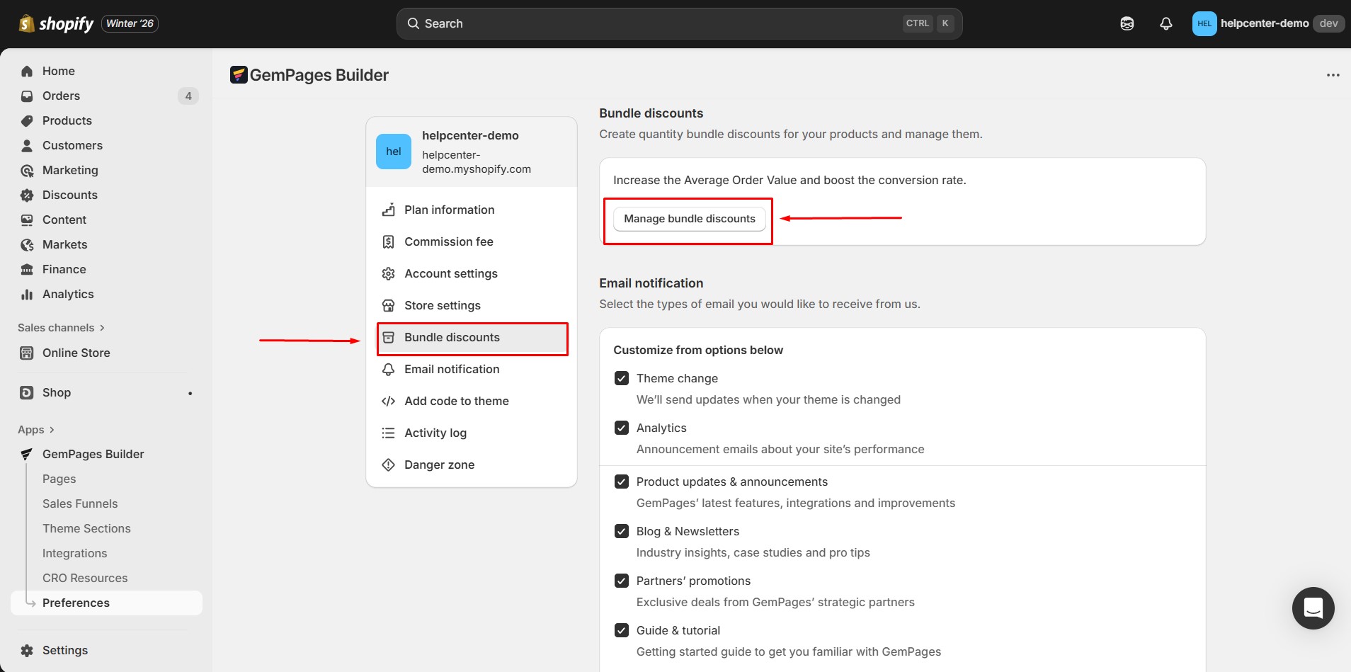
3. Click Add Product to select the items you wish to include in the bundle.
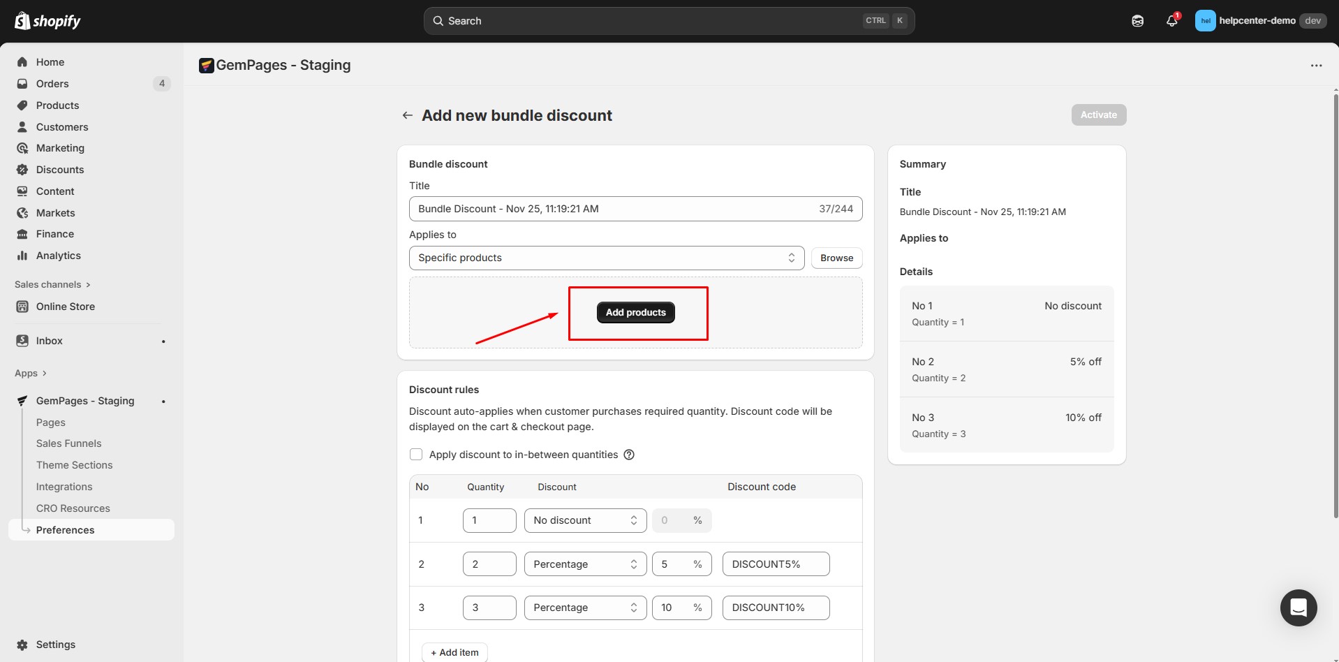
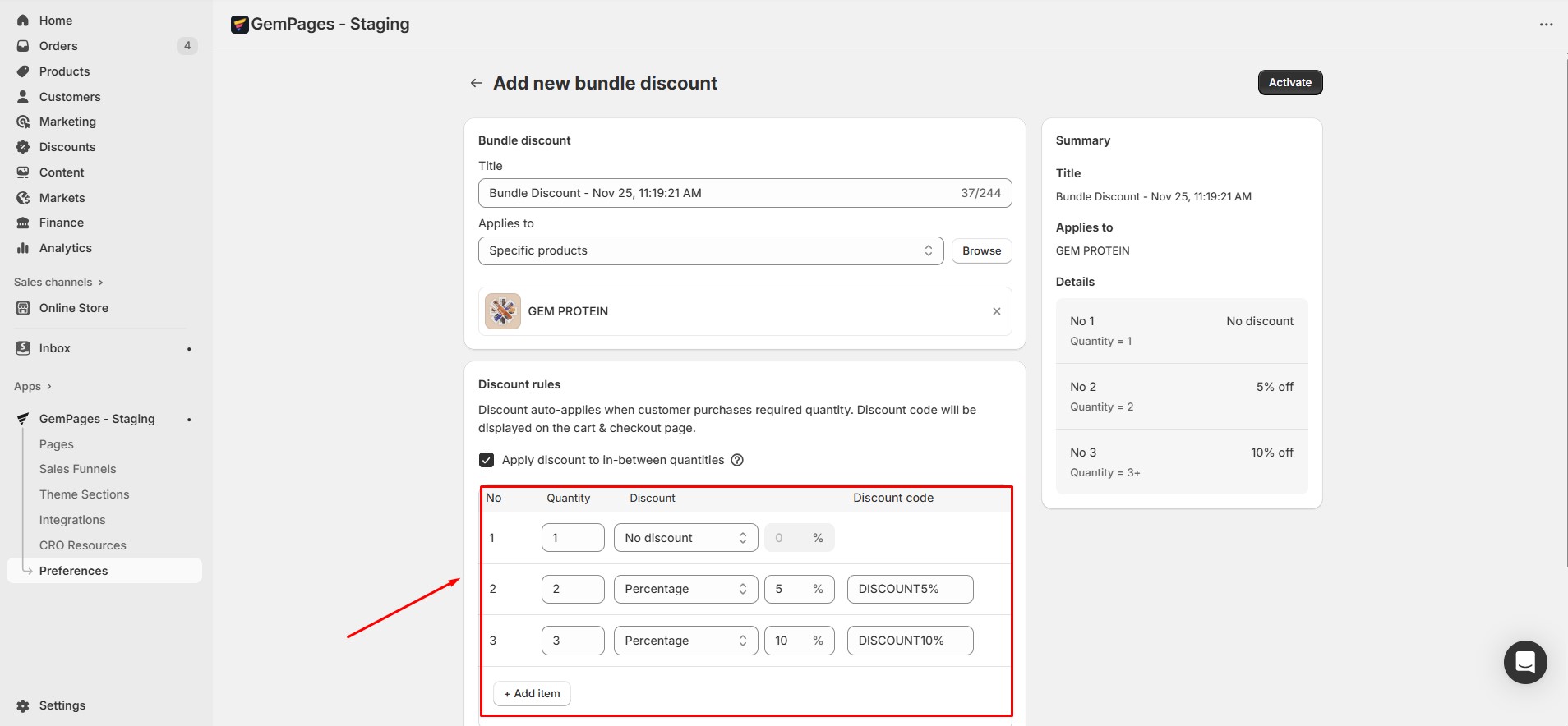
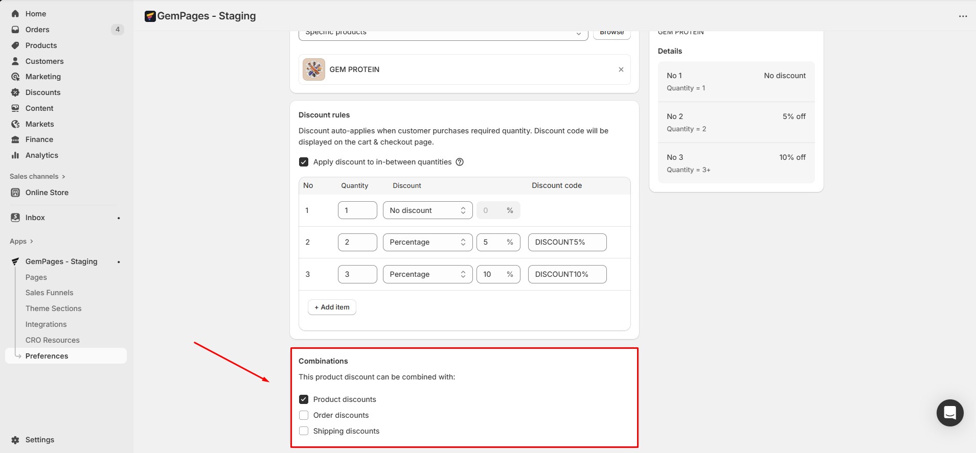
4. After selecting a product, you need to set up the discount rules. The discount will be automatically applied when a customer purchases the required quantity, and the discount code will be displayed on the cart and checkout pages.
In the Discount Rule Settings, you can:
- Enable or disable “Apply discount to in-between quantities”
When enabled, customers who purchase more than a bundle will still receive the discount for the closest smaller bundle.
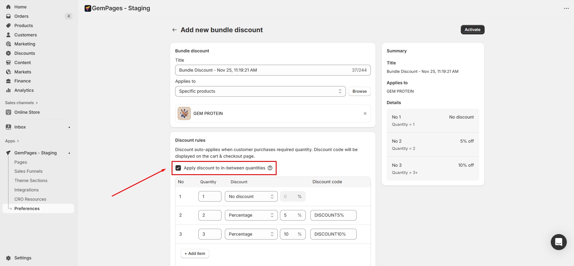 Example: If a discount is set for a bundle of 5 items, and a customer buys 6 items, they will receive the 5-item bundle discount instead of no discount. This ensures customers don’t miss out on discounts just because their purchase quantity doesn’t exactly match the bundle size.
- Configure discount tiers and quantities for each product
5. Choose whether the product bundle discount can be combined with other types of discounts. You can select any of the following options:
- Product discounts: Allow this bundle discount to be used alongside other product-specific discounts.
- Order discounts: Enable this bundle discount to combine with overall order discounts, such as percentage-off promotions for the entire cart.
- Shipping discounts: Let customers use this bundle discount together with any shipping discounts, like free shipping or reduced shipping rates.
 Step 2: Insert the product bundle element into a page
- Go to the Pages section of your dashboard. Open an existing product page or create a new one.
- In the Editor, search for Product Bundle in the search bar.
- Drag and drop the element into the editor. Please note that the element cannot be placed outside of a Product Module.
- Choose between two preset layouts:
- Horizontal
- Vertical (example shown below).
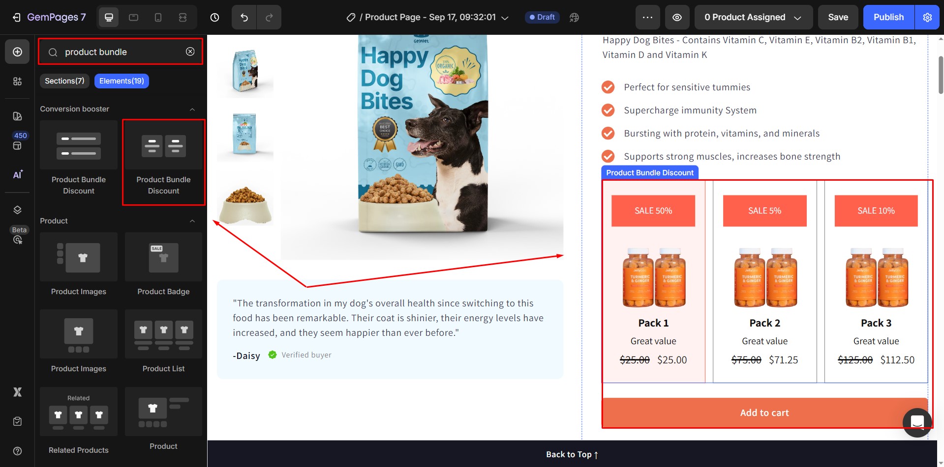
Once added, the prices and comparison prices of the included items will automatically update according to your bundle discount settings.
When you click on the element, the Settings Panel will appear on the left side of the Editor. It contains two tabs: Settings and Advanced.
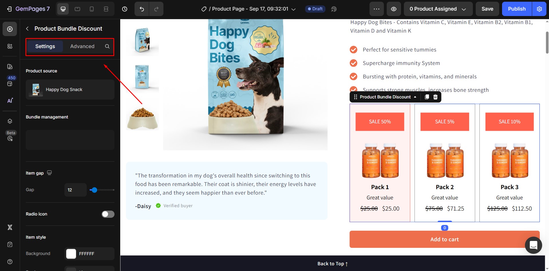
Configure the Settings Tab
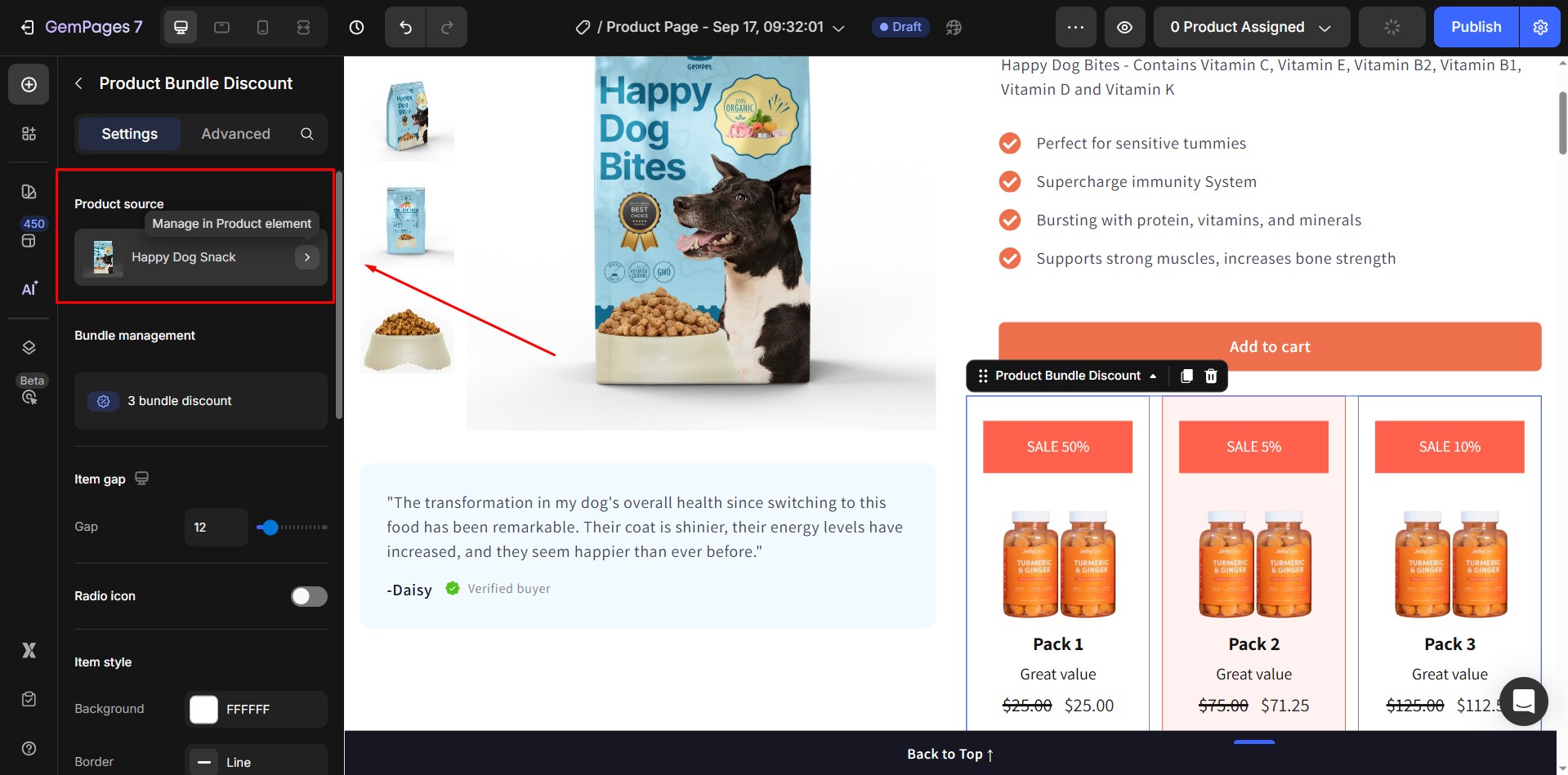
1. Product source
- Shows which product the element is displaying bundle information from.
- Ensure you select the same product you configured in your bundle discount setup.
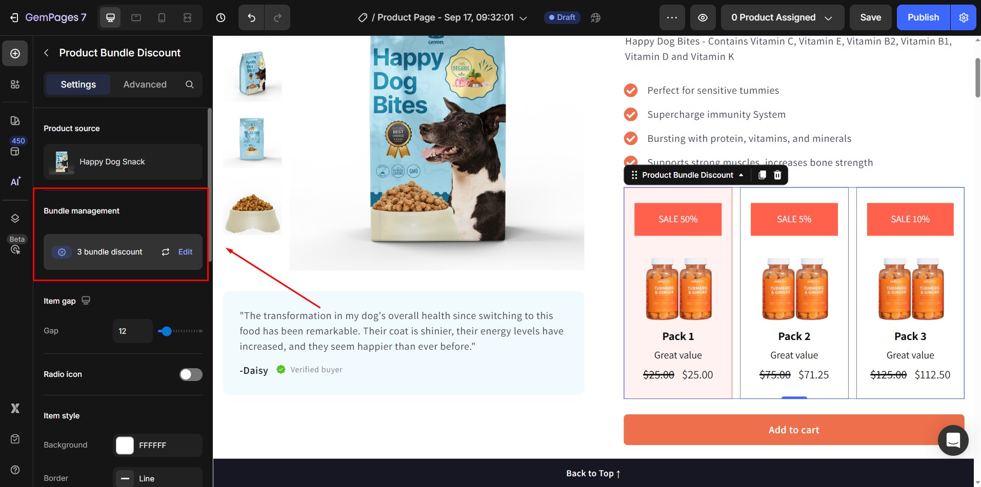
2. Bundle management
- For products without a bundle discount, you’ll be redirected to the Create New Bundle Discount screen.
- For products with an existing discount, you’ll access the Detailed Discount Management screen.
- Sync Again: Click to update discount information in the Editor, ensuring all changes are applied accurately.
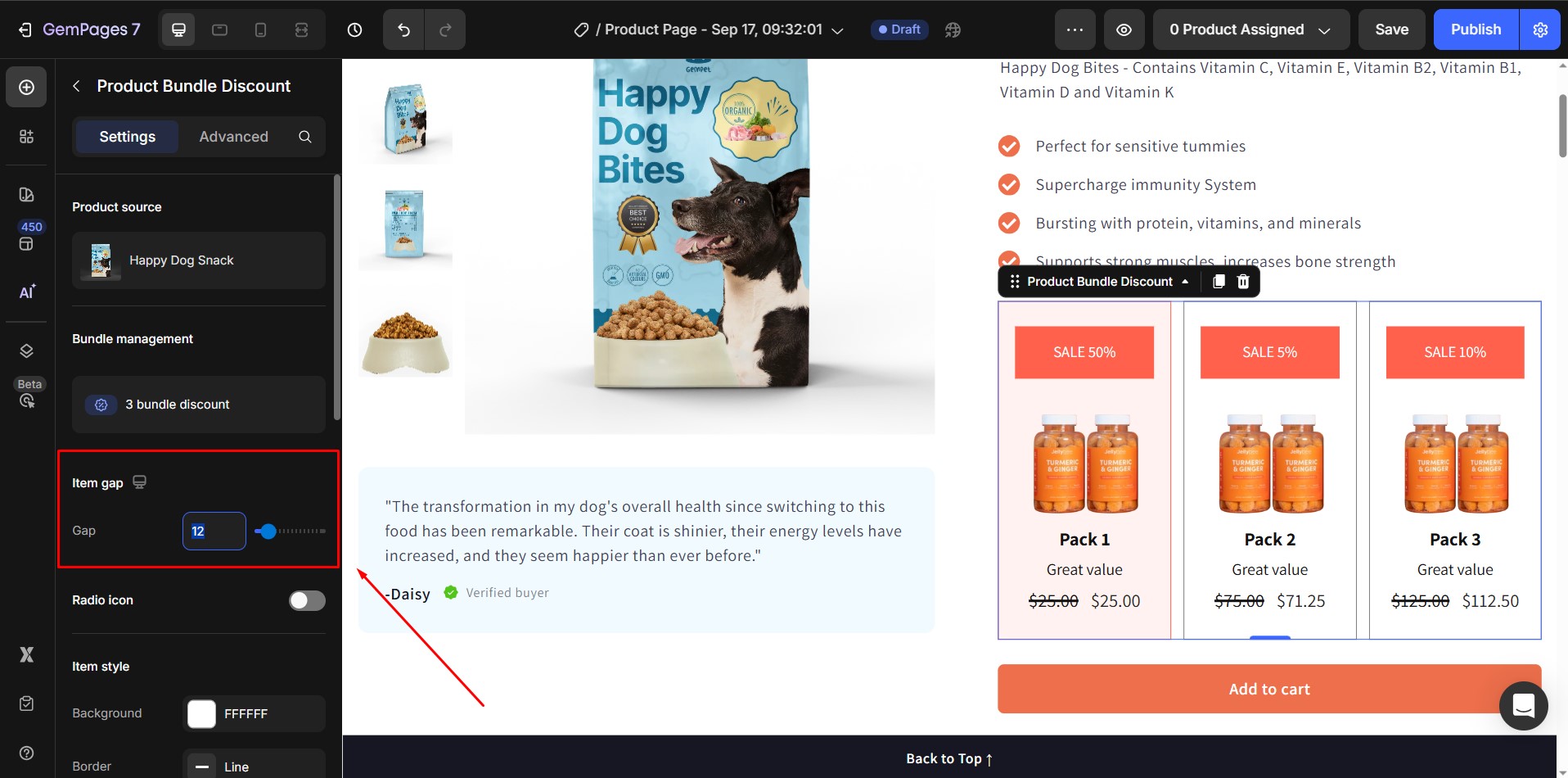
3. Item gap
- Adjust the spacing between bundle items.
- Input an absolute value (px) or use the slider.
- Default value: 12px.
4. Radio icon
Toggle this option On to display a selection (radio) icon next to each bundle item. This helps customers easily identify which product option is currently selected within the bundle.
When enabled, you can customize the following:
- Position: Choose to place the icon on the Left or Center of each item.
- Color: Select any color to match your store’s branding.
- Size: Adjust the icon’s size to fit your design.
- Gap to Content: Define the spacing between the icon and the item’s text or image.
This setting is especially useful when you have multiple bundle options, ensuring clear visual feedback for shoppers as they make their selection.
![]()
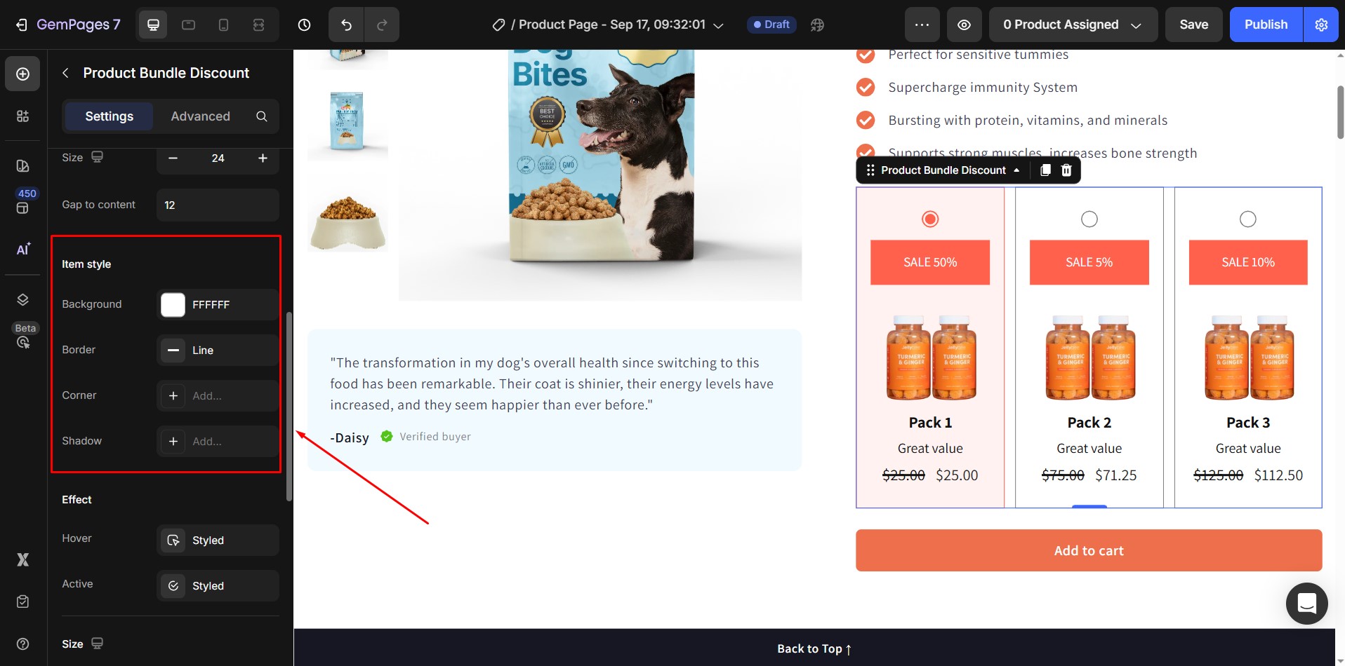
5. Item style
Customize the appearance of each bundle item:
- Background
- Border
- Corner radius
- Shadow
6. Effect
Control visual effects for different states:
- Hover: Opens a popover to configure hover effects when customers move the cursor over the item.
- Active: Opens a popover to configure the active state of the selected bundle option.

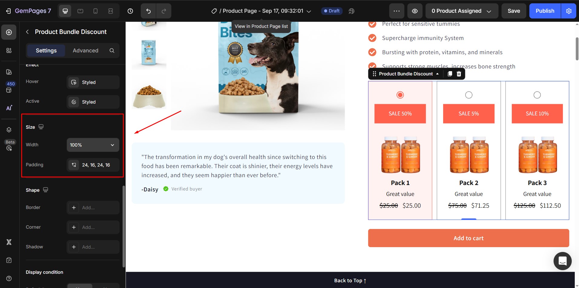
7. Size
- Width: Default is 100%. Suggestions: Full width (100%) or Fit Content (Auto).
- Padding: Add spacing inside the element.
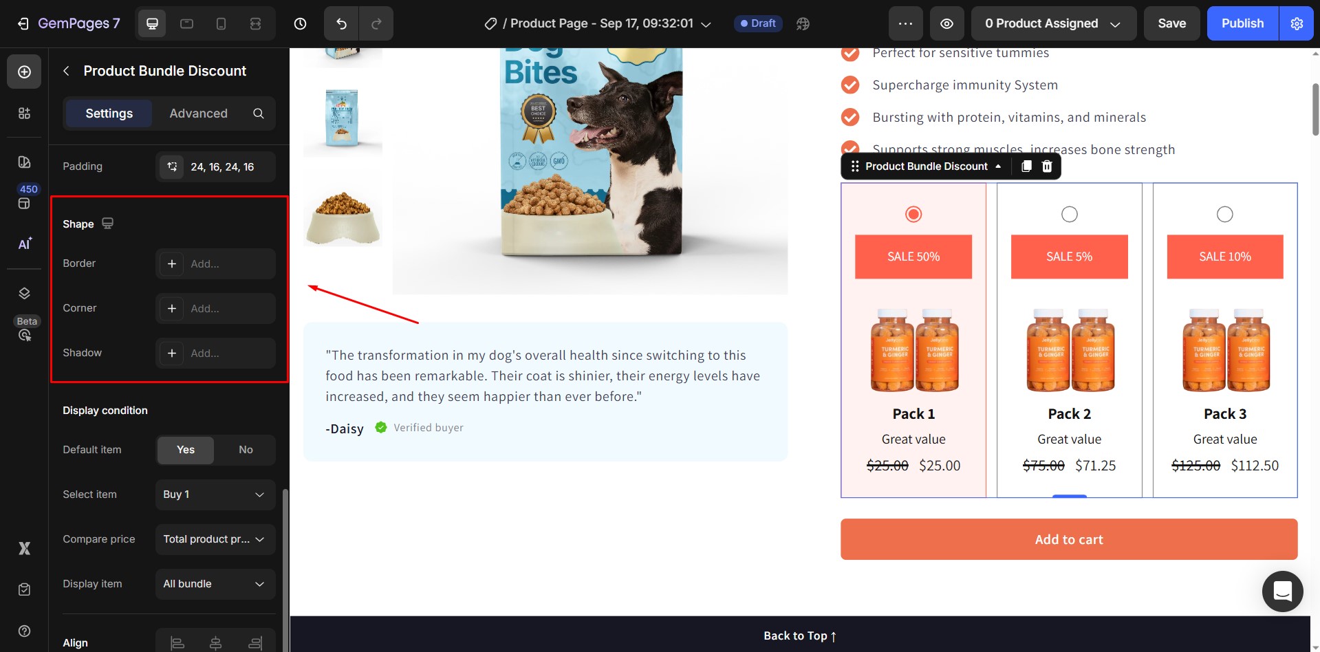
8. Shape
Adjust the container’s appearance:
- Border
- Corner radius
- Shadow
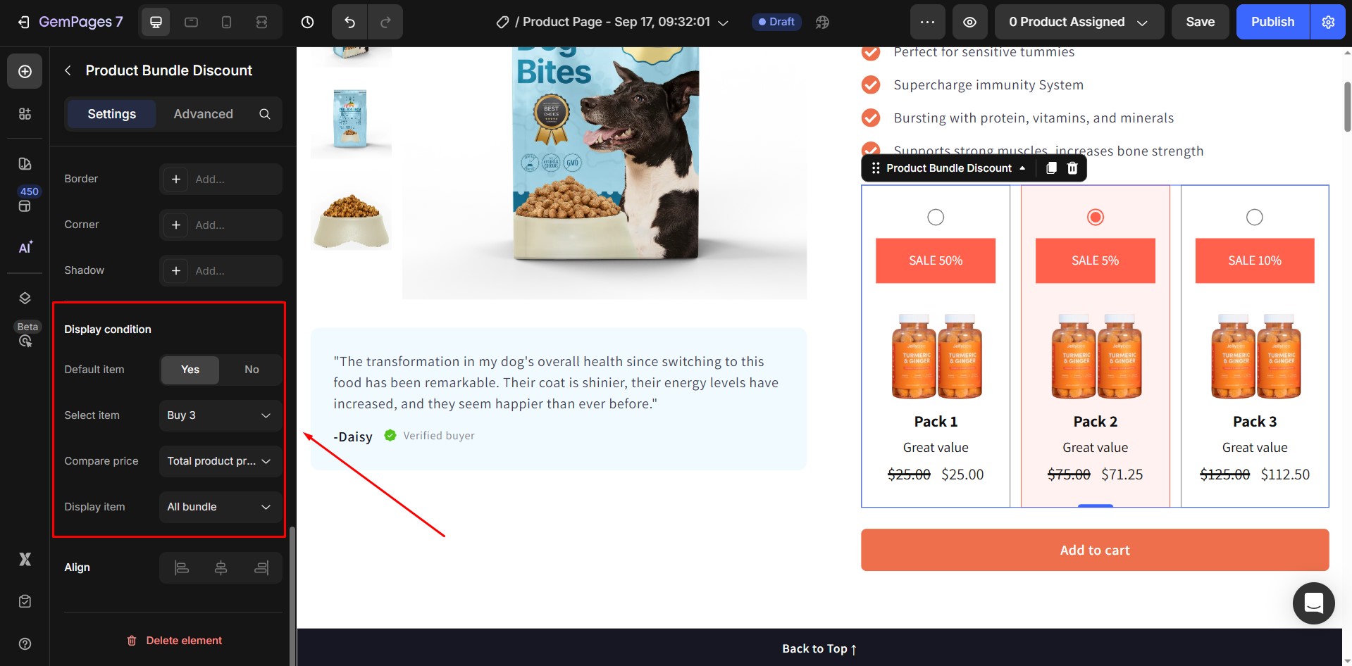
9. Display condition
- Default item: Choose Yes/No to set a default selected item.
- Select item: Define which bundle item should be pre-selected.
- Compare price: Show total product price or total product compare-at price.
- Display item: Show all bundles or hide bundles without discounts.
10. Align
- Align the bundle element horizontally.
- This option is disabled if the width is set to 100% or more.

Configure the Advanced Tab
For more advanced customization, please navigate to the Advanced tab and follow the instructions in this article.
FAQs about the Bundle Discount Element
1. Is the Bundle Discount Element available for all GemPages plans?
No. The Bundle Discount Element is only available on GemPages V7 and is not included in the Free plan. Please upgrade your plan to access this feature.
2. Can I apply multiple bundle discounts to the same product?
No. Each product can only be linked to one bundle discount at a time. You cannot assign multiple bundle discounts to a single product.
3. Can I create a bundle that includes different variants of the same product?
Not yet. The Product Bundle Discount currently does not support multiple variants within a single bundle. It is designed for products with only one variant. Support for multi-variant bundles may be added in future updates.
4. The product bundle discount element does not display on the editor even if I set it up correctly. How can I show it?
You can click Sync again in the Product Bundle element within the Editor to refresh and apply any updates you’ve made. If the bundle discount is still not showing, please contact our Customer Support Team for further assistance.


 Step 2: Insert the product bundle element into a page
Thank you for your comments