


About the Carousel Element
The Carousel element refers to a specific feature or widget that allows users to create and display a carousel of products, images, or promotional content on their website. Here are several key features & benefits of the Carousel element:
- Product Showcase: E-commerce carousels often showcase products from a store’s inventory. Each slide can display a different product with its title, image, price, and possibly a brief description.
- Promotional Banners: The Carousel element can also display promotional banners or advertisements for sales, discounts, or new arrivals.
- Customizable Layout: Users can usually customize the layout of the carousel, adjusting aspects like the number of visible items per slide, the transition effects between slides, and the overall styling to match their brand’s aesthetic.
- Navigation Controls: This typically includes navigation controls such as arrows or dots to allow users to navigate through the carousel slides manually.
- Responsive Design: Like other elements in modern web design, carousel elements in e-commerce page builders are designed to be responsive, ensuring they display correctly on various devices and screen sizes.
Add the Carousel Element in GemPages v7
Step 1: In the GemPages Dashboard, select the page where you want to add the Carousel element.
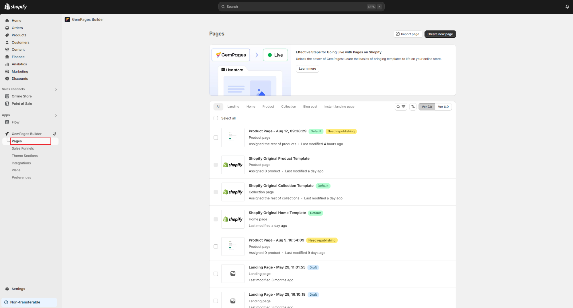
Step 2: Search for the Carousel Element, select the desired type, and drag it to your preferred position on the page.
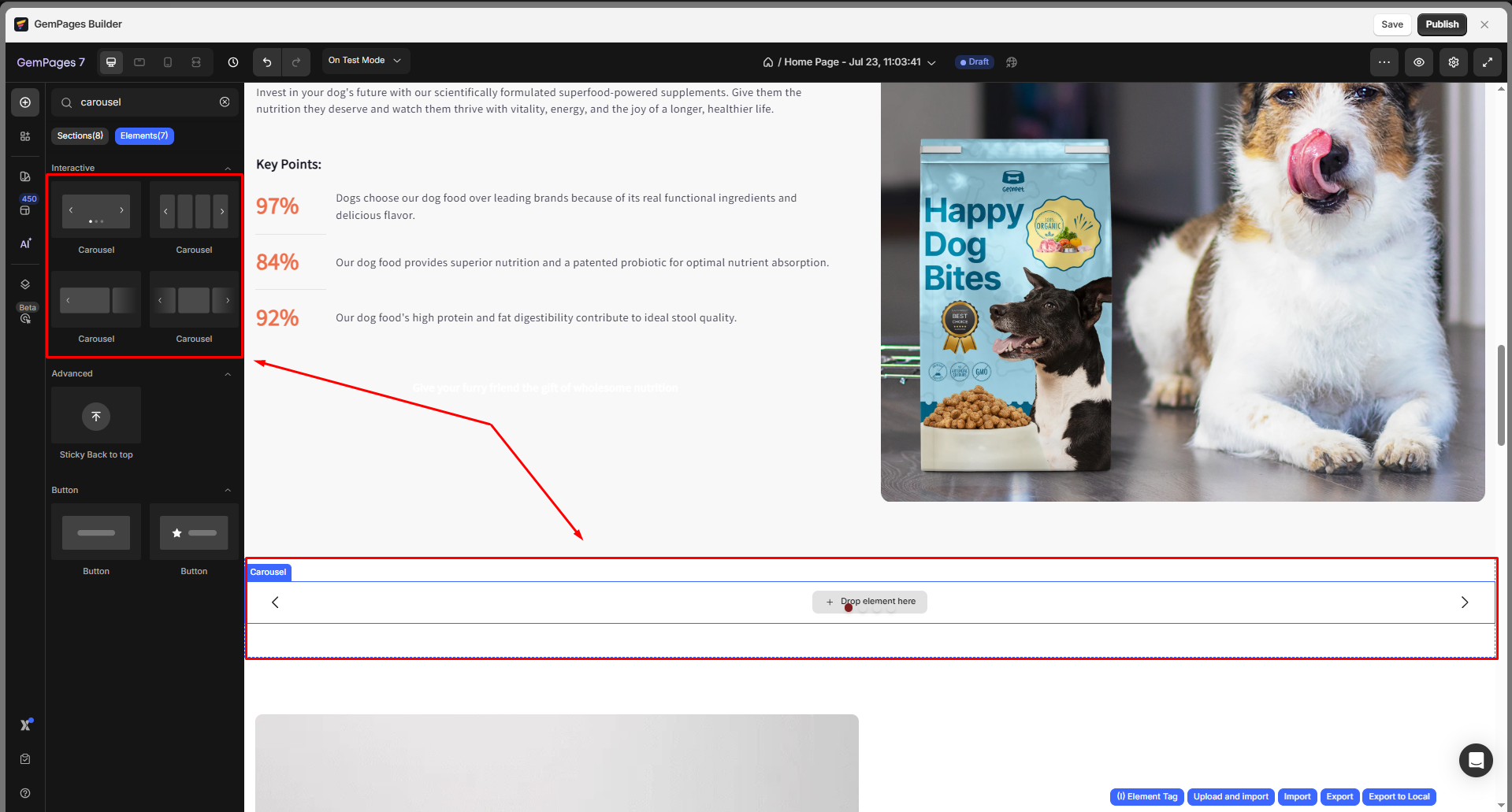
Step 3: Drag and drop any GemPages elements (Text, Image, Button, Product, etc.) to build your layout freely.
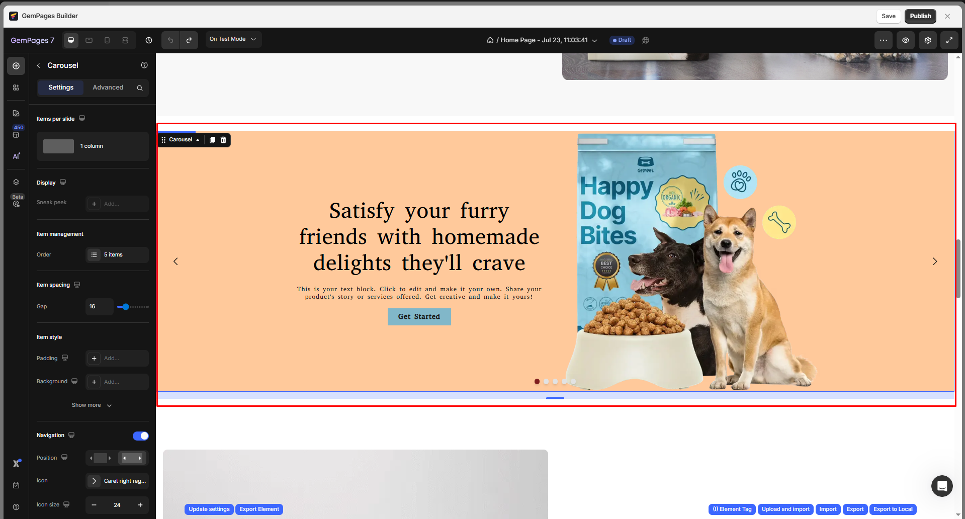
To access the Carousel’s settings panel, simply click on the element.
The left sidebar will then reveal the Settings and Advanced tabs, allowing you to customize its behavior and appearance.
Configure the Settings Tab
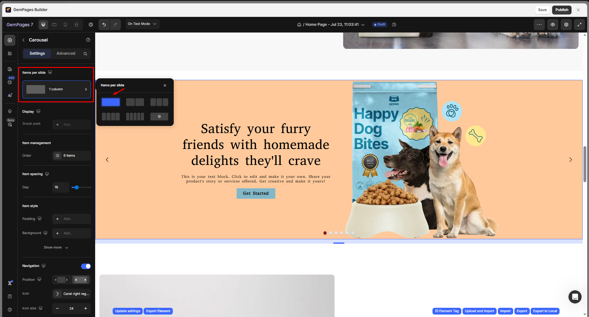
Items per slide
This setting controls how many items are displayed within each carousel slide. You can choose from the preset layout options or set a custom number to fit your design needs.
- Preset layouts: Quickly select from 1 to 5 items per slide using the available grid options.
- Custom value: If you want to display more than 5 items, click the ⚙️ Settings icon and enter the exact number you prefer. This is especially useful for product carousels showcasing multiple items in one view.
Display
This section lets you adjust how items are displayed within each carousel slide to achieve the ideal layout and spacing for your design.
- Max items: Define the maximum number of items that can appear within your carousel. You can display up to 12 items per slide.
- Spacing: Control the gap between each item. Increasing the spacing creates a more airy layout, while reducing it helps fit more content in tighter designs.
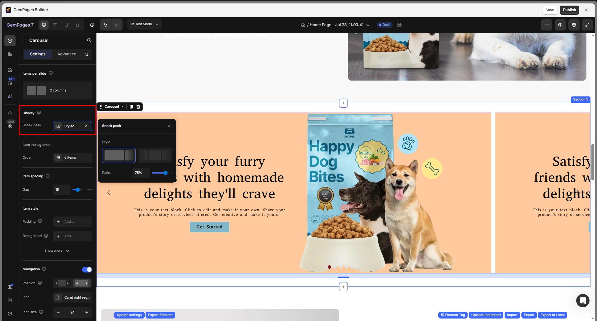
- Sneak Peek: Enable this option to reveal a small portion of the next or previous slide. This visual cue helps indicate that your carousel contains more items that users can explore.
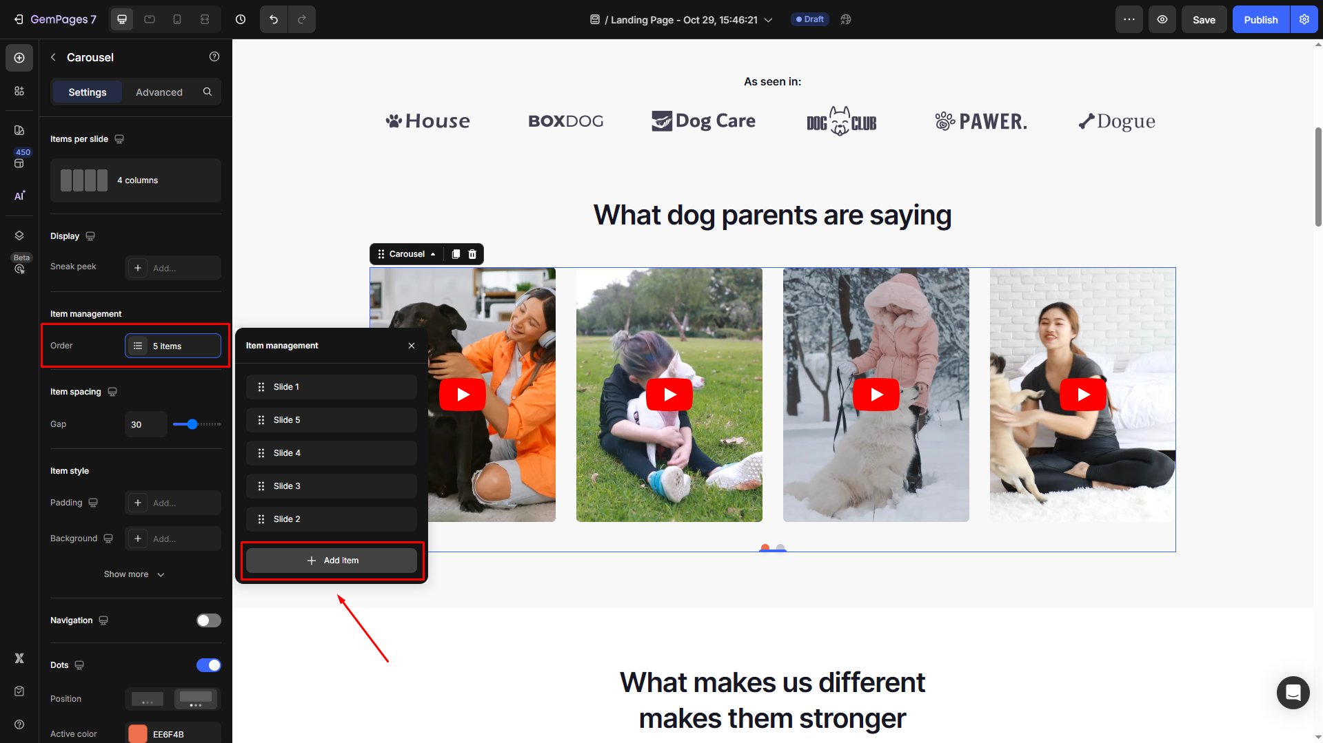
Item Management
This section allows you to manage your items in the carousel, including adding/removing slides and rearranging their order as you prefer:
- When you hover over an item, you can rename, duplicate the item, or delete it.
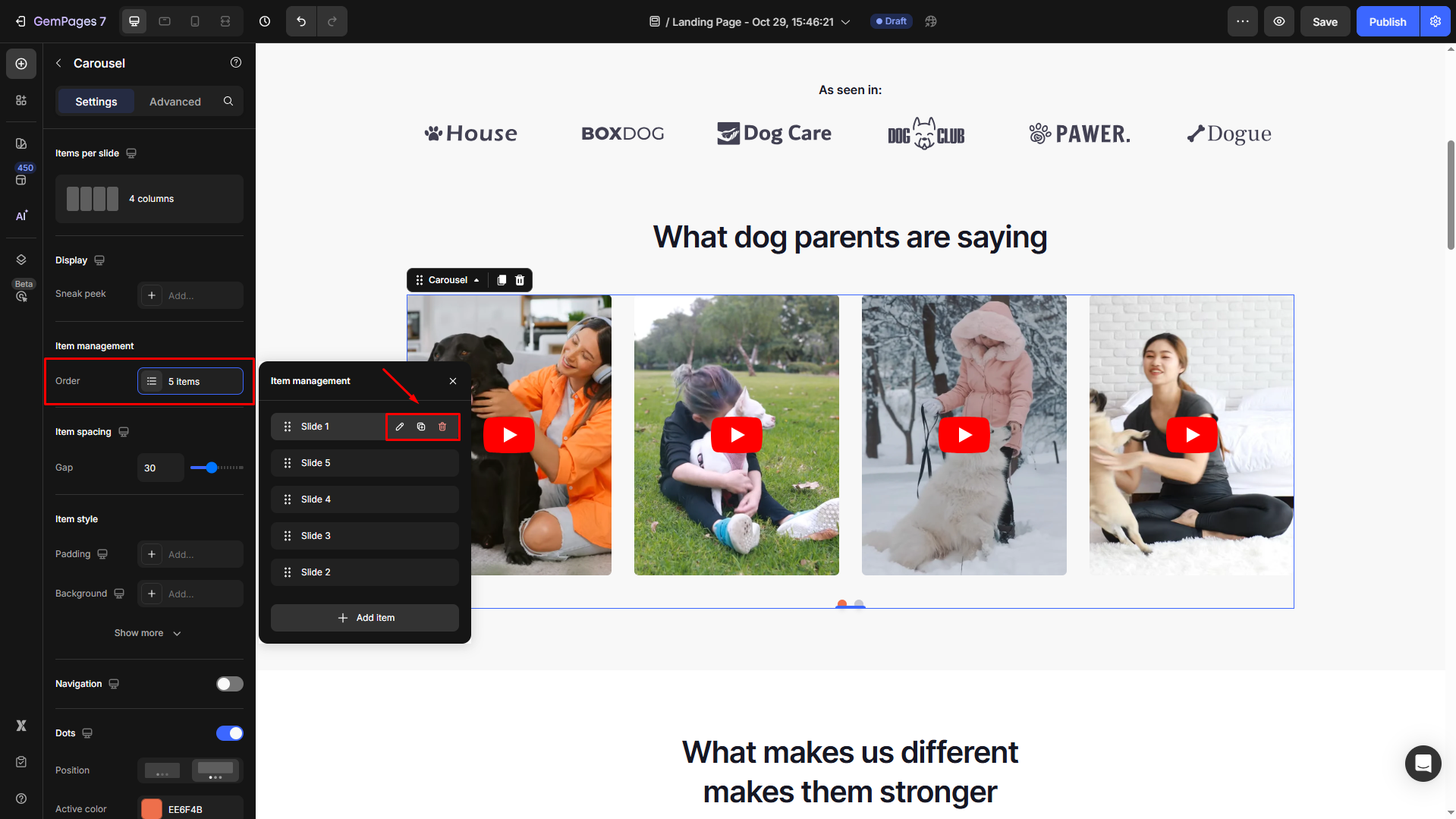
- To add more items, click the “+ Add item” button.
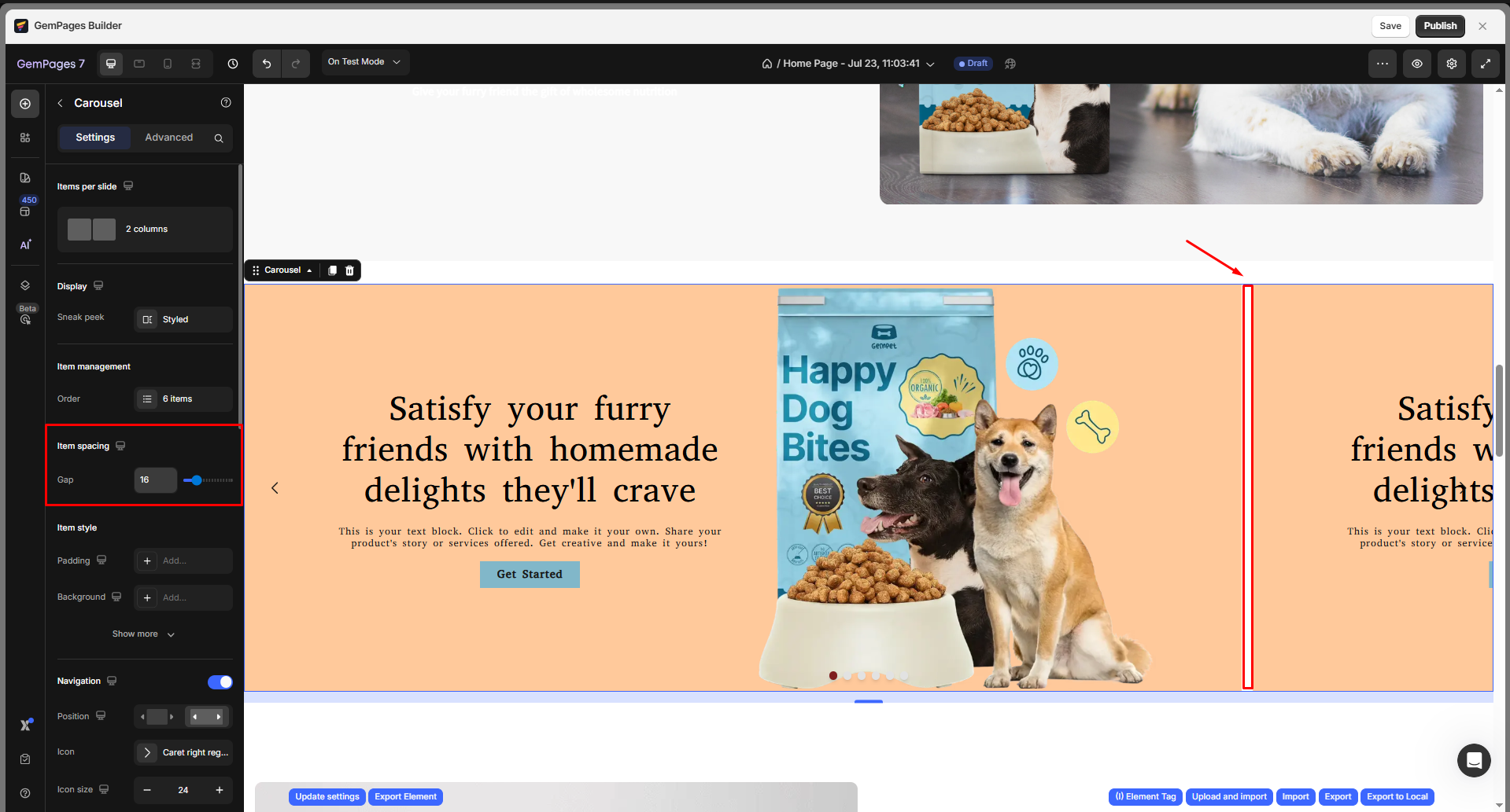
Item spacing
You can adjust the spacing between items (gaps) in your carousel. By default, the gap is set to 16 px.
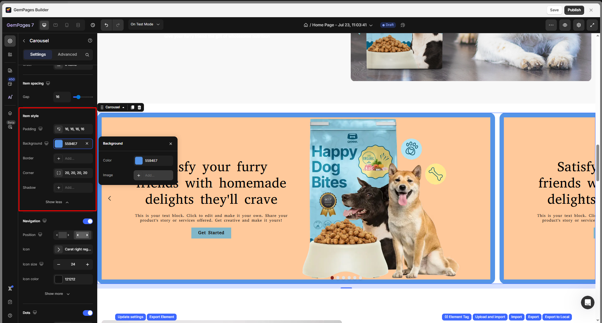
Item style
This section allows you to customize how each item (or slide) inside your Carousel.
These settings help you maintain visual consistency and improve your Carousel’s overall appeal.
-
Padding: Adjust the inner spacing of each carousel item. You can set different values for the top, bottom, left, and right to ensure your content doesn’t touch the item edges.
- Background: Define the background for each item in your carousel. You can:
- Select a solid color (using the color picker or entering a HEX code).
- Upload an image background if you want each item to have a unique visual design.
- Border: Add or customize borders for your carousel items. You can modify the border width, color, and style (solid, dashed, etc.) to match your brand’s style.
- Corner: Round the corners of each carousel item to create a softer appearance. The value (in px) determines how curved the corners appear.
- Shadow: Apply a drop shadow to your carousel items to make them stand out from the background. Adjust shadow size, blur, color, and opacity to get the desired depth effect.
Navigation
In this section, you can customize how users move through your carousel using navigation arrows.
Position: Choose whether to place the navigation buttons inside or outside the carousel area.
Navigation icon: Select the icon style for your navigation buttons, including:
- Icon: The default option is the arrow, but you can change it to other icons that better fit your design.
- Icon size: Adjust the icon size using the plus or minus buttons, or type in an exact value for precise control.
- Icon color: Pick a color for the navigation icons to ensure they stand out against the carousel background.
Navigation button: Modify the navigation buttons (the left and right arrows) to match your page style and enhance visibility.
- Button size: Click Edit to expand full settings and adjust the width and height of the navigation button. Increasing the size can enhance accessibility on mobile devices.
- Background: Add a background color to the button for better contrast against the carousel content.
- Border: Apply a border to help the button stand out. You can customize its style, width, and color.
- Corner: Round the corners of your navigation buttons to achieve a softer or pill-shaped style.
- Gap to edge: Control the distance between the navigation button and the edge of the carousel.
- Show on hover: Choose whether the navigation buttons are always visible (No) or only appear when customers hover over the carousel (Yes).

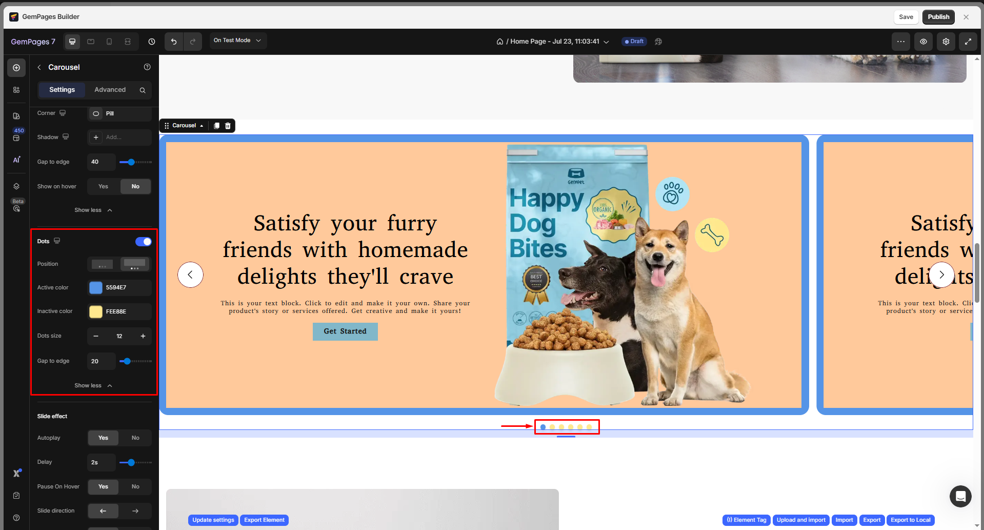
Dots
The Dots section lets you customize the navigation dots displayed at the bottom of your carousel, helping visitors identify which slide they’re currently viewing.
- Position: Choose where the dots appear relative to the carousel. You can place them inside or outside the slides, depending on your design layout.
- Active color: Select the color for the dot that represents the current (visible) slide.
- Inactive color: Choose a different color for the dots representing hidden slides.
- Dots size: Adjust the size of the dots using the plus/minus buttons or type in an exact value for pixel precision.
- Gap to edge: Define the spacing between the dots and the carousel edge. Increasing this value can help improve visibility or balance spacing across different screen sizes.
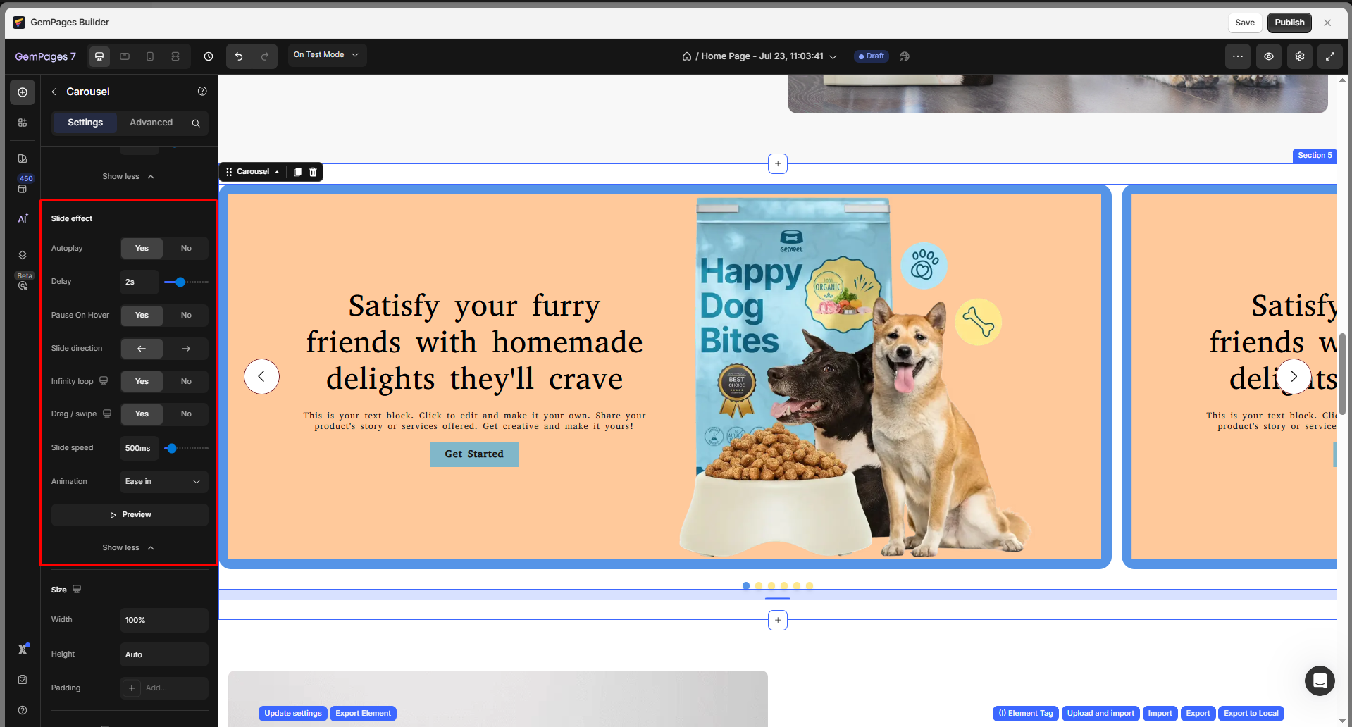
Interaction
Customize the interaction in the carousel element:
- Autoplay: Activate this switch to advance slides automatically. For optimal functionality, combine Autoplay with the Loop feature. With both functions enabled, slides will automatically progress and loop back to the first slide.
- Delay: Set duration (in ms) before switching slides.
- Pause on hover: Stop autoplay when users hover over the carousel.
- Slide direction: Choose left or right slide movement.
- Infinity Loop: Activate this switch to allow the carousel to repeat from the beginning after reaching the final slide.
- Drag/swipe: Enable this option to allow customers to slide to the next image using their mouse.
- Slide speed: Edit the speed for the slides in the carousel
- Animation: Choose the animation effect, such as Ease In, Ease Out, and Ease In & Out. You can preview the animation effect when applying it in the carousel element.
Size
Customize the width and height of the carousel element according to your preference. You can set the full-width carousel by following these steps:
- Set Width to 100% or Full Width.
- Go to Settings > Align and select Center or Stretch.
Make sure the carousel container section or row is also set to full width in your layout structure.

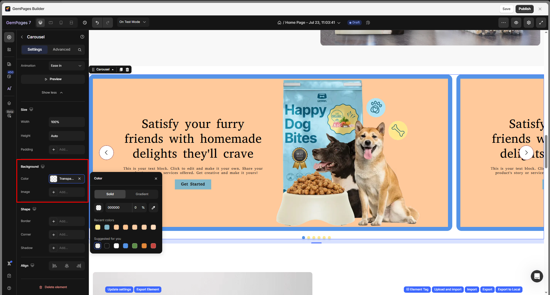
Background
Customize the overall background of your carousel to match your store’s design. You can either choose a solid/gradient color or upload an image to use as the carousel’s background.
For further details on customizing the background, please refer to this article.
Shape
In this section, you can fine-tune the overall look of your carousel by customizing its border, corner radius, and shadow effect. These settings help your carousel blend seamlessly into your store’s layout or stand out as a highlighted section.
- Border: Add or modify the border around the carousel. You can define its thickness, style (solid, dashed, dotted), and color to match your brand style.
- Corner: Adjust the corner radius to make the carousel’s edges rounded or sharp. For example, larger values create a softer, more modern look.
- Shadow: Apply a drop shadow to give your carousel a sense of depth and visual separation from the page background. You can tweak the shadow’s offset, blur, and color for subtle or dramatic effects.
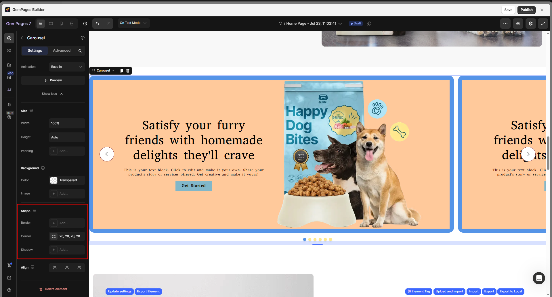
Refer to this article for full guidance on modifying the shape with border, corner, and shadow settings.
Align
In this section, you can choose from three options: left-aligned, centered, or right-aligned.

Configure the Advanced Tab
For more advanced customization, please navigate to the Advanced tab and follow the instructions in this article.
The Carousel element is a versatile tool for adding dynamic, interactive visuals to your Shopify store. With GemPages v7, you have full control over each item’s style, animation, and layout, making it easy to build eye-catching product showcases or brand stories that engage visitors across all devices.
For example, to add a Transition Effect for your carousel, in the Advanced Settings of the Carousel Element, you can switch from the default Slide transition to a Fade effect for a smoother, more elegant visual.
To apply it, go to the Advanced tab, locate the Animation section, and select Fade from the transition type dropdown.
The fade effect works seamlessly with Autoplay and Loop, allowing each slide to blend in/out automatically.
FAQs about the Carousel Element
1. Why is my carousel not displaying full-width?
To display a full-width carousel on your page, please try the following:
- Check that the width is set to 100% Settings > Size.
- Ensure the carousel is placed in a section or row that also spans the full width.
- Set Align = Center or Stretch in Settings > Align.
- Avoid placing the carousel inside narrow columns or nested sections.
2. Why doesn’t my carousel autoplay?
To set your carousel autoplay, follow these steps:
- Go to Settings > Interaction and make sure Autoplay is toggled on.
- To keep it looping, also enable Infinity Loop.
3. Can I display products dynamically in the Carousel?
In GemPages, the Carousel does not auto-pull product data from Shopify like the Product List element. Hence, you need to manually drag product modules into the Carousel for custom control.
4. Why do images look cut off or misaligned?
In case your images look cut off in the carousel:
- Check the Image ratio, Padding, or Slide width settings.
- Use Fit Image instead of Fill Image if maintaining aspect ratio is a priority.
5. Does GemPages Carousel support a fade transition effect?
Yes. In GemPages v7, the Carousel element includes a Fade effect under Advanced Settings > Animation. Enable Autoplay and Infinity Loop for continuous fading transitions between slides.
6. How do I change the sliding time of the carousel?
Go to Settings > Interaction.
- Adjust Delay to control how long each slide stays visible.
- Adjust Slide speed to control how fast the slide transition happens.
7. Can I drag and drop elements into a Carousel?
8. Why are my carousel images not showing up?
- Make sure you’ve added an Image element inside each carousel item.
- Verify that the image has been properly uploaded and is not broken or missing.
- Check visibility settings to ensure the image is not hidden on specific devices.
- Ensure the carousel item is not empty or accidentally deleted.
- Click Save and Publish to apply the latest changes.
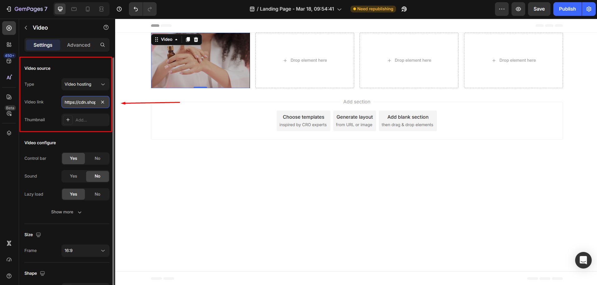
9. How do I replace a video in the carousel?
To replace a video in the carousel, open the GemPages editor and select the carousel item that contains the video. Click on the Video element, then upload a new video or update the video URL in the settings panel.


Thank you for your comments