


Unlike the Settings tab, these configurations remain consistent across all elements. By exploring these settings, you can effectively customize the more advanced features of each element and maximize their potential.
Display on
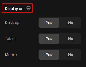
The Display On setting lets you choose whether a particular element or section is visible on specific screen types: desktop, tablet, or mobile-view.
Adjusting this setting allows you to hide or show content depending on the device, ensuring your page is optimized for different user experiences.
How “Display On” works:
- Desktop: Controls whether the element or section is visible when the page is viewed on desktop screens (larger screens, typically above 1024 pixels wide).
- Tablet: Controls visibility on tablet devices (medium-sized screens, typically between 768 pixels and 1024 pixels wide).
- Mobile: Controls visibility on mobile devices (small screens, typically below 768 pixels wide).
Use Cases in GemPages
- Mobile-First Design: If you have a large image or a detailed section that looks great on a desktop but doesn’t fit well on smaller screens, you can hide that element on mobile devices and replace it with a more mobile-friendly version.
- Custom Layouts for Different Devices: A complex product grid may work well on a desktop, but on mobile, you can simplify the layout by hiding the grid and showing a single-column list instead.
- Targeted Messages: If you want to show different marketing messages to users on different devices (e.g., offering a mobile-exclusive discount) selectively, this setting allows you to show certain elements based on the user’s device.
Spacing

In the Spacing section, you can adjust all 4 dimensions of the Margin and the Padding.
Margin
Margin is the space outside of an element’s border. It controls the space between the element and other elements on the page. Margins are transparent and push the element away from its surrounding content, creating a buffer around it.
In GemPages, you might use margins to control the distance between different elements, such as between two images or between a button and a text block, to create visual separation or white space.
Padding
Padding is the space inside an element’s border but outside its content. It defines the amount of space between the content of the element (such as text or an image) and the element’s border.
In GemPages, Padding is used when you want to create space within an element. For example, you can add padding to a button so that the text inside has space around it, making the button larger or more visually balanced.
Shape
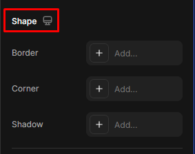
Border
The border is the line that surrounds an element’s content and padding. It defines the outline or edge of an element, such as a button, image, or text box. Borders can have different widths, styles (solid, dashed, dotted, etc.), and colors.
Use Cases in GemPages
Borders are used to emphasize, define, or separate elements visually. For instance, adding a border around a call-to-action button makes it stand out more clearly, or applying borders around images gives them a framed look.
Corner (Border Radius)
The corner, often called border-radius, controls the roundness of an element’s corners. It defines how sharp or curved the corners are. When you apply a border radius, the element’s corners will become rounded, with larger values making the corners more circular.
Use Case in GemPages
You might use the border-radius to soften the look of elements by giving them rounded corners. This is particularly useful for buttons, images, and containers where you want to create a modern, friendly, or sleek aesthetic. For example, a rectangular image can be transformed into a circle by setting the border radius to 50%.
Shadow
A shadow adds a shadow effect around an element, giving it depth and a sense of layering or elevation. Shadows can be adjusted by color, blur radius, spread, and offset (the distance from the element).
Use Case in GemPages
Shadows typically create a three-dimensional effect on flat elements, making them pop out from the page. For instance, you can add a subtle shadow to a card or a block of text to create a sense of depth or apply a more dramatic shadow to highlight an important element like a product image.
Position
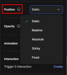
The CSS position property is essential for controlling how elements are placed on a web page. It defines how an element is positioned within the layout using different values.
- Static: The default positioning method. The element appears in the normal document flow, stacking naturally with other elements based on their order in the HTML.
- Relative: The element remains in the normal flow but can be shifted from its original position using offset properties (top, right, bottom, left). The space it originally occupied is still preserved.
- Absolute: The element is positioned relative to the nearest ancestor that has a
relative,absolute, orfixedposition. It’s removed from the normal document flow, so it won’t affect the positioning of other elements. - Sticky: The element behaves like
relativeuntil the page is scrolled to a certain point, then it “sticks” in place likefixed. This is commonly used for sticky headers or floating bars. - Fixed: The element is positioned relative to the browser window and remains visible in the same spot even when scrolling. Useful for persistent UI elements like floating buttons or sticky navigation.
Use Cases in GemPages
- Overlapping Elements: Using absolute positioning, you can create overlapping elements, such as placing text on top of an image. Adjust the z-index to control which element appears on top.
- Offset Adjustments: You might use top, left, bottom, or right offsets to fine-tune the placement of an image or text that needs to be shifted slightly from its usual position without affecting other elements.
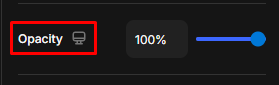
Opacity
Opacity is the degree of transparency of an element, determining how much of the background or underlying elements are visible through it. The opacity value ranges from 0% to 1%, where:
- 0%: The element is fully transparent (completely invisible).
- 100%: The element is fully opaque (completely visible).
- Any value between the elements is partially transparent, allowing for varying visibility.
Animation
Animations are categorized into appearing and hovering effects. Toggle the Animation to ON to expand its settings, choose your preferred one, and configure it to align the animation with your expectations.
When Appear
- Select Fade, Slide, Zoom, or Shake as the appearing effect. Hit None if you don’t want to add an effect when the element appears.
- Adjust the speed, delay, and easing for the appearing effect.
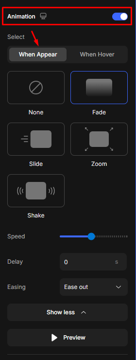
When Hover
Select None for no effect added, or choose from the Zoom and Shake effects.

Use Case in GemPages
- Call-to-Action Button Shake: You can make a button shake or bounce to grab the user’s attention, encouraging them to click. For instance, a “Buy Now” button can use the shake effect on hover or after a specific delay to make it stand out.
- Section Fade-in on Scroll: Specific sections can fade or slide into view when users scroll down a page. This effect creates a more engaging experience, guiding users through the content in a visually appealing way.
- Image Zoom on Hover: To add interactivity, you can set images to zoom in when the user hovers over them, which works well for product images or visual elements in galleries.
- Text Animation: You can animate text elements to slide or fade in on load or scroll, emphasizing important messages or headings.
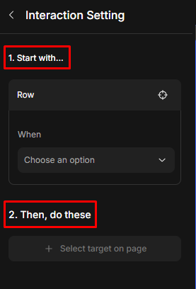
Interaction
Create a trigger interaction for the element.
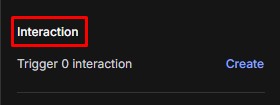
Once you click Create, you’ll be redirected to the Interaction Setting.
CSS class
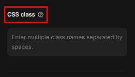
A CSS class is a reusable style for HTML elements. It helps to maintain a consistent look for those elements across your website.


Thank you for your comments