


About the Product Image Element
The Product Images element, part of the Product Module, allows you to showcase images of a specific product directly from your Shopify Admin.
This element features:
- Featured Image: The main image, sourced from the first image in the Media section of your Shopify Admin > Product.
- Image List: A collection of images from the same Media section, displayed as a visual gallery.
To use the Product Images element, ensure you have a product with images in the media section in your Shopify Admin.
How to Add a Product Image Element to Your Page
Note: For proper functionality, the Product Images Element should be positioned inside a Product Module.
Step 1: Access the GemPages Dashboard > Pages, and click on the target page to open the editor.
Step 2: If you don’t have any product modules in your page, drag and drop a Product Element to your desired position.
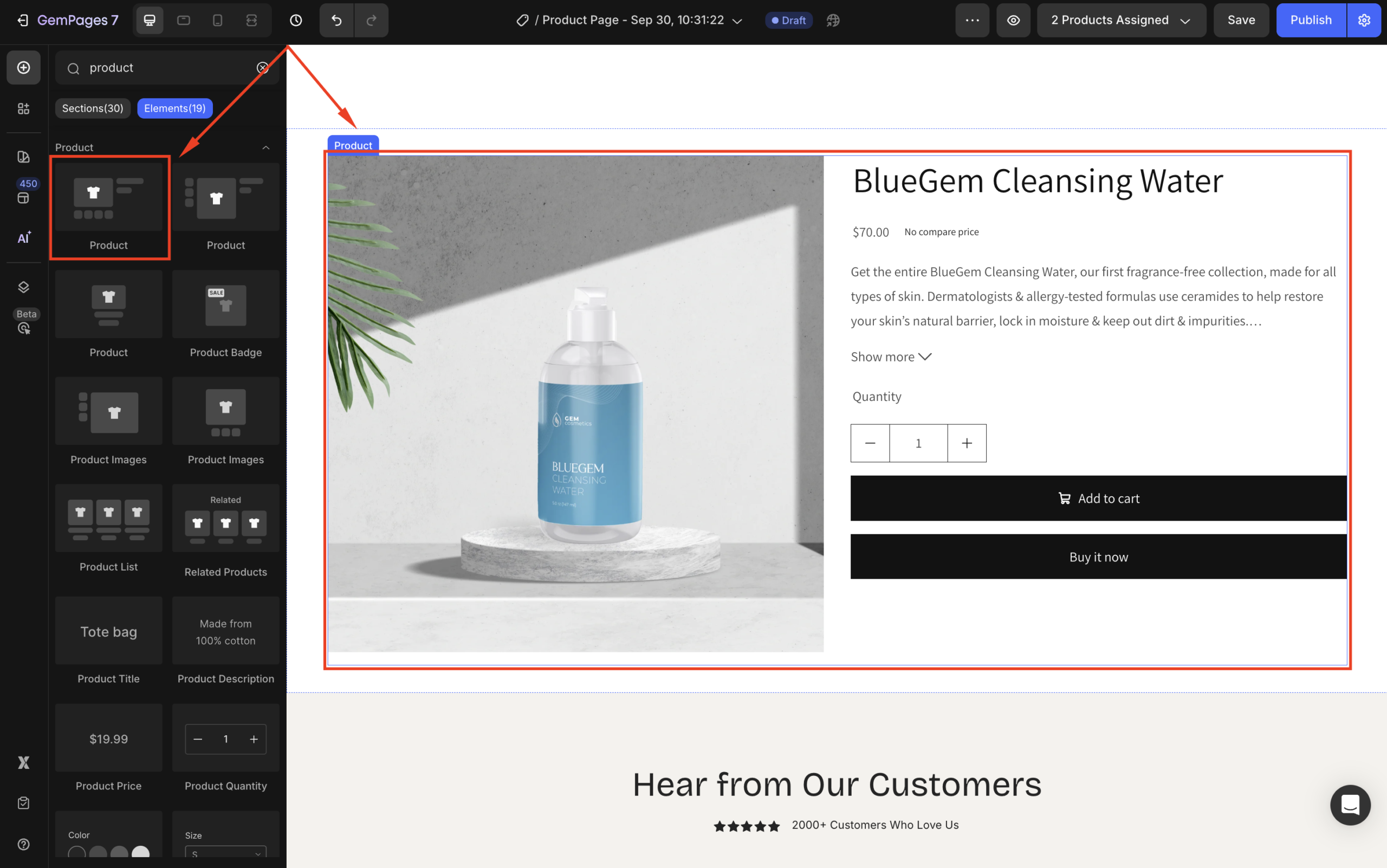
The Product Element contains several child elements, including the Product Image Element.
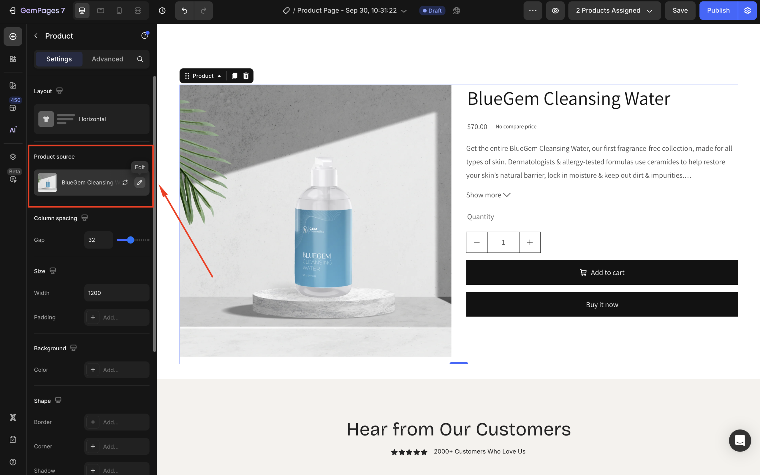
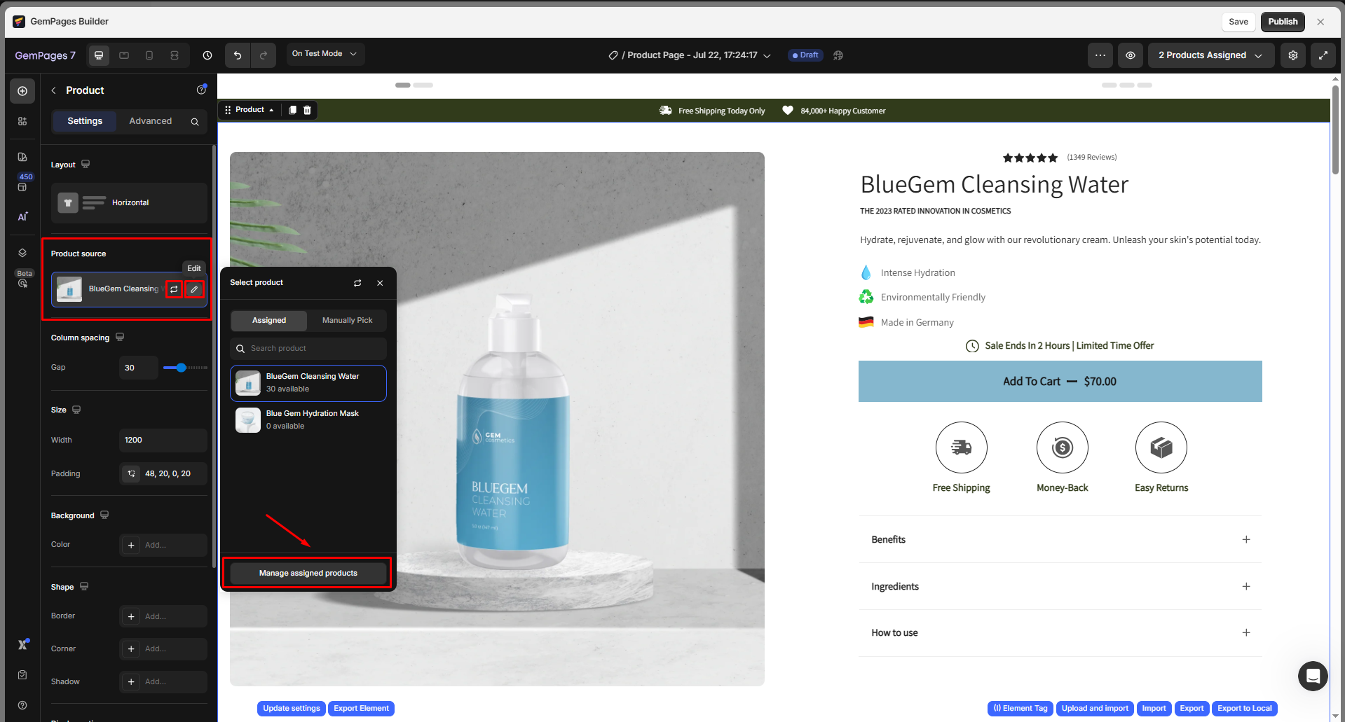
Step 3: Assign a product to the element in the Product source section.
Refer to this article for more details about assigning products in GemPages.
Step 4: Click on the main image to access the Product Image Element
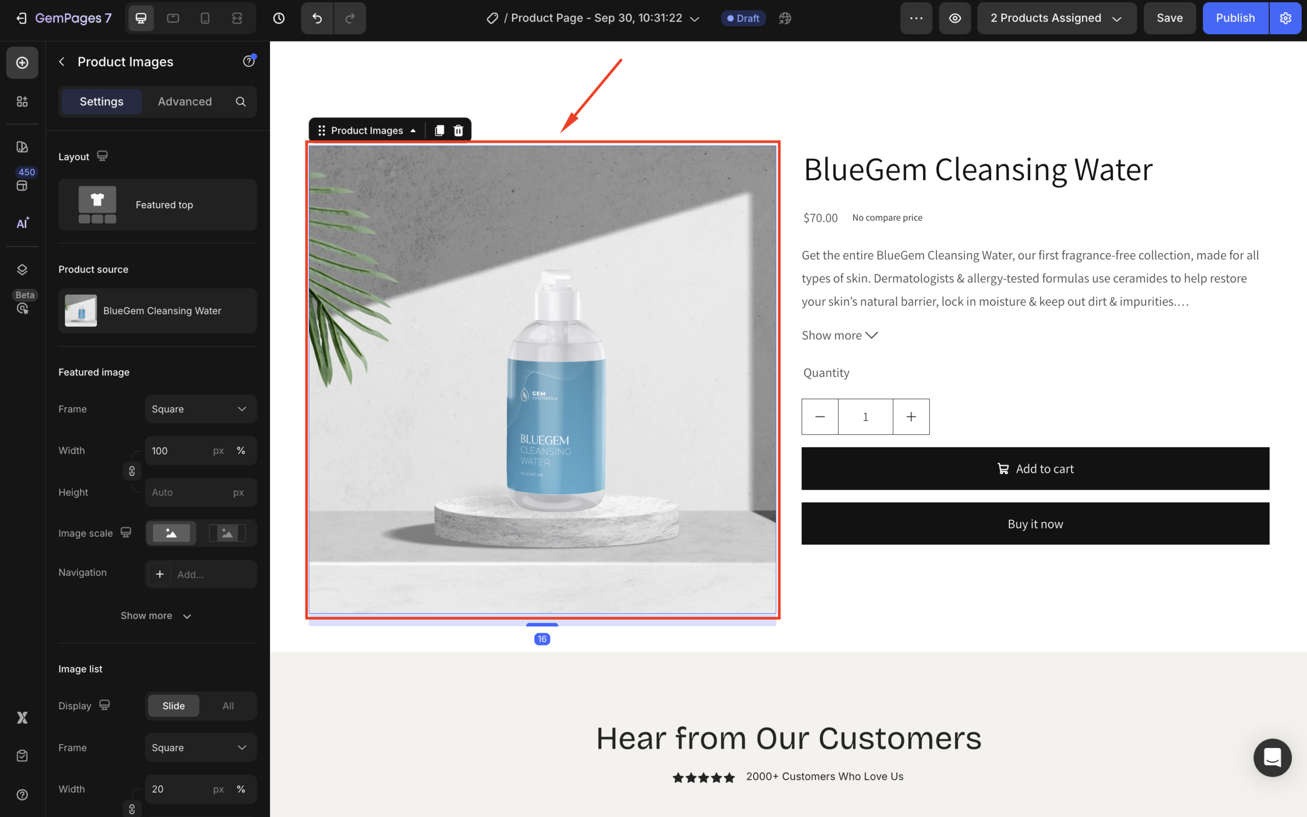
Configure the Settings Tab
Layout
GemPages currently offers 9 pre-designed layouts to help you display both the Featured Image and the Image List effectively.
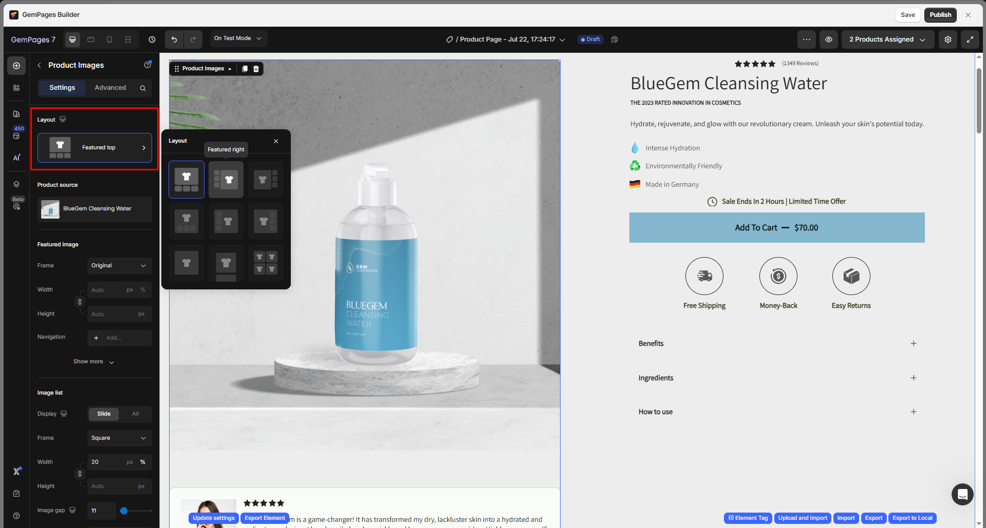
Note:
- You can fine-tune the spacing between images in the Image List.
- Make sure to check how the layout appears on different devices.
Product source
There are two ways to select a product for the product module: Display by assigned product or Manually Pick.
- Display by assigned product
As you select the display by assigned product option, the current template will be applied to all assigned products dynamically. The product will be randomly selected to display on the current editor page.
Hover over the current product source and click the edit icon to open the Select product dialog. From there, you can select other assigned products available.
- Manually Pick
This option allows you to display multiple product modules on the same template and specific variant options.
To make a selection, click on Manually Pick, and a window will open displaying a list of products for you to choose from.

Featured image
The featured image serves as the primary visual representation of your product.

This section includes:
| Setting | Description |
| Frame | Choose between: Square, Vertical, Horizontal, Original, and Custom. |
| Width & Height | Available when selecting Custom frame. |
| Navigation | Select layout: Inside or Outside. Choose navigation icon and adjust size, color, width, height, padding, background of the button, and shape options including border, corner, and shadow.
|
| Corner | Adjust corner radius (e.g., 10px, 30px). |
| Hover Action | Add hover effects such as Zoom. You can also customize: → Zoom Type: Default / Glasses → Zoom Value: Set zoom percentage
|
| Click Action | Choose what happens when customers click the image: → Open Product → Zoom → Open in New Tab: Yes/No |
| Slide Speed | Adjust transition speed between images (e.g., 500ms). |
| Animation | Choose transition effect: Ease in, Ease out, Ease in & out.
|
| Drag/Swipe | Enable swipe for mobile or desktop. |
| Infinity Loop | Enable continuous loop back to the first image when swiping. |
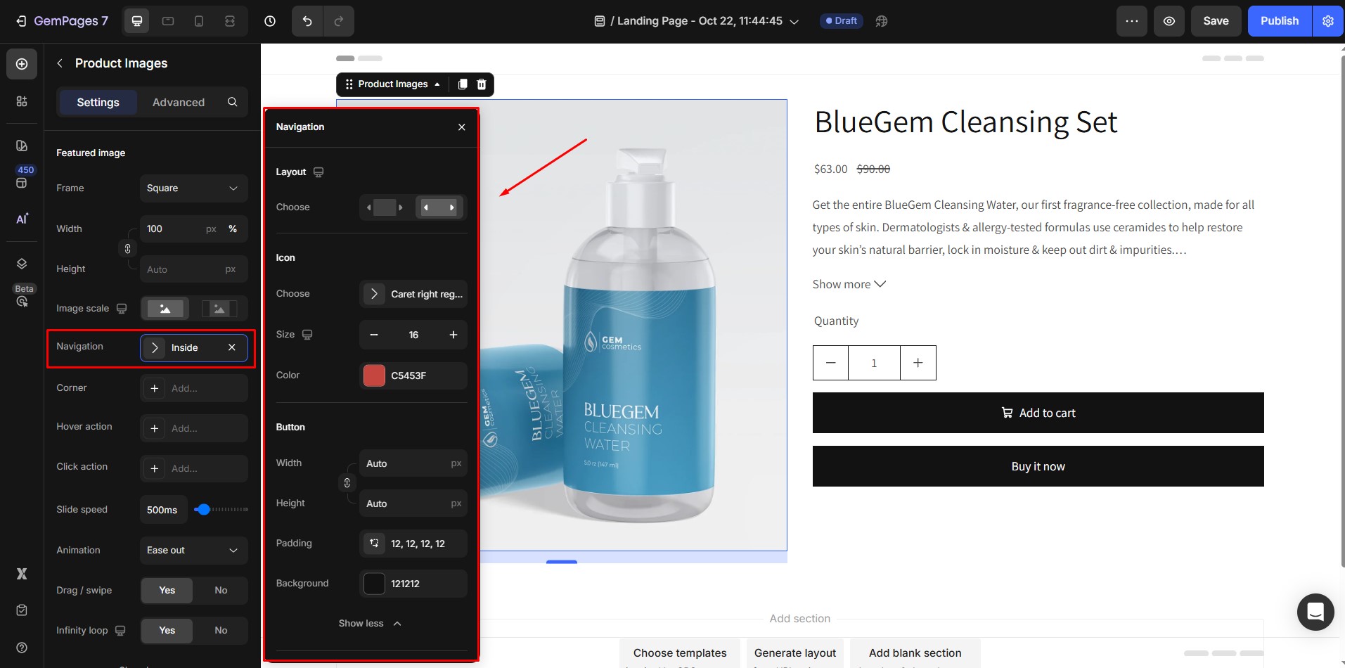
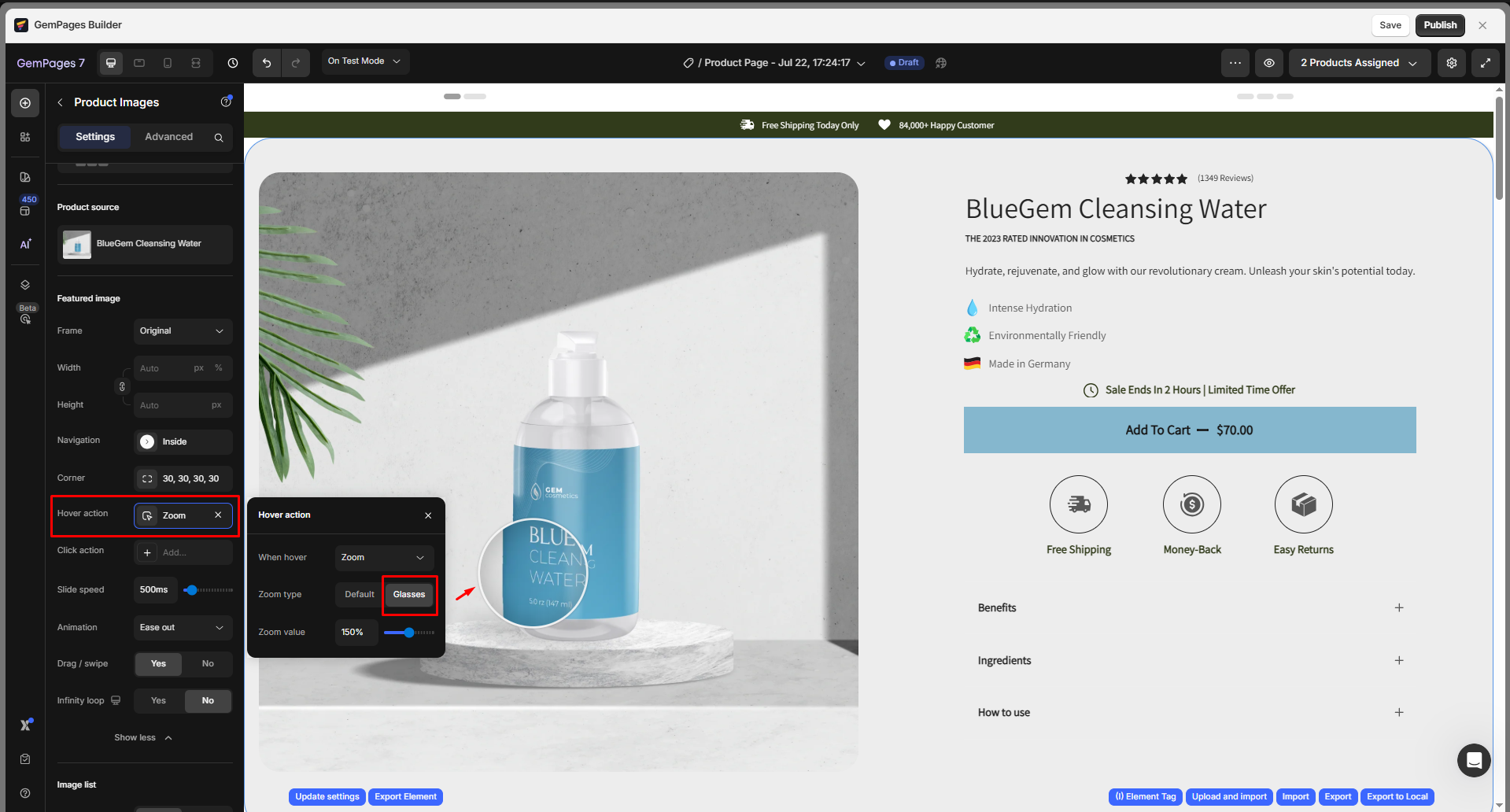
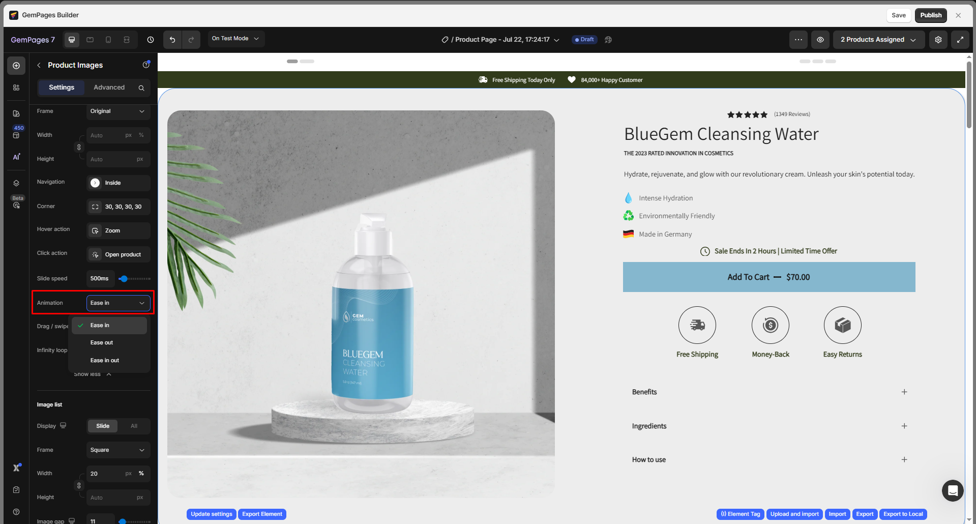
Image list
This section allows you to control how your additional product images (thumbnails) are displayed below or beside the featured image.
Configure:
| Setting | Description |
| Display | Choose between:
– Slide: Display images in a carousel slider – All: Show all images at once |
| Frame | Select the thumbnail shape: Square, Vertical, Horizontal, Original, or Custom |
| Width & Height | Only available if Custom is selected. Define exact dimensions for thumbnails. |
| Image Gap | Set spacing between thumbnails (in px). |
| Image Scale | Adjust how much the image enlarges on hover. Great for visual clarity. |
| Navigation | Enable arrows for slider navigation (if Slide is selected).
Choose layout (inside/outside), select icon, adjust size, color, width, height, padding, background of the button, and shape options including border, corner, and shadow. |
| Corner | Set the corner radius to create rounded image thumbnails. |
| Active Border | Highlight the selected image with a visible border. |
| Click Action | Set what happens when a user clicks a thumbnail (e.g., show in main view). |
| Drag/Swipe | Enable mobile-friendly interaction for switching between images. |
| Infinite Loop | Allow carousel to loop back to the first image after reaching the last one. |
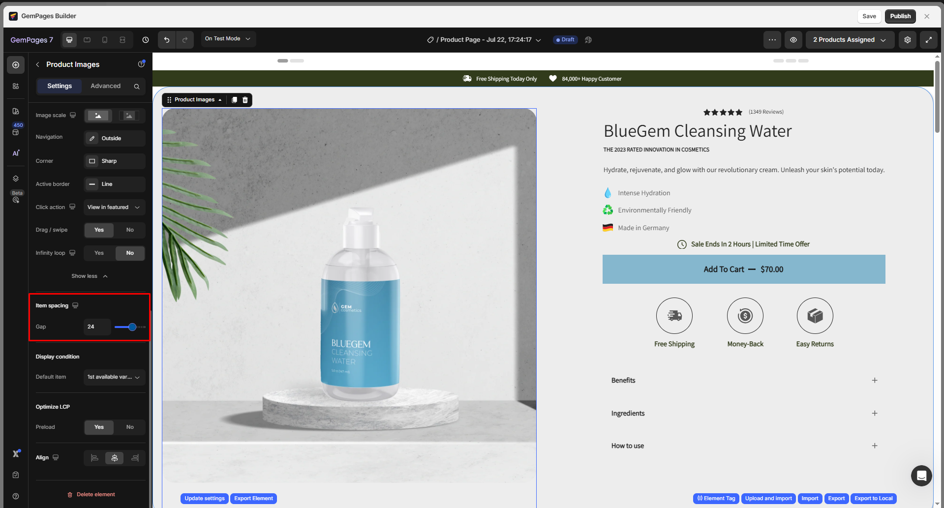
Item spacing
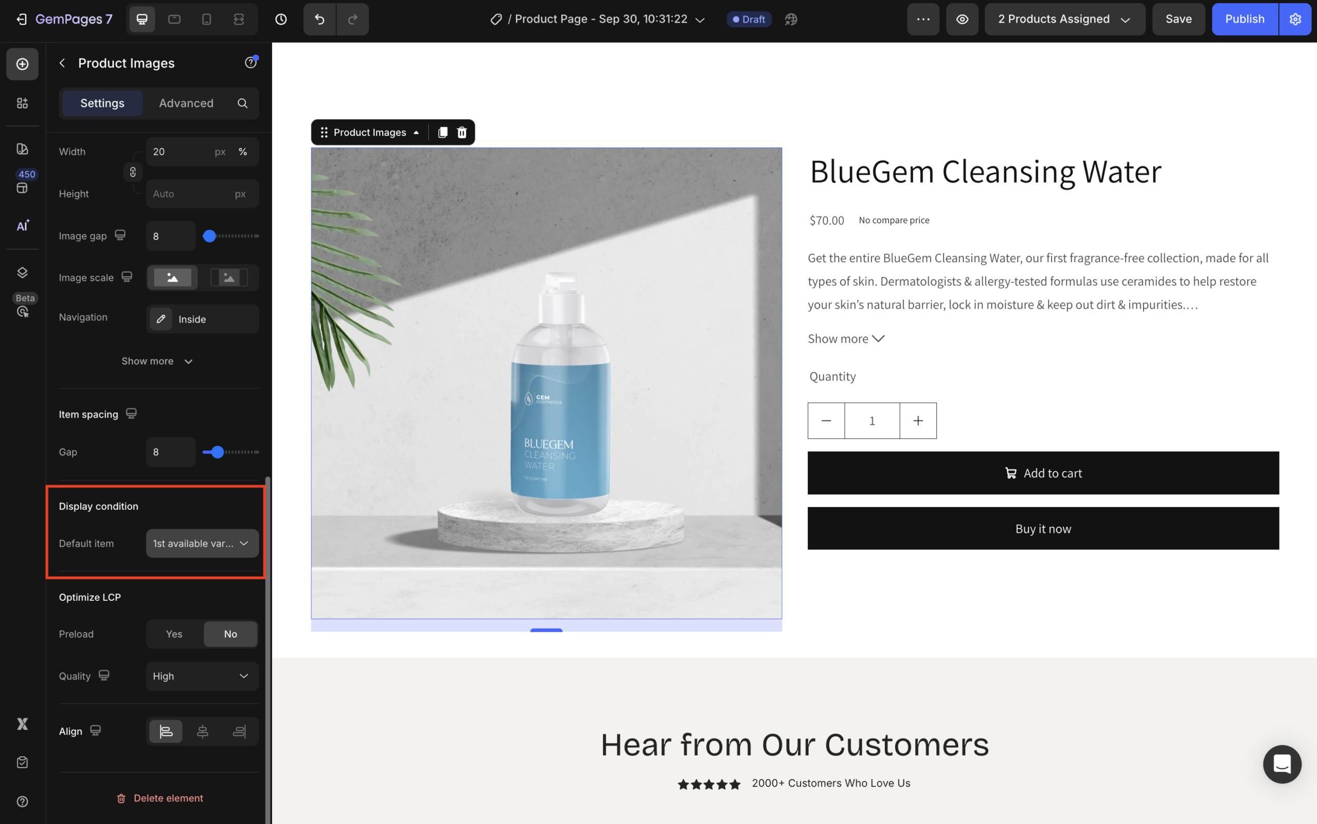
Display condition
Under the Display condition section, you can select a condition for the default image item from the dropdown, including:
| 1st available variant | Displays the first variant image associated with the product’s first active variant in Shopify. Ideal for stores with variant-based images (e.g., different colors or styles). |
| 1st image | Displays the first image in the product’s media list. Best for standard products that use one main image. |
| 1st video | Displays the first video uploaded to the product’s media section. Great for highlighting promotional or demo videos. |
| 1st 3D model | Displays the first 3D model (GLB/GLTF format) added to the Shopify Media section. Use this for interactive product views where customers can rotate and inspect the product in 3D. |
Optimize LCP
If you prefer the image to preload once visitors access your page, choose Yes for this section.

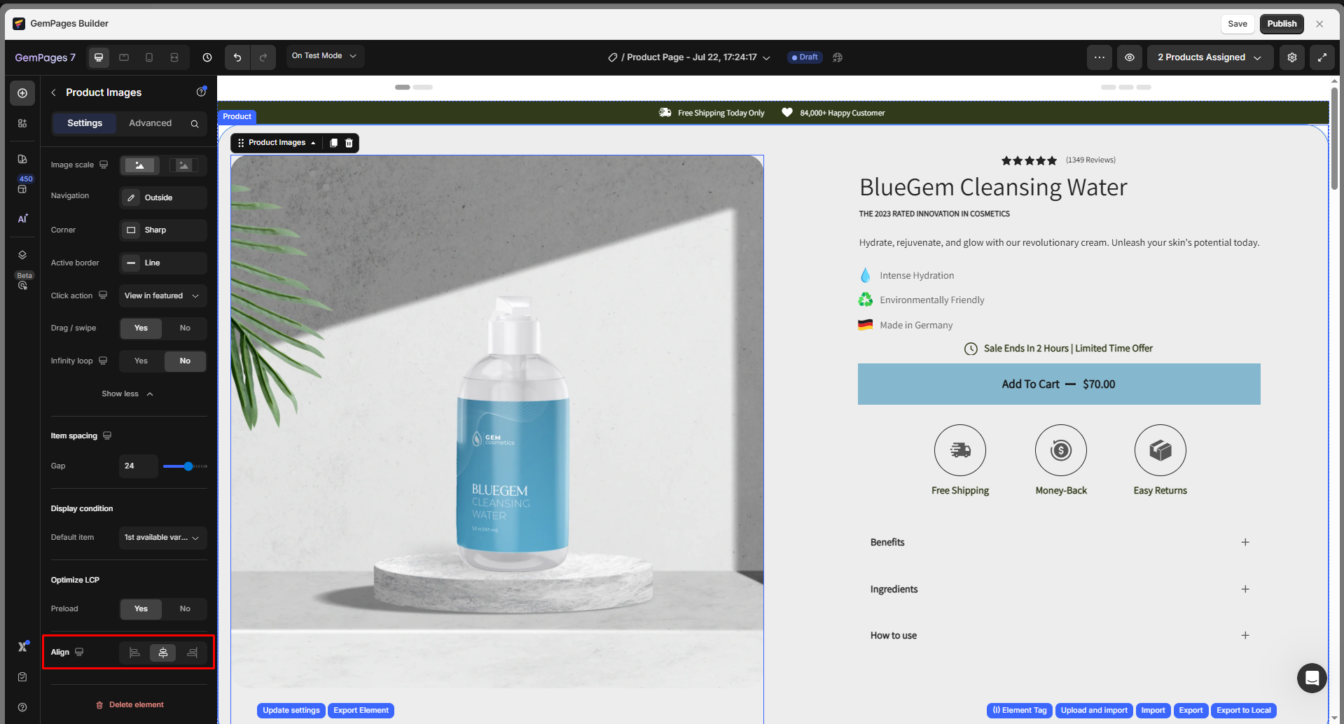
Align
This parameter allows you to determine how the image is positioned on your page. There are three options to choose from: left-aligned, centered, and right-aligned.
Configure the Advanced Tab
For more advanced customization, please navigate to the Advanced tab and follow the instructions in this article.
FAQs about Product Image Element
1, Why aren’t my product images showing up on the page?
If your product images aren’t displaying, it could be due to:
- The Product Images element is not being placed inside a Product Module.
- The assigned product in the Product Module is missing media content in the Shopify Admin.
Check this article for detailed troubleshooting.
2. Why are my product images loading slowly?
Slow loading can be caused by:
- High-resolution images are not optimized for the web.
- Too many images are loaded at once without lazy loading.
Refer to this guide for optimizing image speed.
3. Can I use the Product Images element on non-product pages?
Yes. The Product Images element can be used on any page as long as it is placed inside a Product Module.
4. Can I rearrange the image order inside GemPages?
No. The image order is pulled from the Shopify Admin’s product media section. To change the display order, you’ll need to rearrange the media in Shopify.
5. Can I add a video to the Product Images element?
- Go to Products in your Shopify Admin.
- Select the product you want to add a video to.
- In the Media section, click the + button and upload your video.
- Click Save to apply the changes.
- Go back to your product page in GemPages and click Sync. The video will then appear in the Product Images element.
6. How can I make a page display a specific product with its images?
Step 1: Drag a Product Module into your layout.
Step 2: Assign a product to the module by either:
- Display by assigned product: Apply the current template dynamically to all assigned products.
- Manually Pick: Select one product directly from your Shopify catalog.
Step 3: Once the product is assigned, the Product Images element inside the module will automatically pull and display the product’s images from the Shopify Admin.
For more information, please refer to this article.
7. Why isn’t my product image syncing with my Shopify product?
The Product Image element only loads images dynamically when it is inside a Product Module and a product is assigned.
If your product photo isn’t updating, check that the product has Media in Shopify, click Sync in GemPages, and ensure the Display Condition matches your available media (e.g., 1st image, 1st variant).
8. How to create a product image slideshow?
If you want to create a custom image slideshow where you can manually control each image, you can build your own slider using the Carousel element and Image elements.
Follow these steps to create and change images in a custom product image slideshow:
Step 1: In the GemPages Editor, drag and drop a Carousel element into the position where you want to display the product image slider on your page.
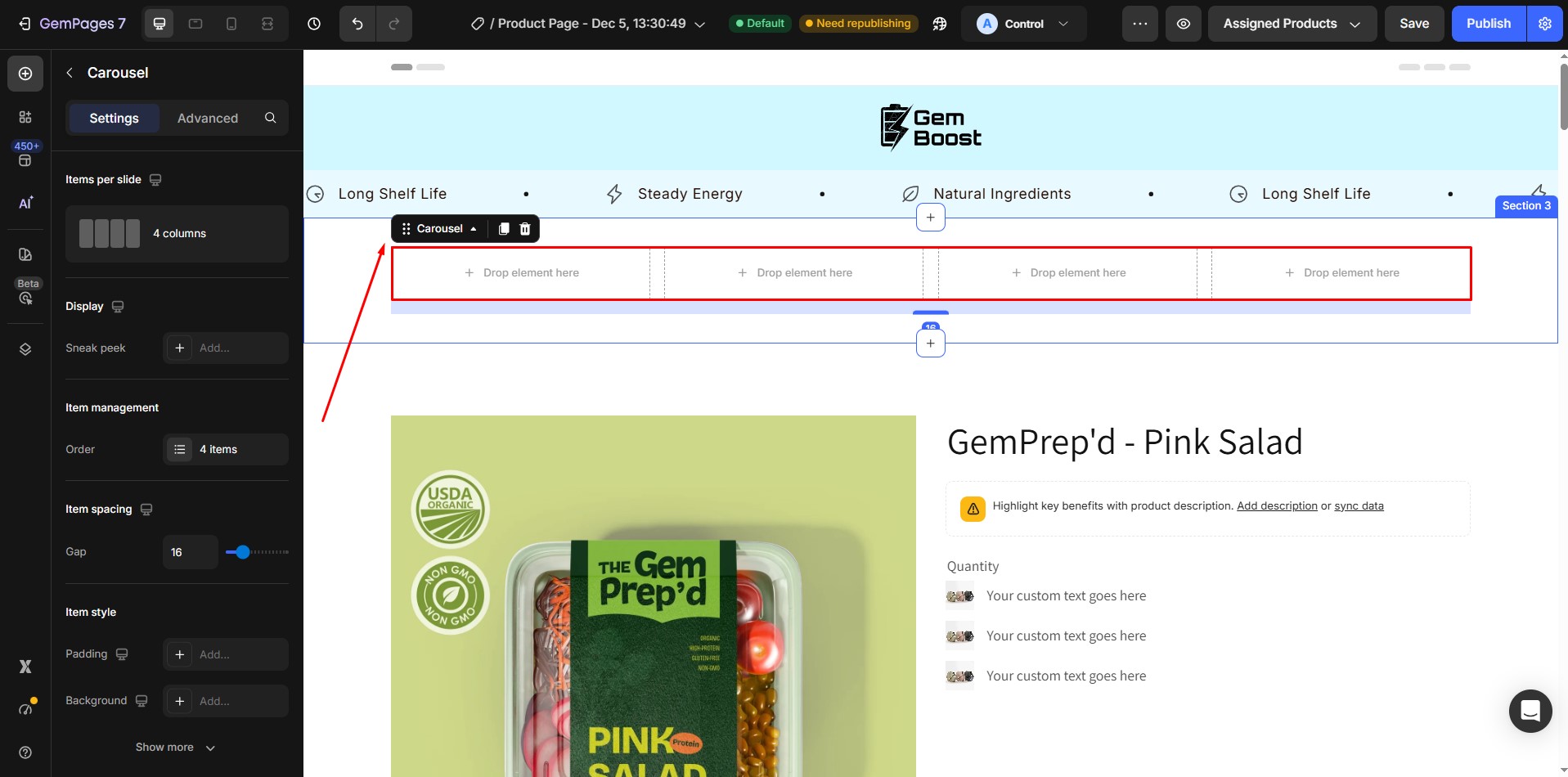
Step 2: Inside the Carousel, drag an Image element into the slider.
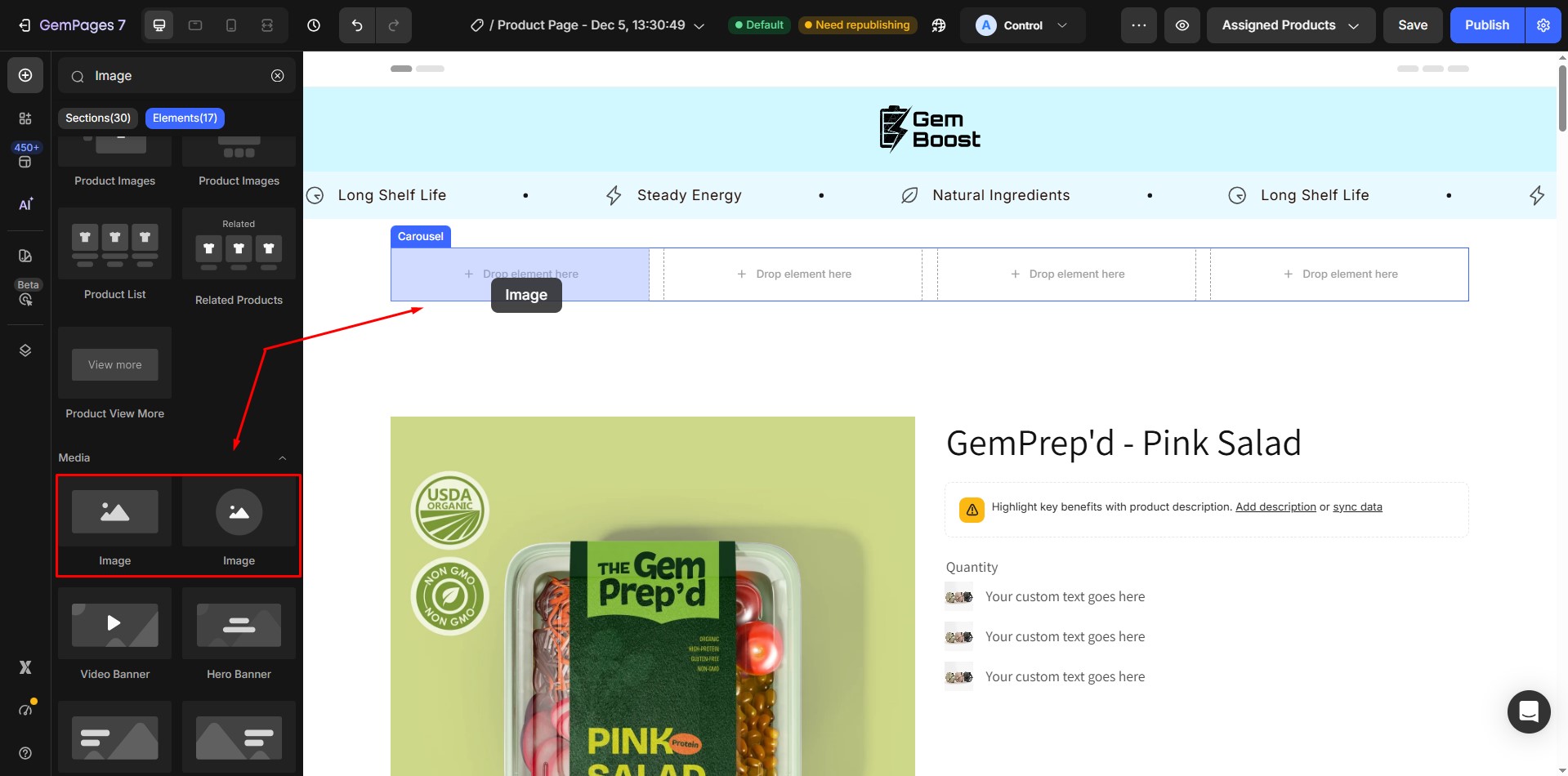
Step 3: Select the Image element, then upload your product image.

Step 4: Repeat the same process for the remaining slides inside the Carousel:
- Add an Image element to each slide
- Upload the product image you want to display
- Arrange the slides in your desired order
Step 5: To change an existing image later, simply select the Image element inside the slide and upload a new image to replace the old one.


Thank you for your comments