


When we launched version 7 of the GemPages Editor, it was a big leap forward — not just in performance, but in how merchants build. But behind every landing page, every product card, and every bundle layout lies one constant: Element Settings.
And over time, those settings started to show their age.
Over the past year, we’ve talked to merchants, and one thing kept coming up: they knew what to build — but the settings made it harder than it should’ve been. So we asked ourselves:
What would Element Settings look like if they were designed around how you think — not just how the code works?
This release, launched on July 29, 2025, is our answer.
We’ve focused on making building smoother and more intuitive — with key updates on new UI pattern & new settings behavior. They’re designed to reduce friction in everyday tasks — and to better support the way merchants build.
Here are the upgrades that will transform the building experience inside GemPages – for the better:
1. Clearer separation of styling and layout controls
For a long time, the Element Inspector in GemPages used a two-tab system — one for styling, one for customizing how the element appears on the page. It worked, but it wasn’t always clear where to start. Some users skipped key settings simply because they weren’t surfaced in the way they expected.
How we’ve improved it:
In this update, we’ve kept the two-tab structure, but clarified their roles.
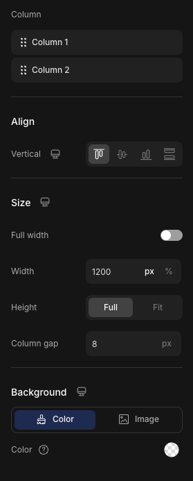
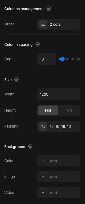
- The Settings tab now focuses solely on the visual presentation of an element, including typography, color, backgrounds, borders, and imagery. These controls apply to the main content area of the element.
- The Advanced tab manages how the element behaves and fits within the layout, including spacing, alignment, positioning, visibility, and responsive display. These apply to the outer container, or bounding box, of the element.
What this means for you:
By clearly separating visual design from structural placement, this update brings greater clarity and control to your workflow.
You no longer need to second-guess where a setting lives or toggle between panels to make related changes. Visual styling—such as typography, colors, and imagery—is grouped where it belongs. Controls related to spacing, alignment, and visibility are organized logically and kept out of the way until you need them.
This improved structure helps reduce cognitive load, minimizes rework, and allows you to focus on crafting pages that are both visually consistent and structurally sound.
2. New UI with a more readable scan pattern
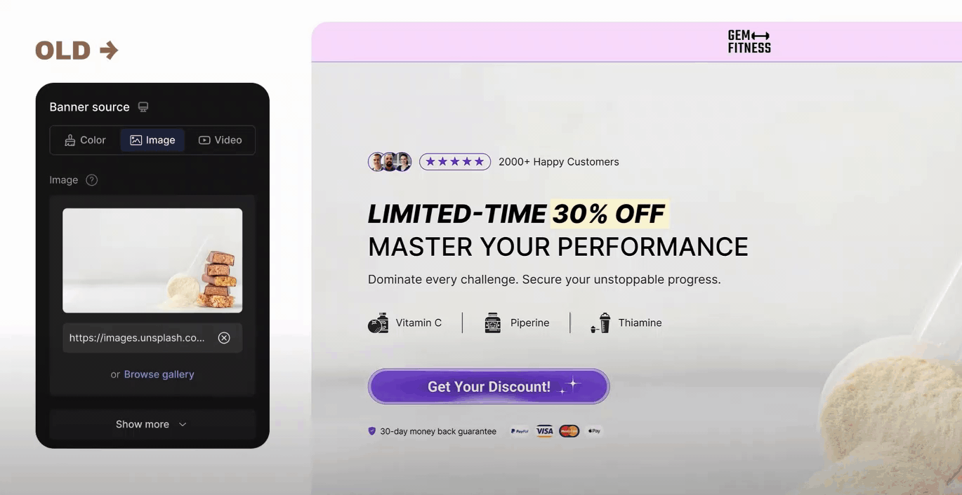
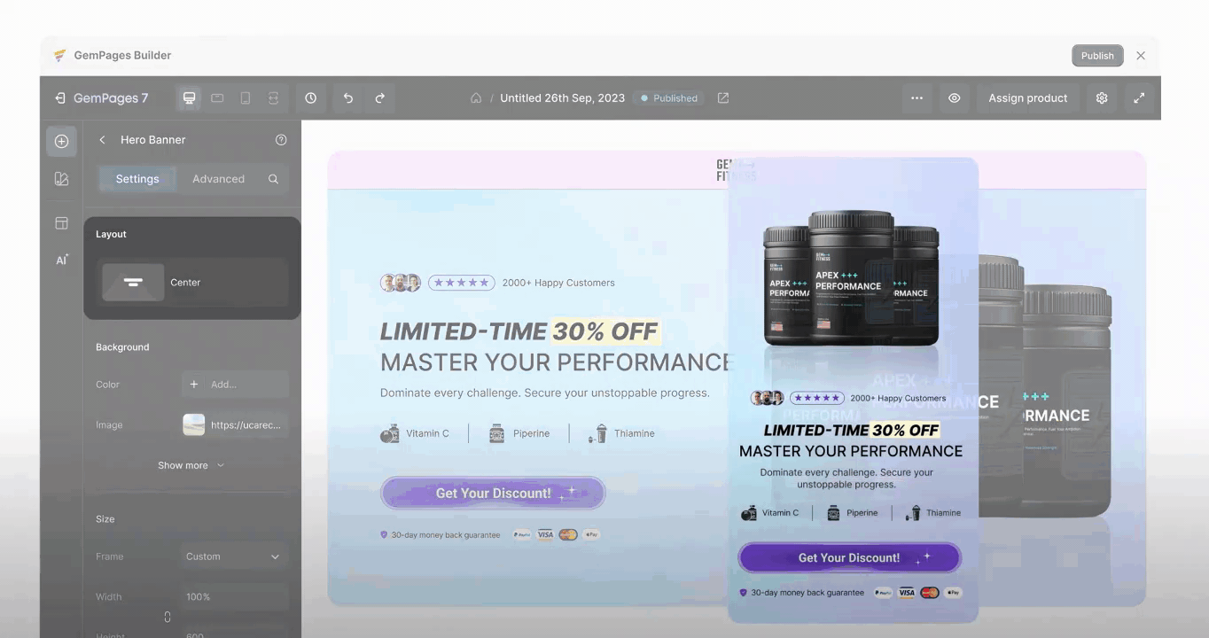
| Old design | Redesign |
 |
 |
In previous versions of the Element Inspector, the structure of controls varied from setting to setting. Some used vertical stacks, others combined labels and values in inconsistent ways. As more settings were added, the panel became harder to scan — especially when working at speed or editing multiple elements in a row.
How we solved it:
A consistent left-to-right scan pattern.
Every setting in this tab now follows a clear left-to-right pattern: Label → Value.
At first glance, it’s a small shift. But when you’re editing dozens of elements, that consistency builds trust. You don’t have to relearn how settings are structured from one block to the next. Your eye knows where to go.
This pattern not only improves scalability as more settings are introduced — it also trains users to navigate the Editor more efficiently, helping both beginners and experienced teams move faster, with fewer mistakes.
Nested settings inside popovers.
Some settings don’t stop at a single value — they open into full sets of related controls. In the past, these additional options were displayed inline, which quickly expanded the Settings panel and made the interface feel crowded.
To address this, we introduced a new structure: nested settings inside popovers.
Clicking on a setting like “Border” opens a clean, focused popover — a floating modal next to the panel — showing only the relevant controls. These popovers can include up to 3 levels of depth, with each child group opening only when needed.
What this means for you:
- It keeps the main Settings panel tidy, showing only top-level options by default.
- It reduces overwhelm, especially for newer users who don’t need every advanced setting upfront.
By hiding complexity until it’s needed, the Editor becomes easier to scan and faster to navigate — without sacrificing power.
3. New behavior of settings
This update to version 7 introduces new types of settings and refines how some existing ones behave — making interactions faster, clearer, and easier to control.
Many settings now follow a click-to-add, click-to-remove pattern. Instead of starting from an empty field, clicking a control will automatically insert a default value. From there, you can adjust or remove it with a single click.
This simple interaction change helps reduce the manual effort often involved in setup. It gives you a clear starting point without the guesswork — so you can focus on adjusting, not building from scratch.
Why it matters
By automatically applying default values, the Editor removes unnecessary steps and keeps your workflow moving.
You’ll make decisions faster, reduce repetitive input, and avoid getting slowed down by settings that don’t need deep customization.
What’s changed in the Settings panel?
| Settings | Old design | Redesign |
|---|---|---|
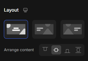
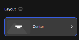
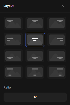
| Layout: Nested settings are now grouped inside a popover, showing only the parent label and its current value. |
 |
  |
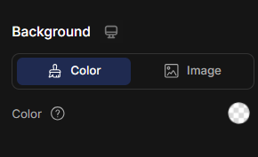
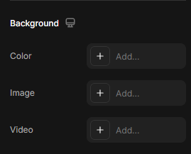
| Background: The updated Background setting gives you more flexibility by adding video as a new option — alongside color and image. |
 |
 |
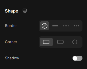
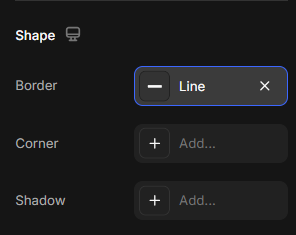
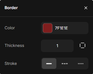
| Shape: Border settings are adjusted inside a Popover, including settings:
|
 |
|
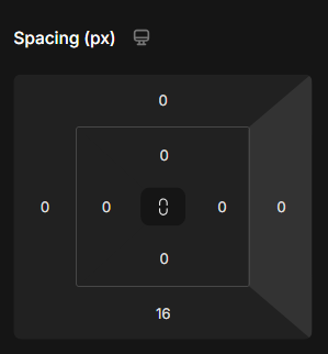
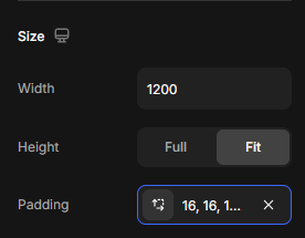
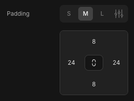
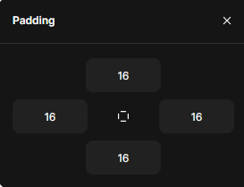
| Padding: In old version, the Padding is sometimes placed in the tab Settings or the tab Advanced. In this update, Padding was moved to the Settings tab. |
|
|
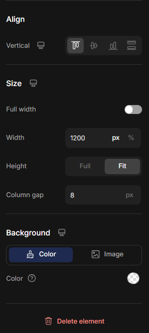
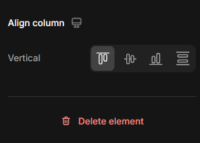
| Alignment: The Alignment setting is now located at the bottom of the editor panel, below Size and Background. |
 |
 |
Browse element settings by type
To help you navigate faster, here’s a categorized list of all elements supported in the upgraded Editor.
Each link takes you to a dedicated article with details on how the element works — and how to configure its settings.
1. Base Elements
2. Interactive Elements
3. Media Elements
4. Product Elements
- Product
- Product List
- Product Cart Button
- Product Title
- Product Price
- Product Compare Price
- Product Description
- Product View More
- Product Dynamic Checkout
- Product Quantity
- Product Vendor
- Product SKU
- Product Image
- Product Variant and Swatch
- Product Badge
- Product Discount Tag
- Product Stock Counter
- Sticky Add to Cart
- Product File Upload
- Product Bundle
- Product Custom Field
5. Article Elements
- Article List
- Article Image
- Article Title
- Article Excerpt
- Article Content
- Article Date
- Article Author
- Article Category
- Article Tag
- Article Read More


Thank you for your comments